
This blog will be a documentation of research into female character design
Don't wanna be here? Send us removal request.
Statistics
We looked inside some of the posts by cboyerma and here's what we found interesting.
Average Info
Notes Per Post
0
Likes Per Post
0
Reblog Per Post
0
Reply Per Post
0
Time Between Posts
6 days
Number of Posts By Type
Text
17
Last Seen Tumblr Blogs


Fun Fact
BuzzFeed published a report claiming that Tumblr was utilized as a distribution channel for Russian agents to influence American voting habits during the 2016 presidential election in Feb 2018.

Text
Animatic and Storyboards
After going over my drafts of storyboards and animatics I have been able to produce new versions getting better each time but I still need to work on pulling it all together. To help me with this I am constantly looking for inspiration looking at professional storyboards and animatics, typically the animatics from studio The Line https://www.youtube.com/@THELINEanimation and are a studio I am motivated by from their dynamic work.
0 notes
Text
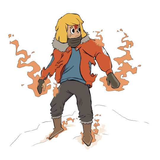
Fenrir Design Update
I was still having problems with the design for Fenrir, he was coming off a lot more cute and innocent when in the film he's meant to pose a threat to the main character and seem like an impossible opponent to beat.

To help with this I went back to looking at wolf anatomy again and try and get a better understanding so I can reconstruct my design to become more intimidating.


Doing this was a very helpful exercise not just in learning about the anatomy but also the practice to carry that over to the film when animating Fenrir.


With all that in mind I believe I was successfully able to recreate the design to tell the viewer what I wanted to and gives off a much different impression then the previous design did.
0 notes
Text
Test Frames
I was given the great suggestion of creating some test frames for what the final film would look like. Not just to help give me direction with how to go about animating but also to make sure that the vision I'm having for the film wont be to time consuming making me unable to finish.

I really liked how this frame came out. I think the none solid colour and simple backgrounds give the characters more attention and in a fight scene that's where I want to viewers eyes to be drawn to the most. Also highlighting them will work in turn with making my female character centre stage.

With this test frame I wanted to try used more dark and solid colours but I don't think it came out as well but I'm still glad I was able to give them tests.
0 notes
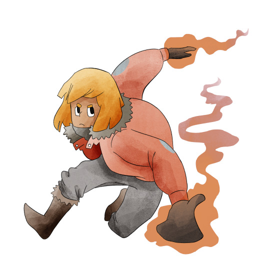
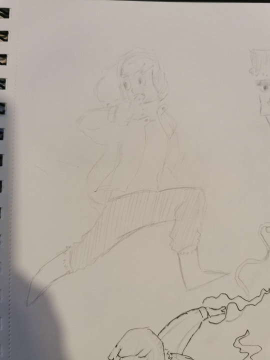
Text
Main Character Poses
To help myself be more familiar with the main character I have continued to draw her in dynamic poses so when it comes to animating her in these awkward angles I will have good practice. It also give me the chance to figure out how I want to tackle the heaviness I want for my linework when it comes to the final film.


0 notes
Text
Colour Testing
After being able to see Michaël Dudok de Wit work and speak to him I've gotten very inspired to create my film using watercolours for the backgrounds and colouring. I loved how The Monk and the Fish used colours so effectively but limited at the same time.
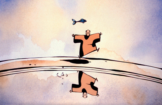

I believe by using this style it can really elevate my characters more in my film and also keeping my colour workload not as intensive.
To start my process in this I coloured some different drawings I have done using the same brushes to get a feel for the kind of effects I can create with them in a timely manner.


Though I do like the results that came out of doing these tests I don't think any of them are what exactly I'm looking for in my film. I did do one other test with watercolours on a drawing of the main character.
This colouring came out a lot more like what I'm looking for with the slight difference of going lighter on the colour to let to textures of watercolour shine through. So to help me with this I'll be doing some best frames to see what the film could look like in the end.
0 notes
Text
A test animation for the main character and starting to get more comfortable with camera moves and drawing the characters in a lot more difficult positions.

0 notes
Text
A lot of what I have been focusing on is my storyboards and after working on my first draft I think the story flows a lot clearer and interesting now. Here are some of the amendments I have done for them and how I changed them.


0 notes


Text
When getting some feedback on my storyboards and designs it was said that I might want to go back and think about how easy my characters are to animate and look at making designs that will be a lot less time consuming when it comes to animating them.
So for this I had a good think about Fenrir and looked into other styles and one artist that I found which sparked some ideas was ND Stevenson and their work with Nimona.

I really like the simple style and colours used but still gives them a lot of character.

These are the first sketches for the new design which I think is going in the right direction but the body shape still wasnt there yet so I continued with my sketching till I was happy with the results.


0 notes
Text


I wanted to start getting an idea of how the fire is going to look in my film. So I started by looking at some standard fire and trying a test animation but after doing this I wanted to do something that will make the fire stand out and tried this blocky look instead. I still need to do some more tests before deciding how I will go about animating the fire but I do really like the idea of having a more different look to it.
0 notes
Text
Fenrir Runestone
I just wanted to highlight the inspiration for the runestone that will be the centre of the animation. Based on runestones that just exist I want to stay as true to them as possible in the way they look.


0 notes
Text
Animation Reference
Just a quick one to show off a channel that does an amazing job of finding great animation from all catalogues, western and eastern and editing together so great. It has been a great resource of reference or even just inspiration.
0 notes
Text
More Storyboard Progress
I am pleased with the progress I am making with my storyboard, not just how much I have done but the ways I am thinking about how I can best create excitement and action within a scene, especially in a fight scene. And I think I've been able to produce some great shots


0 notes
Text
Storyboard Progress
Though I have begone my storyboard process and creating it for my animation I learnt something important when looking at the ways to tell a story and having conversations with other.

This being one of the first drafts of my storyboard it feels flat. A lot of the shots are from straight or side on and not all that creative apart from the fourth panel. I stands out so much compared to the rest and made me think about how I'm presenting this animation and I went back and looked at how I can improve what I have done.

Which lead me to this. Though yes it is similar I think having just that little bit of difference can really engage you more and be more exciting to watch.
0 notes