
Don't wanna be here? Send us removal request.
Statistics
We looked inside some of the posts by celyndizon-cipm and here's what we found interesting.
Average Info
Notes Per Post
0
Likes Per Post
0
Reblog Per Post
0
Reply Per Post
0
Time Between Posts
3 minutes
Number of Posts By Type
Text
10
Last Seen Tumblr Blogs


Fun Fact
25% of US internet users with an annual income of $80-100K use Tumblr.
Text
Section 10
Evaluation Essay
Before beginning my project I had to decide which topic or subject area I had most interest in. Knowing that my degree has different pathways that you can go in, I wanted to branch out and challenge myself to do something I have yet done. Although digital media is heavily web-based, I knew there were other outside directions that don’t consist of coding. Therefore, for creative industries I decided to take a step out of my comfort zone and achieve something bigger than anything I’ve ever done before. I decided to create a magazine. With a magazine I can showcase my skills in adobe softwares, creating logos, creating a layout design and collaborating with other people. However, identifying my client was difficult considering I was torn between basing it on my brother or my university football club. In order for me to pick one, I weighed out the pros and cons for each option. There were more cons than pros from my brother which automatically made me choose my football club (UPWFC). My primary focus of the project was to brand UPWFC and showcase them to the public, locals and University. And to help get them the exposure they need and to gather more girls to join women’s football.
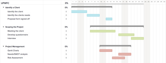
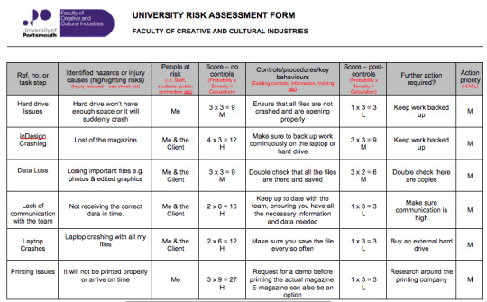
Planning the project was important because it helped my time management and it also ensured that I had everything in order. To do so, I made sure to create a GANTT chart to guide me through the tasks and small deadlines to keep me focus on what needs to be done and when. The GANTT chart will also help show which part I would take the longest amount of time. I planned to have a template of the magazine done less than a month, gradually adding in content then all added content in less than 2 months. So in total, the magazine would be finished in 3 months maximum. Along the process, time was delayed due to faults and miscommunication with my client, however it was still finished on time. Another method of accessing my strengths, weaknesses, opportunities and threats was the use of a SWOT analysis. From the analysis, I had more strengths than weaknesses which gave me a confidence boost knowing that most sections were doable on my level. As for opportunities there were noted than threats which decreased my chances of encountering any problems during the project. The two major threats that did cause an issue during planning was personal problems and lack of communication. However, with my strengths I was able to overcome the issues and stay on track. Lastly, I created a risk assessment to outline what could be damage towards the project, e.g “laptop or software crashing” will create a delay in publishing the magazine, so to execute the problem I had to make sure to save every time a big change is made.
Whilst doing the project management methods, I went and set up a meeting with my client to ensure what their wants and needs are for this magazine. Beforehand, I prepared an interview to see an overall opinion on certain things that they may find interesting or wanting to change. During the interview I gathered data that was eventually used to create two questionnaires for the entire team’s input. The questionnaires were a mixed or ideas from the client and myself, I wanted to know their opinions on the ideas and their suggestions on what can be added. From what I accumulated, my planning and drafting for magazine layout was made easier. After, I began to note down all the suggested contents that the team, client and myself have mentioned and shortlisted down into six sections. Again, I weighed out the pros and cons for each and finalised which content had more to offer then I began to brainstorm each section to get an outlook on what can be included for each one. Also, the client insisted on including a lot of past and present photos to create a variety of past events. As for collaborations, I got in touch with a photography student who was known to be the main photographer for University football. Kwamephotography kindly accepted to collab with me and gave me the approval of using any of his photos. Another photographer came late during production as I was only introduced to him towards the end of our season. However, Sportsdnp took profile photos of each player during our football matches which saved me time from booking a studio and allocating a time for all the players to attend. The two photographers assisted me through the duration of the production which helped me focus on other areas of the magazine rather than capturing pictures, this was great time management and increase my networking skills.
As the pictures were being captured, I had to gather more photos of the girls in action and out of action (outside of football). I made sure I was aware of timing and using it to my advantages. I then began to gather content that was necessary, so I created a google survey to collect the players profile details; their names, DOB, degree, position and a quote or saying. Although it was hard to make sure the girls were responding back it kept me on track knowing that I’ve started early, this will then give me more time to draft the layout. As I started to collect the data I decided to make a list of the 1’s 2’s, 3’s ex-players and committee so that when production begins can I easily include them in.
Once all the correct data and material were gathered I began to storyboard the different sections to get an outlook, and to change any areas. I started off drawing a rough sketch (also known as wireframing) by drawing in boxes that would represent a text or an image. After a few drafts and finally accepting a final piece I started to use inDesign to start up this magazine. Since Blurb gives you an inDesign plug-in I used considering it already has a magazine template, which I then started to envision the draft and digitally create it in the program. Step by step I began the production, starting with the player profile since this will take up more time because of the small attention to detail.
During this assignment I have experience a lot of of both, negative and positive outcomes throughout the project. My organisation skills held back my time management and caused delays in terms of publishing, but during the whole I had the chance to enhance my creativity and improvisation as well as team work. On the other hand, my negative notes were mainly not having enough time to publish it or going over the limit when not necessary. I struggled with starting inDesign because this was my first time using this software, but once I became comfortable and confident with the basic knowledge I started to find out new ways to do things. This was beneficial for me because it enriched my basic knowledge and understand of the software. My laptop was another technical issue that cost me a lot of time in terms of editing, since my laptop runs on a low memory ram the software became slow as I started to work through it. Also, my laptop crashed a few times due to lack of disk space and overheating. Luckily enough I had backed up my files and managed to restart the laptop every so often in case it shuts down again. The downside of the magazine was not giving myself enough time to publish and test the magazine enough times to spot the faults and mistakes. But, I managed to overview the project as I was creating it which saved me time from giving the finalised project a review.
As an improvement on behalf of the magazine, I could have gathered more content on the charity events that they have created and for who, a clearer player profile rather it being jumbled up together and sticking to my time management plan, so that next time I can afford the pressure of leaving it last minute. Since this being my first magazine, my lack of information had me stuck in the beginning and made me struggle in how to create and execute a one, but with the experience I had with AURA I managed to start myself and gradually starting to go with the flow of the production. Although I did not print out my magazine I figured that ebooks or e-magazine are more beneficial considering digital is becoming a primary source of news. Therefore publishing it in an ebook I can always change it or see what I can digitally improve. And my degree favours it by helping me understand the challenges you face as a junior intern. Taking from this whole experience of project management I have ensured to give myself an earlier deadline than to the submission so I can look over it and proofread it, if it was appropriate enough or if the features and content were all aligned. In regards to the software I have taken away qualities that will help me in future endeavours.
0 notes
Text
Section 9
8.1. Usability Testing
8.2. Errors or Admissions

8.3. Correcting Faults
Due to some technical difficulties I did encounter a few which slowed my production time and made me delay. Due to my laptop having such a low RAM has cause it to buffer every time I use inDesign. The software would not only crash and would not close, but my entire laptop froze multiple times before it rebooted and started working perfectly fine. However, I was able to fix the issue by deleting files that were unnecessary and clearing my disk space. This was then time consuming however it did help with the constantly freezing and buffering.
0 notes
Text
Section 8
8.1. Usability Testing
So once the magazine was fully developed and designed, I had to upload it online in order for me to publish it on Blurb. Once on Blurb, I had to wait for the review process to be completed to ensure that all content and material were in shape and form. As soon as the status became Published I immediately checked to see if the ebook was ready to be seen. However, for my ebook/magazine it will only preview 30% of the book unless you purchase it, I have decided to make it free because I am not looking for any profit from this project, but purely to present a University team to the locals and the rest of the university.
*screenshots*
8.2. Errors or Admissions
There were multiple errors within both the pages and covers files. These were because of text or images that haven’t been aligned properly causing for the entire magazine to shift. This made it look unprofessional and was soon sorted once I understood where and what I needed to change and fix. To avoid the risk of getting the same errors again I had to make sure the font was appropriate and up to adobe standards and the size was big enough to fit the page or smaller if it doesn’t. These errors did cause a delay in publishing the ebook/magazine because Blurb did not allow you to move forward if you haven’t fixed the errors, just to ensure you that images and texts may be moved.
*screenshots of errors*
8.3. Correcting Faults
Due to some technical difficulties I did encounter a few which slowed my production time and made me delay. Due to my laptop having such a low RAM has cause it to buffer every time I use inDesign. The software would not only crash and would not close, but my entire laptop froze multiple times before it rebooted and started working perfectly fine. However, I was able to fix the issue by deleting files that were unnecessary and clearing my disk space. This was then time consuming however it did help with the constantly freezing and buffering.
*screenshot of indesign* 8.4. Does the Artefact meet the clients needs
The artefact does meet the clients needs, however some changed due to lack of content and materials to use for it.
0 notes
Text
Section 7
7.1. REVIEW THE PROJECT WITH YOUR CLIENT
The client seemed impressed overall, they agreed that all specifications were all ticked, but some changes and improvements could be made:
Like shifting all the texts and images so that they’re in line.
Add more writing so that audience have more of a read
Fix the mini biography on the player profile
Client/Project Specifications:
Concept: A Title, the aim of the magazine, the theme
Pre-Production Stages: Mind maps, Brainstorming, Questionnaires, Interviews, Surveys, Sketching layouts, target audience
Design and Layout: The design look of how each content is presented
Production schedule: Proposal, deadlines for each task, publishing deadline
Content Planning: Content layout designs - the header, body, images
Printing and Distribution: Meet the Deadline (April 4th 2019)
7.2. ENSURE THE PROJECT IS RUNNING TO PLAN
November - Project proposal
December - Pre-Production (mind maps, ideas, content, research)
January - Collecting data and content, Interviews, asking for collaborators
February - Finalising the layouts and contents, constructing it all together, publishing website found
March - Ready to be published and feedback from your client
April - Deadline
At the current moment, the project is going according to plan with a slight interruption due to my laptop crashing because of the software. However, it has been working ever since but a lot more slower than usual. The pages has recently had some errors due to the font size and arrangement, but that has all been approved so far.
Other than that and the slight delay I’m still on task and currently editing the third section of the magazine.
Luckily I’m still able to grab more in action photos of the girls before the season end.
7.3. CHECK YOUR ASSUMPTION MADE EARLIER ARE STILL VALID
All the assumptions that I made were not all valid, in the beginning I wanted a hardcopy of the magazine, however I had to settle for electronic to save time and money on waiting for it to arrive. Other than I have been in schedule with my GANTT Chart despite the delay and tasks have been done either on time or a day or two later. However, the production of the magazine layout would have been quicker if I agreed on the content I’ll be using.
0 notes
Text
Section 6
6.6. Learning the software or equipment
Before starting the process of the magazine I had to learn how to use inDesign. Although I’ve had the chance to use the software, I know the basic understanding of it. With the help of the adobe plug-in that blurb offered, it made it easier for myself considering that was already a template set out. All I needed to do was insert the contents and making sure the measurements were precise and accurate, so that when I upload it onto Blurb, hopefully there won’t be any problems.
Once I’ve downloaded the plug-in, I can familiarise myself with the tools and begin production. Before starting the production I had to understand which tools I will be using to design the magazine.


For the first few pages I focused on the player profiles, so I had to ensure all sizings were the same. The screenshot above shows the design I wanted to use as a guideline. In order to get the photos I had to do a collaboration with a photographer during a match day so that each player are wearing their match kits.


The small screenshot above is the exact measurements for how I want each player profile to be the same. These measurements are for the size of the box in order for the photo to fit or it’ll be cropped, and also making sure they all fit equally on the page.


These measurements are for the photos size, so it makes it smaller in order to fit the box that I created above.


The first measurements is for the size of the box which will be placed over the photo with the writing on top. As for the box, it shows the font size for the text so that it fits the box.

This was the final design for the player profile pages, equally separated with three across and four down. This 3x4 measurement perfectly fits all the players equally across the two pages. The first page has the first team and the second page is split in half with first and seconds.


0 notes
Text
Section 5
Asset Production
5.1. SOURCING THE MEDIA
All media will be made myself, however some photo and videos will be used from collaborators. The content will be provided by myself which will be taken from my experience of sporting events. All photos must be of high quality to showcase the details within them, it will either be landscape or portrait depending on the display and location of the photos.
Blurb.com
In terms of publishing the magazine, I was recommended the website Blurb.com which has been used by multiple students in the past due to it’s cheap pricing for printing and displaying. Blurb outlined the prizes of the magazine, starting off with £3.99 for a premium magazine with 20 pages (+20p for extra pages). My aim was to do 24-32 pages and it worked out between £4.79 - £6.39 (Premium) and £3.39 - £4.19 (Economy).
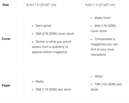
After averaging a range between the pages I looked at the paper types and what the GSM of the paper would be when printed. Blurb was helpful in showcasing the size, measurements and the quality of the paper, it helps you compare the differences. Here are the specifications of the magazine:
Blurb inDesign Plugin
I will also be using the indesign plugin from blurb because it already has a magazine template ready for me to edit on, making it easier and quicker for me to start designing and adding necessary content.
*insert screenshot of the blurb*
Logos needed in the Magazine
As for the other medias I will be using; the UPWFC logo will be a main source considering it symbolises the club. It will be the main attraction as it will draw in attention on who the club is. Therefore, I will have to ask the designer of the logo if I’m able to use in the magazine, depending on the quality of the piece I would need to digitally enhance it in order for it to be considered professional. Very simple with a black and white scheme, keeping it easier for myself to work with. If needed, I will use photoshop to change the black to white if the background is a darker colour, so this will make it stand out.

Colour Scheme
After meeting the client I was able to cut down the suggestions of colours to minimum. They allowed me to create a survey (which included the different options) in order to get a second opinion but from the rest of the team. The colour scheme I suggested were:
Purple and White


The different shades of purple shall be discussed and experimented to see which shade would fit the body of the magazine. My client wanted a shade that is closer to their match day tops or a purple that screams UPWFC and Portsmouth Uni. The white will then compliment the strong vivid purple by allowing it to be the main colour attraction, as for the white it acts a background colour that stages other colours.
Navy Blue and White
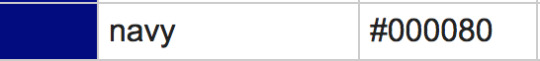
The navy blue and white is the same as the purple and white. Navy blue has such a bold appearance that the white outlines the vividness of the colour. However, there is no correlation with the colour navy blue and the team so this did not work.
Baby Blue and Purple
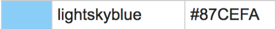

This combination was a mix of the main colour and a lighter shade of blue. This did not combine well as they were not on the opposite ends of the colour wheel. The colours would cause a clash within the magazine because of the strong appearance of both colours.
White and Black


This was the most simplest and easiest colour to do considering it will save time on colour and print. It was also cheaper to print. However, this lack interest for the magazine and would merely be seen as a local newspaper rather than a magazine that showcases an interesting topic.
From the surveys, purple and white had the vast majority following with navy blue and white. In the end purple and white was simpler and more effective because it represented the club and the purple was not overpowered by another colour. The white was most effective as it presents the purple to the audience as well as using black which will darken the ambience of the magazine.
Brainstorming Content Ideas
Over the course of planning and scoping out the media, I was able to sit down and create a spider diagram that will me brainstorm different ideas for the content that is added into the magazine. As part of the researching and understanding the needs of my client, I added a suggestion box for the players to add their own suggestion of what else should be included. Then with the given feedback I was able to think more further on what I can use. I made sure that not all suggestions were considered a slot because too much content will lose the audience’s attention.
Brainstorming Content
Once I kept the brainstorming flowing I began to shortlist the contents or combine two sections together. The shortlist consists of:
Content (Compulsory)
Player Profile
This section is focused on the just players and coaches. Players had the opportunity to take part in this data collection, it will include their 1’s,2’s,3’s with a profile photo of every single player along with the coaches. It will be kept simple and clear to understand and included in the beginning of the magazine so that the audience can get a grips of who they’ll be reading about.
Picture/Quizzes about the players/Guess Who
This was suggested by a few players who thought having an interactive section would be great fun for the audience to get to know the players more. One also pitched having embarrassing stories that are anonymous which will bring out a different side that UWPFC doesn’t show.
History of UPWFC
The history of UPWFC will be included in the beginning to give a summary of who the club is. It will mainly focus on the achievements in the past years and recent league and cup results for each team. I’m not sure if I’m going to include past match reviews or create a seperate section for just football.
Life outside of Football
Besides the life inside of football, I thought having a section that takes a break from the football side of the club. Which includes social team events e.g sober socials, dinners, time away, Tour. This will create a variety of content and not just strictly football.
Upcoming Events?
This section will most likely be added towards the end, however I’m still unsure about including it because of the upcoming events that would actually be happening. On the other hand, it will keep the audience and players up to date with what the club has in plans for the future, which may create more exposure for these events.
Pictures
A picture section just dedicated to extra match day photos, along with social photos (including Purple Wednesdays). This section would be like a gallery of all the memories created by the club as if you’re taking a trip down memory lane.
5.2. INTERFACE DESIGN - DESIGN DRAWINGS AND STORYBOARDS
During the design process and before I was able to pick what I was planning to include in the magazine, I took the shortlist and broke it down into six sections. With each sections I created a spider diagram of what I would include. I found this easier for me to get a wider look on what else could be added, however this isn’t the finalised decision, but just a draft to see what I can highlight based on what the client and their club would want to see.
The sections are also not in order, it was just a rough display on what contents I can think of.
*INSERT SPIDER DIAGRAM*
For the first section, I drawn out a quick draft on the layout of the profile pictures and where the photos would be positioned. I imagined the pictures will be in a square shaped in order for them to all fit on the page. Drafting beforehand makes it easier for myself during the production phase since I already have a pre-planned layout of what I would want to do.
*INSERT*
For the rest of the sections I also created a drawing storyboard of what the layout would look like. This will help me get a rough idea on what layout needs to be created so that when I have collected data and files I can easily import them into the magazine.
*INSERT*
As well as the player profile, I also added a committee page to let the audience know about who runs the club besides the coaches. Although I have drawn square boxes, I will in the future, change the shape so that it is recognised and different from the player profile pages. Storyboarding was a great way of planning and drafting because you can see a rough sketch of what your project would look like. And since it is a rough sketch none of the drawings have to be neat, just as long as they are clear and understandable to read.
*INSERT*
These are the other two sections which roughly drawn out.
Storyboarding or design drawing was very beneficial for me because it made it easier for me for when I begin to create the magazine. The drawings were a clear of showing what layout you would to see and then during the editing it can always be improved.
Gathering Visual Content via Media, Images
But other than those drawings I gathered visual content for the magazine via using a 1TB hard drive, containing a folder for the website only.
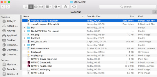
The files were allocated in a folder under the name of MAGAZINE. Where it had separate folders for the pictures e.g Football, Blur, Purple Wednesday (PW). Making it easier for myself to pick which photo I would need at that moment. Besides that, the inDesign files are also in there, the front and back cover with the pages. All the content and data needed for the magazine were all saved under this folder, which helped keep my stuff organised ensuring that all the materials were easy to find and access.
MAGAZINE - BLUR FOLDER

MAGAZINE - FOOTBALL FOLDER - (includes in action photos, any socials that was related to football

MAGAZINE - PW (PURPLE WEDNESDAY)
This folder includes different pictures from the student night outs. From group photos to individual photos.

5.3. VISUAL EXAMPLES - COLOURS, FONTS, STYLES
I used a website called DaFont which allowed me access different fonts that varied depending on the style you’re looking for. I managed to download a couple which I thought was appropriate for the theme of the magazine.

The first font was bold and big which will stand out, I can use this font when I’m highlighting something in particular. This will create a sense of clarity and loudness which will help emphasise the audience in what they’re reading. It will be effective for headings or subheadings.
However, the font does come across as a cartoon effect which might effect the way the content is presented. The font is precisely too thick to use for the entire magazine, however it can be put into good use for throwing in attention on anything specific.
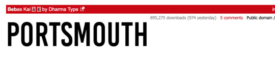
The other font I found was the “Bebas Kai”. It was thinner than the other one and slimmer which will work in terms of the body text. It’s not too bold and loud but very subtle in its effect. Besides using this for the body text I can also use it for headlines, the slim effective will give the magazine a light and soft look that makes the readers intrigued. The font won’t be too flashy or too much for the human eye to handle.
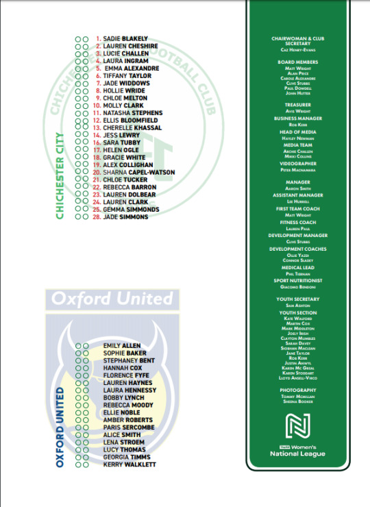
As for inspiration for my project, I researched on magazines in general but mainly focusing on sports and football. The research findings were slightly difficult considering I tried to look for some, until I was approached with a football programme of my friend’s football club. She kindly allowed me to review it and sent me a copy. The programme was my main inspiration in designing the layout of this magazine.
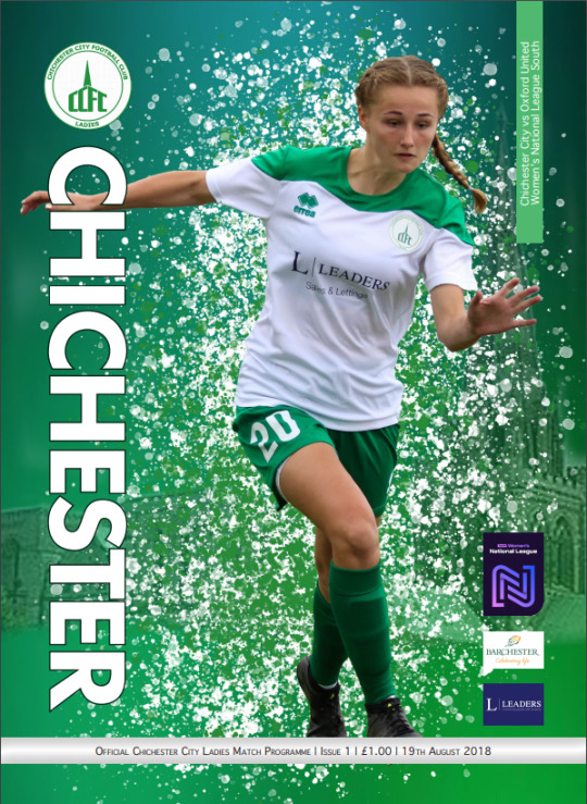
The front cover was very basic and simple, which is something i’m aiming for. So I took that and tried to create something very subtle but effective. They used a full body photo of a player rather than a close-up and cropped the background. Instead they used their team colours as the background to create contrast with the player.
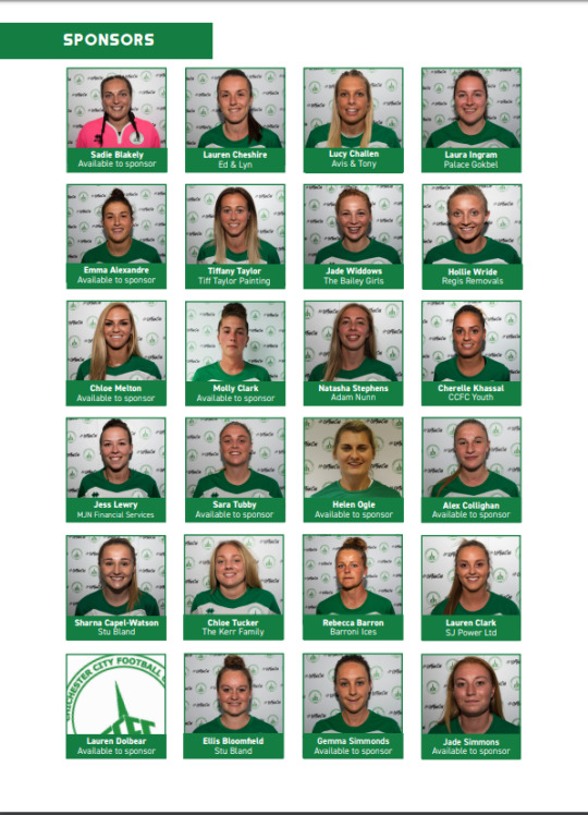
Then looking further into the programme I spotted the player profile page where they’ve included the entire team, but only their photos. My idea was to add a mini biography at the bottom of the photos, so I had to consider the arrangement and sizes of the boxes in order for them to fit like theres. Also, the replacement of the team logo for a players photo is something I will take into account just in case one of the players is available for a profile picture or even so, don’t have an appropriate one that fits the aesthetic of the page layout.
I also looked at their back page to get an idea of how to present the two teams in a smart and subtle way. The team, Chichester, used an effective font that made it simple and clear to look at. The team line up was done neatly and the team’s logo in the background creates a dynamic effect to the text.
Other than the one football programme I did manage to look at other sporting events like the world cup and Olympics
*image of both pls*
They both had their own unique design, but from the two I took away the olympics had a prestigious design that made it look elite. As for the world cup it was presented as an ordinary football programme. With the likes of the olympics and the theme of it, I would be using its design as inspiration when it comes to adding in my content along with the images and extra details.
The Olympics programme showed style in subtle and neat way. The all white background with a small icon in the middle, makes the audience focus on the icon and it creates peacefulness. The main likes of this programme is the clear the front page, not too much text or big writing to put you off from opening the first page.
0 notes
Text
Section 4
Project Management Methods and Tools
4.1. WORK BREAKDOWN AND SCHEDULE/GANTT CHART
Before beginning the project I needed to identify the client, because it is important to know who will fit my criteria as well as my skills level. I also believe in challenging myself to a new digital platform then to something I’m used too, I wanted to be able to step outside of my comfort zone. This is the main part of section 1 because I would not be able to move forward if I did not have my decision set on a specific project.
Scoping the project needed more focus time in comparison to the first section, because this is where all my planning and drafting will start. Without a foundation or a starting point I wouldn’t have a structure to follow, which will delay my production. The questionnaire and interview will help understand the depths and breadths of what my client would want and it would give me an insight on a design and content.
For the project management, it was important to create the Gantt chart to organise my timing and planning. This will give me an overall outlook on what needs to be done and show me how much time it would take. It will also show any delays that I may come across and hopefully adjust myself to the change, the chart will keep me on path with the project. It was also important that the SWOT analysis was created to display the strengths and weaknesses, opportunities and threats that could potentially happen of the upcoming project.

The logo and magazine will take up most of the time because of the planning, research and designing. Before creating the magazine, research needs to be done on various sports or general magazines I can use to base my creation on. With the research, I can critically change or improve my design, by adapting existing layouts and merging it into mine. It will also help me brainstorm an idea for a template. The logo is the same, I will have to research what saying or title will be appropriate for the club and target audience. As for creating the logo, it will take me time to draw a draft before creating it on illustrator or photoshop.
To construct a professional magazine, much research needs to be put into the pre-production which will take the same amount of time as the logo, this then saves time. I plan to have a template in less than a month and the added content in less 2 months, hopefully in total I will have finished the magazine in less than 3 months.
For the logo, I will look into sports magazine logos as well as urban and edgy ones.

The user testing will be carried out once the magazine is finished. It will consist of feedback on the content and the design, if it is up to the clients standard. I would want a general opinion on the users feel about the magazine. This will be carried out with surveys and interviews for the client (including the players). Before publishing the magazine I would want to have an overlook view from the client to see if there’s any changes or improvements that need to be done.
4.3. NEEDS/SWOT ANALYSIS
STRENGTHS
With my degree I have the basic experience of photoshop, Illustrator and inDesign.
My past experience of working in an upcoming magazine will give me an insight on how it is to create one.
My interest in this specific unit of this course will help me motivate myself to excel higher. I also like a challenge. So the more work I give myself the harder I get it done.
UPWFC is my university football team. So I know everyone on the team and have a close connection with the client. This means I have easy access to what I need for the magazine.
I enjoy creating and designing templates, whether it be invitations, posters, photos.
WEAKNESSES
The amount of workload is intimidating and can overwhelm me.
My lack of motivation can delay my timing and cause me to be behind on production.
Client consist of more than one person, so retrieving players data will be hard to collect.
May not receive all the datas that I need which will cause gaps in my magazine.
My time management is not up to standards.
OPPORTUNITIES
There has never been a magazine for UPWFC, which can be a first for the club. It can also be seen as a yearbook for every year.
The completion of this magazine will add onto my portfolio which will shower the clients that I’m capable of undertaking a big project on my own.
It will bring out different skills that I may not know about.
It will improve my organisation and time management.
I will grow to have more confidence in myself when taking up a big projects.
THREATS
The players not communicating with me and helping me fill out forms when needed.
Other deadlines may slow down my production.
Personal problem may affect my work ethic which will put me behind on the process.
The magazine may not arrive on time.
4.5. RISK ASSESSMENT
0 notes
Text
Section 3
INTRODUCTION
The project is to create a magazine for the university of Portsmouth’s women’s football team. The aim is to produce the ins and outs of the club, to showcase what they can offer and what they have achieved as a team as well as promoting it to the University. Since its their first time doing a magazine they have trusted me to design the layout, however I gather information from the team members and asked them what they think should be included. So the end goal is create a piece from myself and the team.
WHAT THE CLIENT WANTS
After meeting with one of the committee members of the team, I asked what they would want to see in the magazine and what exactly would they want to gain from it. From the meeting the member only wanted a magazine that revolves around the ins and outs of the club, from football training to matches to nights out. Since they themselves don’t know what they actually want from the magazine the member suggested I create a questionnaire on getting the rest of the teams opinions on my ideas or any other suggestions that would help create a foundation to start from. As I’m aware, the member wants to see a:
Professional magazine finish
Team photos and profile photos of the players
A history of UPWFC
The Aims:
To include player profiles of the team members to give the target audience an idea of who is part of the team. This includes profile pictures of each player and their details.
Make sure it is filled with different content and to make it interactive with the audience, including mini quizzes for players, guess who and embarrassing stories of anonymous players.
A professional finish for a magazine. Bring the club to life and getting the promotion it should get from all around campus.
3.3 WHAT THE USERS WILL REQUIRE/GAIN FROM THIS PROJECT
The users will gain the access of what the team is about and explore what they would not see on a day to day basis. They will gain a background information on each players in case some may not know who’s on which team, this will then require them to be more engaged and involved with match fixtures. The content will give them an insight on the achievements the club has received in the past years. Within the magazine, I will include the social medias so that the users are up to date with all the match day fixtures, live feed and any other information they would want to know about. This then creates a personal bond between the club and the user.
3.4 RESOURCES THAT WILL BE USED
inDesign
inDesign is a publishing software used to create posters, magazines, and etc.This software will be used to design the layout of the magazine especially since I’ll be downloading the plug-in from blurb. It will help me focus on the typography and have the maximum control of the details to my design. It will also give you a professional finish.
Photoshop
As for Photoshop, with the pictures taken from the sporting events or of the players, I can edit the effects of the pictures in terms of the contrast, lighting, saturation and filters. Other than that it can be used to crop and cut any excess of the images that are not needed. This will play a massive role alongside inDesign.
Illustrator
Illustrator will focus on creating the logo on the magazine or any needed graphics.
Blurb.com
Is the website used to publish the magazine either a hard copy or an ebook for an online access for everyone. Blurb will also provide me with an plug in that will give me the access of a magazine template, making it easier for myself to design it, considering my experience with creating a magazine.
3.5. COLLABORATIONS
Kwame and Sportdnp(david)
My two collaborators are Kwame Photography and Sportdnp.
Kwame is a master student from University of Portsmouth who will be graduating this year. He is the main photographer for all football fixtures at home, men’s and women’s, and over the past two years he has been taking photos for my team. I was able to ask him if I can use any of his past and present photos:
Sportsdnp is a freelance photographer who I became in contact with later in the project. I was able to ask him if he was able to shoot some photos for our varsity game as well as profile photos of each player.
0 notes
Text
Section 2
Meeting the client
After the first meeting where we discussed the needs and wants of the magazine, I decided to have another one with the same member but I conducted an interview to get a finer detail on what they would want to see in the project and to get their opinion on my idea as well as hear what they have to offer.
First Interview:
Who is your target audience?
University students. Locals and other university teams
2. What do you want to gain from the magazine?
Insight to the women’s football club. Behind the scene look at what they get up to off as well as on the pitch.
3. Would you like to distribute the magazine in the future?
Yes
4. Is there any specific title you would like to suggest?
“A day in the life of..” Guess who, Fact files, Throwback
5. Are there any certain pages that may not be necessary?
No
6. What do you want to achieve with this magazine?
Promotion for the club
7. What other designs have you seen that caught your eye?
Bold writing, block shapes with images
8. How would you want to connect with your designs?
Through images and a set format for the magazine. Social media to promote it.
9. What features in the magazine do you want to emphasise?
Player profiles, players achievements outside of football, previous players (throwback), club achievements, match reviews.
10. Do you have an existing design or style?
Keep it purple to suit uni colour theme. Use of key football phrases such as “we go again” or “purple passion” or “bleed purple”. Block shapes with text on so it stands out and is easy to read. Pictures to accompany the text.
From this interview I was able to scope out the foundation of the magazine, helping me understand their needs for the magazine. Once this was done, I created a google survey/questionnaire to gather opinions and feedback from the players on their suggestions on what they would want to see.
Understanding the breadth and depth of the project
Breadth
Before the production of the project, I had to understand which section would need more focus and attention to detail. One of them being the logo/title of the magazine, I would need to do background research on what would be appropriate for the football team. The title/logo must be simple and clear to grasp the audience's attention, it will be drawn out by hand before creating it on illustrator or photoshop. Taken from the client it should have a bold appearance to make it stand out.
The magazine will be created on a website called Blurb.com which offers two options, economy or premium. The difference between the two is that economy has a matte finish to the cover, but a glossy inside whereas for premium it has the opposite which works more towards a professional finish. The printing works in multiple of fours so I would need to decide whether I want 28 pages or 32 pages, which all depends on the amount of content I can gather.
Depth
The design of the magazine will be drafted out on paper, by drawing out storyboards and design examples. These will be carried out by inspiration from a variation of magazine, from sports to fashion, but mostly focusing on the retro aspects, trying to make it to the modern age. The magazine will be designed using inDesign, illustrator and photoshop together. However, the Blurb does provide an inDesign plug-in that gives me a template of magazine layout which saves me time when designing.
The content that is included will need to be detailed and have as much necessary information needed. They would need to be planned before adding it onto the design layout, perhaps write them up on a word document for proof reading. The content need to include text as well as images, to support what is being said. More images will help make it appealing and attractive.
The two questionnaires (include the two google surveys)
First questionnaire was based on initial ideas from myself and asking the team whether they approve, disapprove or would like to improve. Also, in the last question I gave the opportunity to suggest any ideas they feel would be beneficial for the magazine.
The second questionnaire is based on the answers I received from the first. This is where I asked in more depth whether they want this amount of ex-players, what they think should be included in various pages and suggested other ideas they may be bring more content.

The Two Questionnaires
First questionnaire was based on initial ideas from myself and asking the team whether they approve, disapprove or would like to improve. Also, in the last question I gave the opportunity to suggest any ideas they feel would be beneficial for the magazine.
The second questionnaire is based on the answers I received from the first. This is where I asked in more depth whether they want this amount of ex-players, what they think should be included in various pages and suggested other ideas they may be bring more content.

0 notes
Text
Section 1
Identifying a client
My client for this project is my University football team, I will be producing a magazine based on everything the team can offer. However, my first option was my brother considering I’m already handling his football fan page but the long distance between him and I will affect our communication and decision making. So I weighed out the pros and cons for both options and UPWFC have more topics to discuss, also they’re easier to liaise with since they’re within reach. With my football team I can promote the type of team we are to the University or to the public, this project will develop my creativity and organisation skills by producing something out of my reach.
Although it’d be easier to work on my brother considering my experience with his fanpage, the lack of resources I’ll be able to gather will slow my production in terms of creating content for each section. Which leads me to choosing my university football team because I want to be able to show the different side to our team and I’m hoping it will increase publicity and promote the club to other future teammates. And with the appropriate information, students can get an idea of what the football club is about.
Needs and Ideas:
Professional Design: The team would want a professional finish to the project with high quality content. I want to be able to showcase a well refined magazine that is close to an actual published one. Clear and clean layout of all the content with the appropriate colour scheme.
Logo: A simple and effective logo. Nothing too extravagant and vibrant that may overlook the cover of the magazine. I would then need to do background research on different sports/football magazines and look at how they positioned, created and why they produced the logo they’ve chosen. I would also ask myself questions on how it was effective and what would I do differently to suit my target audience.
Typography and Colour: I will be doing some background research on the different fonts that are used in magazine and compare the differences to see which is more effective. The right font makes an impact for the reader, the simpler and clearer it is the easier it is for the audience to enjoy the magazine and to want to read on.
Content: Introduce the right content that will explore the ins and outs of the club, resources and data that the public would have never heard of before. Content that exposes
0 notes