
Statistics
We looked inside some of the posts by chksuki and here's what we found interesting.
Average Info
Notes Per Post
54
Likes Per Post
53
Reblog Per Post
1
Reply Per Post
0
Time Between Posts
20 hours
Number of Posts By Type
Text
17
Last Seen Tumblr Blogs


Fun Fact
In Q3 of 2020, 31% of US users access the Tumblr app daily.
Text


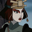
Lylith Andora - Final Hero Pose Here’s is the finish illustration!! I had so much fun in combining all the teachings throughout the course that I’ve learned. Decided to include some kind of background and faded some parts of the body lightly. I used some hatching method and I really love the effect it created! Did minimal shading as I didn’t have a lot of time to fully render the drawing. From what I’ve learned, I need to manage my time better and produce things a bit faster. Overall I’m blown away by this and I feel like I’ve improved a lot!!
5 notes
·
View notes
Text
Drawing Process

- Using the base that I’ve chosen, I enlarged the image to the scale I wanted the drawing to be. I then lowered the opacity and created a new layer on top. To finalise the sketch, I decided to create another rough sketch. I used different colours to pinpoint the details. For example, dark blue for the body, reddish-brown for the dress and light blue for the wings. This helps me outline the drawing easily.


- Here’s a the final outline, I used the vector layer and set the stabiliser to 10. I didn’t want the line to 100% perfect, so I decided to leave some sketchy lines as a personal style choice. This is what I usually do in my sketchbook as well. Once I completed the outline, I filled the base with just a random colour i.e grey. This will help me fill out the character’s base colour before I do the shadings.


- Showcasing a small progress of the character I am doing. I decided to add a rectangle background. But, I haven’t decided if i want a background or not. However, since I don’t have extra time. I probably won’t do a background and I wish I also included rough background sketches as well. I also wanted to experiment and test out different hand positions. The front arm and hand looks stiff. I found drawing frills very difficult and hard to do. Especially since I have 0 knowledge in drawing flowing frills to begin with + the long cloth that hangs out in-front of her dress as well. I was struggling which direction of the cloth, because the body is somewhat twisted + sideways. - This was a huge struggle to me and challenge since I haven’t done character pose like this! Since I am really slow drawer, I do hope I am able to finish this. But, I am also excited to see the finish result!!
4 notes
·
View notes
Text


I quickly did some quick rough gestures and I try to do them like I did during the life sessions in class!
I gathered up some references that I wanted to use and just play around by making the hands and legs in different poses. Most of the reference I found are mixture between Idols, Ballet and Cosplayers. I wanted to capture my character looking happy and energetic. With the poses I found, I think I was able to capture that.
Furthermore, I gave myself a challenge by making the pose dynamic. I experimented with different posture. Such as, lying down or sitting instead of just jumping .A fun challenge but I feel like I've wasted more time instead of focusing on final hero pose. However, this was a great experience for me and in the end I learned how to draw the gesture quickly. And I can use other poses for future projects.
I am stuck between choosing which pose I want to focus on more. But, I am leaning towards the 6th pose. Using this pose, I would be able to capture the full details of my character. For example, clothes, wings, hair etc
4 notes
·
View notes
Text
Chosen colour

Finally chosen colour palettes for my character! Still skeptical on the red frills but, maybe it will look better on the final design. Overall I'm really happy where this is going. Although, I did forget to add the bandages that covers around her neck. On my previous sketches of her, you can see she bandages wrapping around her neck and body. So I just quickly added them here and I also gave her the expression of "crazy". I did this by lower the opacity of my brush and use a darker shade + drew it over the eyes. I discovered that in some animations, they use that technique to showcase fear. Can't wait to start the final process!
3 notes
·
View notes
Text
Colour Test


After I finished doing the turnaround for my character. I started to experiment a variety of colour palettes. Although I have a colour in my mind. I wanted to test out possible combinations. - I started with drawing the outline on top of the drawing I did. Then used the magic wand tool to select and inverse selection. With this, I can fill the inside without going over the lines. I continue to do this with each section I wanted to experiment colours on. - I mainly used red,black and white. Those three colours are usually associated with danger, death, innocence or passion. But, I feel like I would be limiting myself if I only used those 3. As such, I tested out the colours of pink, blue, brown etc. - I also used the gradient tool to help me create a gradient on her dress. I thought plain white would be fine. However, after testing out and playing around with the gradient. It made me change my mind and re-think about my character's colour pallete. - I really love both the 2nd and 5th colours. But I am stuck on whether to include the red parts into the inside of the frills. I love the gradient transition from white to greyish-black. Hopefully I'll be able to decide soon 😅
3 notes
·
View notes
Text


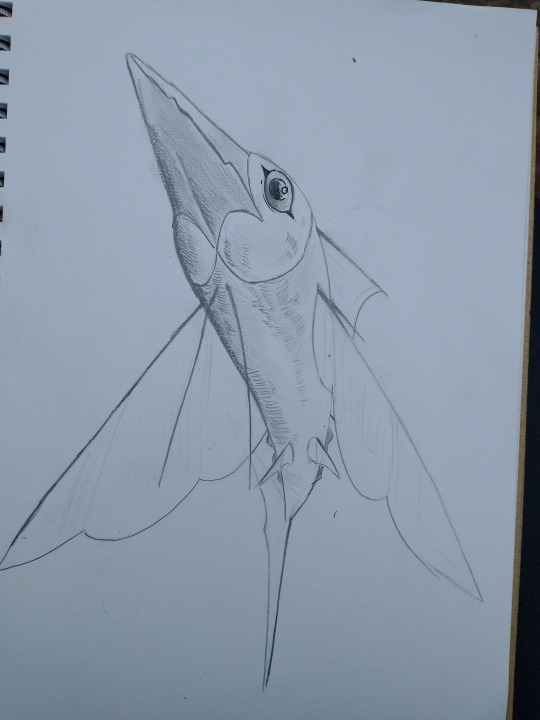
More gesture studies that I did two days ago and I also did a creature design for my world idea. They're called Sky Fish and they're equivalent to Tunas in our world! On the last image I tried doing the hatching technique that Lionel taught us during class.
Really enjoyed doing the hatching method and I am definitely going to be using that method for shading and for creating textures on my drawings!!
4 notes
·
View notes
Text

Some studies of my character that I did in my spare time. I wanted to try practicing expressions by doing quick gestures and use the method that I’ve learnt during class : )
4 notes
·
View notes
Text
Turnarounds


For this session, we looked at turnarounds. I went with the design that I’ve chosen and measured out the height of the character. I used the guidelines as my base (although I did just copy + paste the front view for the back view) I rarely drew side views so it took me awhile to figure out the anatomy and I had to search up side profiles of female anatomy. Like the previous post, I shaded the character in monochromatic colours and kept it simple. I also added a close up view of the hand and as you can see the arm + hand is wrapped fully in bandages. I would do outline of the character. However, I personally prefer go straight into blocking out the base colourings then adding the shading etc. That’s my preference but I am planning to outline the front view so I can test out different colour schemes and play around with colour gradient.
4 notes
·
View notes
Text
Initial Render

Proceeding with the chosen design for this session, we had to overpaint using monochromatic tones and see if the design works or not. The shading is simple and I had to use darker tones to showcase depth and make the figure 3-dimensional with the shading. It’s so the figure doesn’t look flat. In class, Archie told us to not be afraid of using darker shades. As such, I used black to develop the creases in the clothing. After that, I used lighter shades for the highlights and such. I really like the first design I did. However, I decided to do another one with the character wearing a large jacket. I used the same method I did for the first design. Then I asked my classmates which one looks good. This lead to design 3 where I switched the head and the details of the legs onto the first design. I struggled on who to choose but I personally really like the third design since it’s a mix of both designs :)
3 notes
·
View notes
Text
Initial Rough Sketches


To begin with I decided to only design 6 different outfits. However, since I had a bit more time and was struggling to decide. I chose to extra 6 more character designs for Lylith and I have really made it even harder for myself to choose. First off, we had to choose a base and sketch out a skeleton first. I went with almost a young - teenager figure, as my character is described as a young girl. After I finished drawing out the skeleton. I copied + paste the base and spread them out equally. I had pinterest board open and my rough sketches I’ve done from the last post. Coming up with a original design is hard and sometimes I struggle with that. You can tell I’ve got better at figuring out the shapes of the design on the 2nd image compared to the first one. - I used simple colours to outline the clothing + details. I tried out numerous design ideas. Although I do tend to go back in drawing frilly skirts/dresses. I do like the designs of 4,9 and 11. It was so hard to choose which one to go forward with and I’ve asked my classmates for help. In the end I was able to choose one of the designs and decided to develop design 11 more. - Listening to music based on the vibe of the character, does help on creating the design!! That’s what I’ve figured out during the course of sketching out initial rough sketches-
3 notes
·
View notes
Text
Rough Ideas


Here are some rough ideas of the character that I am thinking of. I also wanted to do some posing as well. To be honest when I draw a character, I try to include gesture that reflects the character’s personality and vibe. Since this is a rough and knowing I will do more development. I only sketched two different designs and alternated the colours on the 2nd image. Keeping the idea of a frail young girl in my head and the themes that I had on my mood board. I tried to draw a character based on all that and taking pieces that I like from the images that I gathered. I do admit the designs showcases revealing skin. But I feel that conveys beauty in some way. I wanted to create something that represents inhuman beauty and something you are unable to take your eyes off. This is followed by the pure white skin and hair she has. Lylith’s charming features are her face are considered beautiful in my world. Furthermore, I wanted to create a sense of fear but also subtle in the character design. I usually associate “god-like” beings with the colour white. The colour usually represent purity and angelic. Whilst other colours such as black represents, death, destruction and elegance. I tried adding the frail/mysterious theme by giving her bandages around certain parts of the body. Seeing an wounded person would make you feel sorry for them and you wouldn’t suspect if they’re evil or dangerous. Because, it is within our nature to help someone. Mixing everything together, I hope I’ve created a character that looks someway normal but also mysterious as well! I really like #1 design in the first image with the white, red and black colouring. Although, I am planning to develop more on the design and play around with different colours and meanings behind them! :D
3 notes
·
View notes
Text


Artist Research: Gabriel Soares (Concept Artist/ 3D Modeler) Having seen Klaus and it is one of my favourite animation film ever. I didn’t know Gabriel Soares was one of the artist who did the concept arts for the film. Looking through his work and I have to say, I really love the texture and painterly style he uses throughout each drawing he makes. Connecting with the last post about lighting. We used Gabriel’s work as a example for light and shadow. There’s a strong use of hard lighting and bounce light as well. This creates a sense of realism, depth and atmosphere. For example, the boat scene gives the gives off peaceful, sunny and warm vibe to it. The use of lighting can change the atmosphere of the character and I should consider in using lighting as well in my final drawing. Gabriel Soares’s work is truly inspirational and the drawings he makes are something I want to do in the near future
6 notes
·
View notes
Text
Lighting


In this lesson, we did an exercise inspired by Gabriel Soares’s work and try to do lighting on a simple cartoon head. Firstly, I quickly drew a rough sketch of myself in a cartoon form. Then I created a new layer and placed it underneath the sketch layer. Using a large brush, I filled in the area with saturated base colours only. - Then I created another new layer and switch into “multiply” I wanted the light to be shining down the character. So I shaded the bottom area and followed the shape of the face. - After I placed down all the shadows. I moved onto figuring out where the light will be. Since it be coming from above, I only need to shade in the hair, nose, ears and some parts of the face. For this, like the multiply layer, I created a “liner Dodge (Add)” layer and used the saturation slider. I went from dark to light using the saturation slider. Using lighter colour means the shade will get brighter. So I had to be careful on how much saturation I need to use. This session was really helpful for me because, I really struggled with lighting a lot and it is something I am planning to practice more on. I am happy with the end result and this is something I would do during my spare time :)
2 notes
·
View notes
Text
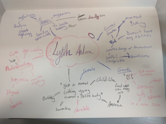
I decided to create a mind map and explore different ideas such as, goals, themes etc. This is very helpful to me and I sometimes do quick brainstorming when I make characters.
Lylith's backstory: found by wandering merchants and unable to remember who she is. Lylith goes on a journey to "rediscover" who she is and where she comes from.
Personality: cheerful, expressive, speaks in third person and childish
Fears: being left alone/abandonment
Goals: finding her memories
Favourites: lylith's favourite treat is sweets!
2 notes
·
View notes
Text
Clothing/face Aesthetics

I also gathered some clothing ideas and some facial inspirations. The last three images are created on Picrew and Artbreeder - https://picrew.me/image_maker/41329 - https://www.artbreeder.com/ Both are useful for quick character creation and the general idea of what the character will look like. I sometimes use those sites to create a character that I have in my mind currently.
Since I’ve decided that the character will be female, I’ve gathered up clothing that look cute, normal and doesn’t give the sense that she’s dangerous. So I though maybe the idea that she’s wearing a tutu-like dress with a simple design. After numerous research, I’ve come up a name for her - Lylith Andora I am using my character that I’ve made a while ago for this course. She one of the characters I really want to flesh out more and the session is really helping me re-discover who she is etc. - I’ve also made a playlist for Lylith to tell a story of who she is just by compiling different songs - https://open.spotify.com/playlist/2WZdyxHRaAsq3oQjYOQ8NC?si=bd47ea42e14f470b
1 note
·
View note
Text
Character Aesthetics

I decided to look at the aesthetics or theme for a character that I have in mind. In my head I’m thinking of a character that’s slightly based on the story of Eden, mythology of Pandora’s Box, Tarot Cards and Seven Deadly Sins. So this means the character will be something like beautiful, dangerous, kind yet mysterious/unknown as well. I decided to include the imagery of snakes. Throughout different cultures, snakes are seen as manipulative, evil, death yet they also symbolise rebirth, immortality and healing. I love the dual meaning behind a simple creature and it is something I will definitely use for my character. This also fits the theme of Pandora’s Box. Such as, temptation that we can’t resist and evils of the world. So I am thinking of making my character have human-like features with some fantasy-like aesthetics as well. - The story of my character: Discovered by a wandering family, they found the young frail girl dressed in strange clothing and bandages wrapped around on parts of her body. Beaten up and close to dying. The family decided to bring her home. They asked her who she is but, she replied “I don’t know...I don’t who I am...” And this is the start of her story to find out who she is. I included lots of white colouring in my mood board. The colouration of white represents - purity, innocence, peace, kindness yet can also mean death. With this idea in mind, I will be using white as my character’s main aesthetics. However, I will also play with other colours as well. To me personally, biblical stories, mythologies, legends etc. all fascinates me and they inspire me a lot in creating stories and characters.
1 note
·
View note
Text
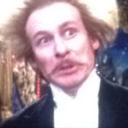
Jeremy Anninos


Artist Research - Jeremy Anninos ( Illustrator working for Riot Games) Jeremy Anninos is one of my biggest artist inspiration ever! Their work is such an huge inspiration to me and I always admire their artstyle! My dream is to draw splash arts for certain games, novels etc. They create illustrations called, Splash Art as seen above and sometimes their own original characters. Currently their skill is far beyond of what I’m capable off, but I want to use Jeremy’s work as a inspiration source for my own project. I found some pieces that showcases strong lighting and anatomy as well. Since the project will focus heavily on anatomy. I chose some of their artwork that showcases the use of anatomy, lighting and semi-realistic proportions. Those three skills are important in creating a character. Especially for the hero pose that I am planning to do for my project and i need to consider how to use those skills well. Atmosphere is also important. For example, the first two drawings are dark, mysterious and with the sense of danger to them. They use a strong lighting point for the main focal point and everything is shaded in dark shadows. It is interesting how they use shadow to make thing less important yet also create an impact on the environment. Depending on the lighting you can make whatever atmosphere you want. So I’ll be considering what atmosphere I want for my character to be in. Although, I won’t be able to create a full background. So I am planning to use lighting to convey the mood and depth instead.
2 notes
·
View notes