
Don't wanna be here? Send us removal request.
Statistics
We looked inside some of the posts by chloebenningtonfmp2 and here's what we found interesting.
Average Info
Notes Per Post
1
Likes Per Post
1
Reblog Per Post
0
Reply Per Post
0
Time Between Posts
19 hours
Number of Posts By Type
Text
17
Last Seen Tumblr Blogs


Fun Fact
Average visit duration of Tumblr.com is 10 mins and 25 secs.
Text


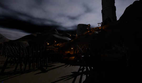
This is the final look of my game, as you can see I have added some fog so your vision in game is not as far but also adds to the eerines. The fog also looks amazing with the moon shining through the tower to create this glow over the land. You can't really see the texturing or stone work on my tower and assets from a far but when you are up close you can really appreciate how much work has gone in to it.
1 note
·
View note
Text


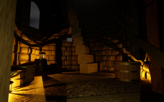
These are some process shots of what I have added into my game, once I had all the coding done and the main shape of the landscape and tower I could add in all my little assets to clutter up the world. I added in a mix of my own assets I created and a few I downloaded off of quixel bridge. Quixel is just a website where you can download a load of free assets other people have made, this made building my game much quicker and help me get a finished look because I wouldnt of had enough time to create everything I wanted in game.
As you can see I have changed the colour of the sky to a much darker colour which is very close to black, this is so it creates that dark eerie atmosphere instead of turning off the light and the sky still being blue. This creates the feel of a storm coming.
0 notes
Text


Quixel bridge is a website where I was able to download all of my realistic materials and assets when I haven’t had time to create my own this has helped with the time and fill out the space
0 notes
Text


Here I have changed the sandy looking grass texture to the more grass looking texture because I didn’t really like the print of the sandy one and I think the grass looks much more realistic
0 notes
Text


The foliage tool was my next step in the making of my game, the foliage tool is amazing and so much more efficient than individually wanting to place everything. I first downloaded a few dead trees and plant assets and imported them into my foliage tool, I selected the ones I wanted to use and how many I wanted to paste in at a time and started paining them over my world, this is just like the landscape tool but pasting in plants. This makes creating large landscapes much quicker and efficient. After this you can go in and edit each item to how you would like.
As you can see I now have many trees and plants in my world which makes it look more realistic, I have placed a lot in making it give a dead forest feel which is a lot like the destroyed forest around Saruman's tower off of Lord of the Rings.
0 notes
Text


Once the main shape and composition was in place I started to code in my terrain texture, I didn't have any idea of how I was to do this so I used an example as help on google and used my own textures that I wanted to in my world. I had to use three different textures, one for the top which will be grass, the second for the middle which will be dirt and one for the bottom which will be rock, and as you can see it automatically puts them all in place depending on the height of the landscape. I downloaded the textures and had to use the main colour, roughness and normal materials to allow this piece of code to work. As you can see my first attempt looked alot more sandy than i wanted so i went back and changed it to a more grassy look.
0 notes
Text
youtube
This was a video tutorial I watched on how to create a simple blend space, I already new the basics I just needed to know the in-depth consign that I forgot since last year.
0 notes
Text

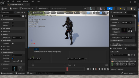

The next step for creating my game was to add in the character. I want my game to be in first person so it really feels like you are there in game experiencing everything instead of someone else in third person, so I needed to find a character, I wanted to make it so when you look down you will be able to see the feet so you are really the character there because some games don't do this. This makes the game feel much more realistic, so I went on to mixamo which is a free character and animation download website and I found a paladin character model, which fit in perfectly to my theme. I then also downloaded the idle and walk animation holding a sword and shield so I can add my own assets in.
Once my character was in game I created a simple blendspace that consists of the idle and walk/run animation, this allows me to put the animations together so they all animate into each other fluently. The blendspace is a graph controlled by a value in this regard we will use player speed. The speed will basically control like a gradient from 0 - max speed. So if you are at 0 idle will play and 1 walk will start and if your at max speed 2 you are fully running.
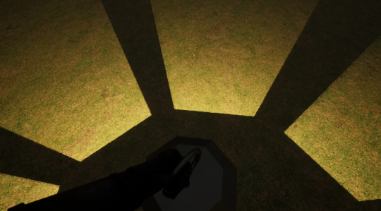


The last step for my character was adding in the sword and lantern, I created both of these in maya and textured them in unreal. I wanted to hold the lantern instead of a shield because my game is going to be very dark and this will help you see and navigate around the world. I added in a point light on the candle so it creates this lit effect around the lantern as you can see on the right. I really like this because of how realistic it looks, when playing the game you can see the sword in front of you and when you look down you can see yourself holding the lantern, this really makes you feel like you are in the game and really gets you invested in what's to come.
0 notes
Text


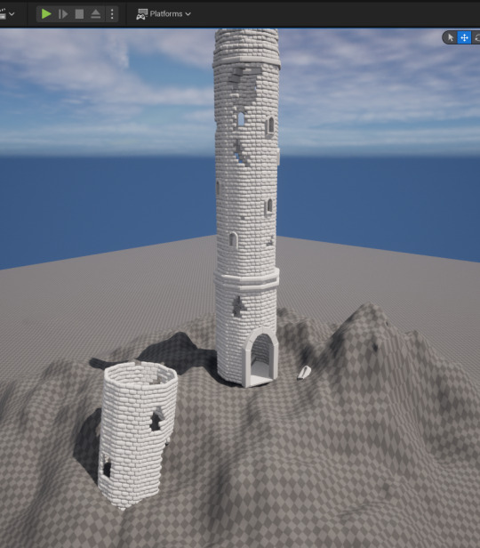
I got started straight away with building my game in unreal by starting with landscaping, This was to build the small mountain the tower will be sitting on, this is a very easy process as its just drawing on land to build a realistic area. I didn't use the smooth tool that much because I wanted to make it look very bumpy and rocky, which would gave it a more realistic mountain look. Once the base of it was done I added in my tower and then added to the landscape so it would fit to the tower. The landscape tool is very good for creating level designs, and zones.
0 notes
Text


Here I created a door for the tower so it looks more realistic and daunting when entering this massive doorway.
0 notes
Text

This is my schedule that I created at the start of the project and I feel as if I have not stuck to this as much as I would of liked but I think I have done a good job on staying on top of my work and not got super behind.
0 notes
Text
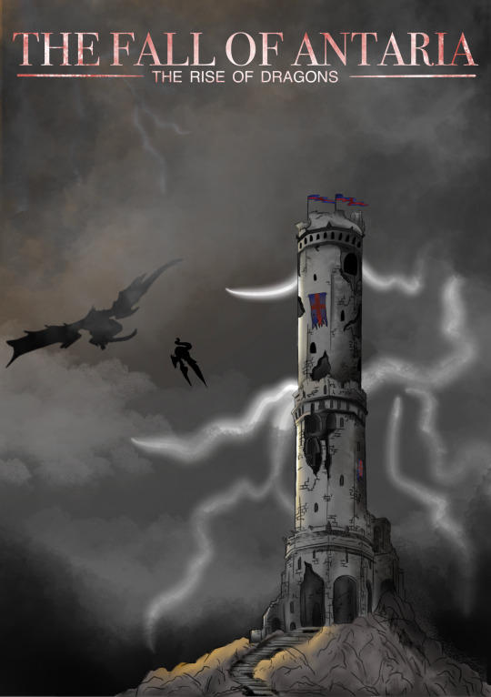
front cover, this time i have changed the font colour again to the bloodstain version and i like this best, i think this is much more enticing than having a simple plain colour.
0 notes
Text


games menu screens.
i have looked at several different menu screens that are made for games. they are all very similar, the last three have a very similar composition to mine, the offset piece of art, with the menu on the other side, i think this gives a good balance to the screen especially if you want to make sure you have some art work on there. they all seem to have some sort of highlight over the buttons that are selected, this makes it easy to tell what you have selected. i prefer the offset layout much more than the central layout.
0 notes
Text

this is the table of all my names i wanted to include in my map, and this table was just to section them away from each other and organise which city village Forrest is which. this helped me create my map and made sure i knew what i wanted to include.
0 notes
Text
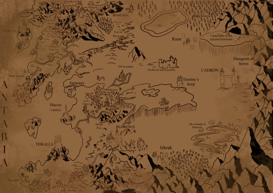
this is the full landscape map, as you can see the right side is much more empty that the left side, this is because you are going inland more and isnt as much about but i also had more space to fill with so little to fill it with. i really like this mountain trim around the edge to barrier off the map and also the player to getting to other parts that wont be on the map or in the game instead of having an invisible wall, this makes it look much more realistic. this right side of the map i can imagine it being unlocked in future updates or expansions, to keep the game going. i like my first portrait map much more because it feels so much more full and much more content going into this.
0 notes
Text

i played with the font colour a little more and i think this is the final look and design. i added this red stain texture over it to give the impression that its blood splatter which will be included in the game so it would make sense to make this. it also makes it not look so boring being a plain colour. this adds some depth and dimension to the screen and adds some eager and suspense to play the game.
0 notes
Text

this version of the menu screen i have changed the colour of the font to white which makes it look so much better, it firstly pops out and its so much more readable than the black font, but also matches well with the lighting instead of making it super super dark.
0 notes