
Don't wanna be here? Send us removal request.
Statistics
We looked inside some of the posts by cieranshippy and here's what we found interesting.
Average Info
Notes Per Post
0
Likes Per Post
0
Reblog Per Post
0
Reply Per Post
0
Time Between Posts
23 hours
Number of Posts By Type
Text
17
Last Seen Tumblr Blogs


Fun Fact
Premium Tumblr themes are available from anywhere between $9 to $49.
Text
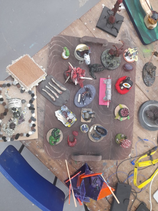
RE-PAINTING MY BOARD / PICTURE OF EVERYONES WORK.
Me and kyrstie, had an idea to re paint my board brown, put sand on it with help from glue and then put my creatures ontop.
I also took a picture of everyones work to remember that everyone did something cool. and just respect and adore other peoples work
0 notes
Text
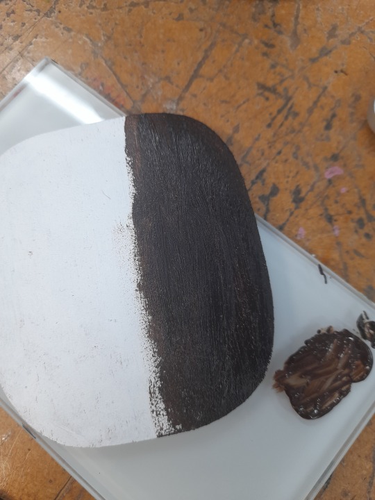
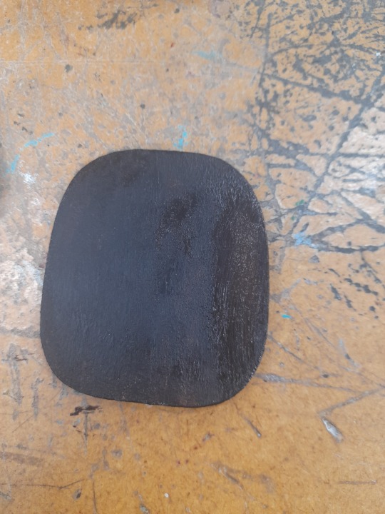
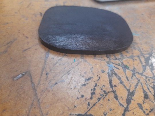
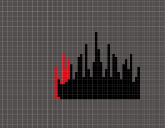
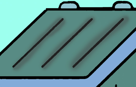
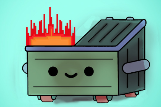
DUMPSTER FIRE!
Since I finished everything, I began doing this quick little side project, of designing a dumpster fire.
PROCESS
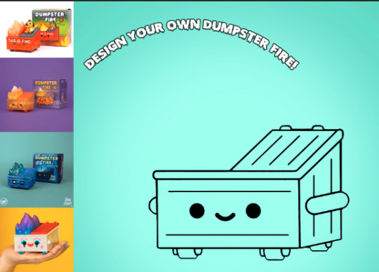
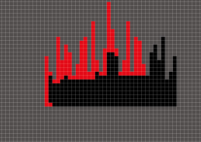
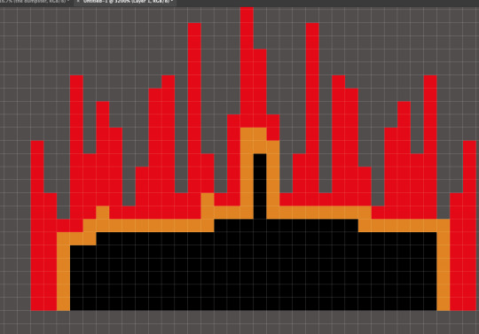
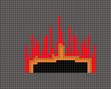
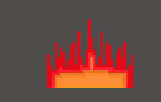
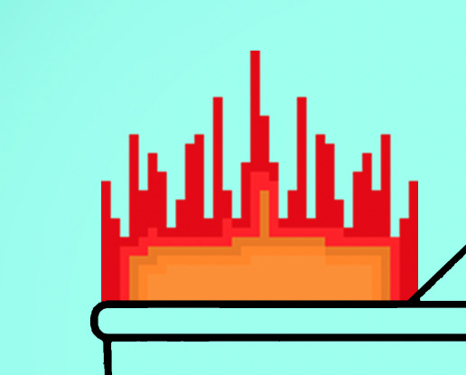
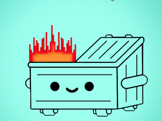
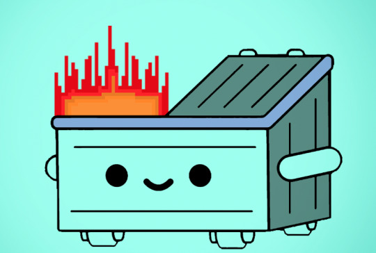
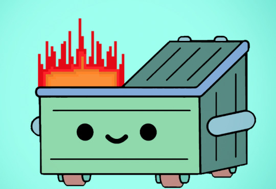

After I made the fire, i then adding the shade to make it look all old and burned.
0 notes
Text
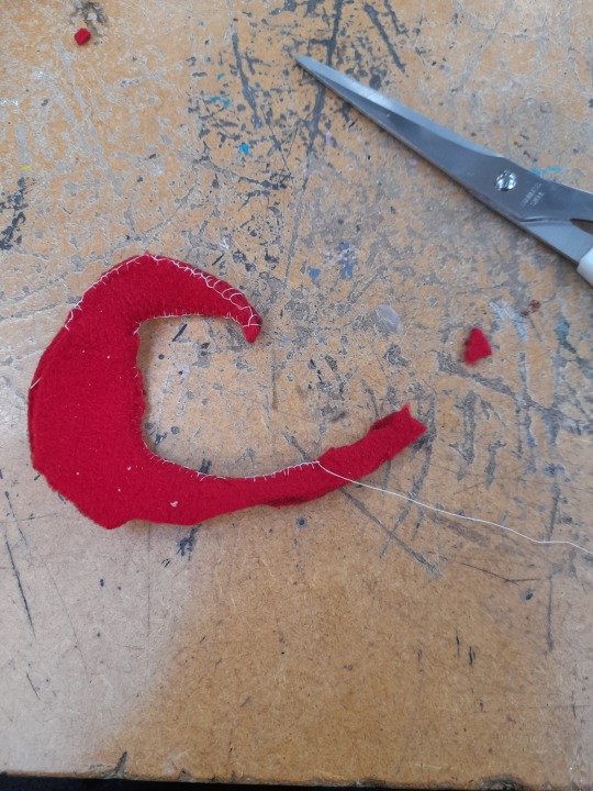
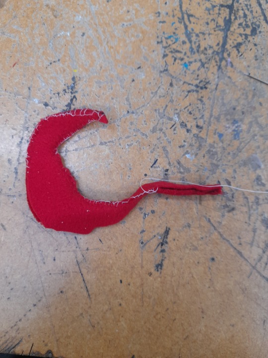
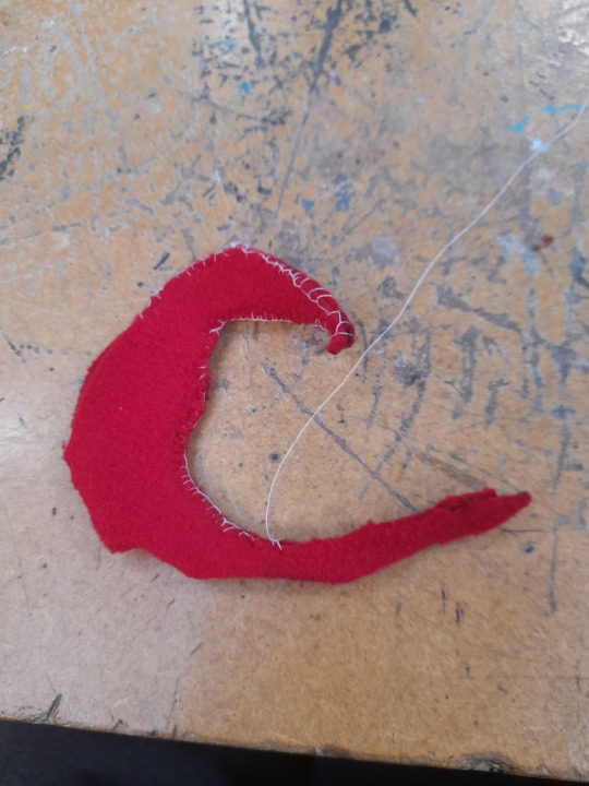
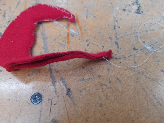
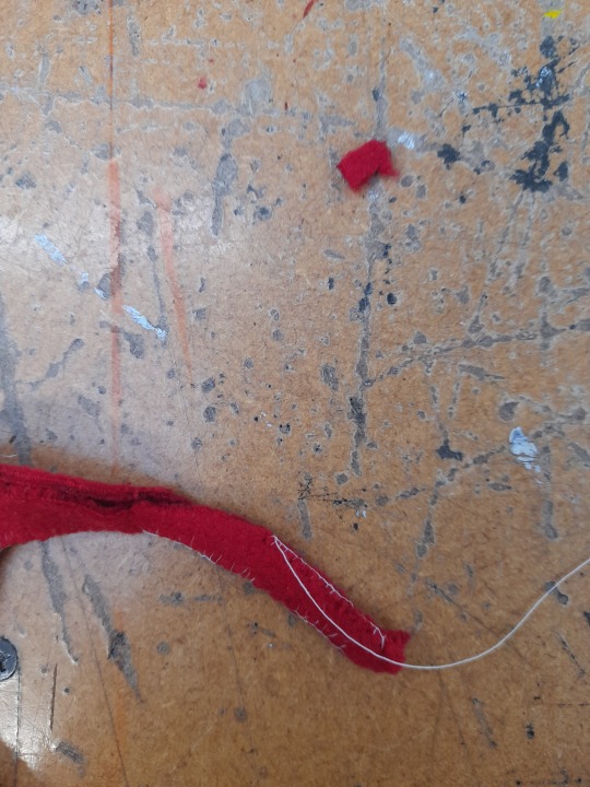
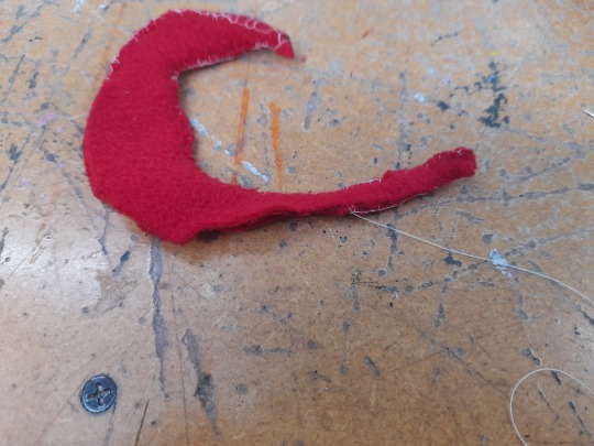
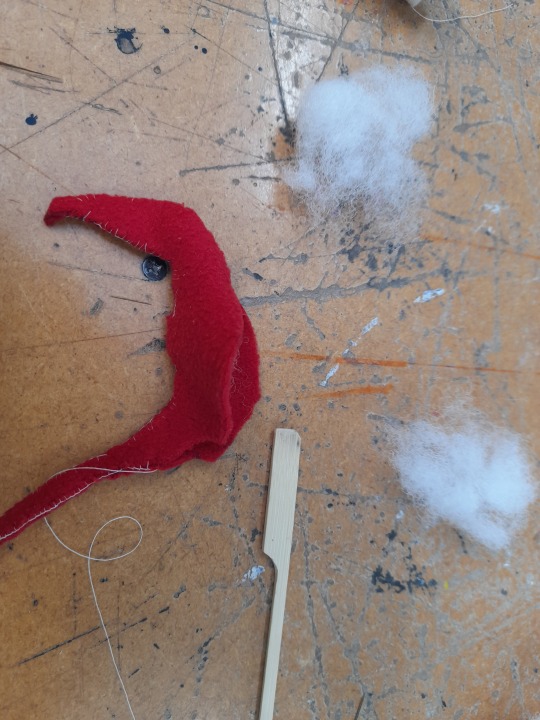
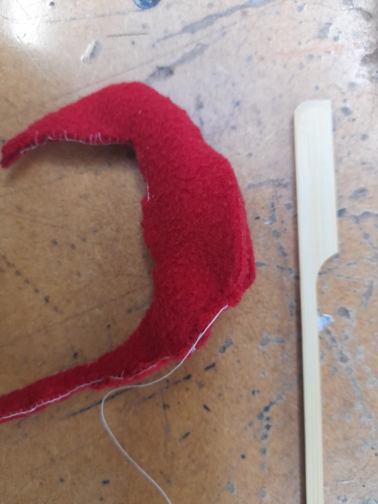
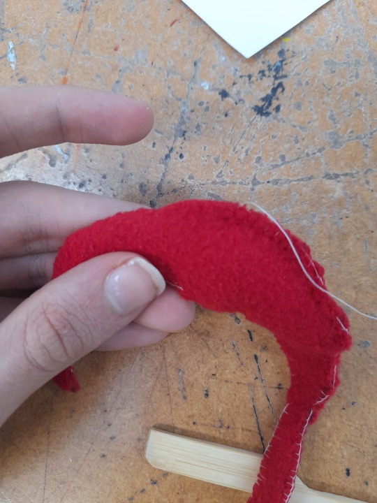
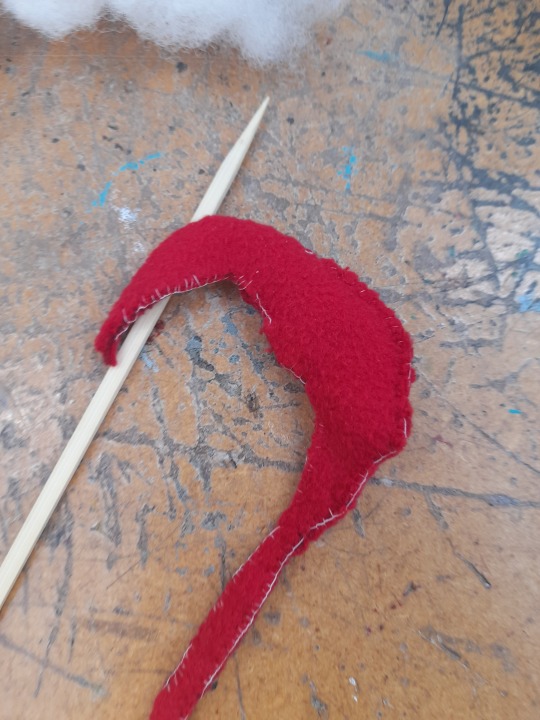
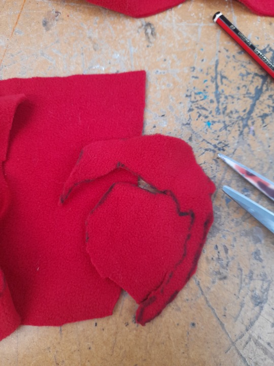
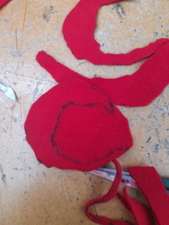
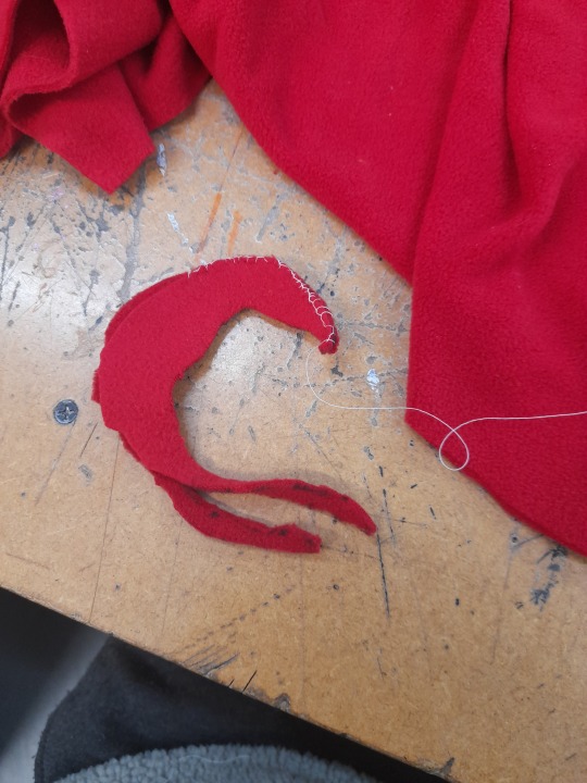
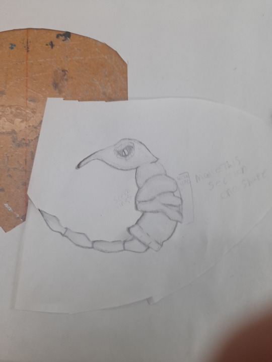
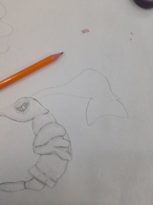
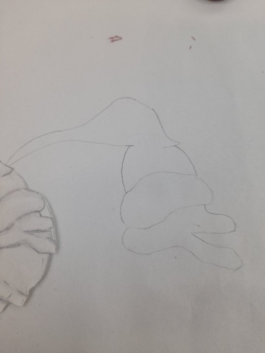
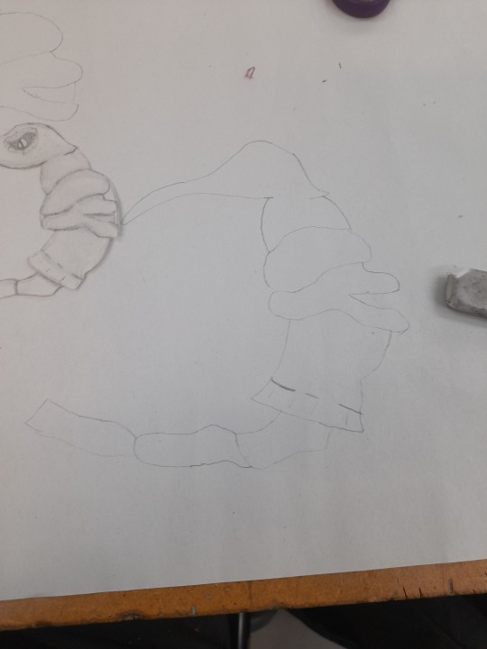
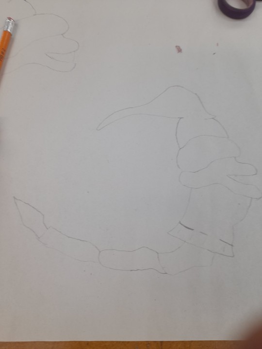
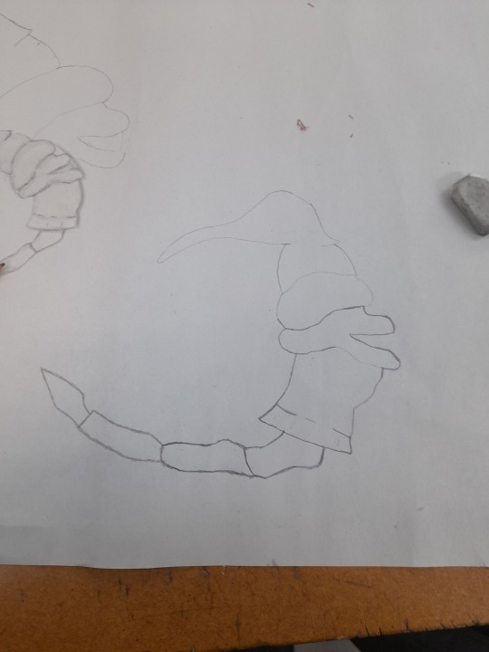
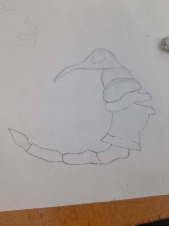
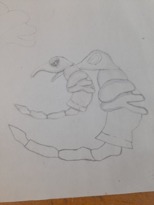
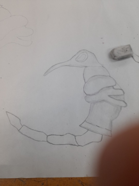
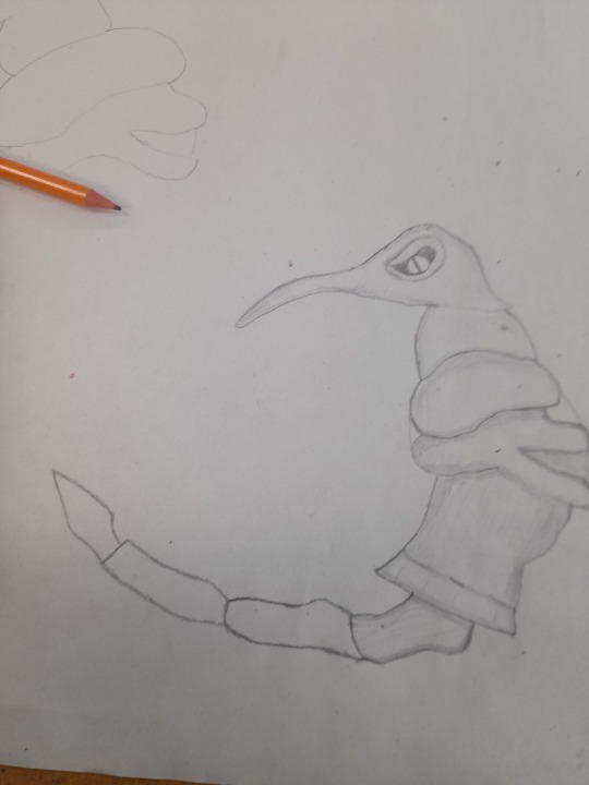
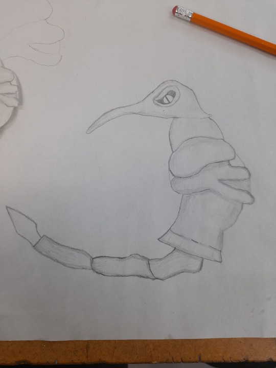
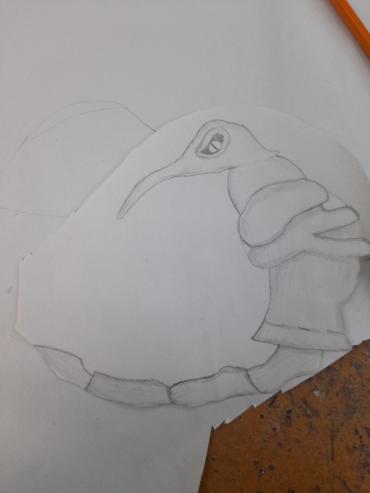
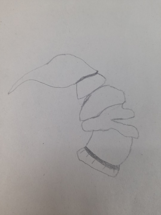
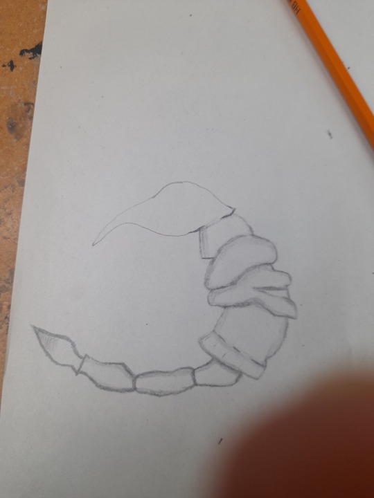
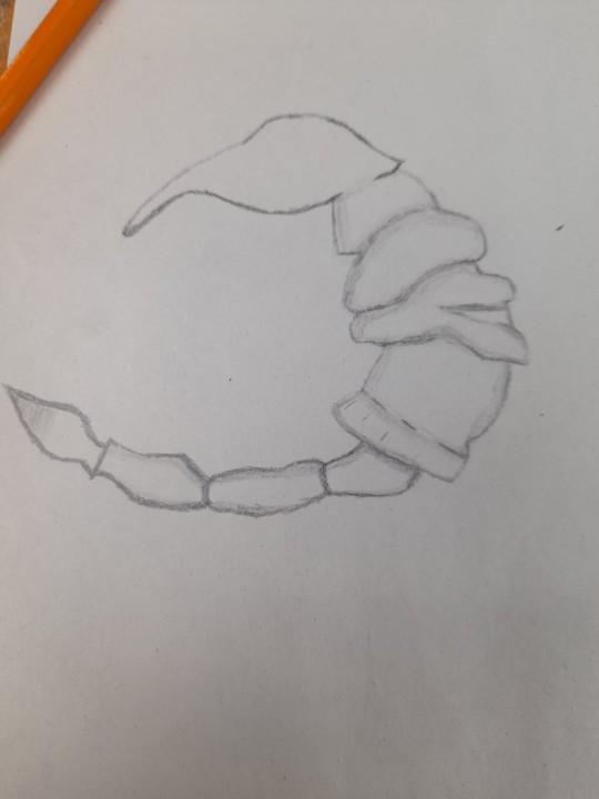
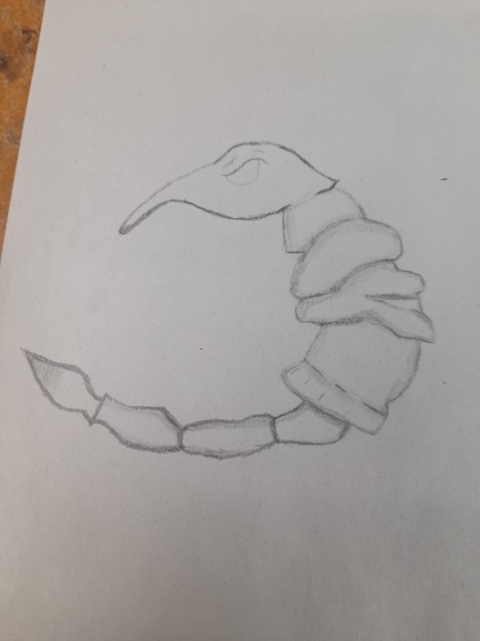
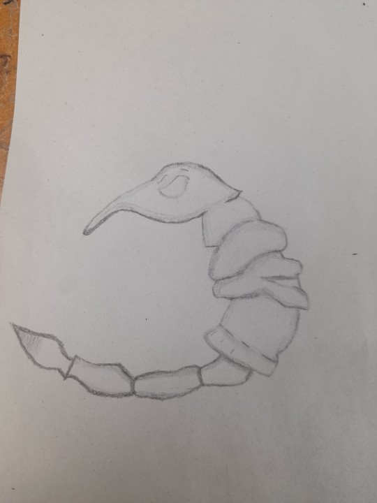
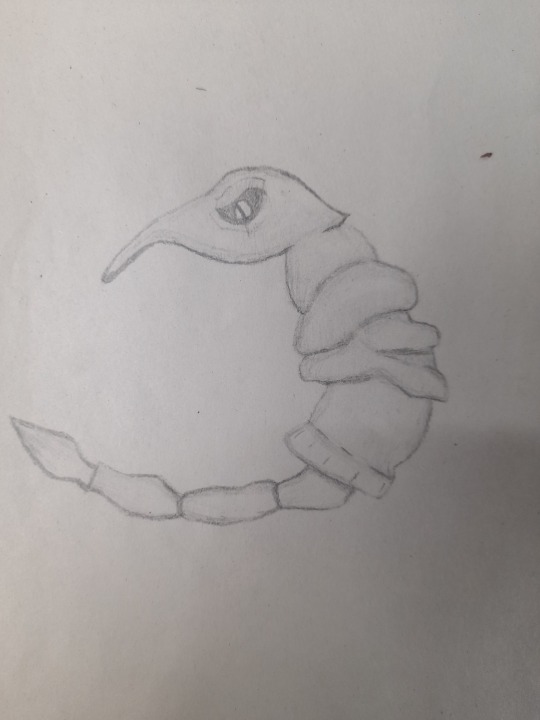
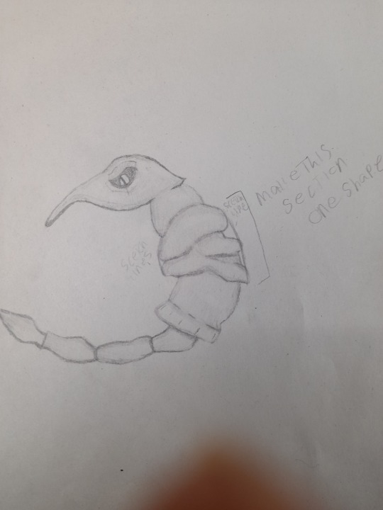
FINISHING PULSHIE DESIGNS
Here is the process of me finishing my design, adding the stuffing etc.
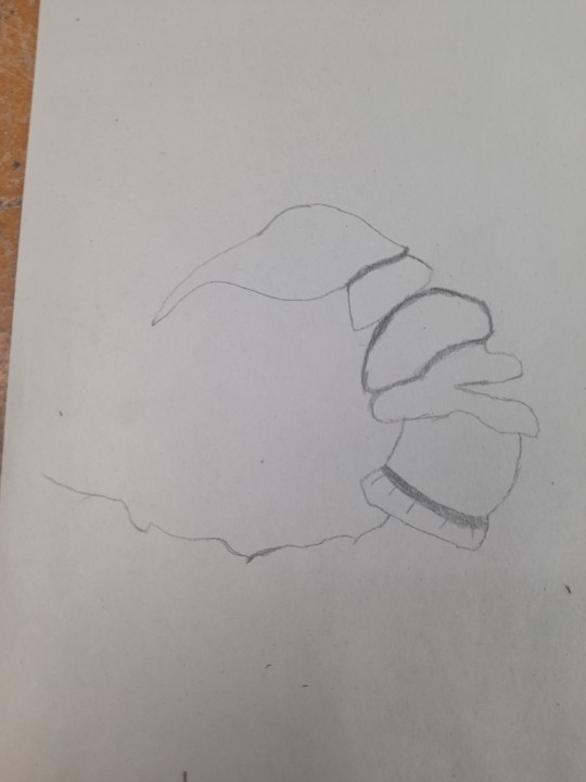
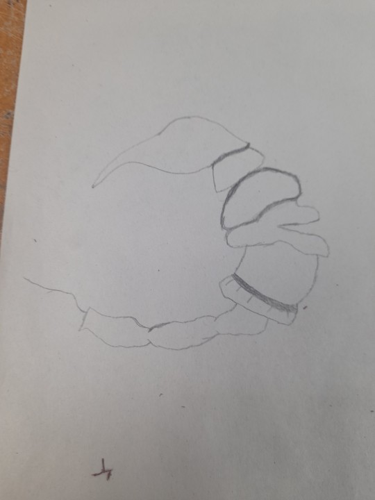
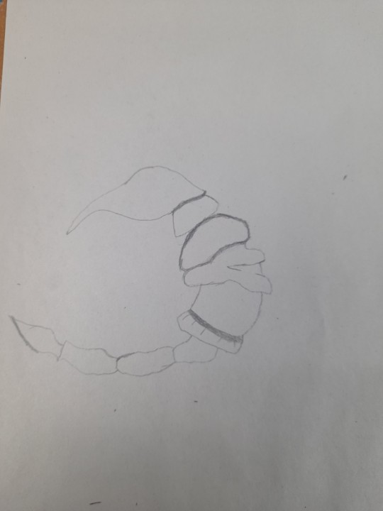
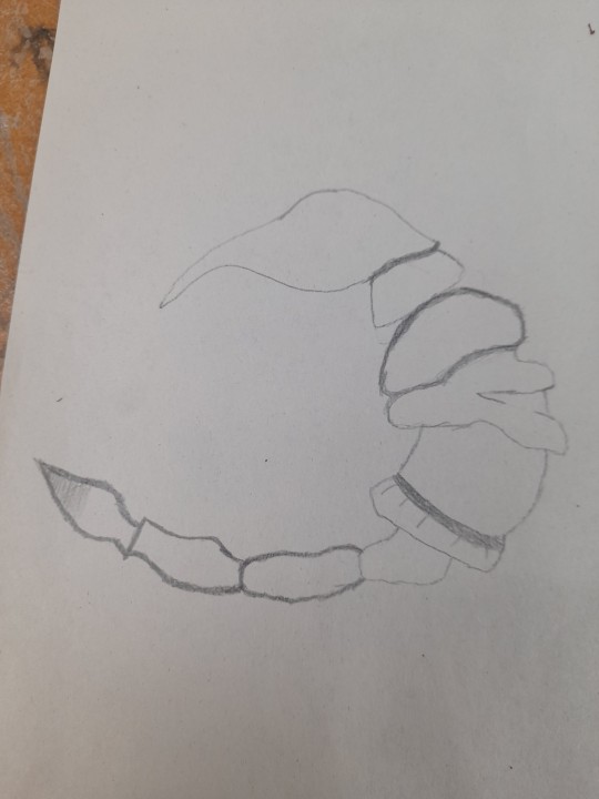
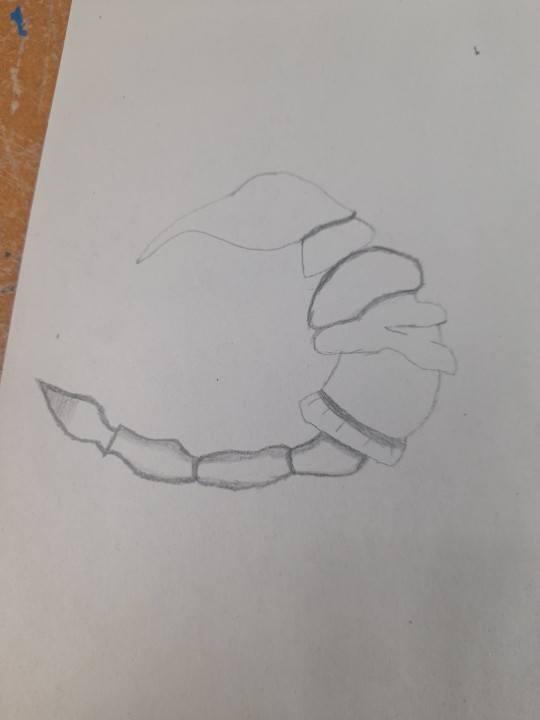
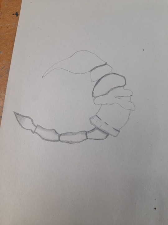
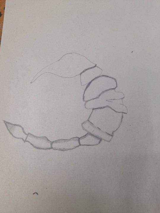
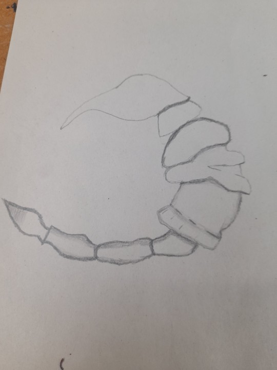
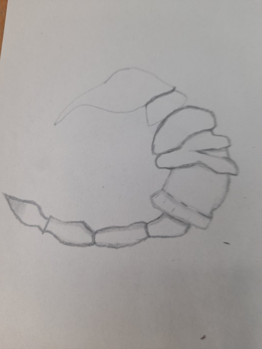
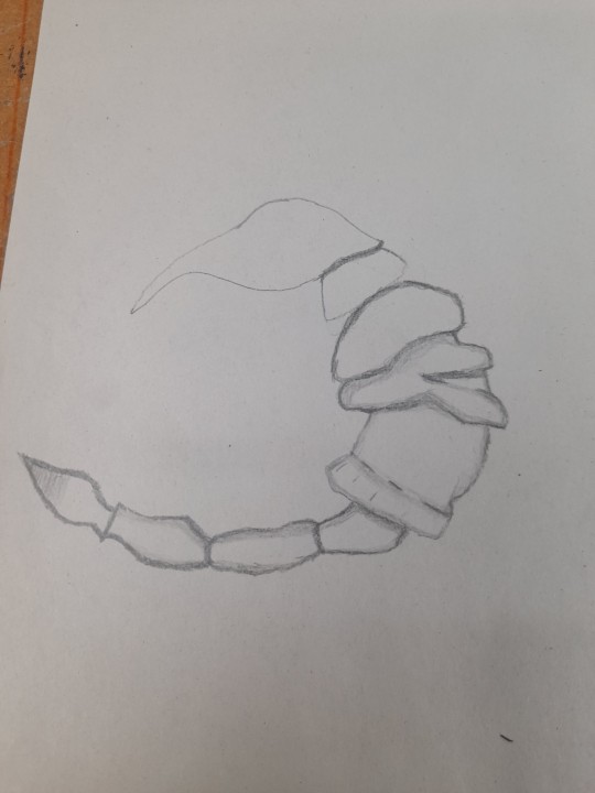
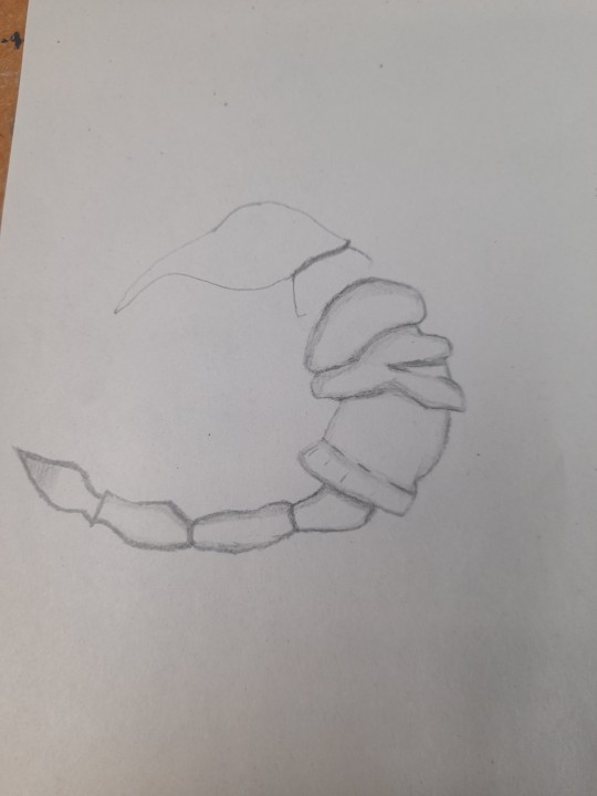
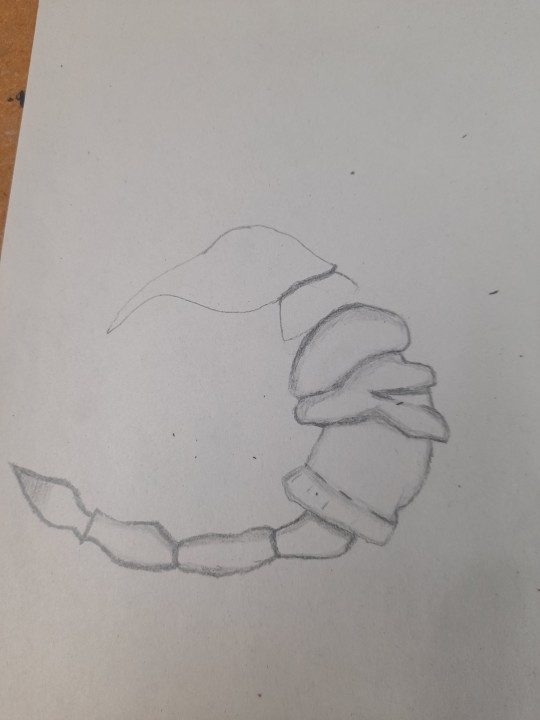
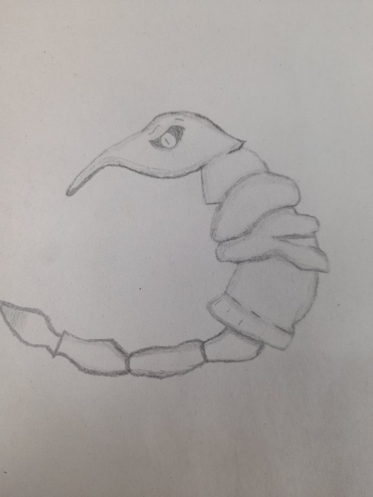
One thing to learn from this, is that despite this being my first time doing stitching and just like drawing it is going to take a very long time maybe longer depending on the situation to get the plushie looking right, the thing I need to take from this trial, that I am not happy about as I made tons of mistakes, is that the more I try the more I will get the hang of it, plus from what I did, is actually quite good from someone who just started, not perfect but something to keep an eye on in the future to then develop and try harder and allow mistakes to happen, while also being happy with the corrections I will make and for someone who is new and terrible at stitching, despite the outcome and me not liking it, it is something to be proud of as it is the start of the many trials in the future.
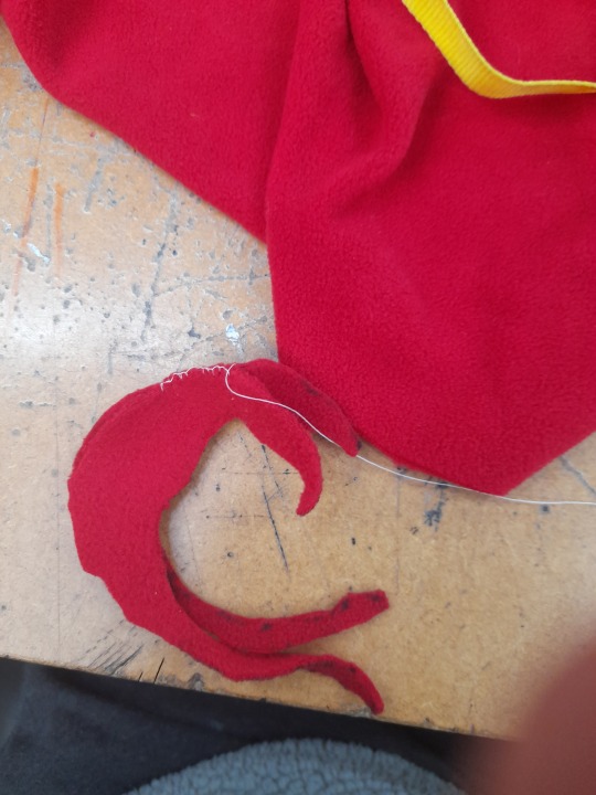
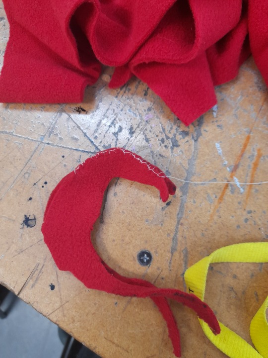
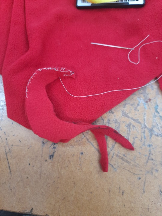
PROCESS
During the process, I just stitched around, the annoying part was getting new thread and doing the knot again but I got the hang of that in the end, despite making some errors, while also realising two things, one try to work with larger scale designs and the annoying part was the tail however once I got that done and completed the spineof the creature which wasn't planned but now the creature has a spine, but for the most part I am semi proud of the outcome.
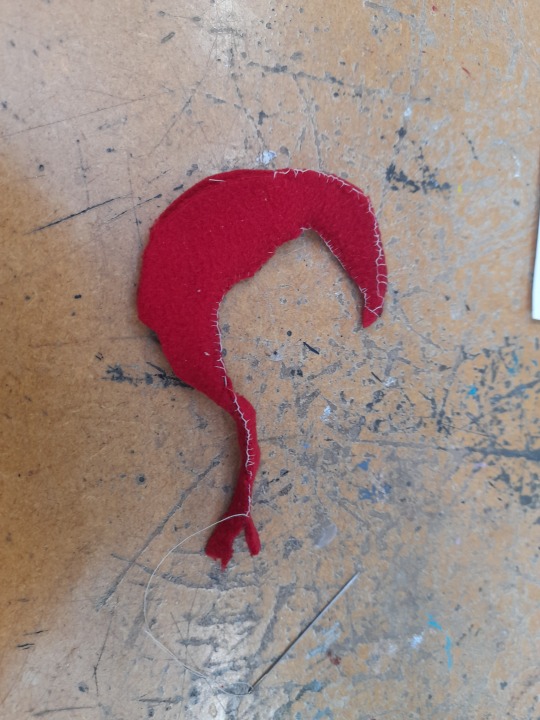
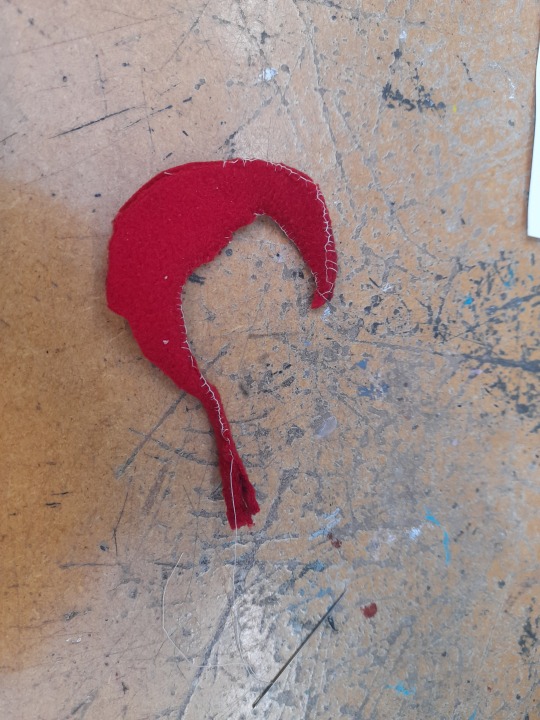
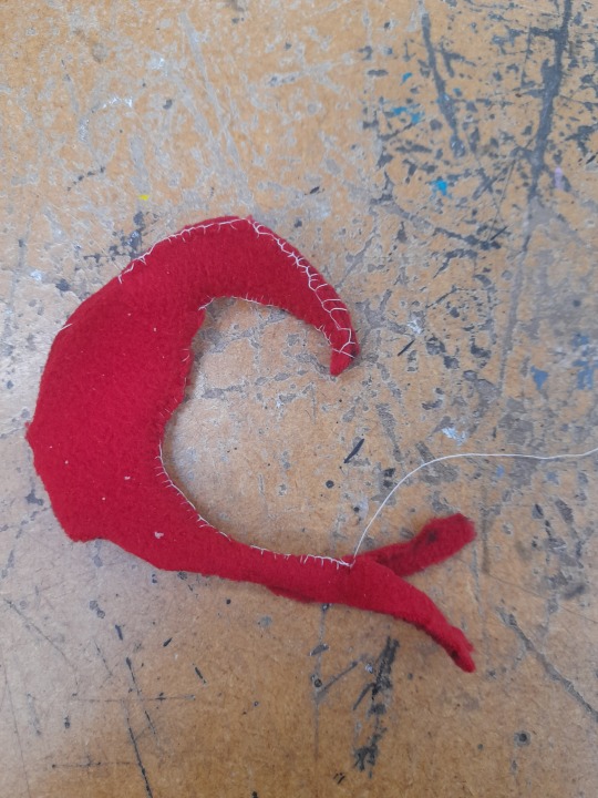
As I said before I do not like it but do, I like it as a trial and not as a final piece, I cannot try and redo now but I can accept that I tried and it is just a trail to know not to worry and what I did is pretty good, till what I thought deep inside my mind, which I need to be more confident sometimes even if I make stupid and obvious misakes.
0 notes
Text
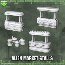
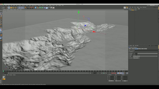
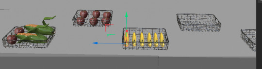
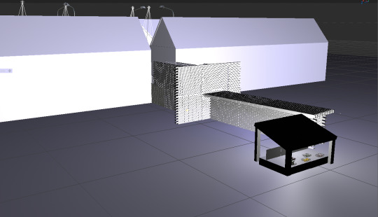
CINEMA 4D (adding additional details)
Here, I wanted to make my alien version of the market town, to look less connected to the earth market town, so what I did was I grabbed the landscape tool and stretched and duplicated it, to make a wasteland for my alien market stalls to go on.
Process
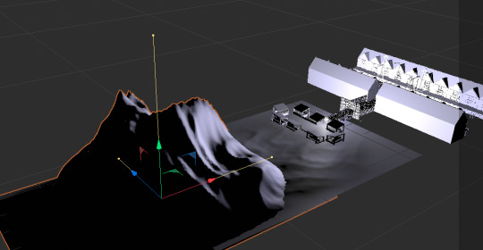
Here is most of the process me trying to make one side look as alien as I can get it.
I then added more duplicates of the same landscape, just to make it as hill like as I possibly can.

I am now going to to render it to see how it looks and get as much screenshots of it as I can, to show that I've done it.
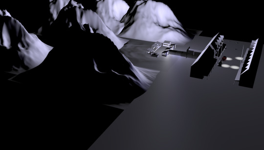
I then saved it again and put it onto my memory stick, to indicate that i've finished as best as I can, I tried to do it, it was tedious but fun and even though I had some slip ups, with trying to make the stalls ad land work with not knowing what I was doing wrong, for what i did so far is enough for me to say that I tried and despite it not being how I wanted it to look like, it still gives the illusion of a landscape separate to the real world landscape.
0 notes
Text
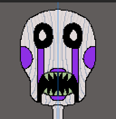
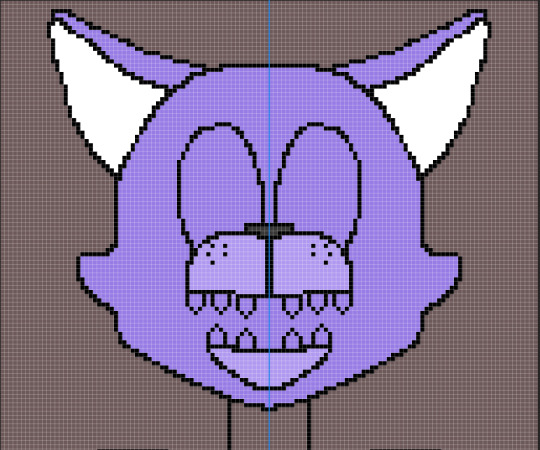
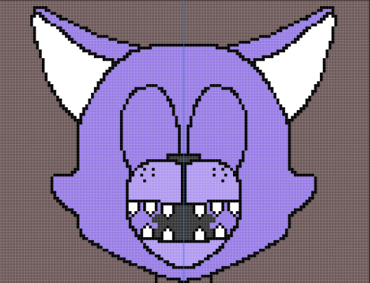
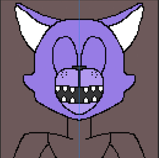
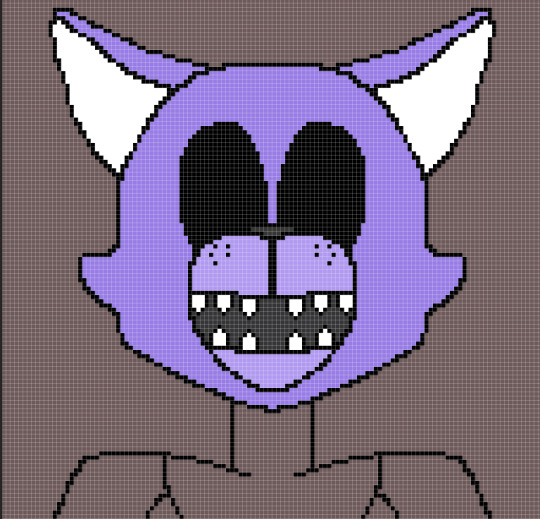
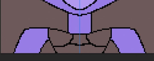
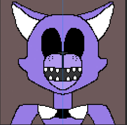
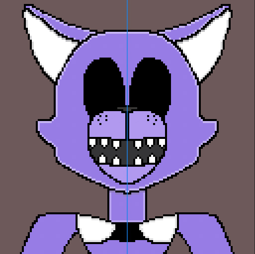
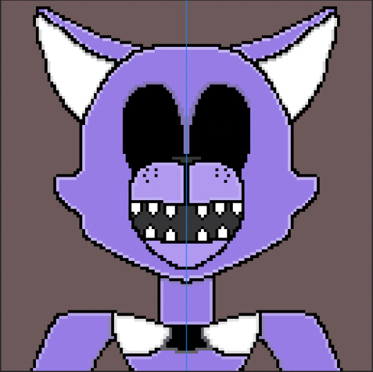
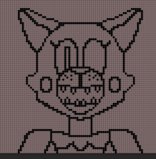
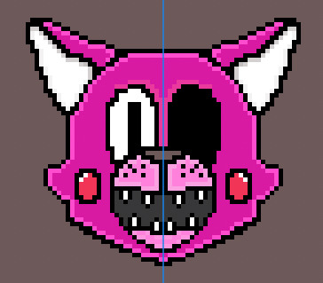
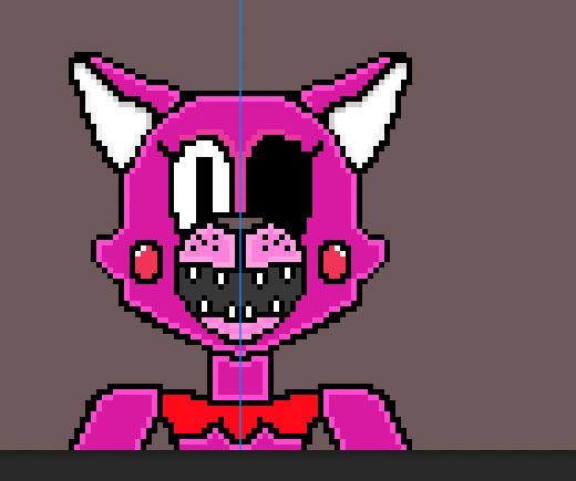
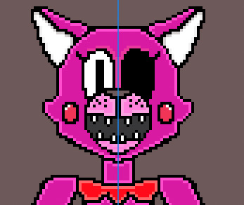
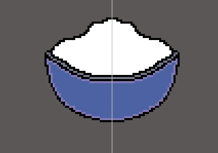
FINAL DESIGN
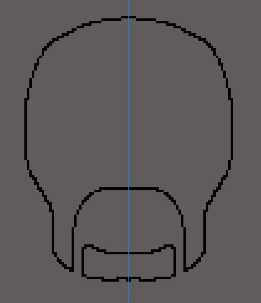
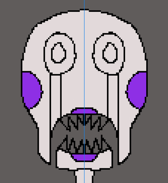
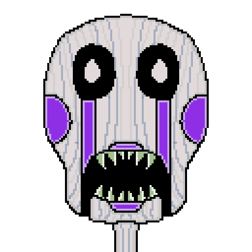
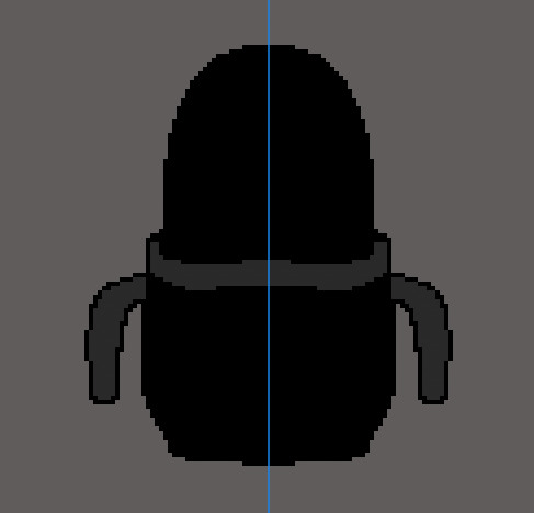
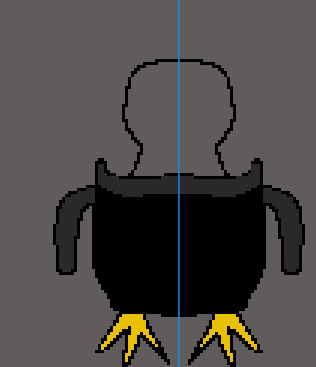
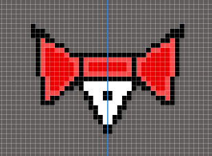
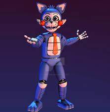
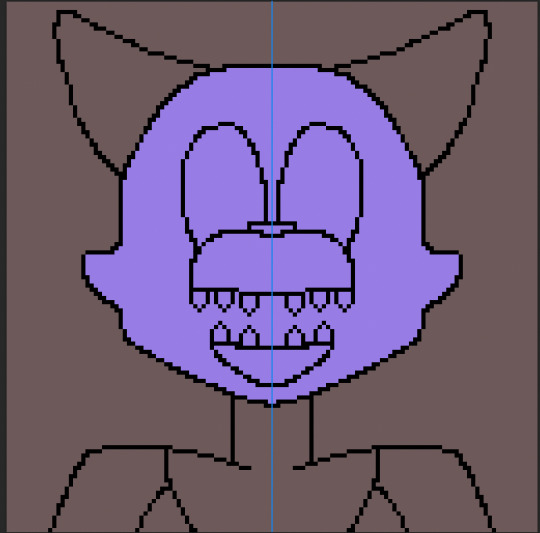
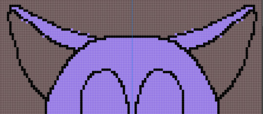
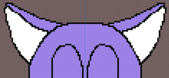
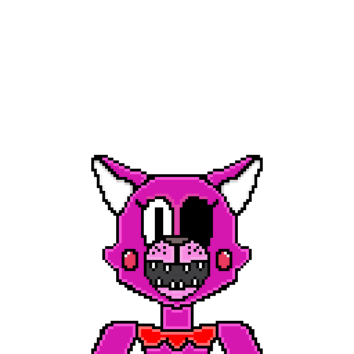
Vinnie (MONSTER) Reference of what i am going to draw in a pixel format.
Going to do the same as I did to the others, shape it, colour it add additional details, while shading it.
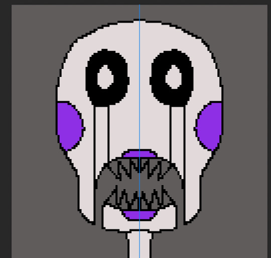
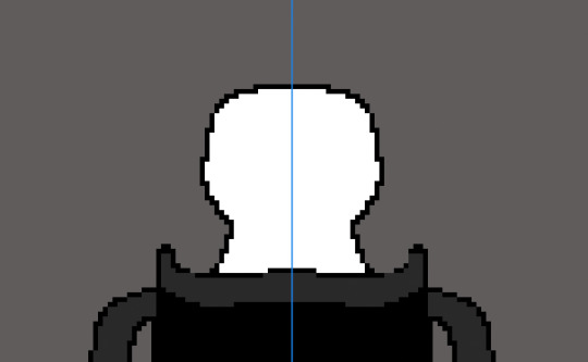
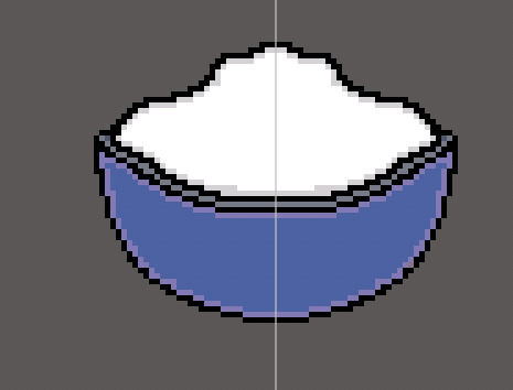
PROCESS OF VINNIE
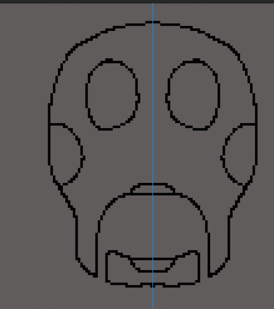
After I got the shape down I then began colouring it in.
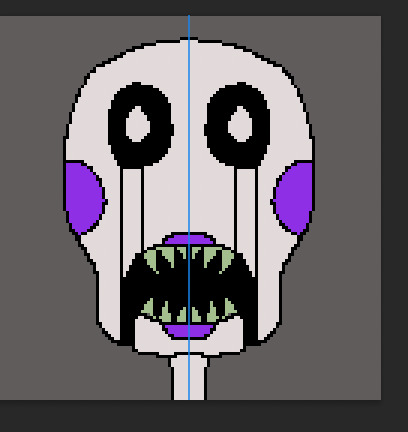
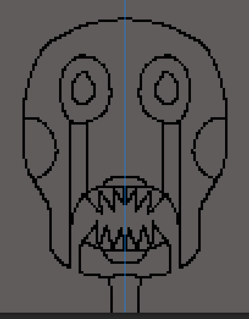
Then I began adding shade to it and additional details.
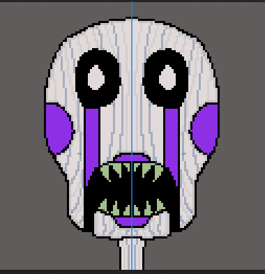
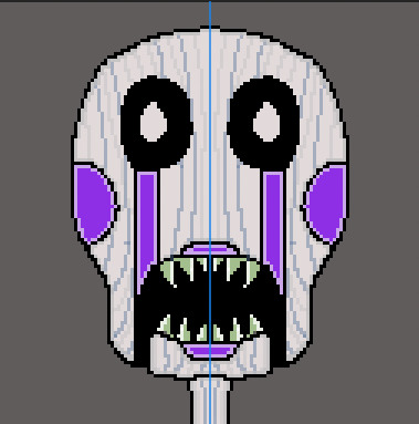
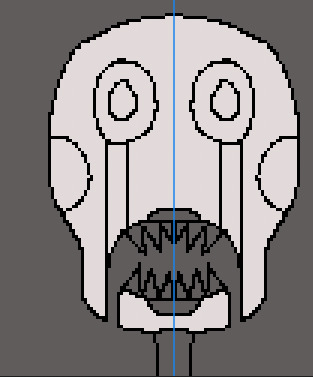
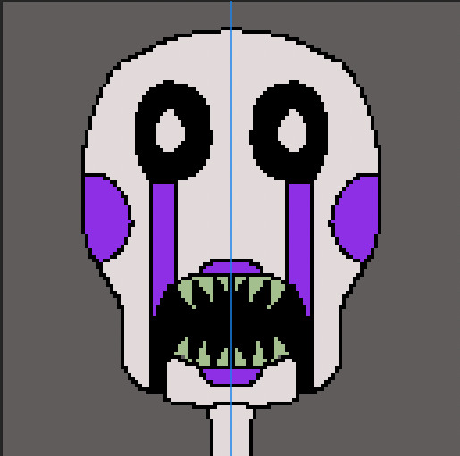
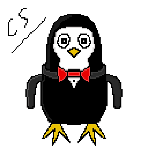
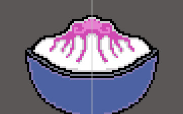
FINAL OUTCOMES


0 notes
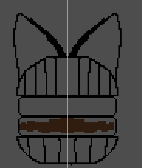
Text
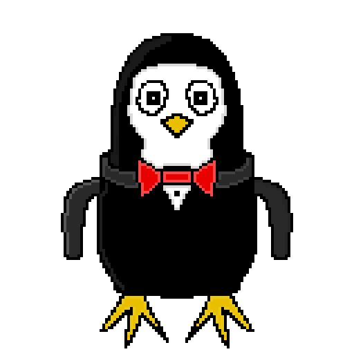
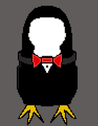
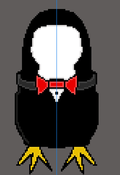
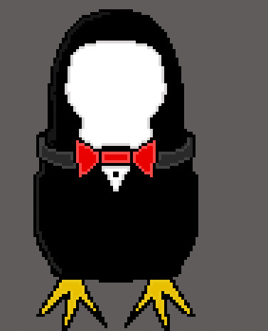
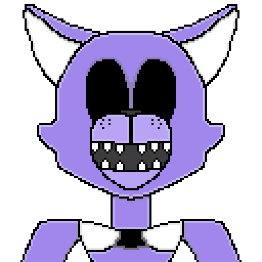
EXTRA PIXEL DESIGNS
Here is the second load of simple pixel fan art from FIVE NIGHTS AT CANDY'S
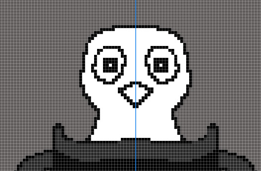
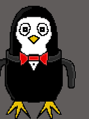
Penguin

Here is some reference of Penguin
Blank
Here is some reference of blank
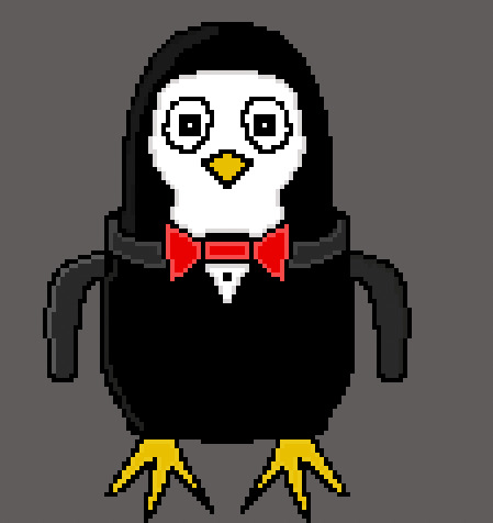
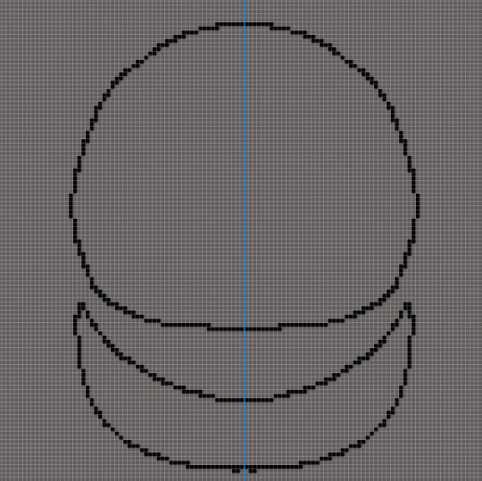
PROCESS OF PENGUIN
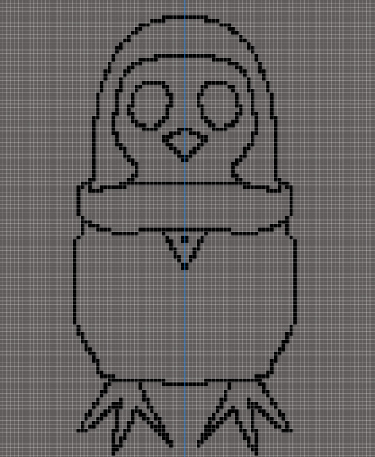
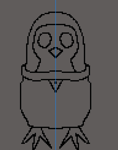
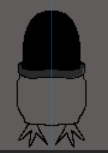
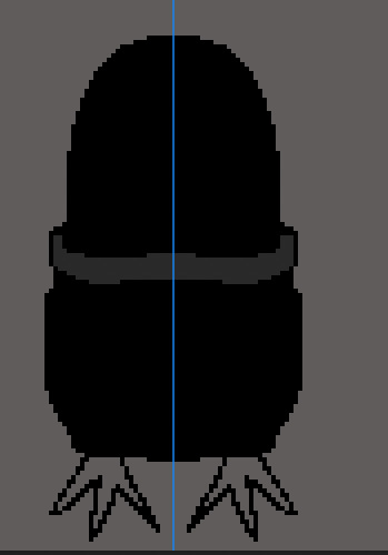

BLACK PROCESS

With each one, I began shaping out how I wanted my fan art to look and began colouring and shading in, while adding additional details, extra parts of the characters that i missed, while making them cute and interesting.
0 notes
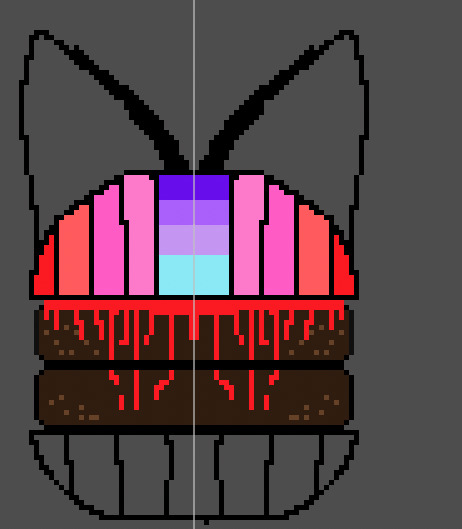
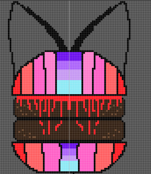
Text
(SIDE PROJECT) PRACTICING, SHADING, DRAWING ON PIXEL.
My inspiration for this, practice is Candy and Cindy, making a pixel counterpart to them. What I mean by this, is that they will be similar to the actual Five Night at Candy's designs, example being a cat, however the way their body looks and their face will be changed and warped.
REFERENCE
PROCESS: Drawing Candy
PROCESS: Drawing Cindy
I used a screenshot for this one, to make a similar style to candy but make it different, make it less big to show how similar they are as they are twins but how different they are as well. As in a normal day life, twins will be similar but different at the same time. This does not include that Candy's eyes are missing or Cindy's eye is missing no, that is just showing how old they are and to give them a creep factor.
the difference is the sizes and the fact Cindy has rosy cheeks a smaller mouth, wider nose, better ear designs etc.
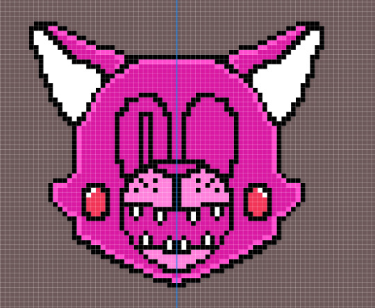
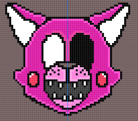
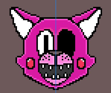
Final outcomes (no screenshots used) "Actual png"
0 notes
Text
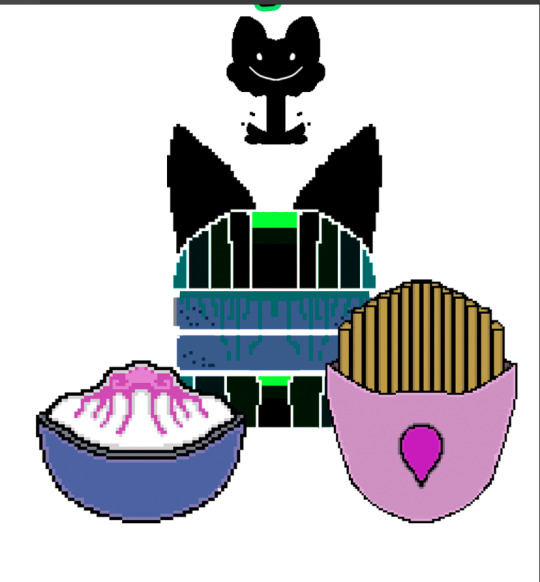
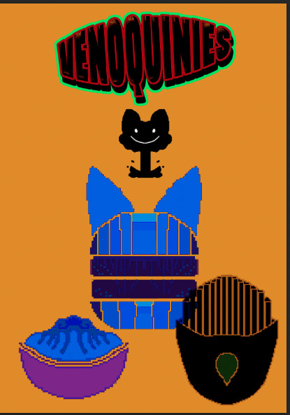
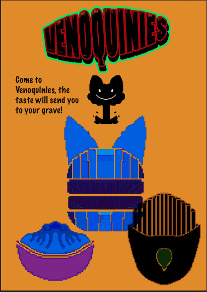
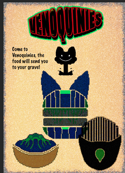
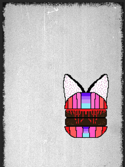
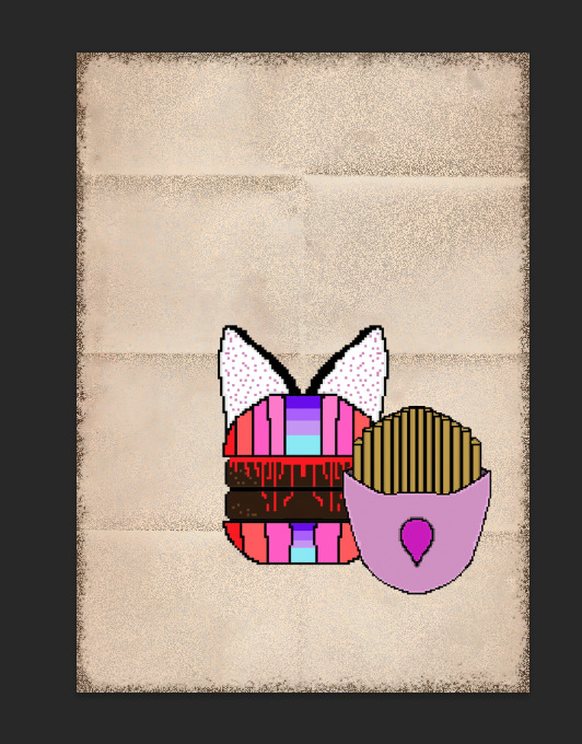
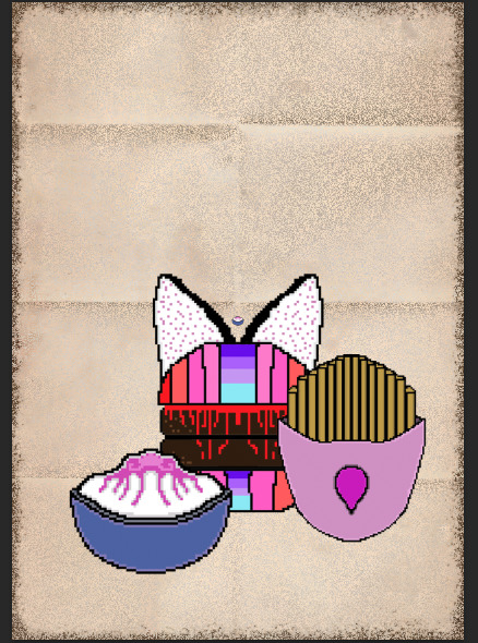
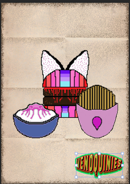
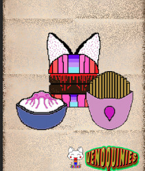
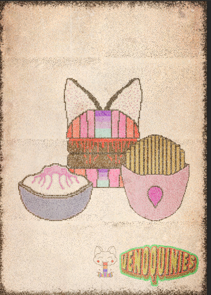
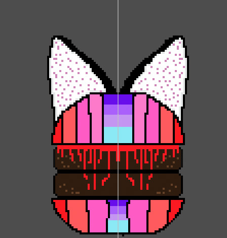
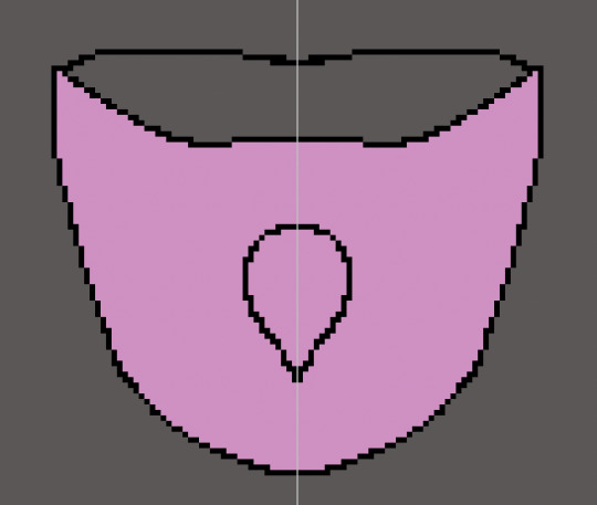
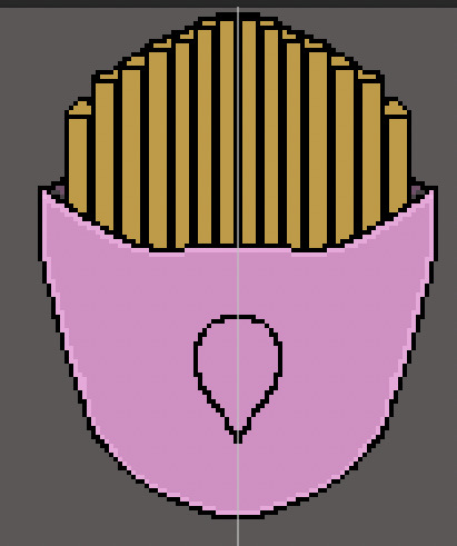
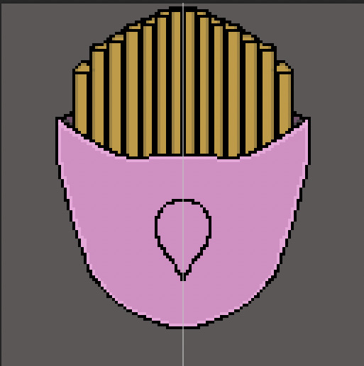
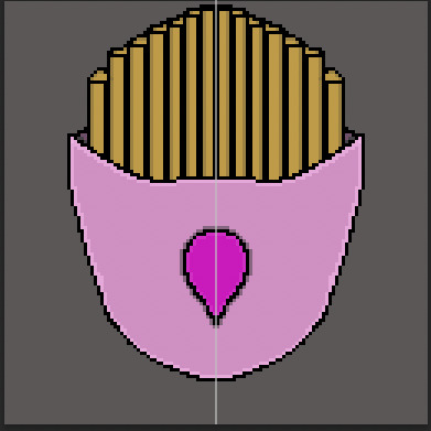
GOOD POSTER UPDATE
This is the process of making my updated version to my good poster, with all the burgers and chips etc and make a little bit better, as I didn't like the other one, plus I lost the psd file of my good poster so I am starting again, which is completely on my part.
PROCESS
I will be using the bad poster design but making it less creepy and more cute like, similar to the first one or trying to get it back to how it looked before.

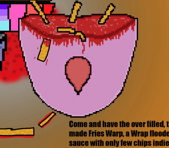
I then changed the fries, in the wrap, I decided to have it flooded with sauce, while having few chips swimming around and it over flowing.
I then began adding shade, to my designs and trying to make the overall design as Polish as I can get it.
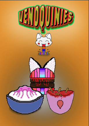
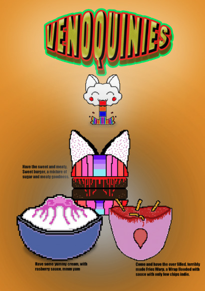
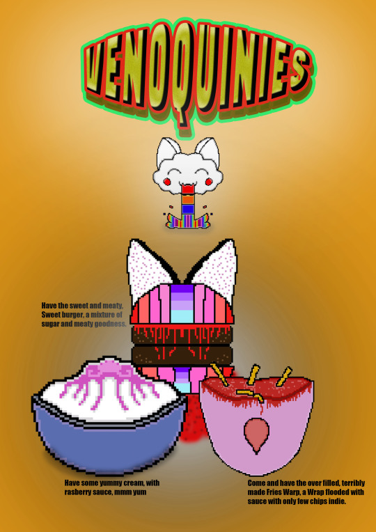
This was really fun making an updated, version I learned ways to make something look professional and poster like, without using the affects giving, just using opacity and black and white, dropping it down using the opacity to give that swirl shade feel to it. I then added sauce near the burger, just to make it loo like it has been poorly presented as that is what I was going for with this poster, I wanted it to be sweet and kind but messy, missing few important details yet still looking awesome and enticing to go and buy the food. And it was fun implementing that idea. this is how I want them to be, I want this "shop' "dinner" "take away" whatever to be misleading while being true and blunt about what are the foods and what it represents.
I then added chips on the floor purposefully poorly, to represent what style I am going for, as I stated before trying to make this poster as semi terrible but good looking at the same time, just to give it that cartoony child like feel to it.
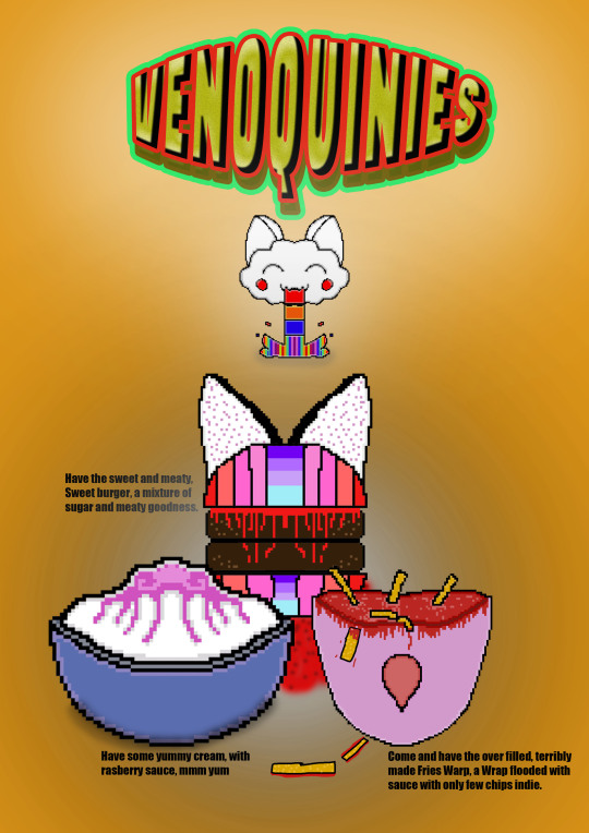
Please excuse the semi mistakes, the last description was meant to say, but I will change one aspect to it.
"Come and have the over filled, terribly made fries warp, a wrap flooded with sauce with only a few chips inside."
0 notes
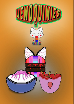
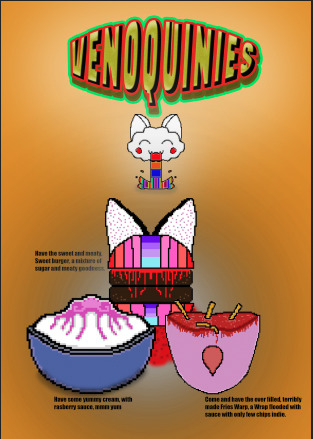
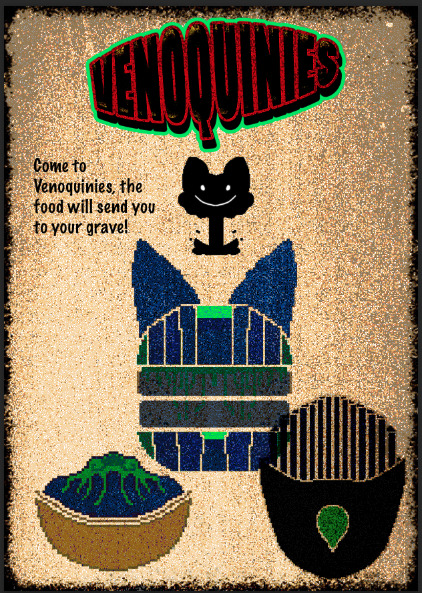
Text
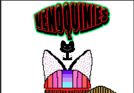
PROCESS OF MY BAD POSTER
I had fun with this one with permission to use my good poster, while saving a copy so i don't lose the good version and mess it up to make it evil and messed up.
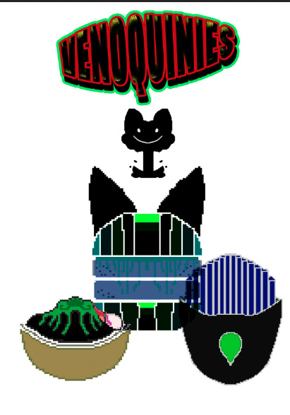
0 notes
Text
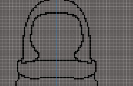
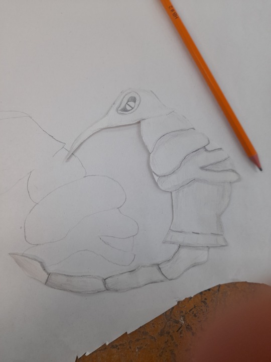
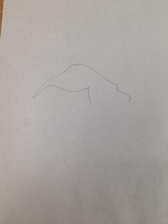
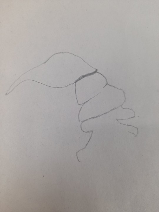
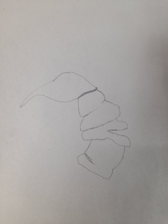
STARTING MY PROCESS OF MY PLUSHIE 3
After I finished the drawing side, I then got pin, fabric, needle and thread, I then pinned my drawing to the fabric and drew around it, got into an issue as I drew the second drawing on fabric the same way when I was supposed to do it the oppisite way, but I quickly fixed that mistake started again. I will say my blanket stitch skills are getting better still need to get use to knotting the threat but apart from small hiccups, my skills in blanket stitching is getting there, I'm doing well just need to improve with the tigtening and actually catching both fabric instead of one and make sure the thread is close together and done straight up so it does not look scruffy, however pretty proud of myself so far with the process.
PROCESS
0 notes
Text
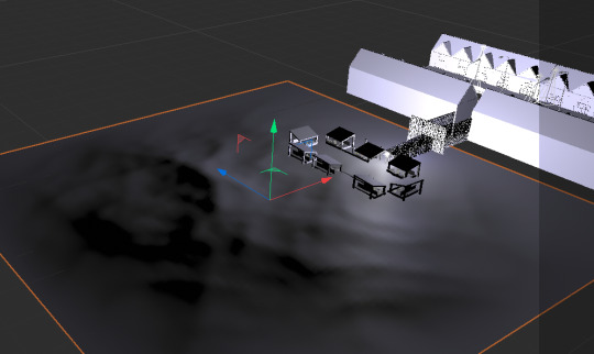
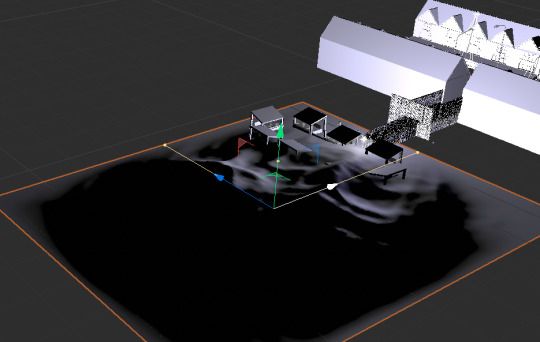
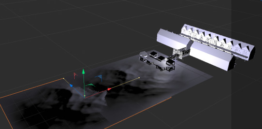
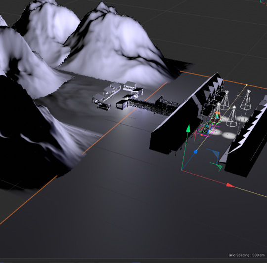
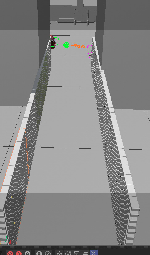
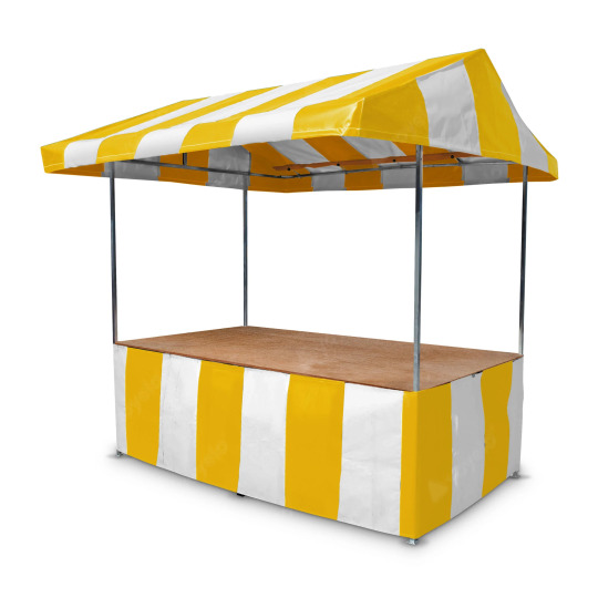
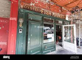
EXTRA RESEARCH OF MARKET STALLS, DIRT PATHS + PROCESS.
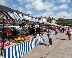
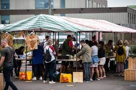
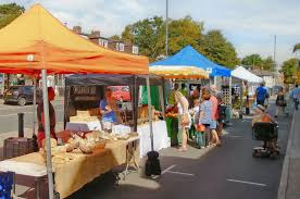
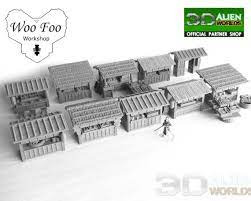
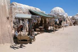
I began looking at more Market stalls of different types, alien and general to get an idea on how to make my versions,
Then I began looking at dirt paths as my plan is to create a dirt path or to use if there is any dirt path assets.
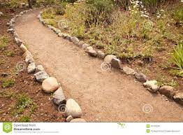
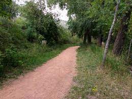
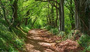
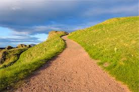
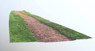
PROCESS
I began my process of making Market Stalls, while also looking for assets for other objects that I can implement into this part of my design.
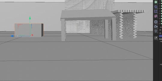
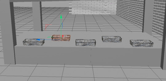
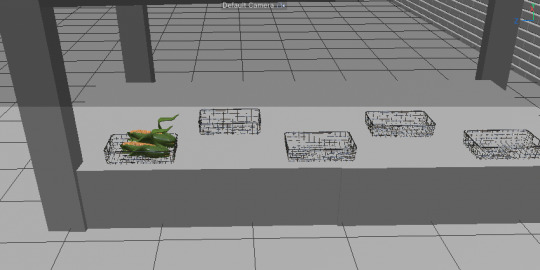
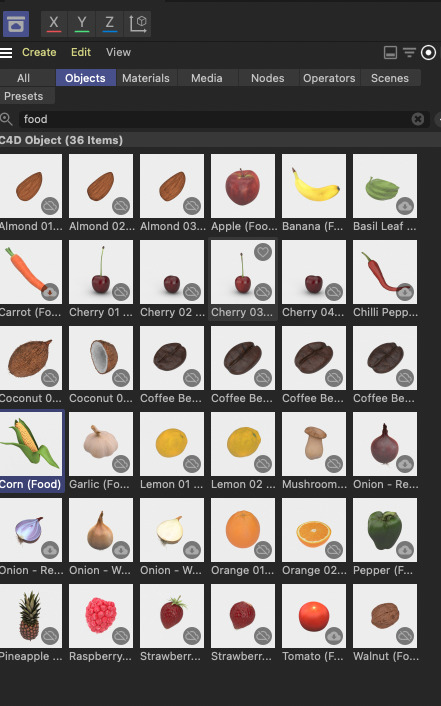
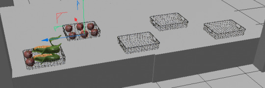
I then added lighting and copied and pasted it, over and over again until I made a small Market area.
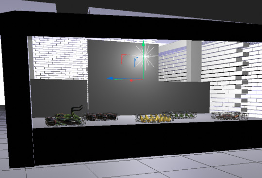
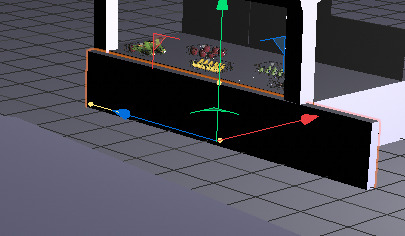
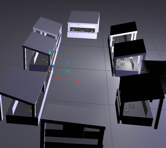
I then put it rendered it to see how it looks.
0 notes
Text
STARTING PROCESS OF MY PLUSHIE 2
Then I began the cutting process, which was very easy as I took my time; I thought I would mess it up, but I didn't.
(Sadly, I forgot to take in depth Photos, so I took a photo of my friends' scissors to show that I did it. The final images may not look like its cut but that's because I had it on a huge sheet of paper, but it is cut.
Then my friends thought this drawing was too small, so I draw another one similar size but bigger, then shaded it (for fun) then cut it out, then had an idea to try both have a go at both, if the small one too hard then the big one will do.
However, during this process, I made a huge one, which was too big, so then i fixed and then drew again which is where the semi big one comes into the picture.
At this point to help me draw it out again I used the already cut one to get a similar shape, which worked very well.
I did the same thing with the little one and drew a cut line as I forgot that I needed the mid-section to be a whole thing, just to make things easier.
I then compared the small to the large, figuring out which one will be easier for me to do?
Then I began the cutting process, with learning from before actually showing my careful cutting. Or proof that I was indeed cutting and not taking a picture of what looks to be still on the page.
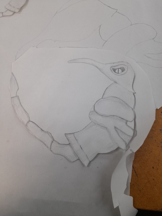
Here it is as cut with the small once again comparing which one would work, but at the same time thinking if I should still do both see what works and IF both works then decide what one would look good.
0 notes
Text
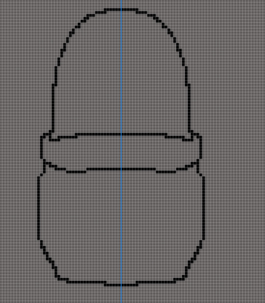
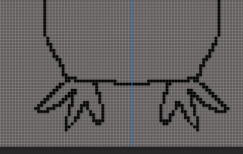
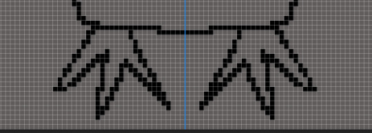
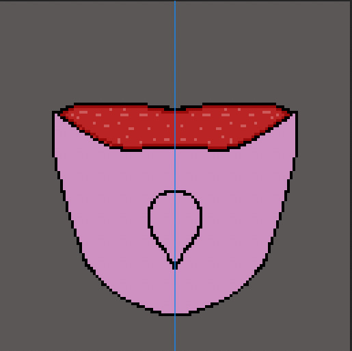
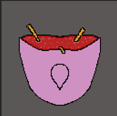
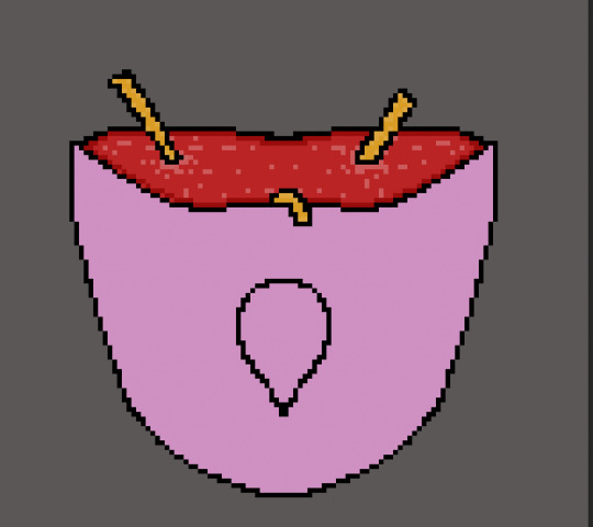
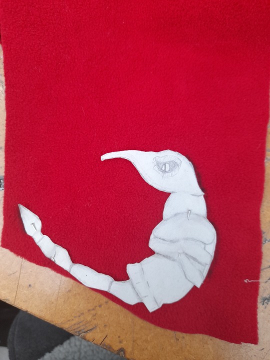
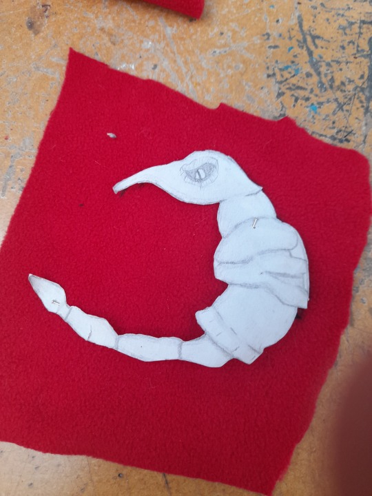
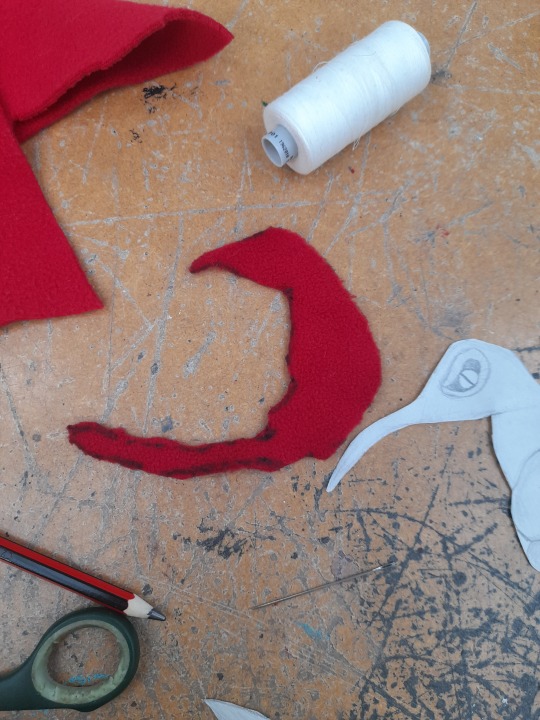
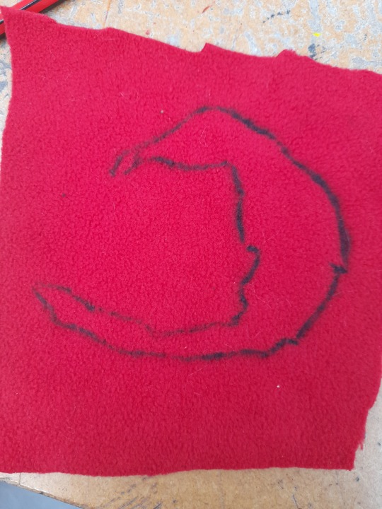
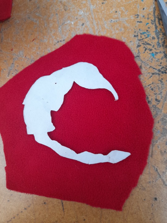
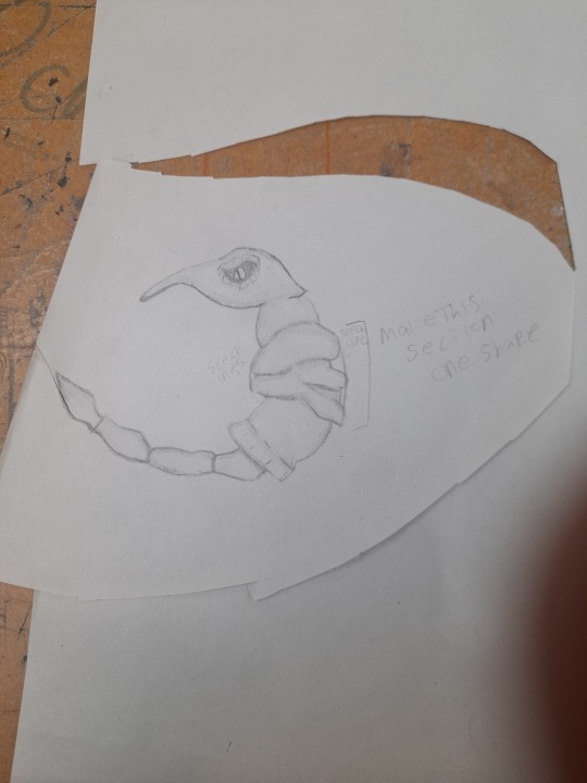
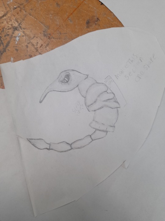
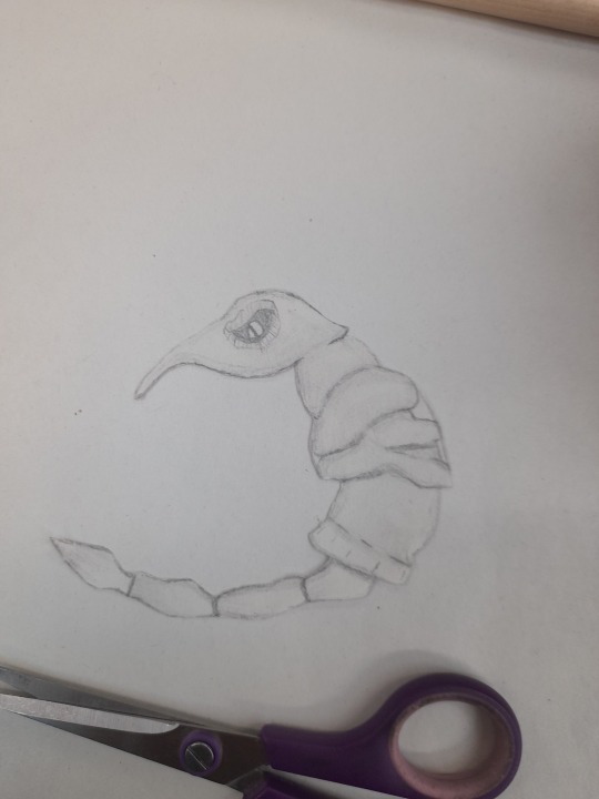
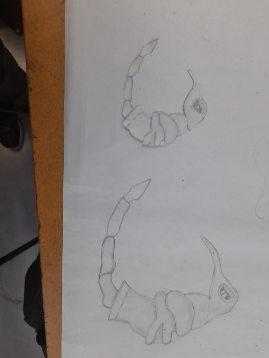
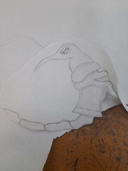
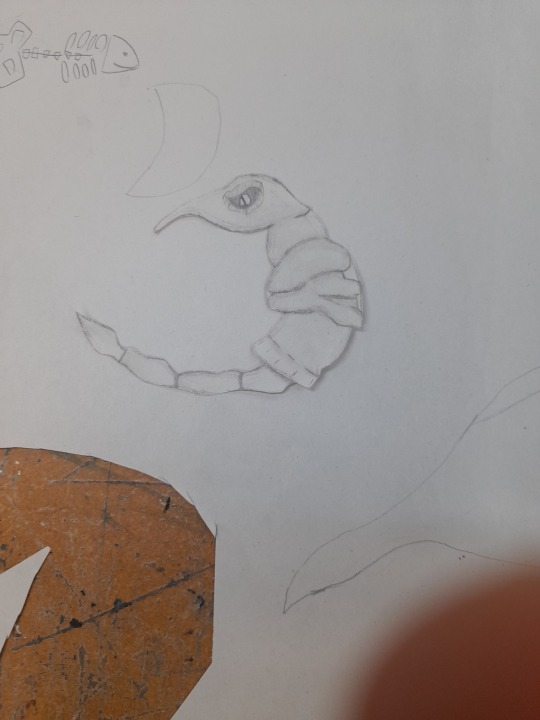
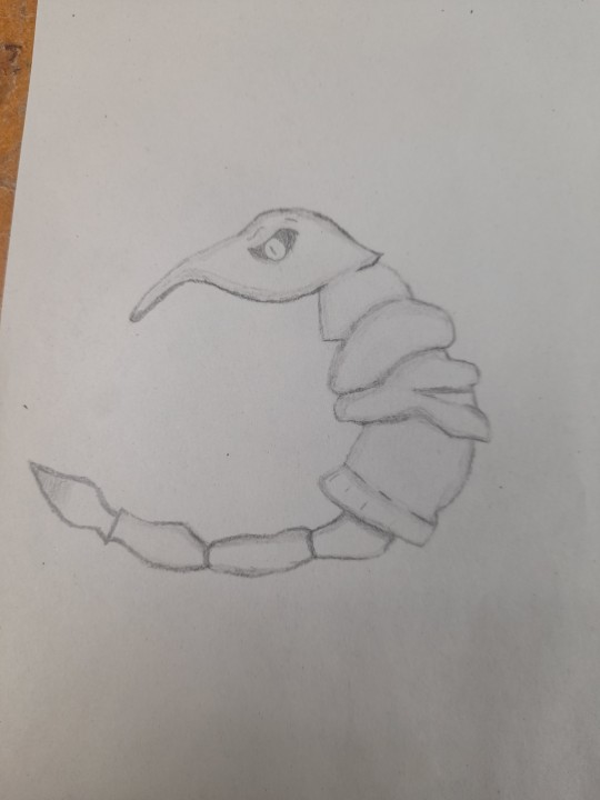
STARTING PROCESS OF MY PLUSHIE
DRAWING PROCESS: The small one
(I also found an excuse to learn and understand how to shade, to make it detail etc, which I didn't have to do but I wanted to try)
I also copied my sculpted design and tried to make the drawing as similar to the sculpted piece.
I also wanted this plushie to look as exact to my sculpted piece as I possibly can, so I made a plan to make it out of red fabric.
During the stages of me drawing an updated smaller-ish version of my creature for the plushie, I began to realise that I was kinda good at shading at a small scale, thought a rubber was also a good way to add lighting onto the final parts of the design, so shaded parts in then rubbed parts out to look a bit more 3D ish.
When I got to this point, I began focusing on the head, making sure it looked creepy as it isn't really important of what the drawing looked like I just for no reason really just wanted to make it look cool.
The head was my best part of making this updated drawing, just fun, the eye I had more fun with making it really detailed and disgusting.
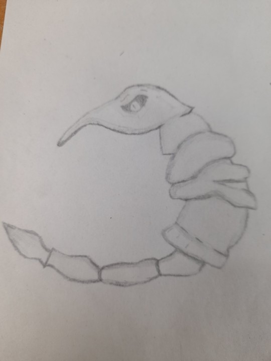
Then Casey helped me out, to make the stitching process and cutting out the fabric outline of this drawing, easier for me with her explaining to make the middle part one body, instead of doing what the drawing suggested which I am really thankful for as I am not quite good at stitching and I forgot, that this drawing is a bit difficult to implement and turn into a plushie, so I drew cutting lines to one part to another so I won't have to draw into what I was originally going to do.
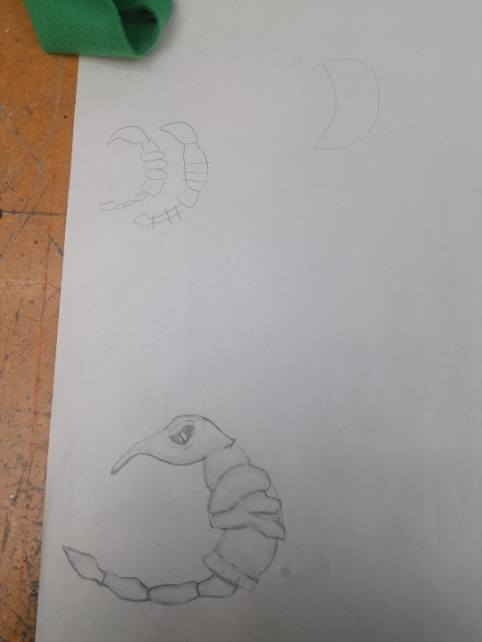
Here example sketches done by Casey and the cut line I drawn onto my drawing, hard to see but it is there.
0 notes
Text
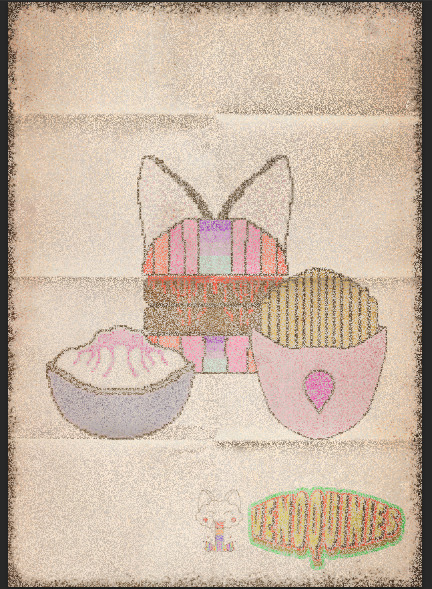
TEXTURE PROCESS
PROCESS ON HOW TO DO TEXTURES
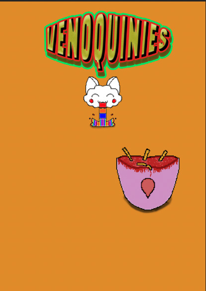
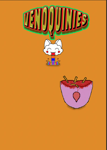
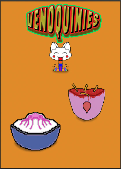
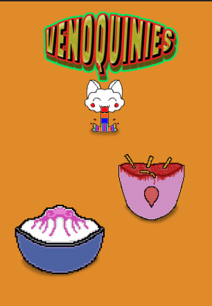
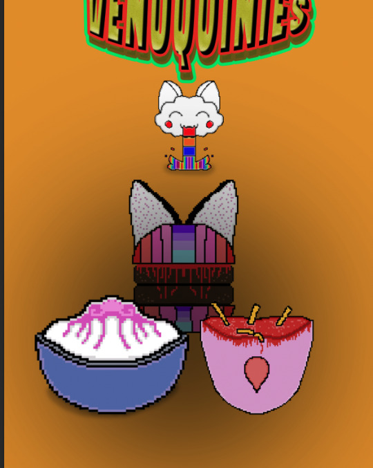
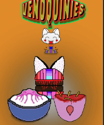
This is just to remind me on how to make my work look cool and old. When got down into the design process of making my poster, I drawn the missing details that I did before and slowly added them to make a misleading poster that presents the food as weird and funky and kinda tasty, which I want, as the food from Venoquinies are not what they seem, in the good and the bad one, the bad one is worse with the food being alien and strange and not like things you would eat, like "raw" or something far more worse.

0 notes
Text
RESEARCH TEXTURES + RE DO PROCESS
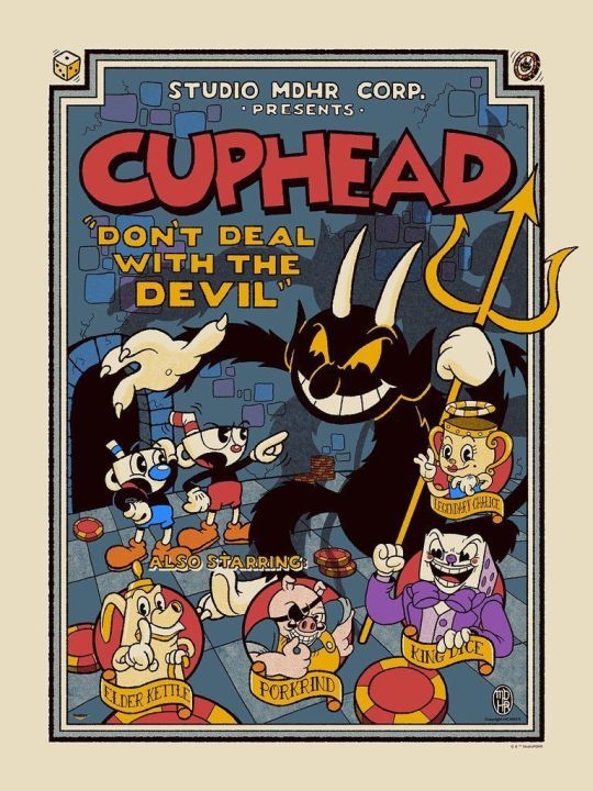
These examples, of what We'll be doing on photoshop with our own posters. Strangely my food poster isn't on my memory stick when I remembered putting it on, so I am going to do create it by scratch with my own design, but how I feel that these affects were made, were either done so by using glitch effects or pencil effect with amount of detail put into it to make it look harsh and like it was destroyed and beaten, the cup head one looks very big childishly and cartoonish, which gives me ideas on what to do.
RE DO PROCESS
of creating self food designs
BURGER
FRENCH FRISE
DESERT
0 notes
Text
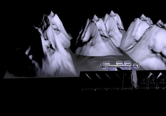
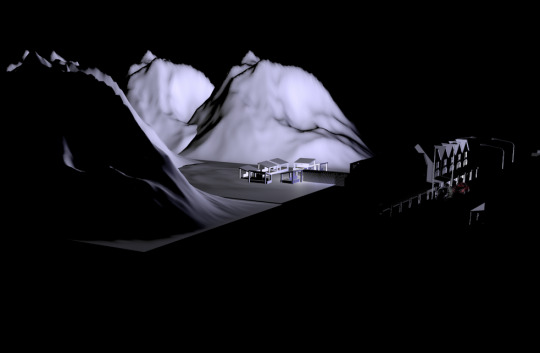
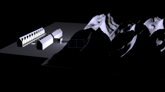
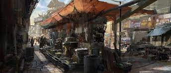
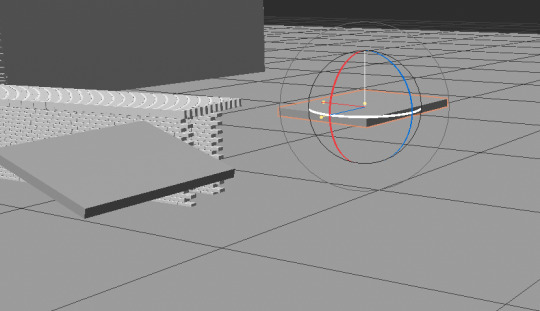
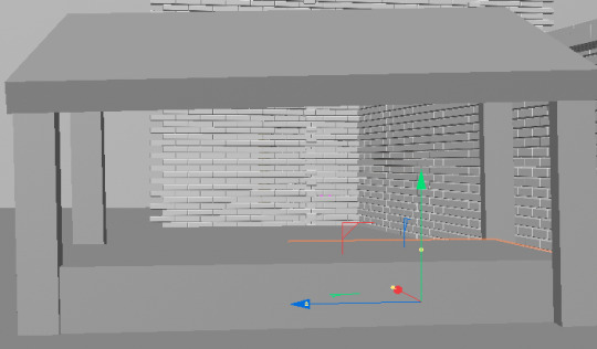
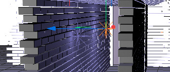
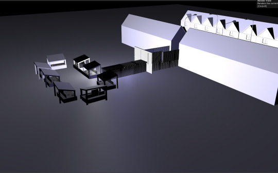
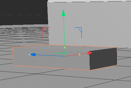
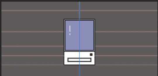
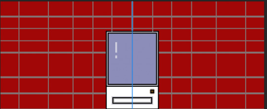
PROCESS OF ADDING AN ALLEYWAY
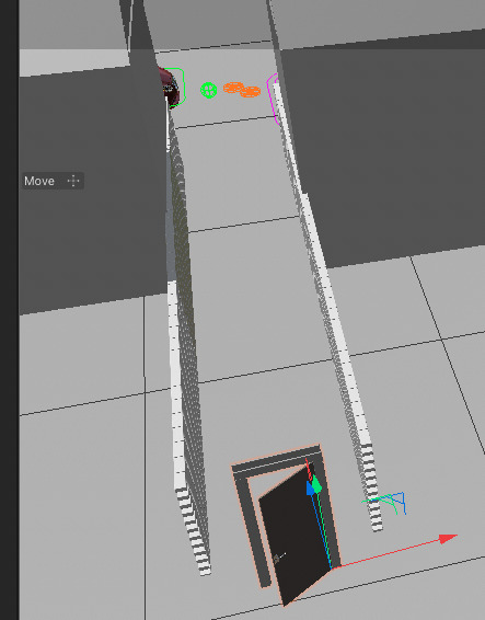
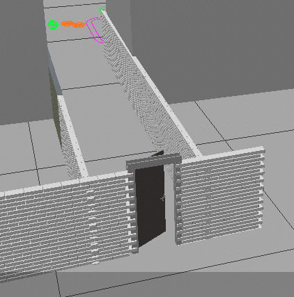
Here is my process, step by step slowly adding the alleyway to begin my contrast to create the other side of the market, to create an alien market.
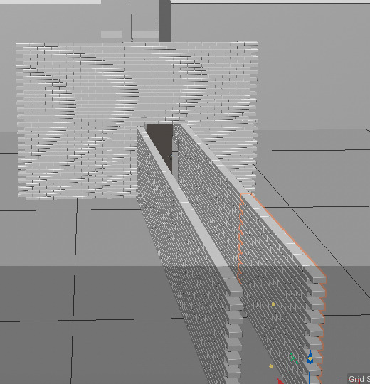
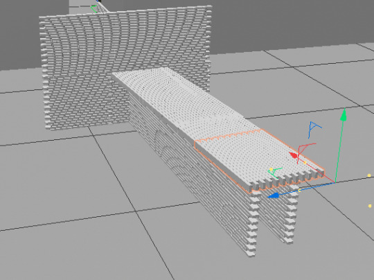
This is where the full idea came from, to have this weird out of place brick tunnel leading to the other world.
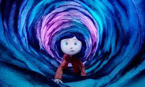
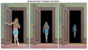
This is what I am trying to replicate, a strange door leading to a corridor, leading to another alleyway to the alien world.
Then I began researching market - to give me a concept idea on how to make one.
PROCESS
0 notes
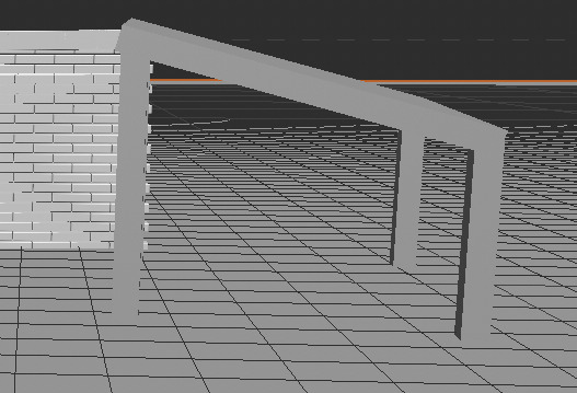
Text
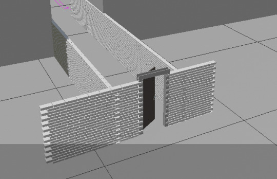
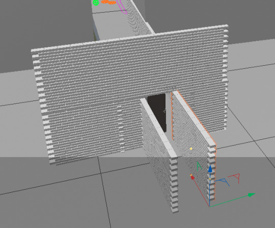
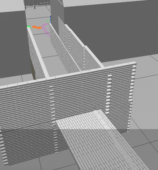
PROCESS OF DRAWING A MARKET DOOR
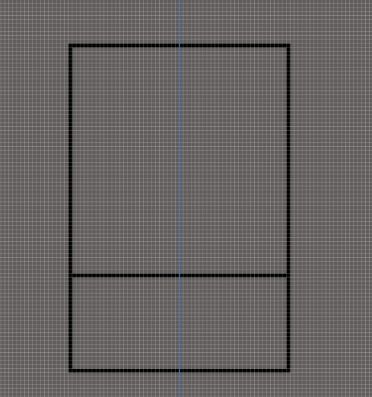
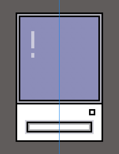
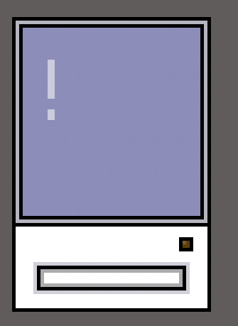
Here is my concept process pf how I want the door to look and what it will look like at the end of the alleyway. A strange door connected to a strange brick wall, Here is my concept. down below.
0 notes