
Statistics
We looked inside some of the posts by cloudythms-wip and here's what we found interesting.
Average Info
Notes Per Post
198K
Likes Per Post
100K
Reblog Per Post
98K
Reply Per Post
156
Time Between Posts
2 months
Number of Posts By Type
Text
11
Note
2
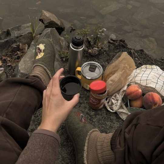
Photo
1
Link
1
Audio
2
Last Seen Tumblr Blogs


Fun Fact
In February 2021, Tumblr had 518.6 million blog accounts.

Note
Hey can I get an aesthetic for a cryptidcore (especially sasquatch and aliens) boy with an interest in vintage clothing, forensic science, camping and classic horror. thanks in advance, love your stuff


702 notes
·
View notes
Photo

Blue Ribbon Screamin’ Green (#3d3dff to #5ffb6c)
211 notes
·
View notes

Text
Title
Bigger
Biggest
Quote
Chat
Lucille
BLockquote
small text
asdasd asdf asdf asdf asdf dasf dsafs df
sfsdf
0 notes
Text
Arthur Weasley: Well, I manage my department, and I’ve been doing that for several years now. And, Merlin, I’ve learned a lot of life lessons along the way.
Molly Weasley: Your department’s just you, right?
Arthur Weasley: Well, yes, Molly dear, but I am not easy to manage.
5K notes
·
View notes
Text
“I want everyone to meet you. You’re my favorite person of all time.”
— Rainbow Rowell
3K notes
·
View notes
Text
A text post.
Here you can see an example of a text post. With bold text. And italic text. And some links. Strike-through.
A heading.
Blockquote
unordered
list
and
ordered
list
18 notes
·
View notes
Text
Example Post
Text
Header
Header 2
Header 3
Header 4
Header 5
Next
Link
And yeah
And
Text text text text text text text text text text
6 notes
·
View notes
Note
First of all, I want to say that I love your work. It makes me so happy! I'm pretty sure that has to do with your color scheme. So, I just wanted to ask, how do you choose your colors?
🌿 This website is amazing for color palettes and there’s so many of them to choose from! But I realized that I kinda suck at sticking to palettes someone else made so I gave up on using pre-made color schemes haha.
🌿For my art I always use soft colors with a pop of brighter/contrasting colors. I use Paint tool SAI as my main drawing program and I always have the HSV slider and color swaches options enabled.
🌿 I’ve saved a lot of colors on my swatch pad throughout the years (5 years so far) so when I’m coloring a piece I always choose from the colors I already saved and then I adjust them through the HSV slider if needed. Here’s my swatch pad:

🌿 When working on pieces with one dominant color I like to mix warmer shades with cooler shades of that color. Here’s my Sailor Moon piece as an example:

🌿 For my Kiki matching set I knew I wanted it to look soft yet have contrasting colors (‘cause that’s the kinda colors Kiki wears). Colors can also look different depending on what other colors you pair them with and even tho I picked a pink-ish color and a orange-y color for her shirt/cap and jacket,they actually come off more as red and yellow (at least that’s how I see it idk haha).

Keep reading
3K notes
·
View notes


Audio
So tied up and tired of this self-inflicted fight In spite of, I light up to lift my demons, I Tell myself I’m fine While I’m looking for a sign Is this body even mine? Feels good to be alive, but I hate my life
193 notes
·
View notes
Audio
PVRIS - Monster
How could you let them turn you into a monster? Your bridge started to burn when you ran all across it I guess you never learn ‘til you live and you lost it
86 notes
·
View notes