
Don't wanna be here? Send us removal request.
Statistics
We looked inside some of the posts by coasoom and here's what we found interesting.
Average Info
Notes Per Post
7K
Likes Per Post
4K
Reblog Per Post
4K
Reply Per Post
1
Time Between Posts
4 days
Number of Posts By Type
Text
17
Last Seen Tumblr Blogs


Fun Fact
Mobile Tumblr US users spend an average of 4.04 minutes per session on the app.


Text
"…good designs fit our needs so well that the design is invisible, serving us without drawing attention to itself."
1 note
·
View note

Text
Lightweight UI
a UI design approach
emphasizes simplicity, speed, and efficiency
both in visual design + system performance
common in performance-sensitive contexts
ex. embedded systems, mobile apps, automotive HMIs, IoT devices, and low-bandwidth environments
Core Characteristics
1. Minimal Visual Load
Clean, uncluttered layouts
Limited use of heavy graphics, animations, or transitions
Relies on simple typography + iconography
2. Optimized Performance
Fast load times + Snappy interactions
Low memory + CPU usage
Works well on low-power / older devices
3. Functional Over Flashy
Prioritizes clarity + usability over visual polish
Focus on task efficiency: fewer steps, clearer paths
Reduces distractions / non-essential elements
4. Modular & Scalable *
Often component-based + easy to scale or maintain
Designed with reusability and flexibility in mind
Use Cases
Automotive UI (e.g., dashboards, HMIs) – lightweight UI keeps driver attention where it should be
Wearables / IoT devices – limited processing power + screen size
Enterprise / industrial tools – prioritize efficiency + speed
Mobile apps in emerging markets – optimized for low-bandwidth / older devices
Design Techniques
Use vector-based assets instead of heavy images
Implement dark/light themes efficiently (e.g., token-based systems)
Avoid overly complex transitions or interactions
Limit / compress font families
Why Lightweight UI?
Improves performance & responsiveness
Enhances accessibility & inclusiveness
Reduces cognitive load & boosts usability
Essential for real-time environments (e.g., driving, AR, robotics)
Helps make critical information Glanceable + Responsive
0 notes

Text
High-context/ Low-context culture & design layout
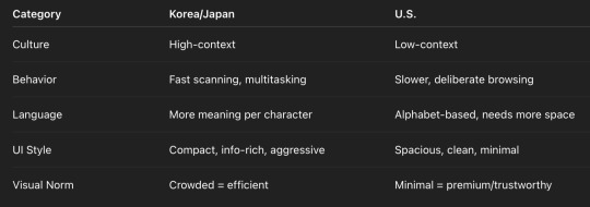
🇰🇷🇯🇵 Why Korea and Japan Prefer Compact, Information-Dense UIs
1. High-Context Cultures
Communication relies heavily on implicit understanding and shared context.
Users are used to scanning and interpreting dense visuals quickly.
People expect to see everything at once and make fast decisions.
Example: Japanese train station maps or Korean convenience store layouts — everything is packed but functions smoothly.
2. Urban Density = Screen Density
Both countries are densely populated and urbanized.
That lifestyle encourages efficient, action-oriented UI that fits lots of information in limited space — similar to a mobile-first environment.
Multi-tasking and speed are core habits; users are comfortable scanning and tapping quickly.
3. Character-Based Languages
Hangul and Kanji convey more meaning per character than alphabetic text.
So you can compress more information into fewer visual blocks, which leads to more compact design choices.
4. Retail & Media Culture
Asian consumer culture embraces visual noise — bold colors, badges, stickers, pop-ups.
Local e-commerce borrows from street markets and convenience store culture: more options, fast decisions. ---
🇺🇸 Why the U.S. Prefers Clean, Minimal UIs with Breathing Space
1. Low-Context Culture
Communication is explicit; people want clarity and directness.
Less is more — users expect hierarchical layout, clear CTAs, and visual cues.
2. Desktop Legacy + Aesthetic Minimalism
U.S. UI/UX evolved from desktop software, prioritizing content layout, white space, and modular design.
Apple’s influence (especially post-iPhone) introduced Western minimalism as the standard of "good design."
3. Slower Decision-Making Behavior
U.S. users often research, compare, and take more time deciding.
Clean UI with guided flows supports this behavior better than compact information blasts.
4. Cultural Association with ‘Luxury’ and ‘Trust’
Breathing space = confidence.
Minimalist design is perceived as premium, modern, and trustworthy.
0 notes
Text
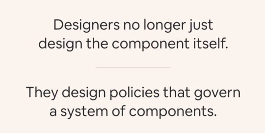
Design system:
Any set of decisions govern across the organization.
ex.
Apple: decisions about how to create services
Shopify: decisions about how to work within specific domains
Spotify: decisions about how to design for everything from the car to watch to a fridge
—
Teams need to work together to ensure the decisions align across the organization
—
Software products & Brand Experiences
0 notes
Text
• Design is relationship.
Relationships between ….
- what we make & think
- ppl we work with that may have different definition of design
- products & users
• System governs decisions that org already aligned around to automate the tasks designers used to do
• Design system is not only about UI components it’s a pattern.
ex. @airbnb it suggests hosts ~$ to charge based on the info about their place/ local trends in the market. Help hosts to make decisions … to reduce the effort ( researching / cost-savings)
• Design system’s measuring success : whether you’re bringing values to the customers ( in terms of their investment of time, emotional energy, mental and physical effort that they have to use in order to use your product.
• Patterns have to increase the quality of the (user’s) experience… if not, no matter how good the components look, they could be creating repeatable, unwanted frictions
• Designers serve needs
0 notes
Text
Design Thinking
Design thinking =
Creative Problem Solving using Human Centered Approaches -> putting your user (human/customer) within the environment as the center of the operating model
----
Step 1: - Understanding your customer: - Behavior, Facts, Pain Points, Needs
Step 2: - Define the goal & challenges
Step 3: - Ideate options of solutions / different approaches
Step 4: - Deciding on a solution
Step 5: - Prototype idea - to test the idea / flow with users - testing the hypothesis without having to spending more money at the point just yet
Step 6: - Validate - wether it works, has flaws, has opportunity to iterate & change the flow or change the design
----
Businesses that practice design thinking see 56% higher returns
0 notes
Text
Design System
Defines & organizes the element + logic that make up an ecosystem to make it teachable & scalable
Types: - (1) functional : HTML of individual - (2) perceptual pattern : ex. colors, styles, typography—unique brand voices
4 things (1) Principle: values that drive the ecosystem that you're defining (2) Guidelines: best practices that do's + don'ts, how to appy those values to the system (3) Patterns: meat + potatoes of a design system / the componentry (4) Practices: most important practice—how to keep a system alive + relevant. Design system has to grow with the ecosystem it serves. Practices defines how that happens.
4 thoughts on design system (1) Design system should be actionable & measurable (2) Design for quick-reference + glanceability (3) Get feedback often: satisfaction/easy of use/ efficiency/ usefulness/ findability/ accuracy (4) Find the soul
1. Create actionable principles
2. Edit
3. Get feedback
4. Find the souls.
0 notes

