
she is here to destroy youpenny. 25. she/her. #userpenny
Don't wanna be here? Send us removal request.
Statistics
We looked inside some of the posts by coldasyou and here's what we found interesting.
Average Info
Notes Per Post
193K
Likes Per Post
108K
Reblog Per Post
85K
Reply Per Post
78
Time Between Posts
18 minutes
Number of Posts By Type
Text
15
Photo
2
Last Seen Tumblr Blogs


Fun Fact
In 2020, 27% of US Tumblr users had an annual household income of over $100,000.
Text

crazy discography to have
3 notes
·
View notes
Text
why does no one talk about how hard it is to have one sided beef with a popular tumblr user
7 notes
·
View notes
Text

grey's anatomy
grey's anatomy
grey's anatomy
the version of the good doctor I made up in my head where shaire is canon
prodigal son episode where malcolm blackmails a brain surgeon about his extramarital affairs to interview a witness who was still being operated on
grey's anatomy
bones episode where zack burns his hands off bc he's helping a cannibal serial killer
grey's anatomy
grey's anatomy
chicago med
10 notes
·
View notes
Text
oh fuck this is a really good hill i gotta die on this
127K notes
·
View notes
Text


Can't stop, won't stop moving ⭑ EVERY 1989 SET COMBO › Orange & Yellow
95 notes
·
View notes

Text

listening and learning
#personal#taylor posting#im so happy for u and ur ugly boyfriend and the fact that i have to keep hearing about football more than normal im serious
8 notes
·
View notes
Photo


16 year old Taylor is really upset over this sign demanding that she smiles (X)
904 notes
·
View notes
Text
looking at your bank account is so scary...like when I spend money it goes away
16K notes
·
View notes
Text


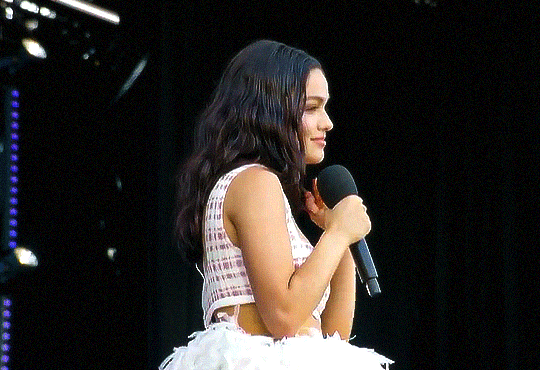
rachel zegler as evita perón / west end live 2025
27 notes
·
View notes
Text
I need TS12 sorry I can’t pretend to be cool about it like the rest of u I need a reason to act insane about taylor swift again
17 notes
·
View notes


Photo
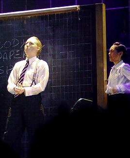

We need to find a corpse! A dead man. Of course!
45 notes
·
View notes
Text


The 1989 Tour
June 23, 2015 - Glasgow, Scotland
102 notes
·
View notes
Text


TAYLOR SWIFT - THE ERAS TOUR London, N4 // Who's Afraid Of Little Old Me?
57 notes
·
View notes
Text

Eras Tour - November 14, 2024 | Toronto, Canada
13 notes
·
View notes