Text
Reflection:
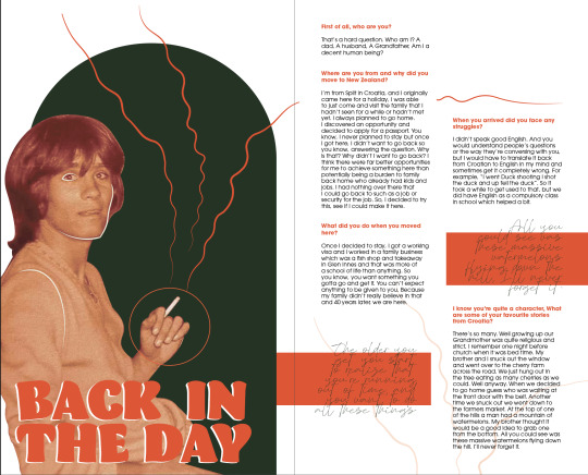
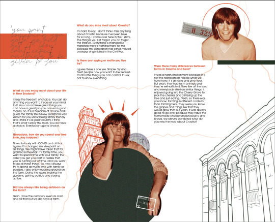
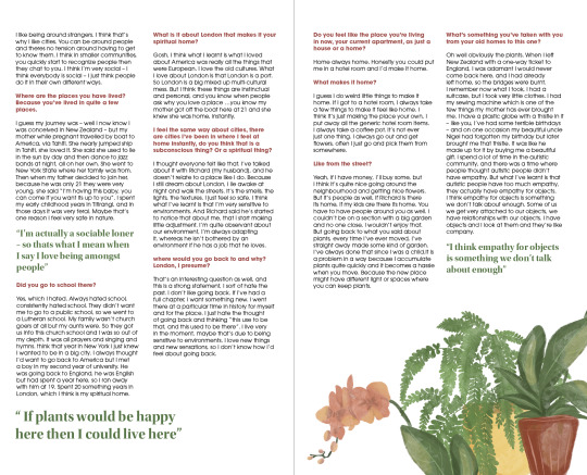
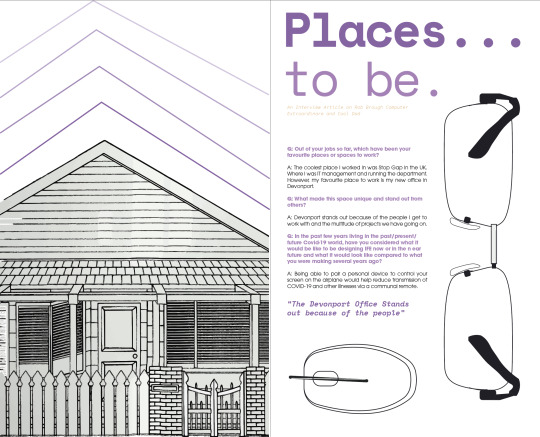
When I look back over this assignment I am very proud of the body of work I have created and produced. This assignment has taught me the importance of time management and given me a real insight in time frames for projects in the design industry. My strong point in design is digital illustration and I feel like the imagery I have generated throughout this project is strong and I am very proud of it. I feel like I used this aspect to my advantage when creating these designs. I have never previously worked with other people work before so found this a little bit difficult at the start however thoroughly enjoyed this as it gave me insight into working around things I don’t necessarily like and change/adjust them to make them more cohesive and fitting with other aspects of my publication design. I adjusted things such as text columns, font size, font styles, colour, image layouts and a couple more things that helped me create a publication that was cohesive throughout. If I had longer I would have experimented more and played around with layout, as I could’ve improved on this if I was given more time. Something else I would work on next time would be creating a range of concepts and developments rather than have only a few of each. In conclusion, overall I feel asthough I have produced my best work in the time frame given and have created variations to the best of my ability to put forward to my final project. I feel like this design is fitting towards each individual interview included within this publication design and overall I think it presents the work well.
0 notes
Photo
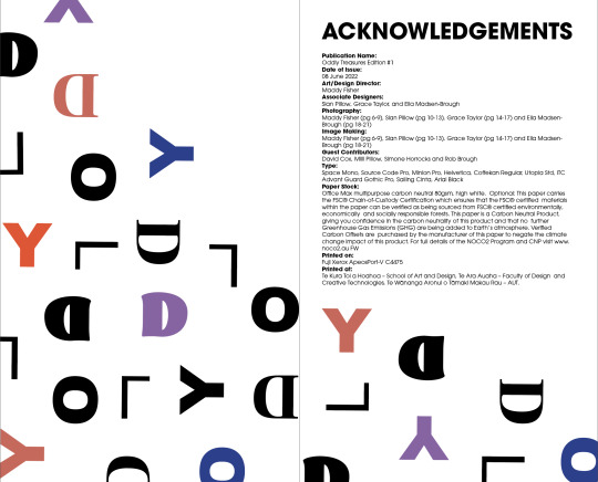
Inside Back Cover and Acknowledgements Pages FINAL
0 notes
Photo

Cohesivity of Front and Back Cover: Front and Back Cover Pages FINAL
I wanted to incorporate similar elements between these two cover pages. I did this by keeping it simple yet informative and subtle. I added in elements from each article/intervioew inside to add a bit of character to this design.
0 notes
Photo


Back Cover Concepts:
I created two very different background cover concepts to allow for me to have a contrast between the two options. I want to make it cohesive and flow well together when put with the front cover so from here I will pick and choose which fits best.
0 notes
Photo


Contents Page Ideas:
I started off by scattering the numbers all over the page however thought it looked messy and wasn't very clear to read. I then changed this to be in a similar layout to my front cover using the black lines and bold/regular font styles.
0 notes
Photo

Updated Acknowledgements Page:
I updated this for the final print out of my publication.
0 notes
Text
Change in Acknowledgements Page:
The original text I used in my acknowledgements page wasn't the correct format. So I changed and corrected this when doing the final edits to my design.
The new text contains the more important elements that need to be acknowledged:
Publication Name:
Oddly Treasures Edition #1
Date of Issue:
08 June 2022
Art/Design Director:
Maddy Fisher
Associate Designers:
Sian Pillow, Grace Taylor, and Ella Madsen-Brough
Photography:
Maddy Fisher (pg 6-9), Sian Pillow (pg 10-13), Grace Taylor (pg 14-17) and Ella Madsen-Brough (pg 18-21)
Image Making:
Maddy Fisher (pg 6-9), Sian Pillow (pg 10-13), Grace Taylor (pg 14-17) and Ella Madsen-Brough (pg 18-21)
Guest Contributors:
David Cox, Milli Pillow, Simone Horrocks and Rob Brough
Type:
Space Mono, Source Code Pro, Minion Pro, Helvetica, Coffekan Regular, Utopia Std, ITC Advant Guard Gothic Pro, Sailing Cinta, Arial Black
Paper Stock:
Office Max multipurpose carbon neutral 80gsm, high white. Optional: This paper carries the FSC® Chain-of-Custody Certification which ensures that the FSC® certified materials within the paper can be verified as being sourced from FSC® certified environmentally, economically and socially responsible forests. This paper is a Carbon Neutral Product, giving you confidence in the carbon neutrality of this product and that no further Greenhouse Gas Emissions (GHG) are being added to Earth’s atmosphere. Verified Carbon Offsets are purchased by the manufacturer of this paper to negate the climate change impact of this product. For full details of the NOCO2 Program and CNP visit www.noco2.au FW
Printed on:
Fuji Xerox ApeosPort-V C4475
Printed at:
Te Kura Toi a Hoahoa – School of Art and Design, Te Ara Auaha – Faculty of Design and Creative Technologies, Te Wānanga Aronui o Tāmaki Makau Rau – AUT.
0 notes
Photo

Inside Cover Page:
I have decided to stick with this design, I added in come colour to the original black and white design and I feel like it matches the publication a bit more and adds some character.
0 notes


