Statistics
We looked inside some of the posts by conveyinformation2023 and here's what we found interesting.
Average Info
Notes Per Post
0
Likes Per Post
0
Reblog Per Post
0
Reply Per Post
0
Time Between Posts
4 hours
Number of Posts By Type
Text
16
Link
1
Last Seen Tumblr Blogs


Fun Fact
BuzzFeed published a report claiming that Tumblr was utilized as a distribution channel for Russian agents to influence American voting habits during the 2016 presidential election in Feb 2018.
Text

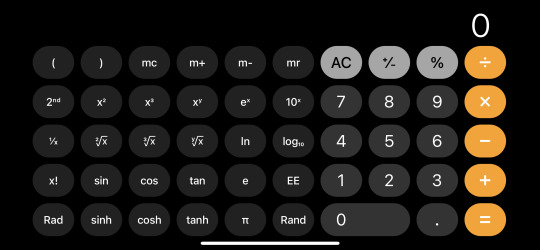
Calculator
The weather app is another essential in the iOS system. It functions as a simple calculator when it’s on the vertical screen. One could use it for very simple calculations on the vertical screen. However, when one turns it on a horizontal screen, it works as a fully functional scientific calculator with log, ln, square root, etc. The color scheme of the app is very consistent whether it’s horizontal or. vertical screen.
-yiwen
0 notes
Text

Weather
The weather app is essential in the iOS system. It is very simple and easy to navigate. The background of this app is the current weather for the current location. One could quickly scroll the entire page to see the weather for different cities or scroll the weather row to see the future weather.
-yiwen
0 notes
Text
The following exercise is based on a discussion created by Professor Andrew Davies from VCU in Richmond.
It's a debate.
The question is: Do we need new fonts?
The class will separate into two groups and be given a position: For New Fonts or Against New Fonts.
Each group will be asked to make a 30-second opening statement.
Following both statements, the group For New Fonts will make their argument and present evidence in a three-minute presentation. The group is allowed up to five slides (in Google Drive > Exercises > Debate).
The Group Against New Fonts will follow with a three-minute presentation. The group is allowed up to five slides (in Google Drive > Exercises > Debate).
The group For New Fonts will have one minute to rebut the group Against.
The group Against New Fonts will have one minute to rebut the group For.
You will have 20 minutes to prepare, and three minutes to prepare the rebuttals. You can use any readings or research. These resources will help frame the debate.
• This Quora thread on Why do we need more fonts?
https://www.quora.com/Why-do-we-need-more-fonts
• This Envato post and video on the Death of Helvetica & Rise of Bespoke Fonts
https://www.envato.com/blog/death-of-helvetica-rise-of-the-bespoke-font/
• This Fast Co. Design post on Designers at Top Companies don’t use trendy fonts
https://www.fastcompany.com/90220770/designers-at-top-companies-dont-use-trendy-fonts-heres-what-they-use-instead
0 notes
Link
0 notes
Text
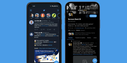
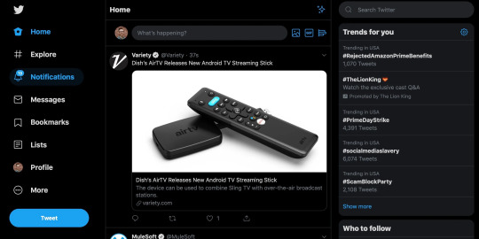
Twitter's app has gone through multiple iterations over the years, but its current version is pleasing to look at and functional. Also it's an example of a UI that's adapted well to both mobile and PC interfaces, providing a similar experience and feel regardless of platform.
Nick
0 notes
Text
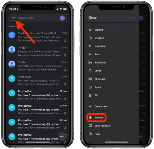
The Gmail app is a good example of simplicity done right. The app keeps everything readable and organized while remaining aesthetically pleasing. Also, every action is only one or two gestures away, making it easy for the user to get to their desired page quickly and efficently.
Nick
0 notes
Text
Safari
Safari is an essential app for any iPhone user, including me. I use this app daily, and it has a great design built for productivity. It is elementary to open the tab browser (just a click on a self-explanatory icon), but even easier is to swipe the navigation bar below to open the following tab. The URL bar was also moved to the bottom of the app. It is easier to reach it, and entering an URL or searching in a search engine requires only one finger (previously, it used to be at the top).
-Julius
0 notes
Text
Headspace
Headspace functions as an easy to use app. The purpose of the app matches the layout very well. This small clip of the opening screen is very simple yet serves as a reminder of what the app is, even before going into using it. It is very creative and simple.
-Judine

0 notes
Text
Contacts
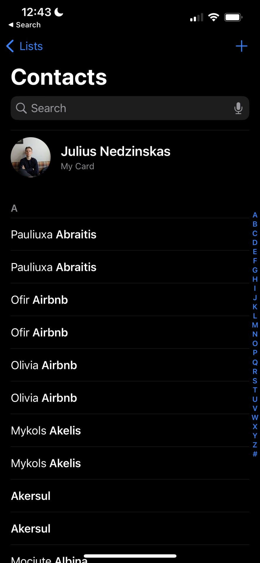
The contacts app is very straightforward and very intuitive. There is only a little in the app besides the list of contacts, a search bar, and a scroll bar that filters contacts by the starting letter of the name. The contacts app comes natively with iOS and is effective. Clicking on a contact yields a simple page with all the information associated with the given contacts, such as phone number, notes, links to FaceTime, and a picture.
-Julius
0 notes
Text
Saatchi Art
Saatchi art app is very easy to use and serves its purpose of showcasing art very well. The information including price, title and artists are available and clicking on the art, will expand to give me details and information. You can save favorites and revisit them. It is helpful and friendly for both consumers and sellers.
-judine
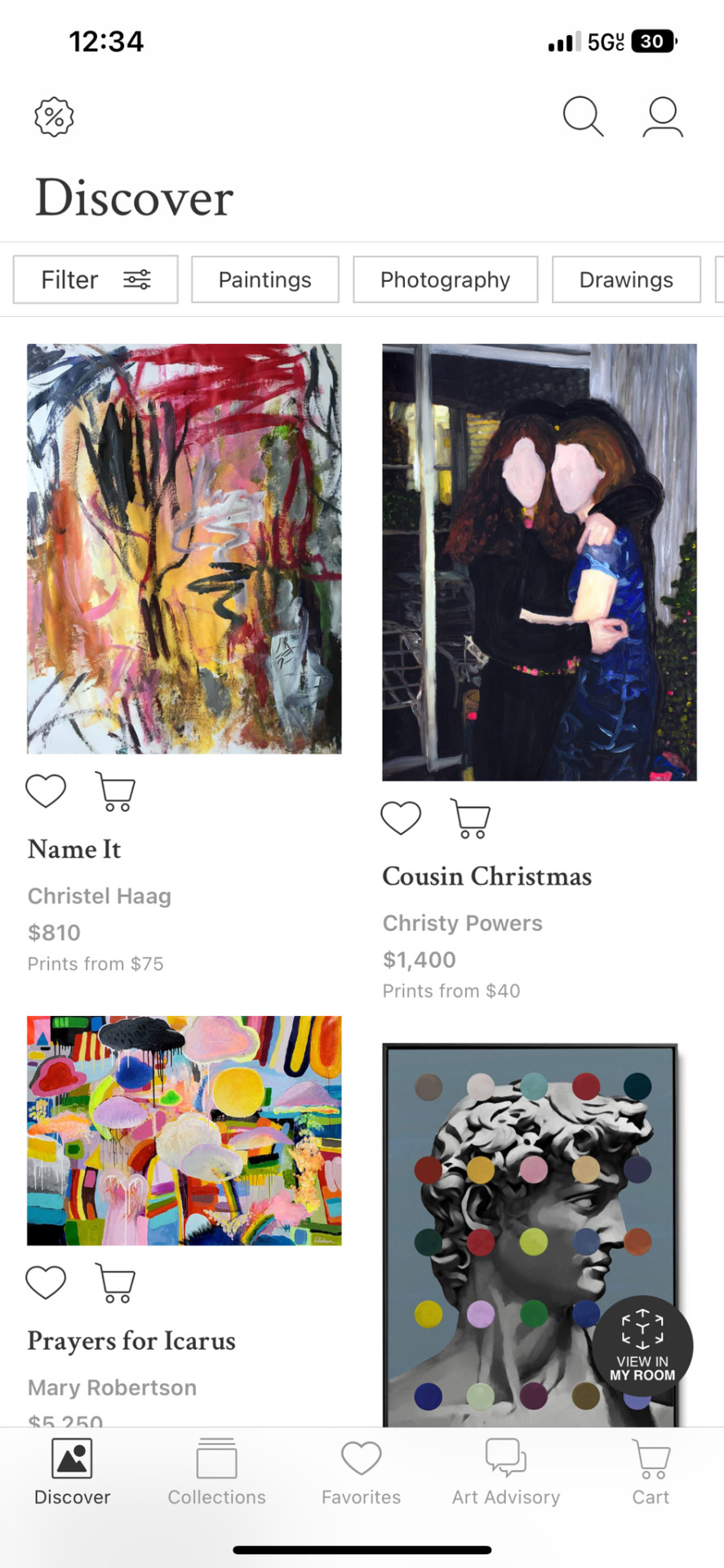
0 notes
Text
Lyft
The design of Lyft is straightforward. Since its major function is to order a drive, the large-scale map showing where the nearest car is can provide an authentic look at how long would the user wait. Also, the street name can tell the users their location.
Morin
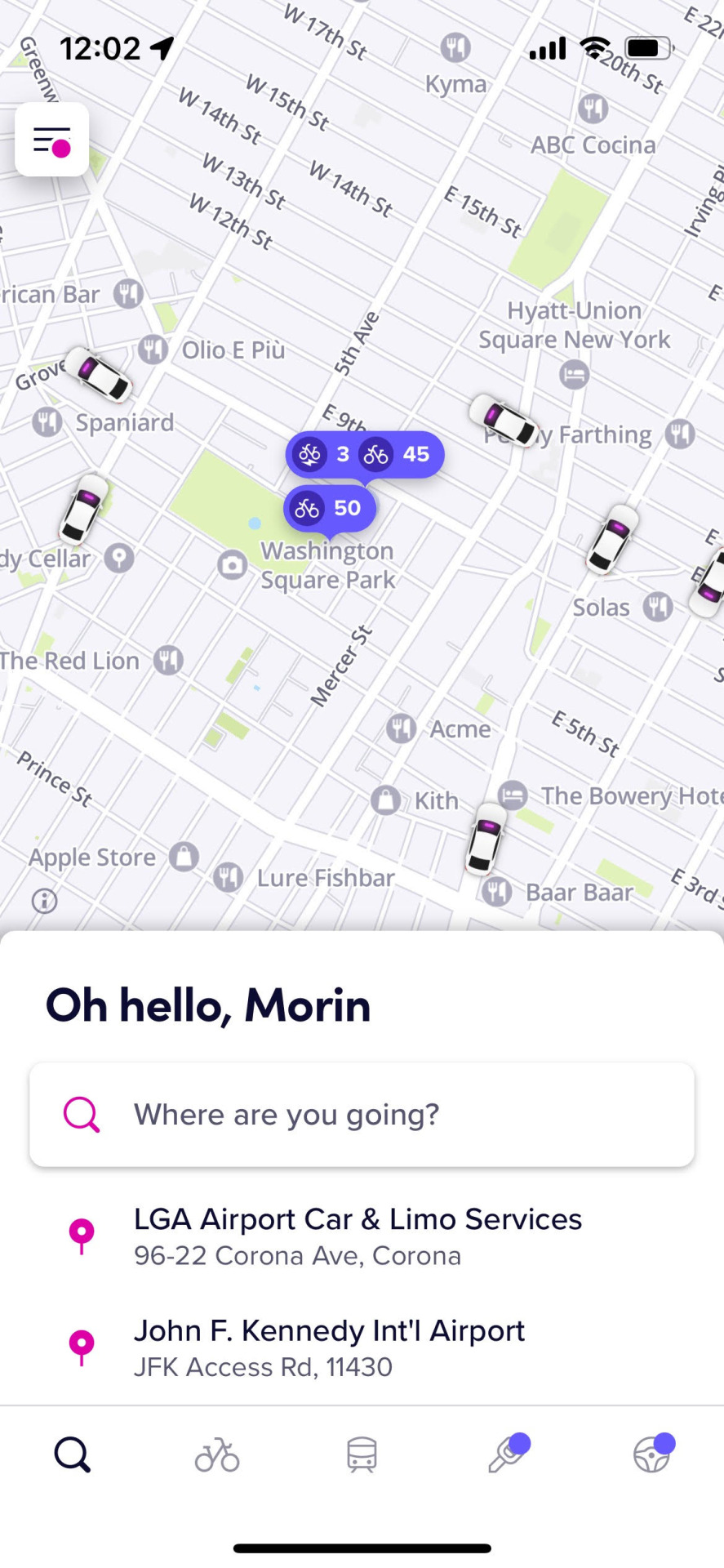
0 notes
Text
Bank of America
The main page of BOA is clear, and it provides the most important information about the user's account (which is also what most users want to see when they open the app) once they open the app. The icons at the bottom are not too condensed and therefore easy to tap on.
Morin

0 notes
Text
Homework: Due Thursday
Your final assignment is to design six high-definition wirefames for an iOS or android app. You are not creating an actual app, but a polished mock up or prototype of what that app would look like on a small screen. Your focus should be spent on the look of your screens more than the user experience or the actual content. That said, you are welcome to upload your files to something like InVision to create a working prototype. https://www.invisionapp.com/cloud/prototype
This assignment will require several skills that you have picked up throughout this class: kerning and line spacing, type combinations, basic layout and alignment, and a custom typeface.
Here are some questions to get you started:
What is the purpose of this app? Who will use it? What do you need to communicate to your user? What content needs to be on each page? How will you establish hierarchy?
Here are Apple’s interface guidelines for iOS, which will be very useful for designing your app (especially Visual Design > Adaptivity and Layout:
https://developer.apple.com/design/human-interface-guidelines/ios/overview/themes/
And the somewhat more complicated Android guidelines:
https://developer.android.com/design/
You may use Illustrator or Indesign for your wireframes. If you'd rather use something like Adobe XD or Sketch or Figma just let me know in advance. The final project will be submitted as a PDF via drive.
You can design your own app, or you can create designs for one of the following (fake) apps:
Unicorn Rainbow, game Mutiny, game Days and Weeks, calendar app Paparazzi, photo app Netwerk, social Mews, cat news Your own project
The deliverables of this project are somewhat flexible, but I am firm on one issue: You may not use more than one image. This is a typography class, and I want to see type-based designs. (Geometric design elements like boxes, circles, triangles, and lines are fine.) This is another way of saying that you should probably start this project by thinking about a logo or an icon.
Here’s a deliverables checklist for the final project:
A custom logo or wordmark for your app. 1024 x 768 pixels. Possibly using your custom type. Icon for your apps, one at 180 x 180 pixels and one at 1024 x 1024 pixels (app store), or one at 192 x 192 pixels (android). Six high-definition wireframes. A custom gif that could be used as a load screen or for marketing purpose, 480p, six seconds max. At least one wireframe must include a chunk of type (maybe three paragraphs). At least one wireframe must include a list.
Here are your deadlines:
THURSDAY, JANUARY 19:
A custom logo or wordmark for your app. 1024 x 768 pixels. Possibly using custom type. Icon for your apps, one at 180 x 180 pixels and one at 1024 x 1024 pixels (app store), or one at 192 x 192 pixels (android). Four high-definition wireframes. At least one wireframe must include a chunk of type (maybe three paragraphs). At least one wireframe must include a list.
FRIDAY, JANUARY 20:
A custom logo or wordmark for your app. 1024 x 768 pixels. Possibly using custom type. Icon for your apps, one at 180 x 180 pixels and one at 1024 x 1024 pixels (app store), or one at 192 x 192 pixels (android). Six total high-definition wireframes (including revisions on the previous four). A custom gif that could be used as a load screen or for marketing purpose, 480p, four seconds max. At least one wireframe must include a chunk of type (maybe three paragraphs). At least one wireframe must include a list. Two reviews of apps with good design posted to Tumblr.
Here are two ways of elaborating on some of the fake apps suggested above:
Mutiny (i based the following screens on the games 2048 and threes)
1. game screen with icon and score. buttons for best score, menu, and leaderboard
2. menu screen with the following buttons: keep going, new game, multiplayer co-op, multiplayer vs, how to play, and rate.
3. how to play screen: swipe right to kill, swipe left to love, love your friends, vanquish your enemies.
4. high score screen: 56476, 44136, 35044, 27236, 15892
5. options screen: music, sound effects, colors, show status bar, main menu
6. special thanks screen: special thanks to those who went out of their way to support us: mom, dad, and jeff stark. voices by: Harold Lloyd, Douglas Fairbanks, Clara Bow, Theda Bara, Lillian Gish, Charlie Chaplin, Buster Keaton, and Greta Garbo.
7. about screen (adapted from wikipedia): Mutiny is a single-player puzzle game created in January 2023 by NYU developer xxx, in which the objective is love your friends and vanquish your enemies. It is a type of puzzle game, and is very similar to several other games, but better. XXX created the game in a single weekend as a test to see if she could program a game from scratch, and was surprised when his game received over 4 million visitors in less than a week, especially since it was just a weekend project. The game is free to play and makes the world better every time someone spends an afternoon mindlessly swiping, swiping, swiping. The game runs on open-source code and has led to many additions to the original game, including a score leaderboard and improved touchscreen playability. Spinoffs have been released, but none of them are as good as the original.
Paparazzi (i based this on hipstamatic, with a shout out to Lady Gaga)
1. Paparazzi App Icon
2 Launch File (can be animated)
3. Captioned photograph screen: Add caption. Sample caption: Sarcasm is the lowest form of wit, but the highest form of intelligence.
4. Edited screen: No edits. Photos you have edited with Paparazzi will appear here
5. Store screen: Featured: Retropak 9. With buttons for “featured,” “search,” “print lab,” and “my gear.”
6. Art School Film. Angular and moody. Popular back when photographers spent more time in the darkroom than the studio. Makes everything look more interesting.
7. about screen (adapted from wikipedia): Paparazzi is a digital photography application for the Apple iPhone and Windows Phone. It uses the phone’s camera to allow the user to shoot square photographs, to which it applies a number of software filters to make the images look as though they were taken with a vintage film camera. The user can choose among a number of effects which are presented in the application as simulated lenses, films and flashes. Several of these are included with the application, while others may be acquired through an in-app purchase. The application has sold four million copies as of January 2023. Paparazzi is part of a retro trend in photography, which has seen a rise in the popularity of cheap and technically obsolete analog cameras (such as Lomography and Polaroid instant cameras), as well as software filters and smartphone software that emulate such cameras. Other vintage photography applications include CameraBag and Instagram. Like Hipstamatic, they often include social networking features. Some phones include similar built-in filters.
0 notes
Text
Exercise: Wordmarks
In class, design five professional wordmarks on five square artboards. Use your name for each design. To be clear, your wordmark will only be your name -- not your name plus your title. You must communicate what you do with only the type selection and layout of your design. Type only; no images or illustrations.
Here are your five jobs:
Designer Lawyer Gardener Professional race car driver Librarian
Consider type selection, kerning, and alignment in each of your designs. Consider sticking with our classics: Bembo, Garamond, Janson, Caslon, Baskerville, Bodoni, Serifa or Rockwell, Futura, Gill Sans, or Univers. You can use any or multiple styles, including Roman, Italics, Bold, Light, Condensed, or Extended.
0 notes