
Don't wanna be here? Send us removal request.
Statistics
We looked inside some of the posts by creativeprojectemmamarie and here's what we found interesting.
Average Info
Notes Per Post
0
Likes Per Post
0
Reblog Per Post
0
Reply Per Post
0
Time Between Posts
5 days
Number of Posts By Type
Text
17
Last Seen Tumblr Blogs


Fun Fact
Tumblr was attacked by a cross-site scripting worm deployed by the Internet troll group GNAA on Dec 3, 2012.
Text
Project Statement
This project explores the aesthetics of digital femininity and confessional internet culture through a series of ‘painted memes.’ Combining text in Arial font with symbolic imagery, the work appropriates the structure of Instagram meme art while drawing from influences like surrealist folk art and Tumblr-era visuals. Rooted in my experience of a recent breakup, the work explores longing, miscommunication, and my urge to be understood. The slow, meditative painting process contrasts with the immediacy of digital media, critiquing the attention span crisis.
0 notes


Text
Reflection
order of the paintings - to tryptich or not to tryptich
With the completion of the 4th painting, I am considering which order I will exhibit them in. I can present them in the order in which they were painted (Queer, 3WW, Nara)) or in the way that I feel flows better narratively (Nara, Queer, 3WW). I will omit the first painting because I feel like the text is not precise enough.
I had intended to sandwich 'Nara' between the two text-only pieces, to create a balanced and symmetrical look. However, as my technique has improved alongside the varying configurations of the projector, as it meant that each painting's typeface will look slightly different (wider, narrower, spacing), they may not look cohesive as a triptych. I think it's important for me to hang all the works together, as this will be the only way to know what looks best. I'm not just considering aesthetics alone, but also how the works feel together in space.
The difficulties of the projector have made the fonts slightly different widths, meaning the visual cohesion may already be broken. With this difference, the need for visual symmetry could become less important. could make the need for visual symmetry less important overall
The slight visual inconsistencies between the work don't have to detract from cohesion. I read this as mimicking the appearance of an Instagram explore page. It reinforces the appropriative nature of the work as I'm not simply appropriating text, but the mode of presentation itself (with an analogue twist).
0 notes
Text
Painting 4: Process


I stretched, gessoed and sanded the canvas before painting several layers of baby pink paint to create the solid background. I found a reference image for the beetle and painted the image onto a sheet of paper, which I tediously cut out with a scalpel. I kept the finished beetle inside a book to keep it flat and safe.
I used the projector again, with the tripod pointed towards the wall. I hung the canvas from a nail on the wall so the projected image would be flat. I used Pages to type out the text and adjust the size, alignment and spacing of the text until I was happy.
I used a washable Crayola marker to carefully trace the letters, using a ruler to ensure the straight lines were precise. Once the letters had dried, I used a wet wipe to remove the bulk of the pen, leaving a fainter outline that would mean painting over it wouldn't require several layers to cover the pen lines.


Reflection
The painting comprises a baby pink background, chosen for its hyper-femininity and echoing of Tumblr era digital girlishness. The beetle was painted onto paper, cut out and glued to the canvas. It's flat and has an almost digital appearance. The work draws upon the surreal, especially in relation to Frida Kahlo's use of floating objects.
The painting is once again inspired by meme structure, where a confessional or emotional phrase in an Arial font is paired with seemingly random and out-of-context object/s. The contrast in image and language creates a conflict between the sincere and the absurd.

In my painted appropriation of the memes, the stag beetle acts as the 'random object' I chose the beetle intuitively - it just felt right. The contrast is also important, with the text evoking romanticism, passion and emotion while the beetle is unsettling and creepy.
I grew up next to several areas of English woodland, where I'd often come across stag beetles. They freaked me out, spotting them was always a heart-racing encounter. My association with beetles is a sense of unease. In this work, I place something deeply visceral next to something emotional.
The romantic sentiment of the piece is disrupted by the beetle's presence. It echoes where I am with my love life - still passionate and believing in love despite its ugliness. Through making this body of work, I was able to process and understand my feelings post-breakup. The conflict in the work echoes the conflict in my life.
The text 'love is the warmest colour' is appropriated from Alt-J's song Nara from their 2014 album This Is All Yours. The song suggests love is not a passive feeling - it is consuming, immersive and emotionally charged. In the context of my work, it highlights that love exists, even in the midst of emotional disconnection.
Its visual parallels to memes (Arial font, surreal juxtapositions) suggest the work is meant to be consumed instantly. The making of the work, however, was the complete opposite. It was slow, repetitive, focused and deeply meditative.
Through this, I explore the speed of visual language, especially within memes. They are quickly consumed, low effort and digestible. This reflects the modern attention span, with the masses consuming short-form content, especially on social media platforms like TikTok and Instagram.
I built each canvas by hand through a process of rigorous preparation. Painting the text required intense precision, which I gained more skill and knowledge of with each painting. I lettered by hand with acrylic paint and tiny brushes. I made micro-adjustments using a damp, firm brush to perfect every line. The process demanded total concentration and opposes the previously mentioned fast-paced digital mindset in every way. I listened to entire discographies while I painted, and my back hurt - a lot!
In my recreation of these memes as physical paintings, I slow down the act of viewing. The meme becomes less of a disposable unit of feeling and more of a tangible object.
0 notes
Text
Painting 3: Process

For this painting, I improved my technique tenfold. I hung the canvas on the wall when projecting to ensure the projection was not warped. I made sure everything was level using a spirit level. I traced over the letters using the washable marker and then painted over each letter in slow, careful strokes. Each letter took me around 45 minutes, as I continually cleaned up any misshaping in the letters with a damp, firm brush.

For the letters that were repeated through the text - t for example, I used parchment paper to trace the first t I had painted and hold over the next t to ensure they were completely identical. Duplicate letters, especially in the same row, are definitely the easiest way to tell if there are inaccuracies, so this was important to get right!

By the end of the painting, the difference in how neat the letters were compared to the previous two paintings was astounding!
reflection

This revised version of the 'Queer' painting was made with the same motivation as the original, however is strikingly more neat, with its almost printed appearance. The neatness really allows the font to shine; it's unmistakably Arial!
I'm delighted with the outcome of this work and the development of my skills. I will omit the original painting from the triptych in favour of this one.
0 notes
Text
Painting 2: Process
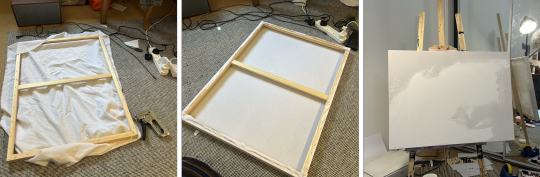
I stretched and stapled fabric onto the canvas frame, applying several layers of white gesso and sanding the surface smooth using sanding blocks as each layer dried. I felt the bumpy surface would make precise lettering difficult as the brush wouldn’t glide over the canvas smoothly. I felt this extra preparation step was absolutely necessary.
These are ways that I adapted as I faced a problem, meaning each painting became more technically refined. My favourite way to learn is on the job, experimenting and letting my intuition guide me!

I improved the accuracy of my technique by borrowing a tripod from a friend to allow me to manoeuvre the projector. I also set up the projector and canvas at opposite sides of the room, so that they could face each other directly. Angling the canvas as upright as possible helped to get the text straight.

I used a light red pen to sketch out the letters. This was tedious as I had to ensure I wasn't warping the canvas too much with the pressure of my hand, which could lead to the letters being uneven. I also had to be careful not to block the projection with my body, meaning I angled myself according to which letters I was tracing.
I decided to split the text into two sections by using different colours. I filled in the lines carefully with red paint, trying to keep the lines as straight as I could through slow, steady brushstrokes. Next, I mixed a baby pink colour and filled in the top section of the text. I found difficulty in this as the paint was lighter than the pen underneath - a product of my not having a plan when I started the text. I had to paint several layers of pink to get an opaque result, which left the words more textured than the red text, an effect which I wasn't necessarily happy with. In hindsight, I wish I had used a better quality pink paint, like I had with the red.
The text 'I just want to love you in my own language' is taken from track 3WW from Alt-J's 2017 album Relaxer. The title stands for 'three worn words' in reference to 'I love you'. The song explores themes of love and fleeting intimacy in a melancholy tone.
youtube
Reflection

I will refer to this work as '3WW' until I decide on a title.
The phrases in '3WW' and 'Queer' capture the difficulties of emotional connection and communication in romantic relationships as well as the frustrating impossibility of fully expressing yourself to another person. This piece is only text, emphasising the rawness of the statement.
I chose this line because it directly mirrors my feelings of not sharing the same internal language as my partners in past relationships, and acknowledgement of a communication barrier despite my desire to love fully.

After completing the third painting (queer version 2) I revised this painting with my new techniques and was able to straighten, neaten and tweak the letters so they looked more uniform.
0 notes
Text
Theoretical Research
Glitch Feminism

Legacy Russell, Glitch Feminism: A Manifesto, 2020
The term 'Glitch Feminism' was coined by writer Legacy Russell. Her 2020 book Glitch Feminism: A Manifesto expands these ideas, proposing the 'glitch', being an error, or digital interruption, as a radical act of resistance against systems that try to categorise and control identity.
Core ideas of Glitch Feminism
A glitch is a refusal to perform 'correctly', breaking the expected pattern. In technical terms, it represents a failure, but is reclaimed by Russell as a creative and political tool. Embracing 'wrongness' is a form of resistance.
Identity, sexuality and identity are recognised as programmable systems, and the glitch allows us to break free from this rigidity
The internet is a space for reinvention and shapeshifting rather than inauthenticity. Glitch feminism sees the digital space as a space of becoming, especially for queer, trans and femme individuals.
The glitch is anti-performative and rejects the pressure for femme bodies to be perfect and consistent
These ideas can be applied to contemporary art in several ways
embracing digital errors and distortions
Use avatars or alternative personas to resist the idea of a fixed identity
turn 'failures' (emotional, aesthetic or political) into artistic forms
work with themes such as non-normative desire, queer intimacy, internet melancholy, anti-perfection
I used the following videos for research:
youtube
Talk by Legacy Russell on Glitch Feminism
youtube
Cyberfeminism as Glitch & Archive: A Conversation with Legacy Russell & Mindy Seu
I find that my work mirrors the ideas of glitch feminism in several ways.
My work embraces tenderness, yearning, girlhood and confession, which have historically been dismissed as weak, messy or excessive, especially in relation to womanhood
The laborious painting of a digital format is glitchy, it ruptures time, expected media and attention
My format, associated with disposability, being the fast-paced, easily digestible meme, is made tactile and permanent. This mirrors glitch feminism as I subvert the expected in my changing of the pace and the personalness of the meme.
0 notes
Text
Reflection
Painting 1

I initially approached this project through the lens of feminist theory, particularly Barbara Creed's theory of the monstrous feminine. However, I soon felt restricted in ways I couldn’t fully articulate. Nothing clicked creatively. Instead of feeling inspired, I felt paralysed. It became clear that I needed to let go of theoretical frameworks and follow my instincts to create whatever felt right. In doing so, I relieved the anxiety that comes with creative stagnation, which also helped me to make creative decisions.
I felt the work was much better aligned with the brief of appropriation, but more importantly, I felt profoundly more connected to exploring this brief.
Though I consider myself a writer before a painter, I was drawn towards shaping other writers' words to fit my own narrative, curating fragments of text that resonate with my experiences. This approach allows me to explore meaning through the lens of existing language, highlighting how words can be repurposed and recontextualised to serve new emotional and thematic purposes.
My work also appropriates structure. It borrows from meme aesthetics while drawing inspiration from Mexican folk art and the surrealist nature of Frida Kahlo’s work, with the floating symbolic objects in my paintings echoing Kahlo’s visual language.
My choice of the Arial font used in the memes that inspire my work further develops the layers of appropriation. Arial as a font is ubiquitous - it is everywhere. It evokes the detached quality of internet memes. This contrast between raw feeling and digital disconnectedness reflects how intimacy and vulnerability are handled on the internet. There is a tension between sincerity and detachment that I explore in this work.

Upon reflection, I feel that the text on the painting does not feel precise and clean enough. I want it to look exactly like the font as it would be on the screen. I feel that this work was a good way to get a benchmark test on my lettering ability and gave me insight into how I may make my process more carefully considered for the next work. I plan to use a tripod with my projector so I can more precisely align the projected text with the canvas. I will also be slower and more careful with my tracing of the letters and use a lighter pen colour to mean the paint used to cover can be more watered down for ease of painting. Finally, I will try cleaning up each letter as i paint it, ensuring that the lines are straight and neat.
0 notes
Text
Painting 1: Process
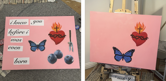
After stretching, sanding and gessoing the canvas, I painted a sacred heart. I felt drawn to place it in the space on the painting's right. This was the only imagery I knew that id wanted to include before I had even finished making the canvas. I printed out images of other possible imagery, such as a butterfly, blueberries and a braid of my hair. I arranged them on the canvas to work out a rough idea of what composition I liked around the Sacred Heart. I hadn't solidified my choice of text at this point, but I used 'I knew you before I was even born' as a placeholder.
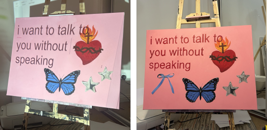
I eventually settled 'I want to talk to you without speaking', taken from Luca Guadagnino's 2024 film Queer. The film is set in 1950s Mexico City and closely follows addict Lee as he becomes infatuated with a younger man, Allerton. The two embark on a journey through the Jungle in search of yagé, a plant believed to provide telepathic abilities to the user, so that Lee may finally understand Allerton the way he longs to.
The phrase used in this expresses a desire for deep understanding, a connection beyond words, but also suggests an impossibility in that connection.
I used a projector, resting it on a pillow and angling it so the text fit in the space around the objects. I traced over the words in pencil, which I found quite difficult, especially with the slant of the canvas on the easel.
The Arial font is a hallmark of popular internet memes, making the phrase feel somewhat impersonal. This contradiction between the deep emotion presented and its detached format mirrors the emotional disconnect and lack of communication experienced in my recently ended relationship.

I will refer to this work as 'Queer' until I decide on a title.
The first painting outcome comprises:
Imagery:
The floating symbols, flat in composition, take inspiration from meme formats and surrealist/folk art.
Sacred Heart - a traditional catholic symbol of divine love and suffering, suggesting devotion, passion and pain. I often use catholic imagery in my work to study its intersections with love, devotion and suffering.
Blue bow - A hyper-feminine object that contrasts with the richness of the sacred heart. It also recalls internet aesthetics where bows are symbolic of idealised femininity and girlhood.
Blue Butterfly - Universally symbolic of transformation and impermanence. Reflects my evolving emotions after the breakup.
Silver stars - The metallic sticker-like appearance develops the meme-inspired aesthetic of the work, blending digital aesthetics into traditional painting. They evoke the visual language of Tumblr-era aesthetics from my youth.
colour:
The baby pink background sets a distinctly feminine tone, with a contemporary association with hyper-feminine internet aesthetics (coquette imagery, digital girlishness). The text is red, creating a sense of urgency and frustration and contrasting with the pink background.
0 notes
Text
Visual Research

Frida Kahlo, Henry Ford Hospital, 1932
Henry Ford Hospital is an emotive, personal painting that articulates Kahlo's experience of pain and loss following her miscarriage in 1932. The painting shows Kahlo naked and bleeding in a hospital bed. The barren landscape behind her emphasises feelings of isolation and despair. Six red threads, evocative of umbilical cords, connect her body to symbolic objects:
a fetus, representing the lost child
a snail, possibly in reference to the slow and agonising tenure of the miscarriage
a skeletal pelvis, symbolic of Kahlo's medical condition, which prevented her from bearing a child
an orchid, a gift from husband Diego Rivera
a medical device, alluding to the treatment received at the hospital
a female torso, in possible reference to her body and struggles as a woman
Though Kahlo rejected the label of a surrealist, the style of Henry Ford Hospital is undeniably surrealist, with the floating objects creating a sense of dreaming. These symbols for Frida are not surreal or dream-based, but deeply personal too.
Stylistically, Henry Ford Hospital also draws from Mexican retablos and ex-votos, which are small-scale folk paintings that usually depict miraculous or traumatic personal events.
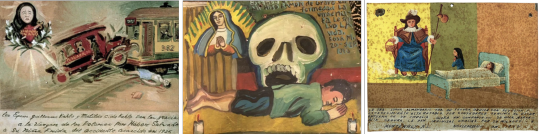
Mexican retablos, titles, authors and dates unknown
The folk art retablo style is characterised by a flat perspective and bright colours, usually painted on readily available surfaces like metal or tiles. The visual space is often divided into thirds vertically, with the bottom third being a space for written text describing the incident, the middle third depicting the incident, and the top third depicting the intervening saint. Realism in depiction is not a priority, with the emotional experience (pain, fear, suffering, relief and gratitude) especially highlighted.

Frida Kahlo, Accident, September 17, 1926, 1926 / Frida Kahlo, A few Small Nips, 1935

Aztec Codices: Codex Borbonicus / Codex Mendoza
Mexican indigenous art, especially Aztec codices, used floating pictograms to tell stories visually. In these codices, objects and figures were often isolated on a flat plane, visually connected but not bound by realistic spatial logic.
Kahlo blends surrealism with the traditions of Mexican folk art whilst still retaining a deeply autobiographical tone.
0 notes
Text
Appropriating the Meme Format
After some reflection on my direction so far this semester, I feel unhappy with the direction of my exploration. I would like to refocus on the concept of appropriation, especially with the appropriation that is prevalent within memes.


Memes made in Photoshop, words are my own, and images are from Pinterest.
I’m both changed and driven by love and my history concerning the latter. I am noticing a shift in the expression of love in the climate of digital prevalence. Emerging is a new form of expression that joins a seemingly random object or image with a heartfelt or reflective message - here I combined intimate, confessional or matter-of-fact lines from my diary entries with an image that may be conflicting or nonsensical.


0 notes
Text
Artist Research
@sotce and @sweerelease08


untitled, undated works by @sweetrelease08 and @sotce
Sotce is a New York City-based artist and writer known for her cryptic, emotionally-charged memes and witty and melancholic TikToks. The artist operates within a niche but influential sphere of confessional meme art, with posts blending vulnerability, ironic humour and kitschy imagery, with an especial feminine language.
As a viewer, I wonder if there is a link between the object and text that only the artist understands. Is the randomness part of the message? The ambiguity is compelling, and I like the invitation it creates for open interpretation.


0 notes
Text
Artist Research
Jenny Holzer (1950)

Jenny Holzer, The 42nd Street Art Project, 1993
Holzer showed a keen interest in art from her early years but had suppressed this during her adolescence. A passion for art had rekindled while Holzer studied at Duke University in North Carolina, leading her to transfer to the University of Chicago and later study at the Rhode Island School of Design between 1974 and 1975. Holzer would move to Manhattan in 1976 where she began to explore her now-renowned work with installation and public art in the Truisms series whereby slogans fraught with cynicism and political implications were presented on posters, billboards and electronic signs. During this time Holzer became an active member of the New York City group 'collaborative projects' that advocated for artist-driven cultural activism throughout the 70s and 80s.
Holzer uses a combination of her writing and pieces written by others such as poetry and first-person accounts of war collected from charities such as Save the Children. A starting point for Holzer's work (see Protect, 2007) was based on a white house briefing before the UK/US invasion of Iraq. Holzer enlarged and highlighted the document, bringing the dangerous power of language to the forefront of the piece.


Jenny Holzer, inflammatory essays, 1979–82
The tone of the work, the Inflammatory Essays, is more challenging and aggressive. These took the form of coloured paper printed with 100-word paragraphs. Holzer wrote these texts herself, however, her writing does not always directly reflect her opinions. Holzer's writing considers issues from multiple viewpoints but will always tackle issues of importance.Holzer builds a more intimate relationship with her viewers by creating art outside of traditional art spaces.
Barbara Kruger (1945)
Barbara Kruger is an iconic American conceptual artist and photographer, renowned for her use of bold imagery and text to explore complex themes of gender, identity, power, and control. Drawing from the visual language of advertising, mass media, and consumer culture, Kruger’s work interrogates the ways in which these platforms influence and shape our understanding of ourselves and our relationships with others. Through her distinctive juxtaposition of images and provocative text, she crafts works that challenge the viewer to confront societal expectations, question the nature of desire, and reflect on the politics of individuality.

Barbara Kruger, Untitled (Your body is a battleground), 1989
Kruger often works with found photographs, primarily sourced from mainstream magazines and advertisements, which she appropriates and recontextualises to subvert their original meanings. These images are typically used in advertising to sell products or reinforce cultural narratives and are reworked by Kruger to expose the manipulation within these systems.

Barbara Kruger, The Future Belongs To Those Who Can See It, 1997
By inserting powerful, sometimes confrontational statements over these images, she disrupts their commercial intent, thus transforming them into critiques of the very ideologies they originally sought to promote. This approach places Kruger within the tradition of appropriated art, where she reuses existing imagery and disrupts it to create new politically charged meanings.
0 notes
Text
Thematic Research
Digitial Girlishness
'Digital girlishness' refers to the online expression of traditionally feminine aesthetics, attitudes, and identities. This is often filtered by the use of irony, camp or hyper-femininity.
This trend emerged across social media platforms like Tumblr, Instagram, and TikTok with the visual language rooted in soft pastel colours, early-2000s internet culture and self-awareness.
It often overlaps with aesthetics like coquette, sad girl, bimbo-core, and hyperfemme, reclaiming femininity through exaggeration and performance.


coquette and bimbo-core
Digital girlishness is often confessional and nostalgic. It utilises 'memes' as diary entries, has low-resolution aesthetics, and plays with irony, making viewers question what is real.
0 notes
Text
Thematic Research
Memes
'Meme' was coined by Richard Dawkins in his 1976 book The Selfish Gene. He used it to describe a unit of cultural transmission, like tunes, catchphrases, or fashion trends, that spread and evolve like genes.
Early internet memes (1990s – early 2000s)
The first recognisable 'internet memes' are image macros - funny pictures with white text in the font Impact.

Other early examples, spread by message boards and emails, include:
youtube
Dancing Baby (1996)

All your base are belong to us (2000)
Mainstream meme culture (2010s)
Alongside the rise of social media platforms such as Facebook, Twitter, Instagram and Tumblr, memes would become a central form of communication.
Memes are now faster, more humorous and deeply layered with the incorporation of pop culture, politics and irony.
memes of this era include:


Tumblr memes (soft grunge, collages, quotes and dreamy film stills)

classical art memes

Surreal memes (Deep-fried visuals, 2000s PowerPoint, surreal humour)
Post-internet & art memes (Late 2010s–Now)
Memes of this period include:
Corecore
youtube
'corecore' emerged mostly on TikTok. These memes involved seemingly unrelated video clips set to melancholic or ambient music. Themes often explored are climate doom, nostalgia and digital fatigue.
Meta Memes

Memes became increasingly self-referential and ironic. Creators began to parody traditional meme formats, embracing lo-fi aesthetics and intentionally "bad" quality to mock the polished visuals prevalent on social media
Digital diary memes

This era of meme blends personal confessions with universal emotional experiences, exploring anxiety, heartbreak and more. The style is characterised by a minimalist approach, placing images of everyday objects alongside text.
0 notes
Text
Artist Research
Tracey Emin (1963)
Emin’s work is deeply personal and raw, addressing themes of trauma, sexuality, vulnerability, and pain. Her work is one of my main artistic inspirations - with her fiercely intimate work inspiring the same earnestness in my own work.
Her body of work's confessional nature and visceral focus on the female body and psyche align with Barbara Creed’s monstrous-feminine, especially through her fearless exploration of the maternal and societal fears surrounding female sexuality and autonomy.

Tracey Emin, How it Feels, 1996
How It Feels is one of Emin's early video works, in which the artist narrates her experience of having an abortion, describing the physical and emotional pain in stark, unflinching detail. The visceral descriptions of her abortion draw upon societal fears surrounding the potential for life and death within the maternal body. Emin’s vulnerability about a commonly taboo subject confronts the viewer with the realities of being a woman, aligning it with Creed’s exploration of the monstrous maternal.

Tracey Emin, My Bed, 1998 / To Meet My Past, 2002
Beds are a recurring, emotive motif present in Emin's oeuvre, serving as a powerful means for exploring themes of femininity, vulnerability, intimacy, and trauma. The bed, a domestic and personal space, becomes a site for addressing the female experience.
Emin's works challenge the traditional associations of the bed as a place of comfort and safety, revealing its darker truths in the context of her experiences of pain, illness and sexual assault.
Strangeland (2005)
Emin’s autobiography Strangeland (2005) is a powerful and candid exploration of her life, offering a deeply personal account of her formative experiences, emotional struggles, and the complex nature of her identity as a woman and an artist. The book covers themes of trauma, sexuality, love, loss, and the intricacies of being a woman. This body of writing serves as a powerful source of inspiration for my own writing process, enthusing me to be fearless in my vulnerability and confession.
0 notes