
Don't wanna be here? Send us removal request.
Statistics
We looked inside some of the posts by creckling and here's what we found interesting.
Average Info
Notes Per Post
3
Likes Per Post
3
Reblog Per Post
0
Reply Per Post
0
Time Between Posts
4 days
Number of Posts By Type
Text
15
Last Seen Tumblr Blogs


Fun Fact
Tumblr was the first site to host the blog for President Barack Obama in 2011.

Text
Emphasis

The above image is of several totem polls in Canada.
When I was much younger, I remember seeing totem polls in Canada when my family went on vacation one time. It was really cool as I am not used to or familiar with these large and amazing structures and I became very interested in the Native American culture. I am by no means very knowledgeable but I have appreciated it and always wanted to find out more. The totem pulls are whole over parts- it is one totem poll, but within each poll there are many figures and symbols with lots of detail and color and meaning making up that one totem poll. The colors and sizes ad shapes of each figure create contrast amongst each other so that they can be distinguished from one to the next. The placement of the winged figure seems to always be at the top- maybe it is the most important, maybe to symbolize it flying in the air high above.
Emphasis Glossary
Emphasis - Pow! Something in a scene dominates. In other words, the designer gives visual priority to part of a scene in order to draw the eye there first.
Contrast in size, color, texture can make one thing stand out from the many things around it.
Focal Point - The focal point demands attention, it is accentuated, contrasted -- the star or the most prominent component of a scene.
Isolation - Feature a single element alone, away from other elements to create emphasis
One Element - Eliminate everything else in the composition and the thing that’s left will grab the attention such as a bold title or symbol.
Placement - Position your most important design component in a place to grab attention, such as the center of a poster.
Subordination -The focal point has the visual power while other elements of the scene are subordinate.
Whole over Parts - Sometimes we don’t want the eye to go somewhere specifically such as in an establishing shot at the beginning of a story. We want to show an overview of the environment before we jump into the story. We might look at a map with lots of details. The whole map is the important thing. When we select a place on the map to visit, then that spot becomes the focal point and the Emphasis shifts from the whole to the specific. Another example is that the whole game is more important than its levels.
0 notes
Text
Scale and Proportion

The above image is of a prehistoric cave drawing featuring a person hunting deer with a bow.
This is a very interesting cave drawing depicting a hunting scene. The drawing offers a human scale- the human size relative to the deer, although I would believe that the size is wrong as the human seems much larger than the deer are. What is also interesting is the proportions of both the human ad the deer. The deer ave very long necks, some have seemingly shorter legs and then others have very long legs. The antlers of the two bucks are massive and very intricately shaped almost like a tree branch. The human has very long legs and a long torso but not very long arms and their head is sunken into the body.
Scale and Proportion Glossary
Scale is the size of one object in relation to other objects in a design. — a certain relative or proportionate size or extent (A human is 7.5 heads tall.) — a standard of measurement or estimation (The UFO was as big as a football field.) — point of reference by which to gauge or rate (My puppy is twice as big as your chihuahua.)
Aspect Ratio refers to the proportions of the height and width of an image. It defines its overall shape, and it is usually shown as W:H (W is the width and H is the height).
Geometry - spheres, cubes, cylinders can be used to build more complex objects
Hierarchy - Arranged according to importance or power. What’s bigger or taller is often more important or harder to kill.
Human scale - sets the stage for the story happening to human-sized characters
Proportions - The size of the parts compared to the whole. Relativity.
Ratio - a ratio tells us what proportions mean to each other. Measuring one thing in terms of another. That monster is twice the size of the human. Their ratio is 2 to 1.
Relative - how objects appear in context with each other
0 notes
Text
Rhythm

The above image is of a painting by Robyn Lamont called “Tangaroa”
This is a very interesting and beautiful piece from New Zealander painter Robyn Lamont. The piece has contrasting rhythms in the way the peacock/wave contrasts with the stillness of the deeper further away ocean. The morph peacock wave hybrid has a flow to it much like both the waves of the ocean as well as the beautiful long flowing feathers of peacocks. This long swirling of the peacock wave creates visual motion- the flowing curls serve to act as the same motion as waves crashing on a beach. This visual motion serves as rhythm and motion. The stillness and calmness of the far deep blue sea on the horizon comes into the shore and waves roll, curl, and crash.
Rhythm Glossary
Rhythm is caused by patterns in movement. What are those footsteps in the dark room? Are they slow or fast? Running or sneaking up on you? Rhythm controls the pace of action in your story. Rhythm can be repeated character types, weapons, or color strategies. We see and hear rhythm throughout nature as well as in our digital environment. Rhythm organizes units into patterns. Rhythm is created through repetition, alternation, and progression.
Alternating - Alternating rhythm is a form of repetition and is predictable. We switch back and forth from one thing to another like a tennis match. Alternating rhythm can create tension, such as switching close up head shots of one character arguing with another.
Audio Rhythm - sounds that create patterns such breathing or shooting rounds of ammo.
Conceptual Rhythm - Intensifies, moves along, or calms the story. Conceptual rhythm coordinates visual and audio rhythm with the pace of your story.
Contrasting Rhythms are two or more sounds or motions at obviously different tempos.
Legato means music in a smooth flowing manner, without breaks between notes or a smooth flowing motion.
Polyrhythmic patterns - use of simultaneous contrasting rhythms. A battle scene has many (poly) rhythms such as big guns, small guns, shouts, rumbles, footsteps, and explosions.
Progressive rhythm is a pattern that changes over time to more or less intensity. Progressive rhythm makes us feel that. something is in an evolving state of change. We can tell when the battle is heating up by the rhythm of the sounds and the actions of the characters running toward or away from the fighting
Repeating - The same thing again and again gives us a feeling of predictability
Rhythm and motion - When a motion repeats, speeds up, slows down it creates a rhythm. The rhythm of tai chi is slow. The rhythm of Kung Fu is fast.
Staccato derives from the Italian verb staccare, meaning "to detach," and can now describe anything - not just sounds - made, done, or happening in an abrupt or disjointed way.
Visual Rhythm - When motifs such as lines or shapes repeat visual rhythm forms.
0 notes
Text
Point
youtube
The above video is the World Gameplay Premiere for Ubisoft’s Far Cry 4.
I’ve used a Far Cry game as an example before, and I am using one again because these games always have such awesome themes and take place in really beautiful settings. Far Cry 4 takes place in “Kyrat” which is a fictional location in the Himalayas and takes heavy inspiration from Nepal. Elephants, monstrous mountain ranges, beautiful temples and statues scattered around the massive map, this game is almost like taking a vacation from a seat in your own home. In this video, the commentators mention how the game’s graphics, which are entirely made of pixels, are “next gen.” This was Ubisoft’s first next gen Far Cry game set for the PS4 and Xbox One platform. The point of the game is to free Kyrat from an evil lunatic dictator by joining up with a group of rebels fighting for the people of Kyrat. How you free Kyrat, is up to you, whether you stealthily infiltrate an outpost and rid it of the region, or you go guns blazing atop an elephant crushing every enemy in your way. At one point in the game (spoiler warning) the player is met with a point of no return where they must decide which of the two rebel leaders to side with: Sabal or Amita. They have differing views on how to run the rebel group and in what direction they will go in and once the player has made their decision- it is final. This game is a really awesome game and the Kyrat (pseudo Nepal) setting is really awesome and beautiful. It is really cool to see the influence Nepal had on the colors, the art, the buildings, culture, and relics scattered around the map.
Point Glossary
You have an idea sparking in your brain. You open a sketchbook or create a new file. You ponder a blank page or layer. You move your pencil or stylus. You land on a point. Your point moves and leaves a trail that evolves into a visible something.
Groupings of points can stimulate human imagination to form familiar shapes. Ancient storytellers grouped stars into constellations of mythological beings. We group pixels into characters, animations, and game levels.
Point is the smallest visual component.
Pixel is a recently invented groovy word. The word "pixel" was first published in 1965 by Frederic C. Billingsley of Jet Propulsion Laboratory to describe the picture elements of video images from space probes to the Moon and Mars. A pixel is the basic unit of programmable color on a computer display. Think of it as a logical - rather than a physical - unit. The physical size of a pixel depends on how you've set the resolution for the display screen. Each visual composition on your screen is made of thousands of illuminated points of hue and value.
Focal point is the feature of a design or work of art that is the most interesting or important or the most strongly emphasized.
The Point is what a player will tell a friend about the game if they like it.
The point is the mission or a moving target.
The point of no return (PNR or PONR) is the point beyond which one must continue on one's current course of action because turning back is dangerous, physically impossible or difficult, or prohibitively expensive. The point of no return can be a calculated point during a continuous action (such as in aviation). A particular irreversible action (such as setting off an explosion or signing a contract) can be a point of no return.
0 notes
Text
Contrast

The above image is a piece called “Mother India” by M.F. Husain.
In this piece by M.F. Husain called “Mother India” there is a lot of contrast in the shapes, and the color. Sharp edged shapes which make up the seemingly floating women are contrasted with the smooth flow of ocean behind swell as the person using a walking stick on the left who has much smoother softer edges and is less sharp. There is actually a high contrast between the shapes as again, the women floating are a lot more geometric and have sharp edges where as the walking stick person and the ocean are smooth and rounded out. The colors also present high contrast as the bright oranges, yellows, and whites lay atop the dark deep blue of the ocean. The outlines of the women and the walking stick person. They have a strong outline which further adds a high contrast between the people + boat and the sea. The piece is asymmetrical as the balance is spread out and not totally even amongst the work, but it does work with the piece.
Contrast Glossary
Contrast refers to the arrangement of opposite elements (light vs. dark colors, rough vs. smooth textures, large vs. small shapes, etc.) in a composition so as to create visual interest, excitement and drama.
Contrast creates variety within a unit, draws the eye to a focal point, creates a sense of adventure or mystery. Contrast is a unifier. Value contrast is when a character or object has a strong darks and lights compared to the scene around it. Size contrast is a gigantic space cruiser compared to much smaller fighters.
Asymmetrical balance is a dynamic compositional strategy in which each side of the axis are distinctly different yet belong to the same story.
High Contrast is strong dissimilarity such as black letters on a white background. The high contrast setting is an accessibility feature built into interfaces to assist people with vision impairment. In visual perception of the real world, contrast is determined by the difference in the color and brightness of the object and other objects within the same field of view. Because the human visual system is more sensitive to contrast than absolute luminance, we can perceive the world similarly regardless of the huge changes in illumination over the day or from place to place.
Low Contrast means a minimum of contrast between light and dark, so that the image is either predominantly dark or predominantly light. The sun sets, dusk sets in and in the gloom there is low contrast in the landscape.
Symmetrical is a form of balance in which both sides of the axis are the same, a mirror image of each other, creating stability and formality.
In visual storytelling the symmetrical formal balance is often contrasted with the dynamic action of asymmetrical configurations. For example, the formal balance and discipline on the Death Star in Star Wars is contrasted with the diversity of the different rebel cells and militias from across the galaxy. The dynamic contrasting rhythms and visuals of the dark side contrasted with the Jedi and rebel alliance has kept the franchise going for decades.
Contrasting camera angles - Part of your story is how you show as well as how you tell. The camera is your audience’s view of your story and should be well planned to reveal the story in the most effective way possible.
0 notes
Text
Unity

The above piece is a work of German Expressionism called “Sturmtruppe geht unter Gas vor” or in English: “Assault Troops Advance Under Gas” by Otto Dix.
There is a strong sense of polyrhythmic patterns: there are soldiers in helmets and gas masks, dead bushes/branches, barbed wire, clubs and grenades. It is very chaotic. This piece can also be an example of Staccato- it is very abrupt and disjointed. The soldiers are thrashing and crawling and reaching out, slipping and crawling in the mud, trying to get out, trying to survive. Tangled in barbed wire and dead bushes. There is a visual rhythm to this piece, there are the repeated circle lenses of the gas masks, the round air filter on the front of the gas masks, the distinct round shape of the helmets, but there there is also the sharpness and jaggedness of the dead bushes and barbed wire wrapping around entangling the soldiers.
Unity - is an entity that is a systematic whole. A fusion or union of parts in harmony to create a oneness. A game is a unity based on a fusion of levels.
Alignment – a common axis creates relationship, the line up creates meaning. Alignment in games can help you find your way on the map or aim true with your weapon. Alignment of troops or vessels indicates organizational strength. Maps are visually aligned with the edge of the frame. Your stats are aligned in a table.
Beat Boards are used to illustrate major story points before the rest of the storyboard is completed. Beat boards are a series of single drawings that depict key focal points in a scene. Beat Boards can be compared to a children's book illustration because an individual picture shows a complex story. Beat boards can serve in art direction to indicate how the shot is staged and show color strategies, using shapes and colors, but are not detailed sketches. (paraphrased from https://roshnikakad.blogspot.com/2012/02/ss2-discovering-beat-boards.html)
Making sure the beat boards relate to each other creates unity.
Composition - is the arrangement of visual elements within a shot. The three basic shot compositions in filmmaking are long-shot, medium-shot, and close-up.
Conceptual unity – a palm tree, an ocean beach, and a beer unify around the concept of 'vacation'
Contrast – creates variety within a unit, draws the eye to a focal point, creates drama. Contrast is a unifier. Contrast is when a character or object has a strong darks and lights compared to the scene around it. Size contrast is a gigantic space cruiser compared to much smaller fighters.
Proximity– closer distances connect elements and far apart elements create separation and sometimes magnetism
Repetition – things that look alike relate to each other. Shapes or colors that recur in the image create rhythm and recognizable situations.
Unifying Strategies -- Designers manipulate contrast, repetition, alignment and proximity to create visual unity and to pull a story along.
Visual unity – is a group of repeating or similar elements that create balance or form a structure
0 notes
Text
Space

The above image is a 3D modeling render by artist Bill Ellis
Bill Ellis is one of my favorite artists, I discovered him on instagram and he always posts really cool shots of his work.
The foreground, is obviously the skull with the cloth and crown, where the background is the ring of gold circling around in the back. The skull is overlapping the ring in the background and it comes together very nicely. I really love this piece of work by Bill. The skull in the foreground plus the somewhat transparent cloth draped over take up a large amount of volume, but it works out as the ring of gold in the back, while very technical and amazing, it is subtle enough to where you are still drawn to the skull and it does not feel like too much is going on.
Space is an area, expanse, territory, distance or range. Variable spaces expand orcontract as our stories unfold. A closeup has a short range. A wide shot covers a lot of territory.
Atmospheric Perspective Value contrast and color saturation decrease with distance. Brightness increases asobjects fade further into the background. In addition, objects such as mountains may appear more blue.
Diagonal shapes pull the eye in a direction to create the illusion of depth. If the diagonal is going back like a railroad track or fence-line the eye will follow it into the perceived distance.
Elliptical Perspective An ellipse is an oval shape. Elliptical perspective provides visual clues to the location ofcurved surfaces in space. Look straight down on a glass of water. The rim of the glassis a circle. Move the glass to the side, the rim now appears as an ellipse. Line up the rimat your exact eye level, the ellipse now appears as a straight line.
Foreground, Middleground, & Background The 3 treatments of objects in space support design to achieve depth. This template for placing and sizing objects in the picture plane shows variations on the foreground, middleground, background configurations.
Foreshortening is when an object's dimensions appear shorter when angled toward theviewer. At the same time the part coming toward the viewer is enlarged.
Linear Perspective is a system used by artists in which the relative size, shape, and position of objects are determined by drawn or imagined lines converging at a point on the horizon. 1-point (Figure 1), 2-point, and 3-point linear perspective are illustrated in“How to Draw Exterior Backgrounds”.
Overlap is when part of one object is obscured by another object. The obscuring object appears to be in front.
S-Curve or Winding Path In an image of a landscape, S-curve or winding path will draw the eye of the viewer into a perceived distance.
Size relationships Objects appear smaller as their distance from the observer increases.
Transparency or opacity is when we feel like we can see objects through a glassy,gauzy, smoky, or dusty layer. The transparent/opacity adjustment affects the saturation and color of objects to give a feel of depth.
Vertical position places objects higher up in the composition to appear further away. Volume is the amount, expanse, extent, magnitude, size, aggregate, bulk, dimensions,or mass of an object. The volume variable indicates the amount of territory needed foreach object in a scene.
2 notes
·
View notes
Text
Pattern and Texture
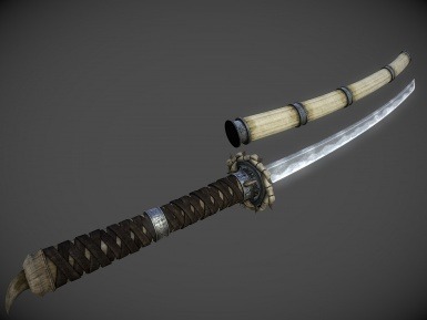
The above image is a katana texture from “Unique’s Uniques” Skyrim Mod by InsanitySorrow.
In an earlier post, I mentioned how Skyrim is a very mod friendly game and I love that. A lot of cool things have come from the community that add or further develop the game, for example, this image is from one of my favorite mods that retextures several powerful items in the game that originally have basic textures. The textures are all very high quality and beautiful.
This katana weapon texture has a very oily and shiny blade. It reflects light and looks like if you were to touch it, it’d be very cold and tough. The hilt is wrapped in strips of leather and I could imagine how that would feel in my hand. The soft and yet strong leather.
Likely, this in game katana was designed through the process of texture mapping to give it the realistic shiny metal look that it has. The blade, the hilt, the sheath look very real and tangible. The wrappings around the hilt and every bit of metal have a highly realistic texture on them. The reflection of light against the metal and the variations of light on the leather wrapping around the hilt.
The texture mapping gives the katana a visual texture, giving the illusion of a grippy hilt wrapped with leather, and then a cold steal blade, a very impressive model.
Motion is action, reaction, energy, what’s happening, gestures, dynamics, mobility,exertion, labor, and progress through space. Motion varies with your story. Motionindicators In storyboards are arrows, blurred lines, smears, zooms in and out. Yourcharacter is dramatized and embodied as a personality through gestural actions. 180-Degree Rule In filmmaking, the 180-degree rule is a basic guideline regarding the on-screen spatial relationship between a character and another character or object within a scene. Bykeeping the camera on one side of an imaginary axis between two characters, the firstcharacter is always framed right of the second character. Moving the camera over the axis is called jumping the line or crossing the line; breaking the 180-degree rule by shooting on all sides is known as shooting in the round.
Anticipated Action A dramatic action frozen in time, the tension mounts, we feel anticipation. We expect the sword to swing or the finger to pull the trigger or the couple to kiss.
Camera Motion Arrows are standard cues, a simple and recognizable way to show motion or progression in a storyboard
Kinesthetic Empathy A player’s actual movement when responding to action in a game. Leaning into a curve in a driving game is kinesthetic empathy.
Line of action is an artistic concept, an invisible line that captures the thrust and vitalityof the movement. The line of action can be drawn by artists as the first element tocapture or exaggerate the pose. Tip: Create the line of action as layer 1 so that youdon’t downplay the pose. When you have the full energy of the drawing delete the action line layer.
Motion Blur When your eyes or objects are in motion, the image will suffer from motion blur, resulting in an inability to resolve details. To cope with this, humans generally alternatebetween saccades (quick eye movements) and fixation (focusing on a single point).How is this biological situation useful in storyboard drawing? How do storyboard artistsuse motion blur? How does a smear function in animated motion? Required: Watch To niko Pantoja Animated Smears and the Hand Drawn Motion Blurhttps://youtu.be/KXuP2_BCmV0
Optical movement is an optical illusion. Although the image is not moving, it appears tomove. To see examples search “Op Art”.
Stillness is calm, quiet, inaction, and peace. Stillness is the opposite of motion. It can be used to contrast with motion.
Visual Ways to Suggest Motion Before there were moving pictures, artistsdeveloped ways to indicate motion. Thesetechniques are used today to quickly indicatemotion. Blurred outlines is one technique, andrepeating parts of a figure is another way. A figuremay seem to be moving if their figure is croppedby the frame of the composition.
0 notes
Text
Motion

Red Dead Redemption 2 is a fantastic game and a great installment to the Red Dead games. I’d go as far to say, this is one of my favorite games. The line of action in this still are Arthur and another member of the gang firing their weapons at likely sheriff as they make an escape after just sticking up a bank. The anticipated action of both Arthur and the fellow gang member is each rechambering a round into their weapons. Arthur has his thumb pulled up over the hammer to pull it down. The fellow gang member can be seen pulling the bolt of his rifle back to chamber a fresh bullet. Motion blur is very present as Arthur is advancing forward as the gang member behind provides covering fire being they are trying to make an escape. The explosion behind is a prime example.
Motion Glossary:
Motion is action, reaction, energy, what’s happening, gestures, dynamics, mobility, exertion, labor, and progress through space. Motion varies with your story. Motion indicators In storyboards are arrows, blurred lines, smears, zooms in and out. Your character is dramatized and embodied as a personality through gestural actions. In filmmaking, the 180-degree rule is a basic guideline regarding the on-screen spatial relationship between a character and another character or object within a scene. By keeping the camera on one side of an imaginary axis between two characters, the first character is always framed right of the second character. Moving the camera over the axis is called jumping the line or crossing the line; breaking the 180-degree rule by shooting on all sides is known as shooting in the round. http://www.cinematographertools.com/images/180-degree-rule.jpg
Watch video Harakiri fight scene (4 minutes) by Masaki Kobayashi https://youtu.be/rhLdSpD3mSQ
Anticipated Action: A dramatic action frozen in time, the tension mounts, we feel anticipation. We expect the sword to swing or the finger to pull the trigger or the couple to kiss.
Camera Motion: Arrows are standard cues, a simple and recognizable way to show motion or Arrows in a storyboard to indicate camera motion
https://i.pinimg.com/originals/bd/f3/4a/bdf34a7b453e7f415ad2724119f70ac9.jpg
Kinesthetic Empathy: A player’s actual movement when responding to action in a game. Leaning into a curve in a driving game is kinesthetic empathy.
Line of Action: Line of action is an artistic concept, an invisible line that captures the thrust and vitality of the movement. The line of action can be drawn by artists as the first element to capture or exaggerate the pose. Tip: Create the line of action as layer 1 so that you don’t downplay the pose. When you have the full energy of the drawing delete the action line layer.
Motion Blur: When your eyes or objects are in motion, the image will suffer from motion blur, resulting in an inability to resolve details. To cope with this, humans generally alternate between saccades (quick eye movements) and fixation (focusing on a single point). How is this biological situation useful in storyboard drawing? How do storyboard artists use motion blur? How does a smear function in animated motion? Required: Watch Toniko Pantoja Animated Smears and the Hand Drawn Motion Blur. https://youtu.be/KXuP2_BCmV0
Optical Movement: Optical movement is an optical illusion. Although the image is not moving, it appears to move. To see examples search “Op Art”.
Stillness Stillness is calm, quiet, inaction, and peace. Stillness is the opposite of motion. It can be used to contrast with motion.
Visual ways to suggest motion: Before there were moving pictures, artists developed ways to indicate motion. These techniques are used today to quickly indicate motion. Blurred outlines is one technique, and repeating parts of a figure is another way. A figure may seem to be moving if their figure is cropped by the frame of the composition.
0 notes
Text
Shape
=

The above image is the cover art for Rockstar Games’ Red Dead Redemption II.
The cover art for the Red Dead Redemption games has always been really cool. They nail the cowboy western aesthetic on the head with rough paint strokes, the font, the imagery, and the art style of the character. I’ve always loved their game covers. I am huge fan of the silhouette of the cowboys riding in the distance against the setting sun. This element makes me think of classic western movies where they will have shots of the main character’s silhouette riding off into the distance against the setting sun. While on the topic of the setting sun, I really like what they did with the sun behind Arthur. They distorted it by painting it with rough brush strokes to add to the gritty feel they are going with this cover and the game itself. The real kicker of this cover art, is Arthur standing here looking tough and mean, pointing his revolver down. He is the positive shape, the clear and obvious focal point where as the sun, trees in front of the sun, and the riders are negative shapes to draw attention to Mr. Arthur front and center.
Shape Glossary:
Shape is the external form or appearance characteristic of someone or something; the outline of an area or figure. As a verb, to shape is to give a particular form. As artists, we shape our characters outward appearance by using shapes.
Abstract Shapes and Abstraction (see Non-objective Shapes): Abstract means no recognizable objects. Abstraction is a sliding scale from realism to completely non representational. Abstract shapes can be used in backgrounds and textures. The background pattern in this Minecraft image is abstract. The character is still recognizable as a human, but the doctor’s human form is abstracted in the game of Minecraft to conform to the blocks of the game world. https://youtu.be/MKs-YdefY1E
Biomorphic is a free-form pattern or design with a shape suggestive of a living organism, especially an amoeba or protozoan.
Curvilinear shapes are s-curves. Curvilinear shapes inform Jessica Rabbit’s character design and can represent a winding river vanishing into the distance.
Distortion is exaggeration, contortion, reform, slant, twist, or warp in ways that depart from reality. Look at the Minecraft Human body example. The figure of the Minecraft doctor is distorted by the shape of the blocks.
Idealism asserts that the physical world is less important than the mind or the spirit which shapes and animates it. Idealists choose the soul, the mind, or the psyche over the body, the material, and the historical. When ideals (of appearance, or proportion for example) regulate the way an artist represents the world, her work can be described as Idealistic. The leading artists of the High Renaissance - Leonardo, Raphael and Michelangelo - are all associated with varying forms of Idealism, as were ancient Greek sculptors. How do you think idealism affects avatar customization?
Non-objective shapes have no object as a reference and no recognizable subject matter. Non-objective shapes are often used to simplify design shapes. Geometric shapes such as a triangle, square, and circle are abstract until you put them together to represent a house or a smiley face. One Minecraft block, away from the game, is anon-objective shape. Inside the game that same block, depending on it’s color and texture could represent a part of a landscape, sheep, or sword. The block as part of a character or environment inside the game would no longer be abstract.
Positive space is the subject, focal point, or areas of high interest in any composition. Negative space is the area around the areas of interest. All compositions balance positive and negative space. Yes, stuff in the negative space can point to the focal point to make it most obvious. Positive and negative create a whole. Every composition is a combination of positive and negative space. Wield the positive and negative spaces with control and story-telling magic to become a design master.
Realism, or naturalism, attempts to represent subject matter truthfully, without artificiality or exotic or supernatural elements. In the visual arts, illusionistic realism strives for the accurate depiction of lifeforms, perspective, and the details of light and color.
Rectilinear is a boxy shape made with straight lines. For example, the screen you are looking at is a rectilinear shape filled with little square pixels, and pixels are also rectilinear. A storyboard is a series of drawings in a linear set of rectilinear frames.
Representational means objects that players can name. The object represents something from the real world, or something that has the verisimilitude of realism. A cartoon bunny can represent a rabbit without being realistic. Representational is a sliding scale from realism to almost abstract. 2 dots and a curve can be arranged into an abstract pattern or they can be arranged into an emoji that represents a smiley face.
Silhouette is a profile or shape that is easy to identify.
Squash and stretch are shapes profiles that emphasize motion. The stretched position shows the form in an extended condition. When you do a sit up your belly squashes and your back stretches.
0 notes
Text
Value

The above image is from “The Elder Scrolls V: Skyrim” depicting two characters in a lightly lit forest.
Skyrim is one of my favorite games because there is so much to explore. Another key feature is the ability to mod the game and the modding community has so much to offer. There are plenty of ENB’s and lighting mods that change the rather aged graphics into next gen. The photo above is an example of an ENB. The gamma is rather high in the foreground as the sky is almost completely washed out with light, even piercing through the tree leaves. There is a good sense of chiaroscuro lighting coming from the sun which is above and behind the player. You can tell based off the helmets and armor of the other two characters. The character in focus also has a spell illuminating the right side of his armor. There is also a strong value of emphasis on the front most character, Everything behind him is blurred and like previously stated the gamma behind is much stronger than the gamma in the foreground. All of this focuses in on the front most character illuminating details in his armor, face, and sword.
Value Glossary
Value in designis lightness or darkness on a scale of white to black (with white being the highest value and black being the lowest value). Value is widely considered to be one of the most important variables to the success of a design.
Chiaroscuro (English: kee-AR-ə-SKOOR-oh, -SKEWR-, Italian:; Italian for "light-dark"), is the use of strong contrasts between light and dark with bold contrasts affecting a whole composition. Chiaroscuro is a technical term for the use of contrasts of light to achieve a sense of volume in modelling three-dimensional objects and figures.
Light and dark-Every element in your design has a value from 1% black (almost white) to 100% black. Value is relative to everything in the composition. Every color has an underlying value somewhere between white and black.
Value as emphasishappens when a strong contrast in value draws attention to itself such as on this ancient Greek vase illustrating value contrast in the service of visual storytelling. Kylo Ren’s red light sable shows value contrast against the dark background.
Value and space-Designers use dark and light values to create the illusion of light as it falls on objects. Value is used to create the illusion of highlights and shadows. Highlights and shadows combine to create the illusion of a light source. The pattern of light and dark can create dimension, volume, and mass.
Value patterns appear regularly in the world, in human-made design, and even in abstract ideas such as stories. The elements of a pattern repeat in a predictable manner. Night and day is a value pattern common in stories.
0 notes
Text
Line

The above image is 3 frames of a storyboard from Jaws
Jaws is probably one of the most famous movies of all time and a personal favorite of mine. I remember when I was younger and being terrified to watch it, but still knew of it, and finally I watched it with my mom and it pretty much being the first scary movie I saw. Jaws just had a whole craze about it and it still kind of has it. It was pretty cool to stumble onto these story boards and when I saw them, I knew had to analyze them. I think the lines of action are very cool, specifically on Jaws. He is briefly out of the water and his whole body is thrashing and you can tell as his tail bends towards the right as well as his head is (making somewhat of a “U” shape) suggesting that he is building momentum to then swing his head and tail quickly to the opposite side. As this is all occurring, two of the three men out to capture jaws are depicted with gesture lines as one of the men on the top frame is throwing his hands up in shock/panic as he launches back as the other is very rigid as his body is locked up and yet breaking trying to hold on to the line or net that has (temporarily) trapped Jaws. The lines of action in the bottom frame are great too. The man holding an oxygen tank can clearly be seen cowering away as he tries to smash the nose of Jaws with the tank in a last ditch effort to defend their boat- the only thing separating them from Jaws (for the moment...). The contour lines are very interesting too. The bow of the Orca is very finely and definitely drawn, they are explicit lines, where as Jaws has many contour lines to create the rounding and softness of his body, head/face, and fins while he trashes.
Line Glossary
Explicit Lines
Explicit means clear, direct, and obvious. If a drawing is easy to read it may be that thelines are explicit, clean, with efficient use of variety. There are explicit lines around theframe of the Dutch Tilt illustration.
Gesture Lines capture motion, such as in an action pose when gesture drawings areused in storyboards. The figures at the head of the Rembrandt Elephant drawing showthe quickly sketched human gestures responding to the elephant.Implied LinesImplied lines in 3-D scenes a line in a scene that is not physically there but is suggestedby points in the art.Implied lines suggest the edges of an object or planes within anobject. The line may be broken such as a dotted line, it may be defined by value, color,or texture, or it may not be visible at all. With implied lines, our brain interprets that aline exists.
Implied lines in 3-D scenes a line in a scene that is not physically there but is suggestedby points in the art.Implied lines suggest the edges of an object or planes within anobject. The line may be broken such as a dotted line, it may be defined by value, color,or texture, or it may not be visible at all. With implied lines, our brain interprets that aline exists.
Line As Value has a long history. Artists have used line drawings to create value, orshading, and to achieve the impression of volume. In this quick sketch of a live elephantRembrandt used outline contour lines around the edges of the elephant and curvedcontour lines around the big legs and belly. Most of the lines are at the lower part of theelephant to show that the light source was from above.
Line of Action (Also see motion) is an imaginary line that extends through the main action of the figure.When you draw an action figure you can capture the line of action on one layer thendraw the figure drawing on another layer.https://art103robatkinson.files.wordpress.com/2014/04/line-of-action-1.jpeg
Line quality is the espressive essence of lines. Varying the line quality makes objectsappear more 3-dimensional and exciting. Range in line quality heightens descriptive and suggestive potential. A single line can change in darkness and width, can vanish alltogether to mentally reconnect later on an edge.
Line weight refers to the thickness or thinness of a line.
Lost and Found Lines
We don’t really need a strong contour line around every part of an object because ourbrain will fill in the blank where the edge disappears. When a line fades out and thenrestarts further along the edge it is called a lost and found line. There is a lost and foundline at the top of Rembrandt’s elephant behind the head. There is a strong contour lineof the skull of the elephant and a strong bulge of the back, but between the 2 curvedshapes the line fades out, yet we still know that the elephant shape continues.
Psychic lines are invisible. Psychic lines form between characters or between a gun anda target, or a hand pointing in a direction. There is no real line yet we feel a line. Eyeslooking in a direction, especially characters looking at each other create a psychic line.
0 notes
Text
Color
The video below is the trailer of Far Cry 3′s standalone DLC called Blood Dragon.
youtube
I remember watching someone’s YouTube play through of this DLC and I just thought it was so cool. A game full of neon, synth wave, guns and “blasters”, cyborg hitmen, and even a laser shooting cyborg dinosaur Godzilla type creature, this game IS a playable 80′s action movie. I love the 80′s/vaporwave aesthetic (an art style consisting of 80′s-90′s nostalgia) and this game hit the nail on its head and a key component of that is the color. Their color palette is very strong consisting of neon pinks, purples, blues, and teals. The color psychology behind the pallet is tying back to what I said earlier, the game is to be nostalgic of 80′s action movies, comics, and cartoons so the game is very vaporwave-esque in the way it uses colors commonly associated with the 80′s specifically a futuristic action movie from the 80′s to create a sense of 80′s nostalgia while still playing a fun shooter game from 2012. Your character, the hero, has these very shiny bright cyborg limbs, a little bit of color symbolism. Shiny bright armor has always been associated with “the good” and dark armors have always been associated with “the bad” (ex. “the black knight” in any comic, book, show, or movie is the bad guy). The bad guys in the game are in dark armor with glowing red accents, where as you are accented with green. Red is often associated with “the bad” and green is often “the good” in good versus bad scenarios (ex: Star Wars light sabers). The colors used throughout the whole game were fun and exciting seeing as how many are bright, very stimulating colors, but they really tied together well to make the game feel like a parody action 80′s game set in what the 80′s often said the future was like.
Color Glossary
Visible light spectrum is the segment of the electromagnetic spectrum that the humaneye can view. This range of wavelengths is called visible light. Typically, the human eyecan detect wavelengths from 380 to 700 nanometers.
Color psychology is the study of the effect that colors have on emotions, behavior and feelingsof people.
Color systems classify color and analyse their effects.
●The additive color system is used for colors of light such as light emitted fromcomputers, phone screens, and projectors. Red, green, and blue are the primarycolors
●The subtractive color system is used for pigments such as ink, dye, and paint.Cyan, magenta, and yellow are the primary colors.
Color to Show Depth
Change in Color is to use color to separate the foreground, midground, and backgroundplanes to create the illusion of depth and is commonly used in animation.
The color wheel, or color circle, arranges a pattern of hues around a circle. There areseveral versions of the color wheel or color circle. The circle connects relationshipsbetween hues to illustrate color strategies. (see 12 Chromatic Strategies) Color wheelhistory goes way back.
Local color is the natural color of an object unmodified by adding unrealistic light andshadow or any other distortion. The color that the eye observes is altered by lighting conditions such as time of day or the surrounding environment. The local color of alemon is yellow.
Palettes
The definition of a palette is the range of colors used in a particular composition or byany person who uses color such as an artist, house painter or interior decorator. Anexample of a palette is Vincent Van Gogh’s limited palette of hues in his Starry Nightpainting. Starry Night’s palette is a variety of blues, greens and yellows. Close up videoof Starry Night lets you come closer than you could at the Museum of Modern Art.
Properties of Color
Properties of color are hue, saturation, and brightness.The H, S, and B in thePhotoshop Color Panel stand for hue, saturation, and brightness.
●Hue is the named color around the color circle such as red, orange, green,yellow, violet, and blue.
●Saturation is the intensity or purity of a hue. Fire engine red is more highlysaturated than brick red or the color of red wine.
●Brightness is the perceived intensity of light coming from a source such as ascreen. On a color screen, brightness is the average of the red, green and bluepixels on the screen. Brightness is important to both color perception and batterylife on mobile devices. Brightness of a screen can be adjusted.
Symbolism of color in art and anthropology refers to the use of color as a symbol invarious cultures. There is great diversity in the use of colors and their associations.Diversity in color symbolism occurs because color meanings and symbolism occur onan individual, cultural and universal basis. Color symbolism is also context-dependentand changes over time.
12 Color Strategies
1. Monochromatic means variations of a single hue such as a light blue and a darkblue or a greenish aqua blue and a lavender blue.
2. Achromatic color strategy integrates variations of black, white, gray, and a fullrange of neutrals.
3. Full Spectrum Strategy represents the full circle of spectral colors byincorporating at least five of the base hues.
4. In the Achromatic/Chromatic Mix strategy Achromatic colors dominate thecomposition with a chromatic hue accent.
5. Warm/Cool: Contrasting ‘temperatures’ of warm & cool. Cool colors appear onthe green/blue/violet side of the color wheel. The colors on the red/orange/yellowside of the color wheel are called warm. Emphasis is on the contrast betweenwarm and cool achromatics: brown - gold (warm), grays - silver (cool)
6. Saturation Similarities/Saturation Contrast
●Saturation Similarities: Hues may vary in this strategy, but all colorsmust have the same or very similar saturations.
●Saturation Contrast: Hues may vary but all colors must have significantcontrast of saturation.
7. Value Similarities/Value Contrast
●Value Similarities: Hues may vary in this strategy, but all colors have thesame or very close values.
●Value Contrast: Black (or dark desaturated hues) contrast with white (orvery desaturated tints of hues). The Value Contrast strategy demonstratesstrong distinction of value with the strongest example being between blackand white.
8. Complementary Dyad creates a strong hue contrast. Complementary hues arelocated directly opposite each other on the color circle
9. Split Complementary strategies are based on two complements. To create asplit complementary color strategy select one hue and contrast it with the hueson either side of its complement, such as Red & YellowGreen/BlueGreen.
10. A Tetrad strategy uses four equilateral hues from the color circle, such as Red,Orange, Green, Blue.
11. A Triad strategy uses three equilaterally balanced hues from the color circle,such as primary, secondary, or tertiary.
12. Analogous strategies collect 2 or 3 neighboring hues on the color circle.
0 notes
Text
About this Blog
This blog will explore the variables, elements, aesthetics, and principals of design. I will use examples to illustrate.
1 note
·
View note