
❝Success in life comes when you simply refuse to give up, with goals so strong that failures only act as motivation.❞
Don't wanna be here? Send us removal request.
Statistics
We looked inside some of the posts by curiouscapture-blog1 and here's what we found interesting.
Average Info
Notes Per Post
0
Likes Per Post
0
Reblog Per Post
0
Reply Per Post
0
Time Between Posts
3 hours
Number of Posts By Type
Text
11
Photo
6
Last Seen Tumblr Blogs


Fun Fact
Tumblr.com rank in the US is 25.
Text
UNIT 8: Daily Reflections; June 16th
Today, was the deadline for my FMP and although I had a few blogposts to finish I managed to finish off everything in time.
The most important thing that I had to do was finish off my evaluation and post it onto my blog before midnight.

As I have mentioned before in my blog, I had an “evaluation points” list where I put the difference problems that I encountered each day which really helped me write my final evaluation. Having all ready the points that I needed to talk about really fastened the whole process as during my last evaluation (for unit 6&7) I struggled a lot remembering all the difficulties that I encountered throughout the project. As you can see in the pictures above, I ticked in green all the points that I included in my final evaluation.
Lastly, to keep track of everything and have a clear idea of if I did everything that the brief required me to do I had this log of all the blogposts that I posted on my blog.


The three pictures above show the finished version of my log. -I have already posted some pictures but above is the final result-
I am very pleased with my final result, and very excited to find out what grades I will be getting as I worked very heard throughout this unit.
0 notes
Text
UNIT 8: “Life through eyes” -evaluation-
I decided to base my FMP on street portraiture. Street portraiture helps preserve human history and history of any given society. It helps us preserve once in a lifetime moments and capture truly authentic parts of human life. I researched lots of photographers for inspiration, such as Lee Jeffries, Eric Lafforgue, Joel Santos, Rehahn and Steve MCCurry.

Above is a picture of my journal showing the name of various photographers in the street portraiture feald. Highlighted are the ones that were closer to my “style” I therefore put down a few notes for each one of them. For example, if their photography is in colour or b&w, what do they concentrate on the most (old people, youth or just people in general) etc.
I explored these photographers' style and photo techniques to help me develop an idea of what sort of images I wanted to create and what was closer to my “style”. One photographer whose work stand out the most and that I have explored in depth is Steve McCurry -http://stevemccurry.com-.

Above is the individual photograph that had the most effect on my own work. This is a photo worldly known under the name of “Afghan Girl” which portrays a young afghan refugee with incredibly beautiful green eyes in a refugee camp in Pakistan. The reason my project is mainly inspired by this one photograph is because I really like the fact that it's simply more than just a “photograph” it's almost like an open book free to interpretation.
My aim with this project was to come up with 5/6 pictures in the style of Steve McCurry. Although this is the idea that I decided to go for it wasn't my only idea.


As you can tell by the three photos above, I had three different ideas (with PROS and CONS for each one of them on my blogpost) that I really liked and that I wanted to use for my FMP but had to reject two of them to choose the best one. One of the ideas was to do a photoshoot based on fashion photography inspired by Jessica Kobeissi and the other one was to create a video on inner beauty inspired by BuzzFeed. However, after considering the different PROS and CONS of each idea I realised that the best one was street portraiture as it not only had the least CONS but was also the one that I was most passionate about.
All in all, I was interested in doing something which was unusual and new to me, in which I would be able to demonstrate that I could be challenged in different areas of photography, even if I was not familiar with them. As a matter of fact, with this project I worked with colour photography which is something I have never done before and experimented for the first time through this project.
The media industry is highly competitive and all media products should be created with a target audience in mind. Target audience is the demographic of people who are most likely to show interest in your product or service. To find out about my target audience I decided to conduct different forms of primary and secondary research. I did questionnaires, online survey and focus group as my primary research. Researched on YouGov.co.uk and https://trends.google.com/trends/?hl=en as my secondary research. Although I did carry out a range of research, I originally had planned to do a VOX POP as well. However, after the first attempt recording it I accidentally didn’t press the record button and ended up going around college asking people questions without ever recording the answers. If only I had paid more attention, and was more aware of what I was doing, I would have noticed that I wasn't recording. For next time, I have to be careful and more aware of turning on the equipment when out shooting/recording. Though I had planned to redo my VOX POP in the following weeks I never actually got around doing it due to the amount of work I had each week. For next time, I will make sure to either be more careful when out recording or leave some additional time for refilming/rerecording. Throughout this unit I found out that the most effective way to find out about target audience is definetly online surveys. Through my online survey (and sharing it on Twitter) I managed to reach a wider range of people and got to know their thoughts and opinions on the topic. I realised that in online surveys the answers were a lot more mature and detailed compared to the questionnaire which had a lot of immature and basic answers with no explanations whatsoever.

Above is a picture that shows a completely wrong answer from what I was asking. This shows what I was explaining just now. The answers on questioners were either really basic or completely out of topic.

On the other hand, this is the answer that I got when asked the same question in the online survey. As you can see, it's more detailed with a very complete answer and their view on street portraiture.
I believe that the main reason for such diverse answers/results is due to the age of the people that did the questionnaire and online survey. In fact, the people that did my online survey were mainly 18+. On the other hand, the people that did the questionnaire were mainly in the age range between 16 to 18 as I handed out my questionnaires in campus and the majority of students are in that age range. For next time, I would like to try and hand out the questionnaires around piccadilly gardens (aiming to hand them to different age range of people) to see if the “issue” is the age range and their immaturity or its the questionnaires that are just not very reliable. Focus groups, on the other hand, are a very effective way to find out about target audience. I decided to do a focus group -https://youtu.be/qVSE-ScqiTs- right after I analysed my questionnaires; according to the answers that I got I chose 3 people that answered that they weren't interested in street portraiture and one that answered very maturely to every single question. The reason I decided to choose 3 people that said that they weren't interested in what I was aiming to do for my FMP was to get an idea as to why they don't enjoy that genre of photography and what would they advice to do differently to make them like it. However, surprisingly, when I interviewed these three people (with the same questions as in the questionnaire that they did a week before) they had completely different answers for every question. This time, the answers were a lot more mature and you could tell that they thought about the answers before saying them. This shows how inaccurate the questtionnaires really are and how you can't simply relay on them when researching about your audience. As my secondary research, I researched on google trends and YouGov. Although I found a variety of data from the previous few years through these websites I felt like it wasn't 100% accurate. They classify men and women 55+ as my target audience. However, if you think about it (and if I take in consideration the primary research I carried out myself) they should have included teenagers/young adults into/studying photography as they are a very big chunk of the target audience. Carrying out this piece of research wasn't completely useless as I learned about the other half of my target audience. However, if I were to do this research again, I would try and find some more reliable websites. Finally, after carrying out all different forms of research I came to the conclusion that my target audience is very wide (going from teenagers interested in photography/studying photography to female and male 55+). The reason for such wide range of audience is because my project evolves around people; we are all humans and we are interested in knowing about other humans living on the opposite side of the world. Finally, if I had the chance to redo the research for my target audience I would concentrate more on online surveys, focus groups and VOX POP (recorded in piccadilly gardens in order to get people of different age groups) rather than waisting paper and money on written questionnaires that are not even reliable. Additionally, I would include more people in my focus group. For this unit, I decided to include only 4 people (2 girls and 2 boys for a point of view from both sides of the spectrum). However, for my next project, I would like to have a whole class and a more open focus group (with a lot more discussion). Although I could definitely improve my research (as stated above), I feel like I have carried out a decent amount of research that helped me define my target audience.
Along with research on target audience, it is very important to carry out other forms of research to facilitate you with your project. The primary purpose of any research is of discovering, interpretation and analysis of information to enhance personal knowledge. I therefore decided to concentrate a lot on my research and put all my effort into it. First of all, I created a research log where I logged my plan of research that I was aiming to conduct in the weeks to come. I mainly researched in the first few weeks of my project to improve my knowledge on all camera equipment, camera settings, composition, light, framing, colours etc. to have better knowledge when out shooting for my FMP later on. However, I did need to continue with my research throughout the project although it was mainly research on Photoshop as I was not very familiar with the software when editing my final photographs. Other than Photoshop though, I did not require any further research as I had planned it very well in my research log beforehand and covered all different criteria that I needed for my project. I mainly researched on the Internet using blogs, YouTube channels, photographers official websites and so on. However, I partially used some books for Photoshop and editing. All the research that I carried out throughout the weeks ended up being very useful when out shooting. I was much more aware on camera settings, I started noticing colour and contrasts, light and the different directions of light, composition and how to frame different subjects to make the composition unique and more interesting. I was generally much more prepared and educated on my project which really helped me improve the quality of my work. I definetly managed to find the majority of pieces of research that I was looking for. However, I did struggle a little bit when it came to location research. As I went to Pakistan for my FMP I had to research the locations that I wanted to go to beforehand so I went onto Google and started researching the famous cities around Sialkot (which is the city I was going to land and stay for the night). Although I very easily found the famous cities such as Lahore and Islambad when it came to Gujrat (which is a smaller city in the country) the content on Google was very rare with very little information and maps that could possibly guide someone planning to visit the city. After various attempts, I decided to get some help from a friend that has relatives that live in the country. Thankfully, she managed to give me all the informations that I needed.

Above is a picture showing the different locations with the respective dates and my “plan” for the week in Pakistan.
However, for next time, I found these two website -https://www.couchsurfing.com- and -http://www.penpalworld.com- that could potentially be very helpful to get in contact with the locals and get information on cities/villages that you don't find content for on the Internet. Lastly, when researching I started keeping a record of my research either on my journal (with the various links) or on my notebook with the different notes that I took from a particular website/blog/YouTube video.


Above are some pictures to show what I just explained. As I said, I kept a log of all the websites that I found useful on my journal along with links.


This on the other hand, is an example of the notes that I took from the different blogposts/YouTube videos for my blogposts.
All in all, the research part of my project was definetly one of the most successful as it really helped me archive what I aimed to and improved my knowledge on so many things that I did not know of before this unit.
After the research was done I started planning for my trip. Since I was going to a country 7+ plane hours away from the UK I had a lot more to plan than anyone that was doing his/her project in Manchester or around the UK. First of all, I pin pointed all the work that I had already done and all the work that I still needed to finalise/finish.

Above is a picture that shows a log of all the posts that I finished. Throughout my project I made it a habit to write down in this log every time I posted a blogpost.

Above, on the other hand, is a log of all the blogposts that were in my drafts and therefore had to finalise or I still had to start. -bare in mind that now it's all highlighted and ticked in green because I have done all the work, initially it was all plane-
My aim was to finish all the research posts along with all preproduction work (schedules, locations recces, risk assessments, locations maps etc.) before going to Pakistan so that when I came back I only had to edit and evaluate my work and avoid any sort of pressure to finish everything in a rush. Luckily, I managed to finalise all my research and preproduction work before heading for my week to Pakistan. My planning, along with the research that I did, helped me a lot through the week in Pakistan. The research posts that I found most useful were definetly locations and culture do’s and don’ts. Knowing the culture and what was considered unacceptable/acceptable in the country really helped me be more confident and get along with the locals as they could feel the respect and knowledge that I had about their country. Additionally, my preproduction work along with my research on the different locations really helped me when on location. I already had a brief idea of what I was going to see in the various locations and had therefore in mind the different sort of images that I wanted which made everything a lot easier. Within the planning phase I not only planned the production phase of my project but the whole entire project to meet the deadline. I set myself small targets for each week under the form of “to do lists” in order to finish all my work in time for the deadline and that really ended up being in my favour as I managed to finish all of my work just in time for the deadline.


Above, are a few pictures that show the “to do list” that I did on my journal.
Although this was a great way to pin point all the work that I had to do, when I first started making “to do lists” it turned out to be really hard for me to follow them. I used to put either too much stuff to do each day or too much stuff of the same genre (ex: research) and never ended up finishing off anything entirely until I realised it. I then started being more realistic about it and only put down the things that I knew I was able to do in the amount of time I had on a particular day. From next time, I will make sure to make my “to do list” according to the amount of time I had that particular day and baring in mind the amount of work I could do in one day. Altogether, I think I planned my project very well which helped me to meet the deadline just in time. I feel like putting out small targets for each week is something that really helped me push myself and reach those small goals for every week rather than concentrating on the bigger goal which could have put me off or made me insecure of not being able to make it.
Throughout this project I have learned a number of new skills. These include, technical skills (camera settings, composition etc.) and practical skills (softwares). I find that the main skill that I built up through this project was the use of photoshop; I really got to use and experiment with it and learn a lot of things that I did not know of before. I definetly had a very basic knowledge on photoshop as I had used it for my very first project, but it was very minimal since the project was on black and white street photography which does not require a lot of editing. However, during this project I researched tutorial on YouTube, I researched tutorial on blogs, I went through books on editing, I asked workshops to my tutors to be able to actually edit my pictures and have a better understanding of the software. All this research then helped me with the editing of my final images. Although it seemed hard initially after a few attempts I started getting my hands on it and understanding the different tools that I learnt about through tutorials and workshops. After using photoshop for a few days and editing photos I eventually managed to get the style that I really wanted to achieve (bright colours and very detailed faces) by using hue and saturation and clarity. It was challenging at first as I did not know how to work out the different layers but after some help from my tutors I managed to understand how to work out with these tools.
(Unedited)

(Edited)
This is the first image that I edited for my FMP and it was definetly the most challenging one. My aim was to bring out the colours of her eyes and make them pop from the rest of the image. After a bit of research I managed to find a YouTube video that explained the whole process very well. However, when it came to actually doing it myself it resulted very challenging and difficult as there were way too many tools to work with that I had never used before. After various attempts though, I finally managed to achieve the result that I really wanted. The eyes looked much more alive/bright and popped out from the rest of her face.
When going through my photographs a common “mistake” that I noticed was depth of field. When shooting I did not keep in mind that I was shooting people and therefore they had to be the centre of attention and by having an f stop to f/5.6 I had the whole image in focus making the subject part of the background rather than making him pop out from it. This was a common mistake that I had to deal with throughout my editing.

(Unedited)

(Edited)
In fact, in this photograph that I ended up choosing for my FMP I had to deal with this issue. After trying to work out around it I decided to get some help. I asked my tutor if there was anyway I could make the background blur. Luckily, there was a significantly easy way to blur out the background by using the quick selection tool and then either the lens blur or gaussian blur. However, when thinking about it from a different point of view (representation) a crisp clear background really helps understand the circumstances of your subject. On the other hand, by blurring out the background (totally) you risk to take away the reality from the photograph. For example, if I had blurred out the background to the point where you couldn't see the bin when asking to someone “what do you think about when seeing this photograph?” they would instantly say “innocence/childhood etc” and poverty wouldn't be the first thing in their mind. However, with a crisp clear background they would be able to see the bin and they might ask themselves “is he playing next to the bin or is that where he lives?” “what is his life like? is he really poor?” “why does he have that expression on? is that because he's been caught doing something or because he had never seen a camera before and is therefore scared of it?”. By being true to the original photograph with very little editing you give the ability to your audience to really understand the subject and their story. After considering all different point of views, I decided to blur out the background only a little bit to give dimension to the photograph without taking away anything from it. In fact, when looking at the final result you can see that it is a little bit blurred out (making the kid stand out) but you can clearly see the bin in the background.
When going through my photographs I realised that although my research was very detailed and contained all the different technical skills that I required for this project I somehow did not keep them in mind when shooting; I had this issue that I was very overwhelmed and in the moment when out shooting that I wasn't really thinking about all the different things that I researched and learned in the previous weeks. I researched on composition. Yet, in a lot of my images I had to tweak the composition a little bit in postproduction (ex: the photo above. I researched on camera techniques and DOF. Yet, I didn't pay attention in changing the f stops when shooting portraits (ex: the photo above). I feel like if only I had paid more attention when on location I could've come up with much better photographs that needed a lot less editing although the editing that I did is already very little and subtle. For next time, I will make sure to be more relaxed when on location so that I actually think before snapping a photograph.
Besides Photoshop, I did learn a lot of other skills that will really help me in the future. I learned about different composition and framing techniques, I learned about colour in photography and how contrasting colours really compliment each other and give something unique to the image. How important light is and the direction of light; knowing how to “read” light really helps to step up your game when it comes to photography. I learned a lot of skills that really helped me throughout this project and that will continue to help me in the future. I not only used these new skills that I learned throughout this unit, I also used some skills that I learned through previous units. First being first, how to devide the time efficiently to finish off everything in time for deadline. Time management is definetly one of the skills that I used from previous units and that I improved even more throughout this final unit. Additionally, I was more aware of research work and preproduction work that I had to do for my FMP. I certainly improved a lot on research and came up with a range of research that I did not know off during my previous units. Generally, I was just more organised and aware of what I had to do and how I could do it in the best way possible.
Throughout this project I came across a lot of challenges that I had to face and find solutions for; some I have already discussed previously (ex: photoshop, finding the locations etc.). Yet, there were a lot of other challenges that I came across. First being first, lack of confidence on going up to people and asking for their portrait. I certeinly researched on this issue as I knew that it was going to be a very big challenge for this project. However, researching and learning some tips and tricks it's clearly different from actually getting the confidence to walk up to someone and ask for their photo. After struggling for a few hours on my first day on location, I realised that I did not have the time to get shy and miss some amazing stories. After a couple of hours, I started getting comfortable with my camera and the people around me. I realised that it wasn't after all that hard to get people in your photo; all you had to do was tell them why you want their picture, what is about them that you find interesting and that got your attention. After all, we are all human beings and we love a bit of compliments no matter where we come from. Language was another issue in the first few days; I had a guide that was supposed to know English but he did not know it to the point where he could understand me or speak fluently to make himself understand. Although the first few days were very hard, I eventually managed to find another guide through some locals that helped me throughout the rest of my days left in the country. For next time, I will make sure that I speak to my guide via phone beforehand so that I am aware if he/she knows the language to the point where he/she can or cannot understand me. When carrying out research on the country I came across this blogpost that explained the load shedding system in Pakistan. However, I did not know that it could effect me to a point where I could not charge any of my equipment for a whole day. During my last few days I was staying in Gujrat (a very small city in Punjab) that struggles a lot with load shedding. One of my last days, I was supposed to go out shooting so before going to bed I put my camera battery along with my spare battery on charge. However, when I woke up I realised that nothing was charged as the electricity was off during the night and I could not go on location in the morning. It turned out to be a very unproductive day. For next time, I will keep in mind to bring more than two batteries fully charged when travelling to countries that struggle with load shedding. Weather change is one big challenge when travelling to countries like Pakistan where the temperatures can go high as 50/55 degree Celsius. When travelling to the famous historical city of Lahore I made the big mistake of going on location during day time rather than 5/6 in the afternoon and getting ill due to very high temperatures that I was not used to. Luckily though, my guide had some family in the city and we managed to find a place to stay over the night. For next time, I will make sure to carefully plan my times for shooting and check the weather before getting on location. These are only a few of the main challenges that I had to face throughout this project. There are however small challenges each day of production that you have to get over and fine alternatives for. Challenges help you grow not only as a person but as a photographer.
As I mentioned in the challenges, the hardest part of this project was definetly getting the confidence to walk up to strangers and ask them for their photo. However, I managed to convince myself that I didn't want to waist my time and sit around being shy when there were plenty of stories out there that needed to be told. Despite this very big challenge, there were things that I found very easy and enjoyed doing. First being first, although it did start as a challenge I very much enjoyed editing my photos. Being able to see come alive something that I had in my head was amazing; I absolutely loved editing.
I believe I successfully fulfilled what my brief asked me to do in time for the deadline. Although I am very proud of my final outcome, if I were do do this project again in the future I would definetly spend more than a week for my production and therefore come up with a lot more pictures. Additionally, I would improve my editing skills a lot more and learn some effective ways to bring out colour in photographs. All in all, I am very pleased with my final outcome, a lot of hard work, time and research went into it as well as a lot of experimental shots. I think my final outcome went really well, I accomplished what I set out to do and in the end it looked even better than I thought it would so for me that’s an accomplishment in itself.
0 notes


Text
UNIT 8: Representation
One of the great things about photography is how different photographers interpret the same subject. This is the essence of photography and what makes it so interesting and unique. We all have our own personalities and a photographers aim is to find ways to bring that out in their photos.

This is an example of representation for the type of photography that I am doing which is street portraiture. This photo in particular could be presented in different ways; this young boy could be presented as innocence, poverty, vulnerability, a range of things based on the interpretation of who's looking at it. This opens a lot of debates on what's the photograph actually about; that's what I want my audience to do. I want them to think and come up with their own conclusions. This, then can be applied to every other photograoh that I made. A photographers aim is to represent his subject in the best/most accurate way possible and try and capture his soul, emotions, being and try and tell his story through a single photograph. The interpretation is then upon the person who's analysing the image. As I mentioned before, everyone views and feels the photograph differently. What might appear as a positive and impactful photo to me, might appear as very negative to someone else. It all depends on who's looking at the image.
0 notes
Text
UNIT 8:Camera shots and decisions
Choosing the 6 pictures for my FMP was a very hard decision to make as I had over 300 pictures to choose from. In this blogpost I will be showing/discussing a few of the pictures that did not make into my last 6 and the reason behind it.

This is a shot from one of the pictures that did make into my FMP. I really like the smile of the little kid and the joy and happiness on her face besides the circumstances that she's in. I really like the contrast and bright colours (red and yellow) in the photo. However, when going through my pictures I felt like the one that I chose for my FMP had more of an impact on me rather than this one reason why I decided to go for that one. Additionally I feell like the photo is not framed very well; the composition is very poor. I don't like all of the background showing, it kind of takes away the concentration from her.

This is one of the photos that I really like because of the genuine smile and happiness of the subject. However, I feel like there is something missing, something that doesn't quite workout. The background is definitely one of the things that made me discard this image from my final 6. Its too crowded, there is too much going on.

This image could have been perfect for my FMP if only it wasn't blurry. I absolutely love the angle I took it from and the contrast between the red and the green. Besides it being blurry, I don't like the fact that the right hand is cropped out. Since my project is mainly concentrated on eyes having the eyes in focus was one of the most important things (that I unfortunately didn't get in this image) reason why I didn't end up using it for my FMP.

One of the pictures of this kid made into my final 6 for my FMP. However, this was not one of them. Although I followed the rule of thirds for the composition I feel like it wasn't the best choice; using this rule didn't help making him the centre of attention which was my aim. Due to the light/same colours in the background and his clothes it makes him almost like part of the background rather than making him pop out from it. Although there were various things that did not go well for this image the expression of the kid is the same; staring right into the lens.

I tried very hard to capture a glimpse of this young girl. However, due to multiple reasons (time and the amount of people crowded up) being only a few of them I did not achieve what I had in my mind. This young girl is the demonstration of how kids live in these countries. This shows what poverty really is. This photograph (if only it was taken properly) could have been a perfect picture that showcases poverty and child misery in countries like Pakistan. The composition is definetly off; I did not look around when taking the picture. You can see a little kid right next to her right arm and there's way too much going on in the background.
Above are only a few of the hundreds of photographs that did not make into my FMP. When going through my photos I realised that although I had a theme in mind, when going out shooting I did not keep that thought in mind throughout my whole shoot. I have some amazing photos that I can't use for this project because they don't focus on the same concept; they simply belong to different types of photography. On the other hand, the pictures that have the same theme have common “mistakes” inbetween them. One of the main “mistake” is composition; although I researched a lot on it I didn't quite follow what I learned when out shooting. Another “mistake” is the focus; I normally put my camera on AF (autofocus) but for this project I was trying to experiment with manual and therefore ended up with quite a few picture that were slightly out of focus until I actually learned how to use it. All in all, I ended up with quite a few pictures that I really liked and that I decided to use for my FMP.
0 notes
Text
UNIT 8: Editing; Photo6
In this blogpost I will be discussing the different editing decisions that I took for the final photograph for my FMP.

Above is the unedited version of the image. As you can see, it captures an old man. The reason I selected this photo is again, because it's a contrast with the rest of my images that portray innocence, youth etc. On the other hand, this photograph, along with the previous one, represents wisdom and age. However, they all have as a common factor poverty. The photograph in itself is not one of my favourites; there are various things that I don't like and that I would have done differently if I ever had a chance to reshoot it. First being first, I would turn the aperture to 2.4 (or something along those lines to get DOF), I would turn the ISO a bit high since he's underexposed and I would avoid making him stand in front of a wall as it makes the photo look flat and dull.
First attempt:
First of all, I opened the image into camera RAW

I changed the exposure to + 0.85 to slightly brighten the image as it was underexposed before, I turned the contrast to +20 to bring out the wrinkles on the face. And lastly, shadows to -8 to get more depth in the image.
I then opened my image into Photoshop

I opened the brightness and contrast settings and I turned the brightness to +14 as the picture at this point was very dark, and I turned the contrast to +15.

At this point, I decided to tweak the composition just a little bit to make the man the centre of attention. The composition was just a little bit off as it had a lot of head gap and a lot of empty space on the right arm side.
when analysing the photograph further I realised that the eyes were too dark and they needed to be brightened up just slightly

As you can see by the screenshot above, I went onto the tool bar and selected the dodge tool to highlight the areas that I desired (mainly the wrinkles and the eyes).
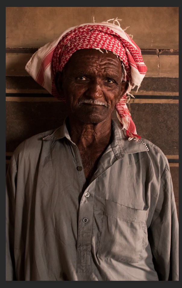
This was the final image that I was supposed to use for my FMP. However, when looking at it a few times I found various things that I didn't quite like. First being first, I feel like the right shoulder is cut off too much. The highlighted areas are too obvious and therefore give an almost “fake” impression of the image which I don't want. Additionally, I feel like I didn’t manage to do what I originally had planned for the image; I wanted to accentuate the wrinkles on his face that even after various tries I did not accomplish. All in all, I felt like I had to try and edit the photograph again to come up with something closer to what I had in mind.
Second attempt:
I opened the image into camera RAW

I turned the exposure to - 0.25, the contrast to +10 to darken the background in order to make the subject the centre of attention, shadows to -10 to give depth to his face. And lastly, and most importantly, I turned the clarity to +48 to bring out the wrinkles on his forehead/face (something that I had been trying to achieve the whole time when I was last editing the image)
At this point, I opened the image into Photoshop:

I went onto properties > hue and saturation > reds to bring out the red in his turban to help make him help pop out from the background rather than making him seem like part of it (as the colours are very similar)

At this point, all I had left to do was brighten his eyes as they were very dull and yellow. I added a new layer > curves adjustment layer > pin pointed in the middle and turned it up until the image was over exposed > cmd + I to invert the layer > select the brush tool and highlight wherever needed (in my case, the whites of his eyes).

Lastly, in the screenshot above you can see the unedited (left) and edited (right) version of the photograph. The editing is very subtle; I only brought out his features a little more, brightened the reds and tweaked up the composition just slightly. Although I am quite happy with the final result, I feel like the final result could have been a lot better if the photo was taken on a smaller f stop (something in between f/2 - f/2.8) and not against the wall which is the same colour as his clothes and makes him somehow part of it rather than making him stand out. All in all, I feel like I have done the best that I possibly could. The final result is very slightly edited but I am very pleased with how it turned out and I will be using it as the final image for my FMP.
0 notes
Text
UNIT 8: Daily Reflections; June 15th
Today, I decided to finish off the write up for all the photographs that I edited. However, due to various things (distractions being one of them) I managed to finish only one of the two that I was supposed to do. After posting the blogpost that I finished I decided to go through the brief (again) and see what was missing. There wasn't necessarily something missing; there were however some things that I could add to improve my project even more. I will therefore be doing a blogpost on camera shots and decisions where I will be posting some of the pictures that did not make into my FMP and the reasons behind them, a blogpost on interpretation and talk about how you could interpret my photographs, and if I have time I will (maybe) be conducting a focus group showing my final piece and getting some feedback. All in all, I feel like today could have been a lot more productive but I will definitely be carrying on with my work at home so that I don't have a lot of pressure tomorrow morning. Hopefully I will finish off everything by tomorrow afternoon.
TO DO LIST:
- Log of all the editing that I do on my final pictures and the reason behind it -finish write up for last image left-
- Finish post on camera shots and decisions
- Interpretation of photographs
- Post pictures
- Final evaluation
0 notes
Text
UNIT 8: Editing; Photo5
In this blogpost I will be discussing the different editing decisions that I took for the following photograph.
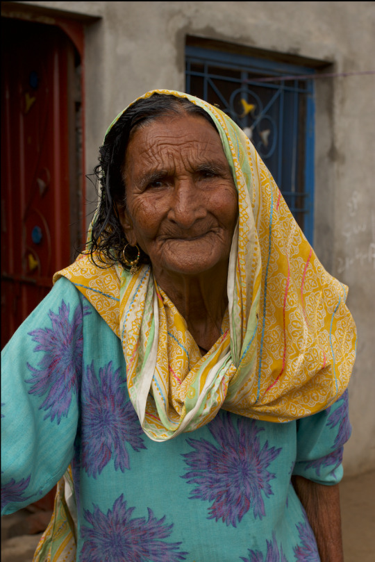
Above is the photo of a very old woman that I photographed in Gujrat, Pakistan. The reason I selected this photo is because I wanted a contrast between the photographs of the innocent kids (youth) and people who have almost lived their whole entire life. I really like the fact that she is smiling although she probably had a very tough life; the wrinkles on her face and forehead are the demonstration of the fact that she had a very long life. I really like the contrast of the red and blue door in the background along with the blue of her dress and the yellow of her shawl.
First of all, I opened my image into camera RAW

as you can tell by the screenshot above, I turned the contrast to +16, the highlights to -1. Lastly, I turned the clarity to +33 to get details in the image and bring out the wrinkles a lot more.
After tweaking the settings a little bit I opened the photo in Photoshop:


First of all, I changed the composition a little bit to make the woman the centre of attention. The head space was a bit too much so I decided to crop that a little bit.
After changing the composition all I really wanted to change was the colours of the image to make them brighter and more saturated. I went on hue and saturation and played around with the different colours. I brightened the blue, yellows, and reds a little bit.

This is the final edited result after tweaking the different colours and changing the composition. As you can see, all I really did is brighten the yellow of her shawl, the blue of her dress and the door on the background and the red of the other door on the background. There is not a major difference in between the unedited picture (left) and the edited version (right) besides the colours and composition. Just like my previous photos, I chose not to over edit my photograph. I want my pictures to portray the people and their true essence and life.
0 notes
Text
UNIT 8: Editing; Photo4
In this blogpost I will be discussing about the different changes that I made to the forth photograph that I selected for my FMP.

Above is the unedited version of my forth photograph. The reason I selected this photo is because I really like the natural posture of the young girl. I did not ask her to do anything (as I never do when taking street portraiture). Yet, it seems like she did it for the camera which I find really interesting. When looking at the previous three pictures you can see that one is almost scared, the other is just staring into the lens and the other one is enjoying the moment. However, this time around, it's a young girl between the age range of 10-13 almost posing for the camera. These are kids that don't get the privilege to stand in front of a camera and get their picture taken a lot in their life. But when they do, they feel important somehow. I learned this during this trip to Pakistan when the mother of this young girl walked up to me and said “Thank you for taking my daughters picture. She thinks that only famous and beautiful people get their photo taken and you made her feel beautiful today. Thank you.” I will never forget her words. They changed my view on a lot of things and maybe that is the reason as to why I like this picture so much. It has a story to me.
First of all, I opened my image into camera RAW

I turned the exposure to -0.05 to make the image slightly darker. I brought the contrast to -6 and the highlights all the way to -83 to bring out the background as it was overexposed and bright. Other than these changes, I decided to leave the photograph just as it is.
Then, I opened my image into photoshop.

After analysing the image for a little while I realised that the composition wasn't quite right. To bring the attention to the young girl I decided to crop the image to show only her and a little of the background.
At this point, I could not find the tools that I needed since Photoshop was on essential mode so I decided to change the workplace to have all the different tools layed out.

To change it, go in window > workplace > photography


At this point, the main thing I wanted to achieve with this photograph was to make the colour pop a little (just like the previous images). However, for this one it was much more needed as the original photo is really flat. I decided therefore to play around with hue and saturation and tweak the different colours a little bit. However, even after changing some things here and there I did not achieve what I was aiming towards.

I then decided to work with the curves adjustment layers to see what differente could that possibly make. Although I still did not achieve what I wanted I found myself liking it more than the original photograph.
After giving up on the colours I decided to work on the eyes and bring them out with some highlight. -used the same method as in previous edits-

(Before)

(After)
As you can tell by the two screenshots above, the eyes are not that different. You almost don't even notice what I did as it is a slight change. I brightened the sclera and highlighted the inner part of the eye to brighten them.

This was supposed to be the finished version of my photograph. However, after looking at it for a while I started finding things that I did not quite like. For example, the face of the girl is underexposed.

To sort it out, I decided to use the lasso tool (tools bar > lasso tool) and the following window opened up

I turned the hue and saturation to +3 to lighten up her face as it was underexposed before.

At this point, I was quite happy with the result. Above is the comparison between the unedited (left) and edited (right) version of my image and as you can tell there's not much of a difference except the composition and colours of the photograph. Although I really like the overall photo, I feel like if only I had more knowledge on photoshop I would have been able to bring out the colours of the shirt a little bit more and make the photograph a lot more interesting. Then again, I think it looks good just as it is as if the colours were bright the eyes of the viewers would grab her cloths rather than her eyes and face which is where I want the viewer to concentrate. All in all, I feel like it's a very good shot. I am very proud of it and I am going to be using it for my FMP.
0 notes
Text
UNIT 8: Editing; Photo3
In this blogpost I will be discussing about the different decisions that I took when editing the third picture for my FMP.

Above is the original/unedited version of my picture that I decided to use for my FMP. The main reason I decided to go for this photograph is because I really like the genuine smile of the little kid. When children are photographed, smiles come beaming through; this is generally true regardless of a person’s wealth. Smiles are indicators of happiness and hope that people in poverty can exhibit. When seeing her beautiful smile no matter the circumstances that she was surrounded with, I was instantly reminded of the fact that money can’t buy happiness. I realised that despite the privileged I have been blessed with, I am quick to complain about minor, insignificant daily happenings. She has nothing. Yet, she's so much happier and full of life than the majority of kids in our countries. That is exactly what I want to tell with this photo. I want to show the happiness on her face compared to her hard life that doesn't effect her happiness in any shape or form.
After choosing the image I opened it in camera RAW

as you can tell by the screenshot above, I tweaked the settings a little bit. I brought the exposure to + 0.35, contrast to +16 to bring out colours, the highlights to -5 as I felt that they were a bit too much, shadows to -6, vibrance to +23 to bring out the colours and lastly, the saturation to +3 to make the colours pop.
At this point, I opened the image into Photoshop
I did some slight changes with the curves adjustment layer to bring out the colours just a little bit more.

I bumped the brightness to +14 as the image at this point looked a little bit underexposed.

I played around with the hue/saturation a little bit. However, I did not make any changes despite the yellows that I changed the hue to -2.
After working with the overall image for awhile I decided to concentrate on her eyes. I did not want to make any major changes but I wanted to make her eyes pop a little bit in comparison to the original photo. I decided therefore to highlight her eyes just a little bit. -highlight exactly how I did for my previous image-

(Before)

(After)

Above you can see the before (left) and after (right) of the photograph. As it is evident, I did not make any major changes to the image not necessarily because I did not know how to, but because the photograph did not require any. All I did was bring out the colours just a little and make her eyes pop out (with some highlight). I could have done a lot to this image (ex: get rid of the fly on the right arm) but I decided to leave it just as it is because I don't like to over edit pictures to then take the truth out from them. Taking out the fly was a few seconds deal but I chose not to. The fly (along with her dirty clothes and the background) represent the conditions that she is in.
0 notes
Text
UNIT 8: Editing; Photo2
In this blogpost I will be discussing the different editing decisions that I took for the second picture that I selected for my FMP.

Above is the unedited version of my picture. The main reason I decided to choose this particular photograph is because I really like the expression of the little kid. His eyes are very big and beautiful. Although they’re dark they are very vibrant and grab the viewers attention somehow. Additionally, I really like the blue and yellow colour contrast in the background. I feel like it really gives something unique to the image.
First of all, I opened the image in camera RAW. I take all my photographs in RAW format to have more control to the image in post production.
As you can tell by the screenshot above I tweeked the settings just a little bit. I went a little bit up with the exposure. Turned the contrast and highlight to +13. I turned the showdows to +8 to give more depth to the image. I also brought the clarity to +32 to make the photo crisp clear. And lastly, I brought the saturation to +9 to make the colours pop and look more alive.
After making some changes in camera RAW I opened my image into photoshop and started playing around with the different settings.

I went into the curved adjustment layer and tweeked it a little bit to bring out colour and texture.

This is the before (on the right) and after (on the left) image that I came up with after editing in camera RAW and working with the curves adjustment layer. The reason I didn't work with any other tool is because I feel like the picture does not require any major edits. I really like the photograph just as it is. Besides, I want my photographs to be real and don't appear as “fake” in any shape or form. Although this could have been the final result I felt like there was something that didn't quite workout. After analysing the picture for awhile and trying to figure out what was wrong with it I decided to change the composition a little bit.

As you can tell by the screenshot above, I decided to focus on his face to bring the attention more to his eyes and make them the centre of attention. However, even after changing the composition there was still something missing, something that did not look quite right. After trying to figure out what was wrong, I decided to blur out the background slightly to make him pop out from the background.

I went onto the tool bar and chose the quick selection tool to then select the little kid (as it was easier in comparison to the background where there was too much going on)

at this point, press select and mask on the top bar and the following window will open up

when this window opens up, all you want to do is smoothen the edges of the selected area to make the blur look real later on.

After pressing OK and saving the previous settings, go on select > inverse to invert the layer and select the background.

Once selected the background, go on filter > blur > gaussian blur and this window will open up

at this poin, put the readius on anywhere between 4.0 to 5.5 pixels to blur out the background just slightly.

Finally, in this last screenshot you can see the final compared version of the before (right) and after (left) of the photograph. As you can tell, just like my previous picture the photo is not highly edited which is my personal choice. I choose not to edit my photographs to the point where they start looking fake, where they don't even project the reality of the situation that these kids/people are in. I could have easily smoothen his skin, colour correct his face and cleaned out his clothes but that would take away the reality of the picture, the reality of the subject. Therefore, alI I decided to do for this photograph was to change the composition, bring out the colours and make the subject pop from the background. I prefer to bring out what is already there In my image rather than putting in something that was never there (ex: I enhance the colours in my picture without ever changing the colours). Photoshop should be about tweaking things here and there, not changing the reality behind the picture.
0 notes
Text
UNIT 8: Editing; Photo1
Despite shooting excellent pictures using a quality DSLR and good glass, at times it’s necessary to edit the pictures taken to suit your photography style or the look that you are trying to go for. It is therefore necessary sometimes to edit photos to increase their attractiveness and quality, hence improving their value. With photo editing, there is no limit to the effects that can be brought in a simple photograph. You can make the boy next door look like a Hollywood star. You can make a simple landscape come alive with the colors of paradise. Picture editing can make even the most ordinary pictures look extraordinary!
In this series of blogposts on editing I will be discussing my step to step decisions and the reasoning behind them. Additionally, I will be posting screenshots to prove my work and before and after of the picture.
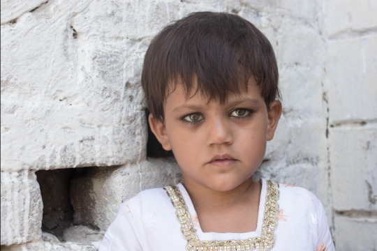
Picture1

Above is the original version of the picture that I then edited getting inspiration from the tutorial above. The main reason i decided to edit the picture was to make her eyes pop out in comparison to the rest of the image.
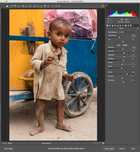
First of all, I opened my image into camera RAW and tweaked the settings a little bit

as you can tell by the screenshot above, I brought the contrast up to +16 to give depth to the image as due to all white colours the image was very flat. I then bought the whites down to -12.
At this point, open the image into Photoshop

once the image is open into photoshop, unlock the background layer and add a new layer by right click on the icon next to path > new layer.
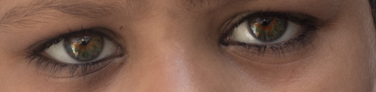
-https://youtu.be/arUt4khitoY) image- Before starting the editing process it is best to look what the eye already has, analys the eye. In most cases, you have a couple of different areas:

Inner eye shape -> yellow (in this case)
Iris -> blue/green that are disaturated (in this case)
Light source -> is coming from the top left. You can see the reflection in the eye. Light enters the eye and bounces around, and then bounces out the opposite side. Therefore, when lighting the eye we have to make sure to highlight it on the opposite side of the light source.
What I am aiming towards is not changing the colour of the eye, perhaps trying to bring out the colours that are already there.

After adding the new layer, grab brush tool by clicking B +alt and then start to sample colours. By sampling the colour we get the base colour to work with. Take the colour and make it lighter and more saturated and with the regular brush tool start creating little lines. Keep repeating the same process using multiple colours to give an original look to the eye (eyes in fact have multiple shades to them and not only one colour especially green/blue/gray). In the screenshot above you can see that I used more than 4/5 colours.

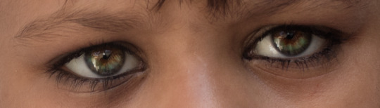
At this point, change layer from normal to soft light to make the colours softer and more subtle
as you can tell by the screenshot above the colours are already a lot lighter and subtle. However, there is still need to give a small blur; you need enough blur where it doesn't look like you have edited it in Photoshop but you still want to get some of the edges and colour strokes.

To add blur go on the top bar > filter > blur > gaussian blur at this point the following window will pop up

put the radius on about 5.5 pixels or below.
The next thing to do is shape the eyes a little bit as at this point they look very flat and dull.

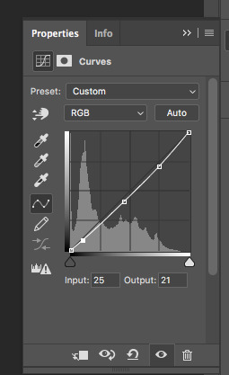
To give depth and shape to the eye grab curves adjustment layer

click in the middle and bring it up a little bit. After this, cmd+I to invert the layer mask. Grab the brush tool and highlight on the opposite side of light source (as explained earlier).
Above is the final result of how the eyes look edited. As you can tell, it's not edited at the point where it looks fake. All I did was bring out the colours and give depth to the eyes. The colours are exactly the same as the original photograoh just more vivid and out there.
After editing the eyes I concentrated on the rest of the face. Being it a child, I preferred not to over edit (ex: the bags under the eyes or small blemished over the face and neck). However, I did get rid of some blemishes/ colours that were distracting. -https://youtu.be/NH0TMVOG_eg- (starts at 03:00)

Above is the screenshot of the nose before any edits. As you can see, there is orange colour all over it which is very distracting when looking at the photo. Reason why, I decided to get rid of it.

Above is a screenshot of the patch tool that you can find in the tool bar that will help to get rid of it

at this point, select the area that you want to colour correct and drag it towards the skin part where everything is clear

as you can see by the screenshot above this is the final result. The orange colour is gone.
Lastly, to give depth do the image I decided to use the curves adjustment layer. I tweaked it a little bit and played around with it to not only give depth and definition to the image but make the colours pop out a little bit as that is the feel that I am going for.

Above is a screenshot of what I did to the curves adjustment layer to get to my final image.

In the screenshot above you can see compared the before and after of the image. As you can tell, the image is not highly edited; the editing is very subtle. Since my project evolves around the story that you can tell with the eyes of the subject I decided to enhance that feature and leave the rest as it is. I did not want to smoothen the skin (ex: get rid of eye bags) because I want it to look real and authentic.
I am very proud of my final result. I feel like I have done a pretty good job as it was my first ever attempt editing a picture in colour. I wanted to bring out the eyes and although it seemed quite impossible initially I got around doing it after watching various tutorials on youtube and finding the perfect one that explained it better. Although I really like the picture there are some things that would have made it a lot better. For example, if only the shirt of my subject was a bright colour (ex: red -> contrast with the green eyes) the girl would have stand out from the white background and not look part of it. However, being it street portraiture I did not have any choice but work with what I had. All in all, i feel like it is good enough for me to use for my FMP.
NOTE: the YouTube links are tutorials where I learned how to use the different tools + how to archive different looks
0 notes