
Statistics
We looked inside some of the posts by dabrandeagency and here's what we found interesting.
Average Info
Notes Per Post
1
Likes Per Post
1
Reblog Per Post
0
Reply Per Post
0
Time Between Posts
1 year
Number of Posts By Type
Text
6
Photo
2
Last Seen Tumblr Blogs


Fun Fact
Kazakhstan’s Minister of Communications and Informatics has blocked the Tumblr site because it contained 60 sites of terrorism, extremism, and pornography in 2015.
Text


Balancing Exclusivity and Whimsy: Designing a Modern Circus Brand Identity by @tavo_studio #DaBRANDé #CreativeChampions #DesignMatters #KeepCreating #BrandBuilders #UrbanBillboard #BoldStatements #DesignThatSpeaks
0 notes
Text


Off Design by @mohammedbadaam
BrandingAgency #BrandingExpert #BrandBuilding #BrandStrategy #BrandIdentity #VisualBranding #CreativeAgency #DesignInnovation #BrandDesign #DaBRANDé
0 notes
Text


Daddy Rack Tennessee Straight Whiskey Design by @strangerandstranger
BrandingAgency #BrandingExpert #BrandBuilding #BrandStrategy #BrandIdentity #VisualBranding #CreativeAgency
DesignInnovation #BrandDesign #DaBRANDé
0 notes
Text


La Favola Olive Oil Inspired by the timeless tale of The Fox and the Stork, this premium extra virgin olive oil pays homage to the value of mutual respect — a sentiment we hope echoes through every tasting experience.
From the name to the brand identity, labels, and packaging, every detail was thoughtfully crafted to reflect the care and quality behind its origin in southern Brazil. More than just an olive oil, it’s a sensory journey — rich in texture, adorned with metallic accents, and wrapped in quiet elegance. Created to stand out as both a premium culinary staple and a refined gift for the discerning few.
Design by @holystudio.co
0 notes
Text

We are the champions of creativity. 💪 And we’re not stopping anytime soon. From strategy to story, we keep building brands that speak. #DaBRANDé #CreativeChampions #DesignMatters #KeepCreating #BrandBuilders #UrbanBillboard #BoldStatements #DesignThatSpeaks
1 note
·
View note
Text
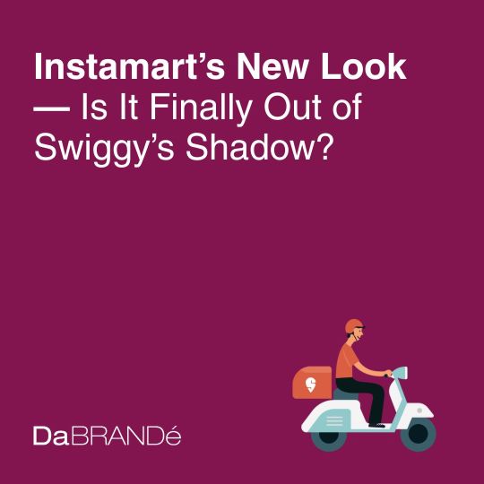
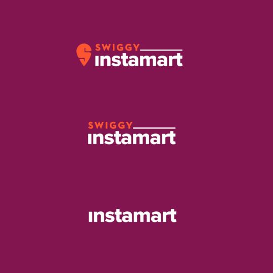
Instamart’s Identity Makeover: Breaking Away from the Swiggy Umbrella
In a bold move to redefine its place in the rapidly evolving quick commerce sector, Instamart has officially dropped the Swiggy branding, ushering in a new phase as a standalone brand. The rebranding rollout began in late May 2025, with the visual transformation gradually appearing across the Instamart app, social media channels, and delivery packaging.
The decision to rebrand Instamart stems from Swiggy’s strategic intent to position its fast-growing grocery and essentials delivery service as an independent entity in the marketplace. Although Instamart will continue to operate under the broader Swiggy corporate umbrella, this design overhaul signals a clear effort to differentiate its identity and build direct consumer loyalty.
Why the Rebrand?
The quick commerce sector in India has been heating up with intense competition from the likes of Blinkit (Zomato-owned), Zepto, and BigBasket’s BBNow. With the market maturing and consumer behavior shifting toward ultra-fast delivery expectations, branding has become a critical battleground.
"Consumers often confused Instamart as just another feature of Swiggy, not realizing it’s a high-capacity, high-speed grocery platform in its own right," said a senior marketing executive involved in the redesign, under anonymity. "We wanted the design to reflect Instamart's unique value proposition—speed, reliability, and relevance in everyday essentials."
Who’s Behind the Design?
The rebranding and creative direction were led by Swiggy’s in-house brand and design team, in collaboration with external branding consultants, though the company hasn’t disclosed specific agency names. The goal was to retain brand recall while crafting a more flexible and modular identity suited for both digital and offline touchpoints.
Design elements have shifted toward a more youthful, bold color palette, departing from Swiggy’s signature orange. The Instamart app now features custom icons, new typography, and microinteractions designed to make shopping feel faster and more intuitive. The tone of voice across copy has also been refreshed to reflect a livelier and more casual appeal—targeting urban Gen Z and millennial shoppers.
What Changes for Users?
From a user standpoint, the changes are largely cosmetic—for now. Customers still place orders through the same app and receive deliveries in similar time frames. However, industry experts say the new branding paves the way for a possible app split in the future, allowing Instamart to become a fully separate platform, should Swiggy decide to scale it independently or prepare it for external investment.
Final Thoughts
Instamart’s rebranding is not just about a new look—it’s a signal of the company’s ambitions to stand on its own in one of India’s most dynamic consumer markets. Whether this design move translates to deeper consumer affinity and market share gains remains to be seen, but one thing is clear: Instamart is no longer just a “Swiggy feature”—it’s stepping out with its own identity and voice.
0 notes
Photo

Branding done for an Fasteners and Construction company, Based in India. #Branding #Dabrande
0 notes
