
Statistics
We looked inside some of the posts by daniel-watson-photography and here's what we found interesting.
Average Info
Notes Per Post
6
Likes Per Post
6
Reblog Per Post
0
Reply Per Post
0
Time Between Posts
8 days
Number of Posts By Type
Text
15
Link
1
Photo
1
Last Seen Tumblr Blogs


Fun Fact
China blocked Tumblr because of pornography and censorship problems in 2013.
Text
Recycle Final Image and editing choices

editing choices


1 note
·
View note
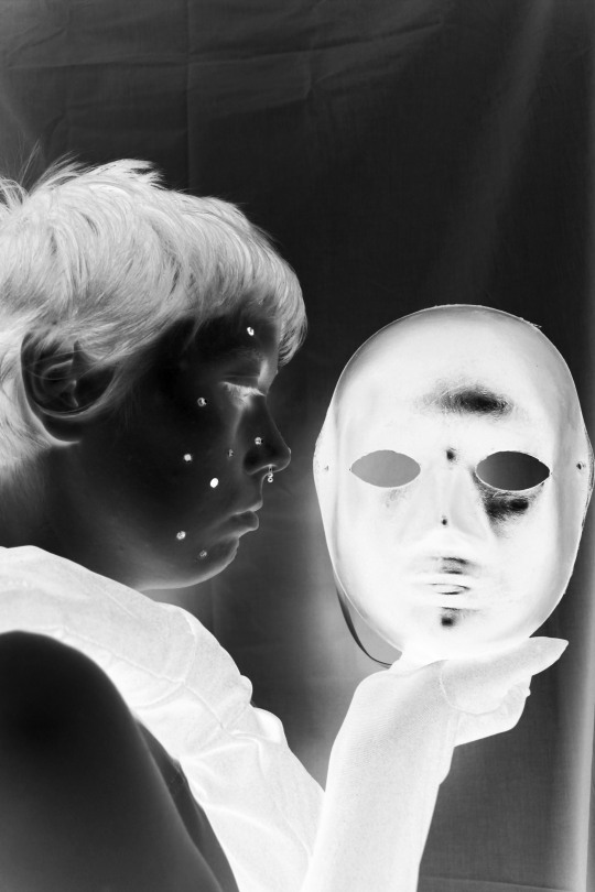
Text
illusion final image and edit choices


0 notes
Text
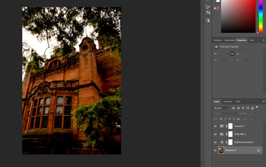
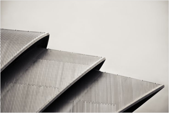
Architecture Editing choices
1.
for the first image i also made use of cropping and the perspetive warp tool the first screenshot is the original image


2.


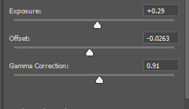
3.


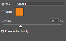

4.


5.


My aim with my final images was to keep a specific colour palette and lighting levels between each photo and i feel i was successful in this regard.
0 notes
Text
Architecture Evaluation
The project theme was “Structure/Architecture” essentially making use of lighting, weather and camera techniques to create 5 eye catching and interesting photos of the outside and interior of a specific building.
Unusually my favourite part of this project was the editing it was fun adjusting the images to a colour and light tone that made me the happiest, in terms of techniques to develop I feel like i should of rented out a wide angle lens i believed my own camera lens would of been fine but I felt dissatisfied with some of the final results especially the landscape shots, I mostly looked at local Glasgow photographers and how they looked at the city, while also keeping in mind the specific style they stayed with, I personally enjoy architecture that makes note of the sides, angles and patterns found within old and modern buildings that photographers then go onto use to create surreal looking photos.
I’m overall happy with my final shots and find them quite visually appealing and hope they are a good example of the kind of architecture I like to photograph and view myself.
0 notes


Text
Moving Image Evaluation
The Project theme was “Moving Image” the general idea was to make a 90 seconds (or a little over) Video of any kind of content we wanted, as someone who had made a video before during an apprenticeship course I was especially excited to give this a whirl, Overall i enjoyed filming the most bringing the storyboard to life while also adding some ideas on the day was a great amount of fun. I honestly didn’t learn any new techniques that I didn’t already know about or had used on the previous short video i had made 2 years before, but that’s okay I nonetheless still enjoyed deploying these techniques again. Now saying this I do want to develop keeping the camera a bit steadier through the use of some expensive equipment I just wasn’t able to get my hands on at the time but will probably look into getting as I enjoy making videos.
My main problem within the project was writing dialogue, I was entirely unsure what sounded natural or not so I ended up just not including any at all, so if I was to ever do this project again I would try and add some dialogue to the final product to make it feel like a more natural story.]
In conclusion I’m pretty happy with my short video i went in looking to make a short comedy skit and feel I was overall pretty successful I edited it myself and although my edits are very basic i feel if i went any more complicated with them it would of boiled down the project to a complete mess so keeping it simple gave me a better result, I enjoyed this brief a lot even if I was unable to give it my full undivided attention due to the work load of the graded unit.
0 notes
Text
Architecture Inspiration
For my architecture inspiration i felt drawn to photos were the photographer has kept in mind the size and scope of the building when they decided on it being their subject
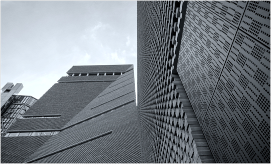
Consistent colour and texture throughout the building makes this very kind to the eyes even if its not the prettiest colour, the sense of scale is portrayed well.

very simple looking area has been transformed to look interesting through positioning of the camera.

incredible framing and post production work.
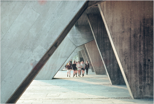
great framing, i like architecture that includes people has it gives an idea of scale.

lovely pattern and symmetry through the windows, contrasting on the white wall.

very dramatic, use of people in the image for scale is effective and the floor pattern contrasts with the pillar colour nicely

Great framing, black and white conversion is definitely the right idea allowing dark and light tones to stand out
using the buildings sharp edges and corners to create a very surreal looking image is an effective strategy i might put to good use.
0 notes
Text
Graded Unit Overview
Project idea and outline included within the evaluation below
Link to final 10 images
https://www.tumblr.com/blog/view/daniel-watson-photography/685249204678017024?source=share
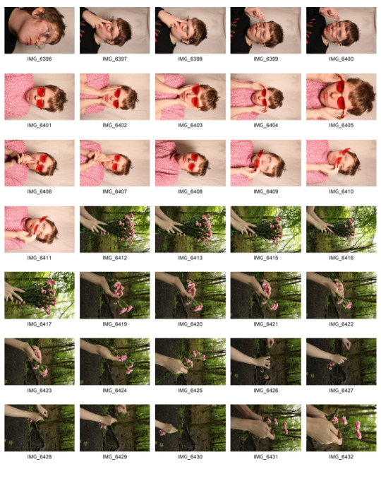
Contact sheets
(this formatted itself weirdly and i couldn’t fix it also its out of order for no reason thank you windows)


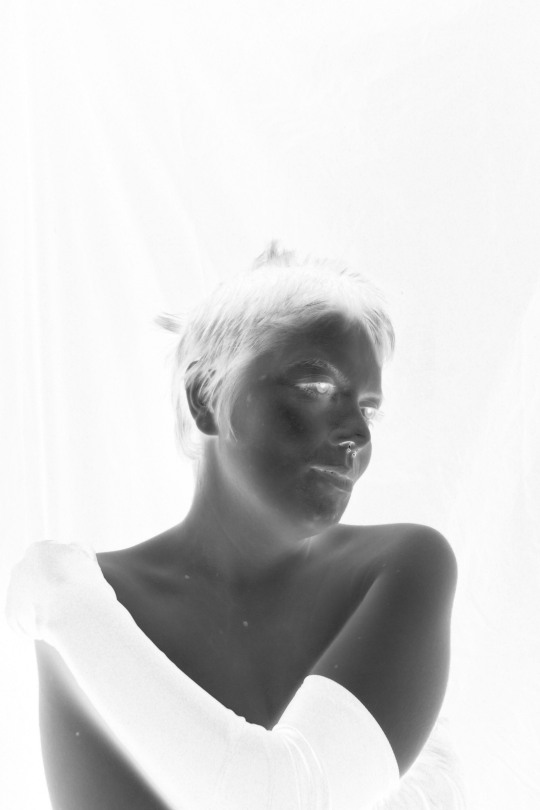
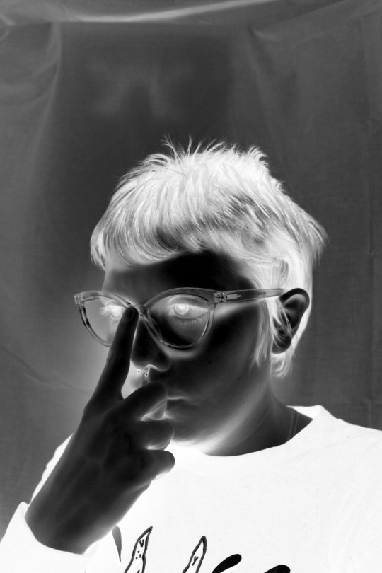
At the recommendation of my Lecturer i tried to do a blend of colour and solarisation with this edit being a bare bones concept for what that could look like, i ended up deciding against using an edit like this in my final 10 as i felt it goes against the entire reason I’m doing this project as outlined in the evaluation below.

Evaluation
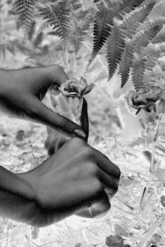
My project idea was to emulate the style of a Rayograph which is a technique invented by American Artist Man Ray, which allowed him to take photos without a camera using only light exposure and photo paper now I myself did not have the time or the knowledge to attempt this myself so I decided to stick with the emulation of the photos through post production editing. The planning and developing stages were relatively simple I firstly started with describing the Rayograph project and research what I could about Man Ray, after this stage i looked ahead to other artists that specifically inspire myself and landed on JUCO and Alec Soth. I originally set dates for essentially every weekend either Saturday or Sunday I would be shooting firstly I would focus on some portraits using a black background, keep in note every shoot i have to keep in note the tones I’m using as dark tones become light tones and dark tones become light tones after the editing I do, secondly i made some images with a white background portraits of a model again, thirdly I did some prop still life esque shooting with a bouquet of flowers with a model lending me their hands for shooting and fourth I would do some outside nature shooting, with left over days I would go back over the project and reshoot where needed.
Now when I got to shooting the project a lot of stuff changed, I was not as available as i imagine and never was my model so I ended up shooting basically every other weekend, over the course of the shoots I employed 2 models for the project I didn’t want to have too many different faces for the project as I felt too much would change between shoots and I wanted a consistent look between each shoot. I ended up not really taking a lot of inspiration from JUCO which I kind of realised before as their vision style is a far cry from Man Ray and Alec Soth, yet I still tried and scrapped the photos I did take in a similar visual style to them.
This project has probably been the most fun I’ve had shooting a project, mostly complete freedom to do whatever I wanted creatively was exactly what I needed and wanted, I feel I’ve been the most with my shooting I set a goal and achieved it and I am very happy with my final images they have a very distinct visual style.
If I had to improve I’d say I need to work on my tumblr blogging I often become too distracted during project cycles to remember to post updates and such to my tumblr on how it’s going, I’m not used to writing diary like entries for anything really so I found it hard to write that kind of stuff in regards to my projects.
In conclusion I really enjoyed my time with the graded unit I had an entire I liked and executing it was a great creative challenge for myself and I am glad I did it, I had a few shortcomings in the shooting phase but overall it went really well.
word count 533
0 notes


Text
Graded Unit
current state of my graded unit
I have done 2 photoshoots
these are the shots i like and took the time to edit into my final idea


currently unsure if i have a final image i’m not shooting again until this weekend the 15/05/2022 where i’m going to try out something different but still under the same moniker of digital solarisation which im taking inspiration from images such as this

just to add a little difference within my final project
So far in terms of my shoots
i’ve bought a white background as a mistake i made in my first shoot where i used a black background and it completely blew out the photo with white tones essentially ruining the image
i’ve taken feedback in from my lecturer who wants me to try and merge a solarised image and a solarised image so i’ll definitely give that a shot and see if its a result i like
0 notes
Text
Moving Images Adverts research Task
Horrifying and yet memorable advert for crusha which is a brand of pre bottled milkshake still purchasable today, incredibly annoying but still relatively well known, interesting animated art style that's both very stiff and expressive.
https://www.youtube.com/watch?v=8Z0xsom6TPg&t=11s
“trio too loud susie” from 1984 is notable for its unique art-style and downright annoying song that is still somewhat catchy?
https://www.youtube.com/watch?v=REuTGVftxSQ
“Cadbury In the air tonight gorilla ad”
Iconic Cadbury ad, even still notable to this day when you search “Cadbury” on YouTube the first result every single time is “Cadbury gorilla” incredibly simple and memorable premise with an amazing song choice.
https://www.youtube.com/watch?v=TnzFRV1LwIo
John Lewis is notable for having some pretty high production ads around Christmas time the one that first comes to mind is their 2016 ad including a dog and some foxes jumping on a trampoline on Christmas Eve a lovely message about gift giving anticipation around that time of year
https://www.youtube.com/watch?v=c8hXrsOx-cs
Cute + downright horrifying “dumb ways to die” disguised itself as just a little funny song on YouTube until at the end you realise you just listened to an ad promoting safety when near train tracks, the memorable song that was very catchy and the cute characters dying in increasingly terrible ways rocketed this ad to be one of the most popular of 2012
https://www.youtube.com/watch?v=IJNR2EpS0jw
“1914″ a Sainsburys ad that aired in 2014 is notable for its partnership with the royal British legion as it chronicles the well known Christmas football match ceasefire that occurred during world war 1 between the British and Germany well shot, and full of emotions and great performances from everyone involved while staying respectful of the real life event.
https://www.youtube.com/watch?v=NWF2JBb1bvM
“end marmite neglect” is an almost 1 to 1 recreation of popular British tv shows where professionals will rescue pets from terrible households and give them care, you could only convince me I was watching one of them until the marmite jar comes in and you realise what you’re watching, incredible ad ALMOST convinces me to eat marmite (if it wasn't terrible)
https://www.youtube.com/watch?v=7R1TDZtNq9g
0 notes
Text
capture and output group questions
(forgot to write down the name of my group)
Output types
Digital photo’s – Usb, hard drive, web download Gallery display through projecter
Direct to media – printed on materials such as metal, wood etc. Flexographic printing can be used
Thermal transfer printing – ink transferred with heat to a surface instead of being sprayed on
Rotary screen printing – a large rotating drum that applies pressure and ink to a surface like fabric to transfer information/images Canvas Vinyl
Duratran – Duratran is a synthetic material that is translucent they are ideal for display on light boxes, light sensitive film is often exposed to RGB light before processing, Offering continuous tone printing and strong black tones. Paper:
Glicee – high quality inkjet printing on fine art paper Ctype – done in a darkroom by exposing an image through an enlarger and onto photosensitive paper.
Paper types With ctype requiring certain types of paper as it relies on photosensitivity to work, the number of paper types available is rather limited, whereas giclee printers can use many different forms of paper, but finding the right one to fit your images can also be challenging given the number of options available. Matte Coated and Gloss Coated paper: Gloss paper has a smooth feel and a shine, it also helps bring out and enhance the colours, it is usually used in advertising and leaflets.
Matte coated paper doesn’t have a reflective or shiny finish. It has a muted dulled down finish that almost absorbs light and refracts it slightly there is less contrast and duller colors. It has a soft textured feel to touch and is usually used for magazines and books.
Silk Coated Paper: This paper is between gloss and matte; it has the smooth feel but without the reflective shine. It’s a versatile paper and is used for a more premium finish. This is because it doesn’t give off a glare like a gloss coating would.
Bond Paper: This paper is the hard waring paper used for writing on or normal everyday household printing. It isn’t coated so can be easily
Giclee vs Ctype
As c-type uses photo sensitive paper it is able to transfer tones and shadows with far greater
accuracy. With giclee using a printer to spray small dots onto the paper it is somewhat limited in its ability to maintain accuracy in the small details.
Gilcee however does pose better when it comes to colours. As the ctype prints are often done in one tone you can lose some of the saturation in the final printed image but as gilcee uses ink, and sprays in tiny dots its able to give a better contrast with colours.
One of the biggest differences between ctype and giclee is there archival quality with both lasting around 40 years in sunlight but in darkness, giclee can last around 200 years whereas c type can only last around 80.
0 notes
Text
surrealism research
Surrealism officially began with Andre Bretons surrealist manifesto released in 1924, Andre is a prominent figure in the dada movement credited to many creative and interesting pieces of surrealist art content. Although he is credited as the true beginning there was a movement in 1917 inspired by the paintings of artist Giorgio De Chirico who capture street scenes with a sort of hallucinogenic feeling. After 1917 chirico gave up on this style but his work was never forgotten by surrealist artists through the german Dadaist Man Ernst calling attention to them around 1922 leading to a lot of collage surrealism work to be produced at this time by him and other artists.
“according to the oxford dictionary Surrealism is a 20th century Avant-Garde movement in art and literature which sought to release the creative potential of the unconscious mind” essentially it encouraged artists to delve deep into
notable surrealist artists include Man Ray, an American visual artist who live in paris and who operated around the years of 1922 to his death in 1976 he is credited as one of the spear heads of the dada surrealist movement.
Pablo Picasso was a Spanish artist who operated around 1890 to his death in 1973, Picasso is notable as one of the most influential artists ever, he is credited with being the figurehead of the cubism art movement being the usual example people will point too.
the uncanny is a style of art that falls under surrealism it relates with taking two objects that don’t belong together and combining them to create a new object it leaves the viewer with an uneasy (uncanny) feeling about the object it is reported the first use of the term was by Ernst Jentsch in his essay “on the psychology of the uncanny”, 1906 he describes it as something new and unknown that can often be seen as negative at first. Famous Psychologist Sigmund Freud threw his cigar in the ring and put forward a new take on the word describing it as something familiar but still unknown.
Man Ray is a notable artist in the field of the uncanny for his art piece known as the gift 1921
The piece features a sculpted flat iron with a row of 14 nails going down on the flat end, Man rays ability to take an everyday object and create an almost unameable object one he even himself decided to not name and istead gift it the cryptic title of “the gift” shows his understanding of the surrealist movement and why he was one of the pioneers there’s something inherently uncomforablte with the deisgn of the flat iron its just plain wrong.
0 notes
Text
Camera Reserach
https://www.adorama.com/alc/faq-different-camera-sensor-sizes/
https://www.cambridgeincolour.com/tutorials/bit-depth.htm
https://www.adorama.com/alc/dynamic-range-photography-explained/
https://issuu.com/media-publishing/docs/mastering-digital-photography-pg-2nd-ed
https://www.premiumbeat.com/blog/what-is-dynamic-range/
Types of sensors
Medium Format (bulky mirrorless cameras like newer fujifilms or X1D 2) – This is the largest sensor type often found in mirrorless cameras, the format itself has its own group of sensors each
35mm Full-frame (Dslr and mirrorless cameras)
APS-H (Canon has since been discontinued)
APS-C (Nikon, Pentax, Sony, Fujifilm and sigma but is often a different size between the 5 brands)
Four thirds / micro four thirds (created by olmypus and Panasonic uses a 4:3 aspect ratio)
1” type (used by Panasonic lumix and sony cybershots the sensors are quite literally 1 inch)

Dynamic Range
In photography dynamic range is essentially the difference between the darkest and brightest colour tones that a camera can capture within the one exposure the max
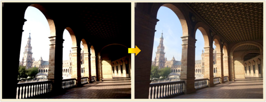
Dynamic Range is important it allows a photographer to recover detail within an image if there’s an issue with the highlights being overblown which would usually result in lost detail IF their camera didn’t have good dynamic range.

BIT DEPTH
Bit depth is essentially the amount of colours that will and can be displayed by a digital device, the higher the bit depth leads to the more colour being used within an image BUT this also leads to a larger file size

The range of bit depth is incredibly large as you can see from the table and will likely range from these key numbers which up the colours available by millions and billions at a time.
Bit depth is important as it is our range of colours and allows us to effectively express ourselves and our vision by adding a large range of colour to our images up to almost 281 trillion available colours!
Digital Noise
Digital Noise is the grain and visual distortion you get when shooting under certain conditions listed below
High ISO although you need this when shooting in a low light the trade off is that this may lead to your image having a ton of noise in it


Small Camera sensor size
Can matter as even at the smaller sides of 400ISO a lot of noise will appear this is just due to how small camera sensors are designed since they can’t reach higher ISOs compared to regular sized sensors.
Shutter speed
Long Exposures can introduce a little bit of noise through static this can be mitigated by reducing the ISO.
Often Digital noise can be avoided by shooting at a low ISO although this doesn’t help in terms of previously mentioned small sensor sizes.
The larger the sensor the less likelihood you will run into awful high amounts of digital noise.
Finally you can get software such as Nik Dfine to manually reduce noise on your images via your Computer.
Sources
https://nikcollection.dxo.com/dfine/
https://www.adorama.com/alc/faq-different-camera-sensor-sizes/
https://www.cambridgeincolour.com/tutorials/bit-depth.htm
https://www.adorama.com/alc/dynamic-range-photography-explained/
https://issuu.com/media-publishing/docs/mastering-digital-photography-pg-2nd-ed
https://www.premiumbeat.com/blog/what-is-dynamic-range/
0 notes
Text
Recycle Inspiration
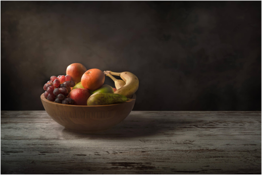
Nick Church
Church goes for a simple approach with his still life just a single bowl of fruit in frame but the way he frames it is everything it’s off to the side with a beacon of light shining onto it, this image is a great example of how good lighting helps and image because although there's a lot of negative space you won’t find yourself looking at anything other than the bowl of fruit from the way he’s made it glow.

Giovana Griffo
Giovanna chooses a very messy and dark brown background to contrast with the bright yellow and green of the lemon; this is then accentuated by the light shining onto the lemon making it stand out even more and leaving us with a very pleasing image to look at.
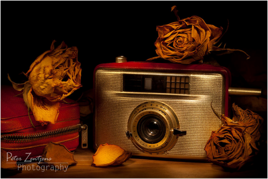
Peter Zentjens
Peter uses a technique with the light and post production to give his image an orange sort of vintage glow which even though this image was taken just under 7 years ago it makes it feel a lot more older than it actually is the vintage feel lends to the subject matter very well with this very old style camera.

Jon Devaul
The use of shadow with this image is great the way the photographer has managed to specifically light the main subject allows it to stand out by itself and giving it this striking yellowish tone.

Ed Philips
Subject matter is perfectly centred and the lighting is perfectly set up to illuminate the props which lends to them standing out effectively
0 notes
Text
Second shoot studio
Contact sheet


Overall went pretty well I’m happy with the images and just need to get on to editing them.
1 note
·
View note