
Statistics
We looked inside some of the posts by darachmcsherry and here's what we found interesting.
Average Info
Notes Per Post
2
Likes Per Post
2
Reblog Per Post
0
Reply Per Post
0
Time Between Posts
4 days
Number of Posts By Type
Text
17
Last Seen Tumblr Blogs


Fun Fact
The Tumblr app for Google Glass was released on May 16, 2013.
Text
Designing Digital Health_
Today I read an article outlining the lessons people have learned from designing digital health for patients, with patients.

Why its so difficult to design for healthcare_
There is some what of a friction between people and technology. First of all, the healthcare industry is highly regulated, complex ecosystem with so many different moving parts which rarely communicate effectively. You have to take into consideration several things; Patient’s needs and frustrations but also considering the interests and motivations of players within the industry such as physicians, insurance companies and governments. Introducing and motivating a new routine within the healthcare is not an easy task! We as designers need understand digital behavioural design and psychological models to fully execute a project like this.
According to the CGG. chronic conditions such as diabetes, hypotension or mental illness cause significant health and economic costs. It is important for patients to monitor their illness and digital products are the perfect solution for this. Disease management apps have big potential to increase the amount of people managing their own health. They have yet to reach their full potential but are so far working!
Problems faced_
Although management apps are useful in some cases, Through user field research, and secondary research, we learn that people’s emotional and functional barriers restrain them from proactively managing their health.
Patient-provider dynamic is the changing, currently patients attend their GP and get seen to but as technology evolves, there is more of an equal partnership between patients and doctors. Technology is being used to facilitate a conversation between patients and their doctor which could lead most of it online and digital.
However there are trust issues with online services and information privacy is currently a big concern. People are afraid of putting up all of their information onto a digital platform as there is fear of it being used or exploited.
Another reason there is difficultly changing the healthcare service to digital is because people don’t believe in ‘digital magic’. There is concern about the inaccuracy of digital tools for health. Take the IWatch activity tool for example. I have the series 3 watch and their heart rate monitor is very inaccurate as well as their calories burned monitor. This can only improve with new technology but for the meantime, it is leaving people wary about the whole thing.
Another big thing about health care is tone of voice, by communicating with a positive tone, patients could subconsciously feel more hopeful about the outcome of their treatment. One digital way around this is to add prompts (”you’re doing great, keep it up!, keep going!”) its all about controlling the patients emotions and making them aware that everything will be alright.
Measuring how good a product or service will be for the health industry can be clearly shown ‘time saved’. Meaning the less time the patient has to deal with their health issue, the more effective and successful the product or service is. Disease management is not something patients choose or want its about what they most do daily. This is why it is important to design with effectiveness and efficiency in mind, keeping a clean feel and clear communications.
I will use what I have learned from this to approach a product and ensure that it is for the user!
2 notes
·
View notes
Text
Week 1: Narrative and Storytelling_IXD304
In semester 2 we will be looking at Story telling. The task at hand is creating an immersive prototype and a narrative website or ebook of the prototype. The brief focuses on Sherlock Holmes and the Heroes and Villains within it. We will need to apply what we know about the design process and ensure that every aspect is covered.
Storytelling in Apple_
We took a look at Apple for their renowned storytelling of their products. They use all sorts of animation, typography, layouts, imagery and interactive elements which keep the users focus on the screen. Take their iPhone 12 advertisement campaign for example. One continuous scroll with interactive elements on every click. Seemingness smooth navigation the whole way through. Large text symbolising the most important information. Large imagery and most of all, amazing aesthetics. This advertisement itself, lives up to Apples reputation for professional and high quality experiences. They see buying their product as an experience rather than just buying a product. Overall their design and storytelling is truly inspiring and one that I will be referring back to through out this entire project.
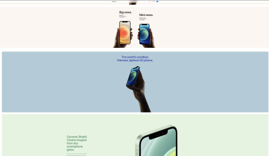
After reviewing and conducting a quick usability test on Apple’s website, I have a better understanding of what to do in this project in order to create a impactful story.
0 notes
Text
Week 1: UX Design_ IXD303

UX In Health Care_
Starting off this new semester we took a look into UX Design and how to create for the user. We will be diving deep into the user experience of the health care sector and looking for flaws within it. We were placed in teams for the first part of this module to work together and research into the failing aspects of the health care service.
From here we will research, research, research and find as much information and data that points to an area that is not very user friendly, whether that be for patients or the healthcare staff. As part of our research we will conduct usability tests on services such as GP practices’ websites and other healthcare apps. This will help us fully grasp a good understanding of the problems.
It is good that we as designers are conducting some of the usability testing as we are also customers/patients of these services and we will already have our own thoughts and frustrates about the healthcare.
Laws of UX_
I took a look into Jacob’s law to gather an understanding of what users really expect. I found that ‘people spend most of their time on other sites’ which means that users are already familiar with how every other site works and why should it change for yours? They want a site that works the exact same to others as thats what they’re used to. If you change an ‘open hours’ list from the information section to contact us page, the user is going to have a hard time finding it. Why would you change something that already works?
Monzo Vs Bank of Ireland_
That was only one example, Another would be the comparing Monzo to Bank of Ireland. Two banks I am apart of. The Monzo app is a phenomenal app which offers the user a great experience. Their service is quick, convenient and truly satisfying. For an app to be satisfying, that is a big plus! transactions are smooth, the service is seemingness and their split bills, share tabs and request money options are very user friendly. Whereas, the Bank of Ireland app is on the flip side. Its a service that I would LOVE to change. I have used their app and website for around 3 years now and it recently got a refresh. However, there was minimal change. Transaction take days/weeks still, customer service takes up to 3 days to respond, App is slow, aesthetics are minimal and the overall layout is confusing. Overall, bag UX Design from a customer’s perspective.
UX Design is ultimately problem solving. It is vitally important that UX is utilised in the making of everything, physical or digital. tasks Such as Usability testing and User research are two key aspects that are essential to the success of a product or service and must be completed to the highest standard. If not, it will fail.
0 notes
Text
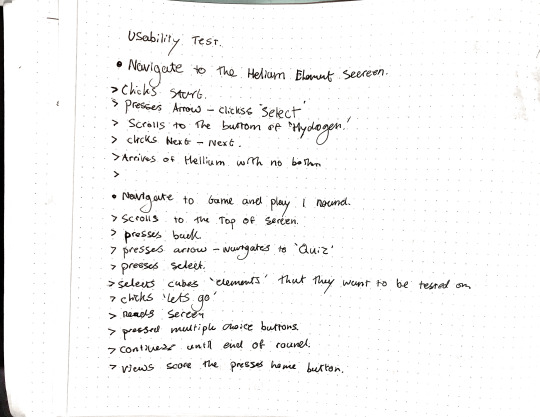
MR. ELEMENT - Usability Test
After redesigning my elements game and prototyping it. I felt it was then necessary to conduct usability test to see if my changes worked and that everything was as expected.
Now that I know how usability tests work and what they actually do and prevent in a project, I will be using them for everything. I also need to be careful who I conduct a usability test on as people will pretend to know what they are doing just to make you feel like you have done a great job.
Usability tests will essentially prevent any future problems in my design process now that I have learned their benefits.
0 notes
Text
MR. ELEMENT UPDATED
After todays critic session I received a lot of good constructive criticism on my game. I essentially realised that I needed to take a step back and have a think about my game. I had tried to design something that I had researched well and knew worked, But I got carried away with the design aspect of it and didn’t focus enough on the user experience side of things. My game was confusing and required too many steps to initially get into the game. I only realised this after Kyle conducted a usability test on it.

WHAT I HAVE TAKEN FROM THIS
Test the whole way through the process. Make sure that I get someone to conduct a usability test throughout the the project even when its only on paper.
Focus on usability before interface design. Sometimes I get carried away with the aesthetics that I lose focus on the experience side of things.
Continuous reminding of user persona and who the product is for. I needed ensure that I stick to target audience and not lose focus on what matters.
UPDATED VERSION*
I needed to make a plan based on my feedback and what I realised needed to be changed. This would ultimately assist me with my problem solving and ensure that I executed this the second time round.

I then wire framed my new screen ideas and content for the updated version of the game. I implemented a new section called ‘practise the elements’ where kid could review the elements before they started the quiz. Therefore they could use the game as a testing tool to actually learn the elements properly.
I wanted to include information about each element that was intersting and fun to learn. Therefore ensuring that the user has a good experience whilst using the app.

Here is just some content that I sketched out that would be used in my design. These are my Illustration icons for each element to show kids an example of what objects and foods had the element in them.

HIGH FIDELITY MOCKUPS *

This is the new version of MR. ELEMENT which has had a sever refresh since the critic. I knew after hearing the feedback that Kyle wasn't happy with the game and I realised myself that It was sloppy. I went back to the drawing board and started to re build the game, Removing unnecessary features and adding new and more suited features.

Above is my new visual Grammar for the game, including all of my new illustrations and icons which I developed on Figma.

The image above is the new section which I made for the game. It outlines the elements visually and shows the user all the fun facts about the element. The user can scroll through the elements by navigating with the ‘next’ button located at the bottom of each screen.

Above is the new and improved quiz which uses only 1 game mode and uses an algorithm to randomise the questions every time. The questions are determined on which elements the user chooses in the ‘choose your elements’ section. Here they can select the elements by pressing on the interactive displays, which highlights them in colour.
I am a lot happier with my new design as it makes more sense. I will continue to refine it and add to it to make a solid experience for the user.
0 notes
Text
Elements Project Link
https://www.figma.com/file/cO7LdYzG2NA0ffQbkPgnkL/MR.-ELEMENT?node-id=0%3A1
0 notes
Text
Value Proposition
A value proposition is a statement that answers the 'why' someone should do business with you. It should convince a potential customer why your service or product will be of more value to them than similar offerings from your competition.
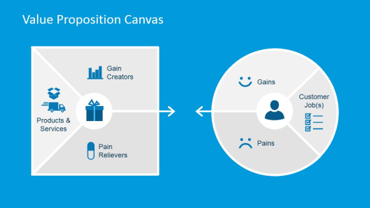
Your value proposition is your unique identifier. Without it, people don't have a reason to work with you over somebody else.
After researching into value proposition I have gained a better understanding of what it means. I watched a very helpful video on the subject to fully get my head around what it mean.
Essentially vale proposition is made up of 2 things; a Customer profile, and a Value map.
The Customer profile consists of 3 things; Gains, Pains and Jobs and the Vale map consists of 3 things; Pain Reliever, Gain Creator and Products and Services.
The Jobs mean the task the customer are trying to get done. The category that my product is under is ‘Functional’ as users use it to make other content.
The gains are the things that your customer would expect to get from your product. So for my product, the gains that the customer would get are the High Quality content, Good value and a Clear view of what I am offering.
The pains represent the things that the customer is scared of, such as; my product being bad quality, Not getting everything they paid for or not getting good value for money.
The value map is used to show how the product will be a pain reliever and a gain creator for customers. Pain relievers are a description of exactly how the product or service alleviates customer pains, making life easier and the gain creators show how the product or service creates customer gains and how it offers added value to the customer.
0 notes
Text
Product Reprice
After careful consideration I have decided to reduce the price of my product to £21 as I feel like £30 is a little too much for 60 textures. I have compared my prices to my competitors and realised that there will be little demand for my product if the price is too high and content is too little. I have also decided to make this product an ‘ongoing’ product where I will update the packs and ensure that all the content is appealing. I have rethought about my products content and I have decided to make an additional 20 textures of paint and dust as these textures are highly useful and easy to make.
I will list my product on Gumroad, Deisgn Cuts and my website as these are the 3 places I feel it will get the most attention. Im really passionate about making this product solid and fit for purpose as I would like to use it in my own work.
0 notes
Text
Digital Product Pricing Research
When figuring out my prices, I conducted a bit of market research into what other people were doing. I needed to understand what prices I am competing with. I used Design Cuts to conduct this research as I found a lot of similar content on their. The three products that I used and based my product around were these three; Dust + Dirt | Speckles and Noise, Black Paper, and Plastic and Torn Paper Collection.
The prices that these products are based on are the quantity and uniqueness of the content. The Dust and Dirt product has only 17 elements within it and so it is prices as a small amount of £12. The Plastic and Torn Paper Collection contains 117 elements and so it it prices at £31. The black paper product contains 30 textures and priced at £12. I
I want to ensure that My product is priced at the amount it is worth. I will take into consideration the time taken to produce, the money spent hiring a photographer, and the uniqueness of the textures.

After conducting a bit more market research I discovered textures on Gumroad. Gumroad was quite different to to Design Cuts and only had very few texture packs that were worth checking out. I feel like Gumroad would be a good marketing platform for my to use in order to make some sales.

After conducting some market research on my product I have decided to base my price on what my competitors are doing. I think £30 is a good price for the amount of textures I am including and the variation of texture types I am implementing. The prices of the products vary from £12 minimum to £31 maximum and I think anything from £20 to £30 should be my aim. I am going to set the price at £30 for now and see how things go but if I receive sales in the first while, I will then consider dropping the price to around £25-£24.
I will need to ensure that my products are up the the standard of my competitions and that I promote my product the best I can to ensure it reached some sort of popularity.
0 notes
Text
Product User Research

As I am creating my product for graphic designers and illustrators, I conducted a some user research on a graphic designer. The information I received was very insightful and gave me a clear understanding of what I needed to include in this product and its marketing. This graphic designer uses texture elements himself and told me what he really wants to see in a product like this.
Different Types of textures.
Files need to be organised and easily accessible.
Wants textures to be easily dragged and dropped.
The textures need to be high quality and obtain a high resolution so they can be scaled up.
To see zoomed in examples of the textures.
To see all products visually .
To see tips on how to best use the textures.
To see examples of the textures being used in action.
I found all of this research quite helpful and It helped me construct my product from the ground up.
0 notes
Text
HTML / CSS Refresh

As it has been quite a while since we touched on the actual code of a design, it was important for us to conduct a CSS / HTML refresh this semester. We will need to know at least the basics of the code for our careers and so Kyle took the time to refresh our brains on the subject.
I have used Webflow to develop my website and Landen to create my digital product page, these are 2 no code applications which allow us to focus directly on the design. However I want to know the behind the scenes so that I have a better understand of why something works the way it does.
Kyle went over CSS grids and Flex boxing which are 2 really important and useful techniques for building websites. It was hard to understand at first as we hadn’t done it in ages but once we had down a fair bit it all started to come back to me. It’s crazy how after neglecting something for a short period of time that we completely forget.
We also went through the basics of HTML and CSS to spark our memories. Things like Padding, spacing, margins, tags, Divs blocks. Even though I didn't use the raw code to create my website I’m glad I used Webflow because it still includes all the programming terms and tools. As a kinesthetic learner I learn best from doing things and making mistakes and so Weblflow as good in that aspect. Before I used Webflow, I wasn't too sure what different terms meant and how to use them but after being surrounded by them visually I now understand them a lot better.
I look forward to getting the opportunity to use code again in projects now knowing what things mean and do. I would like to be gradually brought back into code so that I don't get overwhelmed.
I will use Linkden Learning as an asset for picking up techniques and tutorials on code to better improve myself as a UX / UI designer.
0 notes
Text
Portfolio Website Redesign
After a lot of thinking and a bit or learning, I came to the conclusion that I wasn’t happy with my website. I felt like it could be a bit more tasteful and exciting so I started to rethink. I researched Pinterest and online to gather ideas for a new design. I wanted something that represented my style of art and what I truly thought would work for my brand.
I changed the dark mode theme to an even more dark mode theme as I felt my information wasn’t standing out enough. I designed concept art on Adobe Photoshop to replace my existing art. and then I implemented that into my website.
After learning about flex boxes and CSS Grids I decided to redo some of my pages as previously I had developed them with little idea on how to. Now my content flows and looks cleaner. I also added a ‘products’ page to display my products for my other module. I took what I had designed on paper and Figma and implemented that into a page
Redesign

0 notes
Text
Digital Product Marketing and Promotional Strategy
I have just finished designing and developing my promotional strategy for my product to give it the full send for advertising it to customers. I tried my best to match the Landen site design to my sketches, however that proved difficult as I had little to no experience on Landen. However, I got the layout pretty much the same and got in all of the content that was required
Find attached my Landen and Gumroad pages for my product which i have created to advertise and sell my product.
Landen Link: https://xgwyohpptkq2.umso.co/
Gumroad Link: https://gumroad.com/darachmcsherry#PTnuCC


I like to have everything in the one place and so I decided to include my product on my website. here I could develop it just as I designed it. I laid out all of the content in the right order and linked the buttons to my Gumroad page. Hopefully here I can get some more sales as I can link my website to my social media pages.

Ive tried my best to mimic what I have designed on paper but I encountered several problems. Firstly, I had a real struggle getting this layout the way it is. I had started off using columns but after researching, CSS grid was the way to go. I think the most frustrating thing Encountered was scaling the website up and down for different screen sizes. I am still having bother with it but hopefully after more learning and practice that I’ll be able to get the hang of it
0 notes
Text
Digital Product Promotional Strategy
Now that I have completed my digital product it is time to market and sell it. The next stage is to get my product up and running so that I can start to see some cash role in. I have designed a website for my digital product however I do not have the time or money to fully develop it and publish it so for now, I am going to create a ‘Landen’ page and upload my product to Gumroad. The Landen page will act as a gateway to the Gumroad page where the customer can purchase it. I will also be promoting it on Instagram as I have a design following on it and I know that I will reach people from there.
I have designed 60 decent textures that I would personally use. One thing I will do when I get time I will adjust the pack and swap out textures that I feel don’t appeal to the pack. I really want to make this a solid texture pack for designers and so I will continue to refine it until it is perfect.
0 notes
Text
Mr.Element Mockup
After Sketching out my design and planning the content for Mr.Element IO began to digitalise it on Figma. I have recently started using Figma for Ui designs mockups and it is honestly the best thing ever.
I followed my wireframes exactly as I planned it all out in the way I wanted it. I began with the home screen and then transitioned the whole way to the end game.
In terms of the colour scheme, I wanted to go for something clean and so I went for a dark mode palette. I made Mr. Element into a tour guide character who speaks out all the information on screen. This made the game a lot more engaging and user friendly.


VISUAL GRAMMAR
I felt it was necessary to create a visual grammar including all of my icons, colours, typeface and visual identify assets before I started to build my mock up so that I could use it as a referral board when making sure I included everything I had designed in the wireframes.

Below is a board with all of my visual content that I implemented into Mr. Element.

After completing my mock up I decided to make a short video prototype of the app to run through how it works and how a user would navigate through it. Not all aspects of playing the game are working however I felt it was necessary to run through the basic functionality of it.
youtube
0 notes
Text
Elements Project Wire Frames
As part of my planning and content design, I developed a series of wireframes to express my ideas for ‘Mr. Elements’. I started off sketching out the layout and basic content for the screens then gradually adding the actual content as I went along. I Wanted to fully visualise my whole plan on the these wireframes so designed them specifically to how I intended.


After Conducting my first Usability Test I realised I needed to include Back Buttons on every screen so that the user can navigate to previous screens with ease. I also gathered from my usability test I needed to include a Menu button on each screen so that the user can access settings and their profile from each screen. At first I had planed on having ‘Profile’ and ‘Settings’ as separate buttons on the top of each screen but from a users point of few, I was advised to change it to a menu button inside as there were more buttons to include. And it also cleaned it up.
I went back and added all of these features to my new sketches to get a better understanding of where to go next.

I then sat back and viewed all of my screens on then realised that there wasn’t enough visual content for it to be a kids game. The overall concept was suited for a kid but not the visual design so far. So I went back and rethought about the screens. I added ‘Mr Element’ to each screen and made him talk using speech bubbles so make it more visual for kids. I also added more visual graphics and used imagery to explain each game mode, Question, and No. of elements.

The next stage in my process is to develop these wireframes on screen and get a feel for what they will actually like. I will create a visual grammar to determine the colour scheme, Typeface, lay out all my icons that I will design beforehand to give myself an overall view of what I need to include.
0 notes
Text
Elements Brand_
When first approaching the brand for my elements project I had thought of designing a brand that was catered towards science. So I began researching minimalist scientific logos such as atoms and elements. But then when I began drawing them out I started to realise that these wouldn't suit my users. My users are kids after all, Aged 8-11 and so I had to rethink.
I started Researching more into my users and came up with a mood board on Pinterest called; Kids Logos. From here I heavily researched into characters and kids related logos. I began sketching out characters and figures on paper to see if I could come up with something cool and appealing. I started experimenting with ideas and it started to morph into something that I really liked. I realised that with kids, they want something that it friendly and goofy, such as a monster or a blob.

The first initial keywords that I used for my brand were; Elements and Periodic I tired to incorporate those words into something that would relate to a kid. So i came up with the name MR. ELEMENT.
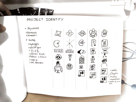
These are my sketches for the brand and what I chose to go with. I liked this little character and felt like it would relate to kids and make them laugh. I began to digitalise this concept for MR. ELEMENT on Adobe illustrator. This is what it looked like.

I really like my design and think it fits in with my target audience. I will continue to work on this concept and turn it into the brand for my product.
0 notes