
Statistics
We looked inside some of the posts by darnahchenery221456 and here's what we found interesting.
Average Info
Notes Per Post
0
Likes Per Post
0
Reblog Per Post
0
Reply Per Post
0
Time Between Posts
1 hour
Number of Posts By Type
Text
1
Photo
16
Last Seen Tumblr Blogs


Fun Fact
There are dozens of funny blogs to kill time on Tumblr.


Photo

Choosing the type font had proved to be rather difficult. At forst i wanted a typewriter-ish font that could tie in the article, but the ones that I liked would make the text really hard to read in terms of letter spacing and how the words would be arranged in each line. I did end up finding a nice classic font that I think links everything together nicely - compared to the layout.
0 notes


Photo
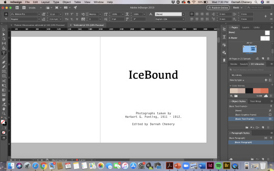
it’s taken me a very long time to think of a title that i remotely like - at the moment IceBound fits
icebound - frozen ice bound - surrounded ot covered by ice
0 notes
Photo

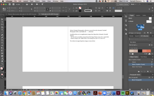
the last page references the photographs and text the were used within the book
0 notes
Photo

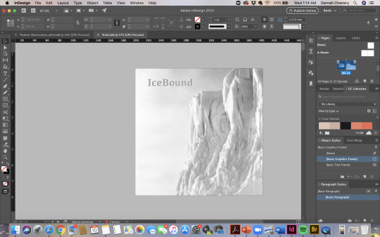
love the contrast within this image and the forms made from the ice. The text is also placed well, leaving that slice of ponting in frame.
0 notes
Photo


quite happy with this too. I think the scale is really effective in comparison with the image. reminds me a lot of of Mayumi Suzuki photobook with her use of scale and layering of sorts
0 notes
Photo

this is the image from the book cover, just cropped a little different. the other quiet moment that i was talking about before.
0 notes
Photo

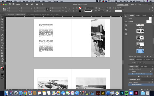

Very proud of this - took a lot of re-working but i got there in the end! this the layout of the text is really nice and even just fits in behind ponting. even the end of the camera fits nicely on the page, overall just a great layout.
0 notes
Photo

Another form of reflection. I think this one is really effective, and i find that the table resembles a glacier which is pretty cool.
0 notes
Photo
a simple page - more of a quiet moment within the book that i think does need it’s place here. I’ve chosen two images for this purpose, i think this one just gives a glimpse of ice life. cropped in and enlarged to a full page, theres so much detail so i think it does it justice.
0 notes
Photo


I like this one a lot - chris the dof is a very famous image, however without the gramophone it’s not so recognisable. also a bit of a play on his numerous lectures and everyone getting invloved - including the animals.
0 notes
Photo


this was a really hard arrangement. Both of these images are well known within Pontings work, and anything i tried just became a jumbles mess. I’ve tried to play around with details from the rooms and i envision these to be fold outs from the book but don’t know how do show that in indesign.
0 notes
Photo


at the moment i cant decide between the black or white background. during one of my crits Wayne mentioned that it could be interesting to try out the black - but i really don’t know if i like it or if it works with the other images. Maybe I just like the white because it is about life on the ice and it’s just more visually pleasing for me.
0 notes
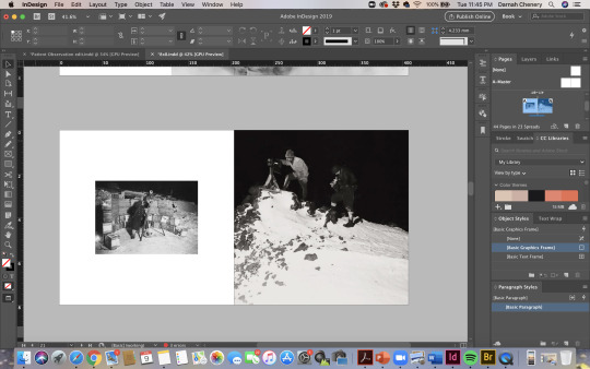
Photo

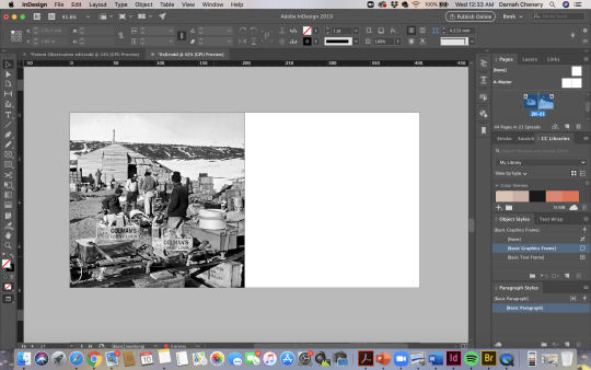
Found a piece of the text that talked about how cold it was during their time in antarctica - therefore ended up pairing it with the best image of the two. Layout is nice and simple yet not too traditional
0 notes
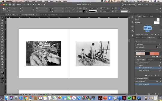
Photo

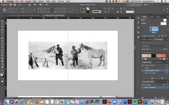
this one was pretty straight forward, but i do like how it turned out. I actually had to flip one of them so they would face each other. I think theres a bit of humour here which is also quite fun within the book.
0 notes