
Statistics
We looked inside some of the posts by decaf606 and here's what we found interesting.
Average Info
Notes Per Post
0
Likes Per Post
0
Reblog Per Post
0
Reply Per Post
0
Time Between Posts
4 days
Number of Posts By Type
Text
17
Last Seen Tumblr Blogs


Fun Fact
The Tumblr app for Google Glass was released on May 16, 2013.
Text
Lab 15
Part 1:
1. Bootstrap Classes:
“Container” - creates a fixed width container with widths determined by screen size
“my-4″ - spacing class that sets the margin (m) on the top and bottom (y) of the element to 1.5 times the $spacer
“row” - sets a container for responsive columns
“col-md-8″ - creates a column in this container as a responsive grid that is size 8. Columns can be size 1-12
“img-fluid” - makes the image responsive so that it scales with its parent unit
“col-md-4″ - creates a column in this container as a responsive grid that is size 4. Columns can be size 1-12
“my-3″ - spacing class that sets the margin (m) on the top and bottom (y) of the element to the value of $spacer
"col-md-3 col-sm-6 mb-4" - creates a column in the container that will be different sizes depending on the screen size. Md for desktop and sm for phones. mb-4 sets the margin on the bottom to 4.
2. Desktop Sketch
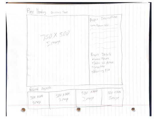
3. Mobile Sketch

Recreated Website: https://damoncoffey.rhody.dev/Lab15/index.html
0 notes
Text
Reflection 10
Dear Jenna,
This week, I am sad to say that this is our last reflection, and thus my last time writing to you :(. This is a memorable week, however, because we learned about Bootstrap and GitHub!
Bootstrap is a popular CSS framework that helps web developers create responsive and mobile friendly websites. It is essentially just a large set of CSS classes that can make developing a website much easier. You just download the framework and reference it in your HTML document and then you have access to tons of helpful classes. For example, if you wanted to have nice columns to arrange images and text in neatly on your site, there are bootstrap classes made for that so all you would have to do is call these classes in certain ways instead of having to manually create the code yourself. These classes are very responsive and well coded so that they can work fluidly with desktop and mobile devices. Bootstrap seems like a very helpful tool for creating websites and I will definitely use it going forward.
We also talked about GitHub this week. Github is basically a version control systems that allows coders who are working on a project together to collaborate seamlessly. There is a “main” program which is where the final and official code is stored, but then each contributor can download this code, make changes to it, then re upload it to Github to be reviewed and eventually updated onto the main program. Github will prove to be very usual for our last lab where we are working with another classmate, as well as the final project where we are doing the same.
The Best,
Damon
0 notes
Text
Reflection 2
Dear Jenna,
This week in web design, we discussed the waterfall and agile approaches to developing an innovation, or in this case, a website. In waterfall development, the steps in the development process must occur in a linear order, with one step completing before the next can begin. In agile, however, there is emphasis on flexibility and testing. If the product is not living up to the consumer’s expectations, it is easy to go back and change something. Agile definitely seems like the bette approach to me.
Also this week, we talked about the dangers of fatigue and computer vision syndrome that can both occur in people with careers that use computers a lot. It is very important to periodically take breaks from looking a screen and stand up as well. Not only is it better for your health to take these breaks, it may also make you more productive while you are working as you will not be as fatigued or tired. I had not thought much about these things and I spend a lot of time looking at my laptop, phone and TV screen, especially during these strange times with everyone inside and learning virtually due to the pandemic. I will definitely try to be more aware of these dangers going forward.
The best,
Damon
0 notes
Text
Reflection 4
Dear Jenna,
This week in CSC271 web design, we finally started coding our websites. I used HTML to create a functioning website that I could even find online thanks to URI’s free domain service. I was a little guilty of procrastination with this weeks lab so it took me a little longer to review the lessons and properly understand HTML, but once I got the hang of it I can say that I was actually enjoying myself while doing it. It was just very cool to see the code that I was writing working in real time as I updated my website.
The website that I created has to do with the animal class Elasmobranchii, which refers to the species of sharks, skates and rays. I chose to build my site on this topic because I am also taking another class, BIO422, which has to do with the same subject. Marine biology and the ocean has always interested me as a hobby so it is cool to be able to create a website for that interest.
My website has 4 pages, a home page, a species page, a page with informational articles, and an about us page. The home page is pretty self explanatory but will include a brief overview of what the site is about as well as hopefully some kind of form that can be filled out to “create an account” on my site. The species page has a list of different species of sharks, skates and rays and some pictures to go along with them and the facts/info page displays more images as well as links to scholarly articles about these species. Finally on the about us page there is some general information and an email link to “contact us.”
Overall I really enjoyed this weeks lab and look forward to building my website even better as the semester continues. :)
The best,
Damon
0 notes
Text
Reflection 9
Dear Jenna,
Happy Thanksgiving!
The lesson that we had over Thanksgiving break was about online website building softwares. These are much different from how we have been creating our websites. So far, I have been coding my website from scratch, but with website builders such as Wix, SquareSpace, and Wordpress, you can select from a variety of templates and build your website without necessarily having to do any coding. This makes having a website a possibility for anyone, even the least tech-savvy individuals.
For the lab with this lesson, we were tasked with recreating our websites on one of these builders. I chose to use Wix and I have to say, it was surprisingly easy to do. The software was very simple and straight forward, I only had to Google how to do something 2 times!
I did find Wix to be the superior of the 3 builders, as it had the largest variety of template styles and designs. I felt like with the other two sites, especially SquareSpace, all their templates followed the same design pattern and I could not really find something that worked for what I wanted to do with my website. Also, it took me a lot longer to find the free version of the builder on the other two sites. I found myself stopped by a paywall multiple times on SquareSpace and Wordpress while I thought I was working on the free version. With Wix, however, I was able to jump right in and knew exactly what I was doing.
If you ever need to create a website, Wix is the way to go in my opinion.
The best,
Damon
0 notes
Text
Reflection 8
Dear Jenna,
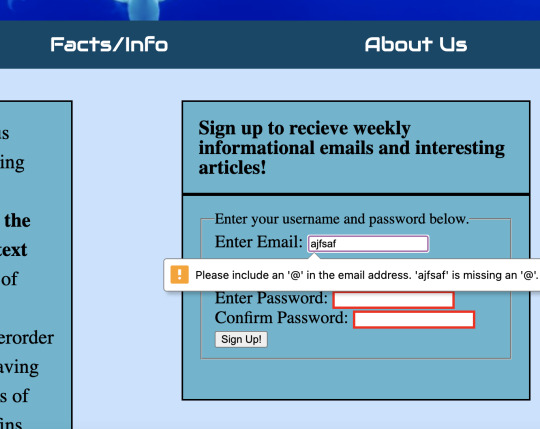
This week in class we returned to the topic of forms in web design and improved the forms on our websites with form validation. Form validation is basically just a way to make sure that our forms are filled out in the way we want them to be, so that the proper data is sent to the server and nobody’s time is wasted. For example, if a field on my form requires the user to enter their email address to sign up for a weekly newsletter or something, the form should make sure that they are entering a valid email that we could actually add to the email list. This saves everyone time.
It was also pretty cool seeing the design changes that you could make when doing form validation. I made it so that if a field is entered incorrectly, a red border will appear around the box so the user knows where they entered wrong information. You can also edit it so a field will require a specific format, such as an email which has to contain a “@” symbol, to ensure that the user enters the proper information.
This week we also used Javascript to add some more features to our site. I added a couple messages that appear when something happens on the site. For example, when the user properly fills out a form and then hits submit, a thank you message will appear. This would not be possible without Javascript.
Javascript is proving to be a very useful tool in web design!
The best,
Damon
0 notes
Text
Lab 14
1. The builder that I liked best was Wix.com. It was very easy and simplified to sign up for a free account and I had access to a ton of template websites right from the start. There was also the option to start my own site from scratch.
2. I chose Wix to recreated my website. I did this because it left a very good impression as soon as I entered their site. Also, their extensive template selection allowed me to find one that best matched my website, while SquareSpace and Wordpress did not have as large a selection and I generally did not like the theme of their templates either.
3. All 3 builders had their advantages, however. For example, SquareSpace has a better selection of widgets that are more customizable and easier to use. On Wix, I used a email form widget that I was struggling to resize the way I wanted it to. Also, for Wordpress, I liked how accessible it was and it makes it easy for users who have never built a website to jump right in, even if they have no knowledge of coding or software.
4. The most challenging part about recreating my site on a website builder was recreating the form on my home page. Wix only allowed you to select a form format from a select few pre-made templates so it was hard to find one that matched the specific fields that I have in the form that I made myself.
5. The most challenging part of using a website builder as opposed to coding it yourself is that you do not have full freedom to do whatever you want. There are templates where you can start from scratch, but if there is something fundamental about the builder that you do not like, you cannot change the back end portion to make it your own.
6. One thing that was significantly simpler on Wix was the addition of an email sign up widget. I was able to use a nice looking widget that people could use to “contact us” as opposed to just a hyperlinked word with the email link. This made this portion of my website look nicer as well as it was easier selecting this widget off the builder than coding it myself.
7. https://damoncoffey.rhody.dev/sharkHome.html
8. https://decaf606.wixsite.com/mysite
0 notes
Text
Lab 13
1. https://damoncoffey.rhody.dev/sharkHome.html
2.

3. To make my site more interactive, I first added a thank you message that only appears once the user clicks the sign up button on the form on my home page and all the fields are filled out correctly. I also made it so whenever the user hovers over the picture of a species on my species page, it changes to another image of that species. Finally, when my facts/info page first loads, an alert message appears suggesting that the user subscribes to our “news letter.”
0 notes
Text
Reflection 7
Dear Jenna,
This week, we continued learning Javascript and how to use it on our websites. We also learned about DOM (Document Object Model) trees which are a helpful way to see the way a document is accessed and manipulated. A DOM tree is basically a tree structure that shows the different parts and tags of your HTML document as nodes on a tree. With this tree, one can change the structure, style or content of a document.
We also learned how to use Javascript functions in order to change things on our website. Similar to CSS, we can use tags, classes and ID’s to access certain parts of our HTML and change things based on what the user does when interacting with our websites. For example, if a user hovers over an image and it changes to another, this is a result of Javascript coding.
I really enjoyed using Javascript because it is very similar to the coding that I have been doing in my other classes along the computer science major. All of the aspects of Javascript, such as for loops and if statements, came easy to me because I have used them in other coding languages in other classes. It was very interesting to me to see how these functions applied to things in HTML and CSS.
Overall, I really enjoyed this weeks lesson and am excited to see what else we can use Javascript for on our websites.
The best,
Damon Coffey
0 notes
Text
Lab 12
1.

2. https://jsfiddle.net/dcoffey606/sze3y8q5/36/
3.
5 Ideas to update my website using Javascript:
-For my sign up form on my home page, I could use Javascript to display a “thank you” message that appears after the user fills out their information and clicks the “sign up” button.
-On my species page, I could add a button for each species that when clicked, displays more images of that species.
-I could add a Javascript quiz on one of my pages that lets the user test their knowledge on the information that they have read on my site.
-Also for my sign up form on my home page, I could add a confirmation box that appears after the user clicks the “sign up” button that asks the user to confirm the information they entered is correct.
-I could add a Javascript pop up box that appears on the screen once the user enters the facts/info page suggesting that the user subscribes to the “news letter” that will send them more interesting articles.
0 notes
Text
Reflection 6
Dear Jenna,
This week in web design we started using the coding language Javascript for the first time. This is also my first time using the coding language. Overall, it seems familiar to me because it looks similar to how you code in C++ which is another coding language that I have used in my other coding classes throughout the computer science curriculum. On top of Javascript, we also learned memory diagrams which are a helpful way to figure out what a program is doing. For example, if you are trying to read a program to figure out what it is doing, creating a memory diagram can help you track variables and their values to see how they are changing as the program goes on.
I have experience with problem solving and coding in different languages so this weeks material came a little easier to me, but I am excited to learn more about Javascript and see what I can do with it in terms of web design! Until next week :)
The Best,
Damon Coffey
0 notes
Text
Lab 11
Memory Diagrams:

(Sorry for my 3rd grader handwriting)
Swap Code:
https://jsfiddle.net/dcoffey606/5v6Lu2nh/4/

Summation Code:
https://jsfiddle.net/dcoffey606/s46oadk9/21/

0 notes
Text
Reflection 5
Dear Jenna,
This week in web design, we talked about responsive design for our websites. Responsive design is making sure that your site works and looks well on all types of devices, such as smartphones, and in resized browser windows. For example, in an unresponsive website when you resize the window, images and text boxes will move around and possibly overlap on each other, making it impossible to read leading to a nonfunctional website. After optimizing it, the pictures may move under the text boxes to better fit the size of the screen and make sure everything is readable.
I struggled with this issue on my website initially. I fixed this problem by changing some parts of my code in HTML and CSS. I initially had my images and elements sized using exact pixels when I should have been using percentages. Percentages allow the elements to move better when resizing the window while pixels are an exact number that could cause some issues. For example, if I set an image to make up 30% of my page, it will always represent 30% no matter how small I make the browser while with pixels, it will always be that specific size which could interfere with other elements.
Anyway, thats all I have for this week, nothing much was added to my site I was just working to properly optimize it, ill talk to you soon!
The best,
Damon Coffey
0 notes
Text
Lab 10
-1. https://damoncoffey.rhody.dev/sharkHome.html
2.


-For the after pictures, I used his history page to show off his nav bar because it was not showing on the home page.
3. -My partner noticed that when the window was resized while on my website, all of my images and text boxes were moved around the screen out of place. I realized this was because I used pixels to set the parameters for the location of these elements. Switching to percentages fixed this issue. He also noticed that the buttons on my nav bar were not spaced properly so I fixed that as well.
-My partner did not have much of a website before this lab, so I noted that it was important to have a functioning nav bar and the spacing of his elements needed to be improved.
-My experience navigating my partner’s website definitely increased by the end of this lab. My parter was slightly behind on his site before we started, his nav bar was out of place, he had no real styling and the spacing of his elements was odd. But by the end of the lab, it looked a lot better and was MUCH easier to navigate.
-My partner’s experience navigating my site also increased by the end of the lab. When viewed in a smaller window on his browser, all of the text and images were overlapping making the text impossible to read. After fixing this issue, the site was much better when put in these conditions. Also, the nav bar was easier to read with the buttons spaced out.
0 notes


Text
Lab 08
1. https://damoncoffey.rhody.dev/sharkHome.html
2.
-I had to replace all but 2 images on my website due to copyright laws. When I was editing my website for last weeks lab, I had completely forgotten about these laws and just picked the images that I thought looked the best on my website. I did not have to change every picture because I got lucky on 2 of them that I had chosen because they were already royalty-free images.
-I did not have to change anything about my site to make it accessible. The tab key is fully functional for navigating my nav bar and using other clickable aspects of my site. Also, I made sure all of my images have alt text so that a screen reader would function properly.
-To make my transparent image, I used the magic wand tool to remove all large background images, and then the lasso tool to precisely edit out anything I missed around the border of my image.
-I optimized my images using ImageOptimizer.com
-Loading Times:
Home Page- Pre-optimization: 588 ms Post-optimization: 298 ms
Species Page- Pre-optimization: 505 ms Post-optimization: 285 ms
Facts Page- Pre-optimization: 1.15 s Post-optimization: 282 ms
About Us Page- Pre-optimization: 635 ms Post-optimization: 300 ms
3. My transparent image:

0 notes
Text
Lab 07
1. https://damoncoffey.rhody.dev/sharkHome.html
2.

3. If I were using an internal style sheet for my website, my html files would be much, much longer and more confusing to read since there would be no external style sheet and all of the css code would be in the same file.
Overall, external style sheets are much easier than internal style sheets, especially for websites with multiple pages.
The most difficult part of styling my website was positioning my text and images next to each other on my species and facts pages. Once I figured it out however, it was very easy as I could copy and paste for the rest of it since I wanted it to fit the same style anyway.
0 notes