
Don't wanna be here? Send us removal request.
Statistics
We looked inside some of the posts by derahill-blog and here's what we found interesting.
Average Info
Notes Per Post
2
Likes Per Post
2
Reblog Per Post
0
Reply Per Post
0
Time Between Posts
21 days
Number of Posts By Type
Text
2
Last Seen Tumblr Blogs


Fun Fact
Celebrities use Tumblr as well.
Text
Project Two: Learning Tool
Part 1: What needs to be learned?
Ideation for this project began with brainstorming the different interests, passions, and different topics about the world I was interested in learning when I was in elementary and middle school, as well as high school.
This image demonstrates this brainstorming process, with different topics ranging from learning the different types of clouds in the sky, to typing games to learn how to use the QWERTY keyboard.
My inspiration for Project two was a typing class I took in middle school. Originally, I was setting out to creating a typing game. After some time thinking through different ways I could create a game, I began to drift away from learning the QWERTY keyboard, and toward an actual story-driven game.
Part 2: Principle Idea
Simple Survival Tool
The Simple Survival Tool is a survival adventure game. You wake up alone in a forest and have to navigate through the different story elements and choices to escape safely. Along the way, the player would encounter choices they could feasibly encounter if lost, alone in a forest in real life. The goal of this survival game is to teach a few basic survival skills to the player, hence why the name ‘Simple Survival’ arose rather than a dramatic name. While this purpose for the game was clear since the beginning, the style of the site has changed significantly throughout the development process.
Story building for this game was an especially fun process, and I have plans to expand the game by as many as five or more days, complete with other features I wanted from day one.
This is an example of a digital outline of the timeline present within the first couple days. It was a helpful exercise to wrap my head around the many possible outcomes of just a few decisions.

This is an example of the outline I used as a constant reference when coding the story into the game. It contained all the text needed and kept track of where in my code the decision was supposed to go.

My first sketches, essentially paper wire-frames given the simplicity, contain elements present in my final product, including the linear style of story with text used as the buttons.

This next sketch initialized a design idea that would be dominant throughout my design process, but removed during the development process of the game. The buttons with changing images in the background could have been more feasible if I built the game using a multi-sectional or multi-web page approach. I expand upon this further in Part 6.

Part 3: Learning Tool Prototype
An exercise employed in class was to create a user task list for the idea. This involved every step(interaction required of the user) the user must take upon visiting the web page. Tasks 2-6 are still valid for my project.

The learning tool prototype was an interesting exercise for my web page given that I had not really considered by text game, at that point, to be a mobile one. It was during this process I realized the advantage of buttons (colored ones specifically), and how they improve the user experience versus link or text buttons on a small device.
This first screenshot from my video shows the prototype with text buttons.

This second screenshot from my video shows the prototype with colored buttons. The user hesitated less with this kind. In addition to this, I feel that colored buttons will make the game feel more visually interactive.

Part 4: Digital Static Wireframes
Draft 1:
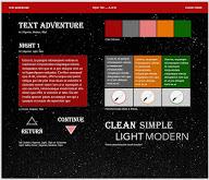
The original mock-up of the start page looks, admittedly, nothing like the current mock-up. While this design preferred the “enter name”, a big, fancy title and a realistic, starry night background, my final product changed each of these. The general color scheme of this first design is carried into the final product.

Draft 2:
This shows how the original mock-up was changed in slight variations, including removing the opaque container box on the start page, and adding a mock-up of choice design with the lower half.

Draft 3:
I really liked this deep black and dark red background combination and tried to use it for the start page and choice design in this draft. While I still liked this color combination, it did not reflect the design and direction of the entire project, which needed a more cartoon and colorful aesthetic.

Draft 4:
After a long search for cartoon night skies, I finally found a picture I wanted to use as the background in place of the realistic night sky.
With this new background, I changed the visual components and colors to create this spooky, almost Halloween experience (really just needs a little orange).
On the flip-side of this, I decided to have “Day” choice scenarios as well, and edited the cartoon night sky in Adobe Photoshop to create a day visual experience.
Live wireframe on GitHub

Day:

Part 5: Style Tiles
The development of my style tiles was conjoined with the creation and changes of my digital static wire-frames.
My first uses a similarly colored background to my first two digital static backgrounds; a night sky with a deep blue gradient. I particularly like the opaque white background on the blue.

My second is reflective of the black and maroon theme of the third digital draft. Again, I really liked this style tile and color combination, but not only was it more appealing as a style tile than a wireframe, it did not convey a light and playful aesthetic.
The third and fourth style tiles represent the alternating day or night states in my game. The third is the night state - the user is introduced to the game with this spooky, playful vibe.

The fourth this the day style tile, which introduces a bright green to the game in place of the bright pink. I believe this keeps the user visually interested in the game, if not interested in the actual content itself.
Part 6: Javascript Troubles & Change of Plans
I learned much about Javascript in my time creating this project.
At first, I wanted to create a multitude of different web pages to build my game with the different options, choices, and endings available.
I realized soon in development that this was not a very feasible idea.
I began learning more about Javascript and its different capabilities, and was eventually pointed to a YouTube video that teaches how to use a simple game engine to create a web-text game.
This was perfect for the bare bones of my website, and videos like these paved the way for me to modify this engine to style my game in the way I designed.
What I managed to figure out:
How to get the basic game mechanics working
How to change the background from night/day
How to change the background of the text container and generated buttons
What I did not figure out, but still plan to work on:
How to get images on the generated buttons
How to use the counter to display certain option texts
Counter is working and every choice has values that add to it, need to figure out how to use it to call a certain option
How to change the hover state color depending on which generated button
What I deleted from my design
Return & Continue buttons are not longer beneath the container. They are now one in the design, as generating the buttons is a much easier solution than creating new ones.
Parallax.js: I initially planned to have a parallax effect on my site. However, using “data-image-src” from the parallax.js package made my site unable to switch backgrounds from night to day. Upon disabling parallax, my background show/hide for day/night started working!
Part 7: Final Product
Thanks for reading, enjoy the game!
0 notes
Text
Project One: Letterform
Part 1: Picking a Typeface
To begin this project, I chose six different typefaces across adobe and google fonts, eventually narrowing down my choice to the Hepta Slab-Serif font. I researched this font to find its inspiration is from nineteenth century slab-serifs that were used for advertising posters.
This image had me considering to base my website design off the different weights of Hepta Slab, so not only showing off the typeface’s typical medium weight, but the characteristics and aesthetic of the extremes.
This link explains typography innovations and the origin of Egyptian type fonts during the industrial revolution.

Part 2: Sketching the Wireframe
My sketches for this letterform began with playing with potential hierarchies and various placements of the letter I had chosen: a lowercase d.
This first sketch importantly established that the heading contains large text indicating the name of the typeface. IT also assumed I would be using two buttons – the number of which varied throughout my process, but in the end, I would have two buttons per letter.
My second sketch eliminated the white space on either side of the body text and character analysis, creating a clearer visual hierarchy, but unfortunately felt as if it lost some of the original inspiration from the advertising posters. I never needed to revisit this sketch following its completion.
The third sketch contains the content that eventually became integrated into my final deliverable. This sketch added and alphabet row underneath the Hepta Slab heading, and also included a box below the row for authorship and inspiration. This is the only sketch and place where I considered using an exclamation and question mark – while I liked the idea of showing additional Hepta characters, I felt the button should not be literally attached the character itself, as that would cause issues in development down the line.
My fourth sketch introduced the idea that there would be an additional container around my content, in which it would be a different color and contain information about me separately at the bottom. However, there were still many decisions made that lead from this sketch to what appears on my site now.
My fifth sketch was a creative derivative from the fourth and my current site appearance. It introduced the columned approach to the character analysis and font research and explored using much larger text for authorship and inspiration.
Part 3: Wireframe Coding
This sketch is a layout of the wireframe I would develop for the site, establishing the foundation for all future work for this project. This is where most of my design decisions were made – from the feedback I received in class to the varied ideas of my wireframe sketches, I found a nice balance between hierarchy, information, and inspiration.
Given this is my first experience with Html and CSS, it was extraordinarily helpful to layout the plan for my code using the wireframe. Organizing the wireframe into divs and sections was essential in coding it for the site – after the fact, I can certainly say it helped much in terms of display alignment, display: flex and other placement issues.
My first visual analysis was lacking in inspiration and creativity, and I did decide to scrap this design. However, to showcase my design process, it is important to include the ideas that never came to fruition.
Part 4: Adobe Style Tiles
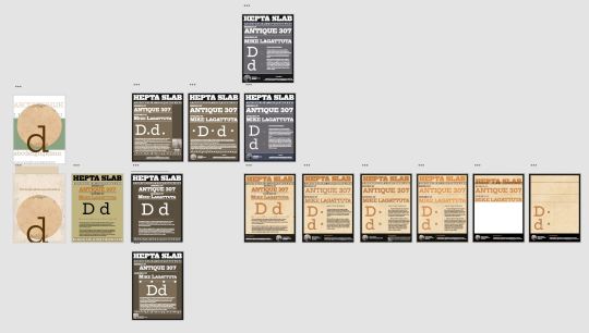
Within one Adobe XD file, I created a plethora of different designs, some differing only slightly, and other designs with clear, major overhauls. Of all these designs, I chose four examples, of the many in the picture below, to unravel the design thought process used to create the final deliverable.
The first employed a rather ugly background color, with a strange variety of text-colors. I really like the hierarchy of Hepta – Design – Author, a feature that will be carried from this design until the final product.

In the second, I tried an opposite color approach, opting for a darker theme with white text over the lighter colors, a decision I would later reverse after receiving feedback in class. This is when I transitioned to a design closer to my fifth wireframe from earlier.

The next major overhaul was changing the colors again from a darker brown to a grey, with a blue band behind the footer and alphabet. As colors go, this was my favorite combination. I’ve always been a fan of the steel – blue color combination, but unfortunately, this design would be farther from its inspiration than I intended for this project.

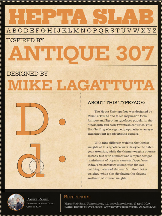
In order to make this design appear more like the posters I wanted it to reflect, I needed to change the color scheme once again. Using class feedback, I found a lighter tan for the background, and found a deeper orange for the text. This combination is not only visually easy to read, but takes clear color choices from this type-face’s inspiration. While I would continue making smaller edits to the design over the next week, I was content in keeping this overall design and steered away from larger design changes.
Part 5: Building the Site
I encountered consistent difficulty with sizing and layout for the characters and button placement for this project. Given the layout of my button was altered several times since the development of my wireframe, I felt I was constantly changing the margin, padding, and position of the characters and typeface research. Around this time, I had just saved my 9_24 draft of the final letterform project.
While I toyed with the idea of using one button to cycle through the different weights of the Hepta font, I felt in over my head with that feature in my project and constrained my scope to two buttons and two weights: each changing the weight and applying a slightly altered visual analysis.

Concerning my visual analysis, I wanted to expose the differences between these weights as I feel this an often ignored aspect of typefaces given the popularity of standard font serifs. After adding jQuery to create functions for these buttons, I made some final alterations to the site (like adding a background color to the button to indicate when it is pressed).
This wraps up the design process used to create this site!
2 notes
·
View notes