
I’m Aldohas — a visual designer crafting bold posters and clean layouts using Canva.I turn simple ideas into scroll-stopping designs that speak loud, fast, and beautifully.
Don't wanna be here? Send us removal request.
Statistics
We looked inside some of the posts by designaldohas and here's what we found interesting.
Average Info
Notes Per Post
2
Likes Per Post
0
Reblog Per Post
0
Reply Per Post
2
Time Between Posts
2 days
Number of Posts By Type
Text
17
Last Seen Tumblr Blogs


Fun Fact
25% of US internet users with an annual income of $80-100K use Tumblr.
Text
Exploring the “Neumorphism” Design Trend
Welcome back to our design trend series! On Day 6, we're peeling back the layers—literally—with a style that quietly snuck onto the design scene, brought softness back to interfaces, and divided the design community faster than you can say "drop shadow." Say hello to Neumorphism, or as some like to call it, Soft UI.
Let’s dive into the dreamy, pillowy world of Neumorphism and see why it became such a visual sensation (and UX debate starter).
What is Neumorphism?
Neumorphism is short for “New Skeuomorphism.” It reimagines the shadows and highlights used in the old days of real-world mimicry (like a calculator app that looked like a real calculator), but with a modern, minimal twist.
Imagine this: a soft, monochromatic background where buttons and cards look like they're being gently pushed in or popped out of the surface—like clay impressions. Neumorphism focuses on subtle depth, low contrast, and a visual language that feels incredibly tactile.
It's clean, futuristic, and soothing... unless you’re trying to design a highly accessible interface (more on that soon).
A Bit of Background: Where Did Neumorphism Come From?
The term gained traction around late 2019 to early 2020 when designer Alexander Plyuto shared some concept UI work on Dribbble that quickly went viral. People were fascinated by how “real” everything looked without using any photos or textures—just light, shadow, and elegant shapes.
Soon after, designers started experimenting with this style across UI kits, dashboards, login forms, and mobile apps. It became the darling of Behance and Dribbble portfolios for a while. But, like every fashion trend, the honeymoon phase didn’t last forever.
Key Features of Neumorphic Design
Let’s break it down into its signature components:
Soft Shadows (Both Light & Dark): Elements have shadows going in two directions—light shadow from one side and a dark shadow from the other—creating an embossed or debossed effect.
Monochrome or Subtle Gradients: Usually based on a single pastel or neutral tone (grey, beige, soft blue).
Minimal Color Contrast: The elements blend into the background rather than stand out sharply.
Rounded Corners & Smooth Edges: Giving the UI a friendly, modern, and very “huggable” look.
3D-Like Visuals: Without any actual 3D rendering, everything feels tangible.
Flat Meets Realism: It’s like flat design with just a little extra oomph.
Pros of Neumorphism
Despite its criticisms, Neumorphism did bring a few lovely things to the design table:
Aesthetic Appeal – There’s no denying it: Neumorphism looks modern, stylish, and clean when done well.
Freshness – It offered a fresh alternative to flat design, which had been dominating for years.
Great for Minimal Interfaces – Neumorphism shines in environments where visual complexity isn’t needed, like smart home apps or digital dashboards.
The Downsides (Let’s Be Real)
Alright, time for the roast.
Accessibility Issues: With such low contrast, buttons can be invisible to users with vision impairments or in poor lighting.
Overuse of Shadows: If you're not careful, it can become a soft, fluffy mess with no visual hierarchy.
Lack of Flexibility: Neumorphism doesn't work well with colorful or dynamic content—it thrives in static, monotone systems.
Hard to Scale: Try designing a full-fledged e-commerce site in pure Neumorphism. Good luck making those CTA buttons stand out.
This is why most Neumorphism implementations are either concept-only or used in small, contained components.
Where Neumorphism is Used Today
Despite the drawbacks, Neumorphism hasn’t vanished. It’s evolved—often being blended with other styles like minimalism, glassmorphism, or even flat design to create hybrid interfaces.
Popular uses include:
Smart home controls
Music player apps
Portfolio websites
Finance dashboards
Designers often use neumorphic elements sparingly—one or two soft cards within a more robust design system.
Design Tip: How to Use Neumorphism Effectively
If you want to add a touch of Neumorphism without making your whole interface feel like it’s floating in a marshmallow pit, try this:
Use it for non-critical UI elements: cards, stats, avatars, etc.
Always check your contrast ratios. WCAG standards exist for a reason!
Combine it with flat UI styles to keep things readable and interactive.
Don’t rely on Neumorphism for buttons unless you provide backup visual cues.
Fun Fact of the Day
Neumorphism became so popular so fast that Figma, Adobe XD, and even CSS generators were flooded with “neumorphic” UI kits within weeks of its rise. Some of them were downloaded over 100,000 times—proving once again that design trends are the fastest-moving fashion statements of the internet.
Neumorphism may not have taken over the world, but it left a soft, pillowy footprint on the design landscape. And in the right hands, it still feels fresh and modern today.
https://letterhanna.com/exploring-the-neumorphism-design-trend/
0 notes
Text
The Dreamlike World of Surrealism in Graphic Design

Welcome back, design adventurer! Today we drift into the whimsical, mind-bending, and visually poetic universe of Surrealist Graphic Design. If you’ve ever looked at a poster and thought, "What in the Salvador Dalí is going on here?" — chances are, you’ve met surrealism.
What is Surrealist Graphic Design?
Surrealist design doesn’t play by the rules of logic or reality. It mixes dreamlike imagery, irrational juxtapositions, unexpected combinations, and often a tinge of mystery or fantasy. Think melting clocks, floating furniture, and people with clouds for heads — that’s the surreal aesthetic in action.
In graphic design, this translates into layouts that feel like waking dreams: symbolic elements, strange compositions, altered perspectives, and visuals that feel both beautiful and bizarre. It challenges the viewer to see the world differently, often igniting curiosity, introspection, or just a delightful “what the heck am I looking at?”
A Touch of History
Surrealism as a cultural movement began in the 1920s, born from the ashes of World War I and rooted in the ideas of psychoanalysis and dreams championed by Freud. The goal? To access the unconscious mind and bypass rational control.
Artists like Salvador Dalí, René Magritte, and Max Ernst became the visual rockstars of the movement. Fast-forward to today, and graphic designers have adopted surrealism as a powerful visual language to tell stories, question norms, or simply stop the scroll with pure intrigue.
Key Characteristics of Surrealist Design
Let’s unravel the dreamy toolbox surrealists love to use:
Juxtaposition of the Unexpected: An apple in a suit. A fish flying in the sky. These odd pairings make your brain pause — and that pause is where curiosity lives.
Dreamlike Imagery: Soft lighting, hazy textures, ethereal color palettes, or celestial elements often help evoke a dream state.
Symbolism: Surrealist design is loaded with visual metaphors — eyes representing awareness, ladders symbolizing escape, or cages standing for restriction.
Distortion and Transformation: Objects morph into other things or defy natural laws (like a melting typeface or a walking staircase).
Layering and Collage: Digital collages that combine vintage photography, nature, space, and human elements are common and surreal.
Why Surrealism Works in Modern Design
In a world bombarded with rationality and predictable branding, surrealism hits different. It’s emotive, imaginative, and unforgettable. This style:
Triggers curiosity — the viewer leans in to decode the message.
Encourages emotional interpretation — it doesn't spoon-feed meaning.
Creates memorable visuals — who forgets a sneaker growing out of a tree or a house floating on a balloon?
Brands and creators use surrealism to signal creativity, sophistication, and emotional depth. It’s ideal for campaigns that want to suggest the extraordinary.
Where It’s Popping Up
You’ll find surrealist design everywhere from:
Editorial spreads — especially in fashion and art magazines like i-D, Dazed, or Kinfolk.
Album covers — artists like Travis Scott, Radiohead, or Björk have used surreal imagery to visualize complex emotions.
Advertising — Think perfume ads with giant flowers, floating bodies, or alternate realities.
Movie posters — Psychological thrillers and dramas often embrace surrealism to hint at narrative depth.
How to Use Surrealism in Your Design Projects
Here’s how to inject some surreal spice without falling into chaos:
Start with a Concept: Surrealism should still be rooted in meaning. What emotion or idea are you trying to convey?
Use Symbolism Wisely: Select visual elements that represent something more than themselves.
Master Compositing: Combine high-quality images with believable shadows, perspectives, and blending to create a seamless illusion.
Play with Scale: Make things bigger or smaller than they should be. A giant goldfish in a city? Classic.
Choose a Palette: Dreamlike doesn’t mean disorganized. Harmonize colors to maintain visual cohesion.
Unique Fact of the Day
🎨 Salvador Dalí once collaborated with the advertising world — including designing a surreal commercial for Alka-Seltzer. So yes, even anti-commercial artists couldn't resist surreal brand work!
Tools and Techniques
To channel your inner dreamsmith:
Use Photoshop or Procreate for digital collage and photo manipulation.
Experiment with AI-generated imagery — surrealism and AI are a match made in the uncanny valley.
Try analog collage using vintage magazines, scissors, and glue. Then scan and digitize.
Fonts also play a key role. Pair classic serifs with warped or experimental display fonts to echo that offbeat surreal flavor.
Final Thoughts
Surrealist Graphic Design is not just eye candy — it’s brain candy. It connects with viewers on a deeper, more emotional or subconscious level. It doesn’t tell you what to feel; it makes you feel something.
So the next time you want to create visuals that linger, confuse (in a good way), and leave a lasting impression, step into the surreal zone.
Tomorrow, we’ll swing back into something a little more grounded — but no less powerful: Grunge Graphic Design. Bring your noise and your textures. It’s gonna get messy.
Sweet dreams (and surreal designs)!
https://letterhanna.com/the-dreamlike-world-of-surrealism-in-graphic-design/
0 notes
Text
Exploring the World of Retro Futurism in Graphic Design

Today, we’re blasting off into a visual style that’s a little vintage, a little sci-fi, and a whole lot of imagination: Retro Futurism. This is where the nostalgia of the past collides head-on with futuristic dreams, often resulting in a dazzling, otherworldly aesthetic that’s bold, colorful, and sometimes a bit kitschy—but in the best way possible.
🚀 What Is Retro Futurism?
Retro Futurism is a creative style rooted in how people of the past imagined the future. Think 1950s space travel posters, 1980s synthwave aesthetics, or neon-lit visions of flying cars and chrome cities. It’s not about what the future will be—it’s about what the future was supposed to look like back when disco was king and everyone thought robots would be doing our chores by the year 2000.
It combines nostalgia with optimism (and sometimes dystopia), often using:
Neon and pastel color schemes
Chrome textures and grids
Futuristic typography (inspired by arcade games and sci-fi films)
Imagery of rockets, domed cities, humanoid robots, and old-school tech
Geometric shapes and digital glitch effects
In short: it's an aesthetic fueled by hope, imagination, and just the right amount of cheese.
🎨 Design Elements That Define Retro Futurism
Color Palettes
Expect vivid colors like hot pink, cyan, electric blue, and glowing purple.
Gradients and neon glow are essential tools here.
Black backgrounds or space-themed canvases help these colors pop.
Typography
Fonts inspired by early computer interfaces or sci-fi flicks.
High contrast, angular serifs, and 3D lettering are common.
Imagery & Motifs
Flying cars, retro robots, ray guns, circuit boards, and celestial landscapes.
Grid horizons fading into purple sunsets—hello, vaporwave!
Textures & Effects
Chrome effects, VHS grain, glitch art, and low-res pixel vibes give it that dated-yet-futuristic charm.
🧠 Why Is Retro Futurism So Popular?
Let’s be honest—today’s “real” future can be a little... disappointing. Retro Futurism lets us escape to a parallel universe where the Jetsons are real, aliens are friendly, and we wear silver jumpsuits to breakfast. It brings back the childlike wonder of what could be while honoring the vintage aesthetics that many of us grew up with.
Plus, in a world obsessed with nostalgia (hello, reboots and throwbacks), Retro Futurism fits perfectly into pop culture. It's playful, ironic, and highly Instagrammable.
✏️ Where You’ll See It
Retro Futurism isn't just hiding in old magazines or ‘80s arcade cabinets. Today, it’s alive and glowing in:
Album covers (especially synthwave and indie electronica)
UI/UX design with retro interfaces
Fashion lookbooks
Movie posters for sci-fi or indie horror flicks
Music videos (especially from artists like The Weeknd or Daft Punk)
Branding and packaging with a bold, nostalgic twist
⚡ Tips to Use Retro Futurism in Your Designs
Use Lighting Creatively Add neon lighting and glow effects to give objects depth and futuristic flair.
Experiment with 3D and Texture Combine flat shapes with metallic surfaces or digital noise overlays.
Embrace the Nostalgia Incorporate design elements from VHS tapes, floppy disks, or old video game consoles.
Don’t Go Overboard It’s tempting to go full synthwave on everything, but sometimes less is more. Use the style to enhance, not overwhelm.
🧩 Fun Fact
The term Retro Futurism was popularized in the 1980s, but the idea dates back much further. In the 1920s and '30s, artists like Norman Bel Geddes and Raymond Loewy created visions of futuristic cities and streamlined cars, forming the foundation of this quirky genre.
💬 Final Thoughts
Retro Futurism is a fantastic fusion of irony, imagination, and nostalgia. It’s not just a style—it’s a celebration of humanity’s unrelenting optimism about the future, even when that future looks hilariously outdated by today’s standards.
So whether you're designing a poster for a synthwave event or branding a new tech product with vintage charm, Retro Futurism gives you a rich visual language to play with.
https://letterhanna.com/exploring-the-world-of-retro-futurism-in-graphic-design/
0 notes
Text
Flat Design – Clean, Crisp, and Clickable
Flat design walked into the design world and politely removed all the skeuomorphic clutter from the table. Suddenly, buttons no longer needed to look like real buttons. Shadows? Gone. Wood textures and shiny plastic icons? Retired. Everything became… well, flat—and fantastically functional.
Let’s unfold the world of Flat Design, the UI darling that shaped a generation of web and app interfaces.
🔍 What is Flat Design?
Flat design is a visual style that emphasizes simplicity and two-dimensional elements. It strips away unnecessary decoration, mimicking neither physical objects nor realism. Instead, it focuses on usability through clean shapes, bold typography, and solid colors.
In short: Function meets minimal flair.
🧠 Why It Emerged
Back in the early 2010s, digital interfaces were cluttered with skeuomorphic design—an approach where digital elements mimicked real-world counterparts. Think: calculator apps that looked like actual calculators.
Then came a shift.
Apple’s iOS 7 redesign (2013) dropped skeuomorphism and embraced flat UI.
Microsoft’s Metro design language (Windows 8) had already paved the way with clean, grid-based design.
Google’s Material Design later evolved flat principles with a hint of depth and motion.
Flat design reflected the new digital era: fast, mobile, and clean.
🎨 Key Features
Two-dimensional elements: No bevels, no embossing—just crisp lines and shapes.
Bold, solid colors: Flat design uses vibrant palettes for contrast and clarity.
Simple typography: Clean sans-serif fonts (think Roboto, Helvetica, Open Sans).
Minimal UI elements: Icons and buttons are stripped of gradients or shadows.
Grid-based layout: Consistency and structure are everything.
It’s all about intuitive clarity.
📈 Why It Became So Popular
Performance: Fewer visual elements = faster load times = happy users.
Scalability: Flat graphics work well across resolutions and screen sizes.
Mobile Friendliness: It’s easier to design clean, responsive layouts using flat principles.
Visual Clarity: Strong contrast and simplicity help users navigate with ease.
Aesthetic Trend: It just looked fresh and modern, especially after years of skeuomorphic overload.
🏆 Where You See It
App interfaces – WhatsApp, Instagram, and nearly every major app embraced flat or semi-flat design.
Modern websites – Especially SaaS platforms, educational sites, and corporate landing pages.
Infographics and dashboards – Where clean data visualization matters.
Logos and branding – Companies like Airbnb and Dropbox went flatter and cleaner with redesigns.
📚 Flat Design vs. Material Design
People often confuse the two. Here’s the difference:Flat DesignMaterial DesignCompletely 2DUses depth cues (like shadows)Static and simpleIncludes motion and interactive layersLess stylizedMore polished and “tactile”
Material Design is like Flat Design’s more tech-savvy cousin with a bit more drama.
🚧 The Downside?
Over-simplicity: Flat design can become too abstract—users might not recognize interactive elements.
Lack of affordance: Without visual cues, it can be hard to tell what’s clickable.
Sameness: When overused, flat designs can look generic and lifeless.
The fix? Flat 2.0 or semi-flat design. A little depth and motion goes a long way.
📌 Unique Fact of the Day
The roots of flat design go back to the Swiss Style (aka International Typographic Style) from the 1950s, which favored clean layouts, sans-serif type, and grids. Flat design is its digital reincarnation, living its best life on the web.
🧪 Creative Challenge
Design a flat landing page for a fictional productivity app.
Use 3 bold colors
Include a clean hero illustration
Use a single sans-serif font
Minimal icons, no shadows, no gradients
Make it punchy, purposeful, and scroll-worthy.
https://letterhanna.com/flat-design-clean-crisp-and-clickable/
0 notes
Text
Maximalism – More is More, Baby

Forget restraint—maximalism is all about going big, going bold, and embracing visual drama like your design just had three shots of espresso. While minimalism whispers, maximalism yells (in a fabulous font, probably with neon shadows and a disco ball spinning above it).
Let’s dive into this wonderfully wild design trend and see why it’s making noise (both literally and figuratively) across the design world.
🔍 What is Maximalism in Design?
Maximalism is a visual style that celebrates abundance, bold expression, and layers of detail. It’s about embracing complexity, emotion, and personality. Think loud colors, clashing patterns, rich textures, and loads of content—strategically chaotic, never boring.
Maximalism is not just about being messy or excessive for the sake of it. It’s about controlled chaos—a curated explosion of creativity.
🎨 Defining Characteristics
Bold Color Palettes: Bright, saturated hues that grab attention instantly.
Layered Elements: Overlapping visuals, mixed media, and complex layouts.
Mixed Typography: Multiple fonts in one layout? Yes, please—if balanced with care.
Pattern-on-Pattern: Clashing florals with stripes? Let’s do it.
High Visual Density: More icons, more textures, more details packed into a single view.
This is organized visual chaos, where the rules are bent to serve bold storytelling.
🧠 Why It Became Popular
In a world dominated by sleek, minimal interfaces, maximalism is like a party crashing a quiet book club. But it’s not just for shock value:
Emotional Engagement: Maximalist design creates rich, memorable visual experiences.
Cultural Storytelling: It allows designers to showcase eclectic, global influences.
Digital Expressionism: In the era of social media and NFTs, standing out is survival. Maximalism gets noticed.
Post-Pandemic Creativity: After lockdown monotony, designers began embracing vibrancy and expressive freedom.
It’s rebellion wrapped in rainbow gradients.
🧱 Historical Influence
Maximalism has its roots in Baroque art, Victorian decor, and pop art of the 1960s. Artists like Andy Warhol and design movements like Memphis Group laid the groundwork for maximalist aesthetics.
In digital design, it came roaring back in the late 2010s as a counterculture to the flat, monochrome interfaces that dominated the early 2010s.
🏆 Iconic Examples
Gucci Campaigns: Alessandro Michele’s designs are a maximalist fever dream—luxurious, layered, and bursting with personality.
Memphis Design (1980s): Bright colors, geometric shapes, and anti-functional furniture turned visual rebellion into art.
Y2K Web Design: Glitter text, animated GIFs, and rainbow cursors—ugly? Maybe. Maximalist? Definitely.
Designers like Paula Scher: Known for using typography and layout as expressive weapons.
🎯 When to Use It
Maximalism works best when:
You're designing for youth culture, fashion, or entertainment.
You want to make a statement or evoke strong emotion.
You need to break the monotony of corporate design norms.
You’re working in print, packaging, or editorial layouts that demand richness.
⚠️ Pro Tip: Maximalism on mobile? Tricky. Use it sparingly or in a modular way to avoid overwhelming small screens.
🧪 Creative Challenge
Design a maximalist social media post for a fictional music festival.
Use 5+ colors
Include at least 3 font styles
Use overlapping elements and decorative flourishes
Think in layers—not lines
Make it loud, proud, and unforgettable.
📌 Unique Fact of the Day
The Memphis Group, founded by Italian designer Ettore Sottsass in 1981, was once mocked for its chaotic, colorful furniture designs. Today, their style is celebrated in everything from modern branding to Instagram filters. Proof that maximalism was just ahead of its time.
https://letterhanna.com/maximalism-more-is-more-baby/
0 notes
Text
Minimalism – The Beauty of Less

When in doubt, subtract. That’s the golden rule of minimalism—a design trend that has gracefully tiptoed across decades, never going out of style, just evolving with the times.
Minimalism isn’t just a visual aesthetic. It’s a mindset, a philosophy rooted in clarity, intention, and sophistication through restraint. In today’s article, we explore the core of minimalist design: its roots, defining characteristics, notable examples, and why it continues to dominate branding, UI, and even architecture.
🔍 What is Minimalism in Design?
Minimalism is the art of designing with only the necessary elements, removing anything non-essential to create a clear, purposeful experience. Its core mantra? Less is more.
This means:
Clean layouts
Simple color palettes (think monochrome or 2–3 tones max)
Plenty of white space
Sans-serif typography
Flat or very subtle visual effects (shadows, gradients)
In minimalism, every pixel has a purpose. And if it doesn’t—it’s out.
🧠 The Philosophy Behind It
Minimalism is heavily influenced by Japanese Zen culture and the Bauhaus movement, which emphasized functionality, geometry, and simplicity. It later found a home in modernist design and eventually surged in digital media thanks to brands like Apple, who used minimalist design to communicate elegance and user-friendliness.
Minimalist design isn’t lazy—it’s disciplined. It takes more effort to reduce than to pile on.
📈 Why It Became Popular
A few reasons minimalism gained massive traction in recent years:
Digital Clarity: As websites and apps became more complex, users craved clean, easy-to-navigate experiences.
Mobile First: Minimalism works beautifully in responsive design because fewer elements mean faster load times and better adaptability.
Emotional Impact: Simplicity feels calming and trustworthy—great for brand storytelling.
Timelessness: Unlike trendy styles, minimalist designs age slowly and gracefully.
It’s the white t-shirt of the design world—versatile, classic, and always in vogue.
🎯 Key Features of Minimalist Design
Whitespace (Negative Space): It’s not “empty,” it’s breathing room. Space between elements allows your eye to focus on what really matters.
Limited Color Palette: Often monochrome or muted tones, with an occasional bold accent to create hierarchy or interest.
Simple Typography: Fonts like Helvetica, Avenir, or Inter dominate. One or two font families max.
Flat or Subtle UI: No drop shadows, bevels, or flashy gradients—just clean edges and flat color blocks.
Clear Visual Hierarchy: Everything guides the eye without being overwhelming.
🏆 Iconic Examples
Apple – Possibly the greatest minimalist design ambassador. From product packaging to interfaces, it’s all about clean lines and neutral tones.
Muji – The Japanese retail brand is minimalism personified. Their stores, packaging, and branding exude simplicity.
Airbnb's 2020 redesign – Stripped back clutter for a clearer, more emotional user experience.
Modern Portfolio Websites – Designers and developers often use minimal layouts to let their work speak for itself.
🚫 Minimalism Gone Wrong?
Oh yes, minimalism can backfire if misapplied:
Too little content can feel sterile or cold
Poor use of white space can make a layout confusing
Lack of contrast or hierarchy can hinder accessibility
It’s a delicate balance. Minimal doesn’t mean boring—it means thoughtful.
📌 Unique Fact of the Day
The Bauhaus School, founded in 1919, originally combined art, craft, and technology. Their minimalist design principles laid the groundwork not just for graphics, but for furniture, architecture, and even interface design in the 21st century.
🧪 Creative Challenge
Design a minimalist poster for a fictional tech startup. Use only:
2 colors (including background)
1 font
1 shape or symbol
Focus on clarity, balance, and whitespace. Can you make a statement with less?
https://letterhanna.com/minimalism-the-beauty-of-less/
1 note
·
View note
Text
Graphic Design Trends (2011–2015) – The Fall of Texture, Rise of Flat
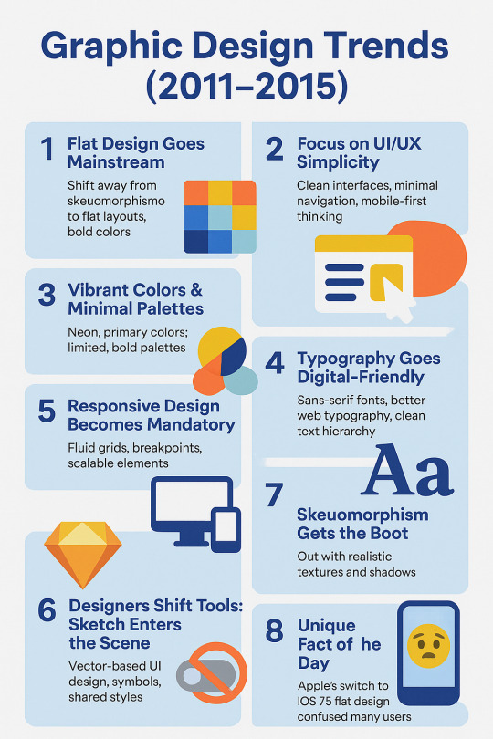
If 2016–2020 was the era of refinement, then 2011–2015 was the disruption phase. Digital design shifted dramatically, moving away from realism toward simplicity and usability. Flat design didn’t just arrive—it stormed in, kicked over the bookshelf, and changed everything.
📱 1. Flat Design Goes Mainstream
The early 2010s brought a rejection of skeuomorphism—the style that mimicked real-world textures (wood, leather, shadows). Apple’s shift from iOS 6 to iOS 7 in 2013 was the watershed moment. Suddenly, icons were flat, colors were bold, and gradients were exiled.
Why it mattered:
Flat design prioritized clarity and speed
It was easier to scale across responsive devices
It looked “modern” and digital-native
Popularized by: Microsoft’s Metro UI and Apple’s iOS 7. Google soon followed with Material Design in 2014 (but that’s more next article).
🎯 2. Focus on UI/UX Simplicity
As mobile apps boomed, user experience became the center of attention. Designers trimmed the fat from interfaces, removing clutter in favor of clean navigation and touch-friendly elements.
Key trends:
Larger buttons
Minimal menus
Icon-based navigation
Mobile-first mindset
Tools like Sketch (launched in 2010) gained traction as designers ditched Photoshop for digital-focused UI work.
🎨 3. Vibrant Colors & Minimal Palettes
This era loved two extremes:
Bright, punchy neons and primary colors (think Windows 8)
Or ultra-minimal color schemes (black, white, grey + 1 accent color)
Color wasn't just for decoration—it was used for hierarchy, feedback, and accessibility.
✍️ 4. Typography Goes Digital-Friendly
Web typography got a serious glow-up in this era:
Web-safe fonts evolved to include open-source options like Google Fonts.
Sans-serif fonts ruled: Helvetica, Open Sans, Lato, and Roboto were in every designer’s toolbox.
Designers used font weight and size creatively to guide user flow—bold headlines, clean body text.
It wasn’t fancy, but it was functional and consistent.
💡 5. Responsive Design Becomes Mandatory
The age of one-size-fits-all websites was over. Enter: responsive design. With the iPhone, iPad, and countless Android devices flooding the market, designers had to think in fluid grids, breakpoints, and scalable elements.
Milestones:
2010: Ethan Marcotte coins “responsive web design”
2011–2015: Every respectable site goes mobile-friendly or dies trying
🧰 6. Designers Shift Tools: Sketch Enters the Scene
Photoshop was great for photo editing. But for UI? It was... clunky. Enter Sketch, a vector-based tool tailored for interface and web design. By 2015, Sketch had become the go-to app for digital designers.
Why it changed the game:
Symbols and shared styles
Pixel-perfect precision
UI kits galore
🖌️ 7. Skeuomorphism Gets the Boot
Remember leather-bound calendar apps and felt-textured Game Centers? Yeah, Apple does too—and regrets it.
From 2013 onward, skeuomorphism was no longer considered “classy.” It was… cringe. Designers embraced flat shapes, simple icons, and clean surfaces.
Fun twist: That old leather calendar? It was actually based on the one in Steve Jobs’s yacht.
🤯 Unique Fact of the Day
When Apple launched iOS 7 with flat icons, it reportedly confused millions of users. The visual leap was so dramatic that many thought their phones had a bug. It sparked hundreds of memes—and a few app redesigns in panic.
🎨 Creative Challenge
Design a mock app dashboard using flat design principles:
No gradients, no shadows
Use bold color blocks
Stick to two fonts max
Keep spacing tight but readable
Extra credit: make it responsive across mobile, tablet, and desktop mockups.
https://letterhanna.com/graphic-design-trends-2011-2015-the-fall-of-texture-rise-of-flat/
0 notes
Text
Graphic Design Trends (2021–2025) – The Era of Bold, Digital Expression

Welcome to the roaring (digital) twenties! The design landscape between 2021 and 2025 was shaped by a world rebuilding after a global pandemic, a tech boom that refuses to slow down, and the relentless scroll of social media. Designers adapted, rebelled, and redefined beauty, all while juggling Figma tabs.
Let’s break it down.
🔮 1. Maximalism Takes the Stage
Forget “less is more.” In the early '20s, the pendulum swung hard toward maximalism. Loud colors, clashing patterns, excessive layering—if it looked like visual chaos, you were probably on-trend.
Why? After lockdown minimalism and clean lines, people craved energy, personality, and joy in visual form. Brands wanted to stand out in crowded feeds, not blend in.
🧠 Common traits:
Bright neons and saturated palettes
Busy compositions with purpose
Mixed typography (sometimes 4 fonts in one poster—yes, really)
Design as visual rebellion
🌐 2. 3D & CGI Integration
With tools like Blender, Cinema 4D, and even browser-based engines like Spline, 3D went mainstream. Designers embraced realistic textures, fluid morphing animations, and 3D characters that blurred the line between illustration and sculpture.
These assets weren't just eye candy—they brought depth, playfulness, and next-gen branding to websites and digital campaigns.
🛠️ Pro tip: Even Canva added 3D assets. That’s when you know it’s real.
📺 3. Y2K Aesthetic Revival
The early 2000s called—and we definitely picked up. Chrome gradients, glossy UI buttons, pixel art, and glitchy visuals were reborn with a digital twist. This Y2K revival hit Gen Z right in the nostalgia (even if they weren’t born yet in 2000).
📼 Expect to see:
Lens flares and liquid metal text
Checkerboard backgrounds
Cyber-dystopian meets Barbie-core
Notable example: Spotify’s genre art and album covers, especially for hyperpop.
🌈 4. Inclusive, Purpose-Driven Visuals
Social movements translated into visual design. Brands didn’t just want to be seen—they wanted to be seen doing good. Diversity, accessibility, and authenticity became essential—not optional.
👥 This meant:
Diverse skin tones in illustrations
Gender-neutral icons and avatars
Subtitles and text contrast for accessibility
Ethical stock photography and custom character designs
Design had to feel real, not staged.
🎨 5. Flat 2.0 / Semi-Flat Design
Flat design made a comeback, but this time, it had shadows, gradients, and a touch of depth. Called Flat 2.0, it merged the cleanliness of flat design with a touch of realism—perfect for responsive UI and UX design.
Think: Google’s Material Design meets Gen Z TikTok energy.
📱 6. Social-First Design Thinking
Designers started treating Instagram carousels and TikTok covers like gallery walls. Motion graphics, thumb-stopping thumbnails, and infographics reigned supreme. Tools like Figma, Canva, and Adobe Express made social storytelling design more accessible than ever.
🎯 Everything had to pop on a 6.1-inch screen… or be scroll-fodder.
🧬 7. AI-Assisted Design
AI tools like DALL·E, Midjourney, and ChatGPT started influencing the design process—not replacing creativity, but accelerating it. Designers used AI for:
Moodboarding
Generating mockup concepts
Writing UX microcopy
Color palette generation
Cue the existential questions: Am I still a designer if I prompt instead of draw? (Yes, friend. You’re just evolving.)
📡 8. Dynamic Brand Systems
Brands started ditching static logos and embracing dynamic identities. Spotify’s logo? Always the same. But the surrounding graphic language? Always shifting to match mood, genre, or audience.
This approach allowed for flexibility across platforms, especially when brands needed to adapt globally and contextually.
🤯 Unique Fact of the Day
In 2023, Adobe reported that motion design demand rose 78% in just one year. Why? Social platforms prioritized video content, and brands wanted thumb-stopping animations—even for logos. This was the era of "If it moves, it wins."
🧪 Creative Challenge
Pick any two trends above and design a visual that blends them. Example: Y2K color palettes with dynamic brand identity. Or flat 2.0 + 3D mashup. The goal? Make something uncomfortably bold.
Post it. Be loud. Get weird.
https://letterhanna.com/graphic-design-trends-2021-2025-the-era-of-bold-digital-expression/
0 notes
Text
Color Psychology – Using Hue to Speak to the Heart

Color isn’t just decoration��it’s a secret weapon. It influences emotions, decisions, and even behavior. Want your audience to trust you, crave your product, or feel like they just got a warm hug? It’s all in the color choices.
Color is the non-verbal voice of your design. It’s what makes people stop scrolling or decide if they like your brand before they even read a single word.
Let’s decode that rainbow.
🧠 Color Psychology 101: What Colors Say to the Brain
ColorEmotional ImpactBrands That Use It🔵 BlueTrust, calm, professionalismFacebook, LinkedIn, PayPal🔴 RedUrgency, passion, appetiteCoca-Cola, YouTube, Netflix🟡 YellowOptimism, energy, attentionMcDonald’s, IKEA, Snapchat�� GreenGrowth, health, balanceStarbucks, Spotify, Whole Foods🟣 PurpleCreativity, luxury, mysteryCadbury, Twitch, Yahoo⚫ BlackPower, sophistication, eleganceNike, Chanel, Apple⚪ WhiteCleanliness, simplicity, clarityApple, Tesla, Wikipedia🟠 OrangeEnthusiasm, fun, friendlinessFanta, SoundCloud, Nickelodeon
Of course, meanings can shift depending on culture—white means purity in the West, but mourning in some Eastern cultures. Context is king (or queen, or majestic sovereign of color).
🎯 Choosing Colors with Purpose
You’re not just picking what “looks nice.” You’re building emotional bridges. Ask yourself:
What do I want my audience to feel?
What’s the brand personality?
Is this digital or print? (Different color modes apply!)
💡 Color Schemes That Designers Swear By
1. Monochromatic
One color, many shades. Classy, harmonious. You can’t really mess this up.
2. Analogous
Colors next to each other on the wheel (like blue, teal, green). Feels natural and cohesive.
3. Complementary
Colors opposite on the wheel (blue + orange, red + green). High contrast, high energy.
4. Triadic
Three colors evenly spaced around the wheel (red, blue, yellow). Balanced, vibrant, playful.
5. Tetradic (Double Complementary)
Two pairs of opposites. Can be tricky, but powerful when done right.
🧑💻 Pro Tip: Use Tools
Not sure where to start?
Coolors.co: Auto-generate palettes
Adobe Color: Find schemes based on mood or harmony
Khroma: Uses AI to generate color combos you love
🎨 Color + Typography = Design Harmony
Color isn’t just for backgrounds or buttons—use it in typography to emphasize hierarchy and mood. A warm color for headers draws the eye; a cooler tone for body text keeps things readable and balanced.
🧠 Unique Fact of the Day
Studies show that up to 90% of first impressions are based solely on color. In fact, using a signature color can increase brand recognition by 80%. That’s why brands guard their brand palettes like dragons guard gold.
Fun twist: The color pink wasn’t associated with femininity until the 1940s. Before that? It was considered a strong masculine tone. History has taste-shifted.
🎨 Today’s Creative Challenge
Design a color palette for an imaginary brand. Pick a theme (e.g., eco-friendly skincare, futuristic tech, retro diner) and:
Choose 3–5 colors.
Assign roles: Primary, Secondary, Accent, Neutral.
Create a simple mockup (social post, business card, or landing page header) using only these colors.
Bonus: Use color psychology to justify your palette choices. Think like a designer and a psychologist.
https://letterhanna.com/color-psychology-using-hue-to-speak-to-the-heart/
0 notes
Text
Typography – The Voice of Design
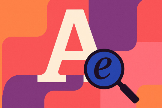
Typography isn’t just about picking a pretty font. It’s the art and technique of arranging type to make language visually engaging, readable, and expressive. Think of it as the tone of voice in your visual message.
Just like in music, timing, spacing, and rhythm matter. A well-set line of type can be a whisper or a shout, a gentle nudge or a power move.
🧠 Quick Typo-Vocab to Flex at Parties (or design critiques)
TermWhat It MeansTypefaceThe family of fonts (like Roboto, Garamond, Helvetica)FontA specific style within a typeface (e.g. Garamond Italic 12pt)KerningAdjusting space between individual charactersTrackingAdjusting space between all letters in a word or blockLeadingSpace between lines of textBaselineThe invisible line letters sit onX-heightHeight of lowercase letters (excluding ascenders/descenders)Serif/Sans SerifWith decorative feet (serif) vs. clean edges (sans)
Yes, designers have a term for everything. We’re fancy like that. 🧐
✍️ Why Typography Matters
Typography communicates more than just words—it conveys tone, mood, and intention. It can:
Build brand identity
Create visual hierarchy
Improve readability
Set the emotional tone
Example:
A luxury brand? You might use elegant serifs like Didot.
A tech startup? Probably a geometric sans-serif like Montserrat or Inter.
A haunted house? Drippy, distorted display fonts. Spooky bonus points if it looks cursed.
📚 Font Categories You Should Know
CategoryFeels Like…Great For…SerifTraditional, elegantPrint, books, formal brandsSans-SerifModern, cleanWeb, tech, minimalismScriptFancy, personalInvitations, headers, brandingDisplayBold, creative, weirdPosters, logos, short titlesMonospaceTechnical, retro, geekyCode, terminal-style designs
🔥 Typography Principles That Make You Look Pro
1. Use Hierarchy Like a Boss
Your type should tell the viewer what to read first, second, and last. Use:
Size
Weight (boldness)
Color
Style (italic, caps)
Positioning
2. Stick to 2-3 Fonts Max
Think of them like ingredients in a recipe. Too many, and it’s a typographic casserole gone wrong.
3. Pair Fonts with Personality
Contrast: A bold sans-serif header + a clean serif body = chef’s kiss 💋
Harmony: Fonts that look like they belong together (same mood or geometry)
4. Don’t Forget About Readability
If people can’t read it, it doesn’t work. Choose legible fonts, especially for small text or paragraphs.
5. Watch Your Spacing
Tight kerning = edgy, modern
Loose tracking = elegant, airy
Too much/too little leading? It’s like wearing pants that are too short or long.
🧠 Unique Fact of the Day
NASA uses a typeface called "Futura" on its spacecraft. Why? Because it’s modern, clear, and highly legible—even in the vacuum of space. Typography: it’s rocket science now. 🚀
Also, Helvetica is one of the most widely used fonts in the world—Apple, Toyota, Lufthansa, and countless others have used it. Love it or hate it, it’s everywhere.
https://letterhanna.com/typography-the-voice-of-design/
0 notes
Text
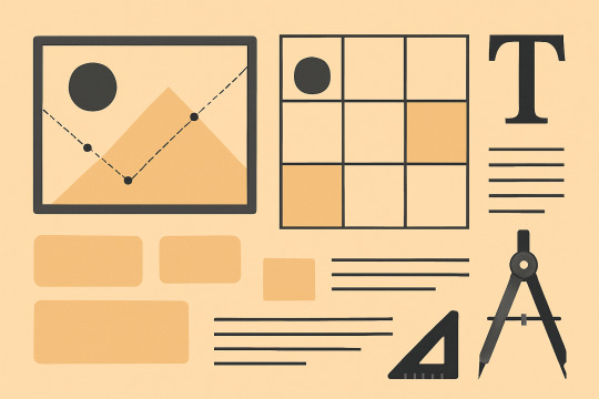
Layout & Composition – The Skeleton of Great Design

You’ve got your colors, your fonts, your logo, your cool illustration of a cat wearing glasses. But how do you arrange all that without it looking like chaos on caffeine?
That’s where layout comes in. It’s how you organize elements on a canvas to create visual hierarchy, flow, and clarity. It’s the invisible scaffolding that makes everything look intentional.
📐 What Is Composition in Graphic Design?
Composition is the arrangement of visual elements to guide the viewer’s eye and communicate a message. It balances form and function.
A good layout:
Has a clear focal point
Creates visual flow
Balances space and elements
Uses alignment and proximity smartly
Feels intentional, not cluttered
In other words: it whispers to your brain, “Don’t worry, I got this.”
🧱 Fundamental Layout Principles
Here are the heavy-hitters you’ll lean on constantly:
1. The Grid System
Think of it as the skeletal system of design.
Helps you align text, images, and elements cleanly.
Can be simple (2–3 columns) or complex (modular grids in magazines).
Even Instagram uses a 3x3 layout. Coincidence? Nope.
2. Hierarchy
It’s how you show what’s most important.
You guide the viewer’s attention using size, color, weight, and placement.
Big titles, bold CTAs, smaller captions. Easy to scan. No guesswork.
3. Alignment
Nothing screams “amateur” louder than elements floating randomly.
Use left, right, center, or justified alignment consistently.
Pro tip: Don’t eyeball it—use your design tool’s align features.
4. White Space (Negative Space)
Not wasted space—breathing room.
Helps avoid visual clutter.
Gives elements room to shine and improves readability.
Think of it like a pause in a conversation. It gives impact.
5. Proximity
Group related elements close together.
Keeps things organized.
Example: Don’t leave your CTA button miles away from your headline. They’re friends!
6. Repetition
Reuse design elements (shapes, colors, fonts) to create unity.
Makes your work feel cohesive and intentional.
📏 Layout Types You Should Know
Here are a few classics:Layout StyleBest ForDescriptionZ-PatternWebsites, postersMimics how Western readers scan—top left to bottom rightF-PatternText-heavy pages, blogsReaders skim like an "F" – down and acrossAsymmetricalModern, dynamic designsUneven elements balanced visuallyModular/GridEditorial, portfoliosUses strict blocks for clean orderSplit ScreenDual CTAs, comparisons50/50 division of the canvas
🎯 How to Create Visual Focus
When everything is loud, nothing is heard. So decide what your viewer should see first. Then guide them like a design GPS using:
Size: Bigger = more important
Color: High contrast draws attention
Placement: Top left or center is prime real estate
Isolation: Give it breathing room to stand out
🔥 Quick Composition Mistakes to Avoid
Misaligned text or shapes 🙈
Too much text crammed together 🥴
Lack of contrast (especially with backgrounds)
Uneven margins or padding
Using 17 different fonts (pick 2–3 max, remember?)
💻 Layout in Action Across Mediums
Web design: Responsive grids ensure consistency across devices.
Posters: Big bold focal point, clear text hierarchy.
Editorial: Modular grids for clean columns.
Social media: Z-patterns and symmetry for scannability.
Each format has its own quirks—but layout principles stay consistent.
🧠 Unique Fact of the Day
The Gutenberg Bible, printed in the 1450s, wasn’t just the first major printed book—it also used a grid system. That's right, your modern-day layout templates are just fancy medieval tech. 👀
Also: Apple’s 12-column grid system has become an industry standard for web and app design. It’s like layout gospel for UI designers.
🧪 Today’s Challenge: Build a Layout Using a Grid
Pick a canvas (poster, webpage, magazine spread) and:
Create a simple grid (3 or 4 columns)
Define a hierarchy: title > subtitle > body > image > CTA
Use alignment and white space to organize the content
Bonus: Try an asymmetrical twist for a modern feel
Once you learn layout, your design instantly feels 10x more professional—even if you're still using free fonts and drawing with a mouse.
https://letterhanna.com/layout-composition-the-skeleton-of-great-design/
0 notes
Text
Color Theory – The Science and Emotion of Hue-Man Design

You might think you “just like blue.” But your brain has been tricked by decades of color psychology, cultural cues, and carefully constructed marketing. And now, you’ll learn to use that trickery for good (and excellent design).
🌈 What Is Color Theory, Exactly?
At its core, color theory is the study of how colors interact—with each other and with our emotions. It's both art and science, helping you choose the right colors, combinations, and contrast to create meaning, mood, and magic.
Let’s crack open the color wheel.
🎡 Meet the Color Wheel
It all starts here, a circle of hues organized by relationships:
Primary Colors: Red, Blue, Yellow
Secondary Colors: Orange, Green, Purple (made by mixing primaries)
Tertiary Colors: Mix a primary with a neighboring secondary (e.g., red-orange)
This wheel isn’t just pretty. It’s your map to color harmony.
🎨 Color Schemes 101: The Greatest Hits
1. Monochromatic
One hue, many shades/tints
Clean, minimal, calming
Easy to balance but can feel flat
2. Analogous
Colors next to each other on the wheel (like blue, teal, green)
Smooth and natural
Great for cohesive vibes
3. Complementary
Opposites attract (like blue + orange, red + green)
High contrast, energetic
Use one as dominant, the other as accent
4. Split-Complementary
A safer version of complementary: base + two adjacent to its opposite
Balanced yet vibrant
5. Triadic
Three colors evenly spaced on the wheel (like red, yellow, blue)
Dynamic, bold, fun
Needs careful balance
🔥 Hue, Saturation, and Brightness (HSB)
Understanding these three helps you control how a color feels:
Hue: The actual color (red, green, purple, etc.)
Saturation: Intensity (vibrant vs. muted)
Brightness: Lightness or darkness of the color
Change one, and you can make the same color feel soft and elegant—or loud and rebellious.
🧠 Color Psychology: Colors Have Feelings Too
Colors can subliminally influence how people feel about a design. Here’s a cheat sheet:ColorFeels LikeCommon UsesRedPassion, urgency, powerSales, food, alertsBlueTrust, calm, professionalismTech, finance, healthYellowOptimism, energy, cautionWarnings, kids' productsGreenNature, growth, wealthEco brands, financePurpleLuxury, mystery, spiritualityBeauty, high-end productsBlackElegance, power, mysteryFashion, luxuryWhitePurity, minimalism, cleanlinessHealth, design portfolios
🚨 Warning: Color meaning varies culturally. In Western cultures, white = purity. In others, it might be associated with mourning.
🧪 Contrast & Accessibility
Good color design isn’t just about beauty—it’s about function. Poor contrast can make text unreadable or alienate people with visual impairments.
Use high contrast between text and background
Tools like WebAIM Contrast Checker help verify if your combos pass WCAG accessibility standards
Rule of thumb: If your grandma can’t read it comfortably on a dim phone screen, rethink it.
🔧 Color in Action
Here’s how color shows up across design:
Logos: Should work in color and black/white
Websites: Use color for navigation, hierarchy, and emotion
Posters: Bold combos for grabbing attention fast
UI/UX: Use color to guide users and communicate feedback (e.g., red = error)
💡 Pro tip: Use color intentionally—not just because it looks cool. Every hue should serve a purpose.
🧠 Unique Fact of the Day
Blue was once considered evil in Ancient Rome. It was associated with barbarian tribes and frowned upon in elite circles. Fast forward a few centuries: now it’s the most trusted color in branding—used by Facebook, Twitter, PayPal, and every bank ever.
Also, Crayola has retired colors. Like “Dandelion” (RIP 2017), which had a good run before being booted for “Bluetiful.” Branding is serious business, even in crayon land.
🛠️ Tools to Help Your Color Game
Coolors.co – Instant palette generator
Adobe Color – Advanced harmonies with visual examples
Khroma – AI-based palette suggestions
Color Hunt – Curated trendy palettes
🚀 Today’s Challenge: Make a 3-Color Palette
Pick:
A dominant color – Your brand’s hero
A secondary color – To support or contrast
An accent color – For highlights or CTAs
Build a poster, a UI mockup, or just a sample layout with them. Then squint. If your eyeballs are still comfortable, you’re on the right path.
https://letterhanna.com/color-theory-the-science-and-emotion-of-hue-man-design/
0 notes
Text
Branding Basics – Designing Identity That Sticks

Branding is what makes people recognize a soda can and instantly think Coca-Cola. It’s why you can spot an Apple product from a mile away, even with the logo covered. It’s not just about visuals—it’s about impressions.
So how do we, humble digital mortals, create branding that sticks like peanut butter in July? Let's break it down.
🧠 What Is a Brand, Really?
A brand isn’t just a logo. It’s the personality, values, voice, and vibe of a product, service, or company.
A brand includes:
Logo
Color palette
Typography
Voice & tone
Imagery style
Layout consistency
User experience
Think of it like a person: the logo is the face, the colors are their clothes, the tone is how they talk, and the experience is how they make you feel.
🧩 Why Branding Matters
Recognition: Strong branding makes you instantly identifiable.
Trust: Consistent design = professional = trustworthy.
Emotion: People connect with brands emotionally before logically.
Differentiation: It’s what sets you apart in a sea of sameness.
Bad branding? It’s like showing up to a job interview in pajamas. 🫠
🎨 Brand Elements in Design
Here’s what you’ll typically build as part of a visual identity:
1. Logo
Should be simple, memorable, and versatile.
You’ll need it in various formats: full-color, black & white, icon-only, etc.
Pro tip: Test it at very small sizes—if it turns into mush, simplify.
2. Color Palette
Most brands use 1–3 primary colors and a few accent or neutral tones.
Use color psychology: blue = trust, red = energy, green = calm, etc.
Tools like Coolors or Adobe Color can help you build a solid scheme.
3. Typography
Choose 1–2 fonts (max 3) that represent your vibe.
Serif for tradition. Sans-serif for modern. Display for flair. Script for elegance.
Consistency in sizes, spacing, and styles keeps everything unified.
4. Imagery Style
Decide on a style: photography, illustration, or a mix?
Set rules for filters, lighting, and composition.
Create a visual library or mood board to guide future projects.
5. Voice & Tone
Yes, even your text has a personality. Is your brand funny? Professional? Bold? Chill?
Voice stays consistent. Tone flexes depending on context (e.g., tweet vs. apology email).
🔧 Create a Brand Style Guide
This is your brand’s design bible. It outlines:
Logo usage rules (what NOT to do is just as important)
Color codes (HEX, RGB, CMYK)
Font choices (and when to use them)
Icon styles
Photography do’s and don’ts
Example layouts
You can DIY it with tools like Canva, Notion, Figma, or get super official with Adobe InDesign.
🌐 Branding Across Platforms
Branding isn’t just for your website or packaging. It needs to show up everywhere:
Social media profiles
Email signatures
Ads
Presentations
Even your invoice design (yes, really)
Every touchpoint should feel like it's coming from the same personality. If your website is minimal and sleek, but your social media is loud and chaotic—you’re sending mixed signals like a bad first date.
🧠 Unique Fact of the Day
The Nike Swoosh cost $35. That’s right. One of the most iconic logos in human history was designed by Carolyn Davidson in 1971 for a modest freelance fee. (Nike did eventually gift her stock... worth hundreds of thousands of dollars. Phew.)
Moral of the story: It’s not about how much something costs—it’s about how consistently and boldly it’s used.
https://letterhanna.com/branding-basics-designing-identity-that-sticks/
0 notes
Text
Imagery – Visual Storytelling Without Saying a Word

From jaw-dropping photography to charming illustrations and punchy icons, imagery is the part of your design that grabs people before they even know what it’s about. If typography whispers the message, imagery yells it across the street (politely, of course).
So let’s get visual!
📸 What Counts as Imagery?
Imagery includes:
Photos (stock, original, product shots)
Illustrations (hand-drawn, vector, 3D, etc.)
Icons & Symbols
Textures & Patterns
Infographics & Data Visuals
Basically, anything that isn’t text qualifies. But here’s the kicker: not all images are created equal.
🎯 Why Imagery Matters
Sets the tone: A moody black-and-white photo vs. a playful cartoon completely changes perception.
Enhances communication: Especially when explaining abstract or complex ideas.
Increases retention: People remember 65% of visual info 3 days later vs. only 10% of text.
Engages emotions: The right image connects to viewers on a gut level.
Breaks monotony: A wall of text without visuals is a digital sedative.
🔍 Choosing the Right Image
Don’t just slap a photo into your layout because there’s empty space. You need images with:
1. Relevance
Every image should have a purpose. If it doesn’t enhance the message, delete it.
2. Consistency
Keep a consistent style (color tone, lighting, format). Mismatched visuals = chaotic vibes.
3. Authenticity
Skip cliché stock photos (handshake in front of a skyline, we’re looking at you). Look for images that feel genuine, or better yet—create your own.
4. Quality
Resolution matters. Grainy, pixelated images will tank your credibility. Aim for 300 DPI for print, 72 DPI for web.
🧑🎨 Photography vs Illustration: What’s the Difference?
Photography
Feels realistic, grounded
Great for products, people, events
Can be expensive or require gear
Illustration
Offers flexibility and control
Ideal for abstract ideas, brand storytelling, or when photography isn’t practical
Comes in many styles (flat, isometric, 3D, hand-drawn)
Pro tip: Combining both can work wonders—but only if they harmonize stylistically.
🛠️ Editing & Enhancing Visuals
You don’t always need to use images as-is. Here's how to elevate them:
Crop with purpose (think about the focal point)
Adjust brightness/contrast for clarity
Apply filters to unify aesthetics
Use overlays (a tinted color block) to make text readable over photos
Masking to blend or create dynamic shapes
Tools like Photoshop, Canva, or Figma let you tweak images without needing a photography degree.
🧩 Icons, Textures & Patterns: The Spice of Design
Icons
Minimal, symbolic graphics to represent actions or ideas.
Use icon libraries like Feather, FontAwesome, or Heroicons.
Keep the stroke weight and style consistent!
Textures & Patterns
Can add depth and tactility.
Subtle is key—grunge textures, noise, gradients, or repeating motifs.
Use sparingly to avoid sensory overload.
🧠 Unique Fact of the Day
NASA photos were once hand-retouched. Before digital editing, NASA’s moon landing photos were manually edited using paintbrushes and dyes. Yes, someone literally painted over cosmic dust. That’s dedication.
Also, the infamous "Distracted Boyfriend" meme? It’s from a stock photo shoot, and the model’s name is Mario. He became accidentally iconic—proving that even the most generic imagery can become unforgettable with the right (or wrong) context.
https://letterhanna.com/imagery-visual-storytelling-without-saying-a-word/
0 notes
Text
Layout & Composition – Making Chaos Look Intentional
If typography is the voice of design, then layout and composition are the stage directions. They're what keep your design from looking like a garage sale flyer from 1998.
Today we’re learning how to arrange all the moving parts—text, images, space—into a harmonious whole that says, “This was totally on purpose.”
🧱 What Is Layout & Composition?
Layout is how elements are arranged on a page or screen. Composition is the art behind that arrangement—how it feels, how it flows, and how it communicates.
Think of layout as architecture and composition as interior design. They work hand in hand. A great design layout:
Guides the eye smoothly
Highlights the key message
Feels balanced and cohesive
Gives everything room to breathe (R.I.P. clutter)
🔑 The 8 Core Principles of Composition
Let’s break down the key ingredients of a killer layout. Master these, and your work will start looking like you actually know what you're doing—even if you’re winging it.
1. Alignment
Everything should line up—either along an edge or an invisible axis. When elements feel connected, your design looks more professional and polished.
2. Hierarchy
Size, weight, color, and placement all help signal what’s most important. If everything is yelling, nothing gets heard.
3. Contrast
Opposites attract. Contrast helps differentiate elements and creates visual interest. Think bold vs. light, dark vs. bright, big vs. small.
4. Repetition
Repeat visual styles (colors, shapes, font styles) to create consistency. Repetition = rhythm = flow.
5. Proximity
Group related elements close together. It tells the viewer, “Hey, these things belong in the same box of thought.”
6. Balance
Symmetrical balance feels formal. Asymmetrical feels dynamic. Both are valid—pick based on the emotion you want to evoke.
7. White Space (Negative Space)
Don’t fear the void! Space between elements improves clarity, focus, and sophistication. Designers worship at the altar of white space. Join the cult.
8. Rule of Thirds
Divide your canvas into a 3x3 grid. Place key elements along these lines or intersections for natural, pleasing compositions (photographers swear by this too).
📐 Grids: The Skeleton of Design
A grid is a system of horizontal and vertical lines used to organize content. Think of it like scaffolding—essential, but invisible in the final product.
Types of grids:
Manuscript Grid: Great for blocks of text (books, articles)
Column Grid: Common in magazines, websites
Modular Grid: Grids within grids—super structured, great for complex content
Hierarchical Grid: More freeform, content-driven structure
🎯 Pro Tip: Use the 12-column grid for responsive web design—it’s the industry gold standard.
🎨 Composition in Action: Layout Examples
Let’s visualize some common design layouts:
Z-Pattern Layout: Eye moves in a Z shape (great for posters and web headers)
F-Pattern Layout: Eye scans top and left edges (works well for text-heavy pages)
Centered Layout: Symmetrical, formal, great for invitations or minimal designs
Asymmetrical Layout: Deliberately off-balance for energy and edge
🚫 Common Layout Mistakes (Avoid Like Expired Milk)
Cramped margins (let your design breathe)
Center-aligning everything (lazy symmetry is a crime)
Lack of visual hierarchy (don’t make your viewers guess)
Ignoring white space (more is more here)
Floating elements with no visual anchors
🧠 Unique Fact of the Day
Swiss design (a.k.a. the International Typographic Style) in the 1950s revolutionized layout thinking with grid systems and sans-serif typography. It gave birth to the clean, minimalist styles we see everywhere from Apple’s interface to modern art posters.
Fun twist: It came from a country that has four national languages—proof that clarity in visual communication transcends spoken words.
https://letterhanna.com/layout-composition-making-chaos-look-intentional/
1 note
·
View note
Text
Typography – Where Words Dress Up and Party
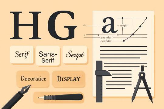
If graphic design were a rock band, typography would be the lead singer. Loud, expressive, and impossible to ignore. But it’s more than just picking a cool font—it’s about arranging type so it speaks, even before anyone reads a word.
Let’s break it down, letter by letter.
✒️ What Is Typography?
Typography is the art and technique of arranging type. That includes choosing fonts, adjusting spacing, setting hierarchy, and balancing aesthetics with readability.
In simpler terms: it’s how you make text look good and work well.
Great typography:
Improves readability
Creates emotional tone
Guides the viewer’s eye
Builds brand identity
Bad typography:
Looks like a ransom note
Makes people squint, cry, or click away
🔠 Font vs Typeface (Wait, They’re Not the Same?)
Surprise! They’re not.
Typeface is the design (e.g., Helvetica).
Font is the file or variation (e.g., Helvetica Bold 12pt).
Think of typefaces as a music album and fonts as individual songs. Same vibe, different format.
🧬 The Anatomy of Type
Let’s get nerdy. Every letter is a tiny architecture project.
Baseline – Where letters sit
Cap Height – Height of capital letters
X-Height – Height of lowercase “x” (and most lowercase letters)
Ascender – Part of a letter that rises above x-height (like in b or d)
Descender – Dips below the baseline (like in y or g)
Serif – The little feet on letters like Times New Roman
Sans-serif – No feet! Clean and modern (like Arial or Helvetica)
And yes, there’s also ear, loop, bowl, counter, and even a tittle (that dot on an “i” has a name, and it sounds like a snack). Typography is nothing if not weirdly poetic.
🧩 Types of Fonts (and Their Vibes)
1. Serif
Feels: Traditional, trustworthy, classy
Famous faces: Times New Roman, Georgia, Garamond
Great for: Editorials, books, serious brands
2. Sans-serif
Feels: Clean, modern, approachable
Famous faces: Helvetica, Arial, Futura
Great for: Web design, tech brands, clean interfaces
3. Script
Feels: Elegant, personal, artsy
Famous faces: Brush Script, Pacifico
Great for: Invitations, logos (use with caution)
4. Display/Decorative
Feels: Loud, unique, highly stylized
Famous faces: Lobster, Impact, Jokerman (gasp)
Great for: Headlines, branding—not body text!
🎯 Pro Tip: Use display fonts like hot sauce. A little goes a long way.
🔧 Typography Principles That Actually Matter
Hierarchy
Make the most important info stand out.
Use size, weight, and spacing to guide the reader.
Alignment
Left, right, center, justified. Pick one and stick with it.
Random alignment? That’s chaos. We fear chaos.
Contrast
Bold vs regular, big vs small, serif vs sans—contrast creates clarity.
Spacing
Kerning: space between two letters.
Tracking: space between all letters in a word.
Leading: space between lines (fun fact: it’s pronounced “ledding”).
Tiny adjustments here can massively improve legibility and vibe.
🔠 Dos and Don’ts of Using Fonts
DO:
Limit yourself to 2–3 fonts per design.
Use font pairing tools like Fontjoy, Google Fonts, or Adobe Fonts.
Ensure legibility first, aesthetics second.
DON’T:
Use Comic Sans unless you’re 9 or it’s ironic.
Stretch fonts manually (use the proper weights instead).
Mix too many styles—it becomes a visual train wreck.
🎨 Want an easy pairing? Try Playfair Display (serif) for headers + Roboto (sans-serif) for body text.
🧠 Unique Fact of the Day
The first movable type system? Not Gutenberg. While Gutenberg gets the Western credit in the 1400s, Bi Sheng of China invented movable type in the 11th century, using porcelain characters. He was dropping type while Europe was still doodling in manuscripts.
Also: the infamous Comic Sans was originally made for Microsoft Bob, a cartoon interface that flopped. The font lived on... and on... and on… (much to designers' collective horror).
https://letterhanna.com/typography-where-words-dress-up-and-party/
0 notes
Text
Color Theory – The Psychology of Hue-Man Behavior

Welcome back, budding design sage. You’ve survived the opening chapter and now it’s time to tackle a superpower that even toddlers wield with confidence: color. But don’t be fooled by the box of crayons—color theory is both art and science. And once you understand it, your design work will go from “meh” to whoa faster than you can say "Pantone 17-3938."
🎨 Why Color Matters (Like, A Lot)
Color is emotion in visual form. It influences how we feel, think, and behave—whether we realize it or not.
Ever notice how fast-food chains gravitate toward red and yellow? That’s not a coincidence—it’s appetite psychology. Blue makes us feel calm (hence all the wellness app interfaces), while black screams luxury (and a hint of mystery).
In short: Color isn’t decoration. It’s strategy.
🌈 The Color Wheel: Your Best Frenemy
Let’s start with the basics: the color wheel.
This circular spectrum is the Rosetta Stone of color relationships. It includes:
Primary colors: Red, Blue, Yellow (cannot be made from other colors)
Secondary colors: Green, Orange, Purple (made from mixing primaries)
Tertiary colors: Red-orange, blue-green, etc. (the kids of primaries and secondaries)
Color Schemes – Your Go-To Combos:
Monochromatic: One color in various shades and tints. Clean, minimal, easy to balance.
Analogous: Colors next to each other on the wheel (e.g., blue, blue-green, green). Harmonious and gentle.
Complementary: Opposite sides of the wheel (e.g., red and green). High contrast, bold impact.
Split-complementary: A primary color plus two neighbors of its opposite. Still punchy, but less aggressive.
Triadic: Three evenly spaced colors (e.g., red, yellow, blue). Energetic and playful.
Tetradic: Two complementary pairs. Complex but powerful when balanced right.
🎯 Pro Tip: Use tools like Adobe Color or Coolors.co to test palettes without needing to own 43 markers and a steady hand.
💡 Color Psychology – Feel the Hue
Here’s how colors generally influence emotions:
Red: Passion, urgency, energy, danger
Blue: Trust, calm, professionalism, sadness (yup, the full range)
Yellow: Optimism, warmth, attention-grabbing
Green: Nature, growth, health, money
Purple: Royalty, creativity, spirituality
Black: Power, elegance, mystery
White: Purity, simplicity, modernity
Orange: Fun, friendliness, confidence
Pink: Love, femininity, playfulness
Gray: Neutrality, balance, sophistication
But remember—cultural context matters. In Western cultures, white = purity. In some Eastern cultures, it represents mourning. So don’t make a funeral invitation that looks like a wedding ad (unless you're designing for Wednesday Addams).
⚖️ Color Balance and Accessibility
Color isn’t just about what looks good. It’s about what works for everyone.
Contrast is key for readability. Dark text on a light background = good. Neon yellow text on a white background = eyewash station, please.
Color blindness affects about 1 in 12 men. Avoid relying on color alone to communicate. Use labels, textures, or patterns alongside color cues.
Use contrast checkers like WebAIM or Stark (Figma plugin) to ensure accessibility. Because good design includes everyone.
🎯 How to Use Color in Your Designs
Here’s a quick guide to applying color like a pro:
Start with emotion – What feeling do you want the viewer to have?
Use a limited palette – Don’t throw the whole rainbow at your design unless you’re making a unicorn party poster.
Pick a dominant color – This will be your visual anchor.
Add accent colors – These highlight important elements.
Create hierarchy – Use contrast and brightness to draw attention where it matters.
🎨 Bonus tip: Most successful brands use no more than 3 primary brand colors.
🧠 Unique Fact of the Day
The color blue was once so rare, it had to be invented. In ancient times, blue pigment came from lapis lazuli, a gemstone more expensive than gold. That’s why old paintings feature so much red and brown—it wasn’t a vibe thing, it was a budget thing.
The first synthetic blue, called Egyptian Blue, dates back over 4,500 years and is considered the first-ever manmade color pigment.
Tomorrow, we’ll jump into the realm of Typography—because fonts aren’t just letters, they’re personalities. From serious serif suits to quirky sans-serif sneakers, it’s going to be a character-driven ride.
Want the next lesson right away, or do you want a breather to go color-code your life first?
https://letterhanna.com/color-theory-the-psychology-of-hue-man-behavior/
0 notes