
Don't wanna be here? Send us removal request.
Statistics
We looked inside some of the posts by designresearch604-ahnesshim and here's what we found interesting.
Average Info
Notes Per Post
1
Likes Per Post
1
Reblog Per Post
0
Reply Per Post
0
Time Between Posts
3 days
Number of Posts By Type
Text
17
Last Seen Tumblr Blogs


Fun Fact
Average visit duration of Tumblr.com is 10 mins and 25 secs.
Text
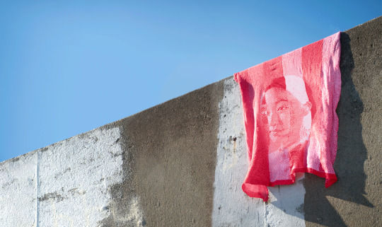
Printing


As I mentioned previously, the paper that played a crucial part in the design decision for this poster, dd not provide the size I needed to print a single A2 Poster.
My only resort was to tile print my poster and make sure the sligning was all right and seamless. I took my time being careful trimming and gluing the tiled prints together to create an A2 Poster.
Overall, I am quite happy with my final poster, however, I wish I did print a single A2 poster, but due to paperstock sizing I was not able to.
0 notes
Text
Choosing Paper Stock

I was looking into paperstock I wanted to potentially print my A2 poster. I knew I wanted a natural looking paper stock that reflected the Korean Hanji traditional paper, however, it is not available in New Zealand to get.
I looked online and in the store to physically be able to see the paper grain and feel of the paper. There was a Japanese paperstock that is very similar to Korean Hanji, both that have been traditionally used in various uses such as books, calligraphy and for art.
Therefore, I decided to purchase this paper stock. However, the specific paper I wanted did not have the size that I needed to print my A2 poster. But I did not want to give up on this paperstock as I felt it was a crucial design decision.
0 notes
Text
Poster Process


I initially had the idea of doing a diptych of 2 A3 posters with the inventory on one side the the elements on the other side.
In this draft I attempt to reflect the inventory list of how the elements are placed within the other spread. However, when I tried this idea I felt that it was too chaotic and quite hard to see. I felt that the idea was good but visually did not execute.
I felt the arrangement was not working in the previous one, so I decided to combine the inventory and elements after learning that we could combine the two. I grouped my elements on one side, prominently although element 1 was an exception.


With further refining and changing a few things around, such as the font size I was able to come up with a final design I was quite happy with.
One thing I found immensely difficult and challenging was setting the type for the inventory list. I found it quite difficult to work out the right font size for these narrow column widths that I was working with. I hjad to change the font size a few times to see which size was working and what wasn't and making sure the text was set beautifully and effectively for readiability.
I also made a numbering system 1-20 so that readers are able to knoww which element each small paragraph encapsulates.
0 notes
Text
Week 11: Essay Feedback


I printed off my draft for my essay and received feedback for it. I found it really helpful as my tutor, Aakifa offered me clear guidance and clear feedback on what should be included in the essay.
I now need to go back and reflect more on my design choices for my poster and how the creatives relate to me as a designer.
I also showed my poster design in this feedback session in class, and my peer commented saying, how she saw the relation between my work and the artists I researched.
0 notes
Text
Week 10: Poster digital drafts/Process


I took this calligraphed name of mine from my workbook and I started playing around with the layouts of the Korean characters. This is one of the elements that will be on my poster.
I've created a grid (still in working), but a rough grid system to help me place my images on the poster.


I've worked out where to add the title and subtitle on the poster. The reason why I have split my Korean name up; the left corner is my Korean surname name in which in Korean culture, we use the last name before the first name then in the right bottom corner I have laid my first Korean name. I wanted to show A "detachment" to my name to emphasize the journey of finding my cultural identity.
I am not too sure if I will use the dotted line in the final poster but I thought it could emphasize the "journey" of my cultural identity. with placing images along the line with supporting descriptions of the images.
1 note
·
View note
Text
More Objects


The hanbok set consists of a chima - skirt, jeogori - the top and gatsin which are the shoes. This embodies my cultural identity that I navigate to find. Like how the hanbok consists of layers there are many layers and stories to uncover and navigate my cultural identity and heritage.
The all blacks jersey is a symbol of myself wanting to swap my hanbok in place of an All Blacks jersey. This speaks as a metaphor for my heritage to be held in uncultured hands who do not understand my culture, treating it as a mere costume.
The seashell something that I have collected over the years from every beach I go to with family and friends, the waters that surround Aotearoa, New Zealand.
The magnet represents my home that I was born in and also live in as a Kiwi-Asian.
The eraser represents the desire of wanting to erase or reject my cultural roots in order to assimilate into Kiwi culture.
These series of badges represent the culture I grew up in which shaped my adolescence and into who I am today .
0 notes
Text
Week 9: AGI Open conference
For me personally, the whole experience was amazing and it was a truly rewarding experience.
Taku Satoh One of my personal favourite speakers were Taku Satoh who spoke about "Just Enough" design - "Hodo Hodo", in Japanese. He said there is balanace and elegance when it is just right - using the chopstick analogy. The chopstick, surfboard and furoshiki share a commonality that they are just enough in its appropriateness and create elegance. He also said Hodohodoshows knowing when to stop, leaving room to resonate and encouraging other elements to shine.
Ahn Sang Soo I think this speaker was interesting in the way he approached design. He thought of design as many things, taking things out of the digital world, but really thinking it of as art. In his design institute, PaTi, is a place for students to be able to partake in Zens/yoga and finding that inner peace for design. He states "life peace symbol, connects people ad live forms, without live forms whether animal or plants we do not exist either. " I thought this speaker was very though provoking.
Kris Sowersby As I began to be interested in type early this year, I was quite excited for Kris Sowersby. He talked about the research phase in designing a Maori typeface. It was also interesting how he took a hypothesis of "what would Maori typeface look like from the beginning?", and with this hypothesis he began to research and design a typeface that consists of serif and sans serif.
0 notes
Text
Week 9: Poster Draft/Ideas


Here, I explore some ideas of how I would like to lay my poster. I've explored both the format of 2 A3 posters or one A2 poster.
Most of these sketches/ideas that I have, consist of a more collaged or analogue style mixed with typography work, which is something that I am interested in as a creative and as a designer. I quite like the idea of almost hero-ing the images of the 20 objects but also narrating that of the theme that the objects hold. It shows a bit of chaos and also "fragments" or "pieces" to show the cultural difficulty I faced growing up, which is a theme that shows throughout my chosen objects.
0 notes
Text
Week 8: Categorising/Critical Review
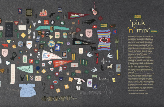
The book, Korean and New Zealand passport, Wellington badge, Korean Won currency, Trip to HongKong Magnet, Seoul Sky Magnet, birth certificate, birth anklet, share a similar theme – cultural significance. Although each object tells a different narrative, they have been a big significant cultural experience for me and influenced me as a person and shaped my cultural identity today.
The felttips, mechanical pencil, muji pen, ruler, scalpel, clay plates, plaster ephemera flower print show my craft and art side of me. This was always a part of my adolescence and a part of me today. These creative tools show how I work in both digital and analogue space.
The diary, post stick notes and polaroid films show reflect my documentation and self growing journey. It is a reflection of my personal identity, which also links to my cultural identity.
0 notes
Text
20 Items + Copywrite


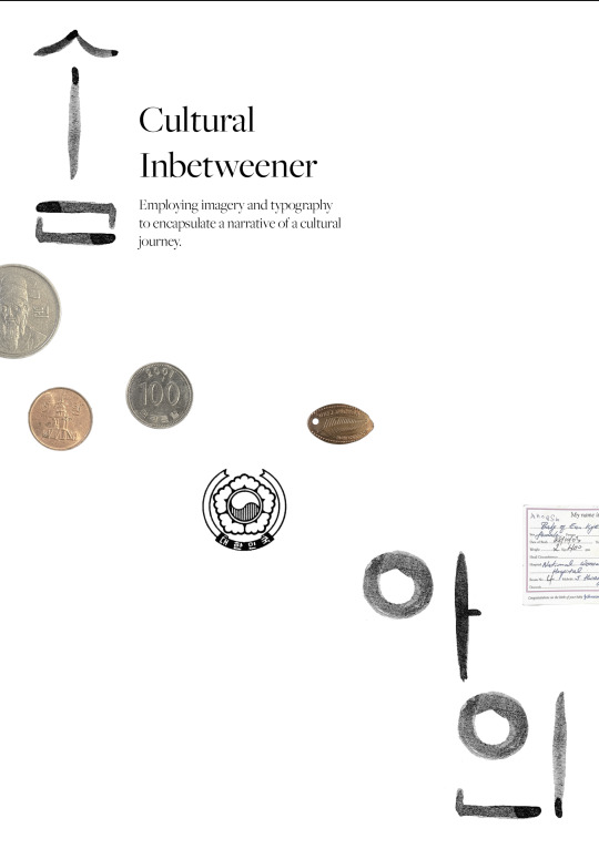
My Korean passport and New Zealand passport. Although I was born in New Zealand, my very first passport was a Korean passport because my mother had the choice of giving me a Korean or New Zealand passport. But because our family was Korean and my roots are also Korean she had chosen to proudly give me a Korean identity. These two contrasting items show the duality of an identity crisis that I feel and experience whilst living in New Zealand as a Kiwi-Korean.
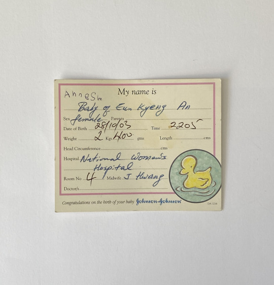
2. Birth Certificate. his is a legal and physical proof of me being born here, a Kiwi-Asian, a Kiwi-Korean. But throughout my life and growing up, experiencing cultural dilemmas, racism and discrimination I was often told to go back to my own country, although I was born here. I've often grown up acknowledging racism instead of standing up to it. I felt foreign although NZ felt like my home and it always was and is. I felt small and scared and "less" than white people and because of the racism I experienced I sometimes wished I was white.
3. Baby anklet (?). It's amazing and interesting to see how small of a baby I was to grow up into a person who can no longer fit into that anklet I once fit into. This is a metaphor for how much I have matured and learned about myself and my own culture as I continue to relearn the culture I was abandoned and ran away from, colonising myself.
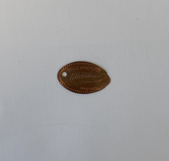
4. Wellington Te Papa Souvenir. This encapsulates my very first trip down to Wellington and serves as a momento of the time. When I look back at it now there was much culture to be learnt and take in, and so much that I did not know of. I remember the joy and excitement of going to a new place and exploring a new place out of Auckland with my family.
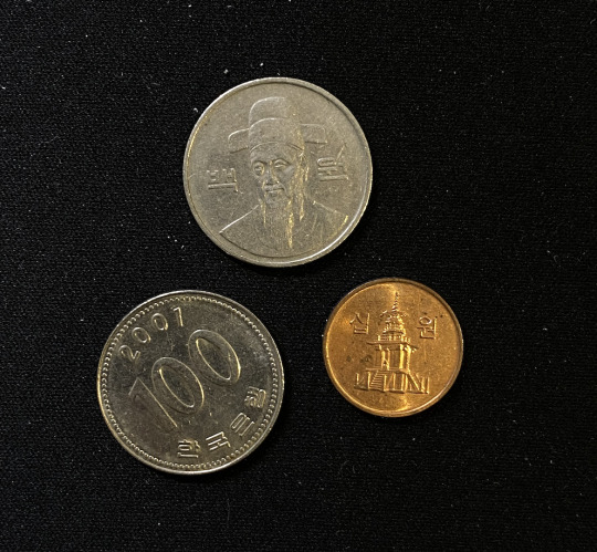
5.Korean Currency – trip to Korea for the First Time. These coins were coins that I kept as a souvenir from my very first trip to my parents home country, Korea which encompasses the preservation of South Korean currency as a form of cultural and historical significance. I vividly remember my grandma, aunties, uncles and even my parents' friends' gave me pocket money often telling me to buy something yummy for myself with the large sum of money that possibly seemed too much for a snack. This is enriched in Korean culture and to me it's a token of them showing care and love towards me and even my parents and their way of expressing their love and care as it is not common to see people express how they feel verbally in Korean, eastern culture, but they also stand as artefacts of a my journey, capturing moments in time, and embodying the pride and identity.
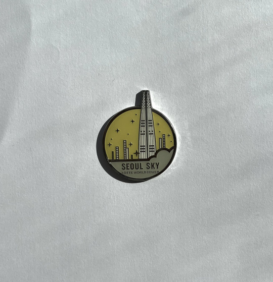
6. Seoul Sky Magnet – Trip to Korea in 8 Years (after first trip). This was my second trip to Korea in 8 years, after the first one. My older sister and I spent hours and hours exploring the culture-rich Korea as we had so much to learn as we knew so little of our own culture and my parents' home country. The magnet was a souvenir from a landmark called Namsan which is famous and popular for their tower that overlooks the city.
7. HongKong Magnet Souvenir at 15 years olds. This trip was a meaningful and exciting trip as my cousin who I lived with as a small child, young as 5 years old; would be visiting him in many years. I was able to visit Hong kong like a local person who lived there as my cousin took us on a designated tour around the hot spots in the local area and throughout the city.
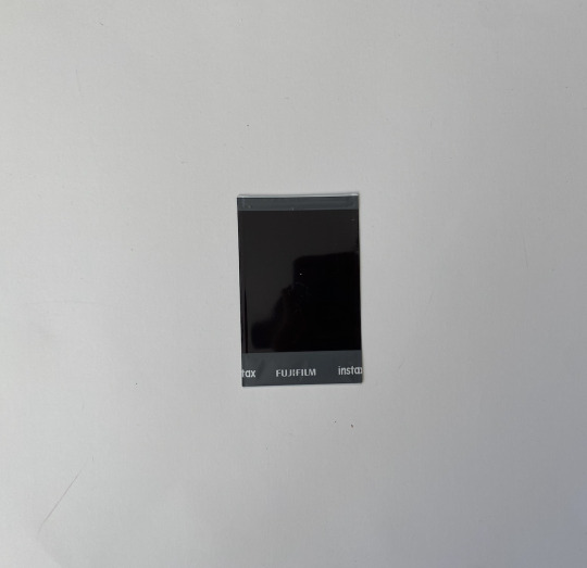
8. Polaroids. These polaroids I took lie in their ability to transform intangible memories into tangible, touchable keepsakes. Unlike traditional photography, which involves waiting for film to be developed, or digitally taken through our phone, it allows an image to materialize within moments of pressing the shutter button. This instant gratification grants a sense of immediacy and authenticity to the captured moments, preserving it in a form that can be held, shared, and cherished in real-time. The physicality of these polaroid photographs, with its characteristic white border and distinctive color palette, imparts a timeless charm that transcends eras, making it not just a snapshot, but a testament to the magic of instant memory-making.
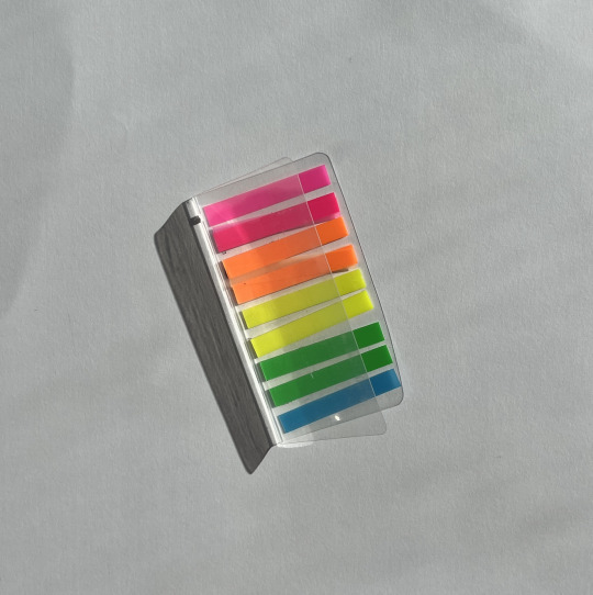
9. Poststick Notes. These post stick notes are important as they help me to mark important pages within my sketchbooks or even in my diary, so that I can come back to them. I often use the same colour post stick notes for pages that have similar or continuing ideas. This item has now become an essential for me as a designer and within my personal life as well as it marks out important and even current events and pages.
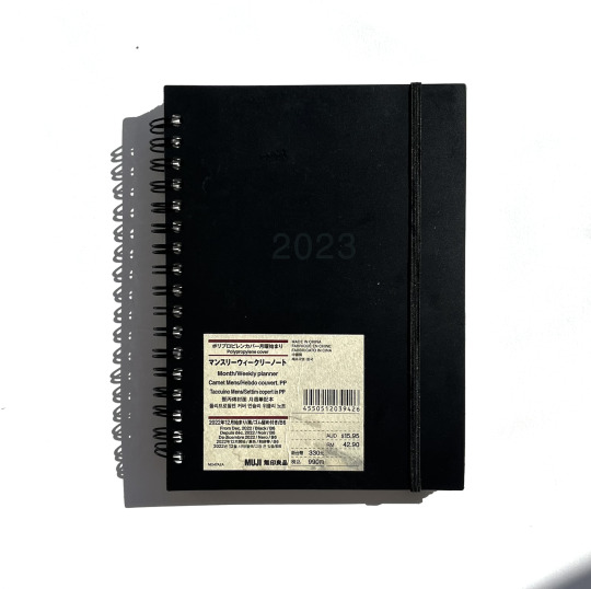
10. 2023 Diary. A personal diary becomes a canvas for expression, allowing me to infuse my unique style and preferences. The diary stands as a tangible object featuring handwritten organization and introspection, providing a haven for dreams, plans, and cherished memories to flourish throughout the year. It serves not only as a practical tool but also as a source of inspiration, reminding me of the transformative potential that comes from purposeful reflection and deliberate planning.
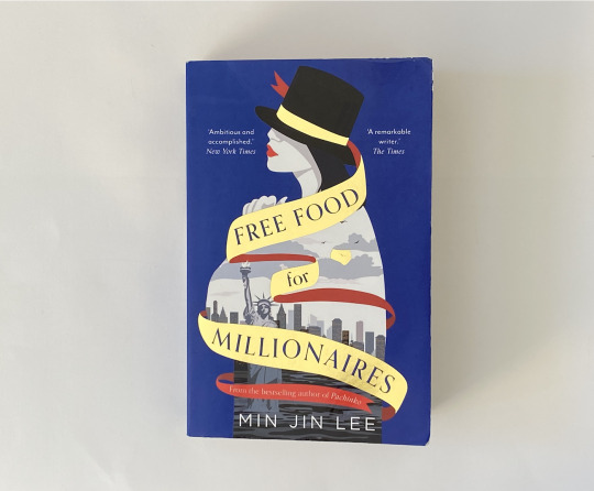
11. Free Food for Millionaires. This novel that holds a special place, "Free Food for Millionaires" by Min Jin Lee is a compelling exploration of ambition and identity as a Korean-American. A young Korean American navigates the complexities of immigrant expectations and personal aspirations. This novel delves into themes of social mobility and cultural adaptation. The title, "Free Food for Millionaires," alludes to the stark contrasts and opportunities that define Casey's journey, highlighting the tension between her heritage and the allure of the American Dream. I found myself relating to the protaganist in the novel as I have also grappled and still am grappling with cultural identity.
12. Clay Trays. Crafted from air dry clay allows for intricate detailing and unique designs. Each tray retains the organic texture and natural colour of the clay but then adds expression and life to the clay with colour and glaze, resulting in a piece that feels intimately connected to me as a person as these trays serve as canvases, adorned with various patterns, textures, and finishes that reflect my individual style.
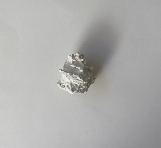
13. Ephemera made of Plaster. This piece of object was an object I picked out and took in an exhibition "20 Objects". Each object has a story, although unknown to the public, but I picked it out because I thought the form was so beautiful in its irregularity. It almost mimicked the shape of a seashell which was a contributing factor as to why I chose this object to take home.
14. Flower Print. This black and white flower print, received as a gift from a friend, carries a depth of meaning that transcends its visual appeal. The monochromatic representation of flowers exudes a timeless elegance and simplicity. It signifies a shared appreciation for aesthetics and a gesture of friendship that reflects their thoughtfulness and kind heart. Every time I look at this print, it serves as a tangible reminder of the bond between friends and the enduring beauty that can be found in even the simplest of gestures. It becomes an enduring piece of art that not only decorates a space but also warms the heart with the memory of a cherished connection and memory.
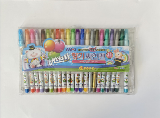
15. Felt Tips - Gift from Grandma at 8 Years old. I remember the excitement I felt when I received this gift from my grandma. I was excited to use this in every piece of craft I made. But I found myself only using it for "special occasions", as I wanted these felt tips to last as long as they could and I have achieved that, they still work to this day. Although it was at such a young age, I thought this was a token of my grandma's appreciation of my constant crafting, and drawing as a young child.
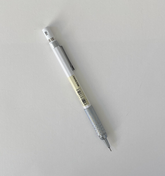
16. Muji Mechanical Pencil. As a designer, the mechanical pencil is my steadfast companion in the creative process. This tool allows me to translate my ideas from mind to paper, helping me to quickly visualise ideas before heading into the digital space – a principle I hold dear in my work. The mechanical pencil is not just a tool; it's an extension of my creativity, an instrument through which I shape my visions into tangible forms.
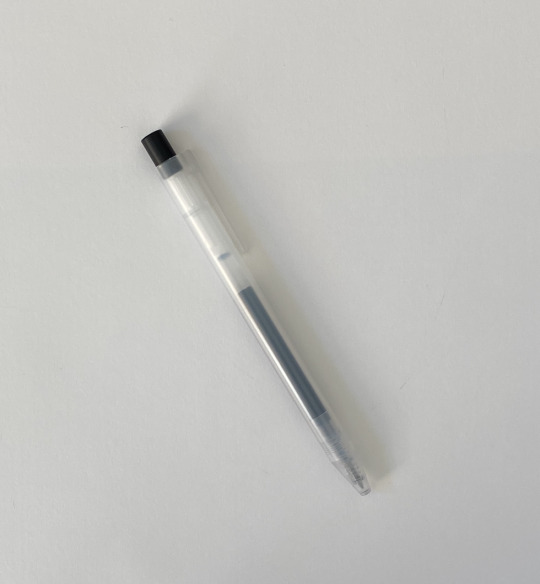
17. Muji Ink Pen. Another analogue object that is important to me is this ink pen. This pen allows me to quickly jot down any ideas, important dates and events to mark in my physical calendar or diary. I appreciate the physical writing more than the digital space, as it embeds in my mind a lot more than it does when I type things in. It also feels more personal to me as it retains my own personal handwriting.
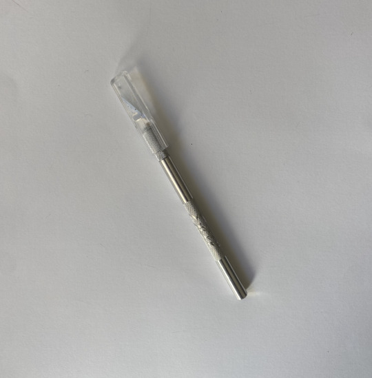
18. Scalpel. The scalpel serves as a crafting knife that epitomises precision, creativity, and the handwork of myself. This took me to shape and sculpt a wide array of materials with exacting detail. It becomes an extension of my vision, allowing for intricate designs and makings. It also enables the transformation of raw materials into objects of design.
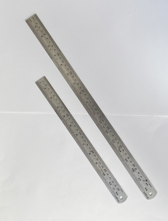
19. Rulers. I have a few differing sizes and lengths of these durable rulers which I have found to be very useful as a designer. Working as a designer does not mean always having to work in a digital space, but many of my interests are rooted in physical crafting which was something I have always done from a young age. These rulers help me to draw and cut precise lines and forms to what I envision.
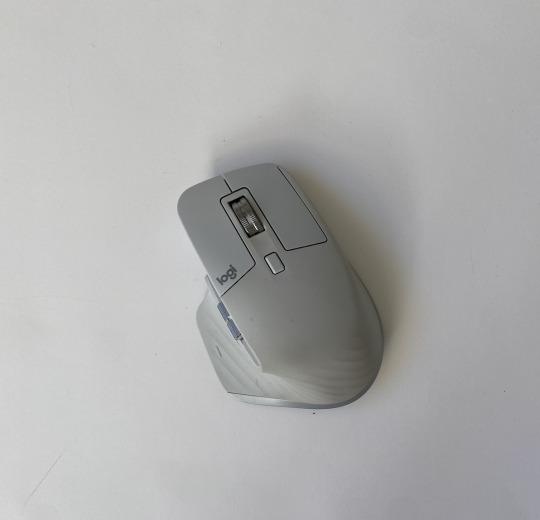
20. Mouse. This mouse is another extension of my hand in the digital space. With precision, I am able to navigate through design software, shaping elements and refining details with a fluidity that mirrors my thought process. The mouse becomes an instrument of finesse, allowing me to execute intricate patterns. It enables me to translate imagination into tangible design.
0 notes
Text
Week 8: Further Research Part 2
Saul Bass
Saul Bass is an American graphics designer in the 20th century. He mostly designed motion picture title sequences, corporate logos and film posters. Rather than making designs look cool or pretty, he believed designs should be able to communicate.
In his design principle he believed in simplicity but within that simplicity, something that is yet familiar but also unfamiliar to the audience. He also constantly rendered originality.
He also believed that trademarks should be readily and simply understood but also possess elements of metaphors and uncertainty that attract the viewers. The idea of producing something simple sends a message whilst keeping the viewers attracted, curious and wanting to come back for more, is a tool to utilize.

Man With the Golden Arm
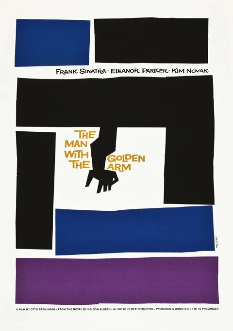

Bass used a crooked arm of a drug dealer to represent the horrors of addiction, as a symbol and centre of the film. The gold typeface, lines and bracketed film title, are the symbolic talents and potential that accompanies the singer throughout his battle with drug addiction.
Through this, you can see Bass's extraordinary way of expressing design through simple but symbolic shapes and forms. Bass reduced messages to simple pictographic images and shapes.
I like and am inspired by Bass's perspective and his practice of design and I think it is quite similar to mine. When I produce work, I like to work around the meaning and metaphor of what the shapes, forms or even the colours can produce, this also includes any copywriting I do. Something that's not so obvious but also obvious enough for the audience to understand.
Although Bass works a lot with pictorials, images shapes and forms, which is slightly different from my design practice, which leans more towards publication design. I cannot say that its a total grey area for me, as I still enjoy working with pictorial elements. But when I do make and create those I also think about what meaning this can give and what [oer it has towards the work.
Seachange Studio
Seachange Studio is led by two people, Amanda and Tim. They are a couple who lead Saechange together and they are an intentionally small company with two others that works with them George and Henry.
No account managers, office managers, project managers, no middle man in their studio. This studio is solely run by designers.
Seachange is not a specialist studio, they do not specialise in anything specific as they do not like to box themselves in but keep throwing themselves in different sectors. They also state that they like working on unsexy industries such as waste management and they get excited and like doing something different that they haven't done something before.
They are driven to break categories and create brave work – which means, create work that when you put your work out there you're not scared of rejection. They like to challenge their clients and in their concepts have one that is a wildcard and a challenge that you think the client won't choose.
Tim and Amanda love spirited work which reflects their personality, bright, jokes and having good laughs – works that are positive, uplifting, joy, surprising. They work in a contemporary sphere but also they make sure their work is somewhat timeless and classic so that when their work is seen in two years or so again, its no longer relevant.
Mama Mexa


They were inspired by decorative flowers on arches they saw during their travel in Mexico a few years back, real flowers or fake flowers. So their highly decorative typeface was inspired by these flower decorative they saw was inspired to create these flamboyant curves.
Because this is a highly decorative font, this typeface was able to be used as the centre of the visual identity.
I like how they challenge themselves to keep pushing their designs to be more than it could be and to do the complete opposite of what other competitors or other designers are doing.
0 notes
Text
Week 8: Further Thematic Research/Findings

https://www.renews.co.nz/a-moment-when-i-was-dehumanised-as-an-asian-woman/
Soon after covid hit, a rise of Asian-hate was assimilated in the country in fear of covid. Because of this, the Asian community experienced lots of discrimination and racism.
This video just shows how much racism there is within the Asian community in New Zealand. Through this, a movement of the Asian community arise to bring awareness to the discrimination they received as a Kiwi-Asian.
0 notes
Text
Week 8: The Single Object
The Single Object entails a story of five different objects with five incredible stories, histories and meanings behind them that had a significant impact on the history of Aotearoa and the people.
Watching these five videos on five different objects, each holding such meaning and history behind them, gave me insight and opened my eyes to how I could go about with my 20 objects/items for this brief.
0 notes
Text
Week 8: Further Research
Sun Ho Lee
Sun Ho Lee is a graphics designer based in Korea and America, but studied graphics design in America. In analysing her body of work, she focuses a lot on cultural themes, relationships with her roots and home country.
Before she was a graphics designer she helped North Korean refugees escape from their traffickers and oppressors. Activism and her design are intertwined as she "preserves and shares the cultural and political in-betweeners who have been neglected...". She aims to create and build a community that is culturally sensitive.
She weaves typography and materiality into her work to communicate abstract ideas to tangible and flexible systems.
She makes visible stories of other Asians through print and textile designs, she makes to create a space and platform for people bi-cultural people.
In her multi-disciplinary practice she highlights the experience of others and herself of the people who she describes as "cultural in-betweeners". These are beautifully crafted and designed with purpose and intent in projects such as:
Is This a Typo ?


In this publication and printed matter, Sun Ho questions and challenges this norm, "Is this a Typo ?". Many immigrants, people of colour, people of ethnic name change their name to avoid the hassle of correcting others and to also avoid mocking and racism.
There are 39 contributors who share and tell their personal stories about their names, butchered, tossed around and names that are recognised as typos on digital interface. This publication brings honour and celebrates ethnic names, their meanings and the individuals who carry them.
I personally can relate to this project as my parents also have given themselves english names so that they can avoid having to correct others of their names and also my siblings whose names on their birth certificate, passport are of ethnic names but also have given themselves english names.
Although my name is not an ethnic name, I can't exactly say it's a western name. Up until this day I still get mocked and teased for my name and when I was younger, especially in primary and intermediate I struggled with the name I was given and wanted to change it to something more generic. I can relate to the struggles and mockery these people have experienced.
Swish Swoosh


This project explores how Asian multilingual or bilingual individuals switch "codes" (languages) at home and in a professional setting. This publication also goes beyond just switching languages but the shift and change within our personality, traits and values.
This knitted ephemera Sun Ho made for this project states that the process of knitting is quite messy like how immigration was for immgirants. The original knitting machine could only read 24 pixels of information per row but she hacked it, increasing the data capacity to 200 pixels. The hacked machine produces glitches, refusing to "surrender to this new, forced way of existing" – this hints at when we swtich codes, we erase parts of us in order to fit in but those parts never can go away but come back.
The Chronicles of Sameri

Through materiality and publication Sun Ho emphaszies the fragility of memories through the glass material she uses for the publication, but also the use of rope communicates the strength and durability of her family members. This publication encapsulates the memories of her war-divided family, with hiopes of reuniting them with their children, siblings and parents (some whom they never even got to meet but only know of). Hr grandparents have cultivated a land in the midst of a barren mountain called Sameri and built houses so that following generations could live there, never having to seperate like how the war separated them.
She "wove together" spotty memories of her aunties, uncles pf grandma and grandpa.
Ji Hee Lee
Is a Korean graphics designer that is based in Germany. Recurring themes she explores in her practice are racial inequalities/stereotypes and how Asians/women experience, to draw attention and address these ideas through visual communication.
In her practice, through thorough research and analysing of her work she uses effective copywriting throughout her work. Some of them are more subtle while some of them are more powerful and can come off slightly aggressive – this is also shown through visual design.
Such as this:
Steretypography Posters

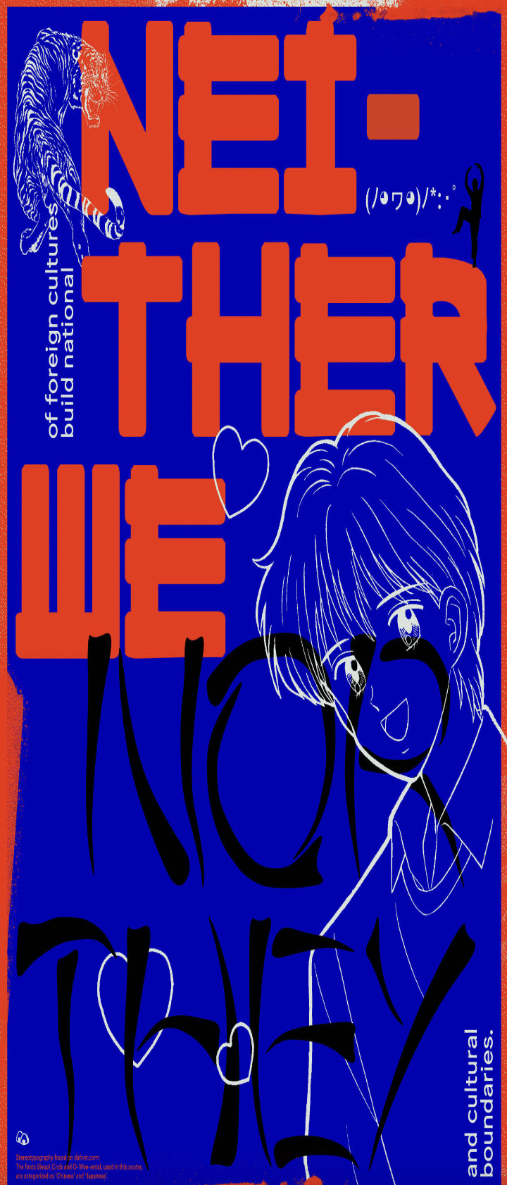

Ji Hee Lee breaks down cultural boundaries built by stereotypes. She explores this idea further by exploring different typefaces and seeking how "western" typefaces are perceived and how "Asian" typefaces are perceived by society. One way she broke this down was by going through a site called "dafont", which is a site for free fonts and there is a section seperate for asian fonts. Ji Hee states “By browsing these typefaces, you can see how ‘Asia’ is perceived to the eye of Westerners,”.
These anime inspired characters, ornamental bamboo sticks and chopsticks that embellish Asian typefaces and fonts come off as pervasive which is also met offline. She used these free fonts from these sites to design a series of posters that reveal how these typefaces have been heavily manipulated to appear "non-Latin" or "non-Western".
Her posters placed side by side fragmentally read: “Stereotypical Representations of foreign cultures build national and cultural boundaries,” and “Those types represent neither us nor you.”
It's interesting to see how this designer has approached her work and the themes and ideas she unpacks through exploration of western and typefaces that try to not appear to be somewhat "Asian". I thought this was an effective and creative way to unpack this idea by exploring how Asia as a whole is perceieved through the eyes of society and western people, when in-fact that is not what represents us.
Poster for Antiracism, 2016

Ji Hee lee continue to reveal the ways racism and stereotyping can become normalized both in visual culture and in society and has been a prominent idea Lee has working on ever since moving to Germany in 2016, as she encountered numerous racial experiences. She found herself sharing her own experiences with another fellow student So Jin Park and they came up with an idea to create a platform where Asians could come up and share their story and heritage, which now directly links to her next project "I Am Angry".
I Am Angry
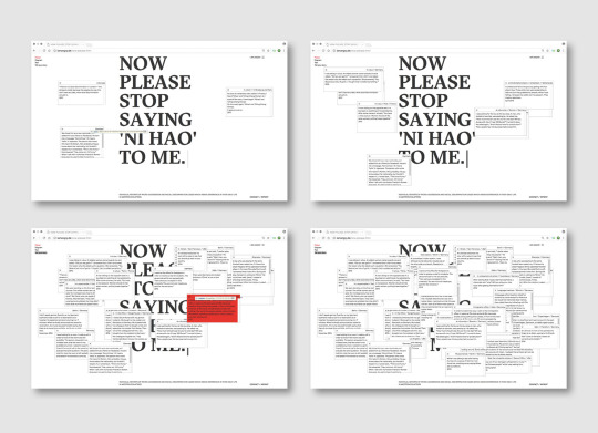

From the platform they created they designed and launched a website "I Am Angry" to house the stories of these people – a website where they hope to continue to empower and help the Asian community find ways to deal with micro-aggression.
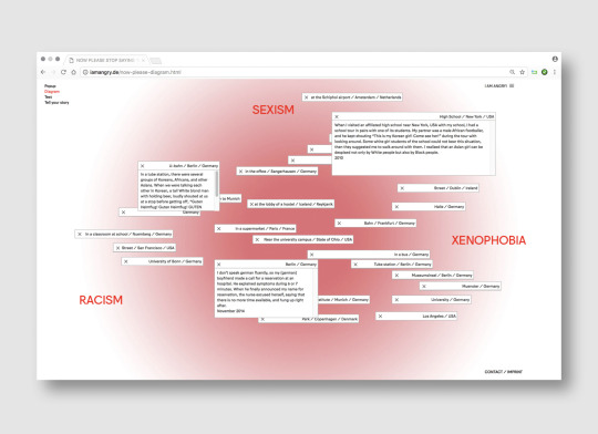
The site is divided into 6 sections, with "Now please stop saying Ni Hao to me" being what Lee calls the "heart and soul" of the website. When ou click on the "diagram" section it arranges itself to three sub sections of the page "sexism, xenophobia and racism". Persoanl stories that were recorded are scattered across the page and the ones that are centered are ones that touch on all three sub sections.
These stroies are displayed on pop-up windows and purposely designed to annoy users as they cannot close these windows which reflect the micro-aggressions they experience. Lee states "It’s a metaphor that derives from our everyday encounters: how we have no control over the situation.”
Many of her projects that she works on addresses these issues as these stereotypes and micro-aggressions is what impacts her as a designer and her day-today life, especially ever since moving to Germany. She believes the projects she works on have impact and promotes awareness and also speak against the prejudice, hoping to see gradual change within society.
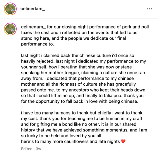
Celine Dam
Celine Dam is a Vietnamese-Chinese writer and actor from Auckland, New Zealand. She has written several pieces for print, online publications and zines and is grateful to inform others through her unique lens. Through these art forms and practice, she hopes to bring light to more Asian stories within western media.
Pork & Poll Taxes
This is a theatrical play that Celine has starred in.
This play is set in the 1890's which follows a Chinese family in Aotearoa and China with the men looking for gold (Sam Gan Saan) and women staying in the latter. Although it is a fictional play the historical background and roots are rbought to light through this play.
To give some historical background, in the late 19th century many Chinese men sought their way to NZ to make fortunes in the Gold Rush. Migrant workers were brought over from China by the government to work in the Otago minefields. But as employment in mines began to dwindle, anti-Chinese prejudice began to flourish.
In 1881 this sentiment became official with a poll tax of £10 (equivalent to $1770 today) was imposed on Chinese migrants and the number allowed to land from each ship arriving in New Zealand was restricted. Only one Chinese passenger was allowed for every 10 tons of cargo. In 1896 this was changed to one passenger for every 200 tons, and the tax was increased to £100 ($20,000).
For Chinese migrants arriving in New Zealand during the poll tax era, legal discrimination weren't the only obstacle they were faced with – migrants were also met with hostility from New Zealand’s Pākehā population, giving rise to organisations such as the Anti-Chinese Association and the White New Zealand League.
Pork and Poll Taxes touches on many of these issues, exploring themes such as sacrifice, belonging and what it means to be a family, which Pua (director & writer) says she based on two Chinese proverbs: “One says that ‘we grow roots where we land’, which speaks to the Chinese diaspora and this idea that you can build a new life and home somewhere else. And the contrasting proverb is ‘fallen leaves always return home to their roots’, which touches on this idea that you always go back to where you’re from.”
Celine states "last night i claimed back the Chinese culture i'd once so heavily rejected. last night i dedicated my performance to my younger self. how liberating that she was now onstage speaking her mother tongue, claiming a culture she once ran away from. i dedicated that performance to my Chinese mother and all the richness of culture she has gracefully passed onto me. to my ancestors who kept their heads down so that i could lift mine up, and finally to talia pua. thank you for the opportunity to fall back in love with being Chinese."
instagram
https://thespinoff.co.nz/society/03-08-2021/pork-and-poll-taxes-reclaiming-new-zealands-forgotten-history-on-stage
Dear Mama and Baba: A letter to my Asian Parents about Depression
This is a raw letter to her asian parents about a mental illness that does not cease to "exist" in asian culture and through Celines beautiful writing highlights the issue of depression in Asian culture and how it is an illness where usually it is not accepted or dismissed because older generations of Asians think its due to "lack of effort"and therefore, many concealing their illness. But Celine speaks out on the matter. She puts herself in the fore front so that other Asian's living in NZ can overcome it because the very culture has dismissed the concept of it.
https://thespinoff.co.nz/society/27-09-2020/dear-baba-and-mama-a-letter-to-my-asian-parents-about-my-depression
Grappling With my Chinese Name
Through this written essay Celine highlights a complicated relationship with her Chinese name. At age 12, she gave herself the name Celine, so she could avoid having teachers and peers mangle the name she was given by her parents. In this essay she tries to come to terms with all the ways our society has made her want to hide her name.
https://www.renews.co.nz/grappling-with-my-chinese-name/
In her work and practice she centres her Kiwi-Chinese,Vietnamese identity. In most of her practice, you can see her constant effort in bringing awareness and tackling on issues that she experiences as. Kiwi-Asian and her difficulty of accepting her identity but also takes us on a journey with her as she re-learns a culture she once walked away from.
Although Celines practice and work is very much different to mine, the themes and issues she tackles down with in her work is very similar to mine and the ideas and experiences I have as a Kiwi-Asian myself. I found myself relating to her, especially as Eastern Asian culture is very similar, Chinese and Korean. Many of the issues she brought up in her written pieces, I was able to relate.
Tyrone Ohia
Tyrone Ohia is a Maori designer. In this video Tyrone talks about his approach to his design practice.
He talks about his ancestors – which has rich and deep connections in Maori culture. He states "It was our view of the environment around us – the forest, the sea, the sky, the earth, all of those things. The most important thing is to open your eyes, our ears, and our minds to receive this type of knowledge.".
His guiding principle is to fully understand the Whakapapa and the. foundations of the project so tat he can encompass the history and meaning into his designs that he produces.
I also have similar views on how I start my design as well. When taking on any design jobs I like to have a full deep knowledge of whom and what I am designing for, especially if related to cultural matters.
This can be seen in these designs and project Tyrone worked on:
https://www.aucklandartgallery.com/page/toi-tu-toi-ora-artist-profile-tyrone-ohia
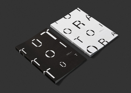
Toi tu Toi Ora
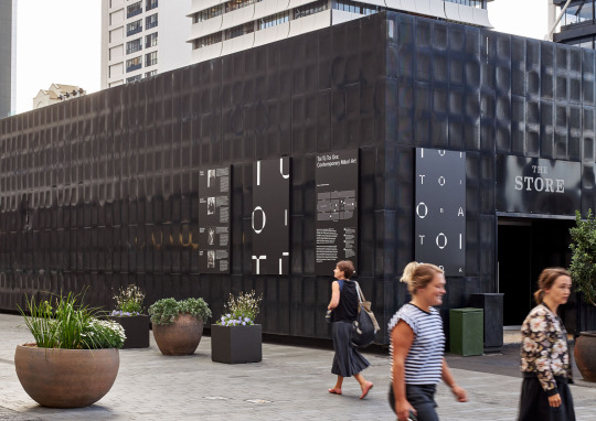
Their approach to designing this identity for the gallery and the satellite exhibition in Britomart was to reflect the unique Maori curatorial framework of the show which is based on the Maori creation narrative. Rather than using the Western chronological order of works they base it on Maori celestial origins.
Basing it on Maori concepts of time and space the shows title forms an interwoven timescape – an infinite ever-changing pattern that spills out of the gallery that draws the viewers into the Maori world. You can see that the words Toi Tu Toi ora repeatedly chants through the gallery space and out into the world, – the words mean "Maori art stands strong and in good health."
The typeface has straight edges, but also warps and bends in mythical ways to reflect the straight lines of Māori woven art forms, and the organic curves of carved art forms.
The shifting between the black and white colour scheme reflects the extremes of the Māori creation narrative – moving from darkness into the world of light, echoing the many dualities within Te Ao
https://bestawards.co.nz/toitanga/toitanga/extended-whanau/toi-tu-toi-ora-contemporary-maori-art-2/
https://concreteplayground.com/auckland/event/toi-tu-toi-ora-contemporary-maori-art
Saul Bass
Seachange Studio
0 notes
Text
Week 8: Copywriting
In week 7 of the formative presentation, I explored and presented correlating ideas of themes of cultural identity and this was also reflected in many of the artists I researched. I was given feedback that I do some copywriting aaround the idea/theme.

These are some ideas that I wrote. These writings reflect my own experiences with my cultural identity and the struggles I went through as a child and throughout adolescence and still today. I am still on a grappling journey trying to relearn a culture a rejected in order to fit in.
0 notes
Text
Week 7: Lecture
General Feedback
Dive deeper - what are their influences, why are they doing that kind of work (social good etc.,)
Underlying message and how they put their messaging into their work – justification of their work
Being able to explain research methods – e.g. taking random images to create collages or thinking purposeful images for the collage and justifying why we work like that
The Creation: When discussing our work we like – why do we like that work: environmental, mental issue etc., dive deeper
Context: what are the field of work - pop art, what is the politics of it - relationship to time and place, investigate further about the artists context
A2 Poster
Diptych A2 Poster of 20 elements montaged as a designed artefact
paired with a contextual inventory of each element - explain significance of item to my work
must include name
draw on strengths – illustration, typography, grids, mixed media
Research
Modes of representation – artist Joseph Kousth, what are the contributing factors that we could bring to the A2 posters?
what is the system that we are going to be developing ?
describe, analyse and underpinning concepts of work
how we use an "inventory" has to conceptually link to our work – again looking back to my artists and seeing what system they used, could be experimental publication design, or something more handwritten conversational
SDL
Thinking about the significance of objects
Ways to Portray 20 Items
Emma Lewis


She is an illustrator based in London. Her illustration style follows a narrative approach to her work. She uses mixed media when creating her work. There's a clear mix of photographic, digital illustration and hand-drawn elements within her work, collaged together. Although these components are all very different, she manages to create and express her style and story cohesively.
Maria Fischer
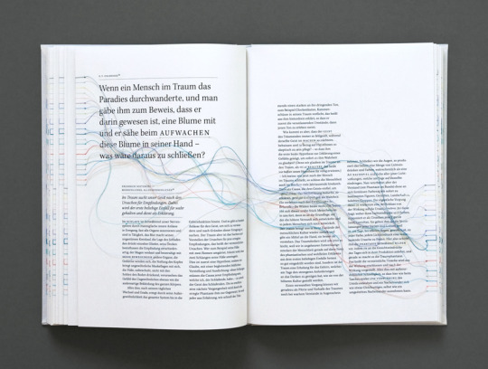

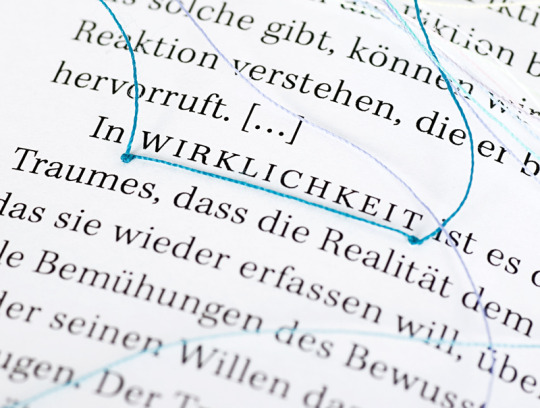
Maria Fischer is a German Designer who explores hyperlinks that we encounter on the internet by showing that through the threads in this publication design. This captures the intangibility and mystery through hyperlinked threads wich tie in with the keywords that she highlights. I am personally interested in publication design and enjoy the process of binding, so I might take my direction towards publication design for my poster.
Threaded Magazine

Both spreads/pages are displayed in the Threaded Magazine. The first image above shows a collated collection of objects and items in its physical form with copywriting on the side of the page. The first image above of the spread feels more personal and intimate. The images below show a more editorial way of the items/objects with texts around and next to the items. The highlighting of keywords is also a great way to highlight its importance with arrows directing the text to the image to show its relation. As mentioned before, I am quite interested in publication design, arranging text and images ina grid system to show effectively communicate through design, so this might be a way to approach my A2 poster as well.
Collage

I grew up collaging a lot through my adolescence all the way through high school and I found myself really enjoying the process of cutting, and gluing pieces of found art together to create a body of work. I like how through collage, you can combine objects to show their relation but also differences to one other object.
0 notes
Text
Week 6: Formative Feedback
Presentation


Key feedbacks that I received from the formative presentation:
There is magic in the cultural stories and perspectives – I could possibly draw on my own experiences for this key relevant theme
What strategies do these artists use that could influence my approach – find my own voice
Find the language that unpacks the work/theme of my chosen creative communities – look into copywriting
Get more detailed and dive deeper – e.g. why do I like packaging, what is it about it?
Build on more ephemera's – what do they use, what ephemera have they created ?
I found this feedback very helpful to help me in the next stages to develop my research and creative work further, for this brief and as a creative.
0 notes