
Don't wanna be here? Send us removal request.
Statistics
We looked inside some of the posts by desn512avagregoriohansen and here's what we found interesting.
Average Info
Notes Per Post
0
Likes Per Post
0
Reblog Per Post
0
Reply Per Post
0
Time Between Posts
9 hours
Number of Posts By Type
Text
17
Last Seen Tumblr Blogs


Fun Fact
In 2020, Tumblr had 29.4 million users in the US.
Text
DESN512-AvaGregorioHansen-AnimatedPosterSummative
0 notes

Text
Old text version practice, colour and transition practice
0 notes


Text


Final formative final summative poster comparison
0 notes
Text
Text practice3, intro 1888 text practice, testing animation preset settings
0 notes
Text

This issue appeared during my production process. In both the original InDesign file and AfterEffects file, both '1888' texts are 'screen' filtered at 50% opacity, however there is a clear difference in each file.
To fix this, I changed the text filters from 'screen' to 'multiply' and the final products looked the same throughout both InDesign and AfterEffects.


0 notes
Text
Process Annotation week 12
Throughout this semester, I’ve developed my skills from the early semester lessons like type, shape, colour, and texture, plus learning animation throughout Adobe AfterEffects. While learning animation, I’ve gained knowledge about animation timeframes, animation aspects such as line tracking, text staking, and fade-in fade-out text transitions to create a looped poster animation for the final summative project.
In week 7 after receiving formative feedback, I changed the entire design of my poster, as I wasn’t satisfied with the product produced from the formative between week 1-6. I returned to an early poster concept design, and developed it through multiple different versions, receiving helpful and effective feedback for each version throughout weeks 8-11 during the editing and animation period.
An issue I experienced in the project was issues with text filters appearing differently in InDesign and AfterEffects. To fix this issue, I compared possible filters between InDesign and AfterEffects to examine which did and did not match, and chose a filter for the text that appeared the same on both Indesign and AfterEffects.
Overall, I made relevant process between week 7-12 within Indesign and AfterEffects through changing my poster layout and becoming familiar with AfterEffects through practice, testing and trialing, and helpful feedback.
0 notes
Text
Animated poster (rewritten)
‘MakingIt21’ is a series of 21 posters with 21 quotes that were directed by David Moloney and created by him and other artists. This series was created to encourage young artists in 2021 after the negative events of 2020.
Each animated poster in the series has similarities in their designs. The posters share simple design qualities with 2 colours (background and black text) plus characters or shapes in each poster. These differences in type/animation show originality from the different artists that took part in the project. The animations make simple designs stand out more from the sliding transition and movements.
Moloney, D. (2021). MakingIt21 [Poster series] ItsNiceThat. https://www.itsnicethat.com/news/david-moloney-makingit21-graphic-design-010221

0 notes
Text
Motion graphics annotation
An Instagram account called ‘graphic.elisava’ posted an animated poster showing different animations, one being the line tracking animation.
The animation style of line tracking is a line being drawn throughout the page in the animation. This movement creates the illusion that something is being written/drawn on the page during the animation. Each line is animated with based off the characters and or numbers that are animated.
Parts of my animated poster was inspired by this tracking animation, but since I did not know how to recreate this animation, I used a similar animation at the beginning and end of my animated poster
Tolaas, S. (2024). Elisava Masters’ Talks [Animated poster]. Instagram. https://www.instagram.com/p/DBRepipKRHq/?img_index=1

0 notes
Text
Process Annotation week 6 (rewritten)
Since the start of the semester, I practiced different techniques such as type and line, shapes, colour, and texture. While learning these techniques, I also selected a location (Auckland Art Gallery) and sketched and digitised design ideas around the location using the techniques learnt. While designing the concepts, I had trouble designing typographic-based posters instead of image-based posters.
Key milestones that were a part of my process were learning InDesign techniques at the start of semester, selecting the Auckland Art Gallery as my site of connection, and adjusting from focusing on image-based projects to the typographic-based project.
When I experienced problems between imagery and typography, I sketched possible posters based on typographic layouts to build more ideas and collect inspiration from multiple poster layouts. Collecting different textures around the Auckland Art Gallery also helped me focus on the textured background designs instead of relying on imagery of the art gallery to add detail in my posters.
Reflecting on my overall process from the beginning to the formative checkpoint in week 6, I learnt how to use InDesign as well as how to use different design techniques and am currently adjusting to typographic poster-based formatting instead of imagery-based formatting.
0 notes
Text
Helvetica (rewritten)
The film ‘Helvetica’ (2007) directed by Gary Hustwit, shows the importance and affect the Helvetica typeface has had on society since it was made.
In Helvetica (Hustwit, 2007) Lars Müller says “I think I'm right calling Helvetica the perfume of the city. It's just something we don't notice usually, but we would miss very much if it wouldn't be there” (43:52). Later in the film, Rick Poynor says “The more the designer uses those typographic and graphic solutions, the more familiar, predictable, and ultimately dull they become” (44.26).
These quotes contrast how some designers enjoy the simplicity of Helvetica, while other designers think the overuse of the typeface makes it boring.
The Helvetica film shared how different designers feel about the Helvetica font. The participants in the film showed different perspectives towards Helvetica, however they agree the font is a symbol of modern society.
Hustwit, G. (Director). (2007). Helvetica [Film]. Swiss Dots. https://www.kanopy.com/en/aut/video/2874825
0 notes
Text
Wāhine Toi (rewritten)
The animated poster ‘Torn’, by Anna Wilkinson (2019) shows the struggle women experience balancing their professional and personal lives. The animated poster conveys the message of women’s struggles through the overlapping texts of ‘Career’ and ‘Carer’. Text and colour are used to emphasise the balance between the two sides bold font and colour. The choice of colour and typography grabs the attention of the viewers, as well as the detail of the text changing as the colours overlap on the poster. The animated wave in the poster also shows the struggle of balancing the two sides of personal and professional.
Wilkinson, A. (2019). Torn [Poster]. Designers Speak Up. https://designersspeakup.nz/present-tense-gallery/#jp-carousel-1705

0 notes
Text
Sulki & Min Annotation (rewritten)
The poster ‘Classic Multiples’, created in 2010, references K-Swiss Classic, a shoe design produced in 1966, original shoes made by K-Swiss. More shoes were made from the original creation, changing aspects of the design, creating another original product.
The lack of spacing between stacked text shows the similarity of each line, while having slight differences throughout the text. Every line of text conveys “Classic Multiples”, despite the missing letters in each row of text.
The repetitive statement through different lines of text shows K-Swiss’ design process making slight adjustments to original products to create a new design from the classic blueprint.
Sulki & Min. (2010). Classic Multiples [Poster series]. Sulki & Min. https://www.sulki-min.com/wp/classic-multiples/

0 notes
Text
Text test, practicing types of text animation introductions
0 notes
Text


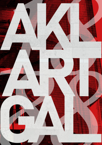
After the formative, I decided to change my original plan and returned to a previous concept from the formative. Throughout the development process I changed color to a darker red, changed the year from 2025 to 1888, the year the Auckland Art Gallery opened, and made the original 'AKL ART GAL' a background to add more type into the poster.
0 notes