After renovating two century homes (without getting divorced), it's time to reflect on the practical skills and hard life lessons that have turned blood, sweat, and tears into a labour of love. Renovating is stressful. It doesn't have to end in murder.
Don't wanna be here? Send us removal request.
Text
Assessment Report of Canadian Red Cross’s Use of Social Media

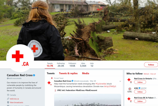
With 155,000 followers on Twitter, 132,000 on Facebook, 19,600 on Instagram, and over 60,000 app downloads, the Canadian Red Cross has a substantial social media presence.
Introduction
The Red Cross is a multi-national organization that serves to prevent and alleviate human suffering around the world in contexts of emergencies. The Red Cross is essential in today’s world to help with humanitarian crises that are happening, whether it be war, natural disaster, or preparedness. The work they do is extremely valuable and helps the greater good of society through the mobilization of power driven by donors and volunteers.
We studied the social media presence of the Canadian Red Cross – Mainly, we focused on their website, Facebook, Twitter, Instagram, and apps, and we inspected all the above platforms for strengths and weaknesses. Our goal is to identify ways to improve the audience engagement of the Canadian Red Cross.
The target demographic of the Canadian Red Cross is adult, middle- and upper-class Canadians. The bulk of their media content is aimed at recruiting volunteers and raising funds for their charitable work. Subsequently they want to appeal to people who have either extra time (retirement age) or extra funds (age 30 to 60). Their online media involves appropriate social factors including listening, customer care, reach, and relationships.1 This outreach serves to reduce anxiety, stop misinformation, and solicit information from the public when support is needed.
More about their organization can be found here.
Results and Discussion
Strengths
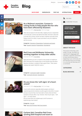
Outreach - The Red Cross includes a wide variety of photos in all their media and their photo content is evenly split between professional-quality versus amateur, with shots of both volunteers (not models) and emergency aid situations. Videos and blog posts offer interviews and information about a wide variety of situations.
Functionality - The Canadian Red Cross is partnered with Dell Digital Business Services with the aim of more efficient disaster responses through optimization of their social media presence. Facebook Live gives real-time answers to questions, and boots-on-the-ground staff members add in-the-moment content to the Instagram feed. The Be Ready app offers real-time disaster alerts for a wide variety of large-scale emergencies based on your location. The First Aid app gives clear, simple instructions with animated demonstrations according to the emergency you click on.
Consistency - The branding of the charity’s social media is consistent across all platforms. The logo and colour scheme of white and red are easily recognizable and utilized effectively on all social media. They consistently use the same hashtags, #RedCrossHelps or #PhotoOfTheWeek, making it easy for their audience to follow them, and most of their social media accounts are verified, showcasing trust and establishment of the brand.2

Weaknesses
Sharing the Same Content across Platforms – they are not curating content to be specific to their respective accounts. Cross-platform repetition does not create an incentive for the user to follow multiple accounts (a faux-pas in the social media world). As quoted by Hootsuite, “Things like caption length, image formatting, and vocabulary differ by platform. Sharing the exact same post on all of them means you might accidentally end up inviting your followers to retweet you on Facebook or pin you on Instagram.”3
Boring Content - their current content does not inspire people to want to follow them extensively. Many of the posts are simply headshots of people and are not that interesting in themselves. This means that users are getting a lot of similar stories, week after week and leads to low engagement on posts. On platforms such as Facebook, some posts only receive around 13 likes despite having 132k followers. As well, they are flooding their Facebook which leads to users not seeing posts due to algorithms which limit this behavior.
Lack of Overall Aesthetics - The static website is not very inspiring and it’s not interesting for the user to follow.4 Currently, on their social media, they frequently post images that appear to be raw and unedited and the imagery is not captivating.
Lack of Diversity – The website is available in only English and French. This ignores the fact that Canada is becoming more and more diverse. Additionally, the volunteers being photographed are mostly Caucasian and able-bodied. This lack of representation may be off-putting for some potential volunteers.
For tips on improving website content, check out this link.

Conclusion & Recommendations
While the Canadian Red Cross has utilized many platforms to engage their target audience, there is still much room for improvement. To encourage users to follow them through multiple platforms, the Canadian Red Cross should provide photos and information that are unique to each platform.
The static website could use updating to engage a younger audience. Embedding videos or animation, taking advantage of parallax scrolling, using Facebook Live, and adding volunteer bios on each page will add interest and increase audience engagement.
More information should be given about local relief efforts, rather than focusing strictly on international emergencies.
Dead sharing links need to be fixed.
Posting on Facebook should be reduced significantly.
Include a volunteer photo with a brief bio in a sidebar on each page. Include name, age, occupation (or previous occupation if retired), province, and a quote about how volunteering has changed their life.
Translating the website into more languages would reach a larger audience. Refugees, in particular, are eager to show their gratitude and having the website available in their language(s) will encourage them to donate their time. Double posting is a great tactic to use for multiple languages.


Increase the visibility of minorities and volunteers with disAbilities on all platforms. Representing a variety of shades of skin, wheelchairs, hearing aids, and chromosomal disorders will encourage a wider market of volunteers.
More leeway could be given to volunteers to provide amateur real-life photos which could be edited by someone in head office. Alternately, uploading in real time would make the audience feel that they were a part of the crisis solution even if they only donated money.
Bibliography
1) https://www.sendible.com/insights/social-media-for-nonprofits
2) https://www.entrepreneur.com/article/309671
3) https://blog.hootsuite.com/cross-promote-social-media/
4) https://www.entrepreneur.com/article/234129
5) https://blog.hootsuite.com/multilingual-social-media-presence/
6) https://www.entrepreneur.com/article/297367
7) https://www.entrepreneur.com/article/234129
8) https://www.entrepreneur.com/article/297367
9) https://www.youtube.com/watch?v=17jN1KmciFE
10) https://www.youtube.com/watch?v=UydKcNVxgaQ
11) https://youtu.be/-vvmJCc5rck
0 notes
Text
Critical Assessment of the Canadian Red Cross’s Social Media Presence

With 155,000 Twitter followers, 132,000 Facebook followers, 19,600 Instagram followers, and over 60,000 app downloads, the Canadian Red Cross has a significant social media presence.
Introduction
We studied the social media presence of the Canadian Red Cross, consisting of a website, Facebook, Twitter, Instagram, and two apps, to determine if they were using their online presence to its full potential. Our goal is to identify ways to improve the audience engagement of the Canadian Red Cross. The target demographic of the Canadian Red Cross is adult, middle- and upper-class Canadians. The bulk of their content is aimed at recruiting volunteers and raising funds for their charitable work so they want to appeal to people who have either extra time (retirement age) or extra funds (age 30 to 60). Their online media involve appropriate social factors including listening, customer care, reach, and relationships and they use it to provide current news and data to the public. This outreach helps to reduce anxiety, stop misinformation, and solicit support from the public when support is needed.
Learn more about the Canadian Red Cross here.
Results and Discussion
Strengths
Outreach - The Red Cross includes a wide variety of photos in all of their media and their photo content is fairly evenly split between professional-quality versus amateur, with shots of both volunteers (not models) and emergency aid situations. Videos and blog posts offer interviews and information about a wide variety of situations.
Functionality - The Canadian Red Cross is partnered with Dell Digital Business Services with the aim of more efficient disaster responses through optimization of their social media presence. Facebook Live gives real-time answers to questions, etc., and boots-on-the-ground staff members add in-the-moment content to the Instagram feed. The Be Ready app offers real-time disaster alerts for a wide variety of weather and localized emergency situations based on location. It gives a detailed list of what you should do before, during, and after a disaster. The First Aid app gives clear, simple instructions with animated demonstrations according to the emergency you click on. Both apps are clear, uncluttered, and scannable which is audience-appropriate in emergency situations.
Consistency - The branding of the charity’s social media is consistent across all platforms. The logo and colour scheme of white and red are easily recognizable and utilized effectively on all social media. They consistently use the same hashtags, #RedCrossHelps or #PhotoOfTheWeek, making it easy for their audience to follow them, and most of their social media accounts are verified, showcasing trust and establishment of the brand, which will build trust in their followers.

Weaknesses
Sharing the Same Content across Platforms – they are not curating content to be specific to their respective accounts. Content is not specific to each platform which does not create an incentive for the user to follow multiple accounts (very much a faux-pas in the social media world). Because it is repeated across multiple platforms, the content does not tell the true story of the brand so it does not allow the user to fully understand their work. As quoted by Hootsuite, “Things like caption length, image formatting, and vocabulary differ by platform. Sharing the exact same post on all of them means you might accidentally end up inviting your followers to retweet you on Facebook or pin your post on Instagram.”
Boring Content - their current content does not inspire people to want to follow them extensively. As mentioned above, the current content is repetitive, which does not make people want to be engaged with the posts. Many of the posts are simply headshots of people and are not that interesting in themselves. This means that users are getting a lot of similar stories, week after week. This is leading to very low overall engagement on posts, especially on platforms such as Facebook, where some posts only receive around 13 likes despite having 132k followers. There isn’t much appeal to emotions. There is not enough content that is specific to their work in Canada as the user doesn’t necessarily fully understand what they do in Canada, itself. Also, the sharing links all give a 503 error.
The Facebook presence is overwhelming; they are posting too many times in one day and this can turn their audience off. On some days, they can have up to 5 posts per day on Facebook. This flooding leads to users not seeing the posts due to flood-prevention algorithms. As well, the posts typically have links to their website; this technique is effective sometimes but should not be used in every post. Additionally, all of the volunteer bios are clustered together on one page, but it’s unlikely that anyone will sift through multiple volunteer stories.
Lack of Overall Aesthetics - The static website is not very inspiring and it’s not interesting for the user to follow. Currently on their social media, they frequently post images that appear to be raw and unedited and the imagery is not really captivating. There are not many other visual elements and they could use some diversity in their graphics.
Lack of Diversity – The only languages in which the website is available are English and French. This ignores the fact that Canada is becoming more and more diverse and many newcomers want to “pay it forward” but may not yet have a good grasp of either of the official languages. Additionally, the volunteers being photographed are mostly Caucasian and able-bodies, while people photographed receiving aid are not. This lack of representation may be off-putting for some potential volunteers.
Instagram is Unverified – Instagram is not being used to its best capacity. The account is unverified which does not instill trust in people to follow the account. According to entrepreneur.com, verification is an important aspect to ensure people understand your account is the proper one to follow. As such, the Canadian Red Cross Instagram account has significantly fewer followers as compared to their other platforms.
Conclusion & Recommendations
While the Canadian Red Cross has utilized many platforms to engage their target audience, there is still much room for improvement. To encourage users to follow them through multiple platforms, the Canadian Red Cross should provide photos and information that are unique to each platform.
The static website, while not ancient, could use updating to engage a younger audience. Embedding videos or animation, taking advantage of parallax scrolling, and adding volunteer bios on each page will add interest and increase audience engagement.
Appealing to emotion is known to increase audience engagement. Stories of desperation mixed with heartwarming triumph will keep audiences coming back for more.
More information should be given about local relief efforts, rather than focusing strictly on international emergencies.
Dead sharing links need to be fixed.
Posting on Facebook should be reduced significantly and the link to the website should be included less frequently.
Include a volunteer photo with a brief bio in a sidebar on each page. Include name, age, occupation (or previous occupation if retired), province, and a quote about how volunteering has changed their life.
Translating the website into more languages would reach a larger audience. Refugees, in particular, are eager to show their gratitude and having the website available in their language(s) will encourage them to donate their time.
Increase the visibility of minorities and volunteers with disAbilities on all platforms. Representing a variety of shades of skin, wheelchairs, hearing aids, and chromosomal disorders will encourage a wider market of volunteers.
Bibliography
The 10 Most Deadly Mistakes in Website Design
https://www.entrepreneur.com/article/234129
5 Ways to Get to the Heart of Emotional Marketing
https://www.entrepreneur.com/article/297367
The Beautiful Nonprofit and Charity Websites That Won The 2018 Webby Award
https://www.youtube.com/watch?v=17jN1KmciFE
Web Design Tips For Not-For-Profit Organizations
https://www.youtube.com/watch?v=UydKcNVxgaQ
0 notes
Photo

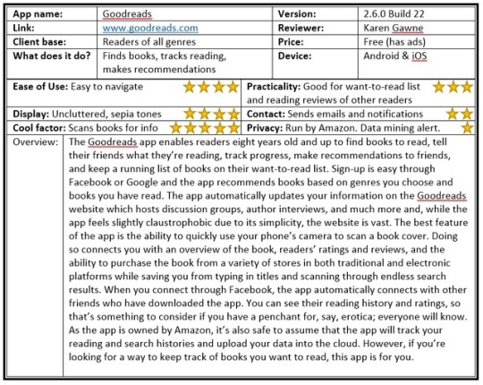
Review of the Goodreads app for school.
#bibliophile#booklover#ilovebooks#bookoholic#noseinabook#nevertoomanybooks#neverendingreadinglist#justonemorepage#cantfindmynightstand#handsoffmybooksmariekondo#ereadersarentthesame
5 notes
·
View notes
Text
Death by XOXO - Taste the Love
Welcome to the wonderful world of chocolate! With three flavours sure to rock you, Death by XOXO Chocolates invites you to join us as we introduce you to some of the best chocolate you can find on the market.
Death by XOXO’s mission is to make the world a sweeter place by reinventing everyone’s favourite food – chocolate! We do that by using the highest quality of ethically- and sustainably-sourced ingredients. Always pure, never artificial. Our chocolates are gluten-free, corn-free, soy-free, and are non-GMO, making every bite taste ooohh, so good.
We at Death by XOXO believe in farmers’ rights. Our ingredients are fairly traded with farmers in the Peruvian valley…never a big factory. Enjoy peace of mind as you bring joy to your taste buds, knowing that your purchasing power directly supports hardworking farmers. Nothing in the world tastes so good.
Join Death by XOXO’s Chocolate Revolution and, together, we will make the world a sweeter place.
Want to learn more about fair trade chocolate? Go to www.fairtrade.ca/en-CA/Buying-Fairtrade/Cocoa and join the Chocolate Revolution.
#chocolate#chocolate lover#fair trade#fair trade chocolate#yum#death by chocolate#ethical chocolate#peruvian chocolate
0 notes
Text
It Sounded Like a Good Idea at the Time

Hey Reno Fans!
I looove old houses. My name is Karen Gawne and, as newlyweds in 1995, Hubby and I bought an old country church that had been partially renovated. It cost us a whopping $70,000. When we moved in, the upper floor had been gutted by a fire, none of the bedrooms or closets had doors, the stairs were rotten, you could see sunlight through the ceiling, the bathroom floor was squishy, the pipes froze in the winter, the plumbing was an abominable mess, and the furnace was ancient. Also, there were bats.
Over the next 12 years, we spent every penny we had finishing that place.
We:
painted
insulated
drywalled
replaced
plumbed
rewired
had three kids
And, with the exception of hooking up the electrical, we did all of the work ourselves. When we finished it, we slapped a ‘For Sale’ sign on the lawn and got the heck out of there. We bought a place that didn’t need any work at all and stayed there for eight years. It was peaceful.
In 2015, we got the idea into our heads that, now that the kids were older and leaving the nest, it might be fun to have a project to work on together. I found a farmhouse that had a lot of potential and we moved in. Then the “fun” began.
Parts of the house had old knob-and-tube wiring (an insurance company no-no) so, on Day One while the kids and I were cleaning and unpacking the kitchen, hubby and an electrician dug the old wiring out of the entire house and replaced it with new. And that was just Day One.
Over the next three years we:
replaced the plumbing
ripped up carpet
built a second bathroom
tiled and grouted floors and shower walls
installed heated floors
replaced the old oil furnace with a high-efficiency propane furnace
stripped an astonishing amount of wallpaper
discovered naked drywall under all the wallpaper
designed, built, and installed a kitchen
became proficient at mitring trim
went through more tubes of spray foam and caulking than I can count
replaced the front porch floor
painted every square inch of the house, inside and out
screwed up a million times
bled, like, a lot
Once again, we did almost everything ourselves. The truly exciting thing about this experience is the fact that Hubby and I are still married and we even still like one another! These renovations have taught us a lot about one another. They’ve also taught us that we are stronger than we know. I, for example, learned that I likely won’t die if a petrified mouse corpse drops into my hair and gets tangled up as I frantically try to remove it whilst wearing oversized work gloves. And I’ve learned that these lessons make for really juicy social media fodder.
I hope you have some fun as I share my tips on How to Renovate Your Home Without Committing Murder.
Hammer in hand,
Karen
#renovate#diy#diy home repair#19th century#farmhouse#marriage#home improvement#home improving project#renovation#renovating#do it yourself#do it herself#what were we thinking#for the love of old houses#old homes#do it again
5 notes
·
View notes
