Don't wanna be here? Send us removal request.
Text
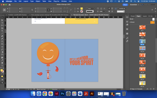

Friday - week 12
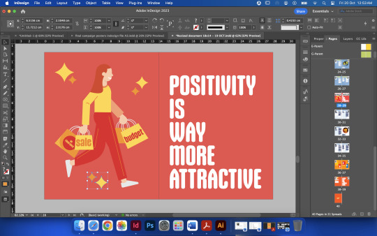
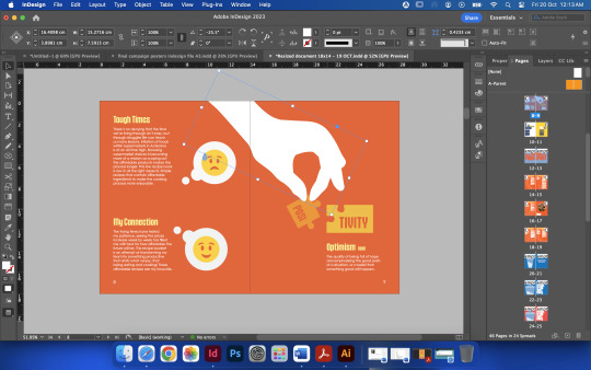
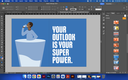
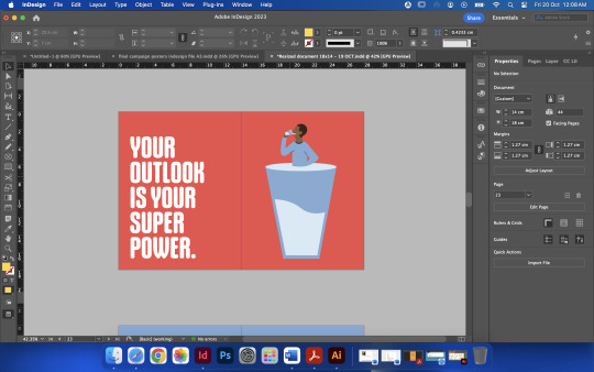
Throughout the past 5 to 6 weeks I have been developing the cover pages to be featured in the publication. I have made so many iterations and which I have developed to cater to the design system and overall message of the project. I am very happy with the finished illustrated images which feature a positive message alongside it. The main reason I wanted these pages was because I didn't want the reader to just be overloaded with text and recipes I wanted to allow the reader to have a break between recipes.
0 notes
Text
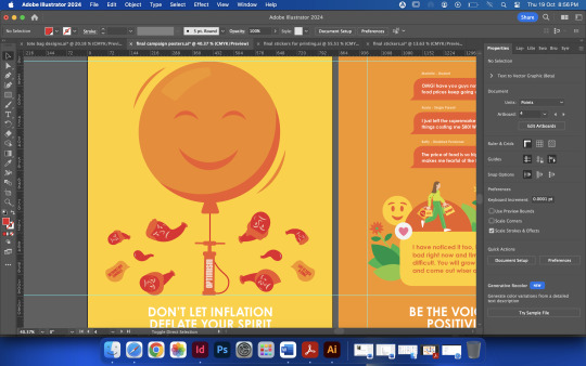
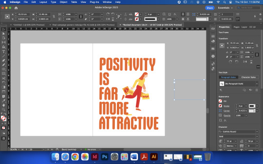
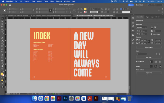


Thursday week 12
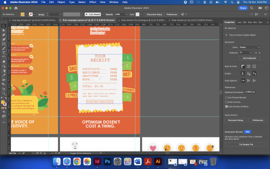
During this week I have developed the posters to be more obvious and look more "treated" It was looking very simple at the start which was not the intention so I used more illustrations to make the poster image more striking.
0 notes
Text


Logo development and playing around
I was adjusting the logo and I added a smiley face in to logo to see how it would look. I wasn't a fan of it as it looked out of place, plus I liked how there was an empty space after the word reminder. I also needed to include a website (call to action) so people would have access to the url which will take them to a website and social media account. This is relevant because most messages and campaigns circulate websites and apps just as much as printing and advertising in public spaces does.
0 notes
Text


Final feedback for publication
During this little session talking to my tutor, we covered how the addition of more illustrations can liven the spreads up more. I agreed with this idea as there was a lot of space which could contain more positive symbols. We also talked about how the real scanned images of the affordable products interferes with the cohesive design. As all of the imagery is vector based. This made sense and I began illustrating the silhouette of the products to give it a vector feel and it did make the publication flow better.
0 notes
Text
Test print week 11, Monday

More test printing and binding
0 notes
Text
Prototype session and Feedback


During the prototype feedback session I received such wonderful feedback which was constructive, but also positive. I had my publication, poster designs, stickers and tote bag designs all printed.
0 notes
Text


Thursday after class
I went home to work on my development imagery and vector illustrations.
0 notes
Text
What I printed to place on wall for feedback 10.2


0 notes
Text
10.3
I wanted and intended to talk with Tatiana about my WIP. During our talk I could sense a lot of confusion with the message coming across in the images I created for the campaign. During the talk I managed to connect myself back to the purpose of the message of this campaign and my original idea in the first place.
I noticed with the help of my tutor that I had somewhat become lost in all the development. I felt as though I disconnected from the primary purpose and intention I had from day one.
After my talk with Tatiana I got to wiring everything down so I didn't forget. The second half of the class was dedicated to the development and then when I got home, I got straight to more development. I wanted to simplify the message down, so I started writing the phrases to then start illustrating imagery to use for the campaign.


0 notes
Text
Thursday session 10.2 and 10.3
This session was a great one indeed, we went over our WIP with a group from the class providing feedback on our projects. I got so much amazing feedback on how I can progress my work. We talked about how the message isn't as obvious so that's what I wanted to work on the most. The girls said that they loved the vector illustration route and that it looks very visually appealing.
During the wall feedback session Tatiana presented how I could create a type of advertising price/recipe tag to go on the supermarkets shelves to promote and inspire people to buy more affordable products or to utilise the cheap brands as ingredients for the low recipes, I loved that idea and it gave me so much to think about.


0 notes


