
Don't wanna be here? Send us removal request.
Statistics
We looked inside some of the posts by ditbycharlotte and here's what we found interesting.
Average Info
Notes Per Post
0
Likes Per Post
0
Reblog Per Post
0
Reply Per Post
0
Time Between Posts
4 days
Number of Posts By Type
Text
4
Last Seen Tumblr Blogs


Fun Fact
Tumblr was acquired by Yahoo for $1.1B in 2013.
Text
Evolution
The brief required me to create promotional material for an exhibition, hosted at MOSI (Museum of Science and Industry), celebrating the development of the city. To fulfil this brief, I will need to create a series of posters which commemorates the development of Manchester through an exhibition hosted at Manchester’s very own MOSI, in addition to this I will also need to create an invitation/leaflet to accompany the series of posters as well as an extended piece of my choice may it be a motion graphic piece, physical creation, exhibition space etc. I feel as though I underestimated this module, initially I thought oh 3 posters simple, but this wasn’t the case and it had taken me a lot longer than I expected to finish the poster as I thought it would which disheartened me a bit but I was determined to finish the project to the best standard I could with the techniques I already had and also learned during the module. If I were to do this module again I wouldn’t of thought it was going to be so easy and forget how much work goes into poster design from research to initial designs to development to finalising layouts. I think what stumped me the most was the Alan Turing portrait as I went through so many iterations that I didn’t think I would ever get him to look right but I did after sticking with it. In regards to the module itself I think that it was well planned out but I feel like we needed to be more open with showing our work to each other and getting other people’s views.
0 notes
Text
Experimentation
Week 7
Poster
In my feedback from my 6 week presentation I was asked to try out an idea involving Alan Turing (the guy who invented the first computer) and code in relation to the fabric idea that I had presented. I wanted to try out this idea as it is something that I’ve wanted to try for a while but not had the knowledge of how to do it so that is something I will need to investigate. This is my experiment of this idea and I think that I could potentially use this for my actual poster idea, but I will try out my initial idea too to see which fits better.
Alan Turing Poster
To start out this poster I got a picture of Alan off of Google and used Adobe Illustrator to create an outline of it using the Pen Tool. From there I used the Area Type Tool to fill in the space with binary code.
These are the first renditions that I created

Left- Original poster (with outline), Right- Image Trace using 3 colours (no outline)

Left- White text, realistic style (with outline), Right- Black text, realistic style (no outline)

Left- Red text (with outline), Right- Red text, realistic face style (partial outline and colour)
The idea is there but I think I need to refine the technique a bit more so that the text resembles more of the shape as at the moment it looks a bit all over the place, so this is what I did.
Refined Technique

I prefer the one on the right as I like the style of the picture compared to the unedited one

I prefer the left as I feel the black text on the light background looks harsh even though it does stand out more than the white.

I prefer the one on the left, right one looks strange with the realistic face
After showing these to my tutor he suggested making the face out of text as well instead of having it as a vector.

These are the 3 faces that I created: top- features outline with colour, middle- features outline in white, bottom- features fill in white.

The middle poster is the the one that I am favouring at the moment but I want to get other peoples opinions on the ones that I have created before proceeding with this one.
After showing this work to my tutor and my class mates for their opinions they suggested that I tried different concentrations of 1′s and 0′s as opposed to using realistic colour and separate sections with the face to suggest that its a face without actually making the features.
It is also quite clear that I have taken this idea way too far and need to go back a few steps and refine what I have.
Concentration Experiment
Hair- 10pt
Face- 15pt
Neck- 14pt
Jacket (inner)- 11pt
Jacket (outer)- 13pt
Jacket (collar)- 10pt
Shirt (collar)- 13pt, 12pt
Shirt (main)- 12pt, 10pt

Week 8
James Hargreaves (Spinning Jenny)
To start this poster I used the same technique as with Alan Turing by getting an image off Google and using the Pen Tool to create my outlines and a space in which to work within.

Original image and Image Trace with 3 colours

Working space outlines

Face outline with brush strokes for the beard and hair as I could get the flow of the hair properly as opposed to using the pen tool which would of taken 3x the time it took to achieve the same effect.

Colour fill, this was a bit trial and error with after I applied the effect as the colour would appear lighter or darker depending on the relief of the effect which I could change in the settings.
This does have a body with it which I haven’t shown the progression of as it is the same as the head in which I found another image of him but with a longer jacket on in which I could then line up with the image I had originally and carry it on so he wasn’t just a head with a collar.

Effect Settings, the settings were something that I needed to keep editing to get the right fabric look and the correct colour for each section, this meant having to change the Relief setting and the Light to make it look like the fibers were travelling in a different direction.

Poster Figure
Emmeline (Emily) Pankhurst (Helped women win the right to vote)
Outline

I had stared in this style of outlining Emmeline the way I did the other two but I didn’t quite have an idea of what to do with her. It was suggested to me that I create a watercolour portrait of her but this wouldn’t fit in with the other two portraits. Someone else in the class had researched Emmeline Pankhurst and the colours associated with her as he was creating a beer label sort of thing and it got me thinking that I could do an image trace with 16 colours in Illustrator (to get the max amount of detail), transfer it to Photoshop and then add in a colour overlay, then transfer back to Illustrator to convert back to a vector graphic.
Image Trace

Photoshop
Using the outline I had created in Illustrator I was able to erase the background of the image. From there I added in the colour overlay using the effects panel, the colours I added were: Purple, Baige and Green.

You can’t really see much of the picture because of how bright it is so I decided to alter the levels for better visibility.

After doing this and putting it back into Illustrator to rasterise this is how it turned out.

Layout
Initial Layout

With rough portrait images in for reference and to see if any colours need changing for visibility

After showing my tutor my idea for my layout he thought that by having this old style layout was a bit typical and that I needed to try and find a grid system within the 3 portraits as a means to layout my posters. This means all of the portrait and not just a focused section which is what I had originally done.

Week 9
Poster Updates
Concentration Experiment with shading
In this version of my experiment instead of putting the face in one block colour my mate Sophie suggested that I used the shading from the image trace of the original image for the facial features.

This is my favourite version of the Alan Turing portrait and this is the one that I will be using for my poster as it is the cleanest looking of the ones that I had created previously.
Leaflet

This was drawn up shortly after my presentation in week 6, and was based off of my initial ideas for my posters but now since my poster ideas has changed so should my leaflet design.

After trying out this idea I decided that I didn’t like it and would be something that I would come back to.

Emily Pankhurst Poster (Revisited)
After a while I decided that I didn’t like the look of the image or the image trace so I am going to start to experiment with it again.

I decided to choose the last render in black and white (silhouette) as it was the most simplistic whist still retaining a fair amount of detail which I knew using Photoshop I could then add in more like highlights and shadows.

I much prefer this poster image compared to the one I made previously as I feel like its easier on the eyes to look at.
Week 10
Final Poster Imagery
Alan Turing

Emmeline (Emily) Pankhurst

James Hargreaves (Spinning Jenny)

Poster Layout Updated

I listened to what my tutor said and decided to make the portraits the main focus of the poster instead of framing them. I also changed the order of the posters so that the one with the most colour was in the middle, this also splits up the two male characters.
After this I had an idea for the layout that the text was part of the portrait which I will test and then implement into my final posters if it works well.

I like the way that this looks so I will do the same with my other posters.
Final Posters

Poster 1

Poster 2

Poster 3

Week 11
Changes to the Layout
In addition to changing the layout I also changed the look of my logo to fit the layout better, this included changing the font of ‘Zooming In On Industry’ from “SignPainter” to “Avenir” to have a contrast between old and modern.

New Leaflet Idea
Front of leaflet

Back of Leaflet

Front of Leaflet designs

For the Alan Turing poster I wanted it to look like it had been pressed in to the paper as a reference to one of the photos I took in Mosi during my research.

For the Emmeline Pankhurst section I wanted it to look like it was part of a protest banner with the plan to use the colours most associated with her (purple, cream and green). In the James Hargreaves part I wanted it to look like a piece of fabric.
Front of Leaflet

Starting out by setting my grids, laying out my text (whilst also experimenting with fonts) and what area I had to work with.

After adding in the basics to how I wanted each section to look, coded dots for Alan, a wood texture for Emmeline which I would later mask with the associated colours and a fabric picture for James which I would also mask with the background colour.
Back of Leaflet

I started out the same way that I did the front of my leaflet by setting up my grids, type and workspace, this time using the divide tool (on the Pathfinder tab) to subtract an oval section of the workspace so that the portrait would be visible.

The oval holes I then filled with a darker grey for the two outside portraits and Emmiline’s associated colours in hers, this way any overhang in the poster would be easy to hide by changing the arrangements of the layers.
Final Leaflet

This is my final leaflet, I finished them off by masking the images on the front of my leaflet and adding and scaling down my portraits for the back of my leaflet.
Week 12
Extended Project
The final thing I had to do now was to create my extended item, which I had already decided that I was going to create a simple animated version of my leaflet. I am restricted in what I can do because I don’t have the skill set yet but the concept is there.
Front of leaflet animation design

Back of leaflet animation design

Making of the Front

Making of the back

Photoshop

As trying to load Adobe After Effects would most likely crash my computer and I don’t have the skills to use it yet I used the technique I used to make my initial animated logo for the Design Fundamentals module which meant creating many artboards of key elements.
Final Outcome

0 notes
Text
Concepts
Week 4
Logos
What makes a good logo
Distinctive
Appropriate
Practical
Graphic and simple in form
Conveys a message
Logo Examples

By Alan Fletcher
This logo sets the feel of the brand and displays what the brand is about. It looks sophisticated and suggests high quality.

By Paul Rand
The work by Paul Rand is all very different in the brands that he has worked with, but they all have a similar look as he uses circles and circular objects in his work a lot.

By Wolff Olins
This is the logo for the London 2012 Olympics, I think that this design is clear and easy to recognise but other people might say the complete opposite as if you took away the location and the olympic rings you probably wouldn’t realise what its for.

By Bruce Mau
Here we have the logo for the sound company SONOS, which makes home sound systems, this message is clear on the image on the right but for the image on the left I think it would be more recognisable if it were different pieces of sound equipment or something similar to that.

By Stefan Sagmeister
This isn’t just the logo alone but I like the idea of the brand having tape as a promotional item as it is for a travel bag company and tape can is versatile and can be used for almost anything especially duck tape.
Personas
What is a persona?
A representation of a particular audience segment for a website / product / service you are designing.
Why do I need a persona?
Personas are based on real users. They help you understand who will actually be using your website, service or product and therefore can be used to make key design and functionality decisions during the UX process.
How do I create a persona?
- Speak to your client: Will often have some information or insights about their audience in the form of marketing information.
- Speak to users: Speak to the people who are likely to use it.
- Other sources: e.g. social media interactions.
Content?
A person’s goals on your website / service / product
A person’s motivations for using it
A person’s current pain points or frustrations
Some demographic data such as age/location/sex
A quote that captures their attitude in general, or towards the website / service / product
A short bio about their background
A person’s technical ability along with which devices they use and how often
Other brands or websites they may like
Personas for my posters

Week 5
Progress Review
At this point I have first taken photos of the City in the brief (Manchester) which I can then experiment with later for poster ideas, created mind maps to help identify and choose a theme and focal point for my posters which was also influenced by the research conducted into the areas needed (Mosi, First Industrial Revolution to Digital Revolution). Then looking at existing tripartite’s in the form of movie series’ to look at how they have a running theme throughout. From there then progressing to look at type and logos which could make or break my posters. Lastly at this point I have identified my demographic and created personas for them which illustrate what they want from my exhibition.
Existing Exhibitions

Exhibition Names

Tutor Progress Review
As we are at week 5 of the brief my tutor decided to see where we’re at this stage, in this session we spoke about my ideas and where I was at for both the Design Fundamentals (travel app) and Digital Innovation and Technology (Mosi promotion) brief.
It was here that thanks to the help of my tutor that I had decided on the exhibition name Fabric along with the slogan “Zooming in on industry” as my theme is about looking at industrial machines used in the making of textiles.

Poster Ideas/Theme

After identifying my themes that I would combine I then created a mood board which I could then use to produce initial poster ideas.


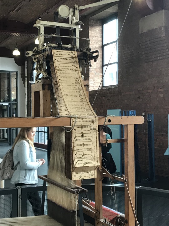
As my theme is machine based I started thinking about the loom scene from the film WANTED which is about a group of assassins that kill people whose names are coded into the fabric created by a loom. This idea interested me and made me think that maybe I could replicate this but instead of coding names showing famous people or Manchester inventions.

From here I started to think about textiles patterns.


Using the photos that I took during the Manchester walk, I can now use them for inspiration whilst experimenting with them.
Existing Posters (Good and Bad design)
When I went looking around other museums I picked up leaflets for things to look at the layout and information they contain as a reference point for my own posters.
Good Design


These are leaflets that I collected whilst at the IMW and the People’s History Museum and will most likely use as an aid to help me with my poster and information layout for this brief. What I think makes these examples of good design is the fact that the imagery used is relative to what the leaflet/poster is advertising/promoting. In addition to that the colour schemes and the use of hierarchy of text have been done very well in controlling and directing the users eyes to where the designers wants it.
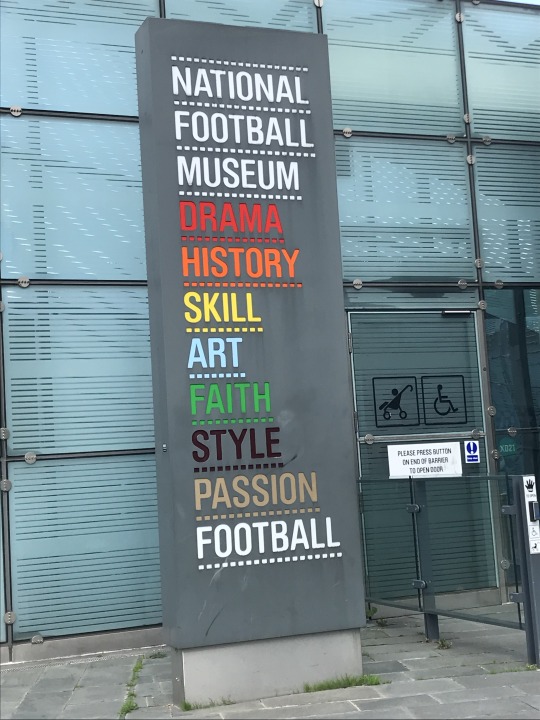
Bad Design

This is a leaflet for the ‘National Football Museum’. What I think makes this bad design is the picture on the front of the leaflet as it is an image of two people kissing and I don’t see what this has to do with football other than the fact that she’s holding a book which looks like its about football, but if you read the text at the left it mentions passion underneath the word ‘Football’ so I guess that this is its link.
Week 6 (Halfway Point)
Logo
Initial Designs

Type Experiment
To start off my logo design I first need to experiment with different fonts to see what would work best with my initial ideas.

These are the 7 fonts that I will be using to progress with for my initial logo ideas.
Digital Renditions

The designs in the red boxes are the ones that I will continue to experiment with to get to my final logo design.
Logo Development

Im stick between these two variations of the same design so to help me decide I will further experiment with them to make a final decision.
Halfway Presentation


Feedback

Overview
Try creating posters with the material/ something relevant eg a portrait of Alan Turing using binary code.
Lead the logo into the poster design and bring it round
Posters portraits of famous people from Manchester e.g Emmeline (Emily) Pankhurst (leader of the British suffragette’s), Alan Turing (father of theoretical computer science and AI) and James Hargreaves
0 notes
Text
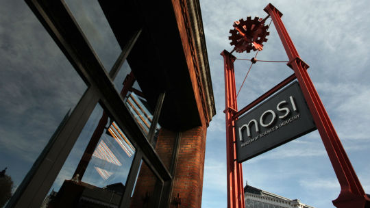
Brief 1 - Digital Innovation & Technologies ‘MOSI Promotion’ Posters
Week 1
Brief
COTTONOPOLIS TO DIGITOPOLIS – a celebration of Manchester’s Industrial Past and Digital Present and Future.
Your mission is to create promotional material for an exhibition, hosted at MOSI, which celebrates the development of the city from its First industrial Revolution… late 1700’s to the second industrial revolution post the events of 1996 (research this) in developing Manchester’s Digital Revolution… ‘96 to now… this minute!
My Understanding of the brief
To fulfil this brief I will need to create a series of posters which commemorates the development of Manchester through an exhibition hosted at Manchester’s very own MOSI. In addition to this I will also need to create an invitation/leaflet to accompany the series of posters as well as an extended piece of my choice may it be a motion graphic piece, physical creation, exhibition space etc.
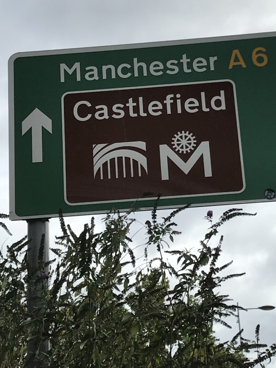
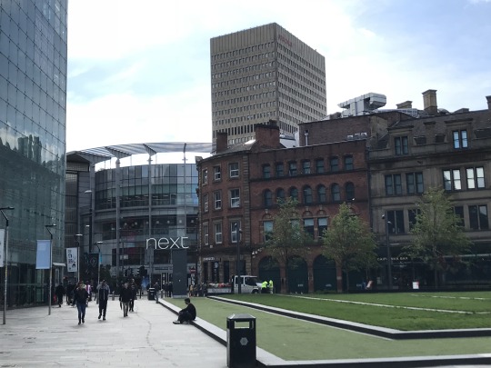
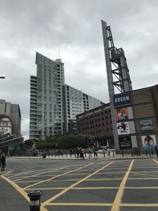
Manchester Photos


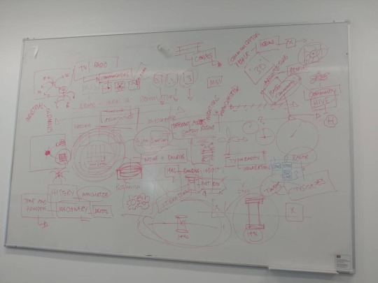
Mind mapping Initial Areas of exploration
To help me with what I needed to look into in order to start with this brief I narrowed it down to 4 main areas that I would need to explore further, these areas are: Research, Target Market, Brand Identity and Initial Ideas. From here I can now take an in depth look into each section to advance forward.

Initial Research

Target Market

Initial Ideas

Brand Identity

Analysis
Research
First Industrial Revolution (1760-1840)
Manchester dominated the cotton industry in the textiles industry
One of the first cotton mills in Manchester destroyed in WWII
Improvement of stream engines productivity- "We may see in a single building a 100 horse power steam engine (which) has the strength of 880 men, set in motion 50,000 spindles. The whole requires the service of but 750 workers. But these machines can produce as much yarn as formerly could have hardly been spun by 200,000 men...”
Cotton was being imported at a rate of 2,000 tons per year (1772), increasing to 45.2 thousand tons per year (1816
Steam and water wheel powered mills used
Automated machines include the water frame and spinning jenny
Canals essential for distribution of coal for the railways to transport the cotton
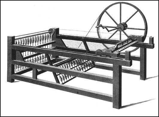
Pic - Spinning Jenny
Second Industrial Revolution (1870-1914)
A target in utilising the power of electricity, oil, and gas
Britain’s cotton industry reached its peak in 1912 when eight billion yards of cloth were being produced
First World War (1914-1919) spelled disaster for the industry in Manchester
WW2 1939-1945
The Invention of Telegraph and Morse 1844 (Samuel Morse)
The Telephone by Antonio Meucci 1876
1906 that the patent for bulbs with tungsten based filaments was filed by Edison.
First flight by the Wright brothers 1903
Henry Ford's Model T the affordable car
Blocks of commercial and warehouse premises incinerated by Air Raids in the Manchester Blitz 1940
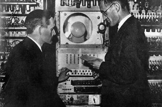
First computer (Baby) pioneered by Fredric Williams and Tom Kilburn based on the work of Alan Turing, paved the way for today’s computer’s tablets and smartphones (1948)
By the 1980s, the industry had all but vanished in and around Manchester
15 June 1996, the IRA detonated a large bomb in the city centre, caused over 200 injuries, spurred rejuvenation of areas in Manchester
Digital Revolution (1950s-NOW)
Development of Graphene the worlds thinnest material used in computing, electronics and medicine.
1980s the computer became a familiar machine
1992 WWW introduced
2000s mobile phones commonly seen, number of internet users growing, tv started the transition from analog to digital signals. Broadband introduced to the UK.
2004 Facebook is born
2005 YouTube launches
2007 Apple releases the iPhone and phone usage increases at a rapid rate
2010 nearly 70% of the worlds population owns a mobile phone
2016 The VR headset becomes available to users

MOSI (1969-NOW)
Opened in 1969
Has 5 buildings
Devoted to the history and practice of science, medicine, technology, industry and media.
On the site of the oldest surviving passenger railway station
Always expanding and changing galleries
Houses a replica of the ‘Baby’/SSEM computer
Has displays from Bomber planes to engines to trains to powerboats
Has a large gallery for the Textiles Industry including machines, printing blocks, dye samples and factory signs
http://collection.sciencemuseum.org.uk/search/categories/textile-industry/museum/museum-of-science-and-industry
End of Week 1 Review
After doing some initial research into Manchester’s industrial past and digital present and future, I feel like I can start to narrow down my initial ideas into more refined concepts that I could use to take forward and use/progress with to create my series of promotional posters. I think that I would like to continue looking into the relationship between machinery used during the industrial revolution and how machinery is used in the digital era.
Week 2
Design Process
This week we went though design processes and shared one of our initial ideas based on research we had conducted.
- Brief: understand what it is
- Analysis: Primary research, secondary research
- Concept(s): don’t be scared to fair and try multiple ideas
- Refinement: Trial and error, go forwards and backwards
- Testing: Iteration (design cycles), keep going till you get a certain outcome
- Implementation: Journey is as important as the final product Theme needs to have an extension piece to the 3 posters e.g. motion piece, storyboard, exhibition layout
Don’t be afraid to explore more than 1 idea especially not just your first idea! Need to be able to say if something not working then leave it, don’t cling on to ideas
Information graphics: making the complicated simple using icons (iconography)
Shared Ideas
One by one we went round the class and shared our starting point based on the initial research we had conducted. My idea was a that I had found a connection of machines so maybe I could break down the machine parts and combine them in different ways to form images for my promotional posters.
Researching Other Museums
To help with this project I decided to go look at other museums nearby to help generate ideas, the museums I had a look at were the Imperial War Museum which is just across the water and the People’s History Museum.
IWM


People’s History Museum


Week 3
Appreciating Type
This week we explored the history of type and its importance in design. We should respect type as it is an art form and comes in many different looks.
Key features of type include
Leading- space between words and lines
Kerning- space between each individual letter Ambrose Harris typography book

Hierarchy of text- where you want the user to look first (usually most important info)

Sans- Without Serif
Serifs- Curly ends on words (Easier to identify letters though the negative space)

Probably the most recognisable piece of design would be the London Underground logo, created by Edward Johnston It’s simple and has no messing around Pixel form and has minimalism in the form of reducing form.
We then got talking about the typeface Helvetica which was designed to be a pure typeface void of personality with pure function for every communication with over 70 variations!
As long as it is legible, Type can be imperfect, it can also be a combination of two typefaces put together to create a different effect within your work.
Session 2
Existing products (Film Ideograms)
The idea behind ideograms is that a graphical symbol that represents an idea or concept without the use of words and can be recognised universally.
The 3 sets of series films that I got to create ideograms for were
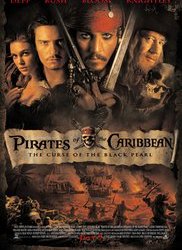
Pirates of the Caribbean (5 Films, 6th TBA)
Terminator (5 Films, 6th TBA)
Shrek (4 Films)
For each film I needed to identify recognisable scenes from each film in each film series and pic one film from each series to create an ideogram for that my peers would be able to recognise and guess which film I had picked prom each series.
1. Pirates of the Caribbean
Curse of the Black Pearl (Chosen for ideogram)
Year- 2003
Main thing- Black Pearl
Promotional Materials- Title 3/4 from the bottom, 5 main characters, fighting on land and in water
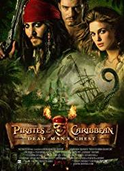
Dead Man’s Chest
Year- 2006
Main thing- Jar of dirt with heart of Davey Jones in
Promotional Materials- Title positioned at the bottom, 3 main characters, ships being taken down by a Kraken
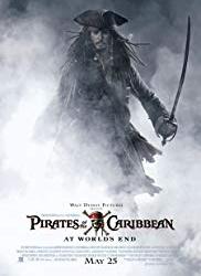
At World’s End
Year- 2007
Main thing- Release of the goddess Calypso/Jack returns from the land of the dead
Promotional Materials- Title positioned at the bottom, single character (main character), lots of smoke/fog
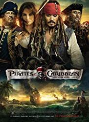
On Stranger Tides
Year- 2011
Main thing- Fountain of youth
Promotional Materials- Title 3/4 from the bottom, characters the same size, ships on rough water.
Salazar's Revenge
Year- 2017
Main thing- Trident of Poseidon
Promotional Materials- Title positioned at the bottom, characters get larger towards the top of the picture, underwater
Ideogram For Pirates of the Caribbean: Curse of the Black Pearl
In this movie Jack looses his beloved Black Pearl to Davey Jones who keeps it in a bottle
Guessed correctly- YES

2. Terminator
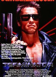
The Terminator
Year- 1984
Main thing- Come with me if you want to live
Promotional Materials- Title 3/4 from the bottom, large descriptions on the poster, main character main focal point
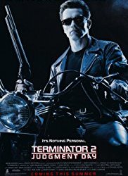
Terminator 2: Judgment Day
Year- 1991
Main thing- T-1000 tries to kill John Connor as a child
Promotional Materials- Title positioned at the bottom, main character on motorcycle with shot gun (main focal point)
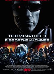
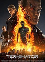
Terminator 3: Rise of the Machines (chosen for ideogram)
Year- 2003
Main thing- SkyNet virus infects the U.S military, development of T-X model robot
Promotional Materials- Title half way in the poster, main character takes more space than the villains (robot army)
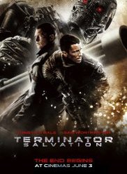
Terminator Salvation
Year- 20039
Main thing- Skyet develops the new T-800 robots
Promotional Materials- Title 3/4 from the bottom, villain larger than the main characters
Terminator Genisys
Year- 2015
Main thing- Going back to the past to correct the timeline of the future
Promotional Materials- Title positioned at the bottom, main characters more present in importance larger than the others, villain in flames
Write about the similarities between the movie posters, running theme
Ideogram For Terminator 3: Rise of the Machines
I decided to illustrate part of the movie poster where the main characters face is half burnt revealing his cyborg side.
Guessed correctly- YES

3. Shrek
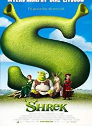
Shrek (chosen for ideogram)
Year- 2001
Main thing- Shrek rescues Princess Fiona for Lord Farquaad
Promotional Materials- Title positioned at the bottom, main characters leaning against a giant letter ’S’ for Shrek
Shrek 2
Year- 2004
Main thing- Shrek meets Fiona’s parents
Promotional Materials- Title positioned in the middle, main characters surrounding the title
Shrek the Third
Year- 2007
Main thing- The King of Far Far Away passes away
Promotional Materials- Title positioned at the bottom, main characters more present in importance larger than the others, villain in flames
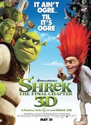
Shrek Forever After
Year- 2010
Main thing- Rumpelstiltskin tricks Shrek into erasing himself from existence
Promotional Materials- Title 3/4 from the bottom, main character vs villain
Ideogram For Shrek
I decided to change my idea from Fiona’s tower to Lord Farquaad’s mirror as this is one of the key elements in this film.
Guessed correctly- YES

Planning
After conducting my research I drew out my ideas for my ideograms on paper before proceeding to digitally reproducing them on Illustrator.

Week 3 Review
At the end of this week I have been looking at existing products in the form of movie posters and what makes them recognisable if you took away the title, from this I have learn that making things simple, clear and containing key elements is best for recognition and this is what I need to include in my posters.
0 notes