
Statistics
We looked inside some of the posts by docdesign and here's what we found interesting.
Average Info
Notes Per Post
4K
Likes Per Post
2K
Reblog Per Post
2K
Reply Per Post
4
Time Between Posts
5 hours
Number of Posts By Type
Text
17
Last Seen Tumblr Blogs


Fun Fact
Mobile Tumblr US users spend an average of 4.04 minutes per session on the app.
Text

This image features a collage made from crumpled and ripped pieces of paper in various colors, creating a layered, textured composition. Shades of white, blue, pink, purple, and black dominate the fragmented design, with jagged edges and visible creases adding depth and visual interest. The chaotic yet cohesive arrangement evokes an abstract and expressive aesthetic, emphasizing imperfection and spontaneity often associated with handmade art.
Image description: A textured collage of crumpled and torn pieces of paper in blue, pink, purple, black, and white; the layers and irregular edges of the paper create a dynamic and abstract design.
0 notes
Text
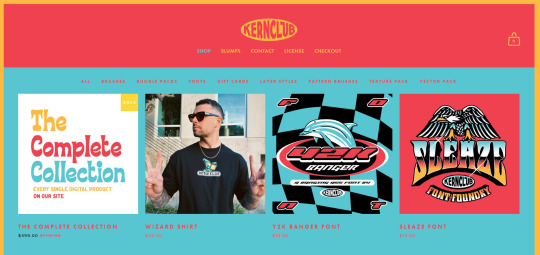
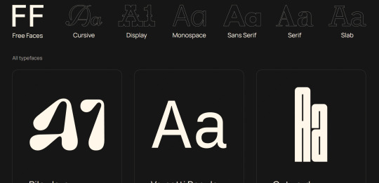
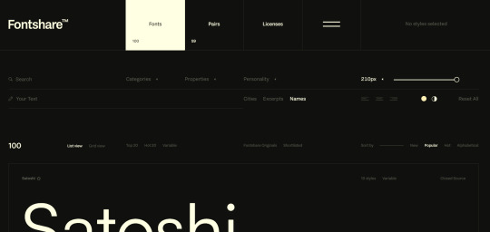
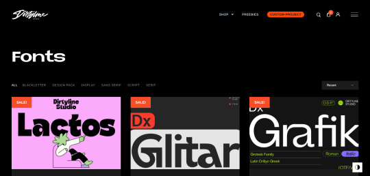
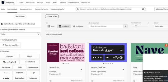
Image Description: A long post with website names above their respective screenshots of their website pages. The sites include KernClub, FREEFACE, FontShare, DirtyLineStudio, FontsGoogle, Velvetyne.FR, Dafont, FONTBA.SE, CALLIGRAPHER (to create your own fonts), and ADOBE FONTS.
Since we've been working on creating digital zines and we've done a lot of digital design work featuring lots of typefaces, I thought it would be cool to reblog this post I found featuring different places to find fonts! I'm sure most of us will need fonts after this class, too, so I hope this helps!
RESOURCES FOR FONTS
KernClub
FREEFACES
FontShare
DirtyLineStudio
FontsGoogle
Velvetyne.FR
Dafont
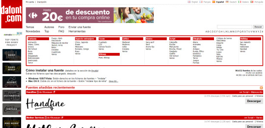
FONTBA.SE
CALLIGRAPHR (to create your own fonts)
ADOBE FONTS
4K notes
·
View notes
Text
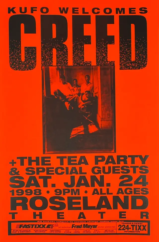
This poster for the 1998 Creed concert is an attention-getting design. The bright orange background creates a high-contrast effect against the black typography and image, making it readable from very far away. The giant, textured "CREED" text at the top really demands immediate focus, whereas the photograph of the band is personal to the performers. The blocky font gives an impression of strength and energy, hence fitting for a rock band. Details like date, time, and venue are aligned well for clarity and ease of access.
Image description: A bright orange concert poster for Creed, in bold black text at the top reads, "KUFO Welcomes CREED". Below that is a black-and-white photo of the band seated in a dark room. Another text is listed as "The Tea Party & Special Guests, Sat. Jan. 24, 1998, 9 PM, Roseland Theater." A small footer includes ticketing information.
0 notes
Text
Image Description: A person holding an orange book with black painted page edges angled toward the camera. The word "MUTE" in white is written in all caps toward the top of the book on the black edges.
I think the book in this image has a good use of color contrast and an interesting use of space. The colors being used are vastly different from one another and allow the design objects to be clearly contrasted. There are very minimal aspects on the book cover and edges as well, leading the audience to wonder what is in the book and only being able to tell the book is titled "MUTE."

—https://www.counter-print.co.uk/collections/all-books/products/mute-a-visual-document
91 notes
·
View notes
Text

This image is a powerful use of repetition in visual rhetoric. Yayoi Kusama uses polka dots to such amazing effect, creating a mesmerizing interplay between the background and clothing and the central pumpkin sculpture. The repetition of black dots against a bold yellow canvas pulls the viewer's eye across the composition and stitches the space together in reinforcing Kusama's obliteration theme through patterns. This design makes much of how consistent repetition can imply infinity and, as a means of immersion, creates cohesion and rhythm that aligns with theories of effective document design.
Image description: A bright orange-haired woman sits in a room entirely of yellow and black polka dots. She wears a yellow and black dress that is totally matching with the design of the room. Behind her is a big yellow pumpkin sculpture, with black polka dots on it, blurring into the background.
0 notes
Text

This image goes along well with our final project. I appreciate the use of tearing up magazines to create your own use of the paper in them. This is a kids DIY project, but I think it's a cool use of materials that might otherwise be thrown away. I think this fits into visual rhetoric well since there is a strong use of color in this project, and organizing the color to look like the Earth. I also appreciate the font in this post, which contributes to the "DIY" feel of the entire project on the website listed in the photograph.
0 notes
Text

This is a great example of a creative resume that also sticks traditional aspects valued in some fields. The resume utilizes two columns and a color block to separate them. I think this resume utilizes the space on the page well, with clear and readable fonts to organize the information. This visual hierarchy is very clear and it allows the reader to easily scan the page.
0 notes
Text

I really liked this design. The pink and red colors could have given this a valentine vibe, however I felt that the purpose of the colors was to show love. The section is about the future of the teddy bear, so using the colors of red and pink were supposed to give those who love them a warmer feeling.
0 notes
Text

I like this picture because it uses a combination of a picture and a drawing. It's a nice way to add an interesting element, while still allowing the image to be very cohesive. There is also a small amount of newspaper in the background further adding to the DIY feel.
1 note
·
View note
Text

I found this collage on Pinterest and thought it was a good example of a good collage. All the colors work well together, and I like how the different pieces are layered with the ones on the bottom in the very front; that way the page reads top to bottom. And I love the circular centerpiece telling the viewer exactly what the theme of this collage is!
0 notes
Text

I found this poster for one of Wallows' albums while scrolling on Pinterest, and thought it was fun. I really liked the layout of it and how cohesive it is. The colors are muted throughout, and the hierarchy of text draws your eye to the track list, which is what you want to be looking at when it comes to album posters.
1 note
·
View note
Text
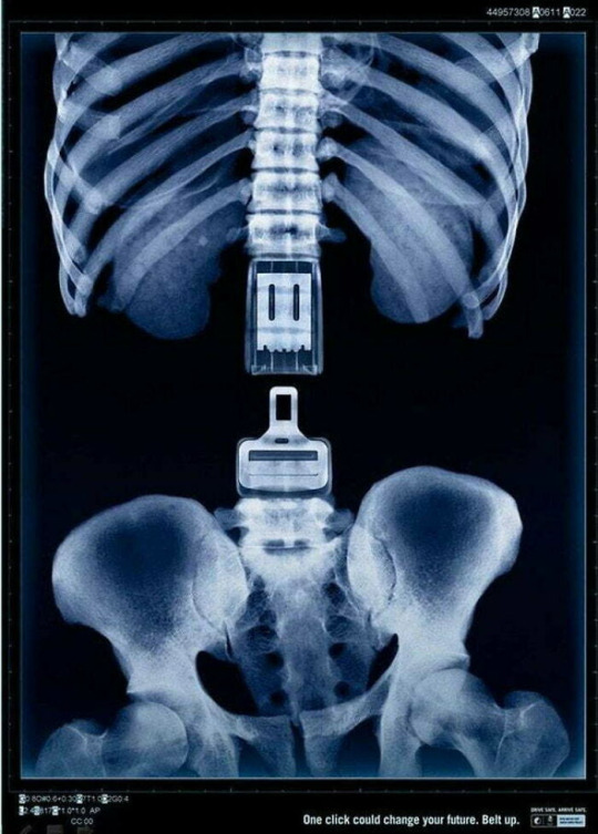
This is an advertisement reminding everyone that seat belts are meant to keep us safe. By showing the uneasy image of a human skeleton split in half, the audience is immediately reminded of their mortality and fragility. What I like most about this ad is the simple design. There are only two colors present: black and white. The image of the seat belt in the center of the ad is also a great way to draw attention to the ad's purpose. The audience can look at this advertisement and know what it's for without having to look at the text at the bottom explaining it. The image explains it all.
1 note
·
View note
Text
Post 5 Submission
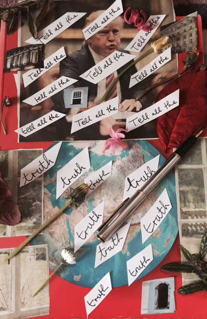
This is a collage poem I found by a poet named Josephine Corcoran. This collage reminds me of the DIY element of the physical zines we created for our final project. In this poem, Josephine depicts the slanted nature of politics by cutting out the words and placing them diagonally. This choice in design and alignment, along with the personal objects belonging to the poet and the natural elements like the flowers, creates a dynamic world that works together to create meaning from elements that would mean less on their own. I also love the visual element where the words are cut out on pointed pieces of paper, showing that the truth cuts like a dagger. Everything is placed with a reason, and it's clear to see that the subject, Trump, is the subject of the poem because he is the largest underlying image in the poem.
1 note
·
View note
Text

This is an old store sign of an ice cream fountain. I think what I like the most about this sign is the use of the green color, and the darker red contrast associated with it. Normally when people see these colors, they think of Christmas, but I think that this does a great job of showing these colors in a non-Christmas way. I also just like the older feeling that this sign has.
0 notes
Text
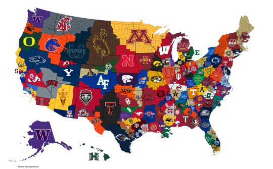
This is a collage of college football teams logos all over a map of the United States that "reign" over that region of the US. There are accurate colors that go along with the logo of the school in that area.
0 notes
Text

This poster for the movie uses contrast in colors of black and white and also the bright red. There is also repetition of the black paw prints all over the poster.
0 notes
Text
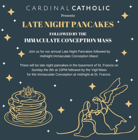
This design has the late midnight colors of navy and gold. They also have an image of pancakes to go with the late night pancake portion and a picture of the Immaculate Conception to go with the mass portion.
0 notes