#doc design
Explore tagged Tumblr posts
Visit Tumblr Blog
Explore Tumblr blogs with no restrictions, modern design and the best experience.
Last Seen Tumblr Blogs


Fun Fact
Tumblr Inc. is using 66 technologies for its website.
Text

This is an example of a more professional zine done in a unique and highly artistic style. Titled "Plastik Comb" by Thomas Schostok and Aaron Beebe, I chose this zine due to its rebellion from the convention of many other documents, such as using grids and relying heavily on text to further the document's message. The co-author of this zine and the creator of the cult 90s PDF magazine "Beast," Thomas Schostok, discusses his design choices further:
"This is a magazine about contemporary art with an unusual layout. Plastik Comb was designed according to the style of the featured artist. Images and the text form a graphic fusion, and each spread is more a piece of art than a common, magazine-style layout. Each page stands for itself and could just as well be framed on the wall. The layouts are reminiscent of the renowned magazines of the 1990s, such as Raygun, Speak, or BlahBlahBlah. The basic idea is to create something completely new with every page and every issue, and not to stick to the usual conventions and grids. Plastik Comb is independent and is produced and distributed by artists. It does not depend on selling well and is therefore not subject to any economic rules, which often dictate the content and type of presentation.”
2 notes
·
View notes
Text
I love linocuts because I feel like I can really see the designer's process through all the hand-carved lines in a way that digital tech often hides. I also like this as an example of a bold black-and-white design because you don't always need to use color to make an impact. The focal point of the woman grabbing a book from the bookshelf is eye-catching, and the text is simple but effective.

'Defend The Internet Archive' linocut print by Molly White. Bid on a print to support the Internet Archive's Open Library. [Image description] Black ink linocut print of a person in a dress reaching for a book on a large bookshelf. Above is “Free people read freely”; below is “Defend the Internet Archive”.
2K notes
·
View notes
Text
google docs decorating is so fun because I can just make goofy shit that just makes sense.
what do you MEAN i can put silly pngs of dogs and it fits the character so well.
0 notes
Text

shapes and gestures <3
#i can’t tell you enough just how much I love their designs!!!#they’re cute they’re hot they’re funny they’re naughty i love them#geto teacher au#he wears doc martens bc ofc he does#mwah i love these two xx#satosugu#sorry jogo#jjk
7K notes
·
View notes
Text


a scribbling little rant about """""art tips""""" that infuriate me. hopefully i got my thoughts out in a way that makes sense
[image description: a four page comic about how gender is shown in art tips.
panel 1 shows various exaggerated examples of how artists divide male and female bodies, with men being depicted as strong and angular, and women being depicted as soft and curvy. on the bottom is the artist's sona, an axolotl with glasses named doc, is peaking out from below the background of the panel and saying "a slight bit of comic hyperbole notwithstanding, sentiments like this are very common with it comes to tips for beginner artists. and, while seemingly helpful at first glance, i something to say about any one of these that tries to define how "men" and "women" are to be drawn..."
panel 2 shows doc crumpling up the previous panel in his hands and looking crazed. he says "they're [bleep]in' scams! or, rather, they tend to do more harm than good..."
panel 3 has doc next to two diagrams of characters, the top having all 4 characters with similar body types, and the bottom having all 4 characters with different body types. doc says "setting aside the blatant misogyny, it's also just... repetitive and dull. by limiting the body types you draw by "male bodies" and "female bodies", you are not only severely limiting how visually interesting your designs can be, but also shooting yourself in the foot when it comes to improving at drawing anatomy. note how much more interesting it looks when you diversify bodies!"
panel 4 shows many examples of ways to diversify bodies, including disregarding gender when drawing bodies, diversifying shape language, playing with size and proportions, messing around with facial features and head shapes, and learning how to draw muscles and fat folds. at the bottom is doc giving a thumbs up and saying "don't let a bunch of old dead guys' ideas of gender and beauty weigh down your artistic potential! also, have fun!!" end id]
#i am being so real when i say that unlearning what beauty and gender are ''supposed'' to mean does wonders for character design#doc talks#my art#my characters#art tips
3K notes
·
View notes
Text
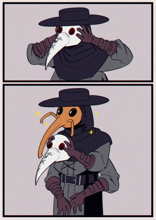
character idea
#plague doc#plague doctor#weevil#bug#plaguecore#meme#art#funny#artists on tumblr#comic#ttrpg#dungeons and dragons#bugs#weeviltime#character design#alchemist#pathfinder#digital art#comics
4K notes
·
View notes
Text

Jimmy SolidarityGaming for Hermitcraft S11 . Please .
#hermitaday#hermitcraft#hermitcraft fanart#hermitblr#grian#jimmy solidarity#solidaritygaming#hi sorry for missing like 10 days lmao#some shit was going on and I had no energy to draw#i swear to god i WILL draw at LEAST Etho and Doc#and if i can ill get to skizz too but my design for Skizz is so . not in my brain .#grian in a constant state of me poking him with a stick but its fine I hc all evos as shifters/changelings so its fine
732 notes
·
View notes
Text

The Flags again because I LOVE THEM!!
Closeups


#I love drawing characters in white voids#Simplified the designs a little for some reason#I don't even remember why because this took me an embarrassingly long time#bungou stray dogs#bsd#bsd fanart#bsd stormbringer#bsd the flags#bsd chuuya#chuuya nakahara#bsd iceman#bsd pianoman#bsd albatross#bsd lippmann#bsd doc#Not me listening to Passion by Granrodeo while drawing this and almost crying. Nope.
2K notes
·
View notes
Text

Working out how I visualize Tom Riddle. I think the only time he's ever let his hair down was at age 12 after he figured out how to game the other Slytherins and in his 30s in Albania, and he made that his entire personality
1K notes
·
View notes
Text
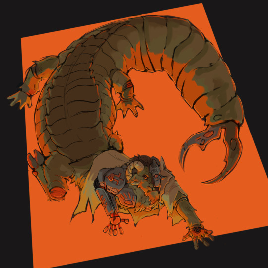
its a bug
#hermitcraft#hermitblr#docm77#docm77 fanart#tw bugs#trying to get more into habit of finishing pieces but not making them a Whole Thing#featuring my wildly experimental and noncanonical chimera mecha doc design#my art#polished work
613 notes
·
View notes
Text
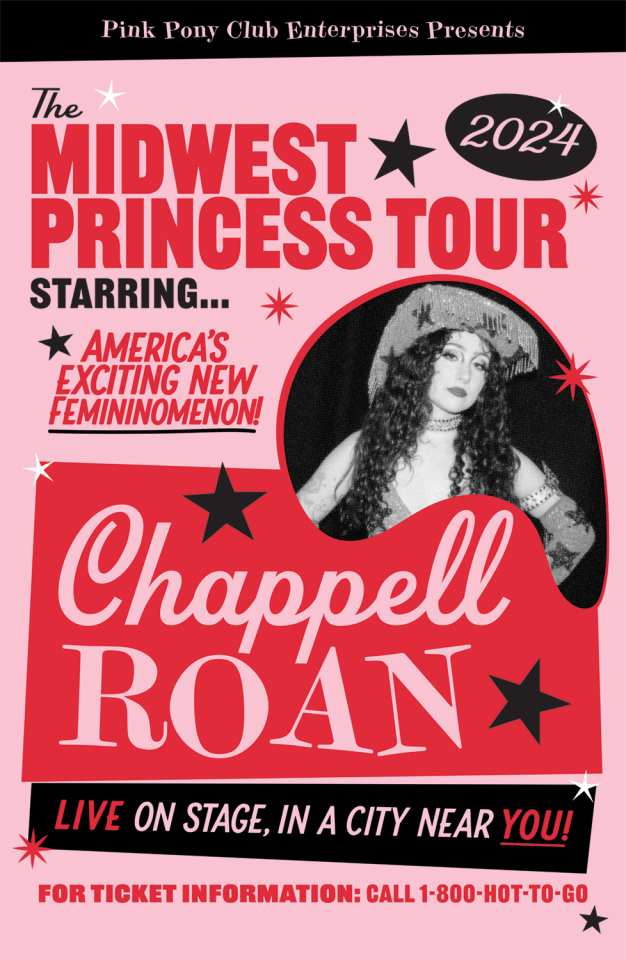
This is an event flyer for Chappell Roan's Midwest Princess tour. The color scheme of this document is very cohesive, where the creator chose one hue and worked with tones rather than choosing a handful of different colors. The use of different fonts, the size of the text, and the use of color add an effective contrast to the focal points of the flyer, and the secondary contact information uses smaller print and is located near the bottom of the document.
2 notes
·
View notes
Text


it's finally done, and it's probably the gooiest garbage i'll ever make.
credit to my new buddy @i-love-tdp-if-you-can-tell for doing almost all the characters' flat colors!! i am so so so infinitely thankful to them bc otherwise none of the other efforts of making this would have happened. between the lineart, backgrounds, shading, and touch-ups, these five pages have taken years off numerous braincells' lifespans, and without their help, may have annihilated my entire brain capacity.
if you like, please reblog! we put in a Lot of time and effort into this!
you would think that between last time (one other event) i tried comic-ing and now, i would've learned to not handwrite the text, but alas...
thank you for answering my plead for help, sky! and for managing to work around my design inconsistencies and sketchy lineart <3 ik you said you didn't need anything, but if you ever decide you want an art, hit me up any time :)
and to the tdp fandom, whoops… sorry for all the requests rotting in my inbox. it was a fun september and a fun six years of lurking, but alas i think i will be bailing for the moment. maybe you'll see me around.
#tdp#the dragon prince#the dragon prince fanart#tdp fanart#soren tdp#tdp soren#corvus tdp#tdp corvus#sorvus#that's a technically--implied-#lychee's trash art#you guys likely will not be seeing tdp art from me for a hot minute#so please enjoy my offerings#btw the costume details are hell#also corvus' old design was vastly superior#there i said it i'm a hater of arc 2 corvus design#the struggles of the designs i want to draw versus aligning to canon#to be clear that's just arc 1 corvus & clean shaven arc 2 soren LOL#sorry i'm also a hater of soren's facial hair#off topic i really would like 2025 to be my return to ao3 so might see less lychee art#finding that it's easier to pop out a doc and write fic between lectures#sort of thinking to start pulling up on yt too but who knows#you can probably tell the parts where i gave up lol sorry it's a bit scuffed#i'm really tired my eye has been twitching all day#a lot of the details are a bit scuffed and the shading's sorta lazy but#there's a lot of art here okay </333
790 notes
·
View notes
Text
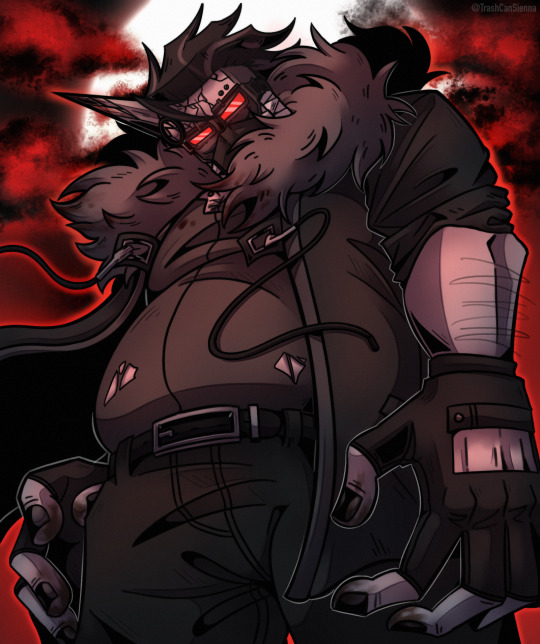
Full moon
#madness combat#madcom#madcom fanart#madness combat fanart#madness combat 2bdammed#madness combat doc#mag doc#mag 2bdamned#I’ve drawn my own mag doc design before but this time I’m drawing the design krinkels came up with#this one was in the drafts for a while so it’s good to finally finish it#yuuuuuuuuup that’s a big boy
527 notes
·
View notes
Text

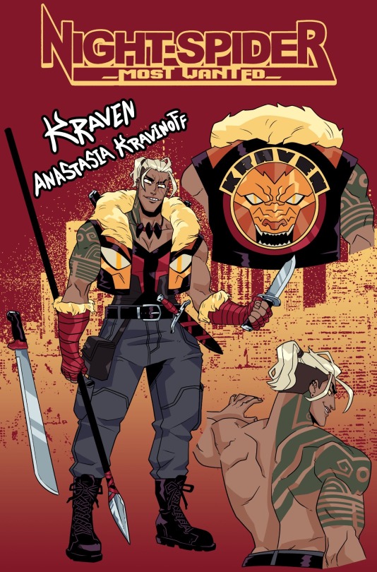
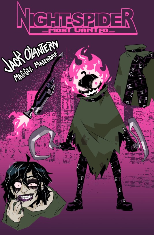


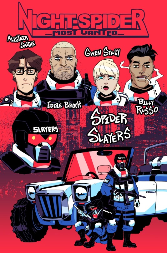
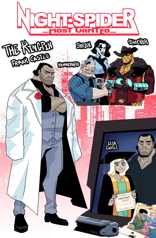

Here’s a bunch of designs for my spidersona’s universe
#my art#artists on tumblr#digital art#art#digital drawing#fanart#character design#marvel#marvel fanart#spiderman fanart#spidersona#Anastasia kravinoff#kraven the hunter#doc ock#otto octavius#jack o lantern#scorpion#mac gargan#frank castle#the kingpin#black cat#felicia hardy#hobie brown#the prowler#aaron davis#alistair smithe#eddie brock#gwen stacy#billy russo#spider slayer
3K notes
·
View notes
Text

found a drawing of catty from Many Years Ago n wanted to redraw her because i still love her dearly... all my favorite utdr shopkeepers are purple cats
[image description: a drawing of catty from undertale looking as though she is gossiping with someone. next to that is another drawing of catty with a caption saying "from when i was 11 years old!" end id]
#my child brain could not comprehend how good catty's design fully is. but now. I Understand.#i'm so glad she got more sprites in deltarune....... i hope she gets more screentime in ch 3 n 4#used to have a shirt of her and bratty actually? i dont think fangamer sells it anymore actually. it was very cute#wish i still had it but it definitely wouldnt fit me anymore#doc talks#my art#undertale#catty undertale#utdr
943 notes
·
View notes
Text

doggy medic this, kitty medic that...medics a lil birdie 2 me
#tf2#tf2 medic#he has a BEAK!!!!!!!!!!!!!!!!!!!!!!!!!!!!!!!!!!!!!!!!!#doodle#digital art#mine#my art#im always enamored with the slit in his coat#he was certainly designed with a dove in mind..#also hi doc if u see this this was inspired by ur post about ur birds :3
770 notes
·
View notes