Don't wanna be here? Send us removal request.
Statistics
We looked inside some of the posts by dumpster99 and here's what we found interesting.
Average Info
Notes Per Post
0
Likes Per Post
0
Reblog Per Post
0
Reply Per Post
0
Time Between Posts
6 days
Number of Posts By Type
Text
13
Last Seen Tumblr Blogs


Fun Fact
Tumblr has 411 employees.


Text
Poster Project


The company/brand I chose is Spotify and I'll be advertising their digital music service (streaming app). The poster will be similar to a club/rave flyer and the slogan will be along the lines of "meet you at the club". Essentially enticing the audience to join Spotify similar to how people hit up the club/go to raves.
0 notes
Text
Deconstruct Reconstruct Project

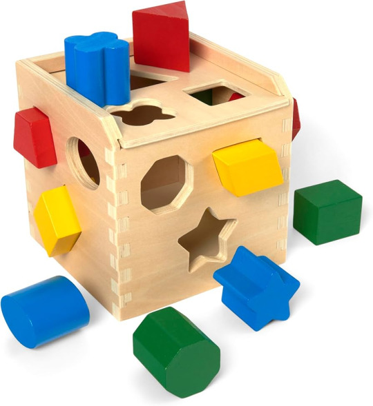
BANDAI is a toy manufacturing company based in Japan. They have multiple lines of figures with varying price points along with producing said figures for different IPs such as Star Wars, Gundam, One Piece, Naruto, Elden Ring, and many more. They are the leading company when it comes to plastic model kits and are particularly very popular for their Gunplas which are plastic model kits for the Gundam franchise. For the new logo, since their company name means "eternally unchanging" or "things that are eternal", I decided to think of a toy that has been enduring throughout the years. I settled on the shape sorting cube which is reflected through the squares/grid in the logo along with the letters of the company name being shapes themselves.
Since BANDAI is well-known for their plastic model kits (Gunplas), I decided to reference that by making a visual reference to "Runners" which is a term for the pieces in their plastic model kits (example below).

I also opted to keep the logo name broken in two (BAN / DAI) similar to the original logo. The reason why I kept it is because upon researching, I learned that the logo was chosen through a contest and the company's name being split in two was a point of contention and a divisive element among the judging panel. I thought that was an interesting bit of history concerning the company so I kept it but changed it's horizontal layout to a cross shape. The cross shape made the logo more playful, which is apt for a toy company, while being a subtle nod at video game controllers where the D-pad is in a cross shape.
Lastly, I decided to keep the original red color of the logo since the original logo is already very simple and the color is a big part of their identity.
0 notes


Text
Typography Project
Quote #1: You melt up my body and all my heart
Quote #2: If nobody's here to hold me tight, I'll melt away.
0 notes
Text


For the black & white font sculpture, I chose the exclamation mark “!” as my symbol to create a design out of. I chose it because it’s made of a dot and a line which gives me a lot of flexibility in terms of creating something with. When brainstorming, the exclamation mark “!” reminded me of a matchstick so I decided to create a design where a light gets turned on and turned off. I focused on shape, form, and space, negative space in this case, to emphasize that idea. To start, I used the Text tool to get my exclamation mark “!” in the Arial font. Afterwards, I used the Create Outlines option under the Text tab to turn the text into an object so I could edit it. I then copy and pasted the object through the CMD + C and CMD + V shortcuts. I then rearranged the 8 exclamation marks in a circle with the dot being the center and converging point. Each exclamation mark would be rotated by 45 degrees through Transform -> Rotate via right-clicking. After everything was aligned and well-positioned, I selected the exclamation mark that was on the south position and right-clicked to select Release Compound Path. That would enable me to stretch only the “stem” of the exclamation mark without stretching the dot. After it was released, I stretched the stem by clicking and holding the bottom anchor point and dragging it down which would form the stick portion of a matchstick. With that, the lit up matchstick was completed and I created the unlit or extinguished matchstick by copying and pasting the long stem with its associated dot. I then created two rectangles through the Rectangle tool and made them be the size of half of the artboard each. One of them would be filled with the color white and the other black which would act as the backdrop for the two matchsticks. For it to be the backdrop, I simply put the two rectangles on the layer before the matchsticks. Afterwards, I centered each matchstick to their respective rectangle backdrop and the font sculpture was complete. I paired the white rectangle with the lit matchstick because I wanted to show that the matchstick was lighting up the place. The unlit or extinguished matchstick was paired with the black rectangle to demonstrate, through negative space, how there was no light in the room.
For the coloured font sculpture, I opted for a playful approach for the design and settled on the letter “O” because it did not have any hard edges nor any straight lines. I thought of creating a character and wanted to keep the design simple and clean in order to give a feeling of lightness and employed patterns and colors to bring an element of playfulness and movement. I turned the letter “O” into an object like I did previously with the exclamation mark “!” and transformed it with the same tools. I created 3 shapes in total, a big oval which would act as my character’s face, an eye that looks to the side, and an eye that looks upwards. What followed suit was a lot of copying and pasting along with Transform -> Reflect and aligning the eyes to the face. I then made columns of 10 faces and aligned them through the Properties -> Align -> Distribute Spacing -> Vertical Distribute Space sidetab. After creating the first 3 columns (character looking left, down, and right), I copied and pasted those 3 columns and reflected it downwards to create the second half of the design. The finishing touch was assigning colors to each blob in which I chose light colors to ensure a sense of playfulness. Red, blue, and green were chosen to bring a sense of energy and gray was chosen to balance it out along with keeping the background white. I assigned the colors at random because I wanted the viewer’s eyes to look around at random instead of rigidly following a pattern. That sense of movement and interactivity plays a big part in bringing playfulness into the font sculpture.
PS: Apologies, I mistakenly thought that we only needed to create 1 design but have 2 versions of it meaning a B&W one and a coloured one. I made another design to rectify that mistake and added it to this final submission post. That should explain why my previous posts were the same design but in different colours. Sorry about that!
0 notes

