
I want to learn how to bookbind but I don't want to spend money I don't have to and I'm sure plenty of you wanna know how to do that too. Follow along while I try to piece together what works, what can be substituted, what can't, all while demystifying the process as much as possible.
Don't wanna be here? Send us removal request.
Statistics
We looked inside some of the posts by dumpsterbooks and here's what we found interesting.
Average Info
Notes Per Post
80K
Likes Per Post
47K
Reblog Per Post
32K
Reply Per Post
107
Time Between Posts
22 days
Number of Posts By Type
Text
17
Last Seen Tumblr Blogs


Fun Fact
In 2020, Tumblr had 29.4 million users in the US.
Text


My personal goal is to try and make fanfic binding as accessible to everyone as possible, so here are some resources on how to make a fanfic hardcover for under $25.
This is a barebones bind for the broke college students and such. Happy to field questions, too!
Here's a proposed budget breakdown:


Loosely organized thoughts:
Fanfic bookbinders often share typesets amongst each other. Never pay for a typeset for a fanfic.
You'll hear a lot about grain direction for your printer paper, but as a newbie on a budget without your own printer, settle for some nice 92 bright paper. If you like the hobby, splurge after but expect to pay at least 2-3x more for short grain paper.
Printing is a pain because some copy shops won't let you print intellectual property smut, and it's very expensive. You are better off bartering instead or looking for a free printer on Buy Nothing.
You know the thick paper wrapping that comes with online orders? It's a good weight for endpapers if you need to scrounge. Paper grocery bags or gift bags (birthday presents) might work, too.
Ask your local library to give you covers from books they are throwing out. Ask for outdated textbooks (those covers are built like tanks) or three-ring binders that are too busted to be binders anymore.
Obtain a used book that was mass produced (so your destruction of it does not impede anyone's access) and maybe even become a little vindictive with it.
If you can afford it, I recommend the Olfa SVR knife (~$10)
If you can afford it, upgrade your ruler to a t-square.


I really hope this resource is helpful! I want to stress how possible this is and encourage people to cherish what they love through art.
If you are interested in fanfic binding and have a little more disposable income, I have an affordable Fan Fiction Bookbinding Starter Pack that I carry on my site. I pack them myself and drop them 1x/month on the 15th.
12K notes
·
View notes
Text
Sometimes, ya just gotta make do with what you have

I decided I wanted to give bobbin lace a try but didn't want to invest a ton of money in case I didn't like it so here has been my solution. I've drawn all the patterns by hand on regular notebook paper, and am pinning into my laptop case. The only money I've spent was on one pack of pencils for $1 (which I'll use anyway), an enormous spool of yarn $5 (bought at a thrift shop), and one pack of pins $6 (which I'll also use anyway).
I'm enjoying it so far, but still undecided if I want to spend more money on it. Real bobbins and a pillow would be soooo helpful though. But its been encouraging how much I've been able to learn already with just these materials!
9K notes
·
View notes
Text
#reblogging this NOT because I'm endorsing it#but because I think it’s funny for “bookdumpster” to be reblogged by “dumpsterbooks”#funny#just chicago things
19 notes
·
View notes
Text
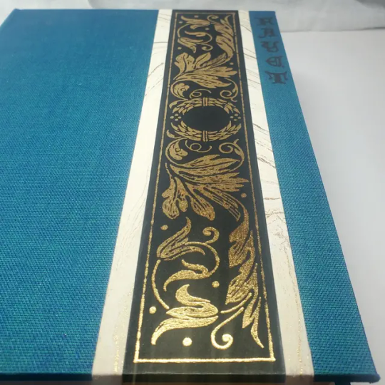
Book Decoration: AKA All The Ways I Don't Use a Cricut
(this post is for people who don't want to buy an expensive cutting tool, or for those that do have an expensive cutting tool that would like to mix things up a little)
1. Print That Shit
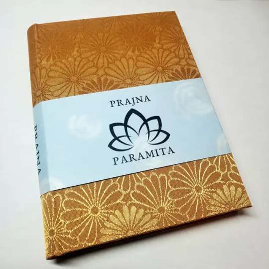
If you're already printing your own textblocks, an easy step for titles is to print them. Above is a title printed onto an "obi" of decorative paper. I measured out where I wanted things on the finished book and laid it out in Affinity, then printed it on a full sheet & trimmed it down to wrap around the book. A more simple method is to print & glue on the label into a slight indent in the cover (to protect it). A third option is to do the spine in bookcloth, while you print on paper for the cover and then glue that paper onto the boards (this usually looks even better when it is a three-piece bradel bind).
2. Foil Quill / Heat Pens
The heat pen is one of my go-to tools, but it can be a bit touchy about materials. The most popular version is the We R Memory Keepers' Foil Quill (which is one of the most ergonomic), but other pens exist that can get you to a higher heat temp, finer lines, or more consistent foil. For example, I have a pen created by a local Japanese bookbinding studio that fares way better on leathers than the WRMK quill & with a finer tip, but it's hell to control. Best results in general are on paper or smooth bookcloth (starched linen, arrestox, colibri - even duo will work but its less solid). The fuzzier a bookcloth is, the less your foil quill wants to deal with it. This means the heat n bond method of making bookcloth does not play nice with a heat pen usually, but there are two solutions: 1) use this tutorial on paste + acrylic medium coated bookcloth instead that will get you a perfect surface for the heat pen, or 2) use the pen on paper & then glue onto the cloth. I did a video tutorial for both foil quill use and this type of homemade bookcloth for @renegadeguild Binderary in 2023.
You get the most consistent results by tracing through a printed template that is taped in place, as I do in the video above.
3. Paint That Shit
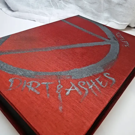
Acrylic paints will do you fine! The above is free-handed with a circle template, because I wanted that vibe. If you need straight lines that won't seep, lay them down with tape first & then paint over it first with a clear Acrylic medium, then your color. Same goes for stencils. Two more examples of painted bookcloth:
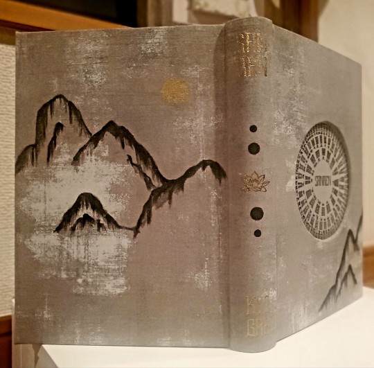
4. IT'S GOT LAYERS
By using layers of thinner boards, you can create interesting depths & contrasts on your cover. You can also make cutouts that peep through to the decorative paper behind. The most important part to this technique is the order in which each edge is wrapped. To get a good wrapped inside edge, you will split the turn in into tabs to get them to conform to a curve. You can also layer multiple colors of bookcloth without multiple layers of board, as seen below left, so long as you mind your cut edges for fraying.
5. Inlaid... anything
Mirrors! Marbled paper! I saw someone do a pretty metal bookmark once! The key is creating a little home for it to live in, which is pretty similar to the above layering method. On one layer you cut the shape, & glue that layer onto the bottom solid board before covering. You can do the top layer as an entire 1 mm board (like I did for the mirrors) or a sheet of cardstock, like I would use for inlaid paper.
6. Decorative Paper
Decorative paper is always helpful & adds to the paper hoard... & its effects can be layers with other techniques, as below. Marbles, chiyogami, momi, or prints & maps of all kinds can be great additions. Some papers may need a protective coating (such as wax or a sealer).
7. Stamps (with optional linocut)
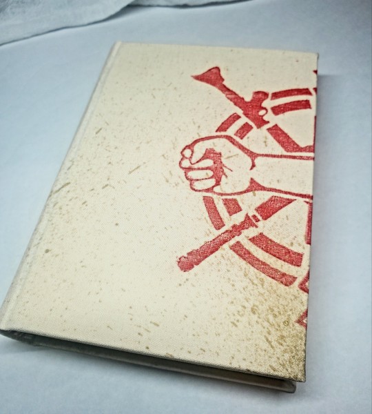
While I've not used many more regular rubber stamps, I do know some who have, successfully! And I've used one once or twice with embossing powder (see photo 3 up, the gold anchor on the little pamphlet bind). What also works is to carve your own linocut or stamp, & then use block printing ink to ink it onto your fabric (as i did above). A bit time intensive, but it was nice how easily reproducible it was, and I liked the effect I got for this particular bind.
These methods are not exhaustive, just ones I've used, and there are of course many others. I haven't gone too into detail on any of these for the sake of length (& post photo limits) but feel free to ask about more specifics. Usually I'm using them in combination with other options.
1K notes
·
View notes
Text
Binderary 2025: Week 2
In the Renegade Bindery Discord Server, we are once again running Binderary during the month of February. Attendance is free, and a link to the 18+ Discord Server can be found on our website.
Whether you’re new to the world of bookbinding or an aged veteran, join us for a month of binding fun! This event is all about community & learning, be it trying something new or refining existing skills.


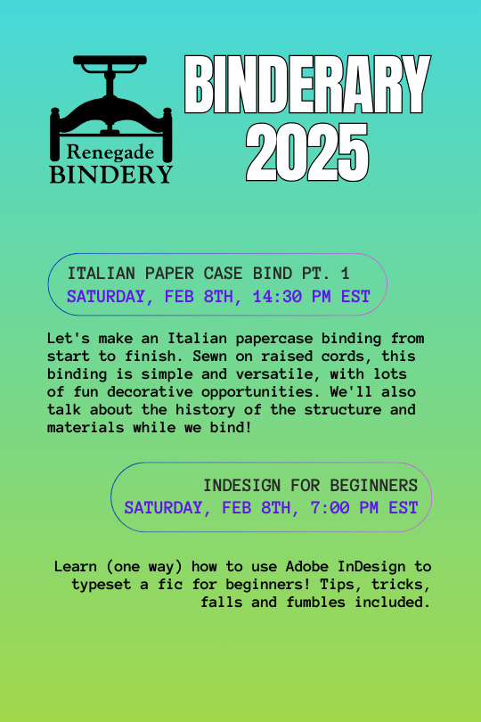
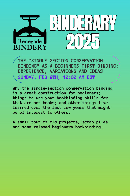


All our workshops are run by members of our fanbinding community, and some of them are even on Tumblr!
Here’s the list of who’s running the week 2 workshops:
All About Bookplates: @silentsunpress Typesetting in LaTeX: @queercus-books VI: Villainous Imposer: @simply-sithel Typesetting in Affinity: @kate2kat Typesetting in One Click: Microsoft Word Macros 101: @owlwinter8 Bookbinding Craft Along 2: Noodle Cutouts and Cover Board Fun: @celestial-sphere-press & @pleasantboatpress Italian Paper Case Bind Pt. 1: Eka InDesign for Beginners: @misanthropiczombie The "Single Section Conservation Binding" as a Beginners First Binding: Experience, Variations and Ideas: minx Decorative Papers: Triple Threat: @starblightbindery, @duran-binding & @mourningmountainsbindery
202 notes
·
View notes
Text
did you know you can learn new skills? just whenever you feel, you can look up new information, practice, and suddenly know how to do something you didn't before? are y'all hearing this shit?
121 notes
·
View notes
Text
HEY
A really good designer has a crazy amount of REALLY GOOD FONTS available for free.

The most they're asking for is a follow and it's worth it for ALL of these.
ORIGINAL POST: https://twitter.com/yuta_ptv/status/1818558025185013903
ACCOUNT: https://twitter.com/yuta_ptv
LINK TO FONTS: https://yutaone.booth.pm/items/2890872
16K notes
·
View notes
Text
Ask An Exec (The Magnus Archives)

Ask An Exec by @shinyopals takes on all five seasons of The Magnus Archives from the point of view of an innocent definitely-not-Ask-A-Manager career advice blogger, who starts getting some interesting queries from a certain archivist...
The entire story is told through blog posts, featuring Jon's terrible anonymized situations, Abigail's attempts at providing genuine advice while also going "WTF?", and many commenters who are also saying WTF while also encouraging Jon to unionize. Shinyopals is masterful at pulling out the true horror in TMA: poor corporate management. It's hilarious but also heart-twisting as the seasons progress, and somehow, somehow, you start caring about not only Jon's situation from a more personal point of view, but also various OC commenters and their attempts at trying to help Jon without having a clue about what's actually happening.

Because this fic is very heavily based on Ask A Manager, I leaned into a self-help tradpub design.

The interior design is not so tradpub-y, but leans into the sterile graphic design of many advice blogs. :D

As mentioned, the fic is formatted like a series of blog posts, which the author did an amazing job of emulating on AO3 (seriously, check it out! A true feat in wrangling code!). It was interesting seeing how much of the comment threads I could preserve while flipping pages, but hopefully it worked out! The fonts, colors, and general design were specifically chosen to mimic the current version of the Ask A Manager blog.

(TMA SPOILER) There's a certain shift change for the epilogue, so I took cues from the author's AO3 coding and changed the design accordingly!

This took almost a year of leveling up in LaTeX to typeset it efficiently; thank you @shinyopals for your patience in receiving this! I hope you enjoy your copy, and seriously everyone, even if you're not in Magnus Archives at all, please read this fic. It's WONDERFUL.
320 notes
·
View notes
Text
Free Book of Dragons Typeset

This next typeset is for The Book of Dragons by E. Nesbit, and was suggested to me by @goodnightmoonvale. I hadn't heard of the book before, but I love dragons, and getting to use all my fancy dragon drop caps was an opportunity I couldn't pass up! I tried to make the title page reminiscent of those old YA fantasy novels I'd always borrow at the library, but then I went a little over the top with the chapter title pages. I included all the incredible illustrations of the book, but please note that the pdf is sized for half letter (letter folio), and the scan quality I found of the illustrations was pretty poor, so the illustrations unfortunately had to be shrunk down on the pages for some weird looking margins. I made them as large as I could, and left them on full pages for now, in case I can find better quality images in the future and just drop them in. There were also some formatting issues with the text when I imported it, so if anyone finds any errors, feel free to let me know! Anyway, this typeset is FREE and is available here: https://drive.google.com/drive/folders/1S2wl_PuxCupofnDpqGuk7VjMHYFMWC6g?usp=sharing
Please consider leaving a like or reblog if these typesets are helpful, and you can follow this blog for future free files! If you use any of my typesets, feel free to tag me! And let me know if you have any suggestions for future public domain works I should do.
38 notes
·
View notes
Text
youtube
The Special Design That Makes Library Books Indestructible
182 notes
·
View notes
Text
Free Christmas Carol Typeset

So I finished up and posted the last chapter of my fic yesterday, and thought I'd get back to doing some typesetting. Thus, here is A Christmas Carol by Charles Dickens, with the original 1843 illustrations by John Leech. Not imposed, sized for half letter (letter folio). Kept the title page relatively simple. I wanted to do something similar to the original 1843 title page.
Free typeset can be found here:
If you use any of my typesets, feel free to tag me! I love seeing what people make. And if any of these were helpful to you, please consider dropping a like/reblog if you can! You can also follow this blog for any future free typesets. (If there's any typesets you'd like to see for other public domain works, let me know! I'm always looking for suggestions. )
29 notes
·
View notes
Text
publishing companies will be like ~ooh this is a hardcover oooh it's so durable that will be $35~ and then you see the actual book and it's like. "perfect"-bound with endbands glued on crooked and a completely plain paper cover under the dust jacket. my dudes this shit is a mass market paperback with delusions of grandeur
32K notes
·
View notes
Text

What is a typeset? Basically, a printable version of a text for bookbinding/reading/whathaveyou. Soooo, currently I have twelve free typesets of public domain works available! 🎊 [Edit: As of 5/27, up to 14!] Twelve was a soft goal for myself (though I have no intention of stopping just yet), and I've had so much fun making these and sharing them all! Here are each of the interior title pages lined up together, from top left to bottom right in order of when I made them. Anyone have a favorite so far? I enjoyed making all of them, though the Jekyll and Hyde one is a particular source of pride. All the files for these books are available in the google drive: drive.google.com/drive/folders/1S2wl_PuxCupofnDpqGuk7VjMHYFMWC6g Everything is sized for letter folio, except for Jekyll and Hyde and The Call of Cthulhu, which are sized for letter quatro. Most of the art/images are from canva or rawpixel. All of these typesets are free for your personal use, but please like/reblog if you can!
And a big thank you to everyone who has stopped by this blog, dropped a like/reblog/ or even a follow. It is greatly appreciated! ❤️ Guys I'm just so happy to have an even dozen in my folder. Twelve is a nice number. (The alternates kind of throw me off though...😆)
761 notes
·
View notes
Text
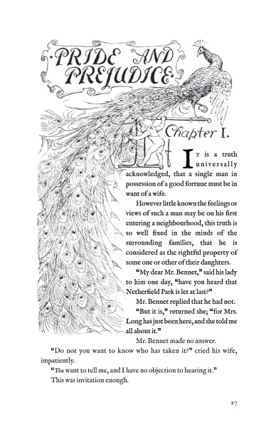
Free Pride and Prejudice Typeset (Illustrated)
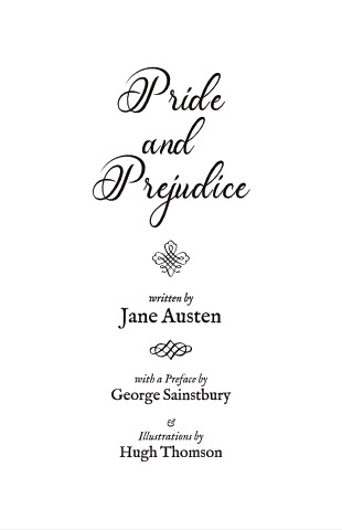
*Collapses.* It is done. I present to you, Pride and Prejudice! By Jane Austen, and Illustrated by Hugh Thomson! Use it for reading, bookbinding, or whathaveyou, the unimposed pdf is sized for half letter (letter folio). And oh god this one was tedious uh, fun to do! All the illustrations are included in this typeset, PLUS all the dropcaps! See below the break for more interior shots, and details about making it. Edit: I FORGOT THE LINK! Here it is: https://drive.google.com/drive/folders/1S2wl_PuxCupofnDpqGuk7VjMHYFMWC6g?usp=sharing Also, as always, please leave credit if you use this typeset! It is free for personal use, just consider leaving a like/reblog if you can, and follow this blog for more free typesets! You can also support me on Ko-fi!
So I kept the title page simple for this typeset, since there's so many beautiful illustrations going on by Hugh Thomson. Just look at this! There's even an illustration for List of Illustrations!
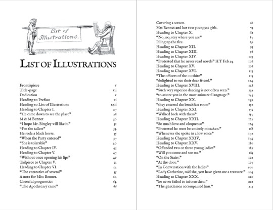
...the list was it's own pain, and a lot of the illustrations had to be manually added in 😅 Twas a fun morning of cross referencing pictures and page numbers. I really loved the drop caps in this book, so I had to make sure to include them all! Each one was unique, and there's a ton of fun detail in these drawings, but the pic quality in the scans was a little rough. Here's hoping they translate okay in the pdf.
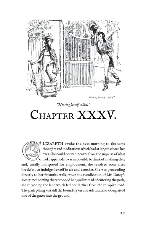
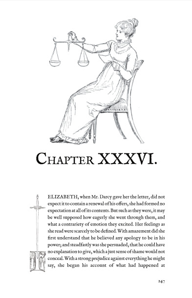
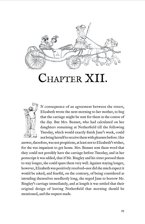
I just really love how this one turned out overall. I tried to have most of the illustrations at the largest size I could fit within my margins so that they could be properly admired. The original peacock version is so gorgeous, and of course Austen's writing is always an absolute joy to read. Anyway, here's hoping this typeset was helpful for folks!
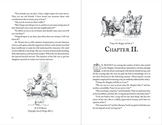
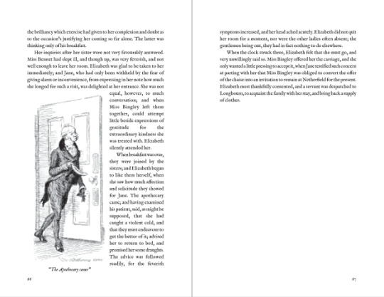
Any errors, feel free to let me know! There was a lot of lines and files that needed to be manually placed and formatted, so some stuff might have gotten bumped around as I adjusted. If you've made it this far, thanks for stopping by!
129 notes
·
View notes
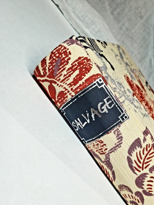
Text


This is the picture book that has been in print the longest, now happily public domain as of this year. This is a badly stitched little prototype using cereal box cardboard, I plan on making some changes and then releasing the pattern as a Pay What You can. A one signature version to be done as a pamphlet-bound little paperback and a two signature version that can be Coptic stitched if you're nasty.
Necessary fixes under the cut
1) did just a single signature because I forgot Coptic binding really requires at least two. I need to lay out the two signature, but I will keep the single signature so I can do it soft cover
2) add enough border to the refresh of the cover so that I don't need to put other paper under it when I'm binding it this way
3) also make a longer version of the cover so it can be cut as part of the pamphlet-bound soft cover
4) ditto to a larger piece of the end paper
5) I put a little note about it being in the public domain and that I laid it out on the old copyright page, I need to clean that up so it's actually visible when printed at this size.
6) improve the cut marks
7) adjust a couple of the pages so that the two page spreads fit smoothly.
8) possibly add page numbers so it's easier to fold
9) possibly add punch spots in the spine

203 notes
·
View notes
Text


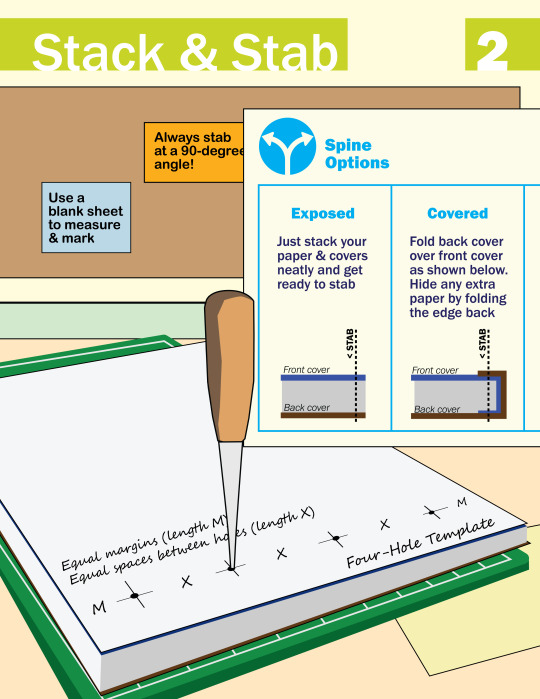

I made this zine last year to teach Japanese stab binding. It's a technique that every artist should know—with just a few tools, it's so easy to bind your own sketchbook or to make a physical version of your art/writing/etc. Download the PDF version (with bonus photos & tips!)
8K notes
·
View notes
Text
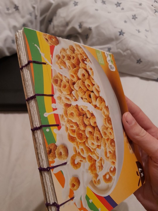
I decided on a whim a couple of days ago that I needed to get into bookbinding - so here's my first try at a coptic bound notebook made with things I had lying around the house
73 notes
·
View notes