
Last Seen Blogs

ssecretfires
latina del rey //
menthatmakemewet
TOUCH ME THERE
mydreamlifereco
DreamLife
violetvix366
90% Of The Time Idk What Im Even Talking About :D
Text
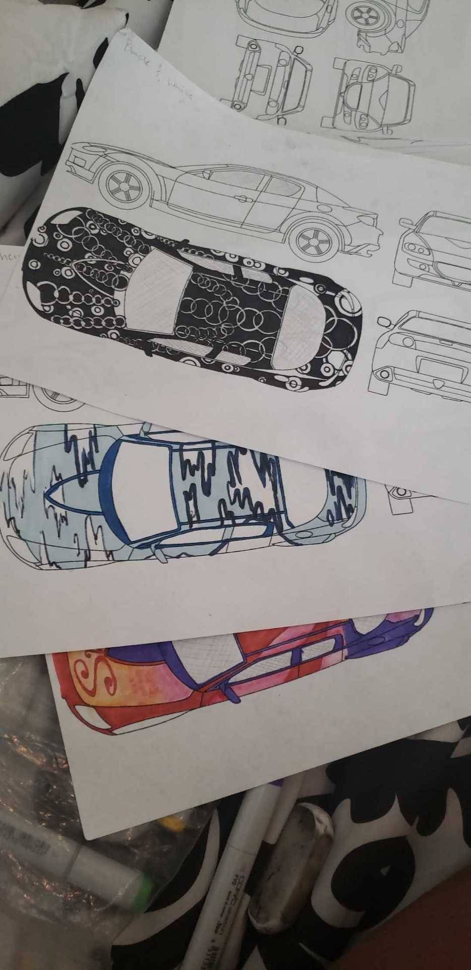
5/3/19- We primarily worked on our art car designs and any missing assignments that we may to finish for the final. The categories for the art car are Climate/Environment, Music Festival, Type/Text, Black and White, and Open. We were also shown how to render the image on the computer and that is due on the date of the final as well. Peggy got back to us about the logo and expressed interest in use of Italian flag colors, so I suppose somehow that'll get done.
0 notes
Text
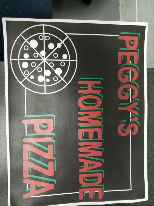
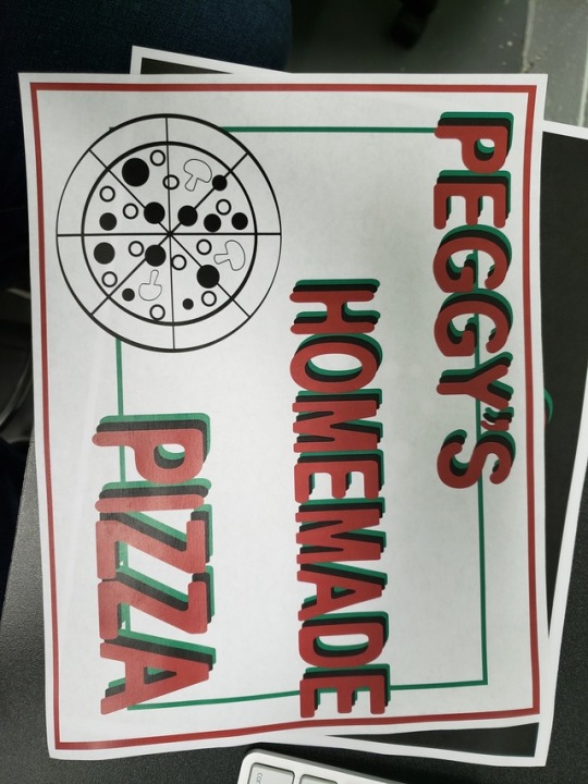
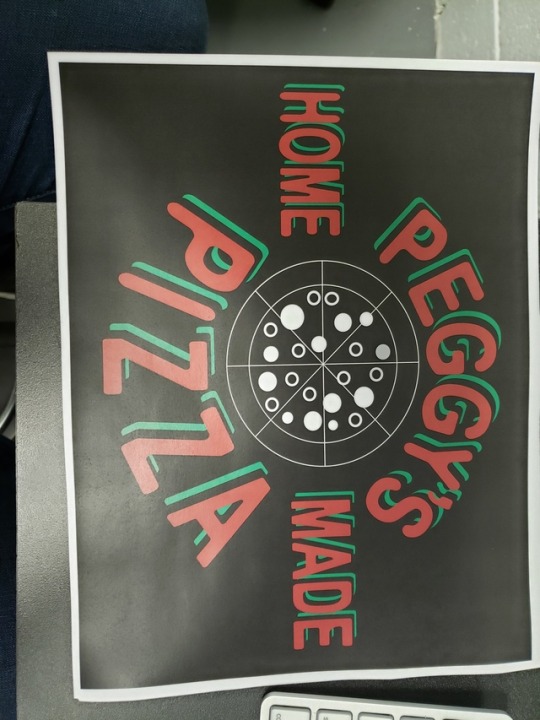
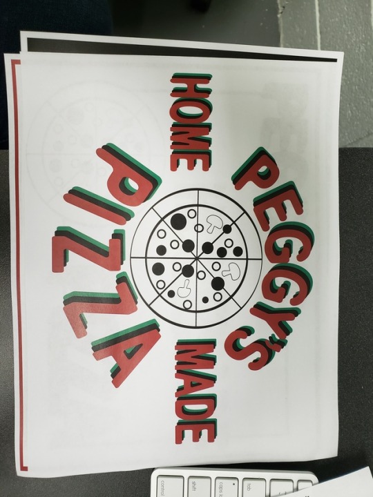
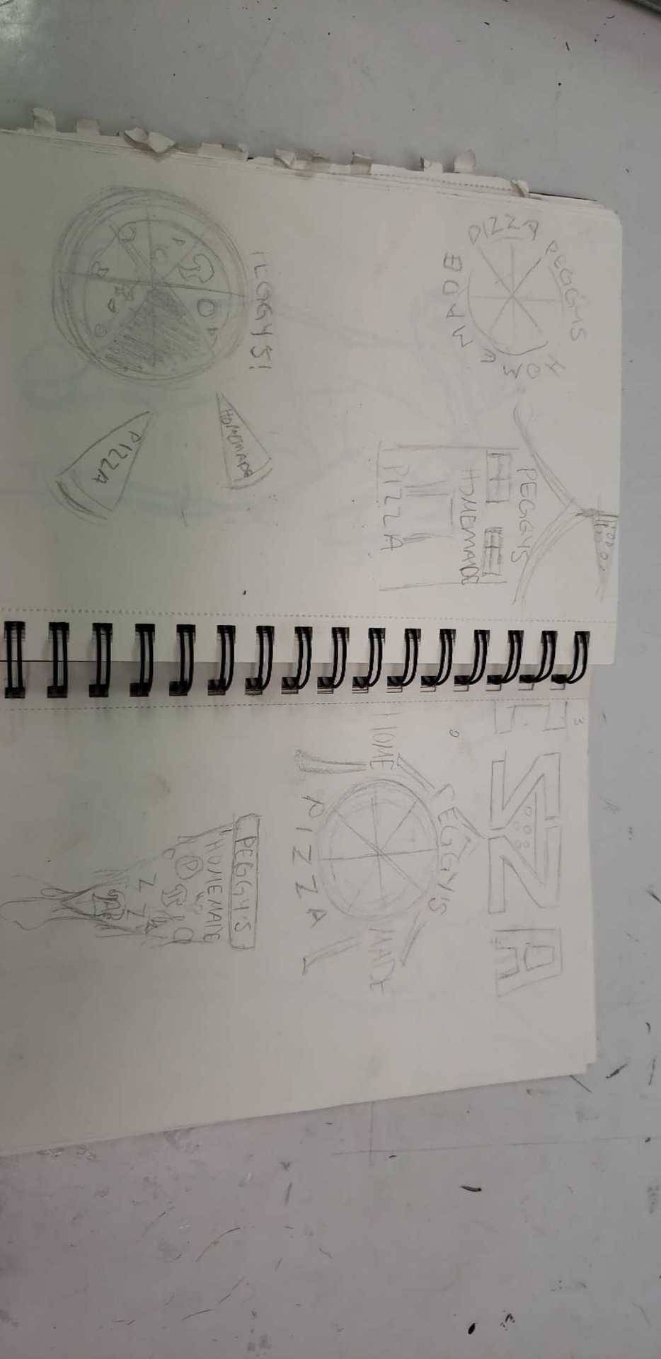
5/1/19- We visited Peggy once again to show her our reworked designs for the logo project. In our last meeting she seemed focused on font so in my designs I tried to create visual interest using the font and kept the image simple.
0 notes
Text
4/29/19- We met Peggy for the second time and showed our redesigns for our logo project and also provided potential slogans for her business. She did not give much feedback on our designs (lol) but she did give us the input she had from her family and workers and it seems that to other opinions in the business, they would like a sign with type and no imagery. We plan to meet again on Wednesday for her to pick a logo, so I suppose we will be working on coming up with original type formats that she could use in her business signage and also tacking our designs on there as well. We spent the rest of the class period discussing type and ways to edit type in Adobe Illustrator.

0 notes
Text
4/26/19- Today we met Prggy in person for the first time and these were my designs that I provided during our meeting. After examining all of our designs, Peggy's emphasized that she really wanted something simple and straight to the point. She also seems to want something that is a very concrete depiction of what she has to offer (no use of items not used in her business/ exact depictions of her). She also does not seem to be interested in color usage and would like to stress the fact that her pizza is homemade. However, she does not want her logo to look "homemade", she would like simple, clean, professional looking logo. After showing her our logos we plan to meet again that following Wednesday adjusting our designs to what she was looking for in her logo. After the meeting we went back to the classroom and discussed our art car project, and watched a short YouTube video on the history of art cars and we say examples of cars designed/painted by artists like Roy Lichtenstein, Andy Warhol, David Hockney and many others.

0 notes
Text
We Called Peggy o-o
4/23/19- We spent majority of this class period working on our Peggy's Pizza designs and we also called Peggy to talk to her and get an understanding of what image she would like her restaurant to have through the new logo. We discussed influences in her business, popular menu items, and places the logo would be used. We also introduced our final project, working on designs for an art car. We have five categories that we need to design for (Type, Climate, Music Festival, Black and White, and then any designs we like). We also have at least one of our designs working with the shape of the car and another working against it.
0 notes
Text
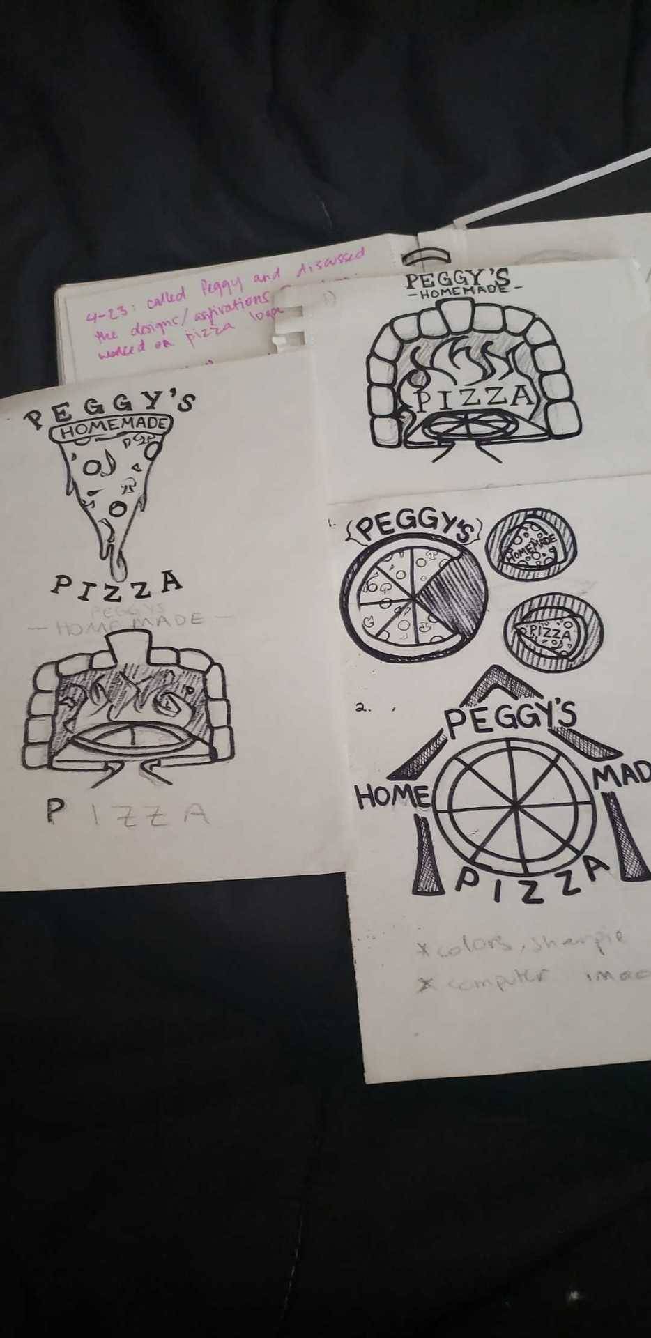
We continued working on our Peggy's Pizza designs. Out of my pictures designs, the dripping pizza and partial pizza got the best reaction so I will continue to develop those ideas for presentation. We also visited a graduate exhibition in Gallery 2 during class and viewed various abstract ceramics works. The artist's purpose to display the inner turmoil she was going through that semester in her life while simultaneously showing how she managed to cope through her artwork.
0 notes
Text
4/15/19- We presented and discussed our Peggy's Pizza logos. The two logos I will focus on developing will be the dripping pizza and the pizza oven logo. We will also be pushing the "homemade" aspect of the business in the logo. We also finished watching a film discussing advertising and different designers approaches to branding and creating advertisements.
0 notes
Text
4/12/19
We finished up our typography poster finals. I primarily worked on cleaning up my lines and erasing any remaining instruments. We did this while our professor was conducting a film workshop at LitCon. We also looked at an art book portfolio of a colleague of Professors Hyams and discussed the value of having a comprehensive art book of your work as a professional portfolio.
0 notes
Text
4/10/19
I started my final typography project and plan to finish by the upcoming Friday. We spent majority of the class period working in this assignment. We also learned about the next assignment, which will be designing a logo for the local pizza restaurant Peggy's Pizza.
0 notes
Text
4/8/19- I finished my practice typography poster board and began my finished copy. I plan to enlarge the letter in the final to make the letters less clear and to clean up the edges. I also would like a more flat wash of ink with no visible brushstrokes and I would like to erase all pencil marks and smudges.
0 notes
Text
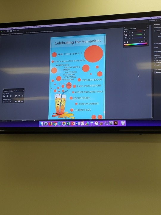
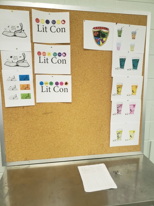
3/29/19- We complete our small version of our abstract typography projects and began working on our 15"x17 1/2" final version on poster board. We also finalized all of our LitCon designs and made finishing touches to the poster design by adding all necessary event information, changing fonts and font sizes, etc.
0 notes
Text
3/20- The class has finally begun to work on the promotional poster poster for LitCon using the glass with ice cubes design. We decided to use a complimentary colors scheme and tried to make the display of event information as freeform and organic as possible since the concept is to have the bubbles from the glass permeating through the composition.
0 notes
Text
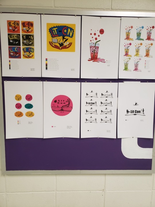
3/18- We made the final edits and printed our designs for LitCon. The clients favorite was the glass with the pink and red gradient, which I enlarged on 11x17 poster paper. She also requested the bubbles be aligned more vertically to fit on the poster without taking too much space.
0 notes
Text
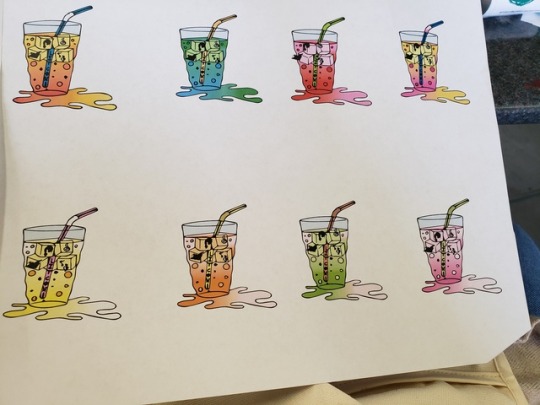
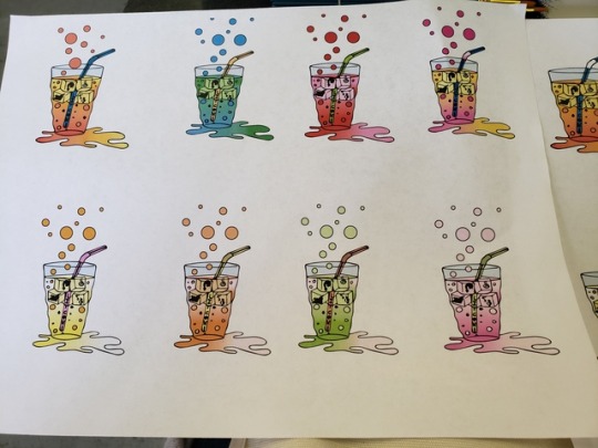
3/8- We discussed our LitCon designs further in class with the client. The client suggested the idea of using bubbles to create interest as opposed to the spill like originally planned. I varied the style of the cup however the client preferred a more rigid appearance.
0 notes
Text
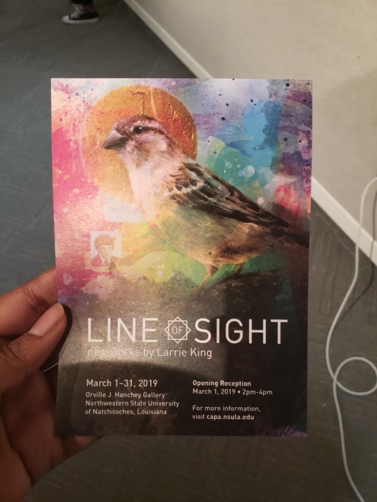
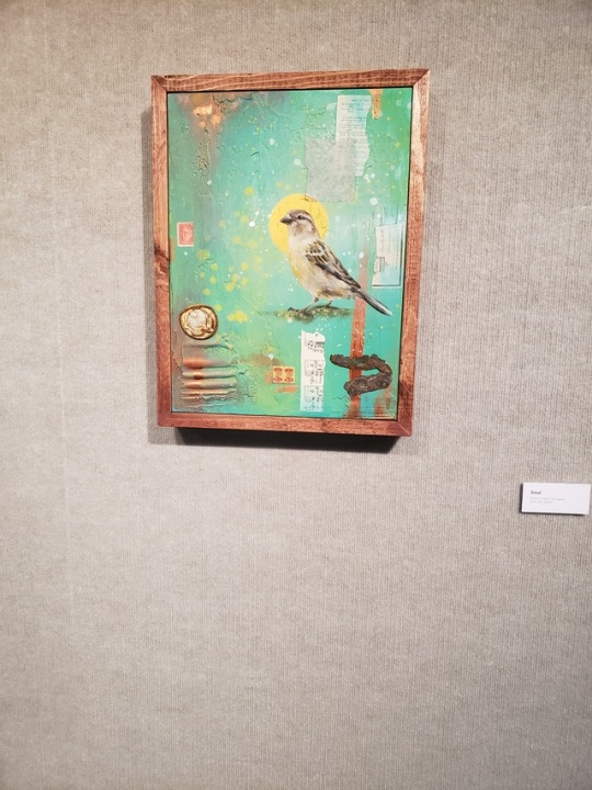
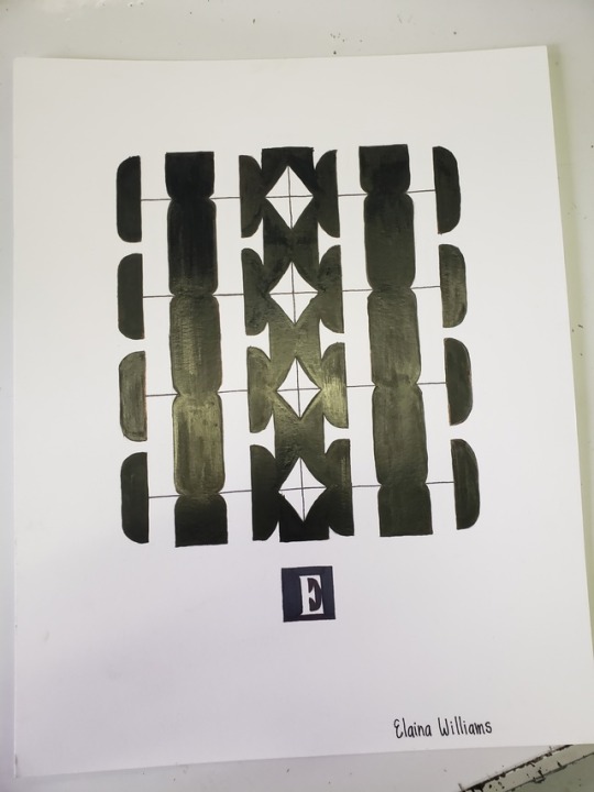
2/29- Today we primarily worked on our typography assignments and coming up with abstract designs using our chosen letters. Towards the end of class we visited our gallery on campus and met the artist who would be holding his opening gallery that afternoon. He discussed his artwork with us as well as the common misconception that commercial design and art cannot mix and encourage the class to continue to actively participate in both.
0 notes
Text
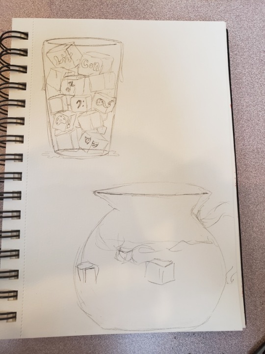
2/27- The client returned to class to examine our logos for LitCon in print and color. We used Adobe Illustrator to duplicate our designs and colorize them for viewing. The client advised me to continue varying designs, focusing mainly on maintaining black lines in the illustration and keeping the puddle at the bottom of the glass that I had in the original design.
0 notes
Text
Last Wednesday we were given the task to broaden our ideas for our LitCon logos. The client specified that she really liked the glass and ice cubes idea so I made a few sketches of variations of that idea.
0 notes