
elysiacampbell-blog
VERTEBRAE
Elysia Campbell First Year Student Fine Arts (Hons) @ UNSW Art and Design. ADAD1002
80 posts
Don't wanna be here? Send us removal request.
Last Seen Blogs

fifa-22-mod-download-12
7DQ# fifa 22 mod download download

roisinrock-blog
Fashion Communication

newjerseyhumanists
New Jersey Humanists

arkytiorthebadwolf
Shooting Across Time and Space!

josesosa1983
chubs,bear, súper bears
Photo


Group Publication ‘Nowness’: Everyday Perspectives
From the perspective of four contributors, this publication endeavours to illustrate the diverse and individualistic nature of our daily lives and experiences of living in the ‘now’. Although the four contributors are similarly studying at University, living in Sydney and are around the same age; we each perceive, interact and move throughout contemporary society in our own individual ways. Through the documentation of products used, objects touched, emotions felt and moments experienced, we are able to glimpse into the personalities, interests and habits of each individual. Each contributor approached this documentation in the creative form that they are most comfortable processing and expressing what they observe the experience the world with, ranging from realistic to illustrative drawing, photographic to text based mediums. These varied approaches demonstrate how each contributor sought to translate their individual perspectives of the world around them, exploring the tangible and emotional connections with the many moments that are what make up our concept of ‘now’, particular to us.
Group Members:
Elysia- black and white illustrations
Annabel- realistic graphite drawings
Stephanie- text based medium
Charlie- photographic medium
8 notes
·
View notes
Text
PUBLICATION:EVOLVEMENT OF IDEAS- our group process summarised.
https://www.instagram.com/flatlays/?hl=enGROUP: Charlie, Stephanie, Elysia and Annabel.
We began our publication development with brainstorming ideas. This process involved general discussion via our group facebook message, with everyone contributing evenly. The convenience of this helped shape our ideas in a more complex manner. ideas were thrown around- but the main jist of the initial discussion was the varied perspectives we all held on ‘nowness’.
An idea of creating an experiment to kick start our publication arose. We assigned one another with the task of producing our visual perspective of ‘Nowness” within a basic clock outline that would show the physical effect of time. The only criteria we gave one another was to stay inside of the format of the clock face & to use the layout to help create a piece that illustrated a certain ‘now’ in history.
Individually we went away and produced pieces inside of the clock framework. This was a good start, which helped us understand the way we comprehend differently and to get a grip of our individual styles.
Annabels experiment:

This piece consists of a varied approach to the ideal female figure relevant to different time periods in history. This approach reveals the gradual progression of beauty within history. Specifically these figures account for the popular culture prevalent amongst western standards of beauty within the past century. Each figure has been illustrated as a symbol of a time period- taking the place of the hour markings on a traditional clock formation- representing time distinctly.
Elysias experiment:

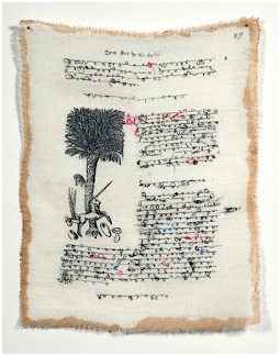
For my first experiment, I wanted to explore the notion of stratigraphy and its relation to recording sequential era’s within history. I had designed a basic clock layout for everyone in the group to use for this experiment, so once I had create a scan of this, I continued on with filling the clock outline in with stratigraphic layers of patterns and colours to demonstrate this concept exploration.
Our initial plans for this assessment included exploring different aspects of evolution in the human and natural world, e.g. cultural standards of beauty, forms of documentation and information distribution, and the evolution of the natural world. My focus was initially about the evolution of the natural world, which can be seen in my stratigraphic experiment. I was also intending on creating an illustrative spread that showed artefacts and objects throughout history. Upon the narrowing down of this concept, we decided to scrap these ideas as they didn’t seem to be completely cohesive with one another, so we then focused on recording our everyday perspectives. This was based off the flat lay illustration that is part of our profile page that I had created.
Stephs experiment:

In the first experiment, I wanted to explore the definition of nowness through a text-based medium. Everyone has their own definition of nowness; some believe that the future is illusional and life is comprised of numerous ‘now’s’; some say that now only exists because of the past and future. No matter which concept you believe in, we must agree that we cannot always be present at this ‘now’ or current moment. Nowness is a state of mind, as one can only experience ‘now’ if they are both mentally and physically present at that moment. In order to describe the everyday struggle of how we cope with nowness, I wrote a piece on how I feel pressured by trying to live in the moment and how, although nowness seems to be a daily life experience, it is actually quite hard to achieve .
Nowness is how we are fully submerged into every single second in our daily life. It does not apply exclusively to happy moments, but all kinds of emotions that you experience. If you are feeling something about what is happening at that moment, you are living in the ‘now’.
From our experiments and discussions, we decided that, in order to illustrate the concept of nowness and living in the moment, we focused on documenting our everyday life to show our perspectives.
Charlies experiment:

For this experiment I initially wanted to explore the concept of “nowness” throughout time through the scope of documentation. I started to research how people have documented their lives throughout history and I found that diary entries provide an investigation into an individual’s “now”, their present life and their experience, so for this experiment I overlayed various diary entries from throughout history from prominent figures such as Josef Goebbles, Ernest Hemmingway and Virginia Woolf, allowing a view into their perspective and their experience of the “now”. I also started to research methods of documentation, and the ways people would document their lives throughout history. The plan being to show a progression through history of the development of documentary tools such as; cave painting; clay tablets; papyrus; pen and ink; typewriters and the printing press, and then onto the digital age with text messaging and photography.
But we decided to proceed with a more cohesive overview of nowness by portraying our own daily perspectives through the objects we use or the places we go. I decided to photograph in a flat lay style all the objects I use throughout a day, splitting it up into the time periods of morning, midday and afternoon.
Visual planning and Design generation:
To follow along with the clock face visual- we researched digital design layouts to help begin with the general foundation of our publication. These are images that we shared in our group chat.
Inspiration images for our design and publication layout can be seen within this post.
13th of October, Group meet up:
We organised a meet up to enable us to solidify ideas face to face. This ignited a progression in our ideas for the publication. the idea of 3 themes of nowness was proposed. From this, we continued to allocate a theme to a spread within the publication.
We specifically decided to look at different perspectives of nowness throughout history. The themes we decided on were:
1.The perspective of beauty in relation to nowness
2.Progression of nature in relation to nowness
3.Documentation and means of communication in relation to nowness
We also discussed possible titles for our publication. These titles help with tying in the concept of Nowness with how we’re looking at perspectives of nowness throughout history.
“Nowness: perspectives within/of time”
“Nowness: a perspective of time”
Note taking and brainstorming throughout our class time lead to us deciding on reducing our workload. Three themes within one publication was TOO MUCH.
Time for plan B:
Feedback helped us in progressing to this point. We decided on really narrowing down with our ideas.
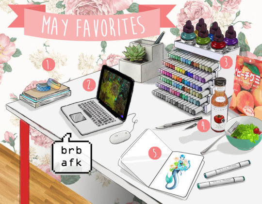
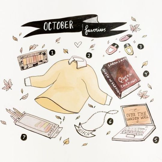
We discussed ideas of nowness in relation to the everyday and habitual. The idea of daily documentation came about, and the trend of ‘whats in my bag’, monthly favourite videos, flat lays and ‘monthly must haves’. Monthly favourites can be in relation to Youtube and technology ( the way these favourites are documented) ‘Favourites’ being objects people own- makeup, clothing, skincare, books, food etc. Monthly favourites are a way of documenting important or significant/interesting/essential items used by individuals in their everyday lives, these favourites are constantly evolving as we are exposed to new things, mirroring the notion of Nowness being every changing.
(hyperlinks will lead you to references)
We all had a fascination with this and wanted to experiment with the idea more in relation to nowness as apart of the every day. Objects in this sense can be symbolic of particular stages of time, and have often owners have associated emotional connections with their every day items. This material based scope of an individuals life, interests and essentials reflects the fact that each perspective of daily life is individualistic and influenced by a persons characteristics, career, schooling, interests, socioeconomic status etc.
This can be shown through our varied approaches to this task- with our contributions to the publication ranging from a combination of creative techniques; realistic, illustrative, photographic and text based. This range shows how we translate what we see and communicates our individual understanding of the world around us.
2 notes
·
View notes
Text
Group Studio Activity Week 11
Curate a series of 10 images that communicate your group’s concept.
Unfortunately, most of our group was unable to make it to the gallery excursion in week 11, so we’ve had to source these images from other places. Below are a series of images and sources that communicate our group concept and form. As we are focusing on the exploration of everyday perspectives, we’ve been quite interested in the cultural phenomenon of documenting objects and thought processes in groups that reflect an individual’s lifestyle and interests at that current moment. Our publication explores the everyday perspectives of each group member, through a number of times throughout the day, and through an overview of what our lives look like currently.
We extended this studio activity to encompass more images and sources of inspiration than just ten, as can be seen below.
Group Members:
Elysia
Annabel
Steph
Charlie
Object Documentation References
Still Life Photography by Jim Golden

http://www.ucreative.com/inspiration/still-life-photography-by-jim-golden/
‘Knolling’

Upon research, we discovered that this kind of flat lay photography of objects is called ‘knolling’ and is quite a popular process of documentation. These images were found in the website linked down below, and we were unable to find direct sources as the website didn’t link them. These images are similar to our own curation of personal perspectives throughout the day (as will be seen in our publication) as they include several objects that seem to be used in conjunction with one another.
https://theultralinx.com/.amp/2013/09/50-amazing-examples-knolling-photography/
Mikkel Jul Hvilshoj
Another photographer that curates objects in a flat lay composition is Mikkel Jul Hvilshoj, whose food photographs are quite beautifully and methodically arranged and shot.
http://www.thisiscolossal.com/2017/10/recipes-organized-into-component-parts-in-food-styling-photos-by-mikkel-jul-hvilshoj/
Text Inspiration
We were also quite inspired by artists who explore concepts through text, using their own handwriting with a stream of consciousness style, as this is the format that one of our group members will be contributing to each spread, due to the fact that they often process their thoughts and understanding of the world around them through writing. Below are some artists that use text interestingly.
Pablo Lehmann uses old text within books and a paper craft technique to create intricate and nonsensical pieces of art, as can be seen in the images below.

http://theexpertsagree.com/2010/01/pablo-lehmann/
Sylvia Ptak actually uses fabric to mimic pages from books, focusing heavily on text. Her style of handwriting is cursive and quite messy, which is also similar to how said group member writes.
Piece from exhibition titled ‘The Unicorn and the Date Palm’ 2008

This piece, ‘Victor Hugo’ 2013, is inspiration in terms of the form of the lettering, as it’s quite messy and edited, seemingly taken from a diary page (it’s actually bases of one of Victor Hugo’s manuscripts).
https://raggedclothcafe.com/2014/11/03/messing-about-with-books-by-margaret-cooter/
Flat Lay Object Composition Reference Illustrations
TODO LO OTRO by Samuel Castano
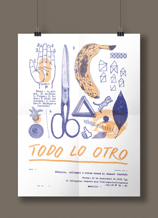
https://www.behance.net/gallery/11207231/TODO-LO-OTRO-(Poster)
Japanese Poster: Pottery and Life by Ryotaro Sasame

http://gurafiku.tumblr.com/post/81483266310/japanese-poster-pottery-and-life-ryotaro-sasame
German Calendar Design
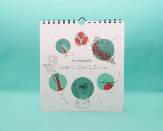
One of our group members (me- elysia) creates illustrations and pieces of art that have circular compositions and layouts, and, following along with our initial clock experiment, we decided that we wanted to use circular layouts in our publication, as they subtly suggest an element of time. This example above, shows how circles can be used in publications to create interesting and dynamic layouts.
https://de.dawanda.com/product/91092551-kalender-saisonkalender-obst-gemuese-2018
Monthly Favourites
(refer to our process post for more information about monthly favourites and how they’ve influenced our publication)
link
Monthly Favourites on Youtube:
Estee Lalonde talks about her recent beauty and lifestyle favourites:

https://www.youtube.com/user/essiebutton
Lauren from Laurenandthebooks talks about her recent bookish and lifestyle favourites:
https://www.youtube.com/channel/UCUeIitiPOwLjwnGVeEKOfXA
Monthly Favourites Illustrations:
EvyDraws:


https://www.evydraws.com/blog/2017/2/12/work-at-home-artist-from-art-school-to-freelance-illustration
Karikun:
https://karikun.deviantart.com/art/Monthly-Favorites-May-2017-686162504
Martina Cecilia:

https://martinacecilia.deviantart.com/art/what-s-in-my-bag-MEME-143365180
Taryndraws: Monthly Favourites
4 notes
·
View notes
Photo


STUDIO EXERCISE: GLITCH
Minor glitch, interfering with a customer’s need for sugar. They may be more hesitant to pick the altered sugar packets up, worrying whether or not they’ve been tampered with.
Elysia
Stephanie
Annabel
Charlie
2 notes
·
View notes
Text
ARTIST STATEMENT FOR ASSESSMENT TASK TWO
Upon reflection of the assessment brief and its relation to my chosen concept surrounding the gender binary, I decided to approach this task by further exploring the ways in which art and design can be used as a platform to encourage discussions of gender diversity, identity, and the restrictions associated with the manner in which gender is perceived and taught within society. As I have explored this concept in a rather abstract manner, focusing more on the aesthetics of colour and patterns as metaphors for the multifaceted and fluid nature of gender identity and expression, I decided to put emphasis on the genderization of colours, namely pink and blue, and the part that they play in the development of children’s understanding of acceptable gender identity and presentation.
Through the process of experimentation, I decided that I wanted to somehow interact with the community through my pieces. I intended to create two artworks that addressed different target markets or ‘age groups’, whose understanding of gender identity and the associated societal restrictions differ due to their stage of learning and perception of the world around them. These artworks include a felt artwork, and a perspex artwork.
Felt Artwork:

As the felt artwork is intended to be displayed as wall decor in a children’s clothing store, or in a child’s bedroom, this component of my final artwork targets not only the age group of small children, as the felt pieces are made using bright colours and with materials that are safe for handling; but are also targeted to the children’s parents. It is targeted to the parents in order to encourage them to think about how they (whether consciously or not) reinforce societal restrictions and norms onto their children through the manner in which they dress, teach and condition them from such a young age; hopefully prompting said parents to subvert these norms and allow their children to have more freedom of expression, particularly in relation to their gender identity as they grow up.
Even though my final artworks explore the subversion of the gender binary and its associated colours in a rather abstract manner, I still wanted to show this gradual subversion visually, which is how the composition of each component of the final artworks came into being. The layered pieces (of the felt component) to the left side of the artwork adhere to the colours associated with the masculine/feminine gender binary, and are also in rigid, geometric shapes to signify the restrictive nature of said binary. These pieces gradually morph into more amorphous shapes, the traditional blue and pink colours first combining and then transforming into multi-coloured pieces.
Perspex Artwork:

Youtube Link:
https://www.youtube.com/watch?v=3bhpCmf7y9U&feature=em-share_video_user
The other final artwork, which consists of a drawing on a Perspex sheet that is rigged up to colour changing LED lights, is targeted at an older and more informed audience, and is intended to be displayed in a dark room within a gallery space. This piece will be used to encourage conversation and questions about the fluid and multifaceted nature of gender identity and expression, and to encourage the subversion of the restrictions associated with the gender binary and its pervasion in marketing, conditioning and the perceptions within general society.
The topographical aesthetics within the piece, which have been abstracted from the first assessment, and throughout the experiments for this assessment task, is intended to allow the viewer to link their understanding of gender to the natural world, suggesting that gender diversity is deeply ingrained in human nature, and is as multifaceted as our topography and geography.
I had initially planned on creating the Perspex component of this artwork on a larger scale, but after reflecting on the costs associated with materials and potential problems that could arise with using several power outlets at once in close proximity; I had to alter my intentions for the piece and create it on a smaller scale, demonstrating the colour changing properties within one piece, rather than having multiple pieces that were lit up with one colour each.
I realise that without the context behind the assessment brief and an understanding of my intentions, these final artworks may seem quite abstract and removed from the concept, or from a general viewer’s understanding. However, I wish to fill a space in the conversations about gender identity and diversity that seems to be rather overlooked by the artistic community, as from my research, most artists exploring the gender binary and gender identity use photo media and text to convey their messages.
Please note that the Youtube video and photographs of these artworks are pieces of documentation, and not the final artwork itself. Due to the nature of this assessment marking and the fact that the Perspex piece can not be truly exhibited in the brightly lit classroom at University, this piece has had to have been documented thorough video and photographic mediums in order to show it as it is truly intended to be viewed. The quality of said videos and photographs seem to be diminished when uploaded to Youtube and Tumblr, so please keep this in mind as well.
Further documentation of these artworks can be seen in the construction posts that have been posted previously.
0 notes
Photo


DOCUMENTATION OF PERSPEX COMPONENT OF FINAL ARTWORK
Link to youtube video showing gradual colour changing effect of perspex piece:
https://www.youtube.com/watch?v=3bhpCmf7y9U&feature=em-share_video_user
(please note that this is not the post with both final artworks within it or the one with the artist statement, that will come promptly).
1 note
·
View note
Text
AT2 Artist Research Bibliography
JeonMee Yoon:
Zuckerman, C. (2017). Colour Code. National Geographic: The Gender Issue, Issue 48, January, pp 12.17
Popova, M. (2009). The Pink and Blue Projects: Exploring the Genderization of Colour. Brainpickings. Available at: https://www.brainpickings.org/2009/12/11/pink-and-blue-project/ (Accessed: 10th September, 2017)
JeonMee Yoon’s official website, Available at: http://www.jeongmeeyoon.com/aw_pinkblue_pink001.htm (Accessed:10th September, 2017)
JJ Levine:
Kulesh, A. (November 12th, 2014). Contemporary Photographers Who Are Playing With Gender. Shutterstock Blog. Available at: https://www.shutterstock.com/blog/5-photographers-who-are-playing-with-gender (Accessed: 9th September, 2017)
JJ Levine Artist Website, Available at: http://www.jjlevine.com/alone-time/ (Accessed: 9th September, 2017)
Chris Rijksen:
Kellaway, M. (September 9th, 2014). PHOTOS: Chris Rijksen Explores Gender as a Performance. Advocate. Available at: https://www.advocate.com/arts-entertainment/art/photography/2014/09/09/photos-chris-rijksen-explores-gender-performance (Accessed: 12th September, 2017)
1 note
·
View note
Photo


CONSTRUCTION PROCESS OF FELT COMPONENT OF FINAL ARTWORK
Materials:
Multiple pieces of coloured felt
Craft glue
Small Embroidery Scissors
Blue tack for display
Nikon Camera for Documentation
Process:
Following the process decided upon in my first experiment and the composition sketch I created in my sixth experiment, I created multiple layered felt pieces in various shapes and colour schemes. This was done by cutting out felt pieces in increasing size, cutting out the smallest first, and tracing a larger version on the next piece of felt, and so on. Once each layered piece had been cut out, they were each glued together.
These pieces were then arranged as planned in the composition sketch upon a white wall, and photographed for documentation.
2 notes
·
View notes
Photo


CONSTRUCTION PROCESS OF PERSPEX COMPONENT OF FINAL ARTWORK:
Materials:
Large Perspex piece
White Posca Markers
LED colour changing light strips set on gradual change
Aluminium tubing for display
Black cardboard for display
Nikon camera for documentation
Process:
Based on the patterns that I abstracted throughout my previous experiments, I carefully recreated them on a large piece of Perspex, using a number of 0.7 white Posca Markers. This pattern drawing process was rather spontaneous, as I didn’t plan out the composition of each piece of the pattern, just went with which area was farthest away from each previous piece of the pattern whilst I let the marker dry. Once the pattern had been completed over the whole surface of the Perspex, I peeled off the protective backing sheet.
To create the colour changing effect, I placed a strip of LED colour changing lights in a length of aluminium open tubing and put this in front of a black backdrop and on a black sheet.
To document the colour changing effect of the completed Perspex artwork, I used the video tool on my Nikon camera and placed it in front of the Perspex in a pitch black room. I then imported it to iMovie and removed the excess sound.
Please note that the film and photos of this piece are documentation of the artwork, not the artwork itself.
0 notes
Text
ASSESSMENT TASK TWO: SIXTH EXPERIMENT- LAYERED FELT COMPOSITION TESTS FOR FINAL ARTWORK
Before creating all of the pieces for the felt component of my final artwork, I wanted to first create two composition tests to inform the placement and patterns in this artwork. I did this by creating a digital composition sketch with possible colour schemes, and also by arranging a number of felt pieces that I had initially created on a wall.
Below is the composition sketch that I created on procreate:

Below are images of the possible felt arrangements. The colours of the felt are actually much different in real life, but photographing them somehow distorts them into darker and less vibrant colours:


0 notes
Photo

ASSESSMENT TASK TWO: FIFTH EXPERIMENT- PERSPEX MATERIAL AND PATTERN TEST
Before I went into drawing the perspex and LED light part of my final artwork, I wanted to make a quick pattern test to make sure that I was happy with the intended result. I am quite pleased with the pattern and know that the white coloured posca marker will interact well with the colour changing LED lights, when displayed in a dark room. This will obviously have to be filmed as a form of documentation, as I will not be able to display this actual piece in class as it will be day time and much too bright.
This pattern is a continuation from my previous experiments, and will combine well with the other part of my final artwork, which includes a wall display of layered felt pieces, subtly bringing attention to the subversion of colours associated with the gender binary and its resulting restrictions.
I had to do this experiment quite small as I only had some space on a scrap piece of Perspex that had previously been used for colour, material and pattern tests. I had also originally planned on creating a final perspex artwork that consisted on multiple stacked pieces of perspex and colour changing LED lights as a 3 dimensional installation, but after calculating the cost involved with buying 7 separate LED lighting strips, expensive pieces of perspex, and figuring out how to plug all of the LED lighting strips in, I realised that this plan is unfeasible. This is why I have decided to stick with one sheet of perspex with the LED strip set on a continuous colour changing pattern, which still demonstrates the fluid and diverse nature of gender identity, expression and presentation.
0 notes
Photo


STUDIO ACTIVITY WEEK 7: VALUE
Value Experiment for Assessment Task Two
Make something related to your assessment 2 project for no more than $5.
For this class activity, I decided to continue on with my previous experiment for my assessment, and create another small piece that can be distributed throughout the community to provoke conversations on gender diversity and expression. I didn’t end up having any double sided sticky tape, so this will have to be applied to the back if individual’s want to use this sticker.
The rainbow colour scheme and amorphous repeat pattern is a continuation of the patterns within my experiments and previous assessment.
0 notes
Photo

Just a reminder to keep the criteria in mind while working on your Assessment 2 projects.
Here is the process I went over in class - as I mentioned this isn’t linear or singular but a suggestion for how you could think about structuring your practice-led research:
Reflect on your poster and think about whether there are any themes, ideas, processes, materials you want to keep exploring. You need to keep the same topic but you can progress in whatever direction you like from Assessment 1.
Devise some experiments/tests and then iterate one you find interesting
Iteration means repetition with variation - the variation could be adjusting a small parameter or something larger like translating to a different material or changing scale, colour etc - repeat, repeat, repeat!
Critically reflect on your experiments to work out what you want to develop and why
Alongside this do contextual research to develop your project. Research the work of other creative practitioners working with similar ideas/processes/materials. Look into theory around your topic
Once you have a series of iterations documented to Tumblr, think about refining one or some of those into the final work(s)
Together the iterations and final work(s) are your Body of Work. You need to reflect on your project in relation to your research in your Concept Statement
16 notes
·
View notes
Text
AT2 ARTIST RESEARCH: CHRIS RIJKSEN
‘Gender as a Performance’ 2014, photographic series created using an old wire shutter-release camera
The artist’s photographic series ‘Gender as a Performance’ exhibits a number of self portraits, where the only variant throughout the photographs are the clothes and the accessories that the figure dons. The artist wished to explore the notion of gender as a performance and the fluidity of gender presentation, provoking questions of identity and expression through a photographic medium.

Gender as a Performance 001

Gender as a Performance 003

Gender as a Performance 006

Gender as a Performance 0011
https://www.advocate.com/arts-entertainment/art/photography/2014/09/09/photos-chris-rijksen-explores-gender-performance
0 notes
Text
AT2 ARTIST RESEARCH: JEONGMEE YOON
‘The Pink and Blue Projects (2005-Ongoing)
I had previously read about this project in a National Geographic magazine quite a few issues back, so I decided to do some further research into their work once I remembered that they explored the colours associated with the masculine/feminine gender binary.
Yoon highlights the extent to which colours are stereotypically designated to different genders, and how they play a large role in the upbringing and merchandising of children’s clothing, decor, toys and belongings.
In their photographic series, the artist reveals the absurd yet normalised tradition of specific colours being used to reinforce gender stereotypes, demonstrating how such behaviours influence children’s understands of acceptable gender identity and expression from such a young age.
This photographer’s series exhibits the exact reason why I intended to subvert the colours associated with the gender binary, and is a good reference point.
It’s interesting to note that before 1914, the colours associated with young boys and girls were actually flipped, where boys were traditionally dressed in pink, and girls in blue. The first high school that I attended was an all girls school, and the uniforms and buildings were both shades of pink, which is interesting to note in regards to colours continuing to play a role in shaping and reinforcing gender expression throughout a child’s later years.

The Pink Project- SeoWoo and Her Pink Things (Light jet Print, 2006)

The Blue Project- Jake and His Blue Things (Light jet Print, 2006)

The Pink Project- Tess and Her Pink Things (Light jet Print, 2006)

The Blue Project- Woojea and His Blue Things (Light jet Print, 2007)

0 notes
Text
ASSESSMENT TASK TWO: FOURTH EXPERIMENT- COLLABORATION & COMMUNITY
After creating the pattern in experiment three, I wanted to apply this to one of the weekly topics, and decided that creating a set of brooches that could be worn by individuals from our community would explore this topic well. I created three brooches, one of which being made from the same felt layering techniques that can be seen in previous experiments, and the other two being made out of shrink plastic. I wanted to create something that would allow expression of gender diversity, following along with my concept of subverting the binary colours associated with masculine/feminine gender binary.
The felt brooch was the first I made and didn’t end up working well enough. It is too large and the beaded fringe isn’t aesthetically pleasing. To be frank, I could have created a much better piece if I had the time and resources, but as this is just an experiment and I realised early on that it wasn’t going to work, I didn’t put too much effort into this felt brooch. I was initially going to make another felt brooch with an amorphous design that can be seen in previous experiments, but decided to explore a different medium instead. Below is an image of the felt brooch.

The pieces I made out of shrink plastic turned out to be much more satisfactory, and I am quite pleased as this is the first time i have used shrink plastic and it was a fun material to work with. This is definitely a medium I will explore further in the future (not for this assessment though), I may see if I can use a full sheet of the shrink plastic and use it as a canvas to be mounted to the wall.
I ended up making four small shrink plastic pieces, but as two of them turned out way too small to be mounted with a brooch fastening, I have decided that they will work better as stud earrings (I don’t have the earring posts on hand so I can’t complete them). I also experimented with different drawing materials, two of which using coloured pencils, the others using gel pens. I have inserted an image showing how these brooches could be worn to spread awareness about the multi-faceted nature of gender identity and expression, and I think that they could be a great conversation starter for this.
Below are two images of the pieces before they were shrunk. The colour is quite patchy in the coloured pencil pieces, and if you look closely you can see cross-hatched scratches that were made from using an old piece of fine grit sand paper (which was recommended by the instructions on the shrink plastic) in an attempt to get the colour to hold better on the plastic.


Below is an image of the pieces once they were shrunk in the oven. The colours intensified quite a bit, and interestingly, the purple gel pen I used turned white, which was expected as it was of the erasable variety.

Below is an image of the back sides of the pieces, which I think look quite good as well as the front side as the colours are more muted and soft.

Below is an image of the brooch fastenings being attached.

I have also included an image of how these brooches could be worn by people in the community as conversation starters about gender expression and diversity.

0 notes
Photo

ASSESSMENT TASK TWO: THIRD EXPERIMENT- PATTERN CREATION
For my third experiment, I decided to further abstract the colours and amorphous shapes evident in my previous experiments by creating a pattern in my sketchbook using multiple coloured pens.
This pattern has helped to inform the possible materials and style that will be part of my final work. I am next going to experiment with using posca markers on perspex. To create a piece of artwork that exhibits a full colour spectrum whilst only using white posca markers, I will most likely be using colour changing LED lights to change the colour of the markers on the perspex piece. I have worked with this medium before and feel that it would work well with my concept of colours being suggestive of the multifaceted nature of gender identity and expression.
(please note that the colours are actually brighter and more pigmented in real life, my scanner tends to wash out any sort of colour).
0 notes