
Don't wanna be here? Send us removal request.
Statistics
We looked inside some of the posts by emceetee and here's what we found interesting.
Average Info
Notes Per Post
1
Likes Per Post
1
Reblog Per Post
0
Reply Per Post
0
Time Between Posts
13 days
Number of Posts By Type
Text
5
Last Seen Tumblr Blogs


Fun Fact
Premium Tumblr themes are available from anywhere between $9 to $49.
Text


When doing research, I enjoy watching documentaries. For more information on graphic design and typography, I came across Abstract: The Art Of Design on Netflix. This docuseries examines the creative processes and inspirations of some of the world’s leading designers across various disciplines. Each episode focuses on a different designer, providing an intimate look at their work, philosophy, and impact on their respective fields and how design influences everyday life, shaping our environment.
One standout episode features Jonathan Hoefler, a well-known typeface designer recognized for his work on fonts like Hoefler Text and Gotham. This episode explores Hoefler’s meticulous design process and his passion for the history and evolution of typefaces. Hoefler discusses the balance between aesthetic appeal and functional readability, illustrating how typography is both an art and a science. The episode also highlights his collaborative work environment and the extensive research that informs his design choices, offering viewers a detailed understanding of the complexities involved in typeface design.
I gained more knowledge on how profound the impact of typography has on communication and visual identity. Through various examples, including corporate branding and political campaigns, I better understand how typefaces convey tone, credibility, and emotion. I also saw how Hoefler’s insights reveal typography's invisible yet powerful role in shaping public perception and enhancing the clarity of written language.
0 notes
Text

Easily one of my favorite typography assignments this semester! I was learning the history of a typeface, which involved exploring the blend of artistic, cultural, and technological influences that shaped its creation and evolution. Each typeface has a unique story tied to its era, designer, and impact on typography. For instance, Helvetica, created in 1950s Switzerland, reflects post-war modernist ideals of clarity and objectivity.
Understanding a typeface's origins helped me better comprehend the personalities and intentions of its designers. With that knowledge, the historical context enhanced my appreciation of typography and its presentation in contemporary design, highlighting the timeless relationship between form and function.
0 notes
Text
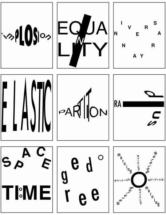
Scale, Depth, and Motion
At first, I was a little intimidated by this assignment. My artistic skills could be improved when dealing with typography. Like most assignments, I researched how to approach it and created a plan. The first few attempts frustrated me because I wasn't satisfied and felt it lacked creativity. Eventually, I started experimenting with different styles and layouts. Then, I found inspiration and a solution to apply to the text. I chose a word and envisioned it as an image, then attempted to create that image and form it with letters. I gradually began to appreciate the challenge and enjoyed the creative process. The project ultimately boosted my confidence in working with typography while expanding my artistic capabilities.
0 notes
Text
AFROFUTURE-ONIA
Campus trip to THE AFROFUTURE exhibition.
The iconic duo OutKast, featuring André 3000 and Big Boi, played a significant role in the Afrofuturist movement. They revolutionized the music industry with their fusion of funk, hip-hop, and futuristic soundscapes raising them to legendary status. Through their music, visuals, and album cover images, OutKast embraced Afrofuturism as a means of exploring black identity, history, and culture.

I was drawn to the artwork WELCOME TO STANKONIA by Samuel Sharpe. It immediately took me back in time, envisioning OutKast’s ATLiens album cover art. Extraterrestrial beings against a futuristic backdrop symbolize their departure from Earth and reflect on the alienation and displacement experienced by African Americans.
Sharpe’s imagery embodies Afrofuturist themes by blending elements of science fiction, fantasy, and black culture. Sharpe captures the visuals true to the duo. I was intrigued by how today's youth can connect with the past, interpret, and pay homage in their own unique way.
0 notes
Text
Black To The Future
I visited the National Museum of African American History and Culture and had the opportunity to see the Afrofuturism exhibition.
The exhibit displays a fusion of African American culture, technology, and visions of the future across different time periods. As soon as you enter the room, you’re hit with bold colors, artistic, futuristic images, and black faces that include a wall of album covers from a range of black artists such as Miles Davis to Janelle Monae.

The room is comprised of diverse artworks, multimedia installations, and interactive displays. It showcased the creativity of black artists from several fields while encouraging thought-provoking discussions exploring identity, empowerment, and social justice within the context of Afrofuturism.

It’s a envision of a world where black experiences are central and marginalized voices reimagine the future and challenge existing power structures. Afrofuturism provides a space for creativity, innovation, and liberation, inspiring individuals to envision new possibilities and the potential to transform our understanding of the past, present, and future.
1 note
·
View note