emilyknightsequentialimage
Emily Knight Sequential Image
A sequence following the idea of morning routine
23 posts
Don't wanna be here? Send us removal request.
Last Seen Blogs

mummykatee
I’m A Mistress Looking For A Sub Slave To Train

cobalien
heaven help us

nishabila
Endless Inspiring
las-cartas-de-paloma
P.D. Siempre Tuya... ©
gciardi
GCanni
Text
Project Proposal
Emily Knight 1011215
6th February 2020
Sequential Image
Theme: Daily Routine
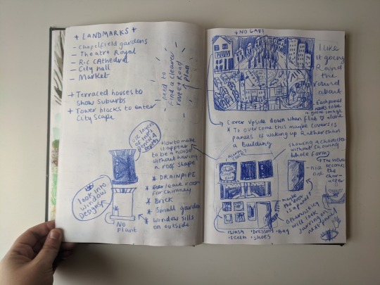
I chose the theme Daily routine as it leads on nicely from my Observation and Experimentation project. In my last project I focused on my place of work (Norwich Market) and the people using the space. This time I want to focus on my daily routine, of waking up and walking to work, and everything else in between. Finding beauty in the mundane of my daily life.
My strengths in Observation and Experimentation were perspective, composition as well as drawing the architecture of Norwich. I feel like the theme of Daily Routine will challenge me in all three of these areas and will help me build on what skills I already have. I really enjoyed sketching the structure of the Market so it will be interesting to see how I tackle a variety of buildings and landmarks to illustrate the walk to work.
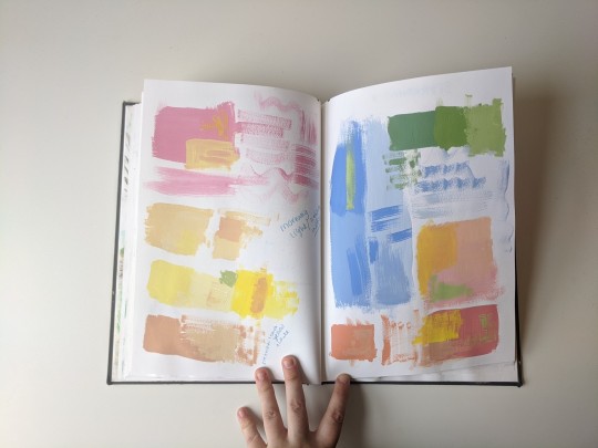
An area I struggled with last term was tone. I had a small break through at the end of the project, but I want to push myself to feel comfortable with a variety of tones. I chose Daily Routine as tone will be vital in showing the audience what time of day it is. I will start tackling this by expanding on the technique I used last term of layering ink and pencil crayon to create richer tones and observing and sketching throughout the day to learn how the light changes buildings and people.
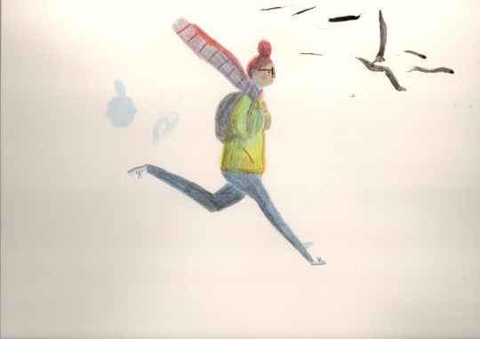
Turning myself into a character will also be a challenge. I have learnt how to observe and draw someone else’s body language but have never drawn my own. I am unsure whether I will use my whole figure in the sequence or what perspective it will be from, but I want to start drawing myself doing daily activities even if it’s just to get a sense of movements used.
0 notes
Photo


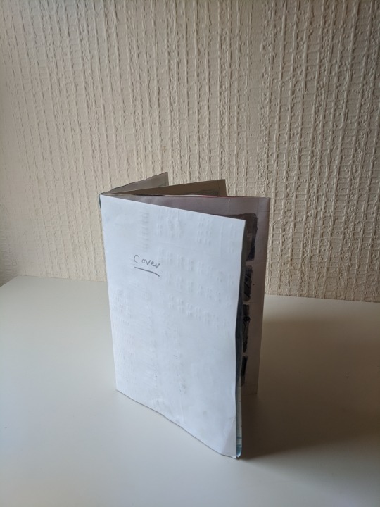

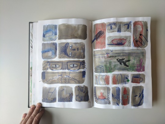
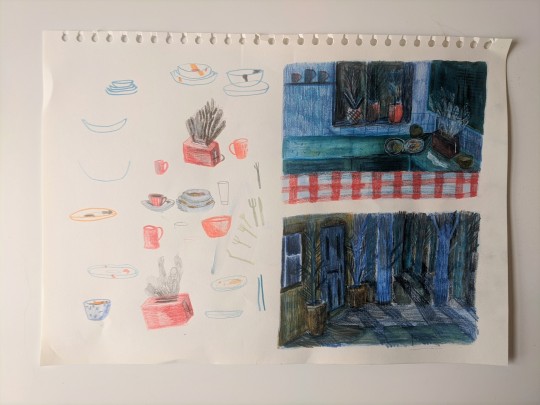
How my Book Unfolds
My sequence is in a slit book design, the map fold out is A1 and each page is A4.
0 notes


Photo

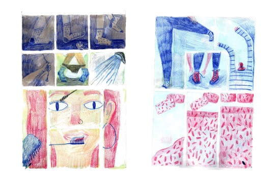
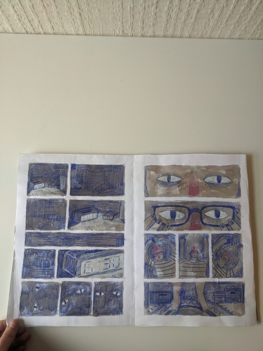
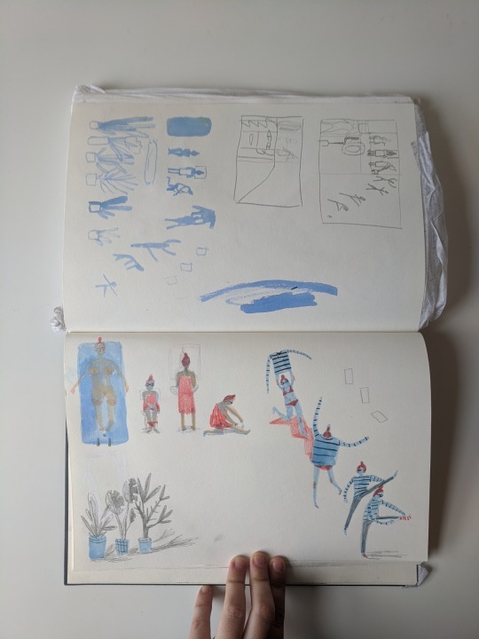
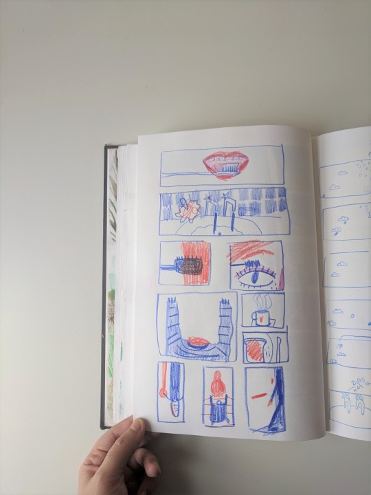
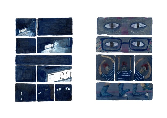
First Draft
Feedback from my peers was that the pace was too slow for someone in a hurry. Some of the panel shapes were working but others were too equal and suggested a steady pace throughout.
0 notes
Photo

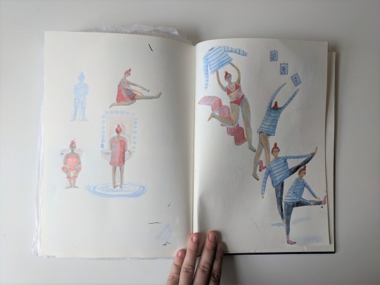
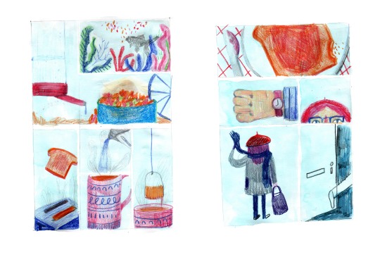
Second Dummy Book
This draft I tried to mostly focus on quickening the pace as well as making the whole routin feel more frantic.
0 notes
Photo


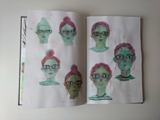
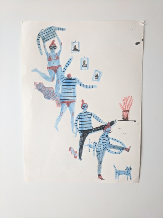
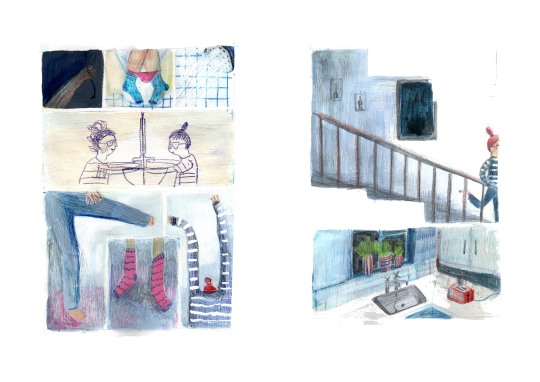
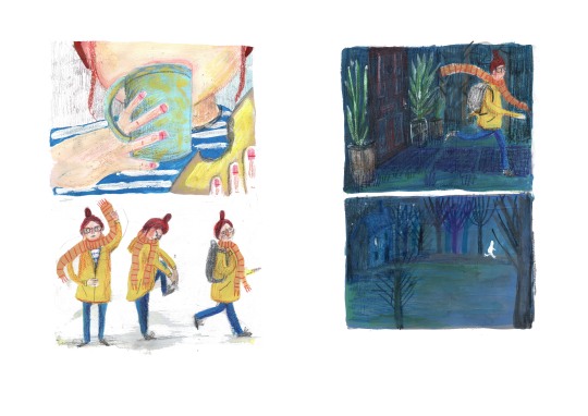
Third Draft
I liked the pace of the first spread from the second draft so decided to keep it the same. I understood I will have to redo the artwork as the character evolved and I used less paint and more ink in this dummy.
In the second spread I feel like I finally understood and was comfortable drawing my character and the space she lives in.
The final spread I think works well but needs a less relaxing kitchen scene. The characer also needs longer legs and arms.
0 notes
Photo
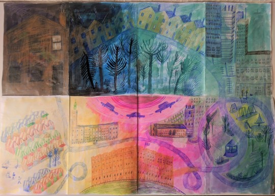
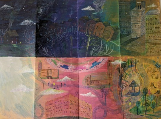


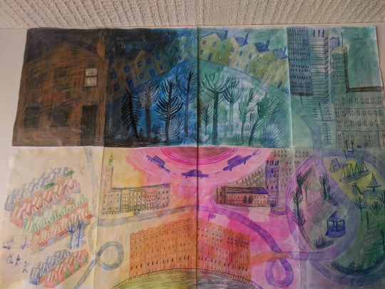
Map Drafts
Originally I designed the fold out map to be in landscape. I wanted it to have a circular feel with the reader following a roundabout in the centre of the map. I shrunk the house size in the second draft as it was standing out to much and creating tension and interrupting the circular feel.
The main issue I was having was blending the panel with the one below it. After changing to portrait, although it lost the circular path aspect, it felt easier to follow and like it had an end.
0 notes