Don't wanna be here? Send us removal request.
Statistics
We looked inside some of the posts by emilyloudwellmultiverse and here's what we found interesting.
Average Info
Notes Per Post
0
Likes Per Post
0
Reblog Per Post
0
Reply Per Post
0
Time Between Posts
1 day
Number of Posts By Type
Photo
11
Text
5
Link
1
Last Seen Tumblr Blogs


Fun Fact
The KCSC sent more than 20K requests to delete posts related to prostitution and porn to Tumblr from January to June 2017.
Photo


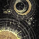
My outcomes
“Space” (top left)- this piece is inspired by the words space, universe and cuboid. I used the Rorschach ink blot process with my gouache paints to create a symmetrical painting whilst referencing photographs of space to include colours that I saw. I used gouache so that I could vary the opacity of some colours to allow others to show through.
“Astral” (top middle)- this piece is inspired by the words astral, universe, dimension and divine. i used the same Rorschach ink blot process as the previous painting but used bright colours to symbolise my view on the word astral. after the paint had dried i used black gel pens in a two handed drawing technique to outline and draw around some prominent colour patches. i began to notice it taking shape of a skull with horns, which allowed me to link it to the word divinity (the horned god).
“Universe” (top right)- these pointillism pieces are inspired by the words universe, space (positive and negative as well as literal space with planets) and white noise. I used pointillism as a process here because it reminds me of white noise static.
“dimension” (bottom left)- the spirograph side is inspired by dimension, cuboid (symmetry, geometric) and time. the right side is inspired by dimension, universe, space and time. for this piece i used gouache paints of different shades of blue to give a 3 dimensional effect of layers.
“home” (bottom middle)- the left side of this spread is inspired by time, botany and element and I used gouache paints.
“future” (bottom right)- This futuristic piece is inspired by universe, space, time, dimension and astral. I used gouache paints as well as a white gel pen.
0 notes
Photo


This is the image I used to fold my zine. I made two of these and stuck them together to make a zine with 12 pages.
0 notes
Text
Multiverse evaluation
There have been many challenges I've had to face in this project. This being the shortest project I've had to do (three weeks) I have struggled to produce outcomes that I'm happy with. In addition, it has been a challenge getting used to working from home without having an actual place to be. Usually the thing that would motivate me to get up and go to college was the fact I had an environment full of supportive people to go to. Now I get out of bed and walk 3 steps to my desk to be greeted with support through my laptop, it's not quite the same. On the contrary, I have been receiving all the help and advice I need through emails, information put onto google classroom and weekly online meetings. This has definitely helped me feel less stressed and much less alone. Even with these challenges I feel I can be proud of what I've achieved and the way I have worked off site considering the circumstances.
The theme of this project is multiverse. It's a MARS project so I had to make sure I was thinking about including math, art, religion and science into my work.
I began my project by focusing on researching my chosen words, as well as zines. I later moved on to researching artists and their processes that I hoped to use in my outcomes, for example Tony Orrico (a human spirograph artist), Kelsey Hammerton ( a pointillism artist) and Nick Taylor (a zine designer). Due to working offsite I have had to adapt what processes I can do at home without the proper equipment, so I went back through previous project sketchbooks and picked out a few techniques I enjoyed doing. These techniques included pointillism, two handed drawing, ink blotting and spirographs. After doing the research I needed I began planning and completing my outcomes. As a result of limited time I feel the outcomes I have produced aren't up to the standard of work I am capable of producing, and I had some very different initial ideas on where I wanted these outcomes to go. That being said I enjoyed using all the processes I had researched, plus I bought some snazzy new gouache paints!
The materials I used for this project were pretty simple as I didn't have access to college equipment. I decided early on in the project that I wanted to do this zine all hand based to give myself a short break from working digitally. I mainly used gouache paints, and I especially enjoyed using them to do my ink blot pieces. The particular reason they worked so well was because of their watercolour like personality, I could change the opacity of different colours to let other colours show through. An example of this is on the “space” pages, I chose to make the yellow opaque to allow the blues and pinks to come out from underneath. Alongside these paints I used uni-ball eye (black) and uni-ball signo (white) gel pens to outline and draw designs. I used the black pen for my pointillism pieces because it has a good ink flow and makes nice dots.
To make my zine I used good quality sketchbook paper and folded it in a common zine way. I made two of these and stuck them together to make a 12 page zine. It measures roughly 7.5 cm by 10 cm and I felt this is a good size because I wanted to make a small zine so I didn't give myself too much space to worry about filling. A preference of mine when creating is in miniature or smaller than average scale because having lots of space to fill on a page can be overwhelming, so this zine was a perfect size to get my context across to the viewer without having to fill large pages.
Conversely, my spirographs would have turned out better if they were on a slightly larger scale. This is because being on a smaller scale the design didn't quite match up geometrically, so when it came to fill in the design I struggled to find a common pattern. To make my spirographs I cut out a circle and a square from a very thick card. I then put a pin in one side/corner and drew round the shape, I would move it slightly clockwise and draw round it again. Each time I moved it I would keep the distance the same, this is where I think it went wrong because of the small scale I couldn't measure exactly how far I was rotating the shape each time.
Throughout this project I have been analysing what I've been doing each week and what I plan on doing the following week. This combined with having a cork board above my desk with the project plan and checklists has helped me to organise my time to get all the tasks done on time. I have managed my time well and I feel, even with one not-so-great week, I have been able to hit each assessment criteria.
0 notes
Text
Materials used in this project
Uni-ball gel fine liner (black)
Uni-ball signo gel fine liner (white)
Arrtx gouache collection
Black acrylic paint
Homemade spirographs in the shape of a circle and square
Multi surface paint pens
My laptop for research, uploading things to my blog and keeping up with google classroom every day. (google, pinterest, instagram, youtube, tumblr)
0 notes
Text
Wednesday 27 th January Complete your evaluation (see the handout assigned to GC) 1000 words min and paste to your blog with imagery to support your creative review and practice
Thursday 28 th January Add analysis to your blog each week (like a diary entry) highlighting your personal development on your project creatively PLEASE make sure you add commentary on how you this has informed your personal development and changes throughout the project
Friday 29 th January Complete your evaluation (see the handout assigned to GC) 1000 words min Work on your blog and add any analysis or reflection to gaps
After getting my interim assessment feedback I have been focusing on getting all the targets completed and any missing work onto my blog. Having this assessment has really helped me understand where I am in the project in terms of tasks done and what needs to be added/improved. I have also been going back through my blog and adding more detail to posts like my research posts. Next week I aim to get my evaluation finished and to continue working on improving my blog.
0 notes
Photo

Some initial ideas for pages within my zine. I pretty much stuck with this plan because I didn't have much time to experiment with different ideas and processes. I also didn't manage to get all 12 words into the zine but I'm happy with the amount I have included.
0 notes
Photo


Tony Orrico “The Human Spirograph”
https://tonyorrico.com/biography/
Tony Orrico is a graphite artist who creates large scale geometric pieces. Orrico uses a two handed drawing technique to create symmetrical patterns around his body.
“I commit my attention, rationally, to the sensitivity of my body at the receptive level— ready points and lines in space. I attain a sense of embodiment that is geometric and mechanical. With no dominating sense of axis or directional force, and find the ability to motor from invented traction. The course is non-objective; it is a continuation of pathway and response to stimuli.”
Lesley Halliwell
http://www.lesleyhalliwell.com/
Lesley Halliwell is an artist who uses spirographs on a very large scale to produce stunning geometric mandala style pieces of work. Unlike Orrico, Halliwell uses brightly coloured ball point pens which makes each part of her design stand out. She overlaps each spirograph which allows the colours to blend and transition smoothly.
I chose to research spirographs as a lose link to cuboid because when I think of cuboid I think of geometric shapes and symmetry. I also chose Orrico because I wanted to include his two handed drawing technique in my zine.
0 notes
Photo

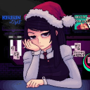
Where I work and how I'm keeping sane this lockdown
0 notes
Text
Wednesday 20th January
1. Evidence planning- each week please make sure that you have added a weekly learning and set objectives.
2. Add 5 examples of artwork from an artist or designer that has use a creative technique or practice that you are keen on learning for example wood print, lithograph or a digital software
3. Start to evidence practical work – please add 3 examples of artwork that you can produce at home, this could be photography, drawings, illustrations, Photoshop work, digital illustration. YOU WILL NOT BE DISQULAIFIED for the lack of materials at home but you must be seen to be working with the resources that you have at home.
4. Photograph, screen grab and add to your blog with creative analysis
Thursday 21st January
1. Add a photograph of you working or your working station
2. Add a list / example of all materials and software’s that you are using
3. Add a plan of an outcome that you would like to complete with an example (draft drawing or mock up)
4. GRAPHICS – complete a poster, collage, postcard, zine on the 12 words (Type) (if you wish)
5. You have complete flexibility on what you would like to complete as an outcome BUT you are second years and there is an expectation that you challenge yourself and so not opt for the easy option.
Friday 22nd January
1. Complete your outcome/s
2. Evidence the journey of the outcome PLEASE add photograph the stages with analysis
This week I have begun to plan and create my outcome, which has been a challenge due to lack of resources and time to experiment. I am working towards a pocket sized 12 page zine based on my 12 words. Much of the art within the zine is broad and open for interpretation from the viewer as to which words they link to specifically. I will be adding images of my outcome and explaining the processes next week.
I have continued to add research of designers, artists and processes onto my blog, all of which are possible for me to do at home with limited resources.
0 notes
Photo


Rorschach Inkblot test
The Rorschach inkblot test is a test created by Herman Rorschach to study the personality and emotional functioning of mental health patients. His goal was to create a test that could be used in the diagnosis of schizophrenia. To take the test a patient is shown a series of 10 inkblot images and has to study and describe them within 30 seconds. The results of the things they pick out determine their mental health.
The beauty and possibilities of things to interpret within the inkblots used for the test intrigue me, which is why I have used this process in association to my chosen words; cuboid (symmetry), astral, divinity, space and universe.
https://www.verywellmind.com/what-is-the-rorschach-inkblot-test-2795806
0 notes
Text
Wednesday 11th January
1. Research the theme MARS
2. Select 12 words from the list
3. Add 12 supporting images onto your blog that sign post the words
4. Add 12 paragraphs / spider diagrams or written analysis on the 12 words
5. Write a description on what is meant by CONTEXT within Graphic Design
6. Add an example of a piece of artwork where CONTEXT has been at the forefront of the artwork
Thursday 12th January
1. Highlight on your blog why understanding the context of a subject is important, for example – I want to produce a piece of artwork based on famine BUT firstly I must understand what famine means, where in the country does it exists and what are the facts and figures in 2021 regarding famine – as an artist why is this is crucial?
2. After you have selected the 12 words GRAPHICS stick with your 12 words
3. Please add a 500 words commentary on why you have selected the 12 word or the 1 word 500 words
4. GRAPHICS please research ZINES where did they originate. Why are they used for communicative context? Add imagery and examples of them on your blog? Can you find examples of some relating to your 12 words? How are they made? What materials are used to make them?
Friday 13th January
1. ADD 10 artist / designers to your blog for the project
2. The 10 artist must relate to your CONTEXT (these are your words or word) OR zine designer / installation artist
This week I began by choosing 12 words from the list given. I then proceeded to research these 12 words, adding images of initial ideas to my blog and creating spider diagrams for each word. making these spider diagrams has helped me understand the context of each word and what type of art is associated with them. I explained why I chose the 12 words I did and which direction I wanted to take my artwork with them, which has made me have a clearer vision for my outcomes.
Looking at context within graphic design and why it is important has helped me better understand the art work and artists I have been researching. I will keep researching and referencing artists on my blog throughout the project.
Next week I aim to plan and start my outcomes. Planning what I will be doing will be beneficial because I’ll be able to gauge what/how much I can achieve within a week.
0 notes
Photo


Wild Oak Design
Wild Oak is a blog I found on Tumblr creates stunning nature scenes using gouache paint. Their use of tone creates brilliant 3D style paintings that draw the viewer in. Their use of greens and oranges make the paintings feel warm and full of nature. I chose this artist to link with “botany”.
https://wildoakdesign.tumblr.com/
Melanie (Visual Mind)
Melanie is a gouache and watercolour artist who likes to focus on nature, landscapes and occasionally animals. I was drawn to Melanie’s work because of their use of bright bold colours which are sometimes used in unnatural ways, like purple mountains and orange grass. Alternatively, they produce stunning more realistic paintings (pictured bottom left), which shows how diverse their work can be.
https://www.visualmindart.com/
0 notes
Photo


Kelsey Hammerton - pointillism artist
https://www.instagram.com/blackdotcreations/
Kelsey Hammerton is a pointillism artist I found on Instagram. Their works mainly focus around animals; dogs, farm animals, ocean life and exotic animals. I was particularly drawn to Hammerton because of their focus on shadows and highlights by varying how clustered the dots are and how much detail is in one piece.
Kris Bromley - pointillism artist
https://www.instagram.com/krisbromleyart/
Kris Bromley is another pointillism artist I found on Instagram. Bromley’s work is very different to Hammerton’s in that they produce much simpler and smaller pointillism pieces. Even though their work is small there is still a great amount of detail in each piece. Bromley combines both line art illustration and pointillism for working in tones and texture to their drawings.
I chose to research pointillism because I felt like it portrays white noise well. The dots within a pointillism piece remind me of the static most commonly portrayed as white noise, and the ability to form dots into an image means I can combine words together within my zine.
0 notes
Photo


For my outcome I am aiming to create a 12 page mini zine
0 notes
Photo


Space Junk by Nick Taylor
“'Space Junk' is a 32-page zine of cosmically-inclined black and white collages, cut, collaged and curated by myself between 2012 and 2017. The zine measures 5.5 x 7.75 inches/14 x 19.5cm and has been digitally printed by Footprint Workers' Co-op in Leeds with a look and general feel of the golden age of xerox zine-making.”
https://nicktaylorillustration.co.uk/
0 notes
Photo


Winter Wild by Kristyna Baczynski
“Winter Wild is a pocket companion for discovering winter plant life - nourishing knowledge for the dark side of the year.
This book is a blend of writing, research, drawings and comics about ten different plant specimens; all drawn in detail for identification. An illustrated selection of historical, scientific and mythological facts.
The plants included in the book are native to Europe and The British Isles; great if you are planning a winter visit, or are a resident wanting to spot some fancy foliage on your next hike.
This book is the first issue in a series of seasonal plant zines.”
Baczynski’s use of blue tones effectively portrays the main theme of the zine; winter, by mimicking the coldness of winter. This zine was produced digitally, similar to Baczynski’s comic drawings, and I chose this zine specifically because it fits in with my botany theme.
https://www.kristyna.co.uk/
0 notes
Link
“Most definitions of zines include the fact that they are small-circulation, self-published, and often inexpensive or free.”
“The first zine is often traced back to a 1930s effort by the Science Correspondence Club in Chicago. It was called The Comet, and it started a long-lasting trend of sci-fi related zines.”
“In the ‘70s and ‘80s, the main hub of zine culture became the punk scene in London, LA, and New York. Compared to the earlier sci-fi zines, punk zines had a grungier, DIY aesthetic that reflected the subjects being covered.”
“In the 1990s, zines flourished again thanks to the riot grrrl scene. As an alternative to the male-driven punk world of the past, riot grrrl encouraged young girls and women to start their own band, make their own zine, and get their voices heard.”
“The rise of the internet has helped make the cost of production almost zero, and online zines such as Plasma Dolphin, Pop Culture Puke, Cry Baby, and Cherry have brought young artists together to collaborate.”
0 notes