emmachine22
Emma Shean
AUB visual communications course, 21
446 posts
Don't wanna be here? Send us removal request.
Last Seen Blogs

nattasan
Nattasan

yesactuallyican
Honestly? I have no idea at this point.

dunplease
im cute and i should get paid for it

keentimemachinedaze
Untitled
Text
27/04/24 - Interesting Points on Streets
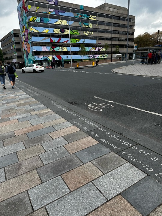
This weekend I went to Southampton, where despite the grey weather and plain architecture, the streets had many interesting elements to them. I took photographs to document for my project as primary research.
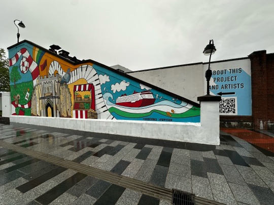
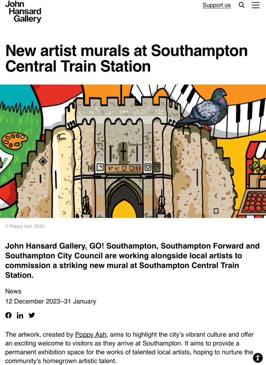
As soon as you exit the train station, there is a beautiful and colourful mural painted over the side of what appear to be abandoned office blocks. This automatically makes the city feel more welcoming, however the contrast is very stark. I feel it is obvious in the positioning and aim of the mural; to make Southampton look nicer than it is, like putting lipstick on a pig.
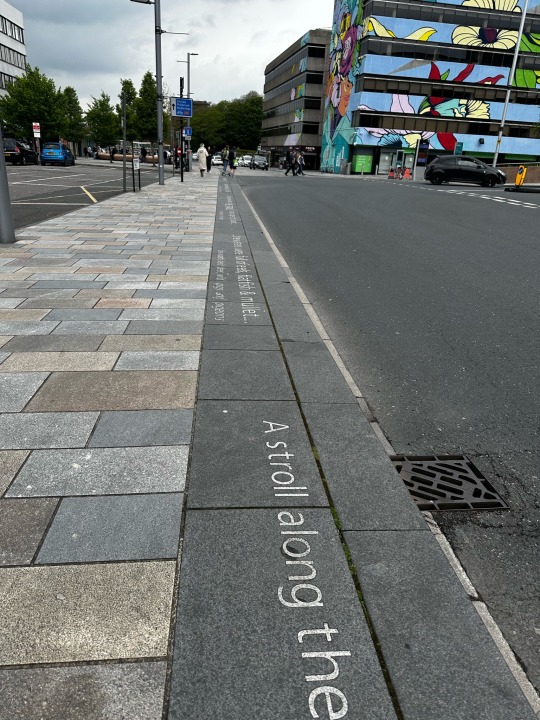
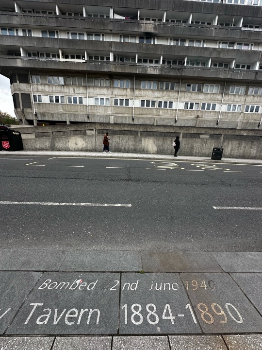
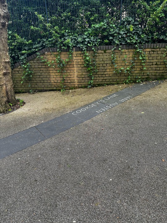
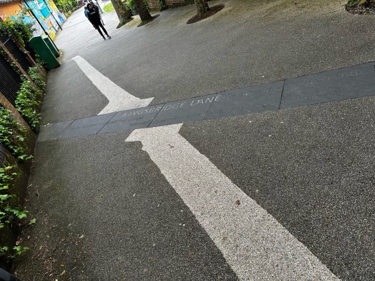
However, the creativity continues as you walk towards to high street and shopping centre, as there is poems and historical facts engraved into the wide curb, which is interesting to look at when you are walking, much like the Lemn Sissay poem.
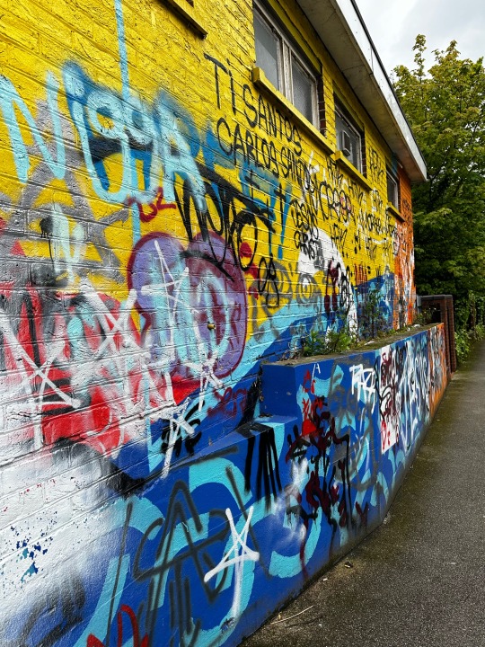
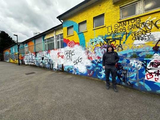
On this walk, there was also a graffiti wall, a small green area and sculptures, which definitely added something cool and appealing to what otherwise would have been a boring walk from the station to the shopping centre. They also had traditional signposts, which aren’t around much anymore. I really liked these, and we actually used them a couple of times and so they served a purpose as well.
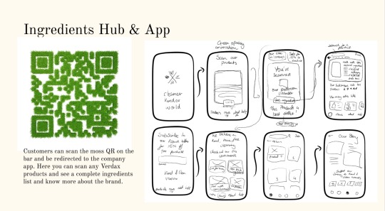
This creativity stopped as it got to the shopping area, however on the other side of the station, there was another mural with a QR code to find out more about the art. QR codes are very in trend at the moment, so I think this was a good way to share information without being overwhelming. It also gives you the opportunity to save the website on your phone and look at it whilst you are on the train.
0 notes
Text
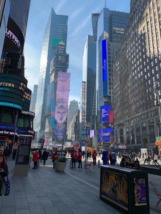
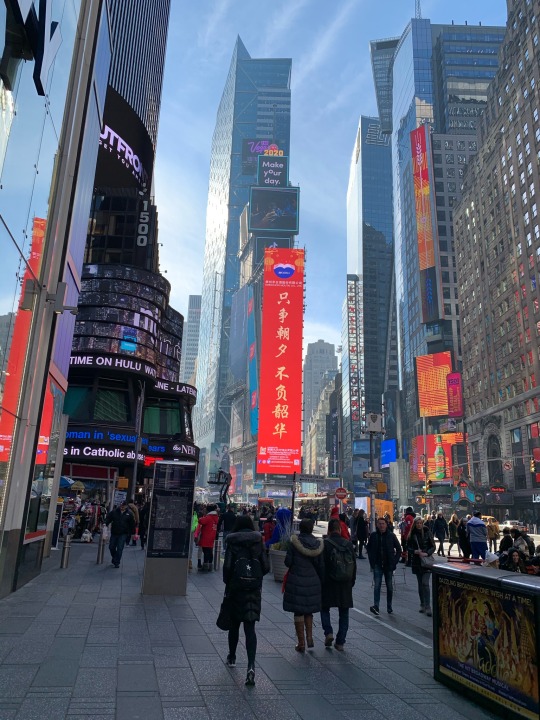
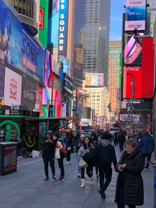
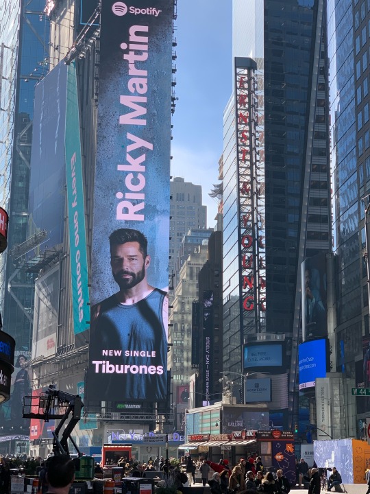
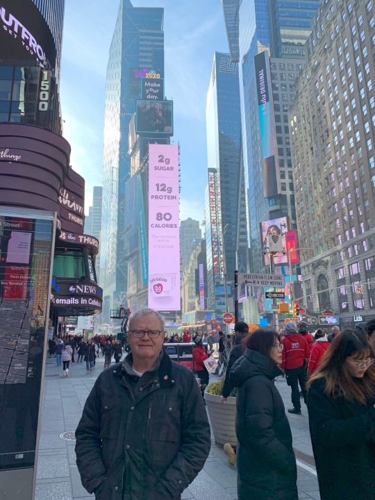
26/04/24 - Times Square
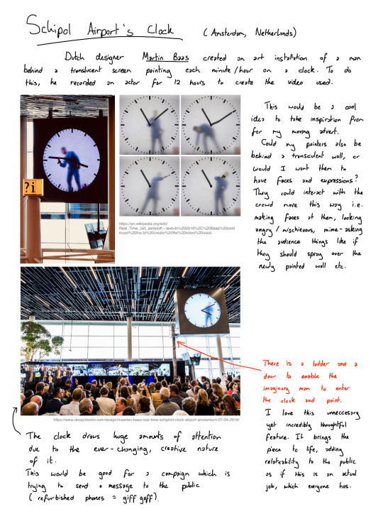
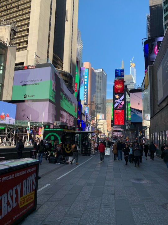
I was speaking to my dad about my COVL project, explaining that I wanted to potentially look at billboards that change, keeping it interesting for people walking on the street and getting people to look up off their phones. I told him about my research for the D&AD project, The Man in the Clock at Schipol Airport, and he suggested to look at Times Square as that is an example of successful billboarding. He went to New York a few years ago, and sent me some photos he took of Times Square. I want to look more into these as a potential outcome for this project.
0 notes
Text
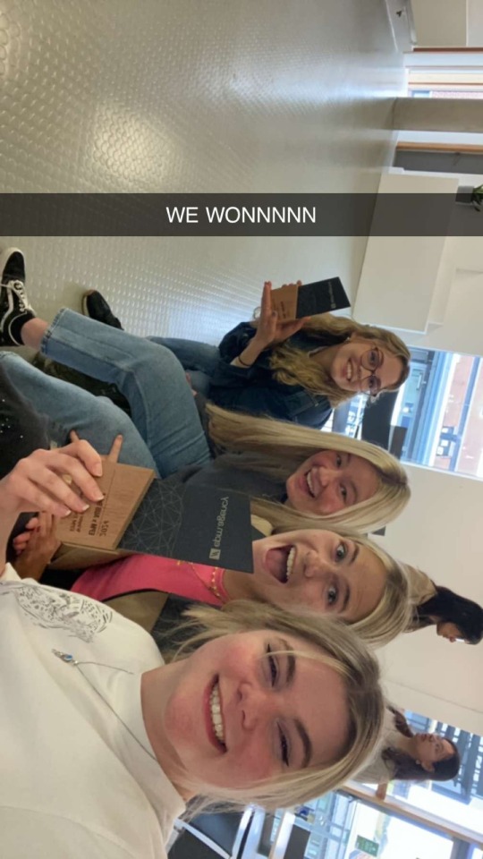
25/04/24 - Final Presentation Part 2
With Feedback
We were all really proud of how our presentation went. We worked very hard in making a cohesive, on-brand exhibition space and feel like EMP could see that.
We ended up winning an award, which was the best outcome to the week’s project!
1 note
·
View note
Text
25/04/24 - Final Presentation Part 1
0 notes
Text
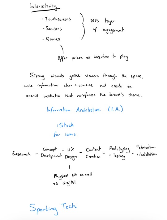
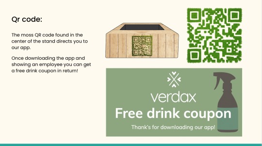
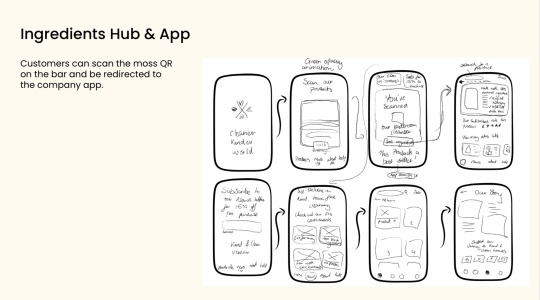
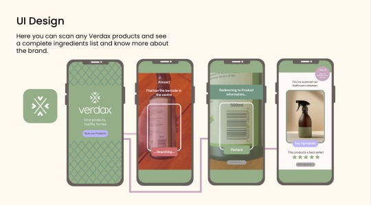
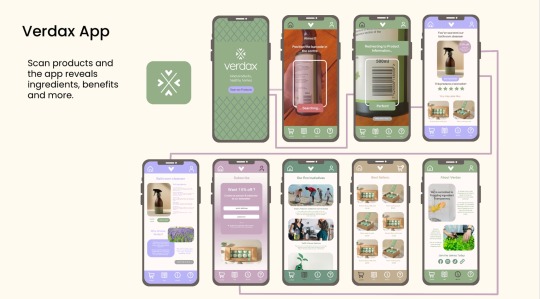
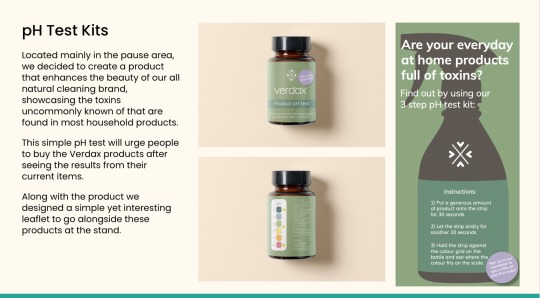
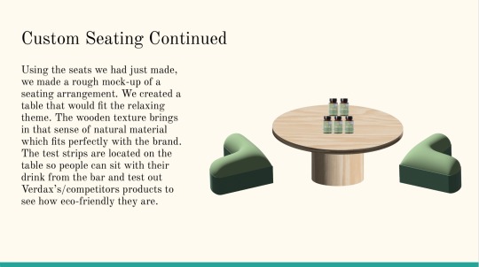
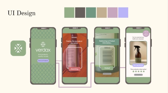
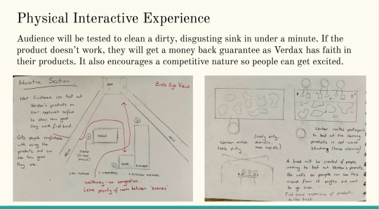
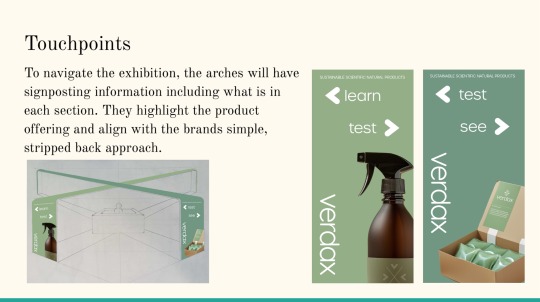
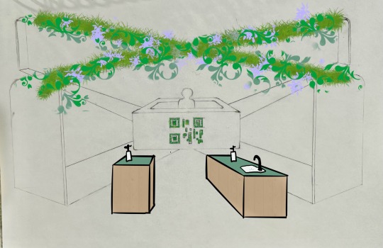
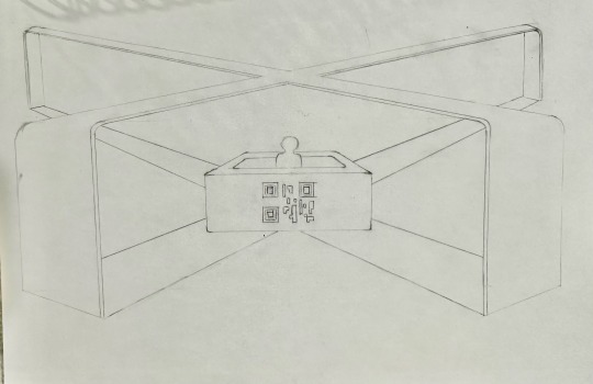
24/04/24 - Digitalising the Exhibition Stand
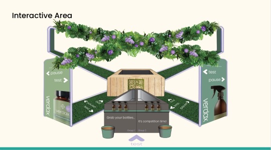
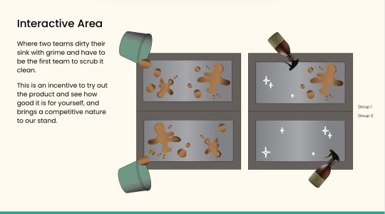
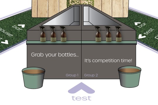
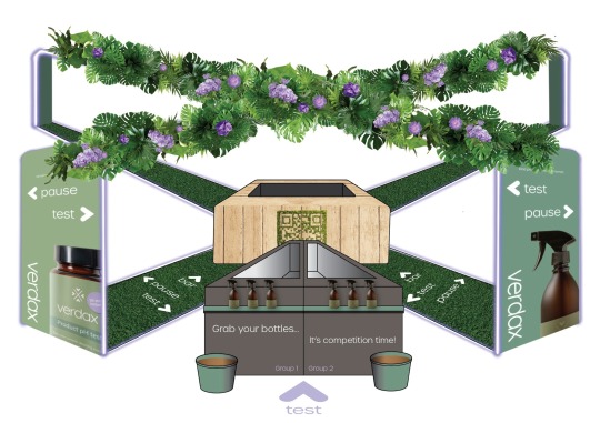
To keep things simple, we made the decision to just have one of the cleaning stands and turn it into a game, where the first team to clean their sink using our product wins a free drink from the bar. I made a quick mockup of how this would look from a bird’s eye POV.
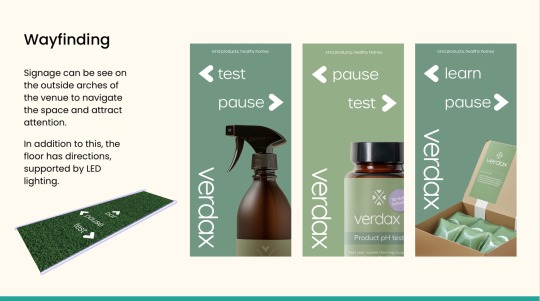
To make the exhibition, I traced over the drawing I had done in Illustrator. This was much better as the sketch was uneven and some of the proportions were not correct, so I could fix this on my computer. It also looked more refined, and so I sent the template to my group so they could use it for their sections. We all added our own foliage, and Georgina made the grass floor and posters for wayfinding. I then added the two adjacent sinks, attempting to continue with the 2.5D perspective to make the exhibition look realistic. I added some text in our font, Urbane, to explain a bit more about what was going on, as I did not do that in the D&AD project and I wanted to build on my mistakes. I felt this was more effective and gave the audience some idea as to what you were queuing up to do.
I am very happy with how my section of the stand turned out, as the colour palette is obvious and hopefully the idea of messing up a sink to clean it in a competitive nature would get people excited and want to test out our products.
0 notes
Text
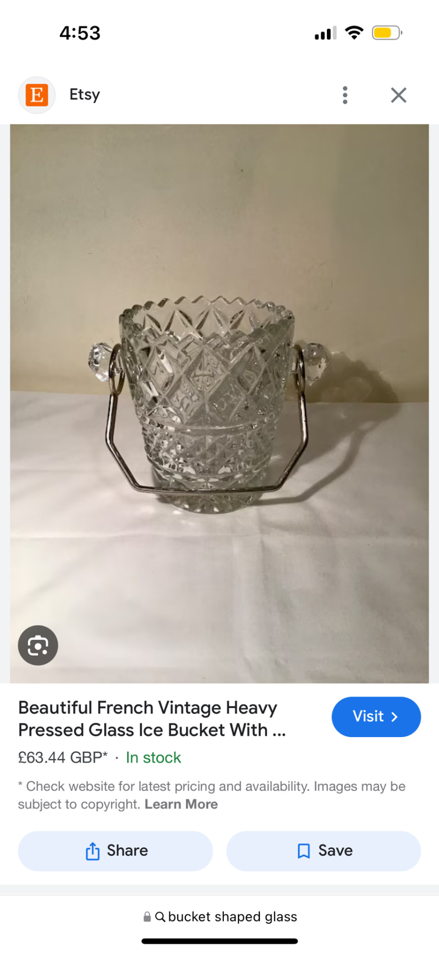
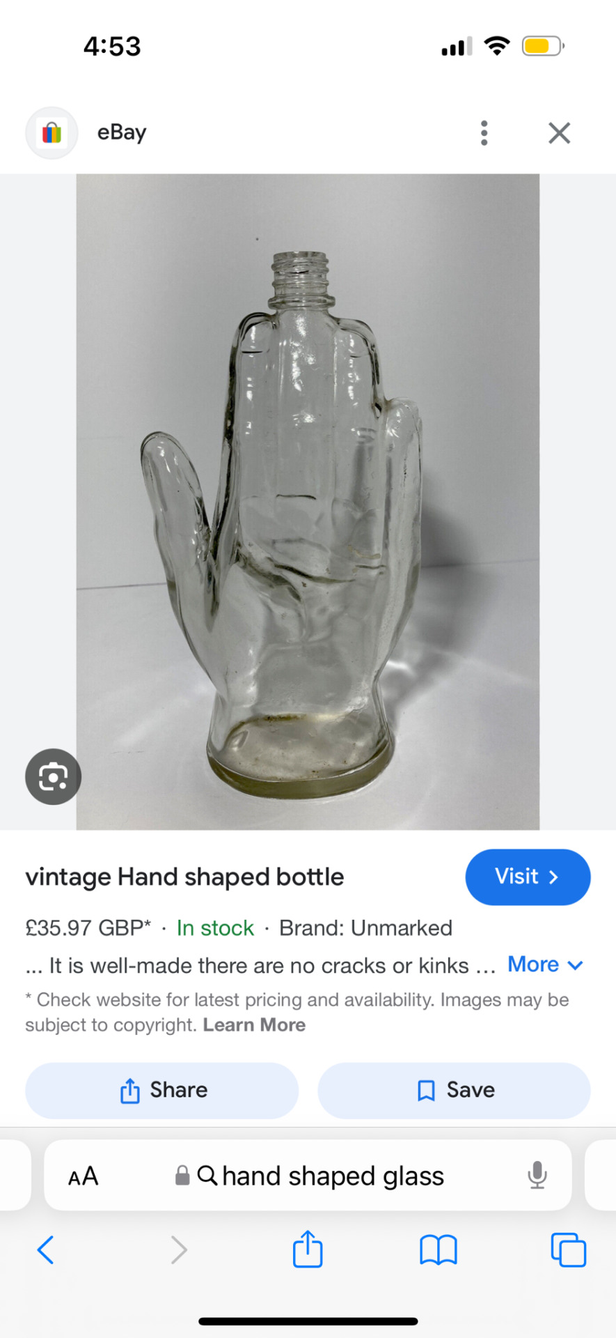
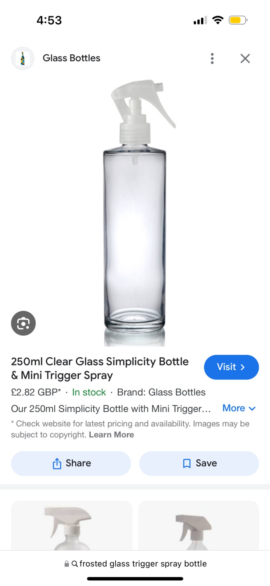


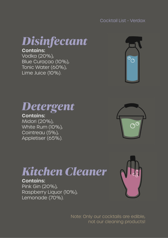
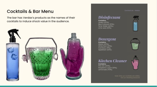
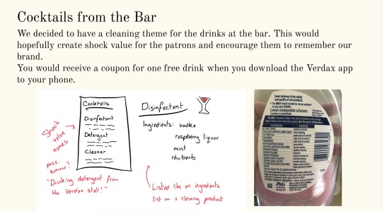
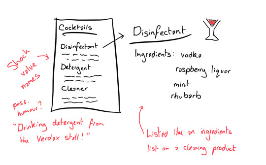
24/04/24 - Cocktail List
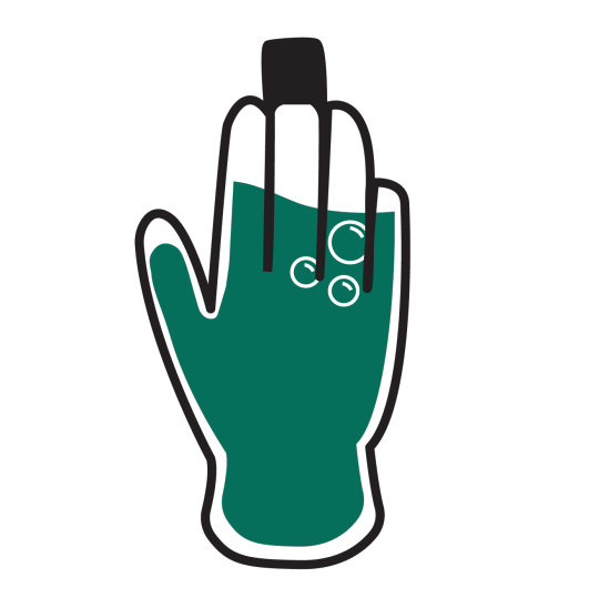
We thought it would be cool to have the drinks in different, cleaning related glasses, so I found some uniquely-shaped glass bottles to represent a rubber glove, spray bottle and a bucket. Amy then put them into Illustrator and vectorised them to make little cocktail icons. She sent them back to me so I could include them on the cocktail menu.
I used the dark grey from Verdax’s colour palette as the background as I think white text on a dark background looks sleek and sophisticated. I had the name of the cocktail in Dejanire Headline black italic, as the hand-lettered curves appeared friendly and elegant, and paired it with another sans serif font, Urbane Light, to have enough contrast between the fonts but still keep them consistent. We had used Urbane in our project, for example in the wayfinding, so it made sense to include it in the cocktails list as well.
I added the percentages of each component of the cocktails as percentages to resemble an ingredients list on the back of a cleaning product, which worked successfully. I also included a jokey note on the bottom to not drink the actual cleaning products, just in case people were confused.
Overall I like the way this turned out, and Amy’s icons added personality to it and let people know which cocktail glass they were going to get.
0 notes
Text
22/04/24 - Intermediary Presentation Part 2
With Feedback
This went really well, with just a few ideas on how to refine our exhibition.
0 notes
Text
22/04/24 - Intermediary Presentation Part 1
We all came together to add our separate parts to a Google Slides presentation to show EMP for feedback before the final presentations on Thursday.
0 notes
Text


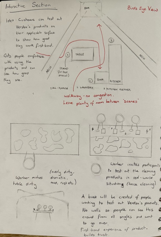
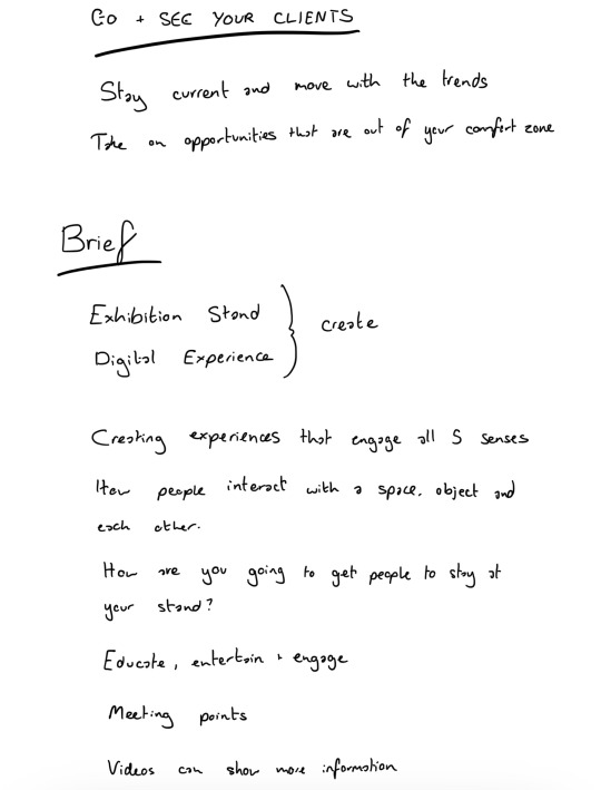
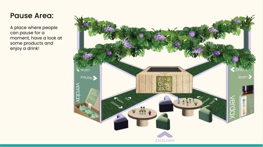
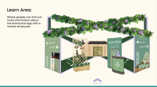
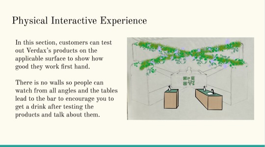
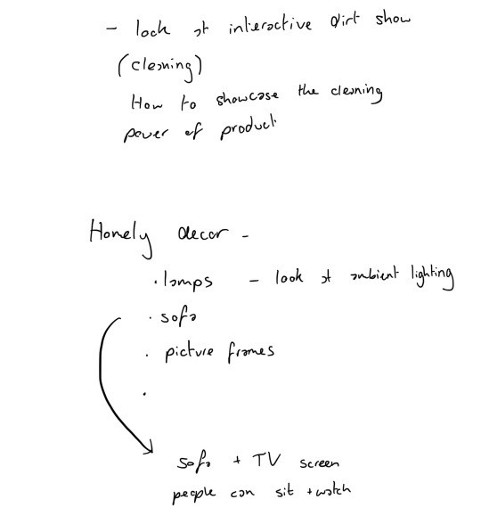
21/04/24 - Interactive Area
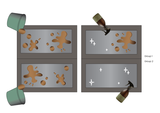
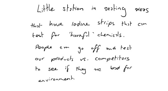
Getting inspiration from the cleaning adverts, we liked the idea of having the audience clean dirty surfaces with our products to test them out. I think my group were unsure whether to have it physical or digital, more like a game where people clean on a screen. This idea would save time in the set up and probably allow for quicker traffic flow, however I felt that having a cleaning game digitally would not showcase how good the product works, smells and how sensitive to skin it is. You could fake how good the product works on a screen as it would work like an eraser, which I think would leave people questioning the authenticity and transparency (Verdax’s values) of our brand. I felt it was more important to have the audience be able to physically interact with our product in a fun environment to see for themselves how good it works.
0 notes
Text

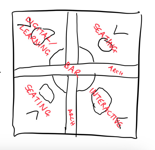
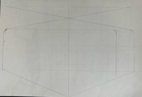
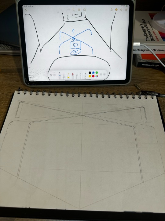
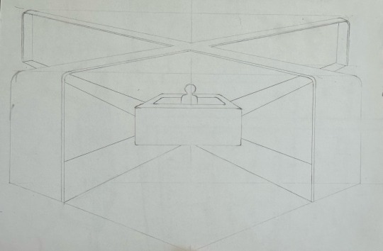
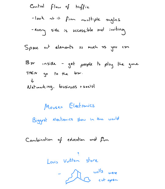
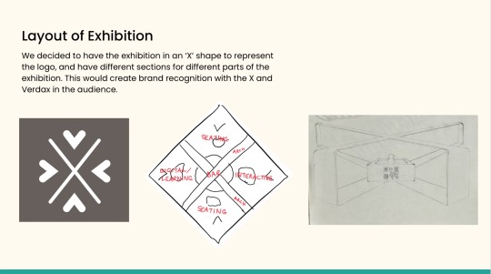
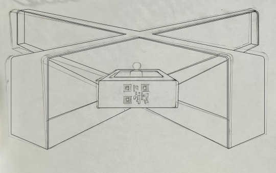
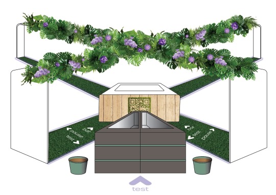
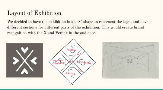
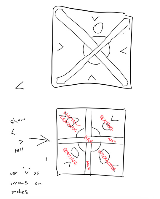
20/04/24 - Drawing of Exhibition
Based on the logo, I created a 2.5D drawing of our exhibition. The idea was then everyone could have this image to incorporate their own aspects, and we could show each section of the exhibit.
It was tricky getting the proportions right, however using grids and vanishing lines made it a little easier. The back arch proportions are a little off, as they should be shorter, but I only realised when we were making the final presentation and it was too late!
0 notes
Text
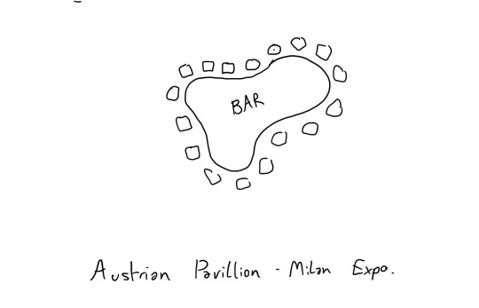

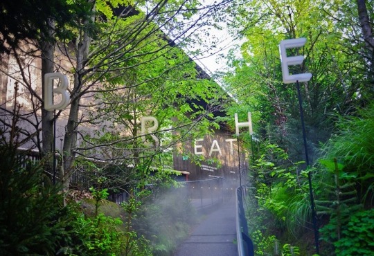
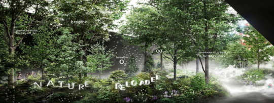
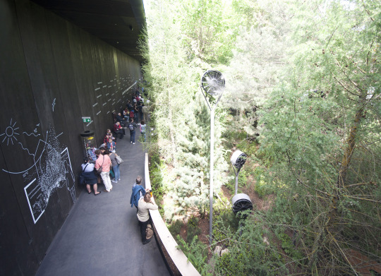
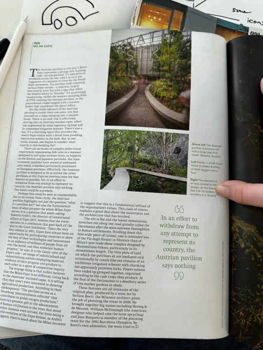
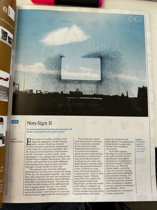
18/04/24 - Austrian Pavilion, Milan Expo.
The Austrian Pavilion was built by architects team.breathe.austria in 2015 in Milano, Italy. It was created to bring attention to one of our most precious resources: air. It demonstrates the potential of hybrid systems that integrate nature and technology to create an “air generating station”.
I saw this exhibition in a magazine from university, ‘Norman Foster: Architect in Space’, and loved the idea of creating this landscape of nature for the exhibition, and to let the audience be transported into an all natural, all green world. It would be something completely different from other exhibits that we looked at, and really encourage the audience to associate Verdax with nature and being eco-friendly and healthy, which are its brand values.
I also loved the text that was spread throughout. It keeps your eyes open and aware, and shows how human design and nature can coexist. It could also be a cool way to show the different sections of our Verdax exhibit, however my group were hesitant as it could be too much. We eventually just had leaves covering the top of the arches to show this nature element of our brand.
0 notes
Text

18/04/24 - Initial Ideas
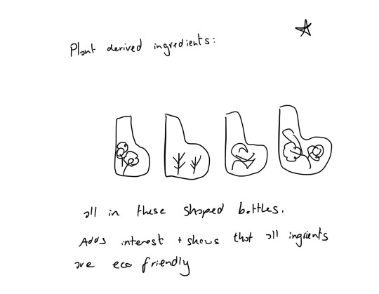
We each came up with some initial takeaways from the brief, and mine were the cleaning interactive element from my research and potentially giving out Verdax water bottles shaped like bleach to incorporate shock value and get people talking. We then got together as a group and discussed ideas and more competitor products. We had a look at the products, logo and exhibition stands, and were deciding which one to use when I thought that the exhibition stand could be in the shape of the logo. This would send a subliminal message to the audience and create brand consistency. It would also allow us to have four separate sections for different parts of the exhibition.
The group was not too keen at first as we weren’t sure how we would create the mockup, however we brainstormed and agreed to have the deliverables as high fidelity drawings instead of the 3D mockups that EMP gave us.
0 notes
Text

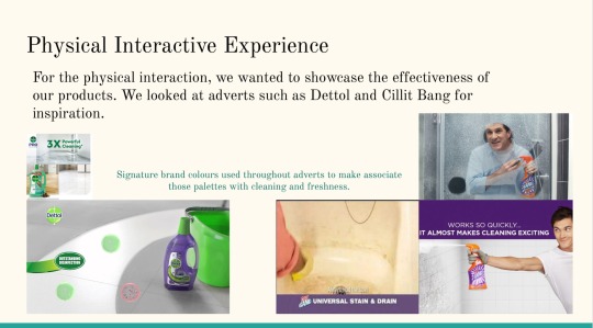
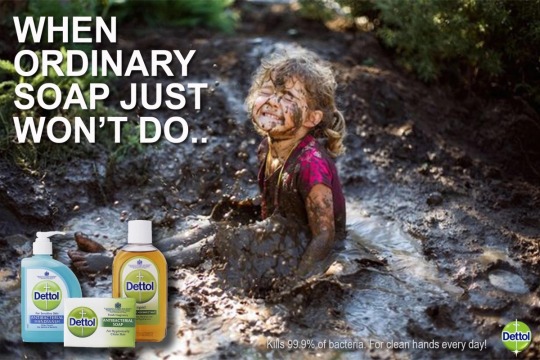
17/04/24 - Research into Competitor Brands
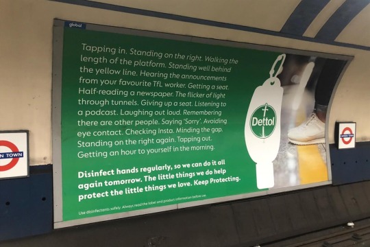
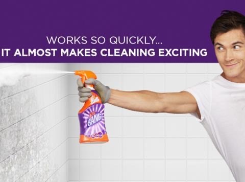
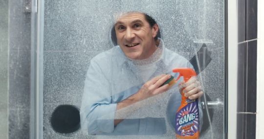
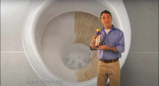
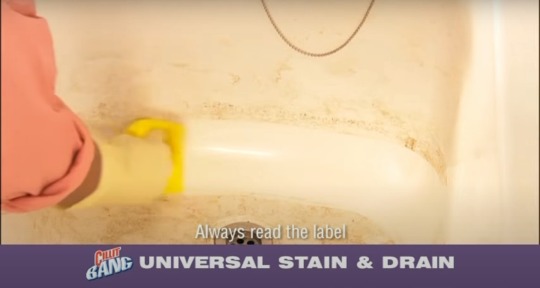
I looked at adverts for Cillit Bang and Dettol, two high profile cleaning companies. They both used their signature company colour consistently and loudly in their adverts to create brand association, however Dettol focused on using stark white, sparkling adverts (with the exception of the muddy little girl, which I thought was more effective as an ‘anti-marketing’ advert) whereas Cillit Bang actually showed real people using the products and seeing how well they work.
I liked the approach of Cillit Bang more, as showing people actually using the products increases trust in the brand and gives it a human edge over Dettol, which is very clinical and cold.
I did, however, like the muddy girl advert for Dettol, as it showed a real situation which young kids might get in to when their parents aren’t looking. It makes it personal and gives the advert the emotion of despair, but relief that Dettol is there to save the day. I liked the idea of people making something really muddy and then using our brief’s products to clean it up.
0 notes
Text
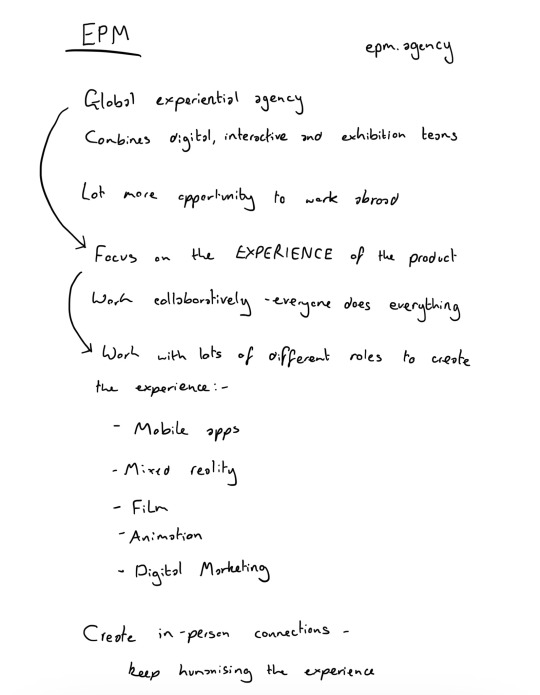
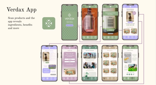
17/04/24 - One Week Project (EMP)
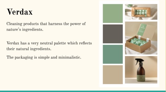
We were given our brands for the group one week project today. Ours was Verdax, a cleaning brand focused on eco-friendly products, transparency and healthy living.
As their brand is very minimal I thought I was going to struggle reining my ideas in, however being in a group really helped with this, as I could say my ideas then others could bounce off them, finding ways to scale them back and create something manageable yet unique. Working with my group definitely helped me develop this skill of not going overboard and helped me stay grounded.
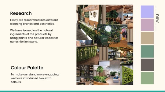
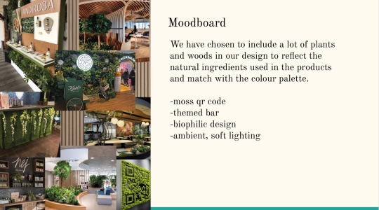
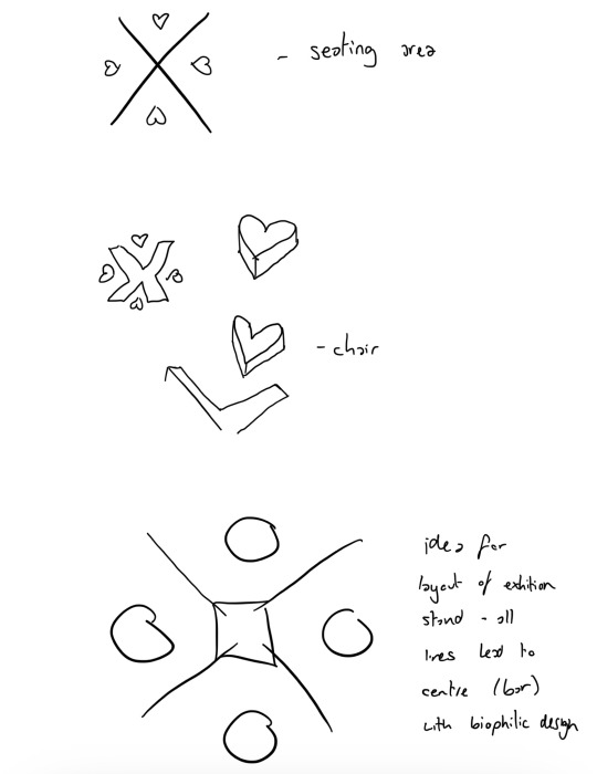
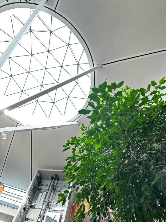
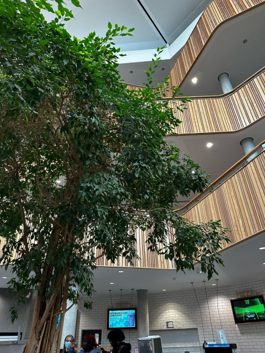
I researched biophilic design, knowing this from my 15 Minute City project. As Verdax is an organic company, we thought it would be best to incorporate natural elements in our exhibition stand.
(Primary research from the SUB hall at BU)
0 notes
Text
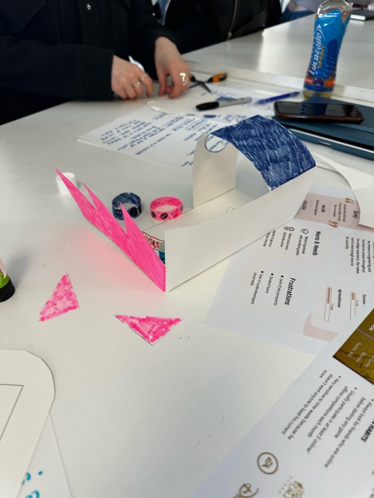
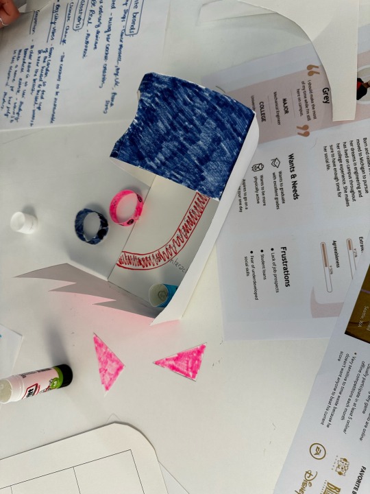
17/04/24 - EMP Project
We did a quick one day group project to create an exhibition stand showcasing Arts University Bournemouth at a UCAS event. Our stand had an interactive paint wall to encourage creativity - what our university is about. It also incorporated the architecture of our university, like the blue drawing building and the jagged studios where the print room/fine art rooms are. I think this helped people create a visual connection with our university and the stand.
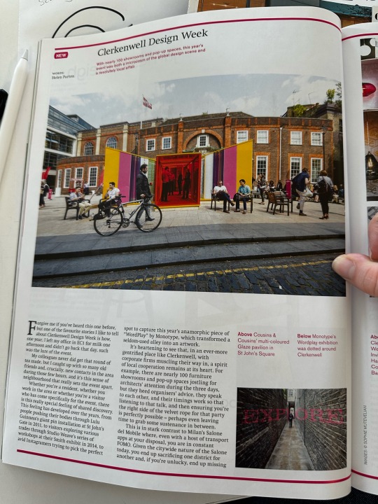
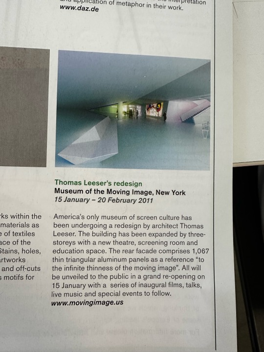
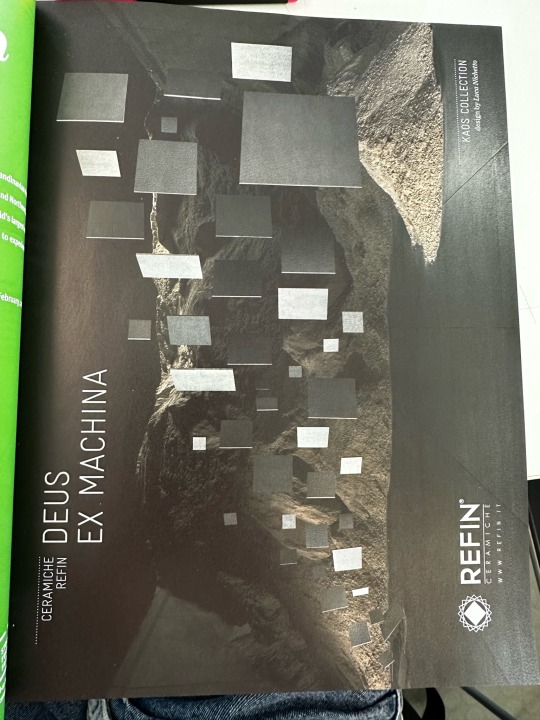
I also found a magazine called Norman Foster: Architect in Space, with some cool ideas for adverts/imagery, which I took photographs of to help with inspiration in later projects.
0 notes