
Network Engineer Ciso Certified CCNA, CCNA Voice, 1 of 3 CCNP CompTIA Security+ BSIT Advanced Networking Pursuing Masters in Instructional Design & Technology
Don't wanna be here? Send us removal request.
Statistics
We looked inside some of the posts by enderaz-blog and here's what we found interesting.
Average Info
Notes Per Post
1
Likes Per Post
0
Reblog Per Post
1
Reply Per Post
0
Time Between Posts
12 days
Number of Posts By Type
Text
10
Video
7
Last Seen Tumblr Blogs


Fun Fact
28.6 is the average number of monthly visits per US mobile user.
Text
Month 12 - Professional Practice


View this post on Instagram
A post shared by Robert Placencia (@crithit)
(animated logo I did for fun)


https://robertaplacencia.wixsite.com/thesis-presentation
0 notes
Text
MDM-690 Mastery Journal
Webpage Layouts
One important takeaway from this month's course is that of well balanced and aesthetically pleasing web page layouts. According to research good navigation design in website contains three things; simplicity, clarity and consistency (Laurinavicius, 2020). The design of a website should communicate a message clearly, flow smoothly and provide a sense of balance to the viewer (Hampton-Smith, 2020). There are many styles of layouts to include symmetrical, asymmetrical, zig zag, grid and so on. What's important is choosing a style that best helps communicate the intended message to the target audience.
Design Feedback
Giving and receiving feedback is an essential step in quality design. According to research positive feedback should start early, be open, avoid being defensive and take it with a grain of salt (Yablonski, 2018). When giving feedback it's always important to give actionable feedback, if you can't explain why something doesn't work in a design then it is not helpful to the designers (Ng, 2020). By being open to change and willing to value the input of others, the design as a whole can be elevated giving the client the best work possible.
Design Portfolio
My last takeaway from this course is that of the importance of a design portfolio. Being new to the media design industry this was something that I hadn't had previously, but have now created enough content to begin filling. A design portfolio allows a designer to showcase how they want to be seen in the design world and their ability to produce design through multiple specialties (Teixeira, 2018). When I originally entered the media design program, I honestly hadn't planned on making media design my career field. I mainly wanted to use my GI bill for personal growth and utilize what I've learned in this program to better help with data visualization in my current career field as a network engineer / team lead. Going forward however, I plan to expand upon this portfolio to open myself up for side freelance work as I really do enjoy implementing what I've learned in this program.

(Portfolio)
(web page layout)
(Design Feedback)
References
Laurinavicius, T. (2020, January 30). Web page layout: website anatomy every designer needs to learn. Webflow. https://webflow.com/blog/web-page-layout-101-website-anatomy-every-designer-needs-to-learn
Hampton-Smith, S. (2020, September 14). How to create balanced page layouts. Creative Bloq. https://www.creativebloq.com/netmag/create-balanced-page-layouts-7-pro-tips-121310009
Yablonski, J. (2018, June 16). Effective Design Feedback - Jon Yablonski. Medium. https://medium.com/@jonyablonski/effective-design-feedback-a22348c83ca2
Ng, S. (2020, February 6). Stuck in a bad design feedback loop? Here’s what to do about it. Dribbble. https://dribbble.com/stories/2020/02/06/how-to-avoid-bad-feedback-loop
Teixeira, F. (2018, June 18). What is the real role of a design portfolio website? Medium. https://uxdesign.cc/what-is-the-real-role-of-a-design-portfolio-website-ee0b5b76112b
0 notes
Text
Connecting/Synthesizing/Transforming
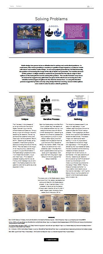
One of the designated learning objectives I which I worked on this course involved creating an infographic on the survey results of the Box Park Sushi design. Some research involved included the process of why it's important to tell a story with infographics rather than just slap together data visualizations. Zencos (2019) and French (2017) both agreed that infographics should be an exploratory journal and work to communicate a message in an easy to understand format, supported by large data sets. What I got from this, was that it was important that all data and graphics used on an infographic should server a purpose and serve to draw the eye of the consumer to the data you want them to learn from. I believe the work I conducted on my infographic told a story without being overly complex. In the screen shot below, size hierarchy is used to show which words were selected the most, presenting a good amount of data will minimal effort to look at it and interpret the data.

Problem Solving
One area of problem solving I came across was how to incorporate a bar style chart in an interesting way that felt in place with design guidelines of my brand. On option was to incorporate a standard business style bar chart within the document perhaps bordered with a design that matched the overall document design. The second option I came up with was to create the bar chart utilizing a stack of brand logos to show the responses. In the end I decided to go with the logo route as I felt it fit in more with the branding versus using traditional style bar chart.

Innovative Thinking
One area that was new to me and produced some innovative thinking was that of creating a survey to gather insight about the public perception about my brand's design. This is an area where I stayed within the box of what others out there were doing, as I was still new to this process. After viewing the results of other peers and looking at online surveys, I feel that this is still an area where I can definitely improve upon. One area, would definitely change, is really tailoring the questions with more specificity versus keeping it too open. Or at the very least, giving a good mixture of both general and specific questions. One part I also found to be very tough was actually soliciting responses. For the most part, had to rely on the responses of family members and friends, as I found social media site groups such as Facebook groups and Reddit, ended up deleting my posts soliciting responses for my work. To improve upon this in the future on actual projects, I will most likely pay to get a larger data set of responses.

Acquiring Competencies
During this course, I've gained experience in gather data sets and creating infographics to help support telling a story about those data sets. In addition, I have learned the following during my weekly sessions and reading:
Design Research - Academic/occupational & Technical
Survey research and questions (What are they) - Academic/occupational & Technical
What can surveys and questionnaires do - Academic/occupational & Conceptual
How are surveys and questionnaires used - Academic/occupational & Conceptual/Technical
Data visualization and Information Design - Academic/occupational & Conceptual/Technical
User Experience Design - Academic/occupational & Conceptual/Technical
Design Thinking - Academic/occupational & Conceptual
What is an infographic - Academic/occupational & Conceptual/Technical
Animated Infographics - Academic/occupational & Conceptual/Technical
Interactive infographics - Academic/occupational & Conceptual/Technical
Infographic Techniques: Know your audience - Academic/occupational & Conceptual
Data Visualizations: Choosing the right charts - Academic/occupational & Conceptual/Technical
Reflection
Overall I had a good learning experience in this course. This is the second instance in this program that required surveying potential consumers and analyzing the data that is received. This was definitely a good working experience as it was something outside of my comfort level that pushed me to grow and learn.
The second part of this course helped keep things interesting and fun, by having us create an infographic to tell a story with the data we had received. In the end, I was also the target audience, as the information I received helped me to learn where i was and was not effective in communicating messages. Overall it was a good experience, that I was able to take away valuable research and design experience.
Zencos. (2020, July 9). Should I Use An Infographic to Tell a Data Story? Retrieved from https://www.zencos.com/blog/infographics-basics-example-design-guide/
French, K. (2017, May 29). How to Make Better Infographics: Tell a Single Story. Retrieved from https://www.columnfivemedia.com/how-to-make-infographics-tell-a-single-story
0 notes
Text
Multi-Platform Delivery Mastery Journal
Connecting Synthesizing and Transforming
One area of research that had been conducted was that relating to avoiding cliches. The first source I had used stated that designs that had lost their originality due to overuse were considered cliches and in bad form to use in design (Bowen Media, 2020). The second source stated that using cliches in design causes your brand to blend in with the competition rather than standing out among the competition (EMXHO, 2018). A connection was made when comparing the work of my early drafts to those of my peers in class. It was quick to see that nearly all of us had used sushi design cliches such as sushi rolls, chop sticks and other highly used elements associated with sushi. With this in mind, I had to re-design a good portion of my draft designs in order to avoid any common sushi cliches all together. The end result was that my final logo had nothing at all to do with sushi itself and more to do with the brand’s characteristics and attitude.
Problem Solving
In one area of feedback that I received, it was pointed out the use of art near my logo, may be taking away from the logo itself and that I may want to add something to divide it. One way to solve this was to remove the artwork all together or make it smaller so that the visual hierarchy pulls the eye to the logo first. The other method was to shift the artwork down away from the logo and divide the logo and artwork with the tagline which hints towards a connection to art within the brand. I had opted to utilize the second method, because I felt that the street art style was a big part of the branding effort itself and was a point to tie into the local community.

Innovative Thinking
It is difficult to describe how my work compares to other in the industry for a few reasons. For one, despite being in a mastery level program, I had not had any background or official training in the field to start with as some of my other peers have. Despite this, I felt my work came out well, but may have not been as innovative as some others who did have a background in media design prior to this program. One area I thought was innovative was the use of custom borders to match the style of the logo within the design guide. Since working in Illustrator and In-Design are rather new to me, the tools, and techniques I have used to create these designs are also new to me.
For comparison, one of my peers came up with a very cool octopus arm design for his logo that was also integrated into his border which was done so well it was an inspiration for my own design of using the elements in my logo as a framing device in my design guide. So with that said, while the style itself was unique and original, the concept is something that others are doing as well.

Acquiring Competencies
Prior to this course I had very little working knowledge of the entire adobe design suite. Of all the tools I would say I had the least working knowledge of photoshop. This course gave me the opportunity to utilize photo shop to achieve and end goal of grafting my logo and branding designs on to everyday objects for concept design. This can be shown from my examples of media assets that I had provided for this course.

Other Competencies Gained:
Avoiding cliches: Occupational/Academic & Conceptual
- Avoiding design that is overused by popularity and unable to stand out among the competition.
Brand Style Guides: Occupational & Technical
- A style guide that shows how branding elements should and should not be used.
Design Hierarchy: Occupational/Academic & Conceptual/Technical
- The use of creating design to train the consumers eyes to the important parts of the message first.
Kerning: Occupational & Technical
- The reduction or addition of space between characters
Tracking: The spacing between letters evenly across an entire word(s)
Showing Work in the Environment: Occupational & Conceptual
- The idea that customers can better visualize design element concepts if they are shown in the same type of environment of how they will be used.
Brand Post Mortem: Occupational/Educational & Conceptual/Technical
- A brand/design debrief of all the design project with the goal of understanding what went right, what went wrong and what could be improved upon in the next project.
Clear Space: Occupational / Technical
- A technique used to define a consistent method of determining the clear space that should be used around branding elements in order to maintain their intended impact while also being scalable.
Master Pages: Occupational / Technical
- A set of pages to allow a branding document to maintain a consistent look and feel that can be applied to the document as a whole.
Bowen Media. (2020, March 19). Cliché, Go Away: Using Visual Stereotypes to Your Advantage | BOWEN. https://www.bowenmedia.com/thoughts/cliche-go-away-using-visual-stereotypes-to-your-advantage
EMXHO. (2018, June 9). How to Avoid Branding Cliches & Stop Being Ignored w/ Tonya Eberhart, Michael Carr & Gene Volpe. Real Estate Uncensored. http://mcdanielrealestatesystems.com/2018/06/09/avoid-branding-cliches-stop-ignored-w-tonya-eberhart-michael-carr-gene-volpe/real-estate-uncensored-podcast
0 notes
Text
Mastery Journal Design Integration
Connecting / Synthesizing / Transforming
One of the areas where I had made a connection was in respect to the two perspectives in design. In one resource by Norman et al., (2009), they discussed how designers must work with the constraints of many items such as medium and cost when creating a design. On the other hand, research from The Interactive Design Foundation (2020) spoke of how users emotional impacted by other design decisions. This came into play in my end design when creating a media plan and media matrix to understand what would best work for designer and user.

Problem Solving
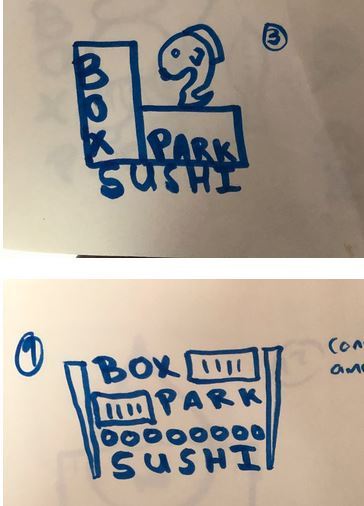
One design problem that I ran into on the Box Park Sushi project was choosing an appropriate typography set that matched my voice and tone as well as the style of the project. For my heading I wanted something that was bold, eye-catching, and unique but still fit the Box Park theme.
One possible solution to this would be to play off of the Asian theme and use an Asian based font such as Nagomi (https://fonts.adobe.com/fonts/nagomi), but I felt that it was an idea that was over-used and not unique enough for the project. The second path I had was to use something that meshed well with the idea of a Box Park storage container. For this path I chose the use of the stencil font (https://fonts.adobe.com/fonts/stencil). In the end I went with the stencil font for several reasons. The first reason was that I didn’t want to go with the stereotypical Asian style font just because it is a sushi restaurant. Having worked near storage container in my career in the Air Force, one thing that had always stood out to me was they stencil writing that you would typically find on old storage containers. This offered a solution that was both unique that also played on the idea of the box park itself rather than just the food theme.

Innovative Thinking
For the first time in my journey to an MBA in media design I feel like I have made a product that feels polished and comparable to professional work. Knowing I had an upcoming trip planned, I scheduled a vacation day in order to dedicate time specifically to work on my creative brief and I feel like the extra time gave me the flexibility to go back and touch up, and re-do work as much as I wanted until I had a final product that I was happy with. I believe my work was innovative and feel like it’s the first piece of work that I’ve created in the program that allowed me to really put everything I’ve learned along the journey in to one visible create place which is my creative brief.

Acquiring Competencies
Adobie InSight: Occupational & technical
Voice: Academic/Occupational & Conceptual
Tone: Academic/Occupational & Conceptual
Emotional Design: Academic/Occupational & Conceptual/Technical
Translating Strategy to Design: Occupational & Conceptual
Static Vision Boards: Academic/Occupational & Technical
Dynamic Vision Boards: Academic/Occupational & Technical
Perspectives of Design: Academic/Occupational & Conceptual
Guerilla Marketing: Occupational & Technical/Conceptual
Reflection
I would argue that I have gained the most knowledge and technical skills so far in this program from this course as well as the course that preceded it. I found it very helpful that different instructors had worked together to create a learning plan that moved between classes creating a feeling of being able to learn core skills, implement those skills and then follow up increasing the complexity of those same skill sets in different manners.

I felt that each assignment provided a great deal of value in the overall program. Week one built upon the voice and tone skills learned in the preceding class helped reinforce those skills by giving the opportunity to continue using them while adding more to them. In the second week we created static vision boards allowing us to visualize the theories that we had learned previously and see how easy it is to fall off the path of your voice and tone. Week three once again built on to the skills of voice, tone and static vision boards and allowed us to add motion and sound an additional way to display all the elements we have learned along the way. Lastly and my favorite project so far has been the creative brief. This assignment is where I felt we put together and implemented many of the skills we have been taught even from day one of the media design program. The use of industry standard design tools helped keep our engagement and enjoyment high and end the class with a nice nearly finished product.
References
Felton, G. (n.d.). Advertising: Concept and Copy (Third Edition). VitalSource Bookshelf. https://bookshelf.vitalsource.com/#/books/9780393733921/cfi/8!/4/[email protected]:13.2
Lee, K. (2012, September 12). Voice And Tone: What’s The Difference? Forbes. https://www.forbes.com/sites/katelee/2012/09/12/voice-and-tone-whats-the-difference/#4198b13065e3
Kenny, J. (2020b, July 2). Know the Difference between Tone and Voice to Set Your Brand Apart. Mojo Marketing - Cloud, IT, & Telecom Marketing. https://gimmemojo.com/tone-voice-set-your-brand-apart/
Acrolinx Team. (2020, February 21). What Is Tone of Voice and Why Does It Matter? Acrolinx. https://www.acrolinx.com/blog/what-is-tone-of-voice/
The Futur. (2014, October 21). How to Translate Strategy to Design [Video]. YouTube. https://www.youtube.com/watch?v=TpcaCW85eI0
Goikoetxea, N., Sierra, E., Larrakoetxea, I., & Gorozika, J. (2010). GOOD PRACTICES TO TRANSLATE CORPORATE STRATEGY INTO DESIGN STRATEGY. Design 2010, 1094. https://pdfs.semanticscholar.org/7179/bc30ae87eca07bd7d60f7180c6da5f28250d.pdf
Felton, G. (n.d.). Advertising: Concept and Copy (Third Edition). VitalSource Bookshelf. https://bookshelf.vitalsource.com/#/books/9780393733921/cfi/8!/4/[email protected]:13.2
Huffington Post, & Hughes, B. (2017, December 6). The Importance of Ethically Sourced Products. Huffington Post. https://www.huffpost.com/entry/the-importance-of-ethical_1_b_10895816
Özçifçi, V. (2017). Determining the impact of brand equity on consumer purchase intention. International Journal of Social Sciences and Education Research, 3(4), 1164–1177. https://doi.org/10.24289/ijsser.319844
Desmet, P., & Hekkert, P. (2009). Special Issue Editorial: Design & Emotion. International Journal of Design, 3(2), 1–6. http://index.ijdesign.org/index.php/IJDesign/article/view/626/255
Saraswat, P. (2019, August 14). The design of emotions and emotional intelligence - UX Collective. UX Collective. https://uxdesign.cc/the-design-of-emotions-and-emotional-intelligence-ba00855107d3
Interaction Design Foundation. (n.d.). What is Emotional Design? The Interaction Design Foundation. https://www.interaction-design.org/literature/topics/emotional-design
Baker, J. (2019, January 28). The Art of Emotion — Norman’s 3 Levels of Emotional Design. Medium. https://medium.muz.li/the-art-of-emotion-normans-3-levels-of-emotional-design-88a1fb495b1d
Norman, D., Northwestern University, Nielson Norman Group, & Ortony, A. (2004). DESIGNERS AND USERS: TWO PERSPECTIVES ON EMOTION AND DESIGN. http://projectsfinal.interactionivrea.org/2004-2005/SYMPOSIUM%202005/communication%20material/DESIGNERS%20AND%20USERS_Norman.pdf
The Interactive Design Foundation. (2020, July 10). The Reflective Level of Emotional Design. https://www.interaction-design.org/literature/article/the-reflective-level-of-emotional-desig
Morris, J. D. (1998, August 23). The Effects of Music on Emotional Response, Brand Attitude, and Purchase Intent in an Emotional Advertising Condition | ACR. The Association for Consumer Research. https://www.acrwebsite.org/volumes/8207/volumes/v25/NA-25
Lasquite, M. (n.d.). Color Psychology in Marketing and Brand Identity. Visme. https://visme.co/blog/color-psychology-in-marketing-and-brand-identity-part-2/
Laubheimer, P. (2020, January 12). The Role of Animation and Motion in UX. Nielsen Norman Group. https://www.nngroup.com/articles/animation-purpose-ux/
Marrs, M. (2020, July 21). Jaw-Dropping Guerrilla Marketing Examples. Wordstream. https://www.wordstream.com/blog/ws/2014/09/22/guerrilla-marketing-examples
Mertes, M. (2020, June 17). 13 of the Most Creative Promotional Products of All Time | QLP. Promotional Products Blog. https://www.qualitylogoproducts.com/blog/13-most-creative-promotional-products
Long, J. (2017, April 2). 6 Must-Do’s for Effective Social Media Marketing. Entrepreneur. https://www.entrepreneur.com/article/292169
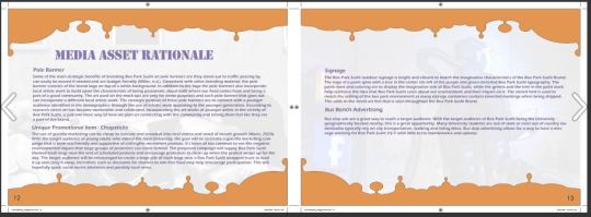
Reynolds, C. (2020, May 6). The Advantages Of Bus Stop Advertising. The Startup Magazine. http://thestartupmag.com/advantages-bus-stop-advertising/
Pavesic, D. (n.d.). Restaurant Resource Group: The Psychology of Menu Design: Reinvent Your “Silent Salesperson” to Increase Check Averages. Restaurant Resource Group. https://www.rrgconsulting.com/the-psychology-of-menu-design-reinvent-your-silent-salesperson-to-increase-check-averages-and-guest-loyalty.html
1 note
·
View note


Text
Week 4 Mastery Journal - Organizational Structures
Connecting / Synthesizing/Transforming
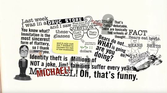
According to Cousins of Design Shack, kinetic typography is a great tool to utilize in projects where you want to create emotional content or capture attention. Kitney of Creativeblog provides an area with many examples of creative kinetic typography and they many emotions it can emphasis. A connection can be made between the two of these resources that shows kinetic typography can cover a wide variety of projects and the entire spectrum of emotions all based upon how animated text is utilized. For instance, fast moving or shaky objects can emphasize a chaotic or fast paced environment. Where slow moving texts and animations can be utilized to emphasize a sad or even peaceful emotions. Research has also shown that an audience is more likely to be captured by animated text versus the use of static typography (Abry, 2012). To show this in my work I had chosen to create a kinetic typography video based on the chaotic ramblings of Donald Trump. To emphasize how he is all over the place in his speech with no coherent thoughts, I chose to have the typography appear on the screen from many different angles in a quick and chaotic manner. The use of color was also used to emphasize different words such as highlighting a question mark in red when even though the speaker was asking the question it was meant to emphasize that we as the audience want to know that same thing (e.g. why would anyone go see him talk).

Problem Solving
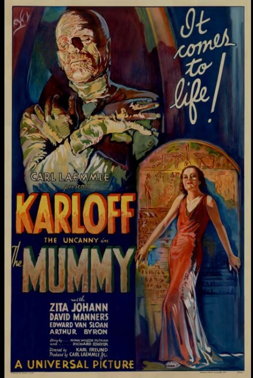
During this months' work one problem that I experienced occurred during the motion movie poster project. In this project we were given a poster that we were to animate into a motion movie poster. This is a process that can help a movie poster come to life (McGregor, 2017). The problem that I encountered was that the tutorial of the project assumed that you already had a specific baseline knowledge of Adobe Photoshop and skipped the steps needed to break down the image into a format that could be easily used for motion movie posters (C.M. de la VEGA, 2017). One solution to solve this would be to watch a tutorial specific to the skills that I needed which were to break down a flat image into a multi-layer image while preserving the background. Another option would be to try to find a tutorial that included every step from the beginning without any assumptions. Since I felt more comfortable than I had with the Adobe suite in the past, I opted to find a tutorial about removing objects in photoshop while preserving the background instead of looking for an all in one solution. For this I found a video that focused primarily on removing objects since I already knew how to create and add layers (Photoshop Tutorials by Webflippy, 2018). In the end the project was a success and I was able to create a movie poster that looked as if the mummy was moving and the environment felt like it was lit with a lantern light flickering. Thought I still have some room for improvement as you can still see a bit of the background that does not quite look natural and could be blended a bit better.
Innovative Thinking:
Comparing how my work compares to others is a bit hard at this point with such a limited portfolio. At this point there is still a ton I need to learn on the technical side to truly be competitive among my peers. As for my kinetic typography assignment, it shows both innovative thinking as well as copying elements or styles from existing artists. My design for instance was inspired by the design by StepDraw where they created a kinetic typography video based off a skit from the show The Office (Stepdraw, 2015). The inspiration of which topic to focus my kinetic typography came from a Rolling Stones article about a Trump speech in which he talks of how great a speaker is, then proceeds to ramble complete non-sense (Bort, 2018). In this case I feel the design itself was innovative as it did not follow too closely to the original inspiration, but shared some elements. Realistically innovative thinking is in the eye of the viewer as some people may view what innovation is differently from simple changes to completely new ideas (Owen, 2012).

Acquiring Competencies
This entire month was filled with learning new concepts and technologies.
1. Adobe Premiere
a. This software suite was a new experience for me and provides a powerful tool for video editing.
b. This skill set can be used in both the academic and professional environments.
c. The premiere suite a was a new technical skill set, but still relies on video concepts to effectively use.
2. Adobe After Effects
a. The After Effects suite offered powerful new ways to enhance video and motion graphics.\
b. This tool can be utilized in both the academic and occupational environments.
c. This tool I would describe as a new technical skill set.
3. Editing
a. This month we learned many different techniques that editors use to enhance their motion design
b. I would consider this both a conceptual and technical skill set.
c. This could be used in both the academic and professional setting.
4. Motion Design Insights
a. From the pitching process to final product, we've learned many techniques to find inspiration in motion design and avoid overload.
b. I would consider this a conceptual skill
c. I feel that this falls in the occupational and academic setting.
5. How the brain visualizes
a. This month we learned how our brain interprets motion and how motion designers can take advantage of how our brain works for maximum effect within design.
b. I feel that this an academic topic that is carried over to the occupational side.
c. I also feel that this is mostly conceptual from the graphics designer perspective.
6. Human Centered Design
a. Human centered design focuses more on how the audience interacts with the design versus the physical aspects of the design itself.
b. This can be both academic and occupational as we need to learn this skill set to enhance how we employ it in the occupational setting.
c. This would fall under the conceptual area versus technical.
7. Unintended Consequences
a. This month we also learned about un-intended consequences in graphic design which can have both positive and negative impacts on the viewer.
b. This again can be considered both academic and occupational as everyone needs to read into their design and request feedback to help avoid any un-intentional negative consequences. Now if the consequence has a positive unintended impact that is always good.
c. This is both conceptual but still utilizes technical skills such as feedback workshops to help identify.
8. Animated Logo
a. Animated logos add a way to spice up traditional logos and help achieve a positive customer impact.
b. The theory behind animated logos and their concepts is conceptual, however to create them in tools such as After Effects requires technical skills.
c. This skill would primarily be used in the occupational setting, but there's nothing that says it couldn't be used in an academic setting as well.
9. Motion Movie Posters
a. The motion movie poster is a way of taking a static graphical movie poster and adding motion elements to it to help capture the eye of your target audience.
b. I feel that this would most likely be used in the occupational setting as there is probably little need of this in the academic environment with the exception of teaching motion graphics.
c. This skills requires conceptual theories for the underlying goal of what you're doing, but emphasizes technical skill in practice.
Kitney, A. (2019, October 4). Kinetic typography: 42 must-see examples. Creative Bloq. https://www.creativebloq.com/typography/examples-kinetic-typography-11121304
Cousins, C. (2015, August 5). Kinetic Typography: An Introductory Guide. Design Shack. https://designshack.net/articles/typography/kinetic-typography-an-introductory-guide/
Abry, M. (2012, October 31). Textual Emotion: Kinetic Typography | Talking Typography. Talking Typography. https://blogs.uoregon.edu/kmabry/2012/10/31/textual-emotion-kinetic-typography/
C.M. de la VEGA. (2017, May 14). After Effects Tutorial - Create a Movie Motion Poster. YouTube. https://www.youtube.com/watch?v=v-Ly2hN8-sA
Photoshop Tutorials by Webflippy. (2018, September 2). How To Remove ANYTHING From a Photo in Photoshop. YouTube. https://www.youtube.com/watch?v=q2DSXNEqStQ
McGregor, L. (2017, July 13). Bring Your Film Marketing To Life With a Motion Poster — PremiumBeat. The Beat: A Blog by PremiumBeat. https://www.premiumbeat.com/blog/create-marketing-motion-poster/
Stepdraw. (2015, November 27). The Office・Kinetic Typography Animation. YouTube. https://www.youtube.com/watch?v=vAQ82U6oWFo&feature=youtu.be
Bort, R. (2018, July 6). Extremely Focused Trump Now Comparing Himself to Elton John. Rolling Stones. https://www.rollingstone.com/politics/politics-news/trump-elton-john-696490/
Owen, M. (2012, February 6). What makes something innovative? Econsultancy. https://econsultancy.com/what-makes-something-innovative/
0 notes
Video
tumblr
I had a lot of fun creating this Kinetic Typography project in Adobe After Effects and I’ve learned quite a bit along the way. This is definitely a skill set I can see myself using in the future! I call it “Great Speaker?!?!”
0 notes
Text
Organizational Structures Mastery Journal Week 3
Annotated Bibliography: AIGA. (n.d.-b). Design for Good. AIGA | the Professional Association for Design. https://www.aiga.org/design-for-good
The AIGA Design for Good site offers a look into the AIGA's design for good program. While this site focuses on the AIGA's specific program, they still offer good insight as to what designing for good is about. Whether its designing for inclusiveness, designing for democracy, women's rights or even communities, these all fall under the umbrella of the AIGA design for good program. This resource gains its reputation from its association with the AIGA which is highly renowned within the design community. This resource is a good resource for anyone looking into the general theory of designing for good and how one can get involved in the process.
William Woods University. (2018, March 29). Design for Good: How graphic design aids social change. With a Flourish. https://undergraduate-blog.williamwoods.edu/2018/03/29/bachelors-in-graphic-design-social-change/
The blog from William Woods University offers a look into how graphic design can aid social change. The article references examples of designing for social good such as the AIGA campaign for solving hunger in the United States through the "Nothing" campaign. The is good for a quick example of designing for social good however it does lack references or citations itself except for mentions within the article. For this reason I would rate this blog lower on the scale of reputable resources for use as a reference.
NC State University, & Nguyen, A. (2017, July 7). Design as a Vehicle for Social Change – TSP. Design as a Vehicle for Social Change. https://academics.design.ncsu.edu/student-publication/design-as-a-vehicle-for-social-change/
The article by Amanda Nguyen of the NC State University offers a great deal of information for anyone interested in designing for social good. The article describes the ethos of a designing for social good and gives multiple examples of designing for social good in use. The article also describes ways in which can get involved in designing for social good as well as techniques to help designers tell a story with media design to support causes. The article also discusses the role of activism and cause-related marketing as well as criticisms against activism. The works contains many references to support their case and would make a great reference for anyone interested in the roles of designing for good as well as its impact.

This week much was covered from concepts such as Human centered design to technical skills such as animating logos within Adobe After Effects. Concepts such as un-intended consequences in design and their role on potential impacts helped drive home the need for feedback before submitting final designs. Other areas such as human-centered design helped in the understanding of how people interact with designs and the impact that designs centered around human interaction can have. In a case study the ideas of problem solving, and innovative thinking can be seen in use and how the organization could have further improved their ad campaign. Lastly, this section reflects upon the concepts that were learned and what skills have been acquired.
Connecting, Synthesizing, Transforming: During week 3 of the organizational structures course at Full Sail University the topic of unintended consequences was discussed. In a Ted Talks video Bierut discussed how volunteering to design libraries so that kids would want to use them also had the unintended consequence of inspiring the librarians who worked there. In another article by the Escapists describes the impact of how a boss design within a game had the unintended consequence of players exploiting the design to grief other players in which they were able to release a plague upon the major cities within the game, effectively bringing the game and players to a complete stop (Croshaw, 2020). After further research it was shown that even this negative consequence could have further consequences that turned out to be positive. The positive in this came when scientists and researchers used the data from the in-game incident to model human behavior in a pandemic environment (Ouellette, 2020). One connection that can be found is that it may be nearly impossible to get rid of un-intended consequences, however it can be very important to analyze designs to reduce any potential negative consequences that could come from a design.

Solving Problems:
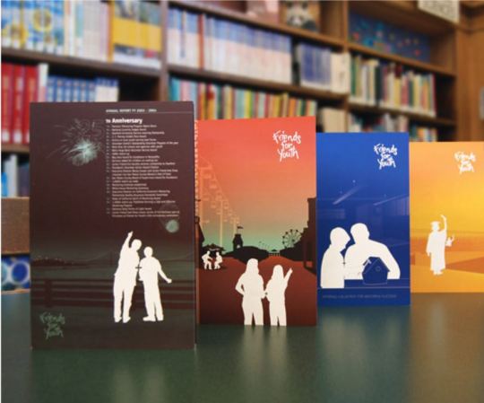
In the case study the Friends for Youth designers were presented with a problem of how to improve the experience of mentees, win financial support from businesses, increase awareness as well as solidifying the Friends for Youth brand (Rise-and-Shine Studio, n.d.). One of the solutions to meet some of these problems included creating mentor journals to help mentor and mentees track their success as well as offer suggestions for activities. Another solution involved creating mail-ready brochures that included annual report numbers and additional data supporting the effectiveness of the program. Many of the solutions to complete their goals differed from each other by who their target audience was. In some instances, the target audience was the mentors while in other instance the target audience included potential donors. The expected outcome was that the children they were mentoring who have a better experience and that donors would be more likely to donate to a program that showed success and portrayed solidified image. The use of motion video could be used in a positive way to help FYY achieve their goals. Motion video can be a great tool to simplify complex issues in an easy to understand video for an audience (Onorato, 2019). Motion video can tell a story in a way that connects with people with a unified message (Vermon Digital Economy Project & Vermont Council on Rural Development, n.d.).
Acquiring Competencies / Reflection
This week involved a great deal of learning utilizing the Adobe After Effects suite to create an animated logo in addition to concepts discussed in the weekly live video sessions and reading. In addition to the animated project the concept of designing for social good was also discussed where the use of media design is utilized to enhance the goals of social causes or communities. In addition, we discussed the topic of un-intended consequences in media design where we intend our work to have one impact and in addition or instead it has another. Lastly, we also discussed the topic of human-centered design where the focus shifts more to the user experience of a design versus the physical aspects of a design.
As for designing for social good, I would describe this as both occupational as well as conceptual. In the fact that the technical side of deploying designs for social good is the same as any other campaign and that its future focus on expanding the brand of a non-profit can help build a professional portfolio in the design field. Unexpected consequences in a design I feel can fit in the role of both academic as well as professional as work in both areas can have un-intended consequences. Human-centered design can also fit in both the realm of academic and professional settings as design work in general can benefit from understanding how a target audience views our designs. Human centered design is both technical and conceptual as the concept itself requires a fair amount of technicality to pull off properly.
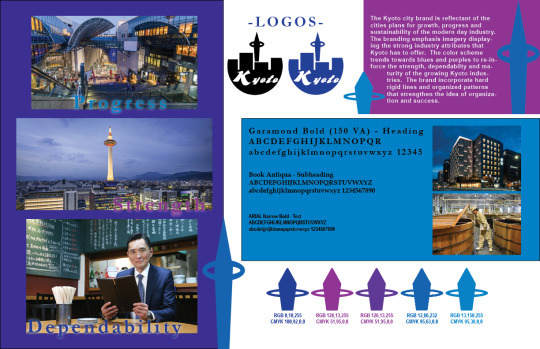
Working within the Adobe After Effects suite was both rewarding and fun. The LinkedIn learning videos offered an easy to follow along tutorial that helped explain the techniques used in a manner that was easy to follow. In my personal experience I did run into some issues with the way After Effects imported my Kyoto design from a previous course. The designs looked great in Adobe Illustrator, but when it was imported into AE, it kept cutting off a piece of the typography. Eventually after a large amount of frustration with the import I moved on and focused more on the animation side of things instead. Overall, I felt okay about the end product I made however, I feel like I can go back and improve the timing of the animation quite a bit more. Afterwards, I decided to use what I learned here and made an animated logo for my side t-shirt business celebrating pride month to be displayed on my Facebook and Instagram page. I was much happier with the end product of this design, however I'd like to improve it even further to see if I can make the D20 dice in the design bounce across the screen instead of just the rolling effect that I went with.
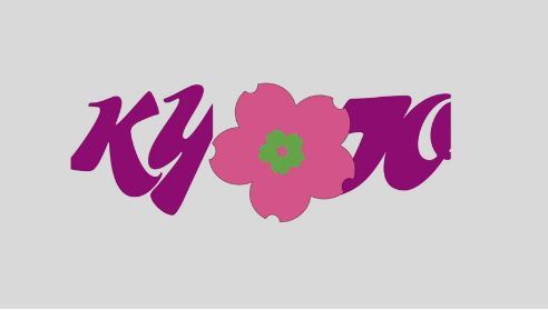
(example of my Kyoto Design Logo Animation showing text cut off)
View this post on Instagram
A post shared by Robert Placencia (@crithit) on Jun 19, 2020 at 8:27pm PDT
(Animated Logo I created with AE for my t-shirt business) References:

0 notes
Video
tumblr
Utilizing what I learned from this week’s work, I’ve created a logo for my personal side business / hobby making geek oriented t-shirts. I created an animated logo for my shop celebrating pride month.
0 notes
Video
tumblr
I wasn’t happy with the speed of the first video so I changed it up a little bit. Still trying to figure out why AE is cutting off a piece of my typography when I import it from AI.
0 notes
Video
tumblr
Animated Logo of my previous Kyoto design. I ran into a problem with After Effects cutting off a part of my text for some reason. I tried multiple times in both AE and Illustrator to resolve the issue, but still haven’t found out why it cuts it out when imported into AE even though it looks fine in AI.
0 notes

Video
tumblr
My first attempt at using Adobe Effects to create a motion movie poster. After the fact there’s a few things I’d like to clean up that I didn’t notice until after exporting the media. All in all I was happy with the outcome, though I feel like I could use a lot more Photoshop experience in order to really make this shine.
0 notes

Video
tumblr
Coffee shop commercial.
License free music from: https://www.bensound.com/royalty-free-music/cinematic
0 notes
Video
tumblr
My coffee shop commercial.
License free audio used from: https://www.bensound.com/royalty-free-music/cinematic
0 notes