
Last Seen Blogs

kpop-dungeon
Kai

mrochid
Kamu.

refaudit
Forum tir sportif AirGun

my-jean-pierre-echinard-stuff
Jean Pierre De Bressieux. Russie France Ardèche Isère.
theevilnae
Ramblings of The Evil Nae
Text
Sailor Moon movie poster concept

Remember my very first post on this blog? Here is an expansion on that idea. Obviously I have a thing for Sailor moon
Anyways this is a VERY old and outdated custom movie poster (actually one of the first I've ever created) for a fictional Sailor Moon movie. For the record, I first made this BEFORE the year 2020 hit, so that's why it's so outdated.
This was made entirerly in microsoft word. In fact, the main part of the moon prism broach started out as a circle graph. I chose Warner Bros as the distributer because I wish for Legendary entertainment to be involved. I like the direction they went with the MonsterVerse films, and I believe they could potentially do a good job bringing the Sailor Moon universe to life.
I have a whole bunch of ideas for a potential Sailor Moon film; enough that I'd probably overwhelm the passing reader with overinformation, so I won't go into further details. I actually do have a few more sailor moon movie posters that I've created (including one for a potential sequel) that I would absolutely love to share on this blog, so you might be seeing more posters on this topic in the near future.
(god I need to post to this blog more often than I currently do)
0 notes
Text
Every night you dream that you talk to a genie, when you wake up you can't remember what you wished for. One morning you wake up with a giant crab pincer replacing your right arm. What do you do?
Stare at it, then go back to bed and deal with it later.
4 notes
·
View notes
Text
Nintendo Posters VOL 2


Told you they'd be here sooner than you'd think
BrainBox is proud to present: VOLUME 2 of BrainBox's Nintendo posters!
Here's what's on for today:
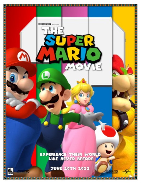
The Super Mario Movie
I believe these first two will be familiar to you. It's my favorite of all the posters I've done so far, and technically, it is brand new. You see, the original word file containing the original collage of this particular poster got irreversably corrupted by unknown means (will not be going into detail about this), so I ended up having to remake this poster from scratch. I kept it pretty much the same, but I did use a photo of Luigi that was different from the one I used on the original. There's also a brand new tagline, and it features the current release window.
2. Splatoon
Won't be going into much detail on this one, since there's nothing new to report here. Plus, i've already shown this one off in an earlier post.
3. Donkey Kong Country
After adding a poster featuring DK for the group of updated yet outdated Mario movie posters, I decided to give the monkey his own movie poster. Once again, I'm using Silhouette art to make this. I took a picture of DK on a vine, paired it with an actual Donkey Kong Country game background, made them both entirerly black, and put them in front of a sunset picture. I WOULD have used a picture of an actual jungle at sunset, but I couldn't find one where the picture of DK I was using would blend right in.
4. Starfox
For this one I used the same basic concept that I used on the first starfox poster that I did. This time around, however, we're on a foreign planet that looks suspiciously like Arrakis (dune jokes ftw). Also, if you look closely at the scenery, you can see that I added a mini Landmaster tank to give a delusion of scale. (at
5. Super Smash Bros
This one is a lot more different and a little more simple than my previous smash bros poster. Also, it's ON FIRE! Both figuratively AND literally! (I'll see myself out) I chose independence day as the release date because it definitely feels like a summer blockbuster, and therefore should be released near a big holiday.
6. Luigi's Mansion
Oh I really feel like I cheated with this one. I actually struggled with this one. I tried my hardest to put my own spin on this, but in the end it still feels very much like the original photo that was used to make these. My original plan was to make King Boo a whole lot bigger than Luigi (like kaiju sized), but I ended up resizing Luigi as well. In the end I ended up adding 2 windows instead of the original photo's one. That makes it a little different, I guess. Anyways, since Luigi's Mansion is technically a horror game, I felt like the release window HAD to be around Halloween time, so the release window is in October. (being generic so that the poster can't become outdated eventually)
What do you guys think? If I eventually do a volume 3 of these, I've decided that there will most definently be a MARIOKART poster!
Do any of you have any ideas of what I can turn into a movie poster next? I'm always open to suggestions, feedback, and criticism!
Enjoy these posters! I'll see you in the next post!
1 note
·
View note
Text
Newly Updated yet Outdated Mario movie posters


Welp, after a TON of procrastination, and after having to recreate one of the posters being presented from scratch due to the file containing the ORIGINAL collage of shapes and photos became corrupted somehow, I am pleased to present the newly updated versions of my Mario movie concept posters. (Of course, now that the release date has changed to april 2023, I'm going to have to update them yet again with the new release window.)
They are pretty much the same as before, partialy because I am already happy with how most of these posters are, but there ARE some new things being presented here today. Here's what's new:
All the posters have had the release window changed from June 2022 to Christmas 2022 (and soon they will all have April 2023 once I get around to updating them. again)
I gave the Princess Peach poster a brand new tagline, as I had decided the old one was too lengthy.
Finally, we have one BRAND NEW poster that features Donkey Kong, cause apparently Donkey Kong is apparently going to be in the film (and voiced by Seth Rogan of all people. no idea how that will work.)
On an unrelated note, I recently got around to making some new nintendo movie concept posters, and I am pleased to announce that I have now made enough to present a NEW collection of Nintendo themed posters for your viewing entertainment!
Nintendo posters VOL 2: Coming sooner than you'd expect!
0 notes
Text
Sign of life + mini rant + mermaids for your entertainment.
Dammit the mario movie got pushed back to april 2023. And I just updated my posters for the mario movie to have 'this Christmas' instead of 'june 2022'! Now I have to update them yet again to have the new release date. Might as well post the now outdated updated posters when I have the chance. Be on the lookout for that I guess. In the meantime have some paint by number pictures of mermaids from happy color.


0 notes
Text
Old swimsuit drawings


Welp, i'd completely forgotten about this blog. Time to try and post more and make more stuff. Hopefully. With that aside, i'd like to present a type of content I've never tried posting to BrainBox before; Hand drawn art!
These are a collection of 7 drawings that I did of various girls in swimsuits. All of them were originally drawn by hand with pencil, traced with pen, and ultimately colored in with colored pencils. Most of them were done on notebook paper, but there were 3 exceptions that were done on smaller sizes of paper. (The smallest one was actually drawn on a notecard)
They are kind of low quality compared to more professional drawings (I'm a bit of an amateur), but they are all drawings that I'm actually very proud of. Proud enough to have them put into my personal art portfolio.
They each have their own title btw, and they each have somewhat of a story behind them:
1. Un Mailiot de bain
The title is actually french for the word 'swimsuit' (I was studying French at the time). It's the first one of these that I ever drew, and i believe that I started drawing this during french class.
2. Notecard quickie
I literally drew this on a notecard. It was originally going to be one out of several notecard drawings that when you put them together, you end up with one large drawing of a girl treading water, but i ended up only drawing the one.
3. The greatest view on the beach:
The reason this one is slightly smaller is because the notebook i originally drew it in was on the smaller size (pocket size, that is). This is supposed to be a pov shot of you at the beach watching a girl pose for you in the surf. The results are actually very good.
4. The record
This one is of a woman attempting to break a breath holding record. If you look closely, you will see that she is wearing a watch.
5. The dive
This is of a woman diving into the water. What's special about this one is that the perspective was intentionally done upside down, with the sky at the bottom and the body of water at the top. It still looks good whether you look at it right side up or upside down.
6. Relaxation
First of all, this drawing is of the same exact girl that I drew in #3. She has the same hairstyle and the same swimsuit on. Second, this is the second draft of this particular drawing, with the original being thrown out. You see, in the original version I had drawn her hands doing something a little more, uh, SUGGESTIVE. And that's all I'm going to say because I don't want to anger the tumblr gods.
7. Diving board
This one is a side profile of a girl on a diving board. I think this one was drawn on blank computer paper, but i could be wrong.
I was actually so proud of 4 and 5 that I actually submitted them to my school's art show, so they've already gotten SOME publicity before now. And now they can get popular on tumblr!
Again, sorry about not being that active on Tumblr. Hopefully this will change soon. Catch you in the next post!
1 note
·
View note
Text
UPDATED Friday the 13th reboot posters


Well, November 13th of 2020 has arrived, and the Friday the 13th reboot is still most likely in pre-production. Seems like as good of a time as any to post some new posters to follow up on one of my previous posts!
We have two posters this time. They are both reminiscent of some of the original posters for the first Friday the 13th film. In fact, one of them uses the same silhouette from the original 1980 film poster, while the other one uses a plain silhouette of jason. Made sure New Line Cinema was incorporated into the poster, since they are the ones that own the franchise now, not Paramount.
I don’t really have much to say about these posters and the potential story about them. Most of what I’d like to say was already said in the last post I did regarding Friday the 13th. Maybe try looking it up in BrainBox’s archive?
Now that that’s out of the way, time to hibernate until the next post! See ya later!
1 note
·
View note
Text
Tom and Jerry 2020 Concept Poster

I should point out for copyright reasons that I DON’T own the rights to Tom and Jerry, neither am I officially part of the team making the actual film. I’m just posting this for fun, for speculation, and for the viewing pleasure of the people following my blog.
Good afternoon tumblr. Today I have to share with you my concept poster for the upcoming Tom and Jerry animated movie, featuring the film’s OFFICIAL logo.
It’s simple and straight to the point, with Jerry making off with cheese, while Tom looks on with disgust. It also features a simple tagline and the film’s general release window of Christmas 2020. (It’s officially slated to be released 12/23/2020)
I have to say, this isn’t one of my better posters, but it’s still a pretty decent poster all the same. The main reason I’m somewhat unsastisfied with the final product is that I wasn’t able to add everything that I wanted to add.
What I REALLY wanted to add to this poster were the 3D models of the famous cat and mouse duo that will most likely be in the real film. Unfortuently, Warner Bros hasn’t released much about the film in terms of imagery yet (except the official title art for the film, of course), so I was forced to improvise with classic 2d images.
Enjoy this poster, and I’ll see you in the next post!
(you know, they are bound to start releasing promo stuff for this film any time now.)
2 notes
·
View notes
Text
Updated Logo

I decided to update my main logo a tiny bit. It’s still the same concept, but now the shapes are all beveled to make it 3D. (also featured are some new colors)
New post coming sooner than you’d think
0 notes
Text
PSYCHO posters


You’d think that being coped up at home due to social distancing would increase my productivity. You thought wrong.
Anyways, today I present to you my posters for a fictional film REBOOT of the 1960 classic.
This time around, I did something a little different from normal. Instead of creating four different posters, I made a single base poster and created four different color variants;
1. A plain black and white version
2. A colored version incorporating the color red (the color of blood)
3. A washed out version of the previous poster, where black is replaced with white, and
4. A unique purple and yellow version. (when I first pulled up the title art for psycho, it was using this certain purple and yellow color scheme, so I decided to make one version using that particular scheme and just call it RETRO.
All four versions, regardless of color, feature a simplistic design in which the word PSYCHO acts as a window looking over a scene of the infamous psycho house with Norman Bates. They also feature Universal as the producing studio, and have September 2025 as a release date, with the intention of having the film’s “release” coincide with the 65th anniversary of the original. Finally, the posters use one of the more iconic quotes of the film as a tagline.
My vision for a Psycho Reboot is very specific. For starters, I don’t want the reboot to be anything like 1998′s shot for shot colored remake. I would want the film to expand more on the original story. It would be the same classic storyline of Norman Bates, but with a few minor tweaks;
1. It HAS to stay in Black and White format. I’m thinking something similar to how Sin City was all black and white, with only certain details being colored in
2. Keep the same soundtrack, or create a more modern version of the same music. It might actually be hard to mess with something so iconic.
3. Expand on the mystery by having the character of Mother portrayed by an actual person. Just seeing a female actor do all the stuff that the character of Mother does can act as a red herring, making the audience believe that she is actually a real person. That way, when the film’s plot twist is thrown in, it would be even more of a surprise. (to people new to the story, that is).
4. Use the addition of a female actor portraying mother to further expand upon the relationships between the two personalities. Think about it this way: Norman Bates looks in a mirror, and instead of seeing his own reflection, he sees the female actor playing mother staring back at him.
5. Have Norman actually find the stolen money. Give him a small moral dilemma of what to do with it. On one hand, he could easily just use the money to build a new motel closer to the newer interstate, while on the other hand, he knows that the money isn’t his, and that someone might be looking for it. I just think that it could be a nice little subplot.
Still got some more ideas for posters in the back of my mind. Gonna try to keep at it. Enjoy the posters and I’ll see you in the next post!
2 notes
·
View notes
Text
Friday the 13th: Dead of Winter (Fake movie poster)

I WAS going to wait to post this on March 13th, but I had ALSO originaly planned to post it on 9/13/19, then on 12/13/19. I just need to get this over with and post it regardless of the date.
Anyways here is a fake poster for the rumored Friday the 13th reboot currently set for November 2020. I would like to point out that although this IS concerning a real franchise, the story that I came up for it is actually an ORIGINAL concept.
MY CONCEPT FOR THE FILM
The film would center around Jason Voorhees hunting down and killing horny teens, like normal, but instead taking place during the summer months, like they usually do, it would be set in the winter months, which I actually don’t think has ever been done before. I know for certain that there are a couple of Friday the 13th video games that explore Jason killing people in wintry conditions, but I don’t think they’ve ever made an actual movie concerning the topic. As far as I’m concerned, Jason lives at Camp Crystal Lake year round, so it’s assumed that he has to survive the winter months just as much as he has to survive the summer months.
Chronologically, I’d like the film to take place sometime between the event of the first two films. My reason: in the first film, the camp was said to have a death curse, making no mention of Jason since he first appeared in the very END of it as a final plot twist. But in Friday the 13th part 2, which takes place around 5 years after the previous installment, the buzz about the camp centers more around Jason still living in the area after all these years. Now how did the talk go from the camp having a death curse to Jason living at the camp? Answer; someone had to have seen the adult Jason with their own eyes, and started a new rumor about the camp.
DETAILS ABOUT THE POSTER
It’s a moderately simple poster, with a lot of emphasis on the color white to represent a snow storm. Finding a picture of a forest in the winter was easy. Finding a picture of Jason Voorhes in wintery conditions, however, was actually very difficult! I could only find 1 picture with the desired credentials that I actually liked, and it wasn’t exactly a picture that translated into my poster very well. For the film’s title, I just ‘borrowed’ the logo for Friday the 13th: the Video Game and replaced the ‘Video Game’ phrase with an original title via the magic of editing.
FUTURE POST
I have some PSYCHO posters that I have in quere for a future post. Furthermore, I have an idea for a film poster for SOMETHING COMPLETLY DIFFERENT, so keep on the lookout for that!
Enjoy the Poster, and i’ll see you in the next post
4 notes
·
View notes
Text
Nintendo Posters VOL. M


Welp, these things had been done for a few months now, and I'm just now sharing them with Tumblr! #lazysloth
Anyway here are my concept posters for the upcoming animated Super Mario movie.
I originally started working on these shortly after posting the last batch of Nintendo film posters to the blog. If you recall, the original poster that I made for the Super Mario movie was extremely simple; a red hat on a white background with the release window. Compared to the other five posters, particularly the Starfox one and the Smash Bros one, it didn't look like much effort was put into making it. So, since there actually IS an animated Mario movie out on the horizon, I decided to expand on the subject a little more than I already had.
So, instead of making one poster, I made six! One 'final' poster, and five individual 'teaser' posters.
The 5 'teaser' posters are all set up in the same way; One Mario character standing inside of a large ? Block. I tried to make it look like each character is emerging from the block in the same manner as items like mushrooms do when they are hit from below.
Each character has their own unique background color and tagline. While I'm not particularly fond of peach's tagline, I do really like how the other 4 came out. Especially toad's tagline! It's TOADALLY awesome! YA GET IT? TOAD-ALLY! AH-HA-HA-HA-HAAAAAA!!!!
(I'll see myself out)
The 'final' poster, on the other hand, is probably one of the more complex designs that I have come up with. I took heavy inspiration from some of the posters for 2018's Ocean's 8. Look them up, and you will see somewhat of a resemblance.
I divided this poster into 5 segments of equal size. Each segment contains the following;
a. a different and unique color,
b. a fragment of the ? block symbol. Put them all together, and you get 1 whole picture (It was actually a huge hassle to get those placed just right), and...
c. one of the five Mario characters that were featured in the teaser posters. I've strategically placed them in a way that makes them look like they are coming out from behind the segment that is in front of them. That way, the poster illustrates an illusion of 3d space/depth.
In case you haven't already noticed, all six posters feature a realistic looking Movie Title that I pretty much made from scratch. It's the one thing that all of these posters share, and I am very happy with how it came out
Overall, it ain't bad for something made entirely in Microsoft Word! After a couple months in development, hopefully it will have been worth the wait. #rippingoffagabennewallquote. Enjoy the posters and I'll catch you in the next big post!
3 notes
·
View notes
Text
I found this on Facebook. And they say Infinity War is the most ambitious crossover in existence! These two beg to differ!
5 notes
·
View notes
Text
The 7 Wonders of the UN-NATURAL World!


Geeze, I had WAY too much fun making this!
These are 7 photos of natural happenings, edited to look like they're something from another dimension
The X in the Sky
The devil's hand
The Hypnotic ball of light
The human windows
Water from the 5th dimension
The elusive W.C.E.E.G. from GTA5
The Color changing roof.
You might recognize 1 and 5 as photos that I have already shared with this blog, but the remaining 5 are all new photos for your viewing pleasure.
Enjoy!
(And yes #6 is a VanossGaming reference)
AND NOW FOR SOMETHING, COMPLETELY DIFFERENT.

0 notes
Text
Nebbish: a Non Sequitur story
(Sorry this took awhile to upload. I was having technical issues as well as inexplicable laziness)


And now for something completely different...
Check THIS out! I turned the entire Nebbish storyline from Wiley Miller's Non Sequitur comic into a cute little booklet! (Or at least the ones that I read in the papers. There might be more I don't know for certain)
It contains all 21 Sunday strips that ran between October 2018 and April 2019, as well as an entire page devoted to copyright information (I'm not trying to plagiarize after all), and an acknowledgments.
All of this is styled to look and feel like a real book. Not only that, it's pocket sized! I really do like how this turned out!
And now, Avengers: Endgame requires me to stay off tumblr for awhile. Not because I haven't seen it yet (I most certainly did yesterday), but because I will be part of the squad cleaning auditoriums after each showing!

(This is going to be a long few weeks...)
2 notes
·
View notes

Text


Snow mountains are back. Took a bunch of photos of close up views of plowed snow mounts. Even climbed up a few to get some new angles. Enjoy!
1 note
·
View note