
Statistics
We looked inside some of the posts by erfanalavi and here's what we found interesting.
Average Info
Notes Per Post
6
Likes Per Post
6
Reblog Per Post
0
Reply Per Post
0
Time Between Posts
2 days
Number of Posts By Type
Text
10
Photo
5
Link
2
Last Seen Tumblr Blogs

Fun Fact
There are dozens of funny blogs to kill time on Tumblr.
Text
STUDIO SINGULARITY II REFLECTION.
I have gotten to the end of semester and looking back over the last twelve weeks I’m pleased that I have learnt some new skills, but I’m a little disappointed with the way things planned out towards the end due to a lack of time and talent. After setting everything up and planning around with the exhibition myself, I couldn't help but feel it was missing a main component to the project concept.
After having to make changes to the boys robot, I knew the concept would become a little more difficult to visually present but it gave me new goals to reach for the next time. Although it does show the idea of using the robot as a personal branding accessory, it doesn't outrageously show to what extend this concept could change what is acceptable in society. Looking forward into the future I believe i have an idea that needs to just be portrayed in the correct manner. I thought getting the human and androids next to each other for a comparison was the key factor of this exhibition, but for the next exhibition i know to focus on showing the breaking and acceptance of conformity from different generations using a A.I.
Overall I’m pleased with the process I’ve endured to get to this point as it was a real challenge making everything come together. The lack of knowledge about both Augmented reality and 3D modelling did turn out to be a little more difficult that planned to learned, but with the help of Harry and Kong who have experience with AR, they helped me avoid making any more bad choices and gave me insight to what they are doing with AR and where I could go with this project for a 2.0 version
0 notes
Text
AR Development Part 4
This was the last week I had to put work into my AR presentation, and to be honest I’m not very happy with the way the App visually turned out. I felt that the Augmented reality app didn't quiet articulate the idea in my head after the changing of clothing for the boy’s bot. After going through difficulty trying to clothe a model of a A.I wearing some crazy clothing, I decided that the boys bot should look similar to him for project timing purposes and to show a sibling kind bond. But after i had made the change, it messed up the dynamics of my project as it made the old man’s screen and the child’s screen visual screens look too similar.
Main updates:
- Put the arms of the men and A.I to their side - A AR landing pad with a purpose/added project info - Finalized what to do with the Boy’s A.I clothing - Play-tested my exhibition with family to see if they understood it
PLAY-TESTING:
When this app was shown to my sister with a poster and statements, she said she could barely understand what the point of the AR visuals were because the visual content is useless unless you read the poster first. This hit me hard and I attempted to learn from my mistakes, but in the end i had no other choice but to update what the audience will see on the device instead of focusing on what is projected on the AR app.
I attempted to change the color of the boys A.I multiple times to random colors, but according to my sister ‘the effect was even worse than having the two screen looking similar’. I then made a call based on time left for this project and my skills to stop extra work on the actual AR models as they are and focus on the landing pad to attempt to get my idea across without cluttering the page.

SACRIFICES:
In the end i must admit i took the wrong approach with attempting to express my idea with the changing of generations with their A.I. If i had play-tested a little bit sooner i would have seen that the project would of made better sense if it was just an A.I that changed clothing as you swiped the screen. The only options available to visually improve communication of my project is by playing around with a landing pad that works hand in hand with the poster and makes sense when the models pop up.
As it nears the end of semester, I took into consideration that the exhibition is only 20% of our overall mark, which meant I had to put extra focus on the other 80% to make up for the exhibition section. Personally if i had more time i would of redesigned the Augmented reality part of my concept, but now i can only learn from the process by reflecting back on my failures and how it will help my future success.
0 notes
Text
Week 10 +final Reflection
PLAYTEST REFLECTION
Reaching the end of our 9 week process of conception, researching and prototyping the team begun the play-testing and reflection section of the process. I began the play-test process by getting 4 family members to look through the website while I watched and noted what they understood and what was confusing to them.

These where the results drawn up in a diagram to show the main issues the play testers came across. it was obvious to see they where confused with aesthetics and layout of the website.

I had to take the testers back to the first page multiple times and told them there was important text is still on this screen. Eventually they all found the small text with a link to the explanation in between two massive images. It was shocking yet important to see how the main page was being missed multiple times, by different people, due to the size pollution of 3 images and the cluttering of small, unnoticeable fonts. There were 4 testers and all four of them got to the most important page last. This was an eye-opener because the ‘vision’ page SHOULD of been one of the first pages they see.
Once on the ‘vision’ page is where things were clarified and a proper picture is painted of what the team was trying to do overall. The page explains overall what the project is about and has a deeper explanation available for those who would like to understand where we would like to go with this project. I also noted that the examples for installations written down for each path helped give a better understanding of what type of work is expected, as well as clarifying what the team is doing for the project that will remain consistent.
The final step of play-testing was when I ask two of my testers who said they could understand what the project was about to participate as if the pillars were there. My brother-in-law pulled out a sticky note a wrote “lost my wallet here, still looking for it” and stuck it on the mental paragraph; my sister on the other hand pulled out a piece of paper and begun drawing a Pouwhenua and said it’s something she would create for a spot in the spiritual PATH as she is open to spirituality and would like to give her own twist to a cultural icon. The other two testers use English as their second language so they didn’t quite understand what the website was asking them to do.

In this last step, I learnt that we can target both the artist and the audience through a better displayed website but if we wish to target people of different cultures to participate, the language has to be simplified on our main pages over viewing the project, and in depth on other pages that will answer a participant’s questions.
Final Reflection:
Up to this point our team had a very solid idea that was feasible, we agreed with what worked and what didn’t in unison, we tried to match up our skills to the work designated, and now we have gathered enough playtest data to blueprint a version 2.0 website and pitch for this idea.
From week 4 onwards we wanted to produce an idea that had some form of cultural influence, during our research period we discovered that the “(waharoa) was designed to transform Aotea Square into a metaphorical marae ”(1). We used this as the basis of this project and I must admit that I personally would change nothing with the idea fundamentals for a 2.0 version.
When we first thought of this project proposal, the team was attempting to morph and present our idea to be more culturally accurate. A taniwha concept was considered for being the centre-piece of our project that stuck for a while, but eventually we found reports exposing conflicts where the Taniwha became an issue that “is being allowed to halt development”(2), and we decided if this was still going to remain a feasible idea we going to have to get rid of the taniwha and focus on the marae concept by itself.
Even though we wasted several weeks attempting to come up with a project involving the taniwha, in the end it turned out to be a blessing in disguise. The problem our group had at the start of semester was we were asking ourselves what we wanted to make for this project by the end of semester, rather than where could we go with this project if semester never ended. Once the taniwha was out of the picture the team backtracked a bit except now we had the Hauora pillars and path idea already in place.
The Hauora idea went from a concept designed to keep us doing minimal background work so we could focus on the taniwha, to a concept attempting show value as a bigger picture by highlighting other’s opinions and experiences to the Aotea space. I believe this was the goal we were attempting to achieve from the start but required that Taniwha hiccup in the process to realize our idea was better with a little less Maori influence but a dominate Hauora theme that can be intertwined with oneself own Hauora .
The only thing that didn’t go too smoothly this semester was communication with certain members of the group early into the second half of semester. “Poor communication is often the cause of great misunderstanding and conflict’”(4) and that became the case here. Team moral was cut short causing two members to leave the group with little or no notice, and there were times when team mates misunderstood the purpose of this paper by asking too many irrelevant questions too early on in the process. We them decided to have consistent group meet ups and chat forums, which kept our team positive as we re-structured the team and found answers to our questions together.
If there had to be aspects of this project that I would update for an upgraded version, I would change the aesthetics of the website to organized what each part of Hauora is about and what is expected visually, and make it more social media related as we are trying to find outside artists. The biggest issue we had with our website was readability and i learnt afterwards that “Colors with greater contrast ratio generally lead to greater readability” (5), so for next time i need to make all important text contrast the background colors/images. Other than that, I believe we have an idea that if followed through could make a very successful Aotea square interactive installation.
(1) Five of the best public artworks in Auckland | Stuff.co.nz. (n.d.). Retrieved from http://www.stuff.co.nz/auckland/83958585/five-of-the-best-public-artworks-in-auckland
(2) Transit and the taniwha - NZ Herald. (n.d.). Retrieved from http://www.nzherald.co.nz/nz/news/article.cfm?c_id=1&objectid=3003401
(3) Durie, M. (1998). Māori health: Te whare tapa whā model. Retrieved from https://teara.govt.nz/en/diagram/31387/maori-health-te-whare-tapa-wha-model
(4) Grover, S. M. (2005). Shaping effective communication skills and therapeutic relationships at work: The foundation of collaboration. AAOHN Journal; Thorofare, 53(4), 177-182. Retrieved from https://search.proquest.com/openview/77cf11ec8f3bbd4308a836a5e2234b6e/1?pq-origsite=gscholar&cbl=47930
(5) Hall, R. H., & Hanna, P. (2004). Behaviour & information technology. The impact of web page text-background colour combinations on readability, retention, aesthetics and behavioural intention, 23(3), 183-195. Retrieved from http://www.tandfonline.com/doi/abs/10.1080/01449290410001669932
0 notes
Photo
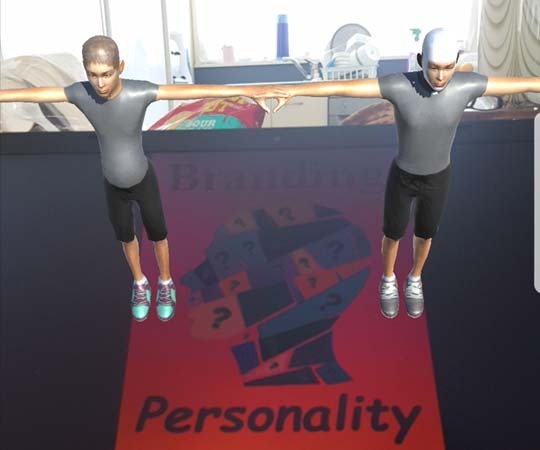
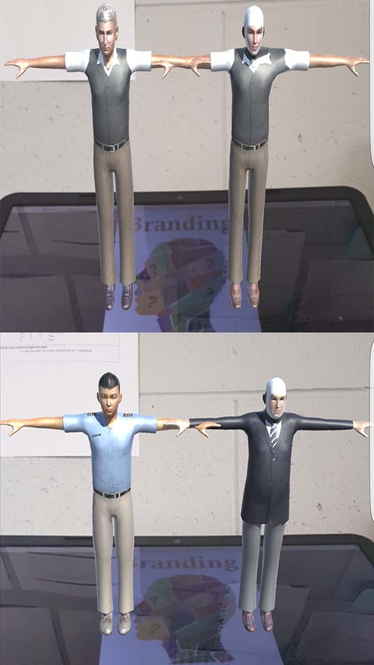
AR Development Part 3
Difficulties Madness:
In between play test 2-3, the entire thing turned to shit where nothing was showing up at all. I made the call to restart the same idea but piece by piece to figure out why it wasn't showing up. When I had the elderly man and the middle aged man pop up everything was working fine, so i believe the issue began with what i was trying to assign the boy’s A.I to it’s position .
I had a peacock style costume on the boy’s A.I but i believe the image might have been too big for the landing pad. Although the problem is not reveling itself i managed to get everything to show up as well as the scrolling up and down to work perfectly with the costume change of the boy.
The image on the left also shows glitches that happened only when i was on the boy’s page. The other screens where registering the men and their bots perfectly from this same angel but when it got to the boys page, this would happen. This was what put my mind at ease when it came to finding the issue because at least now i know it was 1 of the 3 screens glitching out only.
ISSUES PART 2:
Okay so now that i have everything working i need to do something about the screen with the boy because his bot is no longer showing what I need it to show. The aim was to get the child's bot to be dressed outrageously, but due to the issues addressed above, all i know the solution is to change the clothing on the boys bot.
My first thought was to dress the A.I similar to the boy and paint the clothing exotic colors, but even with all that done the message didn't quite come out the way i had hoped. With the deadline for studio only a few weeks away I’m going to have to make sacrifices i dont like, but due to the lack of experience and for exhibition sake its going to have to attempt to portray the same concept as the old man and his bot, except give it the twist that a child might want a brother or a twin.
1 note
·
View note
Text
VCB - Semester Reflection
Over this half of semester, I feel as if I made a lot more progress compared to the first half. This half of semester begun with a bit of drama that kept me driven throughout, but my biggest challenged faced this semester was being grouped with people I didn't know. I was placed in a group with Holly, Jess and Shaista and although they are all amazing hard-working girls, it didn’t mean much because they didn’t show up to class to understand the process we are meant to be following.
Being the only member of my team that attended every lesson for this half of semester, I was deemed project manager. This was done at a very late date since I didn’t know these girls would be pulling a sickie every other week, and it caused me to have to do most the visual work myself so there will be some consistency in our work for the hand in at the end. In saying that I didn’t let them slack off, I arranged the girls so that they will be focusing on work from the day which they were here, and I’ll take what they have and collaborate their ideas with mine. I believe we got lucky for this type of system to work out the way it did, but I must give myself credit for guiding them.
The work produced at the end was to a satisfactory standard but felt as if I had done it all, one thing I would have liked to change was the amount of drawing we had of the actual mascot. I had to keep the mascot looking very simple so when I saw members of my team I could explain new concepts to them while keeping the structure of the drawing consistent. I believe that our focus was on the mascot so there should have been more of a development of it visually.
Overall, I am happy with the final results knowing they were to the highest standard that I could have done. There isn’t much more I could change to help express the potential of the mascot idea as I felt we had it all covered in the end anyway. I would like to continue this project and see how far it could actually go.
0 notes
Photo


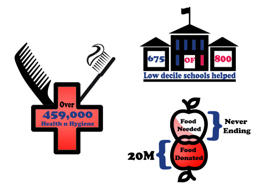
Info-graphics With Shaista
So this has been the third week now in a row where I have had a different member of the team show up by themselves. Although this experience has been annoying, having to repeat what we have done in the prior weeks helped me stay on track as an individual.
This lesson was about getting information across through visuals. Shaista and I begun the class by going over things that were going to remain consistent for this project, In this case the idea of having a mascot and making it look like a can for relevance to the name of the company. We then started questioning what color it would be, we looked back at the storyboard and liked the idea of a white can for introductory purposes.
We then realized that the can be treated like a like a walking billboard in the sense that it can have all the information of the company on its back. My first thought was in the form of a nutrition label or something relevant to cans to give an indication of where the front and back of the can is. Through out the week i had drafted and completed these info-graphics, they weren't ready for the presentation but now that they done they suit the presentation slide very well :)
0 notes
Text
VCB - Storyboarding With Jess
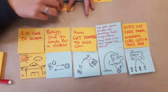
This lesson was spent creating a story boarding by further developing on thethe ideas we had last week. Since this time i have a different partner in the group who decided to show up, i had to keep things straight to the point so Holly or Shaista dont come back to class thinking what whats happening The topic of choice was the mascot again, where Jess and I now drew out different methods that the can could be used to get the children involved more. During this time we spend some time drawing up different variations of a mascot and came to the conclusion that an actual can is the best suited option for a name like KidsCan.
The main area we are attempting to focus with the story board is social media. Last week there we looked into all existing webpages KidsCan had, and for a company that is trying to give off a positive vibe i think their social media is something that needs more attention.
This was the story board i had completed at home to show how a tin-can mascot could be used to educate the children of both high and lower decile school through the use of social media. The mascot sort of becomes a middle man for these schools to connect through a similar image

0 notes
Text
VCB - Mind Mapping With Holly
Now that we had done basic research into our chosen company, we had a better understanding of what KidsCan stood for and how they wanted to be viewed as a business, but most importantly, we learnt what the company was doing wrong to be unnoticed.

This lesson was about Mind mapping to pin point multiple areas of the KidsCan company that can be addressed with a single action. We began the mind-mapping process by branching out from what we had learnt from the research period. The very first thing Holly and I agreed had to change was website, followed very closely by the logo.
The Website: - Is just WAY TO BORING: - It has too many pages and links for the amount of text on some screens. - The photos do not communicate much *other than they want to ‘be positive’ and show that ‘sharing is caring’ - There is barely any color on the pages, and it wasn't because they where trying to use white space, if that was the case the website would be a lot tidier. - There social media links should be utilized and made easy to locate
The Logo: Once again Holly and I agreed that it was a horrible logo because its was just boring to look at. It doesn't tell you anything in the visuals about the business other than being NZ operated, and the color scheme doesn't make sense and is far from appealing. Ultimately this logo does the company no justice as the logo is only words, and to prove it i walked around to students in class and asked them if they knew what KidsCan was. I was not surprised when i got answers like ‘childs cancer services’ or ‘an orphanage”, this quick play-test confirmed that the mind mapping starts with the logo.
How the Mascot idea sparked
Holly and I began mapping out visual components that could be used hand in hand with the website and the logo. We threw a few ideas around and one that stood out was giving the company a mascot. We questioned if a mascot could be the face of the company where he would be used on the website headers as well as being in the logo to create a new personality for the company.
Not only is a mascot useful for humanizing a company for marketing purposes, but it can also help you communicate with a younger audience much more effectively. We then decided that positivity was equally important for having a mascot if we were aiming to educate the children first. We need them to see the company as something unique and exciting so they go home and tell their parents about it.
0 notes
Photo
AR Development Part 2
I learnt a fair bit in this part of the process mostly because I couldn't get the AR to do what I wanted it to do when there where multiple pages to scroll around. By play test 2 I had done the human images with the robot next to them but i couldn't get the pages to change after it had been changed once.
I also managed to get the app to show the child + bot screen except it would not stay up long enough to screen shot. I believe the robot on the boy page is apart of the issue as the image of the robot wouldn't load up properly
For Next Play Test:
- Solve scrolling down + up issues - Solve the boy’s robot issues
0 notes
Text
Thinking: 3D Printing Overlaying
In one of my past posts, I referenced a YouTube video of AR technology working with 3D printings to elaborate the printings. After part one of getting use to AR I went and talked with Harry, who had a lot of experience with this AR technology.
My main concerns addressed with him was the amount of experience required to do an overlay of a 3D printing. Since he had tried 3D overlaying before, he very bluntly told me that we didn't have enough time for me to be learning how to overlay using AR. He also informed me the amount of bugs present in Vuforia because it is a new program, means there isn't even a 100% chance that it'll work on presentation day if the audience holds the device wrong.
These where two very valid reasons to consider for not doing it, but to prove it to myself i revisited my heart video and I understood what Harry was meaning when he said it might not even work. On the YouTube video there where too many instances where the Augmented Reality was failing at reading the 3D printed model and the people on the video where even saying how it has issues reading the image due to lighting and angling of the device camera.
What I took into consideration:
- Avoid the 3D printing as a landing pad for AR - ANGELS MATTER (I've even had a few difficulties in my first play-test) - Avoid detailed images to use for a 2D landing pad - Overlaying is difficult for the moment, due to being so new (thanks Harry)
0 notes
Photo

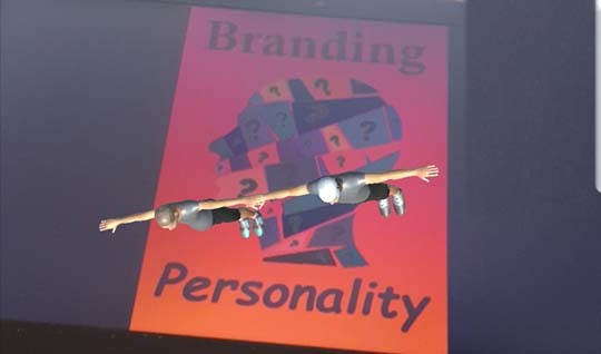
Branding Personality: AR Finally On A Roll
Finally picked up what im doing with all these programs and making them work together to actually have something to present :D
Collaboration to learn:
There was another student named Kong who was doing Augment reality for his studio project as well. I was having a bit of difficulty making everything work and he helped clear things up with his limited knowledge. He was actually the one who guided me through using Vuforia with unity to get this result. My biggest issue was attempting to get a landing pad that registered instantly, to practice i was shown how to make a quick landing pad where the image would show up too.
What I got Part 1:
I decided to portray my idea in AR because its going to be a realistic way things will be advertised in the future, and I wanted to give a sense of what an ad will consist of when AR is used for simple commercial advertising. Last week i was familiarizing with programs and this week I’m testing to see what i can do with it. As you can see in the image above i haven't yet perfected the positioning but i have a decent sized image appearing on screen.
For part one i manged to get a my first example up and running on my phone. The aim in the image above is to show an older man, aim at the baby boomer generation who like to look well dressed when in public., with his AI companion all dressed up to compliment him and how he would be seen in public. The image has the robot all buttoned up and the man loosely shirted with the goal to subtly imply youth to an older man by making the AI
Still to do:
Now that i have a starting foundation i can see what is working and what isnt. First thing first i need to get the arms down on the bot and the man. Then i need to generate a button to move up and down from screen to screen.
5 notes
·
View notes
Photo

Visual research
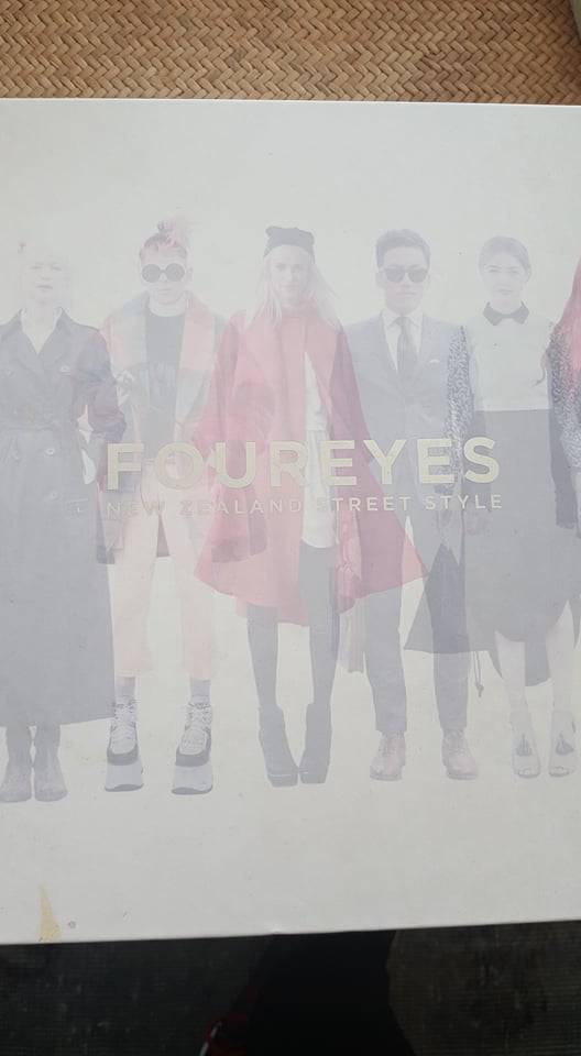
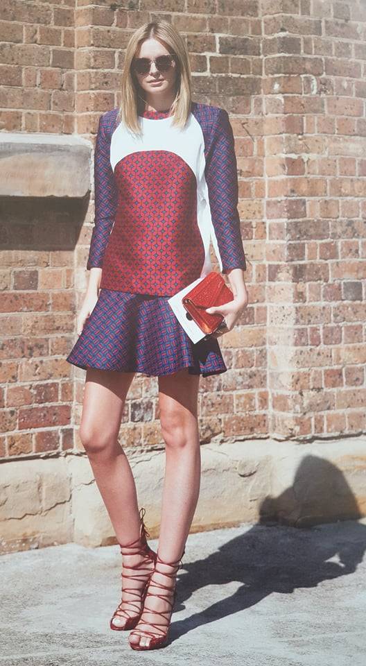
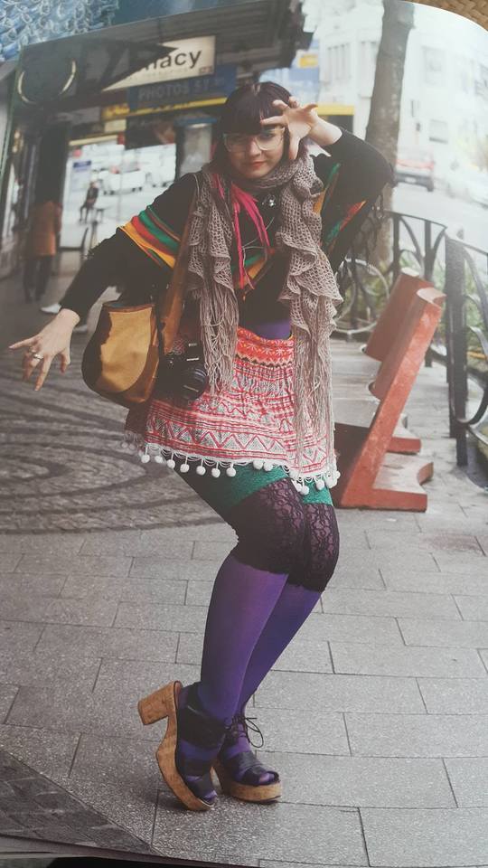
I found a mostly visual book called “Foureyes” (Author : Alex Blanco, Chin Tay, Danny Simmons & Mino Kim) and it focuses on fashion in NZ showing how different outfits bring out the unique personalities of people. I looked into this book to research into how crazy some people are willing to dress and walk out on an average day and wanted to link it back to the project.
What i got from looking at a visual book, was that the outfits worn gave a subtle hint to the personalities of the models but they all still look socially acceptable. There where no people casually peacocking in the streets of NZ in outrageous outfits or anything, and I was a little disappointed to find these photos to be the most unique to relate back to personality. This just tells me NewZealand has a social standard to how we should be in public, But what if your robot companion was waiting for you to dress it up?
According to a Forbes article interviewing Clinical psychologist Dr. Jennifer Baumgartner, She states that ‘You can use your wardrobe to change how others perceive you—and even how you think about yourself’ (2). This tells me that when mankind begins dressing their A.I companions, there is going to be a bit of a change to what will be socially acceptable as there will be multiple A.I dressed (currently) inappropriately according to some.
Once this happens i believe the fashion world will have a singularity revolution as designers can make the most outrageous clothing, knowing A.I will be only capable of wearing and presenting it to the public. Ultimately changing how people want to be seen in public with bots following them. Image a man walking around with 2 bots dressed in suits in the middle of summer, compared to having 2 bots dressed in a bikini in the middle of winter. Both give off different views on how the person would want to be seen dependent on how their entourage of bots present themselves.
Project update:
- Get a comparison happening between different eras. (use what i learnt from emotional branding about how the generations now vary)- how some form of professionalism use with clothing an A.I- Show a odd/outrageous/stupid AI to show how the younger generation would express themselves.
Refferences:
(1) Blanco, A., Tay, C., Simmons, D., & Kim, M. (2013). Foureyes: New Zealand street style.
(2) https://www.forbes.com/sites/learnvest/2012/04/03/what-your-clothes-say-about-you/#790ee3ae6699
0 notes
Text
The Original Plan for Exhibition
youtube
At the start of the second half of semester i wanted to aim for something like this to present on exhibition day, where i would 3D print a generic shoe shape and have an augmented overlay that changed the shoe when swiped down and up . How i planned to show branding singularity through this was to give the idea that people will want to see their options up close and personal even if they're behind a screen.
The Singularity issue:
So this was a great idea except it inst really a singularity related because obviously this is where technology is going when it comes to shopping (especially online). So i had to attempt to think one step further to relate this project to first milestone of singularity known to man, which is where the idea to brand for exposure on Artificial intelligence came to mind.
I wanted to get a 3D printed model of a man and the have a AR robot pop up behind the model looking as its companion. When you swiped up or down the image of the A.I behind the man would change clothes to express the idea that people will dress the same thing very differently. Then i ran into my first two problems with what i wanted the final out come to be. Originally i wanted the printed figure to be about 6 inches tall so it could be the center piece of my exhibition, with my phone being used to look at the AR. Because i am learning about 2 new programs to get the AR happening it became a bit stressful trying to figure out how to print a model. So i skipped a step and attempted to get an AR image to register to a drink bottle that would be the size of my printed product. i had many failed attempts at trying to get the AR to lock on to the image of the bottle and when i finally did get something to show it was a 5th of the size and half stuck on the bottle.
So What...
I had to rethink how i could get my idea of: - A.I clothe branding, - its singularity potentials and - how it would be dressed uniquely to the different users
0 notes
Link
This video saved my ass from attempting to make a character from scratch. This has been a HUGE break through for me because ive had to learn about all these programs (vuforia,unity and Maya) I had alot of difficulty getting use to functions and tools on these programs and trying to understand how they all connect, but in the end i managed to find some sort of flow to get a man happening.
0 notes
Link
The first video i watched after deciding if i wanted to do AR for this project. Gave me instructions on what i should be using. - Vuforia + Unity: to make the AR project - Unity Autodesk: Available templates and animations - Maya: Modelling characters (in my case the robot) - Image required for the AR to pop up
0 notes
Text
Interaction + Play Week 9 Critic
Today we had our final critic presentation and there were multiple things we have to go over to make our website more understandable. From the feedback received from Ben, the prototype we had were perfect for getting the idea across but an extra feature would be writing up specs for the real thing being made, such as weight, size and appearance. This is more applicable to the brief as we are being marked on a informative pitch rather than having the real prototype.
Another pointed added to our prototypes is the play test them in the next few weeks and see how people react to it and write it down as a reference. For the team members doing the physical prototype this is the next step and it'll be something they can put into the video at the end for marking.
Website Updates:
- Stronger Aesthetics - Project direction elaborated - Needing a CONCISE explanation - A self explanatory home-screen - Clean up info - Contact details at the bottom of screen
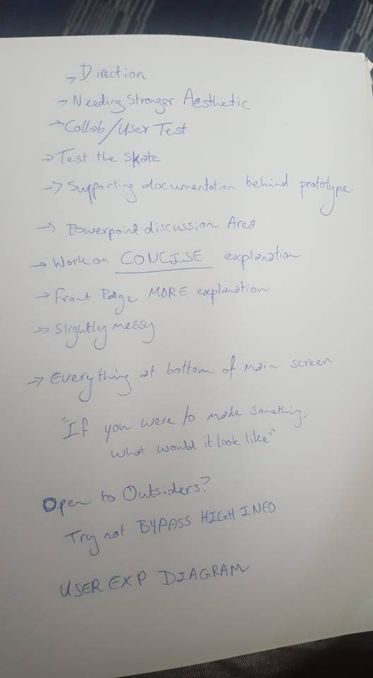
After class, the team got together quickly to discuss what we will be doing in the following week if we no longer have to be working on the prototype. Essentially we boiled it down to, work on the website and begin perfecting a pitch for the project. Since ive done a few pitches already in my 3 years at uni i decided ill make a skeleton draft of what we need to say and how we should say it.
0 notes
Text
Interaction + Play week 8
I had missed out on class this week but using slack and Facebook most the group stayed in touch to clarify what we had to do for the up coming week where we will be presenting to the class our prototypes.
On Monday half our group had gone to see a spokesperson who would be telling us what is okay and whats not to do at Aotea Square. From what I understood from the team, our consistent ideas (being the pillars that the path leads to) are acceptable but we need to clarify what is expect from artist wishing to collaborate with this project.
My Role:
Last week my role was to write up a description of each path leading into the middle and a submission page for the website where artists can understand what is expected. I begun this week by re-editing what i had written about the paths, and due to the removal of unnecessary sentences, the text became a lot more in depth and useful to anyone wanting to get an understanding of the project. I also had to add to the text some more examples of what an outside artist could do as a piece for the pathway leading to its specific pillar.
With this now sorted we could change our submission page so its a simple apply and send method rather than having all the specifications or extra examples on the same page. This made the visual appeal of the website way better as the sub page wouldn't be so cluttered.
Team Meet Up:
At the start of the week, the team got together for a quick recap of who has done what and what is expected in the presentation. Sad to say we had a team member not pull her weight and we were left with a slightly underpopulated site with no background information about the square. This was important to get done as anyone who didn't know about Aotea Square would have no idea about its origins and battles its gone through to be what it is today. So for the coming week someone will have to pick up her slack, but we agreed to wait until after the presentation so we get a check list of things to sort out.
Reflection:
I've been pretty happy with the way things have been going with my group. Other than having one hiccup with a group member, everyone else kept in touch, came to the meet ups and bought new input every week which ultimately is making our projects foundations more reliable in the sense that it'll work if it happened. Even though we have a big team I’m happy to say we all did a part of the project which matched our abilities,degrees and interests
0 notes