
Statistics
We looked inside some of the posts by eugeniekwon-blog and here's what we found interesting.
Average Info
Notes Per Post
31
Likes Per Post
29
Reblog Per Post
0
Reply Per Post
2
Time Between Posts
8 days
Number of Posts By Type
Photo
13
Text
4
Last Seen Tumblr Blogs


Fun Fact
Tumblr Inc. has $15.1M in annual revenue.
Photo


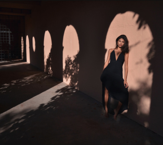

Week 10 Assignment: Photography
When I was choosing these photographs, I chose them because I either liked the composition or the colour palette that are being used. In terms of the composition, I liked how objects (ballerina shoes, laundry, shadow) are interacting with the figure. Even though they are not objects that attract the eye instantly, these objects in these photos are actively placed to be more engaging. A lot of these photos are more towards having the subject in the center, which draws the viewers’ eyes there. However, the one with the shadows create an interesting depth with the figure standing there.
In terms of colour, I like photos that are neutral being able to focus on the photo more. The figures in these types of photos can be focused because the general atmosphere is neutral. The neutral set of colours make the viewers’ eyes to be more relaxed. However, I also chose a few photos that are vibrant in colour. Especially for the photo with two little girls, I liked how the vibrancy in their clothing is captured on camera. Overall, I personally like photos that have simplistic composition but showing the sophisticated aspect with either a neutral or a good amount of vibrant colour palette.
1 note
·
View note
Photo
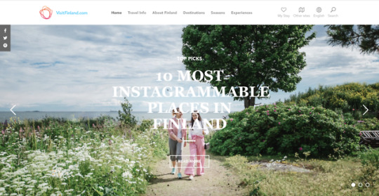
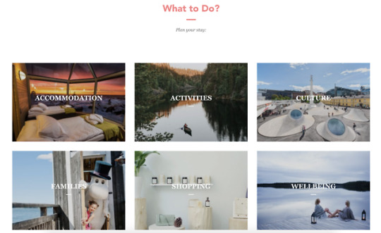
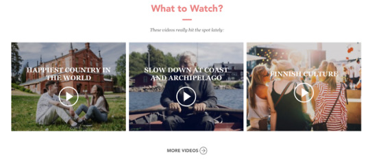

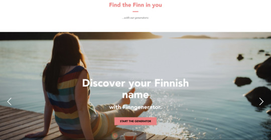
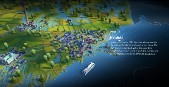
Week 9 Assignment: Destination Websites
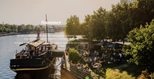
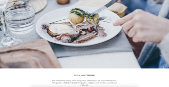
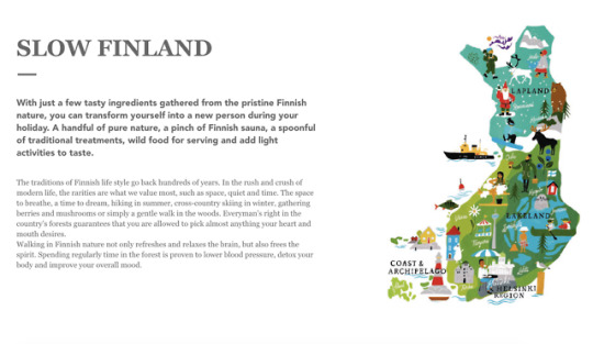
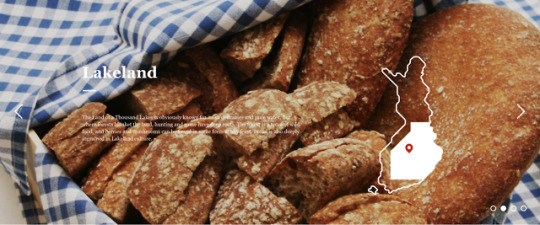
While I was researching for well-designed destination websites, I came across this website called VisitFinland, a website for Finland tourism. The strongest design aspect of this website is the simplicity. I liked how they chose only a small set of colours for the whole website. They also used high quality photos that usually filled up a big space on the web page. The colours found in the photos are mostly neutral, which gives relaxation to the users; the text on these photos add to the visual aspect as well. In addition to the use of photography, they used illustrations and graphics to show the overview of Finland, which I thought was brilliant. The simple graphics like the contour of the land of Finland here and there made it more appealing to the web pages. Thus, the users can see it more in a visual way.
As a user on this website, I found that the website is really user-friendly and engaging. The website separated into simple categories, which looked organized. There are texts on photos and video thumbnails on the main page of the website, which helps the users to easily find what they want. Overall, the visual aspects as a whole make the users to want to go visit Finland.
2 notes
·
View notes
Text
Week 8 Assignment: Web + Social Media Presence Review
Even though I couldn’t be there at Barnes Foundation, I was able to check out their website and social media. As a whole, the content is interesting because they provide a variety of activities such as exhibitions, dance shows, music concerts, and family events where the audience gets to be involved. In my opinion, I think the postings are targeted to those who are passionate and enthusiastic about viewing/experiencing all types of art in general. For those in the arts field, they can be persuaded to check out the museum to gather more inspiration. For parents, they might be able to check out events for their children to be more involved in doing creative activities.
For the text, image, and composition, I was drawn mostly to the logo they have. The rectangles of different sizes and their interaction to the orange colour with the thick font depict the importance in showing their identity. It was also interesting to see that they chose the letters “R” and “N” to be in one single rectangle instead of two separate ones. For postings on Twitter and Instagram especially, I thought it was clever that they used the same rectangular format, but with white borders and transparency as the introduction of a post. Sometimes, a rectangle would be filling in the colour of the focused painting and leave everything else black-and-white, which was interesting to see. The different channels/social media platforms serve different purposes. The website gives a general view of what is happening or will be happening in the museum with some other general information. Twitter and Instagram are mostly similar or the same in what they post; yet, Twitter would be more focusing on reposting it whereas Instagram would be more focusing on personal view/liking the post. Overall, exploring Barnes Foundation’s website and social media was an insightful experience even if I could not be there in person.
3 notes
·
View notes
Photo


Designer Spotlight #2: Pentagram
A few months ago, I learned about the existence of Pentagram. When I started following them on Instagram, I was able to gain more insight on their designs for their clients. For Pentagram, I like how their designs are focused on the client’s need and wants, and how their designs are straightforward in terms of interpretation. Many of their designs are simple, which I like the most. Even if their designs are simplistic, the lines and the shapes clearly deliver the message to the viewer. I was initially drawn to their designs because I recognized many of their designs for big companies. However as I kept looking into their designs, their detail in choosing the right colour and composition grabbed my eye even more.
1 note
·
View note
Photo


Designer Spotlight #1: Nikki Miles
When I saw Nikki Miles’s illustrations and designs for other clients, I was drawn to it because of her line quality and selection in colours. In terms of her line quality, I like how the lines are not sharp, straight lines. Even if something is geometric-shaped (like a cell phone), she uses natural lines like something handwritten. Because of her rugged lines, I feel like her illustrations in general show a relaxed feel. For her use in colours, I like how she uses both pastel and bold colours. The pastel colours go hand-in-hand with the line quality, and the bold colours act as point colours that attract the viewer’s eye. Initially, I was drawn to the simplicity of the composition on the overall design. Even though her design may be comparatively simple, I like how her design looks full.
1 note
·
View note
Photo


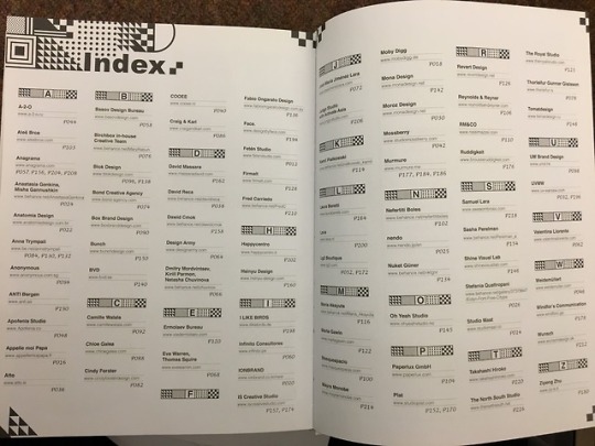


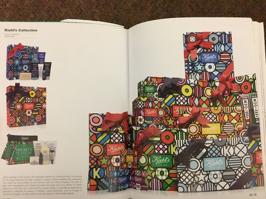
Week 6 Assignment: Library Visit & Book Design
I chose this book because I was drawn to the cover at first. I wouldn’t necessarily say that it is my favourite type of design since I like simplistic designs, but the gold colour with the complex patterns got my attention after pulling it out from one of the shelves. After opening the cover of the book, I realized that the table of contents page (and also the index page) has the motif from the cover of the book, which I thought was interesting to see. For me personally, I found the pages inside to be more fascinating because they have a compilation of modern designs that I like: simplicity in line quality and composition that can be easily understood. Within the field of graphic design, packaging design has been one of my latest interests, and seeing a lot of the work presented in this book inspired me most. To add, I enjoyed seeing on how the designs are placed in this book. Some pages have the text and the photos, some pages are full with photos, and some pages have designs placed on a colourful background. When I eventually take more graphic design courses in the future, I would revisit this book to gain more inspiration and to learn how others have approached a certain design project.
1 note
·
View note
Photo


Week 5 Assignment: Fashion Design
In terms of everyday fashion, I like clothes that are simplistic and casual/semi-casual. For clothing in fashion shows, I would say that the simplistic aspect applies here as well. I like how all of them have a simple style that are portrayed as being elegant. Although many of them are subtle in colour, I think Kate Spade’s fashion has more of the vibrant hues like bright red and purple. From these selections, designers have used techniques such as stippling, stripes, and floral to give more emphasis to texture. The unique patterns, symmetry/asymmetry, and colour combinations are what I have learned so far in design classes that are applicable in these examples.
1 note
·
View note
Text
Week 4 Assignment: Time Management
At the very beginning of the year, I used a physical planner because that is how I managed to organize my tasks mostly during high school. For the first few weeks of the first term, I managed to write down assignments that were given to me that day. However, I realized that I don’t have my planner 24/7, which was inconvenient for me. For awhile, I would alternate using my physical planner and my notes on my iPhone. I realized that it was easier to keep track of my tasks on my phone/laptop since it is with me wherever I go. Therefore, I switched over to the notes app on my iPhone. I write down every day of the week with checklists of the classes I have on that day. After my classes, I would reorganize on how I want to complete my assignments. I would remove each item as I finish them.
For me, I put academics heavily on my list (as my priority). I usually start them early to get them finished 2-3 days before the deadline because that is how I like to deal with my tasks. Because I want to make my assignments with high quality, I tend to stay up late at night, which I usually go to bed at 2AM or even after that. Even if I sleep late at night, I don’t really sleep in because I feel like I could be doing something productive in the morning; the latest I wake up on my free days would be 10AM. In terms of meals, I usually find the time to eat whether that is before or after class. Because I have a free day on Friday, I usually do my laundry in the morning where a lot of people are off to classes, which means there are more laundry machines available. On Thursday night, Friday night, and Sunday morning, I go to church events and services, which means that I am able to find the time to learn about the sermon, relax, and hang out with the people I love. Because I am spending most of my time doing assignments, I always make time to socialize and have fun.
So far, I feel like I am managing my time efficiently because I was able to focus on my academics and socialize with people. Time management sometimes gets challenging for me whenever multiple big assignments/exams overlap at the same time, but I am learning more and more about how to use my time wisely and not to panic/stress over it too much.
1 note
·
View note
Photo


Design & Explore Assignment
Keelty, Safia, George, and I got on the SEPTA to Northern Liberties (interesting fact: this is literally the same group from last quarter except Safia!). We got off at Spring Garden station, and the bright lights welcomed us.
We wandered around the area, observing shops, apartments, murals, and interesting designs. There were several murals we came upon; the colours added the vibrancy to the atmosphere of this neighborhood. In addition, Safia pointed out that there is some degree of gentrification in this neighborhood, and I was able to realize that there are newer buildings in the middle of older buildings. One of the apartment complex we saw was called the Schmidt’s Commons. It had cool architecture that has the characteristics of a spaceship.
For lunch, we went to Wahlburgers, which was near the Schmidt’s Commons. We all got some sort of burger/sandwich dish. I liked the dish I ordered since it was not too greasy. One thing that caught all of our attention was the vibrant green colour of the chairs/interior, which was interesting to see.
Overall from this trip, I was able to learn deeper on how much design is engaged in our everyday life. It is easy to just walk by these streets without realizing it, but I get to look deeper into these designs if I focus on the things I see/observe.
2 notes
·
View notes
Photo


Week 2 Assignment: Best of 2018
I have selected 10 best designs from 2018. To elaborate on one of them, I have chosen an album cover of Honne’s “Love Me / Love Me Not”. The artist utilized a combination of colours that go along smoothly; the artist used analogous colours for the background and the typography, and chose a complementary colour for the mirror frame. The subject in this cover makes the viewers to ask about who she is, which I thought was interesting. In terms of typography, the halved technique is something that gives attention to, as many album covers tend to show the musician’s name and the album title in an unbroken way. To add, the typography also shows reflection, which leads the viewers to look more into it. Therefore, this design in particular demonstrates an effective use of colours, composition, subject, and typography.
1 note
·
View note
Text
Week 1 Assignment: Interests in Philly
https://www.weckerlys.com/
I chose this resource because I love dessert, especially ice cream! For this specific ice cream shop called Weckerly’s, they sell French-style ice cream made from fresh ingredients, which I thought was interesting; they sell all sorts of flavours that also come in sandwich form. In addition, their interior and exterior seem adorable, focusing on their simplicity aspect. It is one of my interests in going to cafes/ice cream shops that have good interior. I plan to continue discovering this interest by searching for more places like this and actually making the time to go there with my friends.
4 notes
·
View notes
Photo


Week 11 Assignment
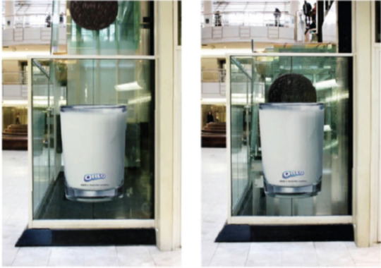
When I was selecting ten advertisements, I focused on mainly looking at how the brand/organization relates to the item/message that needs to be sent out; the ones I chose show effectiveness. For instance, Nike incorporated humor into their ad by making their customers to continue running with their shoes on by not placing the seat of the bench. On a similar note, Ziploc was able to deliver the message of how their products can make anything to remain fresh. In terms of creating ads, I personally think that the artist needs to have a clear understanding of the brand and deliver it in a creative manner that can stay longer in the customer’s mind.
For regular posters, they seem to have a bold background and/or have a simple composition by placing the subject in the middle. Because there is nothing major besides the object itself, the customers can easily focus. For street/installed advertisements, I was able to notice that the artists chose a location that best fits the product. To give an example, the detergent company Ariel found a dark wall and put the ad there to show how much their detergent can clean. Therefore, the effect of street/installed advertisement is very different from the regular posters. With these advertisements, they do not have any issues with Photoshopping.
1 note
·
View note
Photo


Week 10 Assignment
10 Interesting Typography
1 note
·
View note
Photo


Eat and Explore Assignment
Keelty, Caitlin, George, and I met up at the Dragon Statue at 12PM before heading to Rittenhouse Square via SEPTA bus; it took a few stations to get there. After getting off the bus, we had to walk a few streets in order to arrive at The Rooster, our destination for lunch. It was a crowded diner that sells sandwiches. I really liked the choice for lunch because it was not too greasy.
We went to Rittenhouse Square Park, which was close from the diner. I liked the peaceful atmosphere it gave in the middle of the city. The fallen leaves and some of the remaining snow from yesterday might have added that. Not only were there grass and trees but there were some sculptures, statues, and small murals, which grabbed my attention. The little bits of art here and there contributed in making this park unique. However, the park was smaller than what I expected. It was a great walk around the park.
After visiting the park, we wandered around Rittenhouse Square without a destination in mind. We put more focus on viewing the architecture on streets we went to. While walking, we would mention things that we learned in art history and design classes, and I was surprised to see that what we learned actually exists closer than we think. For instance, we saw two doors next to each other that portray figure-ground; we saw pixilated murals and mosaics. It was one of those moments where I realized that I did learn something from my classes.
When we were wandering around, I realized that the streets of Rittenhouse Square were a lot more calm. Compared to University City, it was more like a place where there are more residents and cute little shops. The colours on the buildings/houses were a lot more diverse and vibrant; we came across many purple doors.
Overall, it was a time where I was able to connect more with friends from my major since I do not really spend time with them as much as I do with my other friends. Because we take the same classes, we relate to on so many more things. Also, since I do not really go off-campus, this assignment forced me to go explore a new part of Philadelphia. It was a nice break from my assignments!
2 notes
·
View notes
Photo


Week 9 Assignment
I took all of these ten photos (four of them with the captions are the most recent ones I took). If I were to choose my favourite, I would choose the first photo, which was taken in Rittenhouse Square. The reason is because of the fact that colours seen as rows are different hues of the same colour family whereas colours seen as columns are complementary colours (on the colour wheel). It is also interesting to see that from left to right, the colours get darker, which showcases a gradation effect. Because the two buildings have similar height and width, the meeting point of the four blocks gives tension. To conclude, using similar yet different colours is the most significant aspect about this photo.
3 notes
·
View notes
Text
Week 8 Assignment
While I was watching this episode of the show, I learned how working as a designer can require a lot of energy. For Paula Scher, she would walk up and down Pentagram and work with her peers nonstop; I am usually the type of person to be stationed in one place, but watching her routine made me realize that I would be trying this similar method soon.
In terms of her design project, I was surprised to see her design with Pier 55. The way that she drafted her ideas during her ride in the cab made me think that inspirations can come anywhere at any given time; she utilized her time effectively. After handing her ideas to her coworker who modified them on the computer, she seemed to hold conversations on how to make the logo options for Pier 55 to look more polished and memorable to people viewing it. At one point, she informed how one of the options that she came up with contained the shape of the Pier 55 parks/buildings, which I thought was brilliant because she literally created a connection between Pier 55 and the logo.
I liked how she constantly communicated with her coworkers, which gave her more feedback to make further adjustments to satisfy both the client and herself. Even though she came to the point where she created numerous famous designs, her constant search for new ideas and tasks was admirable. For instance, she wanted to be more interactive with art, so she started painting projects. Her dedication of seeking improvement has taught me a valuable lesson. In terms of her work space, it was mostly messy. I prefer to have a clean workspace, which gives me space to generate ideas in an organized way; I always clean after myself after doing my project. However, I do understand that having a messy desk can actually bring unexpected inspirations, which can be the central idea of the next project. Overall, after watching this short documentary of Paula Scher, I have learned that I should be constantly searching for more inspirations and leaving them in my archive since I have no idea when they are going to be useful.
2 notes
·
View notes
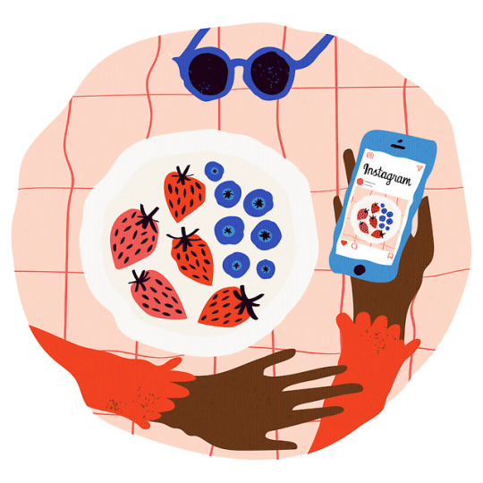
Photo


Week 6 Assignment
All of the ten pieces show “good” illustrations. The illustration I want to focus on is the illustration by Sub Sub (bottom right corner). As seen in the illustration, he utilized more of a complex, unusual composition; the diagonal focus draws the viewers even more to it. In addition, the colours/hues that he used are vivid. The colour of the water and the plants are examples of the use of vivid colours. The red colours also make the overall illustration to pop out more. I personally like this illustration because there are a lot of stories going on since each individual is all doing different things. Because the people are not looking and facing in the same direction, I feel that this illustration brings out a normal day from people. Overall, the artist brought this illustration to life through a unique composition and a series of colours.
4 notes
·
View notes