
I am unfortunately a league fan and even more unfortunately a fan of league skins. I post a quick review of a league skin some times and I'll hopefully get to every single one. This is just my personal taste I am not a professional character designer.
Don't wanna be here? Send us removal request.
Statistics
We looked inside some of the posts by everyleagueskin and here's what we found interesting.
Average Info
Notes Per Post
91
Likes Per Post
89
Reblog Per Post
1
Reply Per Post
1
Time Between Posts
21 days
Number of Posts By Type
Text
1
Photo
16
Last Seen Tumblr Blogs


Fun Fact
Post activity is at the highest at 4:00 pm EDT; notes peak at 10:00 pm EDT.
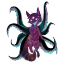
Text

Coven Ahri: Ahri has a LOT of skins, which means that a lot of different thematics have been explored with her and I think with her recent, much needed visual update, I can definitively say that Coven is my favorite. Not only am I just in love with the aesthetic of Coven, but I think it fits really well with Ahri. Her canon lore has her essentially be a soul succubus and her regret and struggles to overcome those urges. However, I think Coven is skin that allows her to fully lean into the sinister side of Ahri and I love skins that (convincing) contrast with the champion they are made for. Also the skull orb is really cool.
1 note
·
View note
Photo

Victorious Aatrox: I don’t usually mind the Victorious skins. They aren’t really meant to be anything more than a flashy ranked reward and there isn’t anything wrong with that and skins like Victorious Blitzcrank prove that you can still make an interesting design out of it. However, Victorious Aatrox, in my opinion, utterly fails at being either an interesting design or a cool reward. Honestly, it’s just lamer version of Justicar, which is something you could have bought for 975 RP instead of subjecting yourself to the agony of ranked League of Legends. Oh, and it easily has the worst wings out of any Aatrox skin.
4 notes
·
View notes
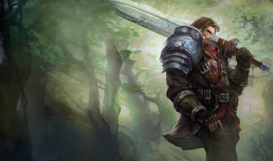
Photo

Justicar Aatrox: As I said with Gatekeeper Galio, the silhouettes of angelic types can be easily converted into a more demonic one and the same goes for the other way around, Justicar Aatrox here being an example. I’m not typically too interested in the Arclight skins, but I think this one is the exception. The image of an gilded, angelic, holy warrior just ends up working very well over Aatrox, plus this is probably the closest we’ll ever get to a pre-corrupted Aatrox skin.
9 notes
·
View notes
Photo

Ashen Knight Pantheon
As a Pantheon player and a big fan of Ashen Knight Pyke, I was pretty excited when this one got leaked. Unfortunately, I do feel a little disappointed by this one. To me, the appeal of Ashen Knight Pyke came from the design idea of a ruined, spectral knight that is now less than human, accomplished by having the body almost completely covered by armor and I feel like that fantasy was lost on Pantheon with his exposed chest and face, which also makes him feel far too similar to Ruined Pantheon. This baffles me because base Pyke also has a lot of exposed skin, yet they chose to keep him armored up. The unfortunate thing is that this exposed skin is really all that’s keeping me from liking this skin, since the actual armored parts are pretty cool and the VFX are excellent.
6 notes
·
View notes
Photo

EDG 2021
Because the World Champ skins are basically the same skin applied to a group of champions, I decided I would just group all of them per line in one post.
Overall, I’m a big fan of the EDG 2021 skins (and that’s not just because I play 3 out of the 5 champs). The dark blue and silver leather armor is a very pleasing aesthetic to me and they did a good job of making the champs look uniform, yet distinct. Looking too uniform is a trapping some Worlds skins can fall into, leading to everyone looking like the same person with different weapons (looking at you iG). I only have a few thoughts on the individual skins
EDG Aphelios: Definitely the least interesting of the bunch. Not much I have to say about him.
EDG Graves: I really like the beard! His hair is definitely the standout of this skin, but the armor and gun is really cool too.
EDG Viego: Definitely has the same issue as Pentakill Viego, where it feels a bit too much like a glorified chroma, but it's a really, really cool glorified chroma.
EDG Yuumi: I really like that this was based on the player’s cat. Very cute :3
EDG Zoe: Probably my favorite out of these. The armor and crown really make it stand out Zoe’s skins and it might be a new favorite for her.
#league of legends#edg#edward gaming#aphelios#graves#malcolm graves#viego#yuumi#zoe#zoe league of legends#zoe league#zoe lol
10 notes
·
View notes
Photo

Battle Academia Garen:
A kinda big issue I have with the Battle Academia skinline as a whole is that I think it does a pretty poor job of selling the idea that these champions are supposed to be teenage students. Many of these skins come off as a bit uncanny when trying to present these clearly adult characters as children and I think that issue is probably at its worst with Battle Academia Garen. While the model and splash art are fine in a vacuum, it becomes a bit jarring when I hear Garen’s voice seemingly coming out of that design.
11 notes
·
View notes
Photo


Mecha Kingdoms Garen:
On paper and in splash art, Mecha Kingdoms is an extremely cool skinline. The mechs have awesome designs, the splash art is beautiful, and Mecha Kingdoms Jax is a great legendendary. However, and this is a big however, I don’t think the skins work super well for the epic skins of the line. The animations of the base champions don’t sell the gravitas and scale of the mechs nearly as well as the art or Jax do and this applies to Garen’s skin as well. Again, the design itself is cool (I especially like how they translated his canon armor into a mecha) and the splash art is one of my favorites in the line, but I don’t think I’d want to use it in game.
Mecha Kingdoms Garen Prestige Edition:
Honestly, this is one of the cooler prestige skins, but not enough to escape from feeling like a glorified chroma, although I do like this design even more than the original skin.
5 notes
·
View notes
Photo

Demacia Vice Garen:
League has finally learned that Garen’s big ass pauldrons do not need to be a part of all of his skins. While this is an example of the in-game model being a tad disappointing compared to the splash art, I still love this skin just for the pure tone and aesthetic. It never fails to make me smile.
5 notes
·
View notes
Photo

God King Garen:
Now THIS is a legendary skin. It takes a lot for me to be super into medieval-type designs and this executes it extremely well. I could go into more detail about it, but its honestly just fuckin badass and thats all really have to/want to say.
8 notes
·
View notes
Photo

Warring Kingdoms Garen:
Warring Kingdoms isn’t a skinline I’m particularly interested in, but I do think this skin works well for what it is. It wears Garen’s ridiculously oversized features better than most and I like the overall vibrant design and color scheme, especially the sword.
4 notes
·
View notes
Photo


Rogue Admiral Garen:
I think this a good example of a skin where the splash art is far more appealing than the actual skin you’re getting in game. That isn’t to say the skin is bad per say, just that you may be disappointed if you don’t check the in-game model before getting this one. The design itself isn’t bad, I just think it's held back by being strapped to Garen’s model. If only everything, from the limbs, to the pauldrons, to the sword, was just scaled down, I feel like this skin would be way cooler.
5 notes
·
View notes
Photo

Steel Legion Garen:
On paper, this is a pretty cool skin and I would say it executes on it decently. Personally, I think it just ends up being a pretty generic steampunk knight, with Garen’s face being made even more painfully generic than it already was. It also just sorta slaps on steampunk imagery onto his armor without much rhyme or reason. I do, however, enjoy and appreciate the unique animations they gave it. Just that extra bit of effort does bring it up somewhat to me.
3 notes
·
View notes
Photo
Rugged Garen:
In most situations, I would find this skin fairly unremarkable, but it becomes so much more entertaining with the added context given to it through Riftquest. This skin being turned into basically Garen’s DnD character that is just a cooler version of himself gives it the charm it needed to be enjoyed by me.
5 notes
·
View notes
Photo

Dreadknight Garen:
This skin is quite simple in concept and execution and I think it pulls it off quite well. It’s a classic “opposite” skin, and I think it successfully manages to ride the line between pure edge and dull boredom and ends up looking like something you might see in Dark Souls, which is a good thing.
6 notes
·
View notes
Photo

Commando Garen:
In general, I’m not a huge fan of the commando aesthetic. However, I think, minus the giant pauldrons and sword, I think it works fairly well with Garen. Unfortunately, the pauldrons and sword are the most distinct elements of Garen’s design, so the whole thing does end up looking a bit silly.
3 notes
·
View notes
Photo

Desert Trooper Garen:
To me, this skin is simply unremarkable. All it really does is give Garen more earthy tones and a bit more fitting armor for the desert (I say a bit, looking at those giant pauldrons). I do appreciate the added scarf and the giant scimitar does breathe a bit of distinctness to the skin.
2 notes
·
View notes
Photo


Sanguine Garen:
This one has a big discrepancy between the splash art and the in-game model. In the art, it just looks like a red chroma of Garen, but bizarrely, the model makes Garen look like a vampire or something, not to mention that his armor and sword are completely different. I really don’t have much to say on the design itself, I’m just baffled about how the art advertises a completely different skin than what you’re getting in game.
4 notes
·
View notes