fashlon
🛸
𝔉𝔞𝔰𝔥𝔦𝔬𝔫 𝔞𝔫𝔡 𝔦𝔫𝔰𝔭𝔦𝔯𝔞𝔱𝔦𝔬𝔫 https://www.pinterest.co.uk/fashlcn/
105 posts
Don't wanna be here? Send us removal request.
Last Seen Blogs

y0ung-c0llect0r
Untitled

electronictagarden
plingplong

ygqt
Bears N Beef
idontfeellikeit
Hey look I titled my account :)
sexylaboratory
Sexy Laboratory
Text
Unit 6: evaluation “NEON” part 3:

Overall when creating my final pieces I originally had planned for more time but due to the time plan I had been working with it did not allow me to get as much time I had hoped, however I am still very pleased with the outcome of my pieces. In particular I managed to utilise neon well and improve on presenting that clearer from when I had struggled in the early stages of my work, being able to tackle the issue of presenting my work and making the key decision to switch up my concept helped me further and I felt if I had not made this decision I would not have been able to complete the brief. The pieces themselves are both successful as stills and videos and I am pleased that I was able to continue with the running idea of using illustrations and experiments into one along with my neon footage to really bring all areas of work I have been developing together. If I were to present this work in person for the final show I would have like to have projected these illustrations onto the wall or some type of backdrop to allow me to further portray the billboard hologram like idea better but aside from that the pieces themselves scream NEON and the club like aesthetic I wanted to achieve in my work and follows from my initial concept and developed concept successfully. If I were to repeat the process of the major I would have better slotted time for my illustration process which maybe would have sped up my drawing time which allowed more focus to be on the installation wall If carried out at the end and not having to re-evaluate my ideas and concept.
0 notes
Text
Unit 6: evaluation “NEON” part 2:

To combat this ultimately I moved my work to a digital medium as the focus was still on using my illustrations and would instead allow me to enhance and take this neon idea further by incorporating the experiments I had made to use into my installation piece but now applying them into a digital scale. From here I decided to rework my concept and ideas to using a digital medium to help present the ideas of poster like illustrations u would find in a night club setting/scenario. Using elements of neon and experimental work to help me do this. I wanted to draw from my inspirations of Pater Sato’s makeup and the use of Futuristic and sharp rendering in Sorayama’s work, which also followed a futuristic theme much like where neon can be commonly found in movies and video game setting/environments. Although I had managed to keep these ideas and will quickly blend well into the new digital approach I am taking I still needed to add a key aspect of neon light into the work as the theme is based around NEON. Instead of placing neon in the space or photographing or even trying to replicate the lighting effects by illustration I decided to video the lighting I had used prior in my mini space but apply it into a dark room where it would be optimum and created some footage that could be applied over the top of the illustrations later on. I thought this was a clear and smart direction as it would allow me to continue to have this aspect of neon running through the work and follow my initial concept, but also it gives a sense of movement to the image and brings it to life as if it was being presented in a proper billboard space or even a hologram type visual following the sci-fi theme. Taking all three allowed me to play around with compositions and rework the main plan of presenting on a proper billboard but now in a 3D scale ultimately reworking what went wrong in my mini space but onto a digital illustration/space. The development process overall was rather frustrating as I had reached moments particularly where I was unmotivated to create illustrations or sketches. This was an issue as illustration was usually my strong suit and was where most of my best work is. Ultimately I was most successful with my experimentation process which is quite surprising considering I am not as well developed or even comfortable when letting loose with my art work and creating messy spaces and compositions. I found my overall experiments to be highly successful and achieved the visual aesthetic I wanted to go for. So even though I had struggled more with my illustration development over the course of the major I was able to achieve another aspect of my concept in improving on utilising experiments and messy mediums I don’t typically work with and is an achievement within itself and really helped to enhance and help my final pieces pop with neon colour and shapes/lines.
1 note
·
View note
Text
Unit 6: evaluation “NEON” part 1:

For my final major i wanted to ultimately take ideas from both elements that have worked well for me in the past and others that i would further like to improve/develop upon and merge them into one. I had been working on some illustrations prior to the beginning of the brief utilising neon/vibrant colours and adding towards my exaggerated style and aesthetic. The use of this was something i thought of continuing to develop and strengthen my use of neon in my work and the final major was the perfect opening to allow me to achieve this. My idea itself was based around how i presented and used neon into my work, particularly taking from its common use of billboards/night clubs and areas of sci-fi themes and applying those ideas to form my own work. Ultimately the goal was for me to create a space/ installation piece that would allow me to present my illustrations onto and also allowing me to develop my use of other mediums in building up that particular space. From my initial sketches and trying to create a mini space reflecting on my ideas so far i noticed i struggled to stay within my time plan as i usually work from creating ideas and sketches in the moment and developing onwards at my own pace so i had already initially began to struggle to follow what i had set out to achieve. Looking into my mini space a lot of the components i needed to utilise or show within this mock up were not present such as the lack of vibrancy and colour from my print offs or that the background was too forced and carefully placed rather than being more authentic and placing and tearing pieces off randomly much like a proper billboard would however, It helped me note areas i needed to work on and would help me form my time plans better relating to my performance and work ethic during that week. One of my key focuses within this major was definitely the experimentation process and trying to build up a space and piece that would serve as a backdrop to present my own work onto. Up until this point i have struggled with being less controlled and more adventurous with mediums and within my own work and was the perfect opportunity to try out new methods and ideas. In particular i noticed the less focus i placed on an experiment the more successful the results were as i did not have to plan or carefully sketch it out i just had fun with the mediums i had at hand. One of the more successful experiments i had created in the process was the photographed wet paint experiment which really grasped the use of colour when edited but also the reflection of wet paint gave of an almost glow like visual reminiscent of lights and almost like a neon glow that i could incorporate into my work further on. The experimental process helped me to just keep elaborating and building up potential backgrounds and ways i can replicate a billboard like environment. A key issue faced during the process of my major and the time plans was that I had yet to construct anything related to my initial idea of utilising 3D elements and creating an installation pieces now based off of club billboards relating to the NEON theme.
0 notes
Text
Unit 6: Artist statement: NEON
For my final major i chose to specialize in illustration and stepping forward in a direction i want to take with me further into university and a career. My work itself projects a lot of exaggerated ideas and elements into them such as bold colours/ silhouettes and ideas. Keeping this in mind i chose to situate my work around an exaggerated use of colour: NEON. The reason why i selected a neon theme was that much like the work i tend to produce i am captivated by vibrant and bold colours and has been something i have been developing lately and wanted to explore further within this brief from different outlooks: illustrations, experiments and even video footage and being able to adapt my illustrations further and exaggerating them further.
My work itself is based around the inspiration from neon lights and this idea of posters situated on billboards or clubs in a sci fi/ futuristic setting. I wanted to approach this work from a different stand point taking aspects and styles i am not so comfortable or well rounded with and being able to apply and utilise them into my work and showing both continuity and areas of variety in my latest work.
0 notes
Text
Unit 6 finalised concept and idea:
The title for my final major is “NEON” and like the title i wanted to focus my work on utilising exaggerating colours and elements i am drawn towards such as drag makeup and crowded compostions. The reason i chose this particular focus was from the way I appreciate the use of neon in fashion and art to help draw or bring focus to areas of work and have grown to use it more often in previous work and was something i wanted to develop further and the final major being the perfect moment for me to do so. Some of my key inspirations come from artists that like to use neon such as Pater Sato whos faces and designs are very much similar to my style and art i personally adore. The use of neon is commonly found in nightclubs of futurisitc settings and concepts which is where i decided to draw attention to when basing the main idea and context behind my work being able to create my own nightclub illustrations/ posters incorporating that vibrant and bold feel and beinh able to present these ideas onto a digital medium and as if presenting a futuristic hologram or poster suitable for club backdrops or billboards. This project will also be a way for me to further develop my experimentation process much like trying to replicate these billboards and aesthetics they have and apying myself to more messy and less controlled mediums and less polished outcomes.
1 note
·
View note
Text
Unit 6: final piece 2 ( with footage )
Compared to the other final piece i struggled more with this particular edit, although i went through the same principles as the last illustration and find the neon footage in this one to also be effective, the illustration quality however is not the same as the last and i was unable to determine or find out why it was happening. I tried repeating the editing process 5 times to try and work around the issue however each time the magenta/ purple figure always came out blurry making it less effective than the other illustration but even so i still have the original illustrations that would be strongly presented too and was a back up in case a situaituon like this had happened.
Prehaps if projected it may hide the issue a little more or add to the blurry glitchy effect like the blur in Pater Satos work, however looking from a phone itself you can definitely notice the difference in quality. If i had more time or were to repeat this major i would have spent more time developing the video editing process to tackle issues like this which fortunately i hadnt come across in my experimentation segment of my work but unfortunately have faced here.
0 notes
Text
Unit 6: Final piece 1 ( with footage )
Using the footage i applied it across the bottom of the piece where less detail was to allow it to not overshadow the key elements of the piece. Choosing the pink colour was intended to blend well with the pink silhouette and contrast the blue as there was primarily more on the composition. I think both these pieces and their still illustration counterparts are very effective and find the sense of movement in the figured hair, the video and the paint edits themselves all merge well into one another overall. I particularly like the way the lighting clashes over certain parts and highlights certains areas to draw your eyes towards it.
If i were to present these pieces in person i would have liked to prehaps project them onto a wall or some sort of background piece, maybe even the billboard itself if it was finished and continued as an idea to portray this hologram like poster on the wall and convey the neon futuristic vibe in person too aswell as on a digital platform and if i had enough time would have been able to achieve, but apart from that i am please with this particular piece/outcome.
0 notes


Text

When creating the final pieces i had to extend the space i had from the images i had before to allow me to add more paint and grafitti experiments into the piece but provide more room to place the neon footage rathef than having it placed directly across the face which may distract from the illustrations. I also enhanced the colours to really provide a more intense and neon visual to the work. In terms of composition i wanted to focus on having an aspect of variety into my work and combining all the elements i have worked on prior the final piece and incorporating the strongest of those elements, keeping the silhouettes and figures bold and sharp and the paint and experiments more messy and unpolished. The reason for this is that they contrast eachother well and really help build up a club poster vibe with the strong graphic prints and ideas and the more rough and cramped mess of the paint to help it feel more used and old just like my original plan on the large scale board but this time adapted to a digital scale as i had already discussed in my change of plans. I really appreciate how well the colours clash from both silhouettes but still work well beside one another forming a collective piece and can stand out on their own too. Using the paint and experiments both in the fore and background allow to project this ideas as of being on a wall from them covering the paint in the back as if being stuck on top of it and then the paint intruding the front as if replicating starting to be covered or torn away much like the proper aspect of a billboard. The stills themselves are very effective and work well as final pieces, my next step is to include the neon light footage to give more movement to the piece and add the final touch to the overall composition, i may aslo play around with some text to see if it is needed or if anything the illustrations along with the footage will be strong enough on their own.
0 notes


Text


When beginning the edits as a single piece i noticed that there was some blank space in part of the image and does draw alot of attention to it. My best bet might be to double up the figures into one composition like my other experiment that was successful. One successful part of this particular edit i feel was the little use of text from the photos of pages i had taken from my minature space. Althought the text/font is unreadable it adds this futuristic feel to it as if being a hologram with text covering and circulating the poster/ drawing along with the slight use of glow from a still of neon footage i encorparated into the drawing allowed it to feel like there was still some sorta of extra neon aspect into it without using the full video into it. This method may help me if the neon footage does not add well to the piece or if i am unable to get the video and image quality to come out as i hope it to.
0 notes
Text
Unit 6: Applying other features:
From the chosen illustrations i decided to block out the entire background from the shape of the body/ face and hair. I decided to take idea from my old hair sketches and have the hair almost as if floating in the frame. This itself adds some movement to the drawing but also gives it a robotic like visual as if looking like wires and other sci fi elements are floating from the figures head. The illustrations themselves are very sleek and give me space age vibes with the odd use of colours, glow and wavey movement.
Although i like the way they are beginning to form i am going to need to extend the images and have more body incorporated into the illustration to not only have more space to mess around with overall but it will be harder to add neon footage into a smaller space and not add too much so quickly to the illustration even without all the paint and experimental work into it. As of now the colours of the figures themselves are not as vibrant and will need to be enhanced to allow them to stand out as neon illustrations.


0 notes


Text
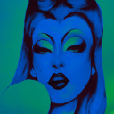
Unit 6: Final piece: digital face illustration:
Utilising the sketchbook application, I was able to draw up and replicate the sketches I had come up. Utilising the smear and airbrush tool I was able to create smooth and blurry line work that resembled the look of using an actual air brush much like Pater Sato. The erase tool allowed me to clean up the lines and make them sharp and crisp to help highlight structure on the face. I also applied some of the glow tool I had practiced with a few sketches before into the eyes and lips to help them pop from the rest of the airbrush work and help already develop more of that neon feel into the week. From all 5 illustrations i decided to scrap the bottom one because i feel from the rest of the illustrations the other 4 link better together in terms of shape and line work. The eye makeup itself is quite different in comparision and i feel will make it stand out further from the rest rather than unify them together. One way to tackle this was to take the idea of shapes in the bottom illustration and somehow carry it across into the other illustrations such as the eyebrows and making them more unique from what i have done so far. I chose to keep the main face white instead of applying skin colour is not only to let me add a block colour underneath but give it that sci fi alien like look to it linking to my neon hologram type aesthetic i wanted the final piece to give off. From all of the designs my favourite is the green illustration in particular, i feel it is the most clean of the bunch and personally for me i an in love with the eyebrow shape i came up with for this particular piece.


3 notes
·
View notes
Text
Unit 6: Reflection before last week:
After sketching out some makeup ideas i found myself beginning to push my direction and idea further. I found the use of only including sharp and clean lines into each face would really provide a bold exaggerated look which can link well to my use of bold and vibrant colours and help bring the overall piece together. It will also allow me to supply some variety into the piece from the experiments and have both elements stand out but not blend into each other so much. My main focus when sketching out designs was focusing on my choice of colours as i wanted to have areas of contrast within the face but also it provides a depth of shadows and helps block out shape and line from the other colour such as the purple being more bold and vibrant from the orange, and having the use of orange to supply highlight and a different element of colour into the piece to feel more neon.
I also used the glow tool on the application “sketchbook” which i am going to be illustrating a few of these designs digitally onto. I want the glow tool to be used on key features such as lips and eyes to help them pop and from the sketches i noticed the more i built up the tool on the lips the more brighter and intense the glow would be and is something to keep in mind when creating my proper illustrations, the glow tool may also come in handy incase the neon footage doesnt work well as intended and can be used as a backup plan to add some fake glow to other areas of my composition. Althought i mananged to pull through and gather my ideas/ sketches this week the only part of my time plan i was unable to follow was starting said illustrations at the end of the week meaning i only have the weekend and next week to create the pieces and complete them. For this i will need to start the illustrations tomorrow to give me enough time to focus on applying the rest of the features to my work and make sure the outcome looks great and even better than my past experiments learning from what worked and didnt and applying that knowledge into these pieces such as making sure the colours are vibrant and scream neon and focusing where the placement of my video footage will go so that the compostion flows nicely.
Time plan week 10:
Monday- wednesday:
Completing digital illustrations and editing them onto background and adding poster like features.
Thursday:
Last minute refinements and writing up artist statement/ evaluation
Friday:
Checking over my entire work and handing/ complete labelling work.
0 notes
Text
Unit 6: Sketches and concepts for final piece:
When sketching my ideas I mainly focused on the face and makeup aspect for my piece taking inspiration mostly from chosen artist Pater Sato and the inspiration images I found on Pinterest. I wanted to mainly focus on colours that contrast each other and stand out from one another. A particular direction I wanted to take with these illustrations were simplifying some features of the face. My main reason for doing so was to allow them to resemble neon lighting as many signs stand out with sharp lines and bold colours. Hopefully applying bold colours for the outlines of the head and body will help them stand out with the rest of the background but allow it to merge into the foreground too blending the two nicely together and as I have stated before trying not to make too many components clash. When selecting the 4 I want to utilise into my final piece I picked the ones with the sharpest lines and contrasting colours to one another to allow them to stand out from one another as individuals. The sharp lines relate to the clean lines of Sorayama’s work and his attention to bold and cleanly rendered work which is something I want to apply into my final piece. The makeup itself is obviously inspired by my love for drag artistry and the works of Pater Sato focusing on the uses of lines and shape to structure the features such as neon cheekbones and blush. From there I want to apply these faces onto the head/body and from there I will be able to figure out which face belongs next to who and how I can apply my wall/graffiti experiments into it.


Lips sketches were not as polished as i had used my mouse to render them instead of mu digital pad and pen, however i did enjoy the use of this glow tool and want to incorporate it into my final piece in small quantities and areas.
1 note
·
View note