
Don't wanna be here? Send us removal request.
Statistics
We looked inside some of the posts by fergusjimminson and here's what we found interesting.
Average Info
Notes Per Post
0
Likes Per Post
0
Reblog Per Post
0
Reply Per Post
0
Time Between Posts
1 month
Number of Posts By Type
Text
17
Last Seen Tumblr Blogs


Fun Fact
China blocked Tumblr because of pornography and censorship problems in 2013.
Text
Storyboarding the user experience
To properly understand how my installation would be used and interacted with it is important to consider the user throughout the design process which I have done with my user personas, scenarios and user journey maps, however these are rather verbal and text-centric considerations and as mentioned in my previous post on designing the layout of the installation it is important to have a clear image of how the installation will look and as I achieved the basic layout of the installation I now had to consider how each stage of the user experience would look in this situation. The best and industry standard way to do this is with user storyboards which are sketches that visually display the user journey that has elsewhere been verbally defined. Below is the storyboard I created for how the typical user will approach, interact and consume my project.

1: The user discovers and approaches the installation which is already in being experienced by another user. She observes to find out what the installation is about.
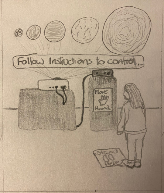
2: The previous user leaves and our user gets closer to the installation which in the absence of any motion being detected has reverted to its initial starting point with a hint of how the user may experience it and displaying the animations to entice any potential users who are passing.
3: Our user follows the prompts and signage to stand in the appropriate place for her motion to be detected by the Kinect sensor. As it detects our user for the first time it enters the first part of the display projecting our own planet the earth on the smallest display shape while displaying below what it is (the Earth) and its size so beginning the size comparison.

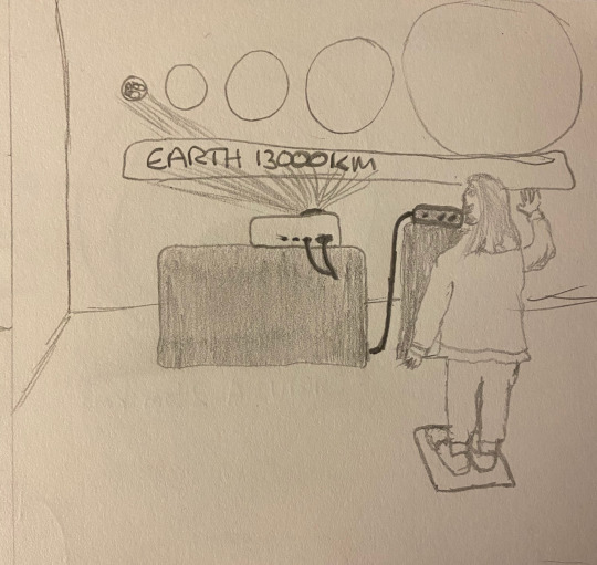
4: The user begins to experiment and moves their hands around to try and get feedback from the installation that they are controlling it. As they wave their hands it triggers the different stars and planets to be displayed on the variously sized display shapes and again, displaying their name and their size.
5: Once the user has become comfortable with the control of the installation through tracking their motion they go back to the beginning and take it slower in order to take in the information being displayed. She moves her hand from left to right which displays the planets and stars in ascending order, once again, accompanied by their title and size. She then starts to play around with the motion tracking comparing these sizes in different orders as she further acclimatises to the usability. At this point the next viewer/user begins to observe and discover this installation.

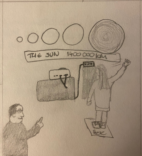
6: Having experience all the displays our user leaves the user position and moves aside to the viewing section. This allows our new user to step into the motion detecting zone to experience the installation. Intrigued by the concept our first user sticks around to view the project again from another perspective where she does not have to consider her motion being tracked. This gives another dimension to their experience and they are able to view how others interact with the installation deepening their perspective which is exactly what this project sets out to do on a grander galactic scale.
Here is the story board in full in my sketch book:

0 notes
Text
Experimenting with software: HeavyM
As this project is mostly dealing with technology that I personally have not used before, in order to get a proper idea of what potential it carries, I have to experiment with the softwares available for this project. Having done some of my own research into other projects such as the one below, I found a software called HeavyM as the premier software for small projection mapping projects and it also looked the simplest. Therefore I thought this was the perfect place to start having just bought my projector (see other post).
youtube
I downloaded and started my free trial of this software and started to experiment. I started by messing around with objects I had in my room already and wanted to try interesting and difficult shapes. The most interesting of these first experiments was on a football, obviously as a sphere it is a challenging shape already but as shown below the ball has many shapes on it in its design which make for interesting elements to isolate and animate individually. I drew this shapes utilising their live projection window and extending my screen and then grouped all of these elements separately to create multiple working parts which were animated individually from each other. The final version of this experiment as shown below is made up of three groups which utilise mostly the fill animations in different ways to create an interesting display.
Next I decided to experiment with custom shapes and it just so happened to be my mothers birthday so I thought I would use this as inspiration and create a mini display to wish her a happy birthday. I got some polysterene A3 boards and carved the letters happy birthday. They were far from perfect but that made for better testing as I adapted each shape. I did the same process of creating by manually drawing out the shapes again, using the projector display window and separating the words into groups in order to achieve different animation techniques available within the software.
0 notes
Text
Storytelling in 2D games
My favourite stories are ones that are told in new expansive worlds that allow your imagination to build on whats given, for example; Star Wars and Harry Potter. The worlds created in these stories are far reaching and grow exponentially side by side with the story. For me personally when I think of the best storytelling GAMES I have played, I think of games such as the Last of Us, which is told in a 3d world which is built to serve the story. The prospect of creating a 2d game is intimidating to me as I see the limits in the worlds that you can build and do not have many great 2d storytelling examples as my experience with 2d games is mostly mini clip or mobile apps which simply kill time free periods in the LRC or the bus journey home. I knew therefore I had to research examples of successful storytelling in 2d games and started with 2 examples:
To the moon (Freebird games, 2011)

To the moon is an adventure game that is hailed for its poignant story. It tells the tale of two doctors who carry out a procedure to allow their patient to experience their life's dream on their deathbed so this is their last memory. It follows the process of a particular patient, Johnny, and as they reveal his past travelling back through time they put together the reasons why his dream is to travel to the moon. Its incorporation of classic RPG design, adventure elements, and its soundtrack have gained, ‘To the Moon’ (Freebird games, 2011) a big audience as they are used effectively to tell an engaging and emotive story.
Cave Story (Nicallis Inc & Studio pixel, 2011)

Cave story, a 2d platformer, is closer to the my intended format and therefore interested me as it goes against my impression that these worlds are limited as reviews describe the, ‘huge world to explore,’ (Holmes, 2010). It also incorporates some of my (and likely many others) impressions of the 2d game not having the facilities for a large story as the came starts with the player controlling a character in a cave and the player has no idea who it is or why they are there but the game uses this as the character doesn't know this either. This is effective in storytelling as the player and the character are discovering everything together which increases the engagement the player can experience.
Freebird Games. (2011). To the Moon. [Steam] PC/Mac. Canada: Freebird Games.
Freebird Games. (2011). To the Moon. [Image]. Available at: https://store.steampowered.com/developer/FreebirdGames. (Accessed on 23/03/2020).
Holmes, J. (2010). Review: Cave Story (WiiWare). Review of Cave Story. Nicallis Inc & Studio pixel. [Online] Available at: https://www.destructoid.com/review-cave-story-wiiware--169033.phtml. (Accessed on 23/03/2020).
Nicallis Inc & Studio pixel. (2011). Cave Story. [Steam] PC/Mac. California: Nicallis Inc.
Nicallis Inc. (2011). Cave Story. [Image]. Available at: https://store.steampowered.com/app/200900/Cave_Story/. (Accessed on 23/03/2020).
0 notes
Text
Installing wordpress

I have to say that, so far, my least favourite part of this whole process was dealing with Wordpress. Other than installing Wordpress in fact. During the second hackathon and Mar’s triumphant return we were taught how to install a CMS backend for our website. We downloaded FileZilla as the FTP we would use, Wordpress as our CMS backend and we had to trawl through our emails to find our SQL information to login once installed.Once all this was installed we were able to upload our websites to the Hertfordshire server, the final step in creating our website!
This process was fairly manageable and well taught by Mar so that we all followed.
However later on, I encountered many problems with Wordpress, the echo function to retrieve pages on our website simply refused to work and when it came to creating a theme, I tried both the one we created in class and creating one from scratch, which took the better part of a day to work out. Neither worked and caused some real grief as they caused all my pages on the server to be blank white! I had to delete the theme through Filezilla causing it to revert back to the original them enabling me to actually access the pages.
I finally found a way to edit a pre existing theme with a plugin:

This allows you to change the CSS of the them currently being used on my website so I changed as much as I could to make my Wordpress portfolio pages fit in with the rest of my site.

0 notes
Text
Website: improving responsiveness
As I created my website I tried my best to keep up to date with every section being responsive so it could be seen on smaller screens. I did this by constantly scaling down the page to see how it resized itself as I added code. However when I got to a almost finished point, I uploaded it to the server and loaded the page on my phone and it was completely different. The links changed colour, the content didn't fit in divs. This meant I revised each section of code to make it more responsive.


I added the scroll function to each div as shown in the top picture. This means as soon as content overflows along the y axis it is able to scroll to see content now hidden below.
Also using media tags, as shown in the second image, allowed me to set my pages so that at certain screen sizes font size decreases, enabling me to fit more writing on one screen, or also non-essential elements, such as the portrait in my about section, disappear when a certain size so there is more space for the text to fill.
The main challenge I encountered was the homepage because, when I added the scroll to this it showed that the background is made to the size of the screen and so any extra when scrolling did not continue the background. To counter this, I enclosed the whole page in a div with the class “scroll” which enables the pages overflow to scroll without moving the background/entire page.
0 notes
Text
ideation and sketching: Final images
After I had created all the materials in illustrator, I had done the “hard work” for myself and was able to simply put it all together (It wasn't that simple) as shown below in my final images:


I put it all together in photoshop and for example had to blur the sky in the 3rd image to fill the ‘mirror’ - I also then applied a layer of effect on top to make it look like a complete flat image.
0 notes
Text
Ideation and sketching: creating materials for final images
In order to create my 3 final images, now I had a decent idea of what those images would include, I wanted to create the resources I would need so that I could then put them all together. Firstly, in illustrator I created the basic shapes that I knew were part of the design and decided on the colour scheme for these as I wanted the final images to be a full set, or at least adhere to the same style.


the bottom of these two was to be the background for my images as I liked the look of the digital terrain mapping and based on the Narcissus chapter which explains humans were made to map the world but we don’t, it represents the surroundings which we notice are there but we not take in the detail and the true sight of it. This therefore is a blank landscape which I created in illustrator rather than use on for google. I did this by drawing a line and then repeating it many times. Then using ‘envelope distort’ I created a grid of selection points that I could then manipulate to create the shapes above.


For the third image I wanted the same look however I was using a specific landscape and so I manually traced it out as a grid with white lines:

I then needed to create the characters for my images with the idea being that from the cartographers point of view(they designed us) they did not care what we looked like and so I made the characters blank which then also showed how arbitrary we are and we focus so much on how we look when we are designed to be looking at what is around us.


I created these figures again by using the pen tool to trace other images and selected a colour somewhere between bronze, grey, and flesh. I also created an image trace of the of a world map to be put on a computer to represent the data collection and then changed the colour of this to green to make it uniform with the images as a set.
0 notes
Text
Ideation and sketching: final images
After the Julien Pacaud study I had a couple ideas but was still really struggling to have the really strong feeling towards 3 final images for this project. I decided to do more sketches where I tried various ideas and made sketches for each chapter. Having a tutorial with Veronica helped with finding this final ideas she pointed out the best things in my images in my study and so I had a couple of things to go off of that I knew worked. However I did not yet know how I was going to actually create these final images. Below are a series of the best sketches I took into the second tutorial:


These sketches were the best because they went on to be the basis of my final images. As I took them into the second tutorial we began to discuss the ideas and we started to make progress on the idea and I asked what method Veronica recommended to do the final images to which she responded on photoshop/illustrator. This suited me as I thoroughly enjoy using these programmes. She then told me to experiment with the third sketch and integrating the idea of the linear contour map in the background on photoshop then and there which I did. I then tried digitalising aspects of it, drawing it on illustrator, and blending it in photoshop so as to make it seem a complete image.
Below are the first rough developments and experiments with this idea:


with these developments I tried to make them as interesting and as finished as I could while using the original sketch. This provided a good starting base to create my final images as shown in my Final images post.
0 notes
Text
Creating an icon series
Designing a series of icons that follow the same rules as my logo created a uniform design for my whole website. First I decided on what my icons would be and which ones would fit in with the hexagonal design of my logo and also be recognisable as what the icon would be used for. I decided upon the ‘@‘ for my contact sections, a ‘?’ For the about section, a basic home symbol and I struggled to come up with a portfolio icon that would be instantly recognisable.


Above was the first stage of designing the icon whereby I used the pen tool to trace the shape of the base hexagon within my logo.


Above is the second stage which went through the same process as shown in my logo where I stripped back the detail to create the sleeker minimal look and then finally copied the same gradient colours from my logo.


The final step was to then include the caption with the iscopeur font matching the ‘Fergus Charles’ logo and so that when added to my website it was clear what each icon represented.
0 notes
Text


Above are other early experiments which Included my initials knowing that I wanted that to be the core of my logo but ultimately I moved away from.


Despite moving away from the designs i still liked them so kept developing them for separate personal projects. I envisioned the trace of a mongoose, made with the pen tool on illustrator, as a mascot for my own sports team and used it to create a team crest. Also, as mentioned in my post on Basquiat, his signature crown inspired me as it was similar to my basic idea above. Therefore i adapted mine so that the lines looked like paint strokes and added color, while i haven’t got a use for it, I really think the roughness of the paint strokes give it the look it needs as a final image. While i haven’t found a use for this yet, I am very keen to find a place for it.
0 notes
Text
Developing my personal logo

Above is the final design for my personal logo which I settled on after trying out a few others and making subtle changes.


I started with the basic shape as a previous blog post shows that much of the world and indeed logos can indeed be broken down into the most basic shapes. I simply followed the shape of the hexagon, drawing out my initials.


The next step was cleaning up the design removing the stalk of the f and softening the corners slightly. Then adding colour to make it a more eye catching image. For a time I was quite happy with the design on the left but it the more I looked it, I quickly got bored of it so I started experimenting with different colours and proportions


As I added more colour and detail I liked it even less and subsequently stripped all the detail back creating the basic logo on the right above. However I still wanted to include the colours I had started to experiment with in the blue/purple gradient. Eventually creating the final thing below and then further developing by adding my first and middle name to create a balanced title image for my website.


0 notes
Text
Planning my website

Above is my mood board designed on adobe indesign, this is a collection of things I had created to be put on my website and also examples of designs that inspired the look of my website. It includes the font used for my logo and icons/buttons, a colour palette including the colours of my logo and the background colour for the whole site. The top two images are design that I’ve seen in everyday life that I’ve appreciated for a while and knew I wanted to incorporate the look into my own work.


I started off by gathering the images I needed/wanted to include in my mood board and creating a blank document on indesign. On indesign I created the layout with blank image squares so that the whole page was covered with images with suitable and balanced sizes.

By selecting these squares followed by ‘file’ and ‘place’ I then added the corresponding images to the blank squares.

By then adjusting the ‘fitting’ with ‘fill frame proportionally’ or ‘fit content proportionally’, the image is fitted to the square it’s placed in.
I found Indesign a very easy programme to use and satisfying as it produces a well finished and formatted document that looks professional.
0 notes
Text
Website: creating the about section


Above is the about section for my website and the code to make it, I found it quite challenging to organise this all as I wanted as certain attributes didn’t seem to make a difference often, I referred to w3 schools for this to find the appropriate attributes to position the elements whether it was the div, text or the image.
Below is the updated version with updated code to make it more responsive as it stops the text overlapping and the font reduces in size to make it easier to read on a phone screen. Also I added script so that the image disappears when the screen is reduced to a certain point, this means that on a phone there is only one simple column of text improving readability:


0 notes
Text
Website: portfolio section


Above is the portfolio section and the associated code, as I started to build it, I knew I wanted a layout, that could display the most possible at once so made a grid, this way it was also easy to make it responsive for different screen sizes.
Once I had made all the code I decided to give each thumbnail a hover script so it would change colour as you rolled over it a feature common with most modern websites and gives it a very clean finished look. See below for the final code and look of this section:


0 notes
Text
Website: creating contact section


Above is the contact section which as I came to make it, I realised in my initial designs and ideas, i had imagined various social media’s and contact form that were simply unnecessary. Therefore I made my contact section simple and prioritised, responsiveness as the font gets smaller as the screen size shrinks and it has a overflow-y attribute so that it scrolls as the content of the div goes beyond its limits on the y axis.
0 notes
Text
Website: Implementing an interactive background
After the first hackathon where Mar showed us a great many javascript options for our website, I knew I wanted to implement something like that in my website especially seeing that there was so many options to implement them from somebody else. I went through a series of options throughout my development (such as https://vincentgarreau.com/particles.js/) , however they were too limited in terms of changing the look of them and with my aim to have my website as close to 100% my own development as possible, I needed something that I could change enough so that it was not instantly recognisable as somebody else. Also I decided on a background because I wanted it to be a subtle finishing touch, as it were, just to give my website that makes the user say, ‘wait, oh thats cool’ and entertain them for long enough but without distracting them from the rest of my site. I knew what kind of design I would like as well as shown in my mood board and after searching on codepen.io I found this: https://codepen.io/brendansparrow/pen/PbzjJa which was exact kind of minimal but eye-catching thing I wanted.
I began trying to implement all the code into my own index.html file and css and linked a new script file to keep the background separate. incorporating this background was probably the most tricky thing I have done for this website, as I wasn't sure what needed to be included and what didn't for it to work. It was hours of trial and error of it not working or it only covering a third of the screen. Again I had help from Tolga with implementing the script and when I got it working, he helped clean the code so I didn’t have all the unnecessary parts.


The above is from when it was first implemented and I had just worked out where to change the colours and so had already changed them once from the original multicoloured state.
Once implemented and again the script was working, that is when I was then free to just explore and take time to work out which snippet of code did each thing. Through this experimenting I was able to work out how to change colours and size of the shapes in the background and how the area around the mouse lit up and how big it was. I changed all of these details to produce the following results as my final background.


0 notes
Text
Website: creating the 3 main sections
I knew from the beginning having looked at many other websites that I wanted to have 3 distinct blocks for the about, portfolio and contact section and I knew I wanted them to be accessible right from the homepage as I wanted to keep it quite simple for the user. I also wanted to keep my background static so that you weren't scrolling through lots of content to get to where you needed and I also wasn’t going to have 3 separate pages. My option was to create divs that opened when you clicked on each icon, however I did not know much about script at all and therefore how to get something to appear with a certain action. For this I got a good amount of help for one of our proctors, Tolga, who at first was confused by what I was asking for and even when I explained he came up with a solution himself. We made a blank div for what would become the about section and then wrote the script code for this div to open when the about button was clicked. While we were creating these we had them transparent so we could see exactly how they were opening and behaving with the rest of the website. He then told me what script to write for it to close with another button. Once we had this first div working, I recreated this code and script twice more for the other two sections and scripted it so that they opened when their own respective icons where clicked.
Once all three divs were working with the script, they were just 3 blank divs at the bottom of the page that appeared in the middle 3rd of the screen. This is when I created the original basic code, as I set them to the right size and position in the middle of the screen to cover the other content and just display that div. I also made them three different colours and completely opaque to make them easier to distinguish.


Above is the HTML and script code for the divs and the homepage without them open.


Above are the three blank divs with the CSS accompanied at the bottom. Once these were styled and working I changed the sizes from pixels to %’s so as to make them responsive as the window changes size and changes on different size screens so that it always took up the same, relative, amount of space.
This script took me a long while to understand. It took a good while to get it to work the first time around and then when I recreated the script for the second div it was not working at all and it was only here that what Tolga had explained was starting to get clearer as I had to work out what each line of code changed.
Whilst these divs now work perfectly and do the job I wanted them too, my original idea was to include them as iframes instead, however when I tried to create iframes they did not work either so when Tolga brought this solution I was much more comfortable with it as, although iframes may bring slightly neater code, I feel I know how to change and alter the divs that I have now.
0 notes