
finni-nf
Artworks and Stuff~
| FnF~ | 18 | Indonesian | She/Her | Art Student |
245 posts
Don't wanna be here? Send us removal request.
Last Seen Blogs
gendermeh
have a nice day

recklesslyglamorous-blog
swirls

huit-heures-cinq-blog
LOANE

solitek-lt
SoliTek
Text
First things first- I’m not a native English speaker, I suck hard at grammar and some additional things and -you know.. I’m a bit shaky articulating myself - read with this warning in mind and have fun!
Some time ago I happened to catch an episode of Flapjack on TV. Each time I see it I get more impressed by this show– each time it seems wilder and more vibrant than the last time – just the finest breed of unpredictable. And maaaan I love the location of this show. This filthy, moldy, contagious harbor, isolated in the eye of the dead sea but containing so much bursting life in its small belly. God I love the possibilities of this place – its so fun how it expands and shrinks according to the story, almost as if its it own independent character, it’s silent but it moves and talks and reacts and breathes. This makes it feel so much bigger and exiting – I could gawk at this gorgeous art design forever, and I probably will, but I got caught of guard and distracted by the the end credits for a moment-


Well this explains a lot!
For the ones that might not know him, Alex Kirwan is a artist doodling his path trough the last 2/3 or so decades of commercial cartooning. His involvement in animation isn’t limited to just one title but is pretty much scattered around various fields of production, as far as I’m aware of he’s done character design, story-boarding, layouts.. but what I really wanna get at is his career as an art designer, because I think he displays a kind of quality that hasn’t been done this well by anyone else.
Although I’m writing this with the purpose to praise Alex, I’m not entirely sure if I’m getting my information from the right sources, I’m not even sure how much involvement he had in Flapjack but he’s listed as an co art director (with the wonderful Paula Spence driving it til the end of the series) for the first few episodes soooooo I’m gonna milk it for the sake of explaining my point of view. And of course remember that he is not doing his job all alone and there are many many artist responsible for the creation and quality of these, artist I highly recommend looking into as well.
As far as we’re concerned here is what’s Alex been art directing-
My Life as a Teenage Robo

The Marvelous Misadventures of Flapjack

Wander Over Yonder

You can see how varied the styles are and which influences they descent from – he tackles some of the most sophisticated and difficult graphic styles possible and skilfully converts them into children animation. There is a lot of sweaty work here, but also so much to give.
This is honestly the thing I am most impressed by – the lightness and playfulness he can pull out of these otherwise very intense and/or serious art-forms. The worlds he draws seem so effortless and blissfully unaware of all the difficult construction that is holding them together, making them ready to fully embrace the cartoony world they’re set in. It is interesting how he uses the most unnatural elements to make a world seem more natural.
Another thing I’m deeply fascinated with is his fearless use of color - this at a time where BGs were drawn traditionally and wrong decisions couldn’t afford a do over. Too much work.
Just look at it


He sense of colors is something completely different than what we’re used to. Not only does he extract a bold contrast between the characters and BGs he also doesn’t shy away from using less pleasurable shades. With that I mean that he fully embraces ‘uglier’’ tones- grays, browns, this weird dirty yellow- and manages to combine them into appealing groups using their disadvantage to either highlight some action or to convey a specific mood.
Here we get introduced to the most important value of his – designing BGs like writing a story.
We now saw that he uses good effort and skill to create environments that feel enriching to the plot and characters and uses every means he can to explore the world he opened.
What makes him stand out is his commitment to storytelling
Similar to my earlier description where Flapjacks home was silently talking to us, so do every of his other shows. The environments are responsive of the actions taking place in front of them, completely aware of their weird strange surroundings – this however, gives the viewer the impression that what we see in the background is not just a picture serving as a display of some location for the characters to stand on, but that it’s a little part of a much bigger world the characters are residing in. It gives the viewer a itch for more.
This doesn’t depend only on the art, but it can grab our interest from a different angle.
His strong sense of graphic simplicity and stylisation allows to grow a good deal of characterization that is unique to its situation, on the other site, the flat environments does not allow much movement trough space. You can do a highly dynamic, detailed tracing shot over mountains in Adventure time for instance, where the style is much more grounded in mass, you can not do that in WOY.
Backgrounds of course are just a layer of skin, a piece of multiple symbiosis’ of a much bigger organism that is animation. The shows that are being mentioned here are respectfully different, and the art adapts to their differences while simultaneously being its own being with its own language.
Anyway, I wanted to do this analysis to direct some attention to a artist that I think is truly remarkable and was able to distribute a great experience trough a medium that is difficult to handle- and I hope you’ve got some happiness from it, I did.
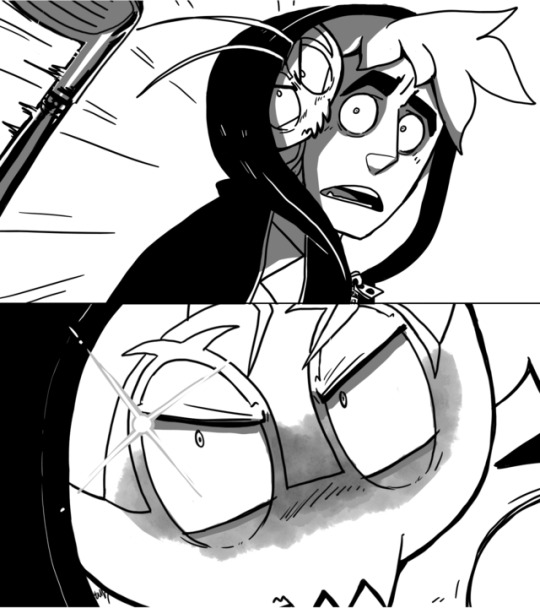
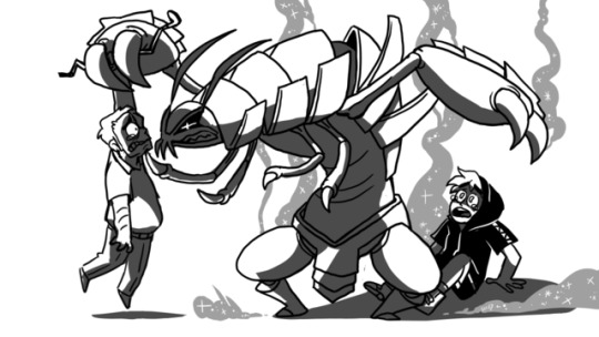
The Marvelous Misadventures of Flapjack
227 notes
·
View notes

Photo


My favorite character of all time is coming back in 2017 and I’m so happy.
19K notes
·
View notes
Photo


“Donald Duck is one of the most daring adventurers of all time!” (x)
2K notes
·
View notes

Photo
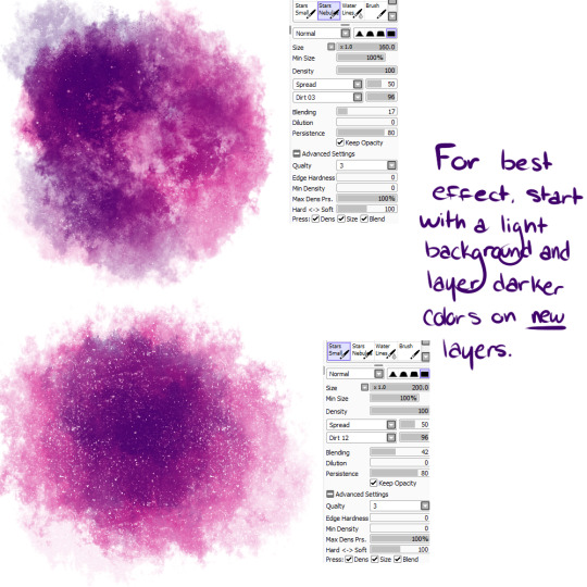
SO I’ve been meaning to post these for a while, but these are two brushes I’ve made! Nebula and Small Stars.
Feel free to use to your heart’s content! Just please don’t go spreading these around like you made them ;u;
24K notes
·
View notes


Text
hello my name is pobular internet artist
here is my portfolio

172K notes
·
View notes


Text
Concerning the Post
Well, it’s been a bit since I did an animation related post, but we have another post going around on tumblr. You guys have probably seen it by now. It’s the one with this gif:

There’s been a few responses to the initial post, including a joke made at the expense of CalArts, other people ripping this post apart, some guy with an anime avatar claiming that all western animation is the same, and at least one post commenting that “Sans is Shaped Like A Friend.”
These designs actually don’t bother me. The rounded head and the big eyes make these characters look friendly and non threatening. Designs like this are meant to play on human’s natural instinct to protect babies. Designs like this are pretty standard in shows where the protagonist is meant to be appealing to a large audience. Disney has been using this formula for years.
Contrary to what this posts suggests however, the character design for these characters do show enough variation worth looking into. While these characters do share some similar characteristics, the way they’re depicted in the actual show itself shows just how distinctive these characters can be. Lets take a look.
Clarence

I’m really not to familiar with this show, but just from pictures and gifs alone, I can tell that this show isn’t too preoccupied in trying to look like other shows. The design seems to be ugly in a very deliberate way. From what I gather, this show has a strong appeal towards nostalgia, and I can actually see that. The designs look like the were lifted from the doodles in some grade school notebook. Personally, I don’t find this shows art stye to be particularly appealng to me personally, but I do have to give them props for making something so unmistakably their own.
Star Butterfly

When I see Star Butterfly, I see somebody’s deviantArt persona personified. Normally that would be considered a bad thing, but given Star’s character in the show, it seems all to perfect.
Star is the perfect example of a parody sue, with her design emphasizing the fact.
Her horns seem to recall the fancy hats and headbands created by many fan artist’s oc’s. You can find headbands like these at your local Hot Topic or else in comic conventions everywhere. Star Butterfly is totally a character who’d go out of her way to buy one of them
Along with her hair, these horns also serve another purpose. While Star’s face and eyes all give off the babyish round design people are meant to find appealing, her horns and her hair add an element of danger. Star is a destructive character, though it may not be so obvious at first. These spikes are subtle reminders of the fact.
Her teeth and mouth are actually very fun to draw. It would be very easy to give a character like Star a set of perfect teeth, but for whatever reason, her mouth seems to be filled with nubs. Perhaps its from chewing her wand all the gosh darn time.
Her clothing changes from episode to episode. This is both reminiscent of many straight mary sues in fiction, but in the context ofa cartoon in gives the audience variation.
Perhaps the greatest asset to Star design is her jaw line that actually moves with her mouth, and squishy cheeks the animators are actually allowed to squish (all these characters have the same kinda cheeks, but this show takes advantage of the fact on a regular basis) something actually kind of rare in this style of animation. this allows for some truly great expressions from her character.


And lets face it, we all knew at least one person who acts like Star in some way or form, inflicting their forced cuteness on the world. Star may look like a self insert character from a Sailor Moon fanfiction, but she’s written like the people who write the bad fanfiction in the first place. Her design is entirely intentional.
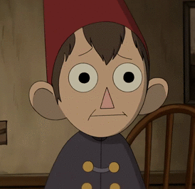
Dipper and Mabel

I’m sorry, but the initial post really doesn’t do Dipper justice. I mean he’s given an incredibly out of character grin. Admittedly that Grin seems right at home with Stay and Clarence, but Dipper never, ever makes that face, something I’m sure has been done intentionally in the character inception. Heck, I don’t even think Mabel is allowed to make that face.
If anything, that first gif shows why big smiling face with soulless staring eyes are inappropriate for most characters. Facial expressions on the character designs are just one kind of way cartoons arre meant to be set apart from one another. Take a look at these faces:


While Dipper is certainly allowed to smile, the faces he’s most often seen with are meant to communicate his status as straight man to the rest of the cast, something usually accomplished be giving him a serious scowl. Contrast this with his twin sister Mabel:

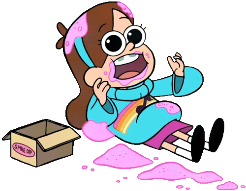

Despite sharing a character base with Dipper, Mabel’s expression embody excess. Even her unhappy expressions stay away from subtlety


The big exceptions for both of these characters seem to occur when acting out of character is the entire point. Mabel picks up some subtler unhappy expressions when the moment is genuinely meant to make the audience feel sad.

Meanwhile Dipper’s out of character squeeing is only funny because of how uncharacteristic it is for Dipper to make an expression like that.

Heck, the only time I think Dipper made the face featured in the original gif was in a scene playing up how creepy that expression really is.

So here we have two characters who have an in universe reason for looking the same, and yet both characters are still distinctive enough to be recognized as their own characters. Compare that with, for example, Dragon Ball Z.

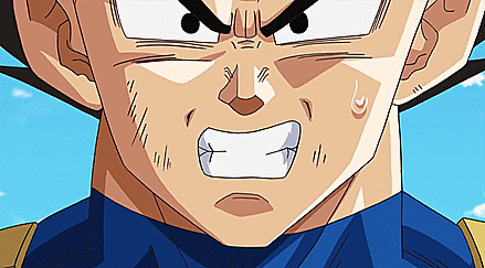
There really is a lot to like about this show, but Character Design is not one of them. I’m sure anime can have a wide range of art styles, but the ones that seem to get popular always seem to have a similar art style, and in the case of shows like Dragon Ball Z, it can be really hard to distinguish characters from one another. When searching for those gifs, I actually had to make sure those two really were separate characters.
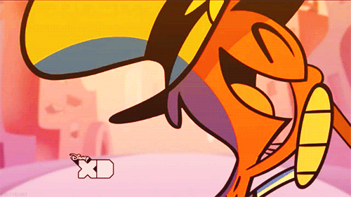
Gumball Waterson

Gumball is a blue cat drawn in a deliberately flat art style. This show is a love letter to many, many different styles of animation, and the main characters themselves resemble graphic design in their flatness. This of course is contrasted beautifully with the live action backgrounds. This is probably the only case I will mention where the design decisions are less character based and more art direction based, but these decisions are ultimately what made this show so unique to begin with.
Steven Universe

Here we have a character’s whose round cheeks are purposely meant to evoke the characters youngness. Though this is of course present in the other characters as well, Steven is notable in that his young looking features are an actual plot point in the series, as well as one of his defining traits.
Steven was designed to be the ultimate little brother (A bit ironic since he’s older than pretty much everyone except Star on this post) and his design looks it.
Finally, I’d like to point out that if these characters were all standing next to each other and silhouetted against some harsh light, then it really wouldn’t take much effort to tell who’s who. Dipper has his hat, while Mabel has her hair. Star has her horns, and Gumball has his ears. Even Steven and Clarence, who in real life would likely have similar body types feature enough extra traits to set the two apart.
Besides. We have plenty of other characters who don’t use that basic head shape:


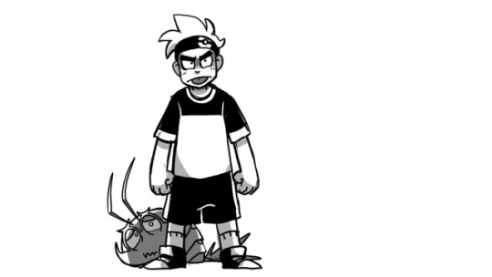
And let’s not forget our favorite rectangle head is coming back as well

8K notes
·
View notes
Text
I was going through the tags for the posts about whether people would pick Bulbasaur, Charmander, or Squirtle. Here’s what your fave says about you
Squirtle:

Charmander:

Bulbasaur:

67K notes
·
View notes
Text
It is our duty as feminists to protect and respect women in Hijabs
633K notes
·
View notes


