
Don't wanna be here? Send us removal request.
Statistics
We looked inside some of the posts by finnredmond-blog and here's what we found interesting.
Average Info
Notes Per Post
1
Likes Per Post
1
Reblog Per Post
0
Reply Per Post
0
Time Between Posts
15 minutes
Number of Posts By Type
Text
12
Photo
5
Last Seen Tumblr Blogs


Fun Fact
Tumblr Inc. is funded by 13 investors.
Text
VISUAL CASE STUDY
my final visual case study, including my finished design rationale:


0 notes
Photo


My finished mock up.
0 notes
Text
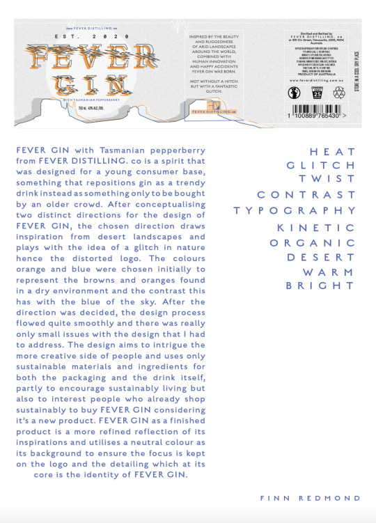
MY FINISHED LABEL

this is my finished label. all in all i’m quite happy with it, and I feel like it ended up how I wanted it, and I surprised myself with my design and branding abilities. :)
0 notes
Text
WEEK 10 DESN 1011
PATTERN MAKING!
for our week 10 self directed brief, we were tasked with making a repeat pattern for label designs.
I found this process really fun and quite rewarding as it is really easy and you get great results in a really short amount of time.

this is the pattern I will use in my label to cover the entire background, but I will set it to somewhere around 10% opacity so that it is only subtle.
during this week I also took the time to go mock up hunting, it was really fun seeing all then different mockups that people have created, and it was inspiring to see all the different types as well. it was also nice to see that there is such a huge design community worldwide, especially when people are willing to provide such great resources that are FREE!
I ended top choosing a gin bottle mockup from creative market that cost $16. I chose this one because it provided different angles and you could change a lot more of the elements than a free one allowed.

0 notes
Text
WEEK 9 DESN 1011

for week 9 we were tasked with a label anatomy exercise to familiarise ourselves with beverage labels before we jumped in and started to design our own.
I chose to do a gin bottle from elderwood distillery. this gin bottle isn't exactly what i’ll be aiming for in my design but it is helpful to map out the label.
I think there a few things that I will include that the above does not, but that mostly concerns little things like, extra signage i.e. pregnancy warnings and standard drinks.
0 notes
Text
WEEK 8 DESN 1011
GIN BOTTLE RESEARCH!
for our self directed brief, we were asked to research packaging for our beverage designs. I spent this time on Pinterest because earlier in the semester I discovered how helpful Pinterest can be, especially for inspiration and it has a huge library of precedents the can inform your design.
I simply searched for gin bottle inspo and came across a massive variety of bottles that helped me gain some knowledge of gin packaging anatomy and it also reminded me of how I wanted to steer away from traditional gin branding because a lot of to looks so similar.
i’ve attached some of what I found below. I mostly included the minimal ones that I liked, as I envision my design more on that end of the spectrum.

I also tried to think about what direction I wanted to take my design in, and from the start I knew I wanted to have a big focus on type, but hadn't really considered, wether or not I’d incorporate photography or something more illustrative. I know now that it will be more illustrative.
0 notes
Text
WEEK 7 DESN 1011
LOGO!
for along time I've had a good idea about what my logo will look like, or at least the aesthetic I'm going for. I knew I wanted to have some sort of layered text, and I wanted the incorporate the ‘glitchiness’ I explored in my moodboards.
I started off just by drawing free hand my logo for FEVER GIN, this did not turn out so well, ahaha, but it encouraged me to refine this because I was initially excited about where it was heading.


after doing this a few times and having refined the two words over and over again, I decided that I wanted to showcase some sort of serif type, so I looked through indesign’s fonts, and ended up choosing minion pro, the most standard type there is aha. I wrote FEVER GIN into design, and used this as reference will I drew the logo on paper.

after this I put it into illustrator and using the pen tool I created the logo I used in the final piece.

0 notes
Text
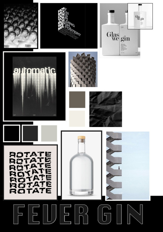
DESIGN DIRECTION
my peers, and Caelli ended up choosing my second design concept for FEVER GIN. I’m really happy with this because although I would of happily moved forward either I felt like I could get more creative with warm orange option.
looking forward to designing FEVER GIN!
P.S. it was really fun to see everyone else's design concepts and get to vote on them, hearing all the feedback and contributing feedback to helped me too, and I'm hoping to apply this learning to packing design.
0 notes
Text
WEEK 6 DESN 1011
Wrapping my head around this idea of a remote presentation was confusing at first especially because at first I assumed we would be presenting live over Zoom, this was not the case. In fact we had to record ourselves and our presentation and watch it with the class, to be honest I thought this was a whole lot better than having to stand and present in front of my peers.
We really only had quite a short time to present our concepts, hence the ‘elevator’ pitch idea, so I knew the presentation would have to be quite condensed. I used my time to have a quite succinct approach, I included my keywords, the final moodboards and my design rationale. In hindsight I would have really liked to include some of my sketches and more of my design process to help inform the concepts, but in the end it came down to a time issue and what was most important.
If I was to give advice to anyway who had to give a pitch, it would be to keep it short and sweet, to the point, and the use the time to explain how you designed your project and why.

0 notes
Text
TUMBLR PEER REVIEW
Being able to go though one of my peers Tumblr’s and help them out by reviewing and giving feedback was not only helpful for them but It was really rewarding for me and got me thinking about my own journal and what I needed to achieve in this space to help my process, even before receiving my own feedback.
0 notes
Text
WEEK 5 DESN 1011

throughout this design process I have found that I am more and more attracted to type and for the self directed brief from week 5 I decided to create a tile that plays with type, layers and colour. After feedback from my peers that suggested I have more type for my design directions I decided that this brief was a good opportunity to play with type in a fun way. and also I actually do believe that type is fun haha.
0 notes
Photo


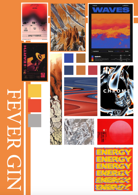
MOOD BOARD FEEDBACK
Receiving the feedback from peers, and Caelli, really helped me in designing two new mood boards for the concepts for FEVER GIN.
I removed images from both that didn't really add anything as there was images already that helped explain that aspect of the design. I also endeavoured to add more type options as suggested.
I really feel as though these two reworkings are an elevated, more creative and refined version of the previous moodboards.
0 notes
Text
WEEK 4 DESN 1011

Mood Board Feedback
During week 4, my tutorial group printed out our mood boards in there first stages for feedback from our peers. I found this process to be quite helpful and allowed me to form or borrow a different perspective to view my work. It was also interesting to me to see what my peers were leaning towards regarding what direction they will eventually choose for me to continue with.
basically both directions need more examples of typography, and more imagery for warm (2) regarding what the actual product might look like i.e. bottle shape and etc. I do like both of my directions but I was happy to hear that the class preferred warm (2) over dark (1) because I think it will be more fun to design the drink with this concept.
0 notes
Photo
WEEK 3 DESN 1011
I found that pulling together mood boards for both concepts really helped me consolidate ideas that I had surrounding both directions.
These first mood boards also helped me begin to form design rationales and key words. for the first direction I chose the key words:
Geometric, typography, brutalist, space, architectural, minimal, movement, dark, edge, and shape.
And for the second direction I chose:
Heat, organic, desert, warm, typography, glitch, bright, contrast, twist, and kinetic.
0 notes
Photo

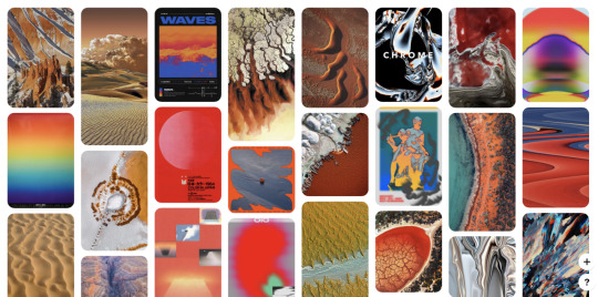
I have found that utlising Pinterest for inspiration has been incredibly helpful. for some reason I had this preconceived idea that Pinterest was just for crafts and baking tips, I can't say why I thought this. But actually it’s an incredible resource, and contains a huge amount of inspiration.
The screenshot above is a selection of my one of my inspiration boards on Pinterest for one of my design directions. This concept is drawing inspiration from geometry and brutalist architecture, with a heavy emphasis of typography.
The second screenshot is showing what direction I will be following for my other concept. The second design direction will also feature typography heavily but well utilise a much warmer colour palette and is inspired by organic shapes of the desert and also the contrast of the colours blue and orange.
0 notes
Text
WEEK 2 DESN1011
During week 2 we have been exploring the design process and and forming an individualised process for ourselves, one that works best for our habits and creative reflexes.
Caelli walked us through multiple techniques and practices for the formation of ideas and ways to refine these ideas. Mind mapping has always been effective for my thought process, but for some reason I had never approached mind mapping in such a hasty way before, my mind maps were usually meticulous and neat. I found doing a mind-map so rapidly allowed me to form ideas way more efficiently and it was more fun.
the two mind-maps above are a product of 5-10 minutes at the most.


The mind-maps, enabled me to form my idea that I’m moving forward with, a spiced gin with branding designed to be the opposite of the normal delicate traditional gin branding that we usually see. At present I'm in the process of forming two design directions...
Direction 1. Fire and Metal. I envision the the bottle being opaque with a rectangle label with a metallic sheen to it with deep oranges, purples, blues, yellows, and some white. I want to layer the colours from the bottom left corner moving upwards to the right top corner in a way that is sort of explosion like. I want this gin to be marketed to people who are not your average gin drinker.
Direction 2. The Desert. At the moment this idea is less formed, by I am being inspired by sandy colours and the cracked ground of a drought stricken area, I want to convey the idea of heat. My target market for this gin is probably more for someone who is already a gin drinker but want to try spiced gin.
During this week we also experimented with an object library, something to help us express our thoughts quickly through illustration while forming design concepts. I have attached the object library exercise that we did this week below. personally this approach is not really effective for me, I think I find that words help me envision an an artistic approach a lot more than little icons.

0 notes
Photo


WEEK 1 DESN 1011
As part of DESN 1011 we have been tasked with designing a branding concept for a beverage. During this assignment I will be updating this blog to document my progress and creative process.
for my first post I have chosen two distinctly different beers to showcase what I deem to be either good or poor branding. in the first image I have chosen a beer by German beer maker Oettinger, this beer to me is a perfect example of a company too afraid to embrace contemporary advertising, branding, marketing etc. I do understand that this beer has been around for a while and it is very important for a brand to have a consistent identity, but I cannot see this beers consumer numbers growing much at all if it continues to use a stock standard beer advertising format. This beer too me looks like most other beers.
In the second image I have chosen the beer Gamma Ray brewed by Beaver Town Brewery. this beer’s branding immediately tells me a lot about this company and I really like their approach to advertising. the beer is quite obviously a craft beer, and because of this they have realised they have a tremendous amount of creative license on how they present their product (because its not bound by traditional beer advertising), they didn’t hold back.
1 note
·
View note