Don't wanna be here? Send us removal request.
Statistics
We looked inside some of the posts by floatingskies and here's what we found interesting.
Average Info
Notes Per Post
19
Likes Per Post
17
Reblog Per Post
1
Reply Per Post
0
Time Between Posts
8 days
Number of Posts By Type
Text
15
Last Seen Tumblr Blogs


Fun Fact
The Tumblr app for Google Glass was released on May 16, 2013.
Text
Hey gang! Another semester has rolled around and I’ve decided to take on another project! This will not be as regularly posted as the last project, but I will be doing a post for each one of the 12 Principles of Animation. See you soon!
0 notes
Text
CMYK: Scale and Proportion


Analysis
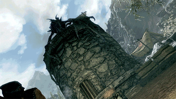
Scale and proportion are extremely important in design. The game Little Nightmares utilizes scale and proportion in order to help narrate the theme, establish the tone, and create interesting and unique visuals. The player is a small child in a signature yellow coat that escapes from a slaughter house for children and must navigate through a cruise ship filled with creatures of extreme proportions in order to make it out alive. The unnatural proportions of the creatures, such as the arms seen in the last gif and the pig-like swollen features of the creatures in the 3rd image are meant to create an unsettling feeling within the player. In addition to the proportions of the characters, another main aspect of the game is the large scale of the environment compared to the main character, or the ratio. The sheer grandeur of the setting seen in the first image can also be noticed by the relativity of the Maw beside a cruise ship. The human scale of the environment is greatly exaggerated, with giant creatures, giant items (seen in images 2 and 3), and giant structures (image 1). This adds to the haunting atmosphere of the game and pushes the idea and themes of vulnerability on the player. Overall, scale and proportion can influence the theme and tone of a product. In the future, I will use scale and proportion to improve the quality of my work by emphasizing and pushing the theme of my work.
Glossary
Scale is the size of one object in relation to other objects in a design.
— a certain relative or proportionate size or extent (A human is 7.5 heads tall.)
— a standard of measurement or estimation (The UFO was as big as a football field.)
— point of reference by which to gauge or rate (My puppy is twice as big as your chihuahua.)
Aspect Ratio refers to the proportions of the height and width of an image. It defines its overall shape, and it is usually shown as W:H (W is the width and H is the height).Geometry- spheres, cubes, cylinders can be used to build more complex objects
Hierarchy is arranged according to importance or power. What’s bigger or taller is often more important or harder to kill.
Human scale sets the stage for the story happening to human-sized characters
Proportion is the size of the parts compared to the whole. Relativity.
A ratio tells us what proportions mean to each other. Measuring one thing in terms of another. That monster is twice the size of the human. Their ratio is 2 to 1.
Relativity is how objects appear in context with each other
1 note
·
View note
Text
CMYK: Emphasis

Analysis
Emphasis in design highlights the most important elements in a piece. For example, in Vincent Van Gogh’s painting, Café Terrace at Night, Van Gogh uses a variety of principles and techniques to place emphasis on the café in the street. One way that emphasis is shown is through contrast in color and value. The dark blue of the night and the bright orange of the café are complementary. Another way that emphasis is shown is through placement. The café uses the rule of thirds and leads the eye to the focal point. In addition to the rule of thirds, the café is also one of the closest elements in terms of foreground, middle ground, and background, leading the rest of the city to be subordinate. Overall, emphasis is important for clearly leading the viewer to the focal point and intended meaning behind a piece. Going forward, I will use emphasis in my work to achieve this clarity and further improve the quality of my art.
Glossary
Emphasis- Pow! Something in a scene dominates. In other words, the designer gives visual priority to part of a scene in order to draw the eye there first.
Contrast in size, color, texture can make one thing stand out from the many things around it.
The focal point demands attention, it is accentuated, contrasted -- the star or the most prominent component of a scene.
Isolation features a single element alone, away from other elements to create emphasis.
One Element eliminates everything else in the composition and the thing that’s left will grab the attention such as a bold title or symbol.
Placement is to position your most important design component in a place to grab attention, such as the center of a poster.
Subordination is the the elements that are not the focal point. The focal point has the visual power while other elements of the scene are subordinate.
Whole over Parts - Sometimes we don’t want the eye to go somewhere specifically such as in an establishing shot at the beginning of a story. We want to show an overview of the environment before we jump into the story. We might look at a map with lots of details. The whole map is the important thing. When we select a place on the map to visit, then that spot becomes the focal point and the Emphasis shifts from the whole to the specific. Another example is that the whole game is more important than its levels.
5 notes
·
View notes
Text
CMYK: Contrast
youtube


Analysis
Contrast in design can be seen in a variety of ways and is important in creating dynamic and interesting work. The series Good Omens shows strong examples of contrast. The show is a comedy about the end of the world and the angel and demon Aziraphale and Crowley’s attempt to save it. From the moment that two main protagonists, Aziraphale (bottom left) and Crowley (bottom right) are introduced, a high value contrast is established. This contrast serves to push the idea of good and evil. In the trailer especially, both characters tend to be shown in their respective light and dark palettes. In the promotional picture (bottom), low contrast is used in the background as a gradient moves across the piece. This further emphasizes the differences of the characters without fracturing the unity of the piece. Finally, there is both symmetry and asymmetry in the image with Aziraphale, Crowley, and Adam (the boy in the middle). The stance and wing placement of the angel and demon are symmetrical, whereas the values once more are asymmetrical. This is to create the image of the metaphorical “angel and devil on the shoulder” scenario, and to imply the strength of all of them together in that scene. Overall, Contrast is useful in creating interesting focal points and environments as well as portraying opposite or likeminded sides of a theme. Moving forward, I will use contrast in my profession to help carry a narrative or theme in my work and to create variation and interest in my work.
Glossary
Contrast refers to the arrangement of opposite elements (light vs. dark colors, rough vs. smooth textures, large vs. small shapes, etc.) in a composition so as to create visual interest, excitement and drama.
Contrast creates variety within a unit, draws the eye to a focal point, creates a sense of adventure or mystery. Contrast is a unifier.
Value contrast is when a character or object has a strong darks and lights compared to the scene around it.
Size contrast is a gigantic space cruiser compared to much smaller fighters.
Asymmetrical balance is a dynamic compositional strategy in which each side of the axis are distinctly different yet belong to the same story.
High Contrast is strong dissimilarity such as black letters on a white background. The high contrast setting is an accessibility feature built into interfaces to assist people with vision impairment. In visual perception of the real world, contrast is determined by the difference in the color and brightness of the object and other objects within the same field of view. Because the human visual system is more sensitive to contrast than absolute luminance, we can perceive the world similarly regardless of the huge changes in illumination over the day or from place to place.
Low Contrast means a minimum of contrast between light and dark, so that the image is either predominantly dark or predominantly light. The sun sets, dusk sets in and in the gloom there is low contrast in the landscape.
Symmetrical is a form of balance in which both sides of the axis are the same, a mirror image of each other, creating stability and formality. In visual storytelling the symmetrical formal balance is often contrasted with the dynamic action of asymmetrical configurations. For example, the formal balance and discipline on the Death Star in Star Wars is contrasted with the diversity of the different rebel cells and militias from across the galaxy. The dynamic contrasting rhythms and visuals of the dark side contrasted with the Jedi and rebel alliance has kept the franchise going for decades.
Contrasting camera angles- Part of your story is how you show as well as how you tell. The camera is your audience’s view of your story and should be well planned to reveal the story in the most effective way possible.
0 notes
Text
CMYK: Rhythm
youtube

Analysis
Rhythm, both visual and audible, can immensely affect the tone and emotion of a piece. An example of this is shown in the Conjuring. The clock creates audio rhythm, which is the first notable instance of rhythm in the clip. The subtle simplicity of the clock adds to the mounting tension in the scene. Throughout the entire scene, there is conceptual rhythm. The diagram below the clip is an estimated timeline of every time the camera angle changes. The amount of shots in a specific amount of time decreases as the scene builds tension and increases when there is an action or jump scare. Progressive rhythm is also notable in the diagram and scene. The tension builds as Carolyn (the lady in the scene) begins to walk towards the door. The increase of shots and gradual fade in of suspenseful music progresses the energy and tension before finally climaxing as Carolyn is thrown down the stairs. Overall, rhythm is very useful in influencing the atmosphere of a piece. Moving forward, I will use rhythm to improve the quality of my work.
Glossary
Rhythm is caused by patterns in movement. What are those footsteps in the dark room? Are they slow or fast? Running or sneaking up on you? Rhythm controls the pace of action in your story. Rhythm can be repeated character types, weapons, or color strategies. We see and hear rhythm throughout nature as well as in our digital environment. Rhythm organizes units into patterns. Rhythm is created through repetition, alternation, and progression.
Alternating rhythm is a form of repetition and is predictable. We switch back and forth from one thing to another like a tennis match. Alternating rhythm can create tension, such as switching close up head shots of one character arguing with another.
Audio Rhythm are sounds that create patterns such breathing or shooting rounds of ammo.
Conceptual Rhythm Intensifies, moves along, or calms the story. Conceptual rhythm coordinates visual and audio rhythm with the pace of your story.
Contrasting Rhythms are two or more sounds or motions at obviously different tempos.
Legato means music in a smooth flowing manner, without breaks between notes or a smooth flowing motion.
Polyrhythmic pattern is the use of simultaneous contrasting rhythms. A battle scene has many(poly) rhythms such as big guns, small guns, shouts, rumbles, footsteps, and explosions.
Progressive rhythm is a pattern that changes over time to more or less intensity. Progressive rhythm makes us feel that. something is in an evolving state of change. We can tell when the battle is heating up by the rhythm of the sounds and the actions of the characters running toward or away from the fighting.
Repeating- the same thing again and again gives us a feeling of predictability
Rhythm and motion - When a motion repeats, speeds up, slows down it creates a rhythm. The rhythm of tai chi is slow. The rhythm of Kung Fu is fast.
Staccato derives from the Italian verb staccare, meaning "to detach," and can now describe anything - not just sounds - made, done, or happening in an abrupt or disjointed way.
Visual Rhythm is when motifs such as lines or shapes repeat visual rhythm forms.
0 notes
Text
CMYK: Unity

Analysis
Unity in design is the fusion of harmonious parts to create oneness. An example of a product that shows unity is the video game Skyrim. One way that unity is expressed in this game is through conceptual unity. The architecture, clothing, magic, types of beasts, and overall aesthetic combine around the concept of medieval fantasy. Another way that unity is portrayed is in the contrast between the dark palettes of the dragons and the light sky. Finally, one last example is seen in proximity. In this open-world RPG, there are mountains all throughout the map. Although the mountains can be traveled to and climbed up, there is always a mountain range with atmospheric prospective in the background. This creates vast visuals that seemingly never end and highlights the grandness of nature in the game. Altogether, unity allows for a product to have a sense of oneness and union which helps to create a strong aesthetic which distinguishes it from other products. I will use unity in my future work to tie my work together and create an atmosphere that is unique and easily distinguishable.
Glossary
Unity is an entity that is a systematic whole. A fusion or union of parts in harmony to create a oneness. A game is a unity based on a fusion of levels.
Alignment is a common axis that creates relationship, the line up creates meaning. Alignment in games can help you find your way on the map or aim true with your weapon. Alignment of troops or vessels indicates organizational strength. Maps are visually aligned with the edge of the frame. Your stats are aligned in a table.
Beat Boards are used to illustrate major story points before the rest of the storyboard is completed. Beat boards are a series of single drawings that depict key focal points in a scene. Beat Boards can be compared to a children's book illustration because an individual picture shows a complex story. Beat boards can serve in art direction to indicate how the shot is staged and show color strategies, using shapes and colors, but are not detailed sketches. Making sure the beat boards relate to each other creates unity.
Composition is the arrangement of visual elements within a shot. The three basic shot compositions in filmmaking are long-shot, medium-shot, and close-up.
Conceptual unity a palm tree, an ocean beach, and a beer unify around the concept of ‘vacation'.
Contrast creates variety within a unit, draws the eye to a focal point, creates drama. Contrast is a unifier. Contrast is when a character or object has a strong darks and lights compared to the scene around it. Size contrast is a gigantic space cruiser compared to much smaller fighters.
Proximity is when closer distances connect elements and far apart elements create separation and sometimes magnetism
Repetition states that things that look alike relate to each other. Shapes or colors that recur in the image create rhythm and recognizable situations.
Unifying Strategies manipulate contrast, repetition, alignment and proximity to create visual unity and to pull a story along.
Visual unity is a group of repeating or similar elements that create balance or form a structure
1 note
·
View note
Text
CMYK: Point


Analysis
Point is the smallest visual component and arguably one of the most broad components in design. Every piece starts with a point, can be made up of points, have a focal point, and have an overall point. An example of point in design can be seen in the game Faith. This indie game utilizes pixel resolution to mirror old games and create an eerie aesthetic. A lot of the game’s disturbing imagery and atmosphere come from a sense of unknowing or vague images that are up to viewer interpretation. The plot of the game is to ultimately perform an exorcism to “finish what you started.” There are several endings depending on how the player responds to the vague goals in the game. For example, the game gives you a gun towards the conclusion, and there are different endings based on what you end up doing with it. The player reaches a point of no return when they use the gun and the ending that the player will receive is set in stone. The power and finality of this action adds stress and a sense of urgency that forces the player to make decisions on a whim. This implies that the point of the game is not just to perform an exorcism or experience a horror game, but to reveal the player’s humanity and psychoanalyze how the player sees a problem and solution.
Glossary
You have an idea sparking in your brain. You open a sketchbook or create a new file. You ponder a blank page or layer. You move your pencil or stylus. You land on a point. Your point moves and leaves a trail that evolves into a visible something. Groupings of points can stimulate human imagination to form familiar shapes. Ancient storytellers grouped stars into constellations of mythological beings. We group pixels into characters, animations, and game levels.
Point is the smallest visual component.
Pixel is a recently invented word. The word "pixel" was first published in 1965 by Frederic C. Billingsley ofJet Propulsion Laboratory to describe the picture elements of video images from space probes to the Moon and Mars. A pixel is the basic unit of programmable color on a computer display. Think of it as a logical - rather than a physical - unit. The physical size of a pixel depends on how you've set the resolution for the display screen. Each visual composition on your screen is made of thousands of illuminated points of hue and value.
Focal point is the feature of a design or work of art that is the most interesting or important or the most strongly emphasized.
The Point is what a player will tell a friend about the game if they like it.
The point is the mission or a moving target.
The point of no return (PNR or PONR) is the point beyond which one must continue on one's current course of action because turning back is dangerous, physically impossible or difficult, or prohibitively expensive. The point of no return can be a calculated point during a continuous action (such as in aviation). A particular irreversible action (such as setting off an explosion or signing a contract) can be a point of no return.
0 notes
Text
CMYK: Pattern and Texture


Analysis
Pattern and Texture are two elements of design commonly seen throughout the Movie Coraline. The first method of the two principles immediately noticeable is the alternating pattern seen in the warm tones of the other mother’s house (top image) and the cool tones of the real world (bottom image). This pattern ties in a main conflict in the plot that Coraline is unhappy with her real life and drives her desire to visit the other world. More small-scale patterns include the tiles and curtains in the different scenes which is mainly to provide rhythm and unity in the scenes. In terms of texture, this stop-motion film uses an intense variety of methods and textures to tell an immersive story. The use of different mediums, 3D modelled props, and real lighting adds to the extreme use of texture, which adds to the verisimilitude of the scene’s background and further immerses the viewer in the movie’s universe. There is tactile texture in the food and clothing, as well as the hair, which is then represented through visual texture when it is filmed and witnessed through a screen. Altogether, pattern and texture unifies a story, creates rhythm, and makes it believable to the viewer. With this in mind, I will utilize pattern and texture in my work to unify my scenes, create dynamic and effective aesthetic choices, and boost the narratives and themes that I a wish to portray in my projects.
Glossary
Pattern
Pattern is an arrangement, configuration, array, formation, guide, matrix of repeated forms. Patterns create rhythm and can be used to predict and organize design elements such as using a grid. In Software development patterns are conventions for describing and documenting recurring design decisions within a given context.
Alternating pattern means to occur in succession, such as day alternating with night. To pass back and forth from one state, action, or place to another such as alternate between happiness
Chiaroscuro is a technique of painting or drawing using a predictable sequence of light and shade to achieve a three-dimensional quality. From the wayback machine: [1680–90; < Italian, =chiaro bright (< Latin clārus) + oscuro dark (< Latin obscūrus)]. Chiaroscuro has been digitized to give depth and dimension in every 3-D video game or animation object.
Collage is a technique of an art production, primarily used in the visual arts, where the artwork is made from an assemblage of different forms, thus creating a new whole. Collage is a prototyping process used to assemble colors, textures, silhouettes and other assets to test ideas, colors, size relationships.
Gradient is continuous change, darkening, lightening, increasing or decreasing color saturation. A gradient is created when two or more different colors are layered to paint one element while gradually fading between the hues or values.
Grid means a rectangular system of coordinates used in locating the principal elements of a plan. and depression.
Progressive patterns create active change, momentum by shifting in a direction, increasing, escalating, or accelerating.
Radial balanced patterns are based on a circle with its design extending from its center. A few examples of radial balance are; a star, the iris in one's eyes, and a wheel with spokes.
Texture
Texture of something is the way that it feels when you touch it, how smooth or rough it is. The texture of an object depends on the unique structure of its molecules. Fur may feel soft or coarse, metal may be oiled and shiny or rusted and rough.
Tactile textures are physical, touchable textures that you can actually feel on your skin in the real world, like when you pet a cat or dog.
Texture mapping is a process in which a two-dimensional surface, a texture map, is wrapped around a three-dimensional object. When wrapped, the 3-D object acquires a visual surface texture. Texture maps create high frequency detail, surface texture, or color information on a computer-generated graphic or 3D model.
Visual texture is an illusion of texture. Pixels or traditional drawing and painting media can be manipulated to give the impression of texture, while the surface actually remains smooth and flat. The texture on an ancient wall, a vehicle, or a creature's scaly or slimy skin increases the immersiveness of a game. Texture artist is a career path. Texture artists are close observers as they collect, organize, and use textures to create believable surfaces.
Verisimilitude is the appearance of being real.
Trompe l’oeil is the representation of an object with such verisimilitude that it deceives the viewer.
1 note
·
View note
Text
CMYK: Motion

Analysis
Motion is critical in narrating urgency, creating dynamicity, and adding energy and life to a story. In Voltron: Legendary Defenders, motion is utilized in a variety of ways which help to create effective, stunning, and memorable action scenes. In this scene, one of the main protagonists, Shiro, fights against a galran soldier, Sendak, who tortured him in the past. One method that Voltron uses is motion blur. This is shown in the lighting of Shiro’s hand, his arm, and in the collision of the two fighting. This motion blur emphasizes the strength and speed of the characters. This show also uses camera motion to add variety and fluid movements through the scene. The constant movement of the camera surrounding the fight also breaks the 180-degree rule. This method adds to the aggression and intensity of this fight and further implies the emotion and brutality of it as well. Finally, there is a moment of anticipated action as Shiro jumps in the air before attempting to strike at Sendak. All of these methods together build the dramatic atmosphere and solidifies the emotion behind this fight. This scene shows that motion is crucial in giving life to a narrative or piece. With this in mind, I will use motion in my work to emphasize dynamic movement and exponentially boost the quality and effectiveness of my projects.
Glossary
Motion is action, reaction, energy, what’s happening, gestures, dynamics, mobility, exertion, labor, and progress through space. Motion varies with your story. Motion indicators in storyboards are arrows, blurred lines, smears, zooms in and out. Your character is dramatized and embodied as a personality through gestural actions.
The 180-degree rule in filmmaking is a basic guideline regarding the on-screen spatial relationship between a character and another character or object within a scene. By keeping the camera on one side of an imaginary axis between two characters, the first character is always framed right of the second character. Moving the camera over the axis is called jumping the line or crossing the line; breaking the 180-degree rule by shooting on all sides is known as shooting in the round.
Anticipated Action is a dramatic action frozen in time, the tension mounts, we feel anticipation. We expect the sword to swing or the finger to pull the trigger or the couple to kiss.
Camera Motion- arrows are standard cues, a simple and recognizable way to show motion or progression in a storyboard.
Kinesthetic Empathy is a player’s actual movement when responding to action in a game. Leaning into a curve in a driving game is kinesthetic empathy.
Line of action is an artistic concept, an invisible line that captures the thrust and vitality of the movement. The line of action can be drawn by artists as the first element to capture or exaggerate the pose. Tip: Create the line of action as layer 1 so that you don’t downplay the pose. When you have the full energy of the drawing delete the action line layer.
Motion Blur- when your eyes or objects are in motion, the image will suffer from motion blur, resulting in an inability to resolve details. To cope with this, humans generally alternate between saccades (quick eye movements) and fixation (focusing on a single point).How is this biological situation useful in storyboard drawing? How do storyboard artists use motion blur? How does a smear function in animated motion?
Optical movement is an optical illusion. Although the image is not moving, it appears to move. To see examples search “Op Art”.
Stillness is calm, quiet, inaction, and peace. Stillness is the opposite of motion. It can be used to contrast with motion.
Before there were moving pictures, artists developed ways to indicate motion. These techniques are used today to quickly indicate motion. Blurred outlines is one technique, and repeating parts of a figure is another way. A figure may seem to be moving if their figure is cropped by the frame of the composition.
0 notes
Text
CMYK: Space/Depth

Analysis
Space and depth in design are extremely useful elements for emphasizing tone and narrating an unspoken story in a piece of work. The game Inside uses a wide variety of methods to imply the grand size of the universe within the game despite the player (the faceless boy with the reddish sweater) only being able to move left and right and creates interesting and dramatic illustrations that capture the player’s attention and guides the plot. One method seen in this wideshot is vertical position. The objects seen in the piece are placed higher up as the distance is increased. Another method is size relationships. The person, dog, and truck are significantly smaller than the player to signify the distance between them. There are multiple other methods used in this work, but the last one that I will point out is atmospheric perspective. As the distance is increased, the value become lighter. This is extremely affective to show the sheer grandness of the setting and to simultaneously add to the eerie and grim atmosphere. This atmospheric perspective could also be labeled as transparency, as the light from the truck seems to be in a hazy environment and the use of fog can further add to the danger and mysterious nature of the man and dog in the background. Overall, the use of space and depth in a piece can give life and dimension to a world that is static and add to the atmosphere of a piece. I will utilize space and depth in my profession to give a sense of unity and dimension to my work and to create universes and settings that are believable and affective.
Question: When would space and depth be more effective in a minimal sense? What different effect or tone can a piece portray with a minimal use of space? What about in a grand space?
Glossary
Space is an area, expanse, territory, distance or range. Variable spaces expand or contract as our stories unfold. A closeup has a short range. A wide shot covers a lot of territory.
Atmospheric Perspective- value contrast and color saturation decrease with distance. Brightness increases as objects fade further into the background. In addition, objects such as mountains may appear more blue.
Diagonal Shapes pull the eye in a direction to create the illusion of depth. If the diagonal is going back like a railroad track or fence-line the eye will follow it into the perceived distance.
Elliptical Perspective- an ellipse is an oval shape. Elliptical perspective provides visual clues to the location of curved surfaces in space. Look straight down on a glass of water. The rim of the glass is a circle. Move the glass to the side, the rim now appears as an ellipse. Line up the rim at your exact eye level, the ellipse now appears as a straight line.
Foreground, Middleground, & Background- the 3 treatments of objects in space support design to achieve depth. This template for placing and sizing objects in the picture plane shows variations on the foreground, middleground, background configurations.
Foreshortening is when an object's dimensions appear shorter when angled toward the viewer. At the same time the part coming toward the viewer is enlarged.
Linear Perspective is a system used by artists in which the relative size, shape, and position of objects are determined by drawn or imagined lines converging at a point on the horizon.
Overlapping is when part of one object is obscured by another object. The obscuring object appears to be in front.
S-Curve or Winding Path- in an image of a landscape, S-curve or winding path will draw the eye of the viewer into a perceived distance.
Size relationships is when objects appear smaller as their distance from the observer increases.
Transparency or Opacity is when we feel like we can see objects through a glassy, gauzy, smoky, or dusty layer. The transparent/opacity adjustment affects the saturation and color of objects to give a feel of depth.
Vertical Position places objects higher up in the composition to appear further away.
Volume is the amount, expanse, extent, magnitude, size, aggregate, bulk, dimensions, or mass of an object. The volume variable indicates the amount of territory needed for each object in a scene.
0 notes
Text
CMYK: Value

Analysis
The Elements of Design are not just seen in animation, but in all products and entertainment. Value in design, for example, or lightness and darkness , can be seen in the movie and musical Sweeney Todd: The Demon Barber of Fleet Street and is very important for the plot and atmosphere. This film uses value as emphasis to distinguish the main characters from the background by contrasting the darkness of the surroundings with the lightness of the characters’ complexions. In addition to the distinction of the characters, the use of very dark values in the clothing and settings of the film gives it a dreary and foreboding sense of the scenarios and location. This dark value is harshly contrasted against the extremely light values of the two main characters of the film, Mrs. Lovett and Sweeney Todd. This light value with heavy shadows gives a sickly appearance to the characters and implies their insanity through this choice. Overall, value can dramatically affect the tone of a piece and give the viewers subconscious insight of its intended purpose. I will utilize value in my work to emphasize the tone and meaning behind a piece and make knowledgeable decisions that unify and strengthen my art.
Glossary
Value in design is lightness or darkness on a scale of white to black (with white being the highest value and black being the lowest value). Value is widely considered to be one of the most important variables to the success of a design.
Chiaroscuro (English: kee-AR-ə-SKOOR-oh, -SKEWR-, Italian:; Italian for "light-dark"), is the use of strong contrasts between light and dark with bold contrasts affecting a whole composition. Chiaroscuro is a technical term for the use of contrasts of light to achieve a sense of volume in modelling three-dimensional objects and figures.
Light and dark - Every element in your design has a value from 1% black (almost white) to 100% black. Value is relative to everything in the composition. Every color has an underlying value somewhere between white and black.
Value as emphasis happens when a strong contrast in value draws attention to itself such as on this ancient Greek vase illustrating value contrast in the service of visual storytelling.
Value and space - Designers use dark and light values to create the illusion of light as it falls on objects. Value is used to create the illusion of highlights and shadows. Highlights and shadows combine to create the illusion of a light source. The pattern of light and dark can create dimension, volume, and mass.
Value patterns appear regularly in the world, in human-made design, and even in abstract ideas such as stories. The elements of a pattern repeat in a predictable manner. Night and day is a value pattern common in stories
1 note
·
View note
Text
CMYK: Color

Analysis
In design, color is used to influence the tone of a piece. An example of this is in Over the Garden Wall. This animated series uses saturation similarities in its color palette to form a sense of unity. On the other hand, value contrast is employed to show depth in the backgrounds, as seen with the dark foreground trees and the slow transition to a solid light background. The overall palette consists of desaturated, warm -toned colors. All of this serves to create an eerie, vintage atmosphere that plays a big role in the mysterious plot of the show. If this show were to have more saturated colors, the eerie atmosphere would be lost. Thus, color is extremely important in evoking specific thoughts or emotions from an audience. I will use color in my design profession to guide the tone and plot of my work and to create aesthetically pleasing color palettes that fit well for all of my projects.
Glossary
Visible light spectrum is the segment of the electromagnetic spectrum that the human eye can view. This range of wavelengths is called visible light. Typically, the human eye can detect wavelengths from 380 to 700 nanometers. The component colors of the visible light spectrum range from dark red at 700 nm to violet at 400 nm.
Color Psychology is the study of the effect that colors have on emotions, behavior and feelings of people.
Color systems classify color and analyze their effects.
●The additive color system is used for colors of light such as light emitted from computers, phone screens, and projectors. Red, green, and blue are the primary colors
●The subtractive color system is used for pigments such as ink, dye, and paint. Cyan, magenta, and yellow are the primary colors.
Color to Show Depth is the use of color to separate the foreground, midground, and background planes to create the illusion of depth and is commonly used in animation.
The color wheel, or color circle, arranges a pattern of hues around a circle. There are several versions of the color wheel or color circle. The circle connects relationships between hues to illustrate color strategies. Color wheel history goes way back.
Local color is the natural color of an object unmodified by adding unrealistic light and shadow or any other distortion. The color that the eye observes is altered by lighting conditions such as time of day or the surrounding environment. The local color of a lemon is yellow.
The definition of a palette is the range of colors used in a particular composition or by any person who uses color such as an artist, house painter or interior decorator. An example of a palette is Vincent Van Gogh’s limited palette of hues in his Starry Night painting. Starry Night’s palette is a variety of blues, greens and yellows. Close up video of Starry Night lets you come closer than you could at the Museum of Modern Art.
Properties of color are hue, saturation, and brightness. The H, S, and B in the Photoshop Color Panel stand for hue, saturation, and brightness.
●Hue is the named color around the color circle such as red, orange, green, yellow, violet, and blue.
●Saturation is the intensity or purity of a hue. Fire engine red is more highly saturated than brick red or the color of red wine.
●Brightness is the perceived intensity of light coming from a source such as a screen. On a color screen, brightness is the average of the red, green and blue pixels on the screen. Brightness is important to both color perception and battery life on mobile devices. Brightness of a screen can be adjusted.
Symbolism of color in art and anthropology refers to the use of color as a symbol in various cultures. There is great diversity in the use of colors and their associations. Diversity in color symbolism occurs because color meanings and symbolism occur on an individual, cultural and universal basis. Color symbolism is also context-dependent and changes over time.
Monochromatic means variations of a single hue such as a light blue and a dark blue or a greenish aqua blue and a lavender blue.
Achromatic color strategy integrates variations of black, white, gray, and a full range of neutrals.
Full Spectrum Strategy represents the full circle of spectral colors by incorporating at least five of the base hues.
In the Achromatic/Chromatic Mix strategy Achromatic colors dominate the composition with a chromatic hue accent.
Warm/Cool: Contrasting ‘temperatures’ of warm & cool. Cool colors appear on the green/blue/violet side of the color wheel. The colors on the red/orange/yellow side of the color wheel are called warm. Emphasis is on the contrast between warm and cool achromatics: brown - gold (warm), grays - silver (cool)
Saturation Similarities/Saturation Contrast
●Saturation Similarities: Hues may vary in this strategy, but all colors must have the same or very similar saturations.
●Saturation Contrast: Hues may vary but all colors must have significant contrast of saturation.
Value Similarities/Value Contrast
●Value Similarities: Hues may vary in this strategy, but all colors have the same or very close values.
●Value Contrast: Black (or dark desaturated hues) contrast with white (or very desaturated tints of hues). The Value Contrast strategy demonstrates strong distinction of value with the strongest example being between black and white.
Complementary Dyad creates a strong hue contrast. Complementary hues are located directly opposite each other on the color circle.
2 notes
·
View notes
Text
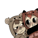
CMYK: Shape


Analysis
Shape in design, seen as the outline of a character or figure, can be utilized in character concepts and design in order to help portray a meaning or symbolism and aid the recognition of a character. An example in which shape is used in character design is in Steven Universe. In both images shown above, abstract shapes, such as triangles, squares, and circles, are very obviously seen in the designs of the characters. These shapes go further by helping to imply or solidify the main traits in that character. For example, in the bottom image, Garnet (top left) is made of squares and she is very stable and dependable, Amethyst (bottom left) is based off of circles and is very friendly and outgoing, and Pearl (top right) is based off of cones and is uptight. In addition to showing the personality of the characters, these shapes also allow for strong silhouettes. Each character in the top two pictures has a unique set of physical traits that distinguish them from other characters in media. The last thing I want to point out is the use of biomorphic designs of the characters. Even for the characters who are based off of boxy shapes and sharp points have a soft and organic flow to them. this allows the characters to appear more alive and dynamic. Overall, the use of shape in design is very well done in this series and all of the characters as a result have very organic, diverse, and memorable designs. I will use shape in my design profession to create dynamic and unique silhouettes and to utilize the subconscious perception of shapes in my work.
Glossary
Shape is the external form or appearance characteristic of someone or something; the outline of an area or figure. As a verb, to shape is to give a particular form. As artists, we shape our characters outward appearance by using shapes.
Abstract Shapes and Abstraction (see Non-objective Shapes) means no recognizable objects. Abstraction is a sliding scale from realism to completely non representational. Abstract shapes can be used in backgrounds and textures. The background pattern in this Minecraft image is abstract. The character is still recognizable as a human, but the doctor’s human form is abstracted in the game of Minecraft to conform to the blocks of the game world.
Biomorphic is a free-form pattern or design with a shape suggestive of a living organism, especially an amoeba or protozoan.
Curvilinear shapes are s-curves. Curvilinear shapes inform Jessica Rabbit’s character design and can represent a winding river vanishing into the distance.
Distortion is exaggeration, contortion, reform, slant, twist, or warp in ways that depart from reality. Look at the Minecraft Human body example. The figure of the Minecraft doctor is distorted by the shape of the blocks.
Idealism asserts that the physical world is less important than the mind or the spirit which shapes and animates it. Idealists choose the soul, the mind, or the psyche over the body, the material, and the historical. When ideals (of appearance, or proportion for example) regulate the way an artist represents the world, her work can be described as Idealistic. The leading artists of the High Renaissance - Leonardo, Raphael and Michelangelo - are all associated with varying forms of Idealism, as were ancient Greek sculptors. How do you think idealism affects avatar customization?
Non-objective shapes have no object as a reference and no recognizable subject matter. Non-objective shapes are often used to simplify design shapes. Geometric shapes such as a triangle, square, and circle are abstract until you put them together to represent a house or a smiley face. One Minecraft block, away from the game, is anon-objective shape. Inside the game that same block, depending on it’s color and texture could represent a part of a landscape, sheep, or sword. The block as part of a character or environment inside the game would no longer be abstract.
Positive space is the subject, focal point, or areas of high interest in any composition. Negative space is the area around the areas of interest. All compositions balance positive and negative space. Yes, stuff in the negative space can point to the focal point to make it most obvious. Positive and negative create a whole. Every composition is a combination of positive and negative space. Wield the positive and negative spaces with control and story-telling magic to become a design master.
Realism, or naturalism, attempts to represent subject matter truthfully, without artificiality or exotic or supernatural elements. In the visual arts, illusionistic realism strives for the accurate depiction of lifeforms, perspective, and the details of light and colour.
Rectilinear is a boxy shape made with straight lines. For example, the screen you are looking at is a rectilinear shape filled with little square pixels, and pixels are also rectilinear. A storyboard is a series of drawings in a linear set of rectilinear frames.
Representational means objects that players can name. The object represents something from the real world, or something that has the verisimilitude of realism. A cartoon bunny can represent a rabbit without being realistic. Representational is a sliding scale from realism to almost abstract. 2 dots and a curve can be arranged into an abstract pattern or they can be arranged into an emoji that represents a smiley face.
Silhouette is a profile or shape that is easy to identify.
Squash and stretch are shapes profiles that emphasize motion. The stretched position shows the form in an extended condition. When you do a sit up your belly squashes and your back stretches.
4 notes
·
View notes
Text
CMYK: Line


Analysis
Lines are often used in storyboarding and animation to help convey feeling and to help narrate a story. In the storyboard panel above from the Owl House, several types of lines are utilized in a way that portrays dynamicity and organic movement in a still image. The first type of line that can be easily recognized is explicit line. The explicit lines in this panel have weight to them that affect how the panel is viewed. For example, the thin lines that outline the hair of the characters suggest a flowy or floaty appearance as with the dress on Amity (left). Meanwhile, the heavy or thick lines seen between the characters and on the hands implies force or a closed space. Whereas Amity is light and flowy, Luz (right) is being guided by Amity’s hands. Another type of line seen in the panel is lost and found line. This is seen in the wrinkles or the clothing and in the hair. This helps to break up a solid space and imply texture and movement. Perhaps the most important use of line in this panel is the psychic line between the two characters. This direct and intense eye contact shows communication and undivided attention, which emphasizes the connection the characters have at this moment. The use of lines in the storyboarding help to set tones and ultimately convey the meaning behind a scene before it is ever finalized. I intend to use this knowledge of line in design for emphasis and to narrate the meaning or intended purpose of my work.
Line Glossary
Lines have both a direction and a length. Line means a mark, streak, stroke, slash, path, stripe, border, contour, striation, course, route, and track. Curved, bent, thick, wide, broken, vertical, horizontal, burred, or freehand, lines delineate shapes, forms, and spaces, volumes, edges, movement and patterns. Not only that – lines create both 2D and 3D objects and figures. Lines are awesome and powerful.
Contour lines indicate the edge around an object or the changes in volume within an object. Contour lines dramatize changes of plane within the form. The curve of a belt around the waist is a contour line.
Diagonal Lines are useful to draw the eye into a composition such as toward the vanishing points. Three common types of diagonals are 1) actual diagonal lines 2) objects placed diagonally in a scene 3) a diagonal line created by the viewpoint such as the Dutch tilt.
Dutch Tilt (known as a Dutch angle, canted angle, or oblique angle) is a type of camera shot that has a noticeable tilt on the camera’s “x-axis.” The Dutch tilt camera technique was introduced by German Expressionists in the 1920s — so it’s not actually Dutch. Directors often use a Dutch angle to signal to the viewer that something is wrong, disorienting, or unsettling.
Explicit means clear, direct, and obvious. If a drawing is easy to read it may be that the lines are explicit, clean, with efficient use of variety. There are explicit lines around the frame of the Dutch Tilt illustration.
Gesture Lines capture motion, such as in an action pose when gesture drawings are used in storyboards. The figures at the head of the Rembrandt Elephant drawing show the quickly sketched human gestures responding to the elephant.
Implied lines in 3-D scenes a line in a scene that is not physically there but is suggested by points in the art. Implied lines suggest the edges of an object or planes within an object. The line may be broken such as a dotted line, it may be defined by value, color, or texture, or it may not be visible at all. With implied lines, our brain interprets that a line exists.
Line As Value has a long history. Artists have used line drawings to create value, or shading, and to achieve the impression of volume. In this quick sketch of a live elephant Rembrandt used outline contour lines around the edges of the elephant and curved contour lines around the big legs and belly. Most of the lines are at the lower part of the elephant to show that the light source was from above.
Line of action is an imaginary line that extends through the main action of the figure. When you draw an action figure you can capture the line of action on one layer then draw the figure drawing on another layer.
Line quality is the expressive essence of lines. Varying the line quality makes objects appear more 3-dimensional and exciting. Range in line quality heightens descriptive and 3 suggestive potential. A single line can change in darkness and width, can vanish all together to mentally reconnect later on an edge.
Line weight refers to the thickness or thinness of a line.
We don’t really need a strong contour line around every part of an object because our brain will fill in the blank where the edge disappears. When a line fades out and then restarts further along the edge it is called a lost and found line. There is a lost and found line at the top of Rembrandt’s elephant behind the head. There is a strong contour line of the skull of the elephant and a strong bulge of the back, but between the 2 curved shapes the line fades out, yet we still know that the elephant shape continues.
Psychic lines are invisible. Psychic lines form between characters or between a gun and a target, or a hand pointing in a direction. There is no real line yet we feel a line. Eyes looking in a direction, especially characters looking at each other create a psychic line.
3 notes
·
View notes
Text
Introductions
Hello! This blog is to showcase my development and understanding of design vocabulary. I will post image analyses of concept art, cartoons, and video games reviewing the different elements of design.
1 note
·
View note