
Don't wanna be here? Send us removal request.
Statistics
We looked inside some of the posts by flynn-digital-character-course and here's what we found interesting.
Average Info
Notes Per Post
0
Likes Per Post
0
Reblog Per Post
0
Reply Per Post
0
Time Between Posts
1 day
Number of Posts By Type
Text
17
Last Seen Tumblr Blogs


Fun Fact
In February 2021, Tumblr had 518.6 million blog accounts.
Text
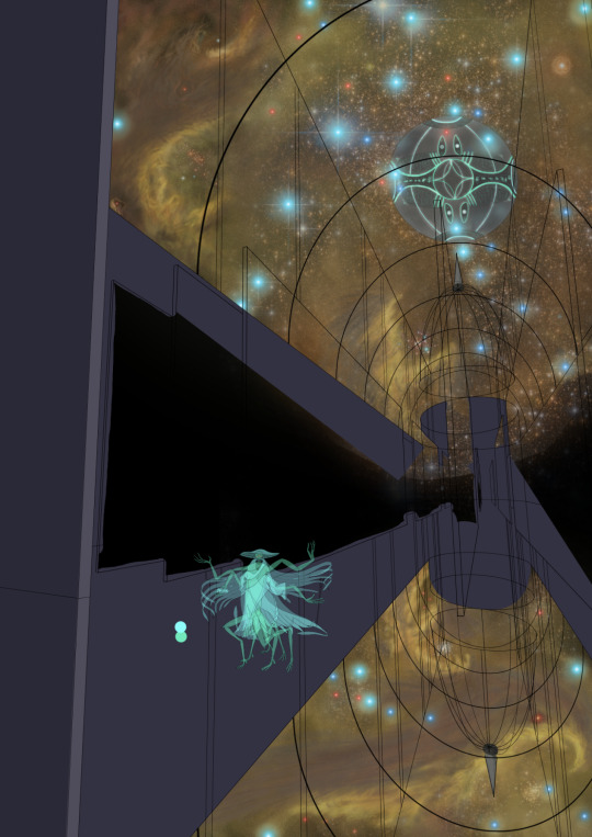
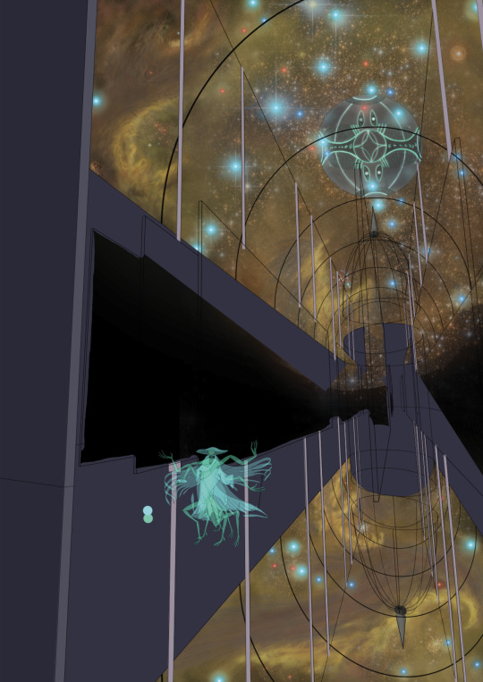
Fleratimus Character Poster Reflection

Here is the final poster
Reflection: I found making this poster extremely fun not only from an art/learning perspective but also because it gave me a good opportunity to work on a portion of my Worldbuilding project that I've been wanting to work on for ages. There are a couple of things I'm not super happy with, specifically those bookshelves in the background, but other that them I had a great time making this. Despite looking like it would be extremely hard to do, the space background was the part of this I found the easiest other than the character itself. The bit I found the hardest would probably be the upside-down reflected dome at the bottom as well as trying to figure out how to go about detailing the inside of the building. If I had longer the bookshelves and walls would definitely look a lot better but oh well. Working on designing the character itself was a fun challenge because of the 10 limbs so drawing all the pieces out separately and sticking them together was a good idea. Something that I'm quite happy with is the non-reflection that makes up the lower half of the image I like how it looks like a reflection but certain elements tip you off to the fact that it isn't. Specifically things like the bookshelves not being reflected or the space outside or Fleratimus either. This poster has been great practice for me, I definitely would want to do similar things for other AI Gods in my own time because I'm really happy with how this has turned out.
0 notes
Text
Character Design Final Poster part 8
Today I finally get to start colouring the interior, I wanted the building walls to be darker than the outside to contrast well with the view and Fleratimus' Avatar
these are the base colour fills for the walls
base colour for the pillars is in, I filled them by using the rectangle shape tool then warping the corners individually to match up with the lines
now to pick a colour for the bookshelves


in my search for references I discovered this, the Sinan Books Poetry Store in Shanghai, this the sorta thing I'm going for

full base colour coats

Took a break from trying to texture the background to finish colouring Fleratimus' Avatar and also added the name at the bottom, originally it was going to go at the top but I made the top very busy and it would look wrong there and cover up some of my better nebula work
step 1 of adding texture to the bookshelves involves the following add noise (set to 4 or 5 or 6 depending on distance, monochrome) then pixelate with the Fragment setting, then sharpen and finally add more noise, this time only set to 2 and not monochrome

I've added a few people standing in front of Fleratimus, mostly for scale
0 notes
Text
Character Design Final Poster part 7
day 2 of making the actual poster, at home I made more bits in my Unreal Engine mockup of the Church of Fleratimus for me to trace, specifically the domes, pillars and bookshelves in the archives

this was hard to make and the dome is proving very challenging to outline as well
after great challenge and many hours, I have outlined the domes, now to do the much easier outlining of the pillars and bookshelves
I have started working on Fleratimus' computer in the background, to start with I designed it on paper


that's the paper drawing, next I started tracing it in Photoshop

this is a progress screenshot, the way I got the texture on the colours was by adding a noise filter to the layers then using a pixelate filter (crystallise and facet for different layers) then if I wanted I added extra contrast by sharpening the layer

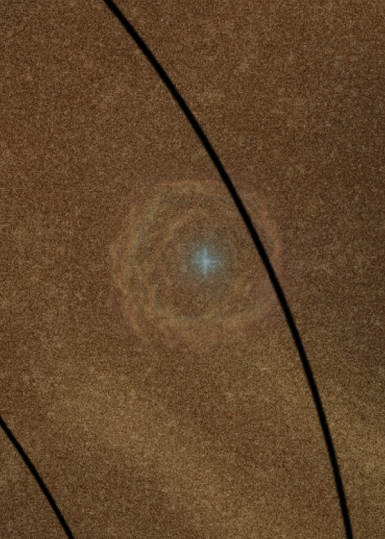
here is the finished Fleratimus Computer, I discovered an extremely useful brush tool that allowed me to paint these textured sparkly dots everywhere because it was looking way to flat before

here's a close up of those cool sparkly speckles
doing this means I have now finished the space background for the poster, here's some pictures


now to finish the outlines for the pillars
finished the full outline for the Church of Fleratimus
here's the current progress fully

0 notes
Text
Character Design Final Poster part 6
finally started working on the poster, I started by making an extremely rough mockup of the Church of Fleratimus in Unreal Engine at home which I used to trace the base outline on the walls and arches
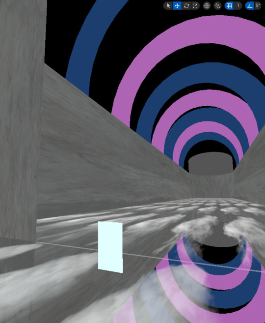

this was the outline I drew from that base, still need to add a bit more to it though. Next I started working on the space background, which can be seen through the windows. I was inspired by something Toby said about including a nebula which would help my scale issues a bit, in this case it was a great idea. Fleratimus is located in the core of a galaxy so here are some pictures of the core regions of our own galaxy.


as you can see it is extremely nebulous an extremely star dense (the cubic parsec around Sagittarius A* contains 10 million stars)
To start of with for the background I created smudges of a bunch of colours (yellows and oranges) that I then distorted and covered in grain to create this
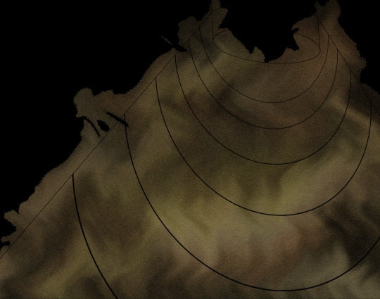
over that I've started clarifying and adding detail to sections to create nebulae and stuff, I also stuck one of the previous images from before into the background for more stars, here's what some of the detailed parts look like
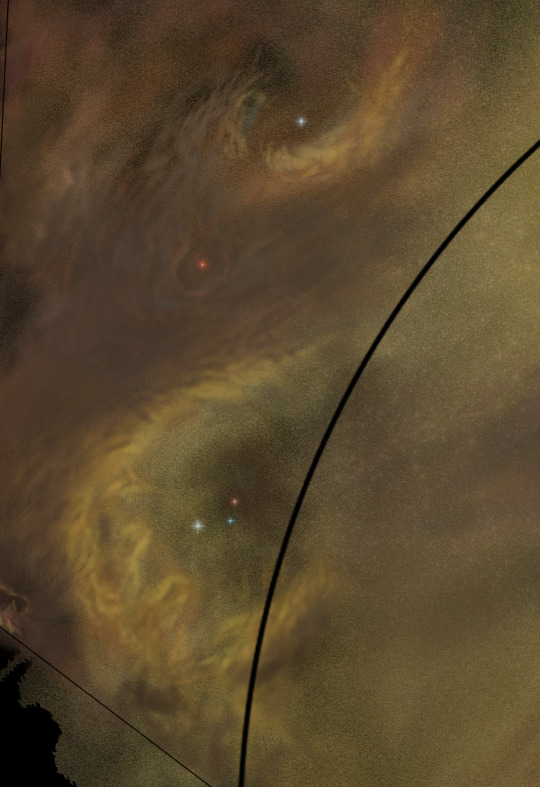
This is what this first background layer with most of the details finished


this is the first piece of the background, the distant background. the next layer, the middle background will contain some stars and the Fleratimus computer, the final background layer will be the front background, it will contain some more stars and a few spaceships
the idea is that having stars both behind and in front of the computer will create a sense of distance and scale, since if there's stars in front of it it must be light years away (which it is) and if it still looks as big as it does from that far away it must be huge (which it also is)
0 notes
Text
Character Design Final Poster part 5
Today we had peer feedback, we had to do some general thumbnail sketches for what we want our poster to look like, then we had to display these and receive feedback on them, here is most of my feedback.

"top right has nice perspective" I would hope because it's the only one of the 3 that I put more than a tiny sliver of effort into

Close up of these two, yellow says "Consistency in character" and "Top one has best composition [incomprehensible] balanced". the red one says "Composition makes him seem a bit small rather than him being a giant", "Work on a pose/angle that emphasise" (???) and "Show size contrast, small planet vs him". for the first red comment I'll touch on similar things later, for the second uhhh idk why the sentence just sorta ends, not sure what they were trying to say about the pose, for the last comment I think they misinterpreted that the "planet" I think they're referring to is actually Fleratimus as well which I think comes off better with colour and probably when I design the symbols on the computer.

for the left yellow one I agree although the reason I didn't make any other poses it because it simply takes to long, 3 days for the one I did was enough for the right yellow one this location is the only location this setup of Fleratimus' computing form and its holographic avatar can coexist, the arches are the inside of its church, something which will look better once I fully figure them out. For the bottom pink one they're saying there's a lot of negative space in one of them, the reason for that is because it took me 2 minutes to draw.

The yellow one says "The uniqueness and detail in the character makes it really interesting" yay, that was the intention. The pink one basically says that there needs to be something to compare the scale to which I do agree with, I was planning on having some people around the base in front of it.

Basically a rewording of the previous pink one, character needs scale reference to ground it.

The top one is the one I want to mention here, it says that the 100 words itself is somewhat hard to understand which I can see, I do think I should rewrite the 100 words to specify more about what the viewer is seeing but I'll try get more feedback on it.
Overall I'm definitely sticking to the top idea as a base. Some things I need to do include provide an improved sense of scale and figure out some of the finer compositional points. Compositionally I want Fleratimus to come off as a God/Godlike being who, despite being huge, feels small in the machinations it is a part of, I think the best way to achieve this presenting of Fleratimus as a physically large and imposing figure but small in it's self perception will be to slightly shrink Fleratimus' Avatar in frame but make up for that with scale markers, mostly things like people and chairs and bookshelves. That should result in the perception that Fleratimus is large work with the perception that it is still a part of even larger things. I can also probably increase the size of the Fleratimus computer in the background, currently it seems a little small and disconnected from its Avatar although when I add the colours it definitely helps connect the two things.
0 notes
Text
Character Design Final Poster part 4
Coming up with the idea for Fleratimus' appearance was the easy part, drawing it, much harder. I used an interesting technique to draw Fleratimus, the 10 limbs and body and cloak proved extremely challenging to visualise (which is why I've only designed one pose which took me 3 days). The way I created Fleratimus was to start by drawing every component separately on paper then trace those parts and assemble it like a puzzle in photoshop, below are the initial paper drawings

These are the 4 arms

These are the 3 left legs

These are the 3 right legs

This is the body and robes

This is the head, hat and cloak
all of these pieces then had to be assembled together in photoshop, I worked by adding the images in and tracing over them (had to move around all the arms and legs to get to the right spots)
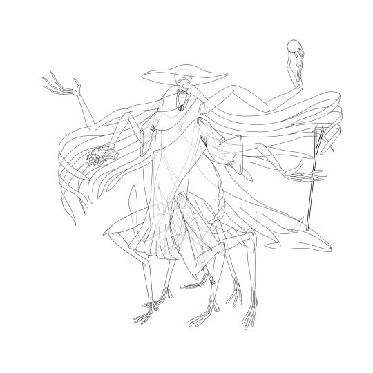
This is the completed outline, a bit hard to comprehend but will be better when I start adding colour
0 notes
Text
Character Design Final Poster part 3
to start designing Fleratimus I began by designing the Church of Fleratimus, the building the image I draw for my poster will be set in

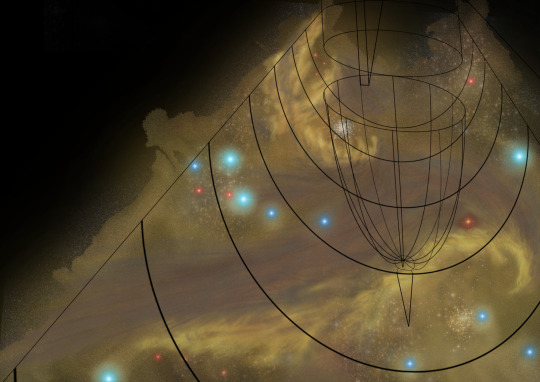
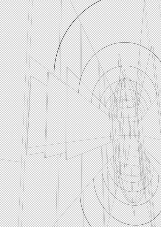
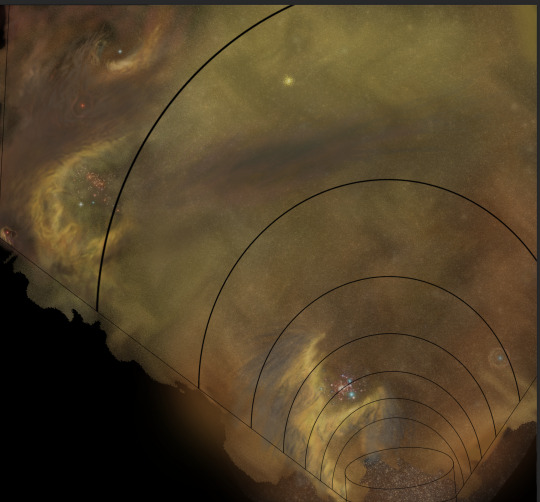
this is a side view drawing of the Church of Fleratimus from the outside, the scale at the bottom right indicates that each square represents 390 metres. The Church of Fleratimus, like all the main churches of the Ophthriqol AI Gods, floats in space. It's located around 5 light years from Fleratimus' computer body and can only be accessed by spaceships of which Pilgrim Ferrys are the most common types structurally speaking the church is 7.8 kilometres long and 700 metres wide at its widest point. The church features a mirror copy of itself under the floor so while its technically 6.24 kilometres tall only half of that is the used structure. The Church features four main sections, at the front (left side of image) can be found a multi-level Spaceport 1.5 kilometres long, 800 metres tall and 600 metres wide. Its for starships to dock and disembark their passengers. Past the Spaceport is the Antechamber/Narthex, this room is 300 metres wide, 300 metres long and 780 metres tall. The first few 10s of meters have a proper floor overhanging what looks like an empty chasm which one must cross to get to the main doors that grant entry to the Nave. this chasm is infact an invisible floor made of gravity, spacetime folded over itself to such a degree that it forms a physical barrier. Past the Antechamber/Narthex is the Nave, as the doors to the Nave open the previously invisible floor is filled with dancing, shimmering, lights that bounce through special crystals and fibre optics suspended between the layers of spacetime that make up the floor. The Nave is a room 2 kilometres long and 650 metres wide, it has a triangular roof 900 metres above where is contacts the walls and rising to 1.8 kilometres tall in the center. At the far end of the room stands Fleratimus' Avatar, its shinnng glow reflecting around the polished room. above Fleratimus' Avatar is a half-dome window through which can be seen Fleratimus' true form. The side walls of the Nave are huge bookshelves with all kinds of books, datapads, scrolls and holopods, the Nave has seating pews for a max of almost 2.8 million people. Past the Nave lies Fleratimus' Divine Archives, it is the largest section of the church, 4 kilometres long, 600 metres wide and ranging from 780 metres to 1.48 kilometres tall. Fleratimus' Divine Archives are a vast library, row upon row upon row of bookselves rise hundreds of metres above the ground giving glimpses above of an arched glass ceiling which ends with a huge, glass, elliptical dome. The Divine Archives are meant as a physical representation for Fleratimus' worshippers of a tiny fraction of its knowledge.
Intention-wise I wanted to acheive a few things with the design of the Church of Fleratimus. First was to convey that Fleratimus is the Deity of Knowledge/Wisdom which is why I went for the library-type aesthetic. Second was to convey that this religion has grown beyond anything Fleratimus thinks is truly justifiable which I convey through the scale difference between this multi-kilometre behemoth church and the 35 meter tall Avatar Fleratimus represents itself as, the idea is that it more ressembles something that was built for Fleratimus to make it fufuill a role as opposed to something Fleratimus willingly built for itself which is also true of the religion as a whole. Thirdly was a more practical concern of how to make the church not look strange from the outside being just a building with a flat floor floating in space, the solution I came up with was to make that flipped mirror duplicate on the bottom, which allowed me to futher show of the Ophthriqol technological prowess with that invisible floor made of gravity and light. The idea for that actually came from something I've seen in Minecraft builds, since the game doesn't have reflections the only way to make something like a mirror floor is to build a flipped copy of the room underneath a glass floor like in this image
having designed the Church of Fleratimus now it's time to do the actual character design part for Fleratimus' Avatar

I started by trying to sketch some various body parts before I decided that actually defining what I was drawing in more concrete terms would be a better idea...


...So I wrote down this list of features that I can begin work on designing and sticking together. This is basically the written culmination of my thoughts on the topic. From the begining I wanted Fleratimus to have those strange/otherworldly freakishly long fingers to delicately hold objects with so I decided to make the toes like that too. Originally the 4 arms and 6 legs were going to be almost human-like with the single elbow/knee joint but I thought it looked a bit boring and not particularly alien, plus the arms looked quite similar to those of another alien speices of mine called the Silpers so I gave the arms and legs those 2 elbow/knee joints, this also solved an issue where having 6 legs in close proximity with only 1 bend point in each leg would result in a cluttered mess of legs at similar positions, adding the second knee should allow more posability and range to the legs allowing me to have them overlap less and spread out more which should make drawing them hopefully easier. I always liked the idea of a more triangular shaped head but couldn't quite figure out what the do with the mouth or anything other than the eyes for that matter, a mask turned out to be a useful idea which I then thought of connecting to the cloak that was already there. To that end I decided that instead of the cloak having a normal head hole with 2 'tendrils' that clasp over the chest like a normal, real, cloak, I elongated those tendrils so that they first wrap over the the lower face then loop around the back of the neck to finally clasp on the chest like normal which I feel to be a cool idea.
since this post is enormously long I'll get to the finalized designing in part 4
0 notes
Text
Character Design Final Poster part 2
we had to make a mood board and word cloud for our characters

this was my mood board, the 3 colours at the top are for the character design, below that is a Birch World from a Stellaris mod which has the same style as what Fleratimus' computing body looks like, below that are actual character inspiration images
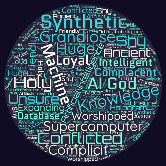
this was my word cloud, the colours for the words are like the ones in the mood board ad is spherical like like Fleratimus' computing body after that we had to start designing the character which is what part 3 will be about
0 notes
Text
Character Design Final Poster part 1
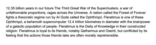
First we had to come up with a character brief for what we wanted to do, I chose another character from my worldbuilding project, an AI God named Fleratimus, the following is the brief
after we finished that we had to make a 100 word summary that we can place alongside our post (which was somewhat challenging because that brief is 1,003 words lol), the following is my 100 words, unless I have to change it
0 notes
Text
character design for an Ovijauwoff part 2

this was the Ovijauwoff fella after I added colour to him, I'm very happy with how this turned out, especially the gradient on his arms and the colours I chose

this is how the final image turned out, I'm very happy with it as promised, some information, in my worldbuilding project the Ovijauwoff are an ancient alien civilisation, they first developed FTL travel (in their case this was the Hyperline Drive) a bit over 3 billion years ago. Their home star is located outside the M87 galaxy but as fate would have it their Hyperline network had no connection points to the galaxy so they were stuck having to live in the very empty regions near M87. first contact between Humans and the Ovijauwoff took place 313 years after the end of The Third Great Galactic War in the year 6781 AD. The Ovijauwoff are amphibious creatures, their armoured underbelly protects them when they slither around outside of water, they can be outside water for as long as a few days at a time but only so long as their skin stays damp, as such their starships require large reservoirs of water. The tank this individual is in is a common Ovijauwoff traveling water tank, these are used by individuals for many purposes, whether that be important diplomatic meetings or simple civilian tourism, these boxes (which weigh roughly 11-12 tonnes) float around using anti-grav suspensors under the base, the corner posts have speakers on them that allow the individual inside the box to easily speak to people outside the box. The Ovijauwoff were notably partial instigators of The Great Triplet War, one of the largest and most destructive wars the universe has ever seen as The Atrioneald-Ovijauwoff Cold War was the first war that kickstarted the three consecutive wars that The Great Triplet War gets it's name from.
0 notes
Text
character design group project part 2
so apparently we had to give each other feedback and then go back and rework our drawings based on that feedback so here's a part 2 post for that

this was the feedback we got, mine specifically is the bottom paragraph
so basically I just have to make it simpler (which I knew already), soften up the colours and make the face look more normal, I'm writing this as I'm still drawing it and it was very hard to find a look for the facial features that wasn't either really dumb looking or extremely hostile and evil looking
this is how it turned out, not particularly happy how it ended up but it was also driving me mad and I had to stop somewhere
0 notes
Text
character design group project

first we had to come up with a brief in groups, then they were dispersed to other groups, this was the brief we were given by from a different group

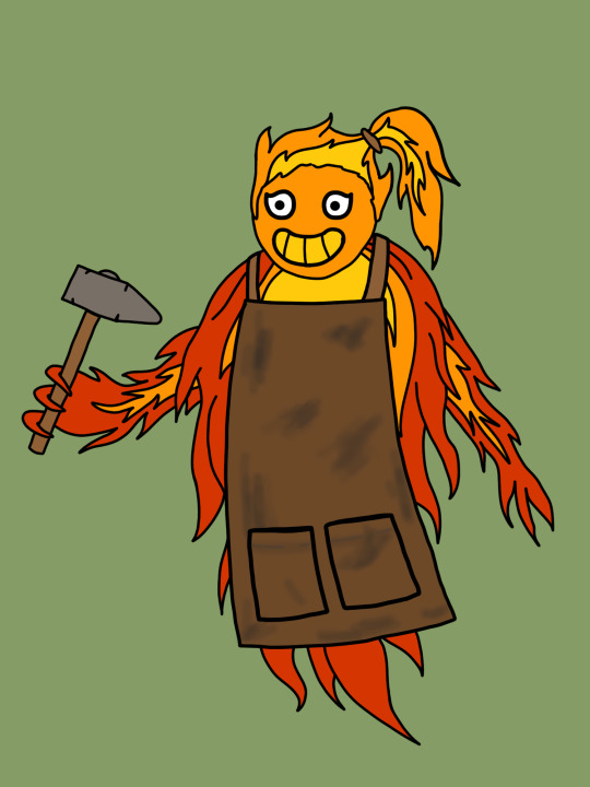
this was my design for the group project, we each had to draw this other groups character in a different style, I was given simple mobile game, I'll talk more about what I thought at the end

this was the colour palette we picked for our characters
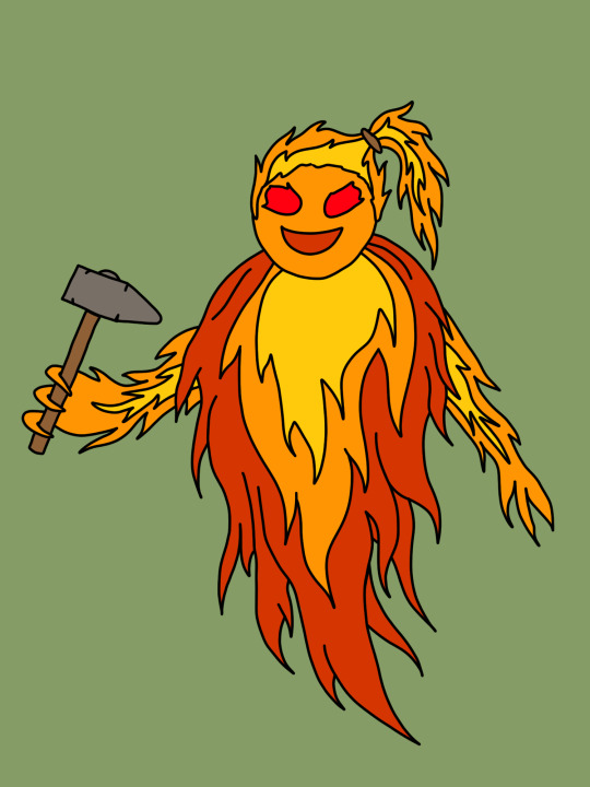
this was my final drawing for it, some thoughts, we found it hard to figure out what the other group intended for this character to look like, some pats of their description used "fiery" and "bright" as metaphors for her work ethic as a blacksmith but then the physical description read as though she was actually just a floating fireball, we went for the floating fireball idea. I did find that it was really hard to simplify fire enough to qualify for the simple mobile game aesthetic, this was as close as I could get it and even this is probably a bit too detailed overall I found this group project to be painful
0 notes
Text

we had to design another character, I used this as an opportunity to design another one of my alien species from my worldbuilding project, in this case a species called the Ovijauwoff


these were my main reference images for the design, as my list of traits at the top says the Ovijauwoff are eel-like alien creatures

this was the design I came up with on paper to trace into photoshop, I will explain more about them in the part 2 post
0 notes
Text
seemed to work, feels weird to do that, yippeee
0 notes
Text

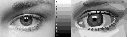
we are starting a value study, this is before we start drawing
0 notes
Text
Illustrator Assignment

this is the inner gatefold cover of ink Floyd's album The Wall, this cover was illustrated by Gerald Scarfe along with all the other illustrated designs for The Wall and especially it's movie version
While probably not something I would aim to replicate myself I do quite like the style, all the characters are extremely exaggerated and metaphorical in their appearance since they're meant to represent how the character Pink in the story sees these people. The drawings have a thin black outline and are coloured in a way that looks like paint/watercolour which it probably is, I do like how the outlines are really thin and kinda disappear into the drawing they surround
0 notes
