
Don't wanna be here? Send us removal request.
Statistics
We looked inside some of the posts by fmp1omarsviner and here's what we found interesting.
Average Info
Notes Per Post
0
Likes Per Post
0
Reblog Per Post
0
Reply Per Post
0
Time Between Posts
1 day
Number of Posts By Type
Text
17
Last Seen Tumblr Blogs


Fun Fact
12.7% of mobile users access Tumblr.
Text
Portfolio [Assembly]
As part of our project we have to fill some portfolio slides with this projects outcomes and processes. Considering my entire FMP last year was on Google Slides, I didn't mind this at all. I was happy to be back, honestly. Below you'll see some of my process in creating the portfolio and a few select slides.

To help me organise the order in which I do things, I colour coded my slides. I used pastel colours so they weren't jarring but I used a system similar to a traffic light to show what was finished, what needed images, what needed text and what needed images arranged and text.

An example of a slide that just needs text is this one, detailing my process of creating my first reference sheet for the course.

Red is completely empty, needing images and text. Since this was an outcome slide, I left this till near last since it was the simplest.

Plain white slides were completed slides so they were ready for viewing. Also, here's some art I've made over the past few months that I haven't posted. Hyperfixations on your own OCs are kinda crazy.

Finally, my last slide example is a slide that needs images arranging and text added.

It was extremely satisfying to turn each slide white and to fill them all with information. I don't mean to flex but I am a very fast typer so it was nice that all I needed to do was type. So it all got done very quickly.

Here is an example of one of my updated slides. I kept the images in a wide variety of positions and layouts to keep things interesting and I split up the text to lead the viewer around the page.
I think I'm pretty much done with the project. My outcomes are finished, I have more than enough posts, my poster is done and my portfolio is done. This has been the craziest twelve weeks of my life, but I'm glad to be finally finished. Hopefully.
0 notes
Text
Poster [Creation]
As part of our project we were tasked with creating an A2 poster to advertise our project at the exhibition. Even though I won't be going to the exhibition, here is my process.

It started with some composition sketches. I couldn't decide what route to take so I made three sketches and asked my mother what she thought. She liked the third one the most, like me. So I went with that one.

Then I made a really vague thumbnail sketch. It allowed me to transfer the sketch digitally and let me work out the general poses I wanted.

Here is my sketch. I used an online pose app to create the poses and it helped me a lot in sketching them. I chose to put trees on the side because it's reminiscent of The God of Shadow and The Sacrifice illustration.

Creating the lineart was reasonably easy because I had drawn all these characters repeatedly before and I had also drawn trees repeatedly before. I recreated the ritual circle from my first illustration and also made the throne again, making sure to add the detail it needed.

Here is the finished colour. I had some real issues with the colours this time. For some reason, colour picking directly from the reference on the top left gave me these muted browns that were definitely not what I was referencing. I've heard Procreate reference image has different colour sometimes to the main image but I've never seen it this bad. To fix this I just inserted the image I wanted to colour pick from into the canvas so I could colour pick the correct colours.

Here was my first outcome. My idea was that the God of Shadow was reaching into the poster from the outside, so he was over a transparent layer. But apparently that wouldn't work with the PDF, so we had to change the plan. I added some darker filters around the edge to add a creepier feel and I shaded everything, using the methods I used before for the flames and background.

Here is my second outcome with help from Kyrstie. We added a paper overlay to add an aged feel to it all and she also added a small blood splatter on the bottom left.
I'm proud of my poster. Last year we only had to compile our images in a simple grid format but this year we had to make an actual illustration and while it stressed me out, I heavily preferred that method.
Crazy to think all my artwork is done for the college year. My next and final post will be my progress on my portfolio, then this blog will be complete.
0 notes
Text
Extended Work [Toyhouse Profiles]
Since I really like the character designs and I wanted to use them again in the future, I made Toyhouse pages for them just like I did for my pirate character from the Pieces of Eight project. I found a red themed profile template online by the user 'catajam' and I used the code and filled it out for each of my characters.
The Sacrifice

The first one I completed was The Sacrifice's. It was really difficult to think of Likes & Dislikes for him considering he was trapped in cell most of the day but I managed to make it work. It was fun to think of more specific information about his backstory and I enjoyed finding moodboard images.
The Follower

Next on my list was The Follower. She was a little easier to think of personality traits for and out of all the sections, I enjoyed making her relationships the most.
The Leader

Here is The Leader's template. My favourite part was finding images for the moodboard, I liked the mask that I found. Making her likes & dislikes was difficult but I managed to finish it in the end.
The God of Shadow

The last one I made was The God of Shadow's. The most difficult part for him was writing the backstory but I think it works.
Developing these characters with more than just their visual design was fun but also really challenging in some parts. I'm glad I did this though, it allows the characters to live on past this project and also allows other people to enjoy them as much as I do.
0 notes
Text
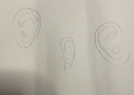
Independant Work [Ear Study]
Another point of weakness in my style is my ears. I'm not good at the different shapes and they often don't look realistic. So before half term, Kyrstie tasked me with doing an ear study. I focused mostly on college work up until now but I found some spare time to do the study so I finally finished it.
First I looked online at some artists I liked to see how they drew ears and I saved a few references.

I chose to save this one because the top right pose had her ear showing and it was a very simple representation of the ear so I saved it to see the basic bare minimum, really.

This one is quite the opposite, this has a lot more detail. It's good to get a good range of references so your visual library gets a spectrum of references.

Lastly I saved this one because it was a sketchy style which shows less detail in htings but I liked that the ears had a slight triangle shape to them and weren't as simple as the first reference I chose.

The next thing I did was put them on PureRef and line them up so I could easily see them all.

Using one of my art books as a real life ear reference, I drew each version. The real ear, the triangle-ish ear, the simple ear and then the realistic ear. The last one on the page is how I do ears normally.
Looking mainly at the real life reference, I sketched a few renditions of the detail I'd like to save. I tested different angles and perspectives and tried to keep the level of detail the same.
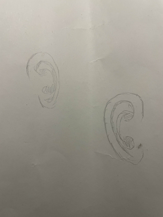
Then these last two were attempts at speeding up/seeing what other details I could forfeit. They were also smaller to see what I could keep/not draw.
Only time will tell if this helped since I have no plans for close up artwork of humans at the moment, but I think it helped. It reminded me the basics of the ear and it reminded me of the ear we made with the Super Sculpy. Ears are very unique, but they do have a basic shape. So I'll make sure to remember it the next time I do art.
0 notes
Text
Weekly Haiku and Project Reflection
It comes to a head
The waves are getting larger
Let me be the moon
This Haiku is basically saying 'let's finish it all' which I think is fitting since it is the last week. The moon keeps the oceans consistent with the tides so that's why I mentioned the moon. It felt like a poetic way to say 'let me finish all the work before it gets too much' which I'm trying my best to do.
Reflection
This project has been tough.
After last years FMP, I knew what to expect this year, even with the higher level course. But with the curveball of grief, this project feels 10 times harder now. But I've commited to finishing my plans and while I had to cut a few down, I still stuck to my plans. I also did a lot of research which helped and I made sure my outcomes were high quality.
I learnt a lot about my work process and artstyle and life in general in this project, so overall I'm glad I did it. Art helps me cope so having to draw so much in this project helped me stick to goals during a tough time so I don't even really mind the conflict of times.
What I'd change next time is that I'd adjust my schedule. Sticking to a posting schedule for the first few weeks of 4 posts a day was great to burn through my research but didn't leave much artistic motivation for the actual artwork. Next year for whatever the theme is, I'd definitely do less research. 160 posts is a lot, especially since 100 is the expected number at the end of the project and I hit that a few weeks in.
I know I also should 'use' my friends for 'body doubling' more. Being around someone else helps 'force' me to do my work so next project/FMP I'll definitely use my friends company more.
This project has been full of ups and downs but I'm excited to finish it. Twelve weeks can go by in a flash but it still feels like a long time, so I'm glad to be nearly done.
0 notes
Text
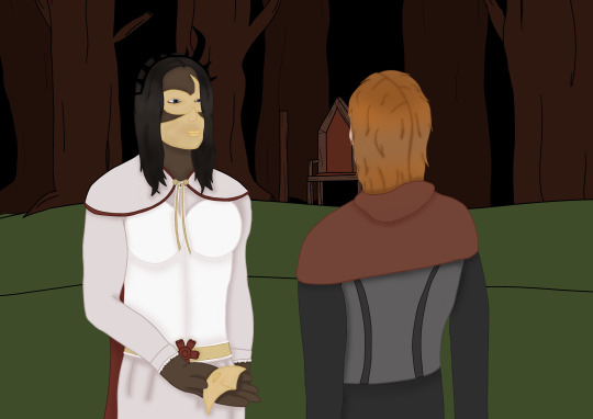
Illustration [Follower & Leader]
As part of my project plan I had planned to draw two outcomes featuring my characters. Here is my second one, featuring The Leader and The Follower interacting.

Here is my thumbnail. It's very vague but my general idea was to have the throne in the shot and to use the golden ratio to lead the viewer's eye through the piece.

Here is my sketch. I used the same minecraft build as before and changed the position to get the right angle for the art and it definitely helped me think about perspective.

Here is the completed lineart. I really struggled in choosing the perspective of the girls and making a good pose but I used a pose-making app on my iPad and I screenshotted the poses in there and it helped a lot. I struggled with changing the body shape since the default model was a buff man but I think they look distinct enough.

Here I have coloured the two girls. This was the easiest because all I had to do was colourpick from their reference sheets.

Here is the finished colour. To get consistent background colours between the illustrations I used one of my screenshots of the work in progress of the other one and I colourpicked the background before it was shaded.

Here I started shading it. I started with The Follower because she had the least detail and I wanted to ease myself into the shading, which worked. I also coloured the lineart because I think it adds an element of realism.
Here I shaded and coloured the lineart of The Leader. It was difficult to get the colours of the masks right but I don't think it looks too bad. The most annoying part was colouring the lineart since I left many accidental gaps and it was so frustrating to go back and colour it in properly.

And here it is, finished. I shaded the forest and throne behind them and also added a flame to the torch. I added a bunch of red and dark filters and to add some contrast I put a blue shadow in front of The Follower. My idea was that it was a direct opposition to red since blue is usually 'the good side' to show maybe she hasn't decided her alligance yet in this artwork.
This one was difficult because I liked the idea less than the other one so I wasn't really motivated to do it. But with the deadline looming closer, I kicked myself into gear and finished it. It was difficult to get the perspective right on both the background and the two characters but I think I pulled it off enough to be not that much of an issue.
My final artwork to create is my A2 poster, which will be one of my upcoming posts. While I will not be going to the exhibition due to being out of the country, I will still push to make this a great outcome so I can display it at home afterwards with pride.
0 notes
Text
Research [Posters]
An important part of creating is of course looking at inspiration and gathering references. So while I work on my poster, here are some posters in media that inspire me. Some of these are for advertisement but actually most of them are in-universe posters. I find these more interesting than simple advertisements so that's why I like looking at them for inspiration.
Arcane Season 2


The advertising posters I really like are the Arcane Season 2 ones. They show the characters in different lightings and situations and shows off most of their main goals/arc of the season.
Five Nights at Freddy's Security Breach In-Game Posters
youtube

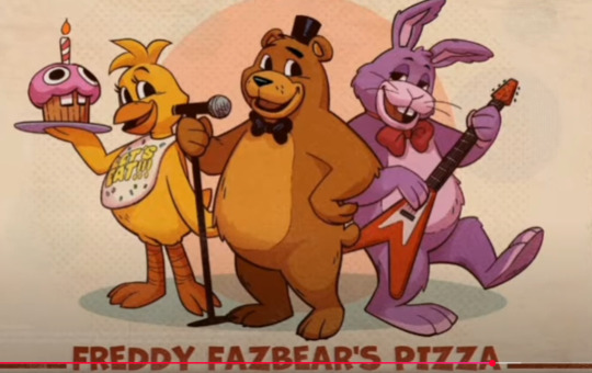

In Security Breach, there's a lot of posters. Being basically a Fazbear Mall, the walls are covered in posters of advertisement. I really love the ingame ones because they fit the sitting and there is even some collectables/scenes that have older posters from the earlier buildings in the ingame franchise from the old Fazbear's Pizzeria to Fredbear's Family Diner. I think all these posters fit the era they were designed to be in and I like how some of the Pizzaplex posters are animated in some billboards, it adds a nice touch.
Dead by Daylight: Greenville Cinema Posters
In the Dead by Daylight map Greenville Theatre, it has a small cinema inside filled with made-up movie posters. I found these really interesting because they are in universe and could be referencing some of the Killers or Survivors of the game if you look at it in a certain way. Please excuse the screwdriver and the 'Stalk' word in the screenshots, I played Micheal Myers to take these screenshots.

These two are really cool. The Whales one reminds me of most normal movies nowadays and The Sinking Ones looks very experimental and cult-like, very contrasting.

The next one I found was this one which reminds me of a movie like Texas Chainsaw Massacre or something more indie and body horror themed.

This last one is also very Texas Chainsaw Massacre esque. I really like the framing of this one with the building/machine inside the guy and he also has a resemblance to Evan Macmillan or Max Thompson Jr. who are both Killers in the game.
Posters are very important. They give your story or characters at face value and should lure in your viewers so they are interested in watching/playing the media. They are also good merch, like band posters or movie posters. These are all great inspriation for my own poster design, which will be completed in the next few days.
0 notes
Text
Independant Work [Weekly Sketches]
Tuesday


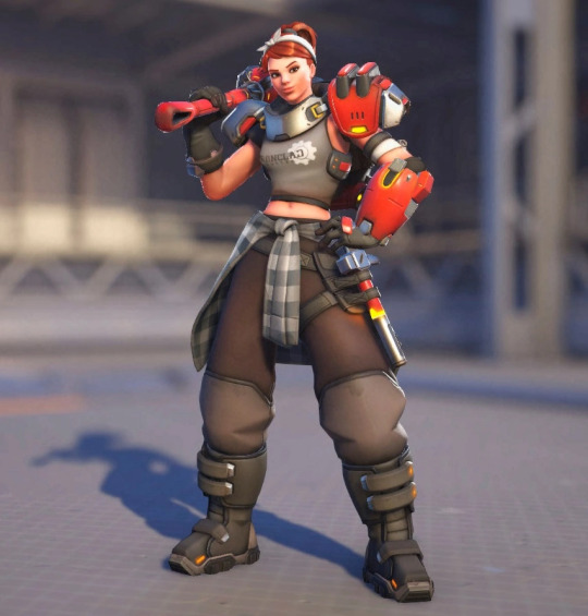
So on Tuesday I saw this pose and instantly thought of Junker Queen. So I drew her in this pose, although I forfeited a lot of the details. I wasn't bothered to open the game and see her in a 360 so I just added the recognisable features. I don't think she looks too bad, although I could've definitely made her more muscular.
Wednesday


I decided to keep with the Overwatch theme so on Wednesday I drew Moira in this pose. I felt it fit her well and it was interesting, her design is pretty complicated. I think she's still pretty recognisable though, especially with the corrupted hand.
Friday


As usual, I was late again. But either way, more Overwatch. I saw this pose and it reminded me of Brigitte so I drew her in it in an alternate skin. I could have made more muscular I think but she still looks recognisable. I quite liked drawing her hair to be honest.
I think this will be my last week of sketches. Next week I want to solely work on finishing things for the project so I'll use the time I spent on my sketches on other things like my portfolio or blog. I really enjoyed these sketches, even if it did feel like a chore sometimes. I stuck to the habit and pushed myself each week and I think it did help my traditional skill. I maybe got better at drawing by eye and it helped me learn how to use my pencil in different ways for different kinds of pressure.
But I am glad to be done with it, it was so annoying to decide who to draw sometimes. Maybe I'll continue it when I return to college for year two? We'll just have to see.
0 notes
Text
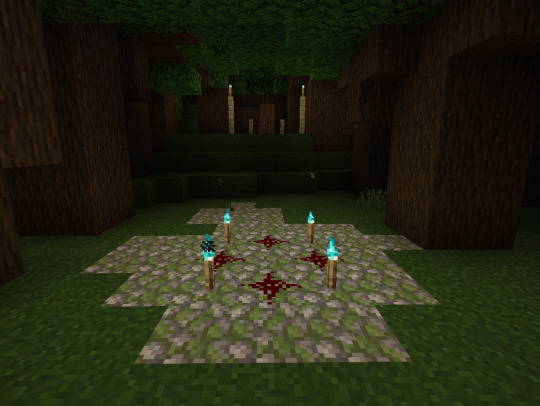
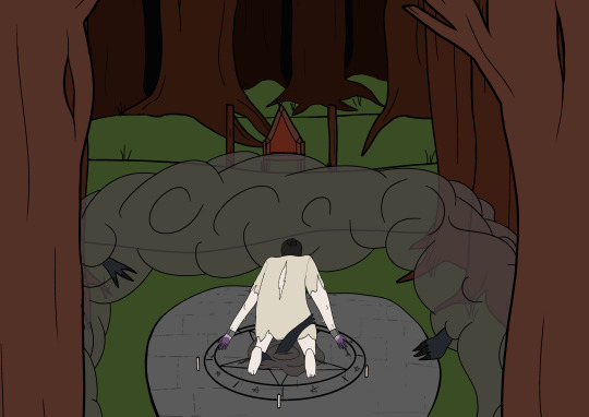
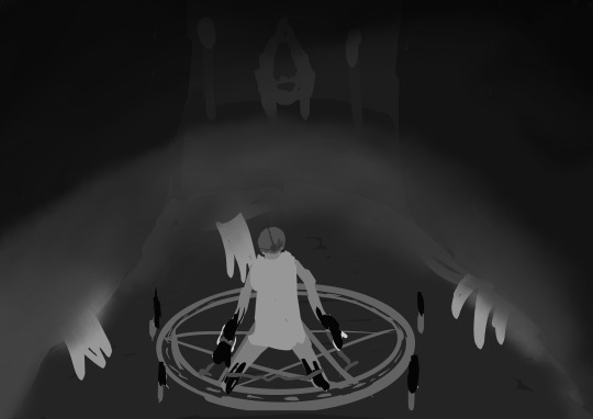
Illustration [The God of Shadow & The Sacrifice]
As part of my project plan, I am going to make two rendered illustrations of two characters interacting together. The first one I've made is the interaction between The God of Shadow and The Sacrifice.

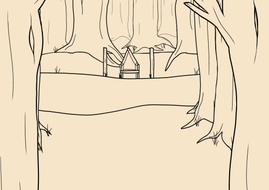
Here is my thumbnail, a very vague idea of values and composition.
To help cheat learning perspective, I made my setting in Minecraft. I'm clearly a master builder. But it helped me work out a general perspective and also was a starting point for the background so I wasn't sketching it completely from scratch.

Here is my sketch. I used a photo of myself as reference for the pose and I vaguely sketched over the Minecraft reference. I added two large trees in the foreground to give depth and also to add to my original composition plan of keeping it in thirds.
Here I finished the background lineart. Since my canvas was A3, I didn't have many layers to work with, only about 20. So I did this all on one layer and I regretted it heavily later. Even with many filter layers, I have a lot of leeway with my layer count so I should have done the foreground, middle and background on different layers. But that's something to know for next time. To help add perspective and distance I made the lineart thinner for each set of trees the further back they were. I think it helps add to the illustration.
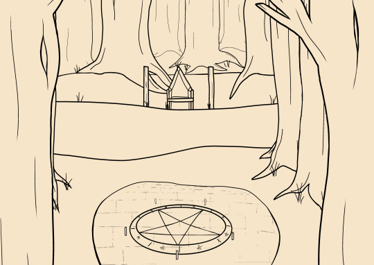
Here I finished the ritual circle. I used the circle tool and the distort tool to make the circle and thickened the lineart of the stone underneath the closer it was to the camera. Then I made a solid brick line and used a painting type of brush to vaguely erase it to make it look aged.
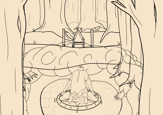
Then here I finished the lineart of The Sacrifice, The God of Shadow and the fog He arrived in. I also added a portal under The Sacrifice and had some extra arms grabbing him because I liked the idea of a direct interaction of Him trying to pull him down.

To start the colouring I coloured in The Sacrifice and the fog, the portal and the hands of The God of Shadow since I could easily colourpick those from their references.
For the background I used generic wood colours and made each set of trees darker the further back they went so they looked like they were getting deeper in the dark forest.

Here I started shading. I had shaded the fog, added flames to the candles and torches and I shaded the ground and the trees. I added glowing effects to the ritual circle to add a more mysterious magical element to it and I made all the flames purple to show that The Sacrifice's power was changing them all purple.

And here's the finished outcome. I shaded The Sacrifice and made sure all the lineart was coloured. I added blood to his shirt to make it look old and ruined and I added some multiply layers of dark red to the forest to make it look looming and dark. Then over the whole image I added a very low opacity red multiply layer so it didn't look too red but it added a red hue and made the red of the ritual circle pop.
I had a big issue with motivation in drawing this one, as well as the other one. But as I expected, in the last few weeks before the deadline my ADHD has kicked in and I'm finding it easier to draw these illustrations for college. All that's left now is to make my poster and the other illustration, which I know I can finish. Those won't be my next posts but they will be soon.
0 notes
Text
Weekly Haiku [21-27 April]
Sand is falling out
Our past has filled the jar up
As it has my art
Basically this weeks haiku is 'time is running out but my art is nearly done' but in a very wordy way. I don't know, I still don't like haikus. But we're in the final weeks now so I might as well stick these out.
0 notes
Text
Artist Research [Arankay]
Arankay is a french artist who specialises in furry style art with a variety of characters. They do both reference sheets and illustrations but in this post I will be researching their most recent speedpaint which is an illustration.
I have chosen to research this artist today because their style is really cool to me, I'd love to emulate it. In some of my recent personal art I've used a smaller brush like their art so I hope by watching their illustration speedpaint I can learn more tips and tricks to draw more like them.

One thing I enjoy about their speedpaints is that they use the Youtube Chapter feature to separate the sections of their work. It makes it easier to study and rewatch parts to learn different segments of their style.

First they start with thumbnails. They use big shapes with not a lot of detail and make lots of different layouts which is definitely useful since this is being commissioned, it allows the customer to choose exactly what they want without having to be commited to lineart already.

Here is their refined sketch. This is insane to me because this already looks like a completed outcome and this is only the second stage. Next up is lineart, which is my favourite part of their style.

Here is the lineart stage of the character. I love their use of linght weight and how they draw the hair, everything looks so effortlessly realistic even if it's an animal character.

Here they coloured and shaded the character (they currently have the colour layer hidden though) and I really like how smooth their shading is. I really want to get good at this kind of shading with heavy light coming from one direction and the rest in shadow and looking at illustrations like these help break it down a lot.

And here is the finished result. I really like the colours and the shading and their style is really cool. Maybe in the future when I'm done with college work I will try to study it more closely and learn to copy it better. For now, I'm good with just appreciating it.
Watching them draw inspires me to draw so this research has definitely helped me stay inspired for this project. It's nice to research artists I like because I enjoy talking about things I enjoy and looking into these artists as more than just one finished outcome is fun, I like seeing their process.
0 notes
Text
Independant Work [Weekly Sketches]
This week I focused on just drawing characters I like. I was a little late as usual but I got them all done.
Tuesday

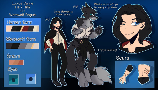

On Tuesday I decided to draw my rogue OC with his cloak. I planned to draw this digitally but I haven't drawn him in a long time so I decided to make it a sketch too. I know his face and neck is a little wonky but considering I hadn't done these sketches in a few weeks, I don't think he looks terrible.
Wednesday
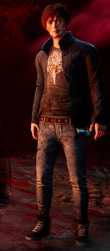

On Wednesday I decided to draw my main survivor in Dead by Daylight, Quentin Smith. I really like his design and he was fun to draw but the pose was kinda hard due to the foreshortening. I think I did good though, except that it's too high. But I can't just move the layer down so I'll have to live with it.
Friday
On Friday I decided to draw another character from Dead by Daylight, this time being Julie Kostenko because the pose really fit her. It was difficult making the shapes and the leg is too short but I think she looks menacing enough.
This week was fun, even though I was a bit late. The poses were difficult but not intimidating and drawing my favourite characters were fun. I'll continue these sketches until I submit my project, so there's only two more weeks left thankfully.
0 notes
Text
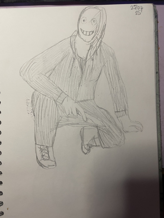
Expression Sheet
As requested by Josh, today I made an expression sheet for The Sacrifice. Since the rest of my characters have masks, I felt it only fit to draw him. I decided to do this traditionally to push myself and also to not allow myself too long on it, I still have other art for my project to do so I don't need to make these perfect outcomes.


As inspiration I looked at the expression sheet I saved before and also looked online for a wider range of emotions to pick from.

Here is my first three. It was easy to choose these emotions because they are the basic ones and while I'm not happy with how inconsistent they are, I don't think I did too bad. I know they all have their own anatomy issues but I think they get the emotion across.
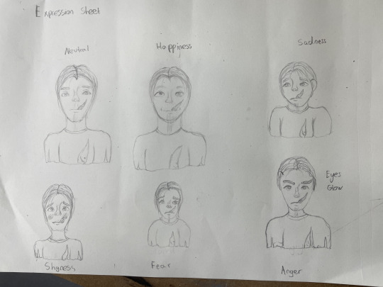
Here is the full sheet. I shot myself in the foot by writing the emotions first because I did not give myself enough room to draw them all the same size and I can't just resize them like in digital so I had to put up with it.
It was interesting to draw the same character again and again in different expressions and it was kinda fun but I really don't like how inconsistent the style is and their sizes. Next time I do one of these I'll make sure to sort out the positions better. I think my favourite personally is the sadness, it is the clearest emotion and I think he's quite cute in that one.
This was certainly a fun test. I don't plan to make any more of these for this project but I'm glad I did it either way because it was dipping my toe in another kind of artwork and helped challenge me traditionally and help me develop how I draw emotion.
0 notes
Text
Reference Sheet [The God of Shadow]
And now, my final reference sheet. Only finished a month late on my schedule, no biggy.
As a reminder, here is his concept sheet.

He is the most nonhuman character of my group so it was difficult to get the motivation to draw him but eventually I did and I finished the sheet quickly.
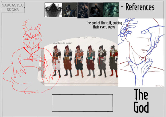
After reformatting it to fit the others, I started to sketch it. I kept it to the same pose as the concept sheet for simplicity.

Here is the finished lineart. I changed the design a bit from the concept sheet and added different accents. I changed the necklace to a sash because I was inspired by Patrons in DnD and I imagined maybe he had a deal where he had to wear something from the cult while they worshipped him. Or maybe he's just showing off his cult. I kept the showing ribs but this time I actually looked at a picture online and while it's a little wonky, it's more realistic than the concept sheet. I also made the mask more triangular because I wanted him to have a lot of hard angles and it added to the triangle theme in his design.

Here I've coloured it. I kept the same colours as the concept sheet but in the accents I've added, I made them darker to add some contrast and depth to the design.

Here is the colour palette and the alternate colours. The greyscale version is very similar to the original and I kept the smoke the same to have some consistency. I themed the two after The Follower and The Sacrifice and I think they're interesting interpretations of the colours.

The last part I had to finish was the extra pose. I chose this pose because it gave an air of mystery of the cult, maybe The God isn't in control? Maybe the members are? I wanted it to give mixed messages and also it was a way to bring everyone into one piece so I stuck with the idea. I also tried to make my fingers more jagged and not as curved and perfect as usual after Kyrstie's advice, I hope that comes through in the art.

And here it is completely finished. I changed The God text to Arabic to fit the concept sheet and I coloured the extra pose, adding some sleeves to The Follower and The Sacrifice's hands so they weren't just floating wrists.
Honestly, this one was the most fun to make. I know I procrastinated on it a whole month but it was so satisfying to finally finish my reference sheets and I really enjoyed making the extra pose. Next my work will focus on the A2 poster and the A3 illustrations I'm making. The hardest part is over so now I will crack down on the rest and get it all finished.
0 notes
Text
Illustrations [Thumbnails and Inspiration]
From what I've seen online, thumbnailing is a crucial step in making any large illustration. It is a starting point of the illustration and lets you try different poses, perspectives and composition without commiting to lots of lineart.
Since I want to follow a professional standard with these illustrations, I started with thumbnails. Of course, mine are very sketchy since I am not super skilled at them but they get the idea across in my head.
The God and The Sacrifice
My first illustration will be The God and The Sacrifice interacting. I feel these two have the largest difference in power dynamic so it will be interesting to see how they interact and since they both have powers, they can use them. To begin with, I gathered inspiration images and put them on PureRef, an app that is for image storage and it is very helpful.

Here is my inspiration sheet for my first illustration. I chose lots of LoL art as my main inspriation but I added some other artwork and thumbnail examples to help give inspiration in many different ways. This helped me come up with a concept for my thumbnail.

Here is my first version. I tried to keep the focus on The Sacrifice and used lighter values to guide your eyes but it didn't work out exactly as I hoped.
Here is version two. I considered making the flames and powers dark to stand out from the rest but while it does stand out, it doesn't draw your eye to it. So I changed things up again.

Here is the final version. I emphasised the pose more and added more accents on the flames and the powers to make them more promiment. In terms of composition I tried to stick to keeping it all in thirds. It's a basic way of composition but I think it works here.
The Follower and The Leader
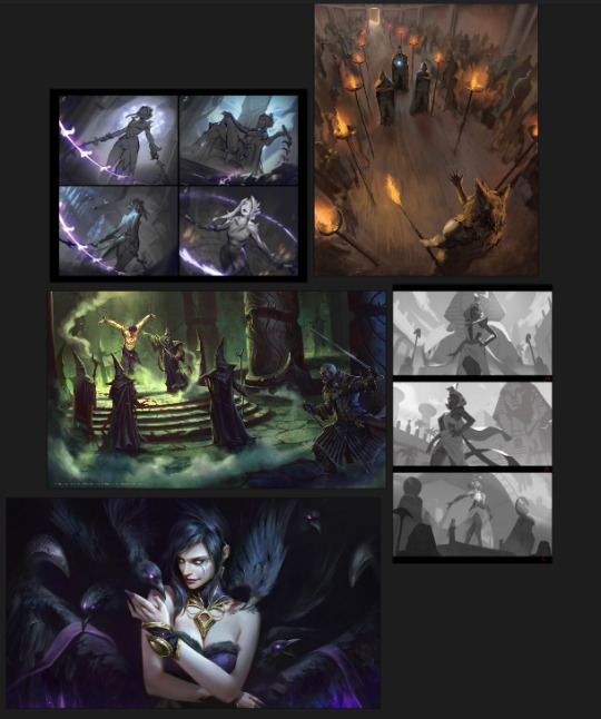
For these two, I wanted something more intimate. I chose lots of references of wide shots but I knew my main idea was going to be closer than these other images. But I still added them because inspiration is helpful and they could assist me in lighting.

Here is the first version. My basic idea was to follow the Golden Ratio, also known as the Fibonnachi Spiral. I wanted the viewer to look at The Followers hair, then the throne, then at The Leader's clothes, then at the mask in her hand. It wasn't a perfect spiral in this version though, so I improved it.

Here I moved The Follower further to the right and lightened up the throne to make it more noticable. Hopefully this helps guide the viewers eye down to the mask.
My next step is to actually start drawing, which I plan to start this week. I know I will probably hyperfocus on these illustrations so I know I can get at least one finished before the deadline. Unfortunately my (possible) ADHD thrives when deadlines get closer so as things come closer to the end, I will be completing more work. That's just how it is with my brain, but I will keep myself to a high standard so my outcomes remain high quality.
0 notes
Text
Research [Resident Evil 4 Remake]
Resident Evil 4 Remake is the biggest inspiration for this project. It is most obvious with the Zealots and Ashley's story.
RE4R came out in 2023 and is a great remake. It follows the storyline of Leon Kennedy going into rural spain to find the president's daughter, only to be caught in a cult.
My favourite enemy is the Cloaked Zealot. They have large staffs and aggrivate the Las Plagas, causing it to evolve into another mutation when they bang the staff and it irritates the Plagas inside the player.

Here is their concept art. They are very similar to their ingame appearance and you can see their draping hood and large staff.

Ingame their staff has a lantern to make them easier to track and the top plagas symbol is changed but the rest is very similar. I really like the skull on their head and how it makes them look unnaturally tall, even though their head is further down.

The Cloaked Zealot is the most irritating enemy to face because they are often out of range and repeatedly make other enemies harder to kill by transforming them into Plaga Guadana and Plaga Mandibula. Their ringing also gives Leon pain and makes him stumble which makes fighting even worse.

Ashley's scenes in the game with the plagas and the cultists inspired me heavily for The Sacrifice. Most obviously the painted markings but in the story I can imagine they have similar events too.

Another thing that inspired me is the veins that show up when the Las Plagas is getting too strong and is about to take complete control of the characters. They aren't on the characters for long but they definitely inspired me heavily for the veins on The Sacrifice once I edited him.
This game really inspired me for this project so I'm glad I'm a Resident Evil fan. The Las Plagas is a really interesting parasite that gives a lot of threat to the characters and it makes some really interesting scenes and mechanics. Of course, it missed a lot of good moments from the original but it still holds its own as a game and I really enjoy it. I'm doing a hardcore run and I hope to 100% it on Steam one day.
0 notes
Text
Creating my Pitch Sheet
So a few weeks into the project we were given a google slide to create a pitch sheet for the project. Since I had nothing to put on it, I left it alone. Now I have some content for it, I've finished it.

One of the example pages was a pitch for Machinarium, which is a game I actually loved as a kid. I don't remember finishing it but I used to play the beginning again and again. The pitch is mysterious and draws you in with the startings of a story but no actual detail. The images work too, showing you the character and the setting as well as the title screen. The black background brings your eye to the main images too.

The next example was for a game called A Juggler's Tale. I've never heard of this so this pitch was genuine to me, but I don't really like it. The background being an image of the game with smaller text plastered on top makes it feel messy and the way the text overlaps the images doesn't look good in my opinion.
Now, onto mine. Since I'm not making a book or a comic or a game, I wasn't sure where to go with it. So I just tried to make it like a movie trailer or a book blurb, being purposely mysterious with the little story I had planned for the illustrations.

Here is my pitch sheet. I've never sat in front of game investors so I have no idea if this would work but I just imagined it as a book blurb to lure people in.
Here you're also getting a sneak peek at some thumbnails for my illustrations. I know they aren't perfect, but it comes with thumbnails.
This probably isn't a good pitch sheet but I'll make sure to ask for feedback next week and I'll probably change the images later on when I polish up my illustrations. But this was an interesting exercise and it was kind of fun to imagine me advertising my drawings and characters in this way.
0 notes