
fragilemundane
fragilemundane
My name is Michaela Glass and this is my art blog! I'll mostly be uploading sketches and finished art. May reblog art references too.
Tags & Links: http://fragilemundane.tumblr.com/post/147432196522/tags-links
110 posts
Don't wanna be here? Send us removal request.
Last Seen Blogs

ask-nightmare-the-dream-demon
ask NiGHTMARE the dream demon

fairytrashmother
There's No Place Like Home

still-loveacoffeegirl
Blair ✰
still-loveacoffeegirl
Blair ✰

bllssie
r u n a w a y , love.
Photo


While I’m on here posting Motorcity stuff
Have a quick meme I did for the children a couple months ago
Got the idea cause everyone has Mike not usually swearing and Chuck usually swearing the most soooo
#mundane art#motorcity#mike chilton#julie kane#dutch gordy#chuck (motorcity)#mike (motorcity)#julie (motorcity)#dutch (motorcity)#fanart#meme
59 notes
·
View notes
Photo

idkw but when I saw this gifset from the great and super underrated movie Attack The Block, I saw these two!
Not really proud how it came out but whatever here you go!!
MIKEWHYAREYOUSOHARDTODRAWYOUAREASQUARE
28 notes
·
View notes
Photo


Some drawing 2 art that I actually still like
1 note
·
View note
Text
My 3 Unfortunately-Secret Programs for Illustrators
There are a few programs I use on an almost daily basis as an artist and illustrator which I find invaluable, but that seem to be unfortunately more secret than they deserve to be. Which is too bad, because they solve a lot of small workflow problems that I think a number of people would find useful!
I’ll keep this list limited to my big three, but it is organized in order of usefulness. (And incidentally of compatibility, as the latter two are Windows-only. Sorry! Please do still check out PureRef though, Mac users.)
1. PureRef
PureRef is a program specifically designed to make it easier to view, sort, and work with your references. I actually put off downloading it initially because it seemed redundant– couldn’t I just paste the refs into my PSD files? Indeed, the only real barrier to working with PureRef is that learning the keyboard shortcuts and the clicks to move around the program takes a little while. But getting over that hump is well worth it, because it has some distinct advantages over trying to organize your refs in your actual art program.

Firstly, you’re no longer bogging down your actual PSD file with extra layers, nor having to fight with said layers at all– PureRef has no layer panel, so you never have to scramble to grab the right one. All images you paste into the program retain their original resolution data, so you can resize, rotate, crop, etc as needed without distortion. If you find yourself needing to adjust the values, color, etc of a ref image, you can just copy paste it into Photoshop, make your adjustments, and copy paste it back into PureRef.
The other great advantage is that you can toggle the program as ‘Stay On Top’ and keep it above Photoshop (or whatever else)– which was always a problem when trying to make a reference collage in a separate PSD file. I find that I just don’t look at my references as much as I should when they are on a second monitor, and this solves that problem.

I’ve used it religiously for about a year now, creating a new PureRef file for every illustration I do, as well as a few for specific characters, cultures, or settings in personal projects. As you can see in the example above, I like to sort my images into little clusters or ‘islands’ of specific content, so that I can easily scroll out to see the entire reference map, then zoom in to the relevant cluster easily.
There is one big tip I would suggest for using this program, if you have the harddrive space: As soon as you get it, turn on the ‘Embed local images in save file’ option. This will make your PureRef files bigger, but you’ll never have to deal with a ‘broken link’ if you move around the source files you originally dragged in.
2. Work Timer
This is such a simple little app that it doesn’t have a very formal name, though I think of it as ‘Work’ or ‘Work Work’ (for some reason.) It’s a timer that counts when your cursor is active in any (of up to 3) program you set it to count for, and stops counting when you change programs or idle. No starting, pausing, stopping, or forgetting to do any of those three things.

I use this one to accurately track my hours, both to inform myself and for commissions or other client work. At the end of a work session, I take the hours counted and add them to the hours I’ve already spent on that image in a spreadsheet.
I have it set to count my three art programs (Photoshop, Painter, and Manga Studio), so based on the settings I use, it doesn’t count time that I spend doing relevant work in my browser (such as looking up an email to double check character descriptions or ref hunting), so to counter that, I set the ‘Timeout’ option in it’s menu to 360. This means it will count to 360 seconds of cursor inactivity before it considers me idle and stops counting. Since it instantly stops counting if you switch to ‘non-work’ a program, I figure this extra time just about cancels out relevant time that it ignores in ‘non-work’ programs by counting an extra minute or so when I walk away from the computer to grab some water or what-have-you.
3. Carapace
I use Carapace the least of these three, since my work doesn’t often have a need for creating perspective lines. But when there is architecture involved in something, this proves invaluable in simplifying that process.

Carapace lets you copy paste an image into it, and then drop in vanishing points and move them around to create perspective lines. (Though you’ll want to scale down your full res drawing or painting a bit to avoid lagging the program.) Like with PureRef, fighting the shortcuts is the worst part of it, though for myself it’s more of an issue in this program because I don’t use it often enough to remember them. Still, it gets the job done, and it’s easy to adjust the points to feel things out until you get them ‘right’. Then you just copy and paste the grid back into your art program and you’ve got that information to use as need be on its own layer.
Of course, using Carapace isn’t a replacement for actually knowing how perspective works– you still have to have a sense of how far apart the vanishing points should be placed to keep things feeling believable. But it sure does save you a lot of trouble once you do have that knowledge.

So, there are my big three recommendations for programs to help your art workflow. I hope people find them useful– if you do, please share so that they climb a little higher out of their unwarranted obscurity! And if you’ve got a favorite tool like this that I didn’t cover, feel free to share it in the comments. I know I’m curious to see what else is out there, too. Also, if Mac users have any suggestions for programs that fill similar functions, feel free to share there as well!
My Website • Store • Commissions • Instagram • Twitter • Deviantart
68K notes
·
View notes
Photo

So I got a lot of messages after my first post asking me to explain layers, so I have put together a cheat sheet of the different layer types. The quickest way to become awesome with layers is to know exactly what each one does. Once again, I’m no expert, and these are just my personal definitions, so please try these out for yourself! LONG POST BELOWWW
THE LAYERS CHEAT SHEET PART ONE:
1. NORMAL: Aw yeah you know all about this layer its just your average layer
2 DISSOLVE: This mode “dissolves” some pixels, allowing the lower layer to show through. very pixel-y. Reducing opacity makes it dissolve more.
________
3. DARKEN: Now the difference between darken and multiply are a little confusing, so I will explain them together. MULTIPLY is more of a glaze, while DARKEN favors the darks on all layers. So if you have a darken layer on, it tend to reduce/remove the lighter tones on the layer if there are darker tones below it, while darkening the darks.
4. MULTIPLY: A glaze that darkens the color of the layer below. It is great for shading. Reduces whites.
5. COLOR BURN: “Burns” the lower layer favoring a more saturated look. Marks made over white are not preserved.
6. LINEAR BURN: “Burns” the lower layer, with a little less saturation than color Burn. Also will preserve colors over white.
7. DARKER COLOR: I tend to avoid this puppy cause it does not darken on the RGB channel. (feel free to try him though!)
______
8. LIGHTEN: Lightens the colors below. Favors lighter colors on lower layers.
9. SCREEN: Lightens the colors below, but much closer to the “glaze” analogy as above. Reduces blacks.
10. COLOR DODGE: Often used for magic-y effects, color dodge bumps up saturation and is very bright.
11. LINEAR DODGE: Much like color dodge, but less saturation.
12. LIGHTER COLOR: Once again, this is an outside RGB channel layer, so I don’t really use this.
As you probably have noticed, the second two groups are opposites, so if you have a good handle on one, you probably know exactly what the second group does! I will do the remaining groups next week as they do not follow this pattern.
Thanks!
drawmaevedraw.tumblr.com
EDIT: Part two here: Photoshop Layers Part Two!!
14K notes
·
View notes
Photo


There is a serious lack of booboo tutorials.
66K notes
·
View notes
Text
THIS GOES TO ALL THE LITTLE ARTISTS OUT THERE
Volavarn and I have collected and hoarded these, in order to make good use of them one day. Now we decided to share them, so all of you could use them too:
Color Pallet Generator
Textures
Clothing References/Costumes
HD Movie Screenshots
People and Animals - Classes
Muscles and Bones
Anatomy - you have to log in with your google or facebook account though
Concept Art
and always remember

have fun :D
139K notes
·
View notes
Text
geekysideburns replied to your post: I’m having a hard time no…
Have you gotten to reference layers yet because OMG.
WAT IS THAT
83K notes
·
View notes
Photo


To export the animation you can either “save for the web” or “render video.” It’s not the most efficient thing in the world, but it’s a weird kinda fun.
90 notes
·
View notes
Photo


Support » http://www.patreon.com/doxydoo
Guest » http://www.patreon.com/seel
71K notes
·
View notes

Photo
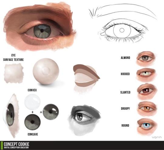
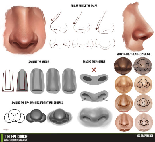
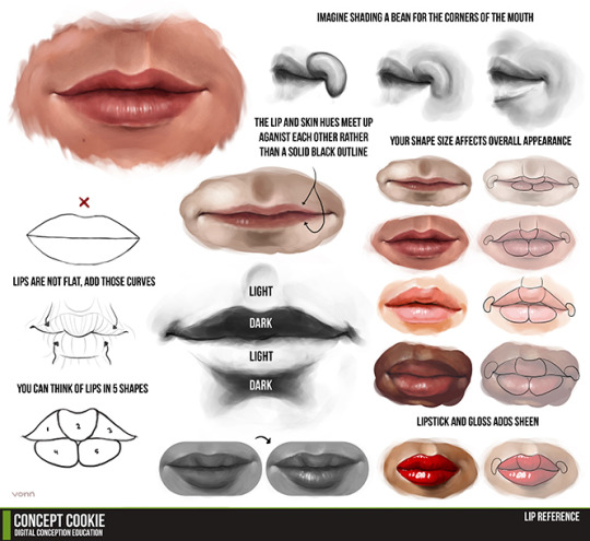
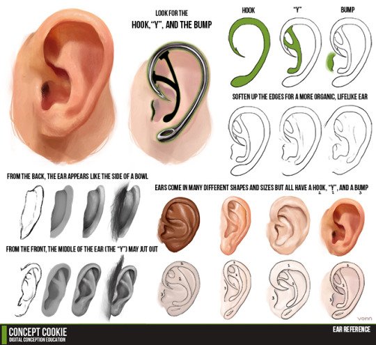
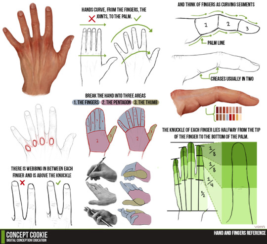
Eyes, nose, mouth, head, hands, ears and folds reference drawing tutorials.
283K notes
·
View notes
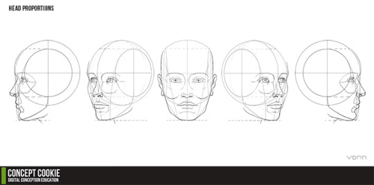
Photo


A BUNCH OF PEOPLE ASKED BABOUT HEADS AND HEAD ANFLGES SO YEAH I JSUT DUMPED IT ALL ON ONe i’m not relaly suere what tips to give on this i yeah HOPE IT HELPS
THERE REALLY ISN”T A FIXED PROPRTION for faces because people have different dfaces yeah OS JUST DRAW WHAT YOU THINK LOOKS GOOD!!
82K notes
·
View notes
Photo


WA’s BOOT Anatomy Tutorial Pt2 by RadenWA frm DeviantArt
49K notes
·
View notes
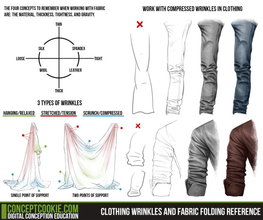
Photo

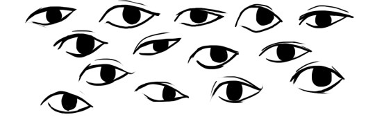
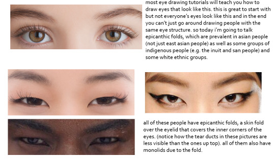
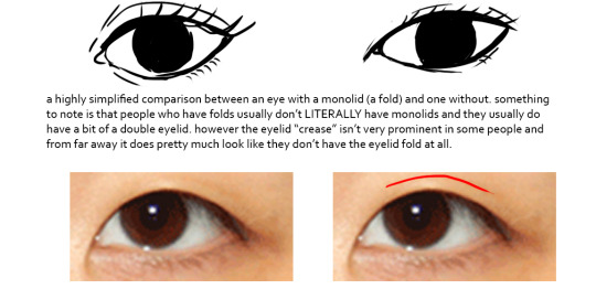


this was gonna be a tutorial and i guess it still is but if anything it’s just a really long and drawn out “essay” on drawing people with epicanthic folds. one of my biggest pet peeves is people drawing asian people exclusively with the same type of eye they’d give white people or anyone else who typically doesn’t have the fold! however i know that most people are taught with the standard white person eye (google image search for “eye” and it’ll all be pictures of white people’s eyes) so learning to draw epicanthic folds is a consciously learned thing.
therefore i bring you this, which attempts to break the mechanics of epicanthic folds down into something that’s a bit easier to digest and implement in your own art!
style can be argued i guess but it’s not that hard to stylize eyes with folds if you do proper observation and research. eyes with epicanthic folds are as diverse as eyes without so it’s not like you have to adhere to a strict model for them (although many people think that you have to) and all it takes to distinguish the two in stylized art (and even in semi/realism once you think about it) is a few lines! like i said this is a learned process but it’ll make your asian characters (and characters of other races even) a bit more interesting and believable.
57K notes
·
View notes
Text
apparently ppl don’t know about waifu2x??? despite its… concerning name it’s literally the most convenient website i’ve ever come across as an artist
it allows you to resize artwork without it becoming pixellated. this is a MASSIVE help if you, for example, make lineart too small or something. it works best with things that 1. have no textures 2. have smooth lines 3. have cel shading, but it still works really damn well for things that don’t fit that profile
here’s an example:

normal size

2x in paint

2x in waifu2x
so like, there’s that. go wild
236K notes
·
View notes
Photo
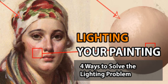
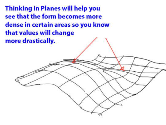
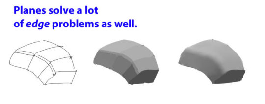
Lighting your Painting: 4 Ways to Solve the Lighting Problem
Fundamentals of Painting
“Most of the time when we are painting, we get so overwhelmed with all the info, which is why practicing the lighting fundamentals beforehand will be beneficial for future work. This will be a pretty lengthy article, but it is pretty comprehensive in terms of necessary fundamentals.
Fundamental #1: Importance of the Plane
When painting and using light, you need to switch from the form build-up approach to thinking about the right plane structure to make the right lighting decisions.
If you can simplify the elements into the proper planes you will understand the structure better and you will be able to assign the right values (when lighting).

Fundamental #2: Light Properties
There are some consideration to make when thinking about lighting. I will try my best to explain some of properties and explain how the lights affect the values and colors of a scene.
Light-Shadow Ratio: The light-shadow ratio determines how much of a contrast there is between light and shadow. A higher contrast is created due to sunlight, and a lower contrast due to overcast weather for example. This is caused by different intensities in light.
Value Keys: Value keying is mainly a design technique used to adjust the value scale while maintaining the light-shadow ratio. Depending on the light situation we have a specific value key in the scene.
Value Compression: Value compression is needed, because we as painters can´t get the full range of light into our paintings. We need to decide, if we want to expose for the light side or shadow side and sacrifice the values on the other side
Light Color: The first thing to understand about light is that it constantly changes it´s wavelengths, therefore changing it´s color. To simplify the process just identify the light as a warm or cold light.
Shading Components
Fundamental #3: Light Set-up
Now that we know how values and colors and affected by light, let´s look at how to set up lighting situations. These lighting situations are always used, and can be divided into natural and artificial light:
Light Types: There are only 3 basic light types you need to know to light your scene. Key Light, Fill Light and Rim Light.
Light Sources: There are only so many light sources that exist. Knowing about them will help you identifying them in any given reference and use them creatively.
Global Illumination: The characteristics of global illumination is the use of bounced/reflected light. It is used to calculate where reflected light is coming from, so we know which planes receive what light in any given scene. You need to treat it as a diffuse light source. It is most effective when there are a lot of shadows.
Fundamental #4: Material Behaviour
Many Material renders disregard the properties of Light. The reason we have learned about light in the first place is to convey materials in different lighting conditions and make them congruent to the scene. Let´s look at the materials and how light interacts with different surfaces.

Learn how to think about shapes, value, color and edges and understand it to apply the knowledge of physics to adjust your values and colors. A proper artist knows both the mechanics of painting and of physics.”
For full explanations complete with image examples, go to the article.
9K notes
·
View notes