Last Seen Blogs
thoughtcascades
Water of Wisdom

spazticjedi
Spaztic Jedi

pride-of-liberty-ave-blog
Liberty Ave in The Pitts

full-moon9
LUNA
Text
Contextual Statement
I forgot to hand this in on canvas so I'm just adding it here so I don't have to unsubmit the whole assessment to attach it there.
Link to the doc itself: https://docs.google.com/document/d/1pibKZZOW2gDce_o63JpDIGt7AGd5_buaVC0OeVz5EAs/edit
Throughout this semester of type focused design work I found it quite interesting since it made it a necessity to use programs in the Adobe suite that I had never touched before. This allowed me to expand my knowledge into two more programs and also into graphics animation as a whole, since that was an aspect, among many others, of design I hadn’t scratched the surface with yet. I found this a nice thing in the assessment to be able to look at and begin to understand, possibly for use later on in the years of university. With the assessment and the work I produced from it, they both followed a minimal detail, simplistic design to them, while also having quite different colour palettes associated to them. My specimen booklet was built around the contrast between a bright red and white, while my animation was based around the colours used in Wallace tartan.
For my type specimen book I made the choice to go with a lesser known typeface I found on Adobe Fonts, Condor. Since it was going to be used across all my assignments, I needed to make sure it was something I liked white also having enough fonts within it to have flexibility for any typographical application. Condor was quite good for this, as it’s main design aspect was its contrast between thick and thin strokes, something that gets progressively more exasperated the heavier the font becomes. Something else that was good about the typeface is that it had a vague connection to me, through it looking like a sans serif version of the metal letters used at the mouth of the driveway of my old house in Avondale. For the style my booklet was going to go into, I had to debate with myself a colour scheme to go ahead with. One of the thoughts I had to build more of a connection with my work to myself was making it follow the colouration of my family’s Wallace tartan, although I couldn’t get it to work. This was mainly due to the layout part of the style I was wanting to go ahead with, which was a simple half and half split design. I ended up still going ahead with a red though to somewhat correlate to this idea, with it being a tone closer to the brightest of the squares in the tartan. For my pages I initially went through very slowly and past the time it was supposed to be done by making spreads for weight, alphabet, numbers, a contents page, and an anatomy page among others. My struggle first time around with the creation of this booklet was keeping everything stylistically sensible, as some of the parts I applied to my booklet were far away from the style I was otherwise going with in the rest of the spreads. Something else that was a problem was my scaling and placement of text and other parts of the booklet, as I was constantly trying to fill space when I could’ve been leaving it open and breathable for far more impact and attention drawing to the champion element of any specific spread. I did have moments where it did work quite strongly, like in my pepeha spread. I felt that I used good hierarchy in that spread, with the 2 lines of text I used for each sentence (one in Maori and the other in English) enjoying good contrast to one another. This spread was also quite interesting as it made me think about macrons and the importance of their placement quite a lot. I had a chance to go back and change some of the things that weren’t working in the first version that I made so that it could be a much stronger booklet come the end. With extra perspective I was able to understand and see, then pick out the flaws it had, even though I had missed the original hand in for it in week 6.
With the digital kinetic type, I again was stepping into unknown territory with the software that I was going to be using, along with exploring animation again for the first time in many years, although this time it was more serious than any other time before. Having not made use of the tartan idea, and this assignment requiring me to involve my pepeha in some way, I almost instantly had an idea for the direction I was going to go in, one that involved the tartan. I was going to base my animation around the line ‘Ko Wallace tо̄ku whānau’ from my pepeha, which meant I had the ability to use any stuff that relates to my family name, which is where I got the connection to this symbolic fabric. I began making progress on this by creating a digital, simplified version of the pattern in illustrator, which gave me an asset I knew was going to be crucial for working out positioning later on, along with my colour palette. From there I moved onto aftereffects, starting some experimentation and skill learning of the program before getting cut off from it and the rest of class by contracting a stomach bug. This turned out to be extremely problematic, as it threw everything off the routine and made it hard once it was over to get back into the swing of things. I managed after not too long though to find the rhythm again and resumed making my animation. I used throughout it a lot of position adjustments with keyframes so that I could move the lines of the tartan from outside of the frame to inside it. I did this for the first part of the animation, where the lines all came together, intersecting one another and also starting and finishing at different stages because of where I positioned the keyframes of them. I also used this whenever I was moving larger squares into the frame and also when the tartan fell out of the frame into a single line. The other main adjustment I was doing to get the effects that I wanted was scale, which I found most useful as another method to change/reset the frame, especially when I was zooming in on type later. The other thing that got a lot of use during the production was keyframe assistant, as that allowed me to make the movement the objects were experiencing look way smoother with little effort. I did have a look at more complex graph adjustments, but I left them since they got far too confusing very quickly. I decided in terms of sound to just use music since I couldn’t work out and find a good set of sound effects that would’ve worked with the style it was in, nor worked with the fact that it is based off of fabric. Instead I went and found some music since it would’ve been very dreary without any audio. I went in search of some Scottish music since that ties in with the heritage surrounding the fabric in my family. I found something that wasn’t too harsh and loud, a flute section of the song Auld Lang Syne, which I then added in, dropped the volume and faded it out at the end, thus polishing off the animation and adding more intrigue to it than if it were to have had no sound at all.
Throughout this class I found out a lot of brand new skills and things that I can do with certain aspects of design. I got a much greater understanding of typography and how to better maximise its potential effectiveness. I definitely could've, from my end, done a lot better to manage time and try to avoid unnecessary instances of lacking speed and indecision, things that also plagued me in other classes. Despite this massive issue, I felt that what I produced wasn’t all too bad, especially considering the time I had left myself. Their somewhat rushed nature does show a bit though, since I never really had enough at the points where I could’ve got insightful feedback that didn’t need to be rushed. I found the process a whole lot different because of the timeframe compared to school, which is something that despite how obvious it was I never totally got until I was already too far behind and having to chase after myself for about the entire second half of the semester.
0 notes
Text
Extension Days
Since I was granted an extension for my assessment, I was able to have more time to think more carefully about it and how I could make it.
I realised when I reopened my aftereffects file that the way I had done everything was incorrect, as I had done a 6x3 layout which didn't allow for a square within the tartan to be centered, which is what I was wanting so that the next part of the animation could work as I wanted it to. Because of this error I had to go back into illustrator and redo the tartan that I was using as a reference for the positioning of all my elements, so that I could paste it back into aftereffects. I then had to redo this first step of the animation, which wasnt too bad since it was just a lot of shape duplication and then arrangement of their positions, which I did very quickly last time.

Once I had them laid out I then moved to tinkering with the positions of their keyframes, so that I could have them all offset from one another and have more interesting overlaps. It was also going to allow me to save the center line for last, as once that one exited the space of the frame I was planning to have it be tracked and followed down and away from the rest of the tartan. Before I thought about that though I had to do the second part of the tartan, that being the squares that were going to go below these lines and finish off the tartan in full.

I began by doing a single square in the middle that I spent a bit of time getting it as close to the perfect size as I could, fitting over the whole tartan square accurately and on the edge of its margins. This was super important to get right as I was then going to use that rectangle as a source shape to duplicate from, going up and below it with squares that I dragged from that original one. Then, after having created a line of three squares, I duplicated those three across to the left and right to fill the rest of the lines. Once I had them all in position I could then adjust the keyframes I had added to the source square, moving them all around and placing them where I wanted them to be.

This allowed me to make them start and finish when I wanted them to. The keyframes I had set up on them earlier had them going from non existent to full size for this part of movement, which made for a super effective introduction to them. After sorting all this out I played around with putting the squares first and the lines second, and then vice versa. These ideas both looked ok, but not astounding as having them sequential made the process of the tartan forming take almost 10 seconds, which was way too long and slow going. I thought then about putting them together, having squares show up while lines went past, which when I initially put them together immediately looked much better. I did have to adjust all the squares though, as I thought it would’ve been even better if I had them show up after an intersection in their respective place by the lines above them.

This decision was a very good one, as it lead to what I thought was quite a satisfying animation, as it was very smooth and managed I think to not come across as massively busy despite the amount of stuff that was going on. Having done this first part quite well, I could then move to the next part of the animation, where the tartan would then move down in the frame, reducing to a single middle line.

This was comparably not quite as difficult to work out as the first part, as it was mainly about adapting existing content within the animation to make a new shape that I could drag down the frame, before stopping at some point after a couple of seconds so that I could move into the third part of the animation that would reveal the text that was so important to this animation. I think it turned out well, the movement of it down the frame was interesting and a good speed that made it look like it was moving quite considerably. The stopping part of the animation was also not too bad, it was slightly sudden but I felt it got into its position in a way that wasn’t too jarring and contrasting the smoothness of everything else that had come before it. Having set this up now I could move to the next part of the animation that was going to lead closer to the text.
I had the ending square of this line come to rest at the top of the screen, before enlarging out from the bottom and filling the frame. The lines on that square also moved with the square, although I chose not to scale them with it so that I could try and vary the otherwise constant scale. Once I had the square take up the whole frame and change its colour I then made the horizontal line of the tartan stop short before the edge of the frame, before extensions of the line came down.


This part turned out rather smoothly which was nice, as it was the part in the animation where the tartan was least like it’s normal shape and structure. It also allowed for me to move into changing the frame to another color again, which this time would involve the text the rest of the animation had been building up to for about the past 15 seconds of eventual video.
This transition was maybe my least favourite part of my whole animation, as even though it could look like the lines were filling up the frame in the way a liquid would, I felt it was a rather weak way to transition into the next colour, when I had plenty of opportunity to do something better, especially with the lines that I had: they could’ve had a more pivotal role in this change. I mainly did it this way because I wasn’t sure how else to go about the change in the frame, which had to happen since I was going to bring the text in in that next part.
For this I returned back to a more tartan resemblant idea, which involved lines coming from out of frame and going across it. I also had the text match the colour of the background, so it would somewhat look like the line was moulding it’s way around the type. I had this happen somewhat quickly so that I could then move on to adding the rest of the text, which was going to complete the sentence of that specific line of my pepeha.

I had these bits of text come out from within the line, which I felt was the most effective way to do it, rather than having it come from the side of the frame and take its position from there. This also completed the main part of the animation, while also tying together all the frames to the relation of this text.
Having revealed the text and not having much allocated time left in the animation, I moved towards adding credits and making a title for the project, which I did by first resetting the background colour back to white again.


I did this by making the WALLACE text and the tartan line it was on expand out and become larger, engulfing the frame. I chose the C in that word to be the focal letter for this zoom in, as it eludes very slightly and obscurely to the next part being about the credits. To bring the background back to white, I put a copy of the word on top of the original that would not only scale with it, but go from 0% opacity to fill during this sequence. I think this transition was the best out of all the others, since it had an edge of uniqueness the other did not. Once the background was fully white again I could then add the information I needed for the credits.

I first began by adding some lines going across the frame, as a reference to the start and also to keep the consistency of the focal theme right the way through. I then had the text come in from the side as it felt like the best way to do it in this situation, as I had made the colours different in order to stand out more against these lines.
I also added music right at the end to my animation, since it definitely needed something more to elevate it and give it an extra level of depth. I wasn't quite sure exactly what I wanted to do for that, although I knew I wanted it to have some strong connectivity to the subject of the animation in order to help support it. I figured going in the cultural direction would've been good, since there is a fairly potent connection between music and tartan, not just the Wallace one, in Scotland. I thought briefly about bagpipes but I felt that would've most likely been too exuberant for my animation. Still not knowing quite what I wanted, I ended up just searching for royalty free Scottish music and scrolling pages for a while, listening to samples of every song I went past. I ended up after not too long finding a flute cover of the song Auld Lang Syne, which is used normally in occasions like New Years, and now things like graduation etc.
It ended up working quite well once I implemented it into aftereffects and dropped the master volume. It also very slightly has its beat matching parts of my animation, which his a rather great bonus. Its softness complimented the smoothness of the shapes I was working with, tying the animation together quite well and making it something I was rather happy with, which is something I don’t feel very often for a lot of my work, especially when it’s been forced into a small window of time because of myself.
While I was working through this animation and all the work associated with it, I also made the adjustments David said for me to do in my specimen booklet so that it could improve and be less space hungry like it was. Even though it wasn't absolutely necessary to do so, I wanted to do those adjustments anyway since they weren't that major and resolved a lot of the issues that had come about in my first version of the booklet. Once I had both these assignments done, I was able to finally submit my work that came out of a super messy, poorly managed first ever semester of university, which surprisingly I felt didn’t turn out all that badly.
0 notes
Text
Rationale
I would have adjusted this to make it better if I had time to do so.
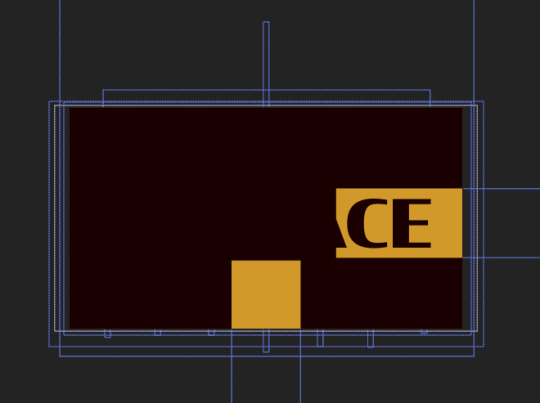
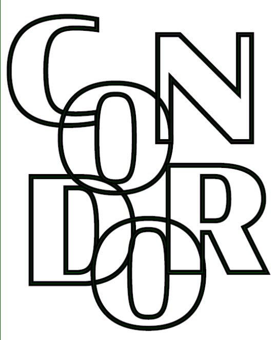
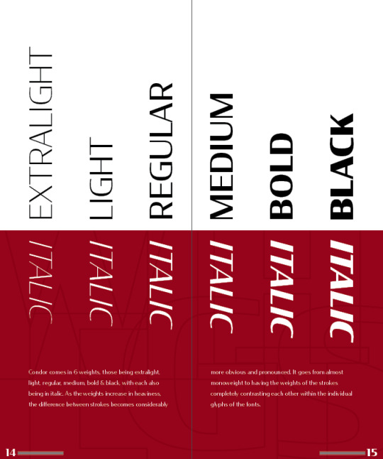
For my type specimen booklet I chose to explore the sans serif typeface Condor, created by American typographer David Jonathan Ross. I decided to go with this type after coming to the realisation that the original one I found to use in initial tasks wasn’t going to work, since it had no font families at all, along with only being in capital letters regardless of what was typed. Condor had 6 weights, italic versions of all of those, along with compressed, condensed, extended and wide versions in all these weights too. I also found that there was a much better, albeit vague connection with it to me, that being how it has a fair resemblance to type used in my family’s crest, but as a sans serif typeface rather than the original serif one used.
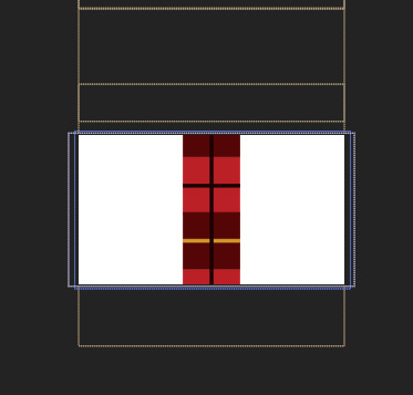
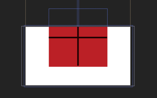
For the booklet’s palette I struggled for a while to work out a solid palette to use for it, and for a while I was working in black and white. I had committed to a simplistic duotone idea for the booklet’s general structure, since I found that would be a good way to keep the type prominent but also a strong way to differentiate and in a way isolate certain elements without making things overly intrusive and hard to focus on. Since I had no overtly personal preference to a certain colour, I never quite settled on something until I thought of using a mid red to pair with the white I knew I was going forward with as the other prominent colour. This was inspired by a rough combination of the two red tones used in my family’s tartan. I contemplated and partially experimented with how to implement the two tones of red as a flank to the main red I created along with the gold/yellow present in it, but with the direction I was going in with the structure of my booklet I couldn’t find a way to make these colours work in a way that was purposeful and effective. Due to this struggle, I ended up sticking with the very simplistic palette of the tartan inspired red, white and black, where I could try and form a slightly minimal and precise design with ideally a high emphasis on the cohesiveness and contrast of the different flat coloured pages within the booklet.
To begin experimenting with this typeface while simultaneously making it personally relate to me a bit, I incorporated my Pepeha (including smaller sized rough english translations of each line) along with occasionally adding words and phrases that relate to myself and some of my interests that shape me for each spread that included them prominently. I also made the type 3 dimensional like a pseudo 7th weight, which also made it much more decorative, which is why I largely limited it to being included in the cover pages of the booklet.
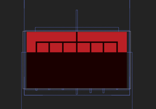
Outside of the text I tried experimenting with making use of images as something to fill in the red areas of the booklet in order to give more depth, but the ones I tried colour matching and putting into place didn’t really work in the way I would’ve liked, even when I turned them into a vector. Their detail I felt was way too high and thus made the booklet quite unbalanced, since the flat balance of its half red and white structure got disturbed by the additions I tried to implement, while also distracting from the main focus of the type a bit too much with this incorporation.Eventually I found that I could make use of my typeface for this extra detail, and using the outlines made some subtle details in every red area of the booklet. A lot of my page layouts, even though I had sketched initial ideas for them changed a lot, especially the weights spread (pages 14 & 15). This was mainly down to uncertainty about sizing and placement of certain elements, while maintaining a balance I was happy with, along with the dimensions of each individual page, which to me was quite unusual in the sense that I wasn’t used to it.
Overall, I learnt a lot from the creation of this booklet, including InDesign itself which I tried to almost exclusively make it in so that I wouldn’t be inclined to fall back on the more familiar Illustrator. I did struggle a bit with the layout of each of my spreads, which is probably where everything becomes a bit weaker in general, but I still feel that it turned out alright for my first attempt at producing something in an Adobe program that is completely new to me.
0 notes
Text
Week 12
This week I continued going with my digital kinetic type in the final class of Making and Media. I got approved for an SCA as well so that covers off the time I unexpectedly didn’t have because of me being sick a couple of weeks ago. With that in I had much more time to try and make my animation somewhat ok, something that I continued to do in this final class.
I ended up by the end of class having an actual decent animation of the first set of lines coming into frame. I had plans to later apply easy ease to them to see if that would make their introduction to the frame more interesting and effective.

I had each of these lines animated to come across the frame, something pretty simple really, but something that I felt would eventually work quite well once they got put in their proper colours and didnt have the tartan there as a reference. I also went ahead with the far more simple method of making the shape and then moving it in its entirety, as opposed to what I was trying to do before, which was way too complex to work out. I also staggered the starting points for each of the lines movement, while also varying the time it takes them to reach their ending point, making the animation a lot more interesting than if all the lines were moving in tandem with each other. I also gave easy ease a go on all the lines, but it didn’t really work as well as I envisioned it might’ve, so I just went back on it and left the lines on standard, normal keyframes. After having finished this in class at a rapid pace, I had to go and move across to other bits of work I needed to get done, so that coming into this extension period I would be hopefully be as ready as possible so that I can get everything finished off not just for this class but Design Practice as well.
0 notes
Text
Week 11
I began finally trying to make some proper progress on my kinetic type this week after the turmoil the last 2ish weeks have frustratingly brought on me, especially surrounding me getting stuff going and being in the routine of everything.
I started out by giving myself a refresher of the software, since I hadn’t done much in it for a while due to the gastro bug rather decommissioning me for far too long.
I found this video to be incredibly helpful in getting the basics of the program back into my head, which is all I really needed since I wasn't going to be achieving very advanced things with the program. It did however give some additional tips and tricks that I found quite interesting and useful, and things I was definitely going to try and incorporate into my final animation.
youtube
Having watched this and got a lot of the most basic and fundamental skills a part of my knowledge, I got onto aftereffects again and began trying to incorporate them into my animation. For the most part of the lessen I was taking a lot of time trying to work stuff out still, mainly with the arrangement of files and compositions and things like that. I did begin trying to make the first part of my animation eventually though, but it ended up going super slowly and rather unsuccessfully, as I was trying to get the lines for the tartan to extent out from an object with no width and become the long rectangle it needed to be within the frame. I briefly got it to work but couldn’t replicate it with the other lines I needed, which I worked out later being because I was daft and copied the shape after I had applied all the positioning keyframes to it, which messed with a bunch of things, including the path it was set to travel on. After spending a long while in and after the class trying to understand what went wrong, I eventually conceded and went home, taking a break so that I could try and come back later to it and resolve the error that I initially couldn’t decipher.
I came back to it briefly at a later stage of the week, somewhat cracking it but not completely, as I was still having issues trying to get a technique that was probably still too complex for my current skill set to work. I eventually decided later while not working on it that just moving the shapes in full scale would be easier and still achieve the same effect within the frame panel anyway.
I also found that by the end of this week and still having not found much time to get in the work for the class beyond the minuscule amount I did, and because of design practice constantly making it’s way to the top of my priority list, I was definitely going to need to apply for an SCA. I think that having that for both my classes is probably necessary since I lost a whole heap of time to the sickness that occurred, and I don’t think I can recover from that without more time.
0 notes
Text
Week 10
This week I ended up having to miss the class since I still hadn't fully recovered from the gastroenteritis by the time it came around. I still had to continue to wait for myself to get better before I was able to get back into my kinetic type and its production, which was rather annoying since it meant I wasn't able to get stuck into everything again until the actual Week 11 class. Some of the knowledge of shortcuts and stuff like that was forgotten because of how long I had been away from aftereffects, which was a bit of a frustrating aspect I was going to have to relearn coming into that class, so that I could get certain things done faster on the program.
0 notes
Text
Week 9
This week I continued with learning after effects while also making progress on my digital kinetic type.
Before all that properly began, I stated by getting some feedback from David on my well overdue type specimen booklet for how I could improve it and make it more consistent by changing, adding and especially taking away certain elements. Some things that he told to me was that there were random elements that stylistically didn't fit with the rest of the booklet, such as the rather random 3D E in the pepeha spread, and also the overlayed alphabet, which even though I applied it slightly differently to the idea, it was definitely still rather ripped from that. He also found that my numbering was randomly off from the rest of the grid, which now looking at it is rather bad, but that can be fixed rather easily, as can most of the other issues. Among other small things he critiqued on with the booklet, I found that the main takeaway from the feedback was that I needed some major revision to my scaling, especially with the text, and that I also needed to not be quite so compelled to fill every available space that was presented to me within the booklet, which I presume is in order to take advantage of more negative space to break up the booklet and also to draw more focus to the type.
With that feedback taken onboard and noted down, I got back to trying to make inroads on my kinetic type. I began thinking about colours for the tartan and the creation of these assets for the actual video in Illustrator, before David came around to see how I was going. While he was around, he proposed to me an adaptation of my initial idea for the motion in forming the tartan, where rather than it doing in a foldout way, where each square flips out from the next, I break it down further to just the lines of the tartan and give motion to those individually. Because of my low skill level with aftereffects, which would make the animation of this folding effect quite difficult, the adjustment to using the lines and giving them each motion would make things easier, and to me, probably more effective since it can get quite interestingly busy with all its parts intersecting and going up and under each other. He demonstrated to me how this could be done, showcasing the layering and positioning of the starting and finishing points of keyframes for the objects, and how the rest of the frames get filled in between the keyframes. This demonstration, which was quite helpful in giving me an idea of how better to use aftereffects is also what prompted me to realise how much more effective this idea could be, mainly because of the intersection that would be present in the design.
I decided to go ahead with this and later in the week get some of it done, while also experimenting with other concepts in aftereffects. I ended up however not getting any of that underway, since before I properly sat down I ended up getting quite sick, which rather ruined my ability to really do anything for the rest of the week.
0 notes
Text
Week 8
In this week it was all about After Effects and how it works. We were given a brief introduction to the software by David which helped with outlining the workspace, creating and saving files and stuff like that. I spent most of the lesson trying to better ingrain the stuff that was taught in class, especially with the management of compositions and the individual elements within them.
Later in the week I took another look at the program, trying to make better sense of it since I had decided I was going to go in the direction of aftereffects, as it was going to definitely fit a lot better what I was wanting to achieve. I wasn't going to concern myself with premier pro too much, as I wanted to avoid learning another piece of software in tandem with another complex one I currently had very little idea on how to use. I continued trying to learn though, working out things like the workspace and all it’s intricacies that are far more complex than any of the other software I’ve used before. I also got more familiar with keyframes and how to adjust them, along with figuring out some important shortcuts that would make my life way easier in the production of my work. I did a couple of basic tests that I didn’t capture in the end, but they mainly were just for understanding the workspace and how I can best go about some of the things I may be doing for my actual final product.
Alongside these tests I had a look at various bits of inspiration, including some of the work posted to the 36 Days of Type Instagram account, which we were shown in class in order to promote ideas.
0 notes
Text
Week 7
This week in class we got introduced to the second part of the Type Matters assignment, the digital kinetic type, where the focus shifts from being static like the booklet was to something with a focus on motion and also sound. Despite being behind on what I should have done coming into this week, I had to keep moving forwards in class and shift my thinking into this second part of the assessment. I decided, partially with the lecturers suggestion and because it fits my initial thoughts on what I'm going to make, to go with AfterEffects. It also helps that we're going to learn it in class, so that can make the procedure of creation a lot more manageable than if I decided to go with something else. Before the storyboarding process I began by sketching out random ideas I had, whether they were thinking more thematically or about possible motion I could involve in my later concepts for my kinetic type.
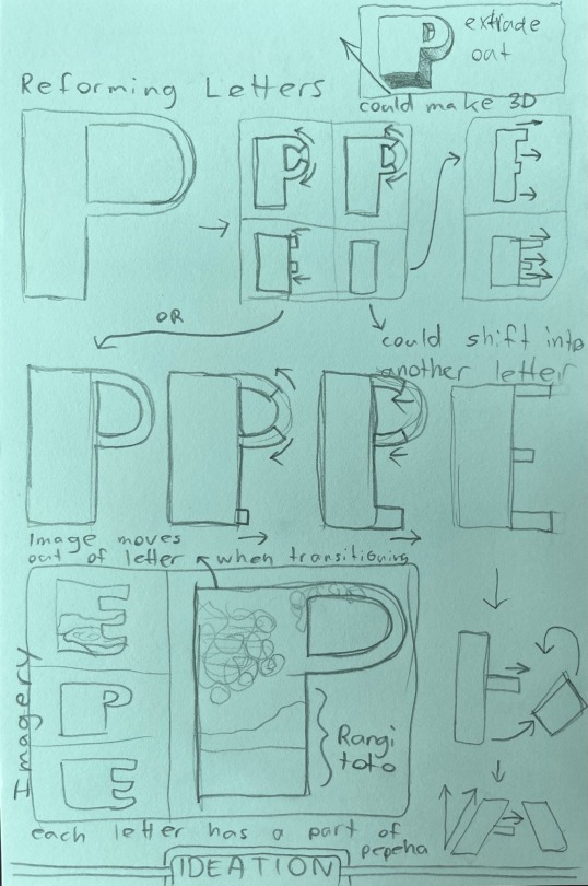
I began by drawing out this idea I had thought of during the explanation and introduction to this part of the assessment, where I explore what I could do in terms of motion for the lettering. I was thinking of possibly having a single letter in frame, which morphs periodically into the next letter of the word, which for this example is just pepeha. It then goes through the whole word, before expanding out of itself at the end to display it as a whole. I also considered with this idea of making it able to loop. I also trialed incorporating imagery relating to my pepeha into each letter, which would change as the letter does. I also thought about making it 3D, allowing it to possibly extrude out among other things.
The kinetic type I come up with needs a relation to my pepeha, which can be more image based like in my initial idea above or more type based through a word, the latter of which I ended up exploring with my last name of Wallace.
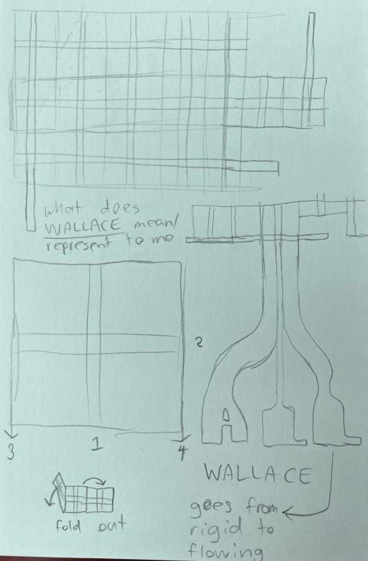
It has a general image I can already strongly relate to it, that being the tartan, which in itself could be quite interesting to explore as a leadup to the type because of all its various lines and squares. I thought of having the squares fold out from one another or alternatively appear as an array, possibly in smaller segments of squares and lines. I thought from there that once the screen gets filled with the tartan, it could pan down, with the squares gradually falling away until a single line is left in the frame. The tartan square could then terminate in the middle of the frame and split off into individual lines, which then form the word.
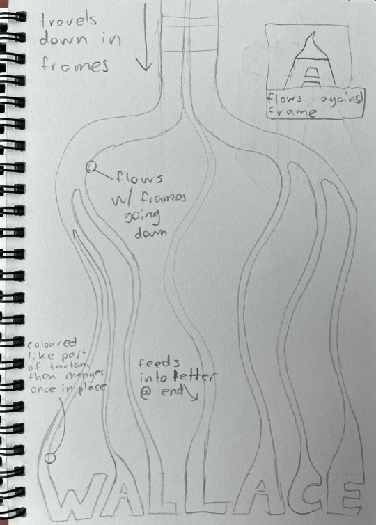
I explored this idea in a much fuller way here, showing how the lines could ultimately feed into each individual letter. I also contemplate how the frames would only be involving a section of this overall image at once, in order to give a sense of motion to the lines. I explored this part a lot more comprehensively later on, when I made a storyboard involving what my possible keyframes may be and how the tartan and type would form.

The differing aspects of motion in this idea is something that I think could be interesting to explore, as it goes from a bit of a rigid, grid focused beginning with the folding out of the squares of tartan to a flowing and smooth part later on, which then feeds into the type to create their forms. The only part I'm not sure how to approach yet is how to make the type much more notable rather than it being all the effects that are just solely there to build up to the typeface Itself. I could possibly extend the eventual animation beyond where the storyboard ends and incorporate more type focused animation from that point onwards.
Along with this tartan focused idea, I trialed another that looks at my pepeha more broadly, while focusing on type a lot more from the start.

I'm still unsure if these ideas are realistically possible to achieve with a basic knowledge of After Effects, but I want to at least try if I end up going in this direction when the digital work starts next week.
Outside of all this brainstorming I also managed to get the video explaining my booklet complete, albeit extremely late compared to when it should've been finished, just like all my other work up to this point.
I struggled throughout this process just like I had done with everything else, but mainly because struggle with recording myself for work like this, something I had to put past in order to get it done before it became another piece of extra work in the catalogue I had to get done while more stuff came in.
0 notes
Text
Mid Semester Break
During the break I began by finishing up the first version of my type specimen booklet, since I hadn't done so by the Thursday it was required for. It ended up going much slower than I intended it to, since I think I was agonising too much over layouts and details I wanted to add to every spread, even when they may have been unnecessary or not the best in terms of the thought and execution behind them. This needless indecision ultimately ended up forcing the video I also had to make by the 20th April out to a much later date.
For the actual booklet finishing however, I felt that through the process of making it, it needed more to it to help it become more sophisticated, since it was always going to turn out quite simplistically because of its layout. I felt it needed a bit more than just the text and rectangular forms that were going to be taking the centre stage of the booklet. I contemplated adding textural images within the red area only within my booklet, but I felt that I didnt really have any images that had strong relation to parts of my booklet other than the Wallace crest, which I could use for my pepeha spread. Since I felt this idea wouldn't really work effectively, I then though of the possibility of making use of an idea I had put to the side right near the beginning of making the booklet.
This idea of text as conjoined outlines was something I initially was going to use for the focus of a whole spread, but it never really found a place in my booklet until I thought on how to reuse it now. Instead of placing images in the red areas of my booklet, I thought it could look quite interesting to place text in this way in that area instead.


Compared to the image idea it to me has more relevance to the rest of my booket, as it shows another unique usage of my text while also relating to the subject of the spread that its used in, kind of like a subtle title.

I think in this first trial the way it resembles text but looks more like linework when the rest of the elements are present in the spread is quite an effective addition to my booklet. In this first trial, the text I used has good relevance to the rest of its specific spread, as it uses the letters in the word PEPEHA to create the lines that overlap one another, leave the boundaries of the spread and sometimes conjoin. Even though this wouldn't necessarily be noticeable in the full spread, I think its a nice detail that actually makes it purposeful beyond just adding something more to the spread. Because of how well I felt it turned out, while staying on theme the largely graphical, straight cut and imageless design, I decided to incorporate it into every spread where there was an area of red, so that this more sophisticated depth could be reached. I didn't end up wanting to include it in the white areas as I felt it would reduce the difference between the two 'halves' I was getting in my design.

I first added this new element to all the spreads I had already done, along with adding some extra elements to the introductory spreads that showcase other parts of the typeface and how it would look scaled up, while also providing some balance the the rest of those spreads. Once this was done, I then moved on to creating the rest of the spreads I wanted to get done in order to have a first completed version of the booklet.
I began by taking a part of the booklet design I had stuffed over and putting it together as an actual spread, as I had earlier included it within my introductory spreads, but only one half on each spread, which doesn't really work with the format at all: I was probably thinking about too much like it were an animatic, which it wasn't at all.

Once I worked that out and put it back together on one spread as it should’ve been, I found it’s comparable simplicity to be a bit refreshing, as its a clean showcase of some of the typefaces weights in a more practical manner, and also with scale and exploration of lowercase letters alongside the capitals. I also found it worked quite well being fully red, something currently unique amongst my other half split spreads.
Having assembled that spread I then moved on to the weights one, which turned out to be a massive problem and by far the most difficult spread to finish. I struggled for ages trying to work out a layout that would strike a balance between all the key elements that would be there: the red area, white area and type itself, both for the weights showcase and an extra piece of information I felt like I should add.

I went through at least 6 different explorative versions of this spread, probably more since I was changing so many things, large and small really quickly, often not screenshotting some of them since i was so desperate to find a breakthrough with it. That eventually came though, with the spread that would become my final.
The biggest things that made this one work where my other attempts didn't were the halving of the type elements, making some enclosed in the red area and in white, while the others were within the white area and in black. I placed the regular fonts on top while adding the italic versions of them below, creating quite a successful balance and visually indicative design, that also makes good use of the fact that its going to become a page eventually.
After solving this perplexing spread I made a start on something that I felt would've been a bit more simple to understand in terms of layout, the contents page.

The idea for this final design came about quite quickly, which I knew was inspired by one or more things, but I couldn't think what they were. I wanted the typeface's name to be used in a titular aspect again, in a similar way to how most novels often do that with the cover and then often the third or fifth printed page. This contents page would also give me a chance to essentially title each of the spreads within the rest of the booklet, as some of them were unnamed. It also broke the convention I had established with the rest of my spreads, that being the clear distinction between the red and the white, which could have maybe served better as an actual cover page, although I didn't like it nearly enough compared to what I had actually done to contemplate the massive overhaul I would've needed to undertake to rework it. When I made this spread too I didn't have all the others done, so the actual information on it would have constantly changed.
Once I had this surprisingly graphically complex layout in terms of making it completed, I went on to doing an anatomy spread that broke down parts of the typeface and its design.

I think there are things that could’ve been done better with this spread, mainly the stuff I put into the red area of the booklet since it looks slightly out of place compared to everything else shapewise. I think the whole white area turned out very nicely though, with all the annotation and detail highlighting looking very good visually. While it’s not uncommon to see, the anatomy piece of text in the middle of the spread also doubles quite well as a title for these two pages.
While it took me a while to completely finish this spread, because of all its finicky details, it felt worthwhile to display some of the typeface’s qualities while finding some of them out myself upon doing the necessary close analysis of it for this spread. Once I had it completed I then went on to the last spread I felt I needed to add, being a spread with numbers on it.

I’m not entirely satisfied with how this spread turned out, as it’s a bit of a rinse and repeat design from the alphabet spread, but much worse. I think ultimately I was needing to move on from the booklet to the rest of the stuff I needed to get done, so it was probably a bit rushed and rather poorly executed in terms of the layout of all the elements. The layered element is probably the poorest placed object in this spread, as it being cut off at the edge of the page just doesn’t work at all
Having finished this spread and organised all the others to an order I felt was best, I was finished with this first version of my type booklet, and could then move on to thinking about the video I needed to produce, along with the binding of the booklet itself as a proper physical final product.
I didn’t have much time left when it came to these next steps though however, since I also had to concern myself with other bits of work, so that was why it ended up getting shelved to the side a bit, rather detrimentally. I did end up printing and then going the lazy route in terms of binding, stapling it instead of threading it and using only the standard low gsm A3 paper to put it together. The process was going somewhat alright despite my stupidity in arranging the pages together, but the worse error came about when I reached the very last step of the binding process. I managed to somehow, when using the guillotine to trim off the empty edges of the paper, lift my foot off the pedal clamping my booklet down, leading it to come loose and cut drastically wrong: the last thing I needed.


Despite this catastrophic blunder, it still managed to stand on its own, which I guess could at least count for something, although I had no more time to actually go and try to print it again, since I left the process far too late, something that was unfortunately not surprising to me. Because of how badly it turned out, I didn’t end up submitting it at the end of the first class back, since it didn’t even have all the content within the spreads properly visible due to the chunk I hacked off of it. With the mid semester break coming to an end, and with the video still to do, I had to shift my focus within class to the next part of the project, that being a type focused video.
0 notes
Text
Week 6
This week was hand in week for the PDF of my specimen booklet. I needed to crack on in order to get it done, since I was rather far behind. Continuing from where I was last week I began filling the inside of the booklet, starting with my Pepeha spread.

I made the red area of this spread extend beyond the halfway point of the 2 pages, going to about a third of the way over on the left page. In this left page I added a body of title text to take up this white area, which combined with the body text that I aligned to the right created what I felt was quite a balanced spread. With his body text, which was my pepeha itself, i tried creating a hierachy between the te reo maori text and an english translation of it. I wanted to include both languages, mainly so that I could know what I was saying in maori to an extent, even if the translation is most likely not completely accurate. To get this hierachy I made the maori text larger and heavier in weight since it was much more important, while the english was smaller, lighter and in italics. I also added macrons later once the rest of the text was in place.


I wanted to make sure that my usage of macrons in my pepeha was as accurate as possible, since I had a lot missing in my original script of it. I also decided in the end to do them all manually, as the macrons in the typeface were super inconsistent in showing up for whatever reason, while also being a lot more unpleasant looking to the ones I eventually installed, since they didn't align very well to the individual letterforms. Through a bit of research on this I also found out the extent to which a macron can completely change the meaning of a word that is otherwise spelt the same, highlighting to me their huge importance. I also had to adjust my use of taku, tāku and tо̄ku since I was at a point using them somewhat interchangeably and uncertainly. I did research on this too so that I could be a lot more certain that I wasn't using anything wrong, at least compared to before
Once I had this whole spread and some of its intricacies looking pretty good and more well employed, I kept on going through the pages I had made rough concepts for, moving on to the alphabet spread.

This spread also turned out quite well, as it’s colour layout made it quite obvious to me as to where to put everything else in order to complete it. I put each of the alphabets, one in uppercase and one lowercase, stacked on the red half of the spread, with each of them taking up about their own half of that page of the spread. For the other part of the spread I took some inspiration from something that I found quite interesting in the week 4 presentation.

I made use of this as a complementary element to each of the alphabets I had included, as I felt it would be an interesting way of adapting the alphabet and making it a more decorative part of the spread. I made sure to also align these to the alphabets they were associated with too, to make it as visually pleasing as possible.
After getting through some of these spreads, I backtracked a little bit and went to do the two introductory spreads for the booklet, which included a summary of the typeface and it’s creator, along with my rationale which I wrote up a bit later and then subsequently added to the spread.


I feel that both these spreads are in need of something more, as they feel far too heavy on the one side where all the type is, while completely empty on the other, since it was just plain red. I felt though that I didn’t have enough time, so I had to move on and try and get something more ready, including the rationale.
My efforts in the end turned out to be far too slow and plagued by indecision and a desire for a produced product that was far too unrealistic for the time that I had. Because of this, by the time of the hand in I pretty much only had the alphabet spread, a half finished rationale and typeface introduction spread, which both didn’t feel very polished and complete, the pepeha spread, and both covers, which wasn’t enough at all for it to be considered finished. I felt discouraged to hand it in since it wasn’t close to done, so I decided to basically forfeit the Formative despite how bad that was, and then try and power through it in the Mid Semester break, so that I could have it done as soon as possible so I could have time to make the video on it and also try to get it printed out and bound.
0 notes
Text
Week 5
For this week I properly began to make progress on my type specimen booklet, after realising I wasn't going exactly in the right direction for it. I was thinking for some reason of it being solely about my pepeha, even though this is only supposed to be an singular aspect of the whole booklet, not something filling every spread. I had already made some light progress with the title pages prior to this realisation, so I was able to translate the core idea I had started to form across to what I should be doing for my title page. I had already decided I wanted to commit to making the text 3 dimensional, as it would in a way act as a 7th, very decorative weight for my typeface that I could possibly just use exclusively on the title pages or for any other large headings inside my booklet. Other than that I was super uncertain about how to lay everything out, so I went and did some drawn concepts for this page and multiple others I thought would be good to include within the booklet.

This is something I really have no idea why I didn't do earlier, since it gave a bit more clarity in terms of what I was roughly looking at doing for my pages. It allowed me to think a lot more about a basis for concepts I could then explore digitally, especially the ones that turned out quite promising. Once I did some of these in class and on my bus ride home, I began readjusting my cover page with more correct text and then looked at laying out the text.
I initially began focusing on the arrangement of the text itself because I hadn't quite settled on the colour palette I was going to go ahead with for the rest of the booklet. I was going to experiment later with the ideas I had for that once I was getting happier with the layout. This is why I stuck with the covers main background being black with the text being white, as it shows the contrast I want to eventually have between the colours in my booklet.


I tried some of these ideas for text layouts, most being based on my drawn concepts, seeing how I could arrange it, especially in a fragmented manner. I decided these layouts weren't quite as good as what I eventually settled on, since the text's layout was either not quite interesting enough on its own, or, like with the stacks of 3 groups of 2, not very pleasant to read. The one I settled on kept the text as the predominant focus of the cover, since I wanted to try something without any imagery other than the title, giving the chance for the 3D look to pop.

Once I was satisified with the text layout I then moved on to actually formulating the layout of the rest of the cover, which would subsequently have some degree of impact to the rest of the booklet. I tried a couple of quick of the cover, before seeing how an idea I had based upon the page 2 - 3 spread of the Base 900 booklet would work.


I found this layout of the text and arrangement of colours to be quite effective, as I deliberately made the heavier colour be the one situated at the top in order to command more attention to it. I also found that the text provided a good balance to the large areas of black or white, as it made both of the colours look like they stretched further but also end sooner, making the focal point of my cover quite obvious and strong. I think the way the text is stacked in two parts is quite good as well, since it splits the typefaces name into its two syllables, while also putting the O’s in visually pleasing alignment with each other. I think while it’s a bit unusual that they’re 3D, I think it works in showcasing the typeface in a unique application that could stand out against the rest of the text in the booklet, while also demonstrating that the Condor typeface can work well in a way that’s a lot more decorative, like some of the typefaces Condor was inspired by in its creation. I think it adapts it in a way that is reminiscent of the way some of its inspiration Art Deco typefaces were designed and how they were applied physically to buildings like movie theaters of their time period.

Their 3 dimensional application was something I wanted to incorporate into my design somewhere, as I felt it fitted the typeface quite well. It also harks back to its inspiration too quite strongly, taking it a step further by adding dimension to it, like how they were sometimes used in these types of theatres.
With this layout coming together well for now, I then moved on to settling on a colour palette that I was going to commit to for the rest of the booklet. I had the main two ideas of one based on the colours in the Rangitoto photo I used in the quick poster I made last week, and another that I though of a bit later, which made use of 2 reds and a yellow/gold, which was based off of the Wallace tartan of my family

The Rangitoto based one I think didn’t really work for me, as it’s connection to me for a start is rather small, and also it didn’t have the level of contrast I was getting when I was using black and white as a placeholder palette. This considerable contrast was something I wanted, so I decided pretty quickly that I didn’t want to go in the direction of those colours, even though they were quite an exciting combination and a bit outside of the more basic combinations I often find myself working in.

I then gave the tartan inspired palette a go, and while I think it worked better than the previous combination, the colours touching like this isn't fantastic to me. I think It needed some way of breaking it up, probably with white space, which I tried incorporating into the design.

This quick attempt at incorporating some white while retaining the colour split in the forms and text I think just exposed that the specific colours and the tones I chose for them don't really work, at least not in the way I was incorporating them together. I then went back to the thought of having some bright neutrality in the white again, and looked at just keeping it simple with a singular other colour for the majority of my booklet.

I finally settled in on this predominately red and white palette, taking what I thought were the best things from the tartan palette and applying them to a design that focused on the aspect of contrast, to the level I was getting in when I had just put black and white in as a temporary base. Since I wanted a bit of a connection, albeit subtlety to my family’s tartan, I made the base red a sort of mix of the two used in that tartan, which produced a rather crimson red that leant towards the brighter side of shades. I was also partially inspired by the thought of the colours used in stereotypical old 50's diners, which I figured fitted Condor's style to an extent considering its roots of it's inspiration. The design I finally got to me looks quite sharp and brings the focus to each of its elements that I wanted, even though it’s incredibly simplistic.
Since I had this layout and colour combination sorted on the front cover, I applied it exactly the same to the back, with text that included my name and class number stacked on top of each other.

This works well for me as it has perfect flow to the front cover and vice versa, while the text is able to command its importance quite well due to its placement in the middle, which would have worked better I think then anywhere else, while also matching the front cover. I didn’t really feel the need to experiment with the other ideas I had considered on paper, as it matching the front cover worked very well to me as soon as I put it together.
During the rest of this week I thought about other ideas for the inner part of my booklet, contemplating how I could digitally create them with some inspiration and some sketches. I didn't really do much more though, with the exception of a bunch of half done, still rather conceptual elements that didn't really have a place anywhere, which wasn’t really ideal since I needed to be handing it in next week.
0 notes
Text
Week 4
For this week there was a focus on image creation for the possibility of involvement in the type specimen booklet. In class I tried experimenting with techniques using some of the images supplied as resources, as I didn't really have any of my own images that could relate to parts of my pepeha.

I quickly whipped this image up using 2 of those supplied images, making use of the multiply blend mode in particular for the editing, something that I had surprisingly not really used much any time I was editing photos back at school and in my free time.
After this first image I then tried applying this blend mode to an image I had taken in Design Practice, thinking more purposefully about how it could possibly being appliable as a subtle background in my specimen book.

Even though It doesn't have much relation to aspects of my pepeha, I could make use of it somewhere else in my eventual booklet if I feel that images would work as an element for backgrounds.
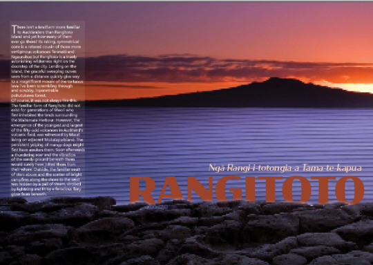
Later in the week at home for SDL I designed a poster that thought about the involvement of an image from a part of my pepeha, along with type taking a strong presence in it. I used Rangitoto as my subject, since out of all the other important locations in my pepeha like Lake Pupuke, it’s the one that I have the most connection with having directly experienced it by climbing it twice with my family.

I based the colour palette around what was present in this particular image, which was the orange from the sunset and the blue-lavender from the surrounding water. I thought these colours could be an option to go ahead with in my type booklet too since they pair really nicely together, and could work well with both black and maybe an off white. To make the poster itself I worked in Photoshop, and started by duplicating the image and cutting out the rocks at the bottom, so I could put them as the top layer in order to slightly mask the text I put in later. For the main image I added a bit of texture into the water by putting in another image I took last year of a part of the Auckland Museum’s lobby. I then compressed the image, adjusted its brightness and set the blend mode to multiply, before erasing the parts of it that stuck out from the water on a layer mask. I then added the text in the typeface I’m going to use in my specimen booklet, putting it in between the image layers so that it appears behind the rocks. I also added the volcano's full name as a secondary piece of text above the main title. I also chose to align those blocks of text to the right, where Rangitoto's main shape and height is. After getting this main initial idea done, I trialed a couple more versions looking at the layout and addition of more text.

I then experimented with adding some paragraphs of currently filler text about Rangitoto, along with some larger text for a quick statistic about the volcano. I also rearranged the title text, moving it to the left while making the subheading text italic for some variation amongst the rest of it. While the secondary text worked quite well, especially with the opaque rectangle behind it, I felt its positioning wasn't quite as good as what it could be. I then changed this up again for the final version of this quick poster.
I relocated the body text to the left, so that it didn't obscure the shape of Rangitoto, while also getting rid of the extra text in between it, since I think it detracted from the title text too much. Because of this I moved the titles back to the right side, while keeping the subheading in italic since I found it worked well in making it command a bit more attention, particularly against the body text. Throughout this whole process, I also tried using a different typeface, Segoe UI, for this body text, since I wanted to see how it would fare alongside the Condor titles and also against this main typeface as body text. I wasn't quite sure personally if Condor worked as body text yet, and I wanted to try and have a backup sans serif typeface in case I decided against using my main type in this situation.
I also continued a bit of research for the booklet, while continuing to think about whether or not I felt I could stretch Condor across into every application in it. I started out working on the specimen booklet too, although I didn't really get much more done beyond a very basic concept for my title page.
0 notes
Text
Week 3
For this week as a part of the SDL tasks I was tasked with making a couple of redesigns of the NZ Birth Certificate. I began by doing one in portrait, like the current one in use in the country, then I tried a landscape one.

For this first certificate I decided to maintain the rough style of the current official document, since I felt that it needed to keep a sense of formality even though its a bit dull from a design perspective. I did add some more details to the background, being some graphical ferns arranged to form a partial pattern that stretches across about half of the page, giving it a bit of a subtle flair that relates to the country. I also made the headings for each section and the title text much more prominent by enclosing them all in black boxes and making the text white, differentiating them from the body text. For the title page I tried seeing how the Māori and English text would work placed alongside each other, but I felt it forced them to become too small in point size, so I stacked them on top of each other instead, which I felt worked a lot better. The addition of New Zealand's silhouette to the right of the text felt quite good too, although it does leave a gigantic gap of this black box where nothing is there, which I think is possibly for the worse but I wasn't sure quite how to improve it. For the body text I feel that the addition of the vertical bars helps a lot in setting out a rough vertical area where the information can be filled in, while also separating the lines of text from each other a bit more. I also aligned them to the right of their bounding boxes, like it is on the current document, which I'm not entirely sold on in terms of how it looks but I think it works well enough, at least for the reasons of there needing to be information recorded, and having that able to be documented in similar alignment is quite good. Further down I made the Parents column a single section, with the same information copied twice under the heading. I think this is better than the specific mother and father sections that are currently used, because it no longer specifies specific parental partnerships, meaning they can be filled in accurately and easily depending on the couple, whether its a mother and a father, a pair of mothers, or a pair of fathers. I also added a section for surrogate or sperm donor information if its applicable to the child, since I think it's quite important for that to be recorded and be made known on the document. I also added the registration number box down the bottom of the document, which was mainly because I didn't know where else to put it without it looking worse. I think overall with this portrait version the biggest problem is the arrangement of the text and the space that is left for information to be filled in, but other than that I don't think it turned out too bad considering the time in which I did it in. The same can't really be said for my landscape one though

I definitely did this one in a far more rushed manner than the portrait one, which is reflected in its overall appearance. I kept a lot of the elements the same from the previous certificate I did, but instead of the black title/heading boxes, I tried laying out the text without them directly onto the white background of the document. This I think made the whole document overall look remarkably worse, which was compounded by the poor layout of certain elements, especially with the positioning of the registration number box. I also tried making the background imagery different to the first certificate, using the same vector of NZ's shape, which I think may have worked better if it were portrait instead. I also tried making the title headings sit in line with one another, which I think could have turned out a lot better with some more depth to them like in the portrait certificate. The large, rather odd bit of negative space stands out in a bit of an unpleasant way too, which I think may be because of the text in the child section stretching beyond where the text in the parent section ends.
Later on in the week once I had these Birth Certificates done I set up the InDesign file for the type specimen booklet, while working through the tutorials for the program in order to be able to produce a decent piece of work.
I also began a light bit of research for inspiration and possible ideas for my booklet across the week too.
0 notes
Text
Week 2
For this week I began with trying to work out the AUT printing system with my moodboard from last week. It was simple enough once I found the page to upload my file, but from there it became rather frustrating, as the job never came through because of a printing error. From that failure I moved with the rest of the class in opening up InDesign, which for me was the first time doing so, as I had only used the other Adobe programs of Illustrator and Photoshop beforehand. I began trying to get an understanding of it, which was initially made a lot easier with certain key commands for zooming/panning and a couple of important shortcuts for tools being identical to the programs I'm more familiar with.
I then made a start on the first activity, where I realised quite fast that the typeface I had used in my moodboard wasn't super practical for it, as it had only one font in its family. I ended up having to spend a little bit of time finding a vaguely similar typeface that had a much more expansive family than Quicksilver. I ended up settling on Condor, another Sans Serif typeface with a lot more difference of thickness in certain strokes, and 60 fonts to choose from instead of just 1. Once I had a couple of the fonts activated, I was able to begin properly adjusting the document.

I left the text as it was just so I could focus more on playing around with alignment, spacing and sizing, while simultaneously getting more familiar with InDesign and what some of it's specific key commands do. It also allowed me to trial varying weights of the Condor font family and see how they would look in upper and lowercase, condensed, bold and regular, and also in outlines, which I tried with 'mana'. The typeface displayed all the diacritical marks present in the text, except for the one above the a in 'digital'. I did change the z too, as it adjusted to a capital letter which looked rather unpleasant.
The second activity was looking more at the arrangement of larger bodies of text and how in InDesign the textboxes can be arranged and have the text linked together despite the boxes being separate.
I found that the Condor typeface I chose to replace the rather limited Quicksilver one didn't work incredibly for body text: it felt challenging to read because of the strong variation of thickness in each of the glyphs strokes, but also possibly because of the letter spacing.

I made an attempt to adjust the spacing but it still didn't feel quite right considering the size of the text, so I ended up changing the body font entirely to another sans serif font, being Bahnschrift, which I figured would've been a lot easier on the eyes to read since its a constant thickness across each glyph, while also being somewhat complementary in form to Condor, which I kept as it was for the heading. I also tried the drop cap in the sans serif font of Constantia in attempt to make it stand out a bit from the rest of the sans serif typefaces around it, along with drawing even more obvious attention to where the paragraph starts.

I noticed once I initially added the first screenshot of this to the post that there was an crucial error with how the text formatted itself once I changed the font, so I scaled it down by 1pt and arranged the list part of the text to the textbox below the 2 columns above, which wasn't the best immediate fix but as of making and trialing stuff on the document I wasn't quite sure about the specifics of what to do to make it considerably better.
To finish off this experimentation, I trialed making use of the serif font Cambria for the body text, as it and other similar serif typefaces are easier to read across in large sections due to the serifs themselves providing more flow into the next glyph used.

I also tried changing the column layout, although it wasn't quite as effective as the first layout I had gone for, especially with the list section which had got much more compressed in order to compensate for its lower height relative to the rest of the text. This made it much more of an annoyance to have to read since there were sometimes as little as 2 words on a single line.
0 notes
Text
Week 1
For the first week of Making and Media, once we all got introduced to the course, David and Ezra, and the overall introduction to typography assignment, I began along with everyone else by creating my pepeha. It wasn't the first time I had made one, although the last time was all the way back in Year 8, so I didn't have much of an idea or reference to start from since I had forgotten what I included in it. In class I started off by going down the sheet that got handed out with the mountain, sea and river that were closest to where I grew up in Avondale while I was young. I felt by the end of the lesson that what I had managed to fill in wasn't incredible, so I asked my mum if she could relay back some advice from one of her work colleagues who's leading the introduction and increasing prevalence of Te Reo at the school she teaches. With some resources from him and a change of my pepeha's focus to that of my dad and his mountains and rivers, along with a bit of vague mention to my own history and introduction to the most direct members of my family, I had it finished, at least for now.

I included rough english translations of each line since I'm far from fluent in Te Reo and wanted to make sure I knew a lot better what I had included in my pepeha. I feel like there could be a lot more for me to add in my pepeha, possibly going more into my personal heritage to where I grew up, either as a part of this pepeha or another version, but that may be something I look at later.
Something else I had to get prepared for next week was a moodboard involving images relating to parts of my pepeha, while also including a typeface that reflects us best.
For mine, I included images of all the parts of my pepeha that relate to my dad, like Ragitoto and Lake Pupuke, along with multiple images of the two areas I've properly lived in in my life so far. Some of those images include Point Chevalier beach, the local train station and the Avondale Spider sculpture for the area I was born in, and the main shopping center and pioneer village for the area I live in now. I also included the Wallace family crest since across this side of my family it's displayed in a couple of forms, including a kind of plaque that has been said to be something that'll eventually get hand down to me. The font I chose, Quicksilver, leans more towards the kinds of title style fonts that I prefer, being sans serif and often somewhat bold. Its also what I often tend to find myself creating any time I'm drawing type or what I'm wanting to use for text for any designs I make. I also filled the text with the Wallace tartan texture, which I made in Illustrator in order to give some relating iconography to my surname without using type for it.
1 note
·
View note