
Don't wanna be here? Send us removal request.
Statistics
We looked inside some of the posts by fusioncharts and here's what we found interesting.
Average Info
Notes Per Post
1
Likes Per Post
1
Reblog Per Post
0
Reply Per Post
0
Time Between Posts
23 days
Number of Posts By Type
Text
17
Last Seen Tumblr Blogs


Fun Fact
Tumblr was attacked by a cross-site scripting worm deployed by the Internet troll group GNAA on Dec 3, 2012.
Text
What is Marimekko Charts ?
Mekko charts, sometimes referred to as marimekko charts, are an effective way to visualize complicated data. They are perfect for examining market share, sales, or multi-variable connections since they combine bar width and height to display the relative proportions of categories. Marimekko charts make it simple to compare various sectors, identify patterns, and make precise, data-driven decisions. https://www.fusioncharts.com/dev/chart-guide/standard-charts/marimekko-chart
0 notes
Text

Power of AI: Smart Charting for JavaScript Developers
Check out this informative article from FusionCharts to learn more about the innovative field of smart charting. Learn how AI-driven charting may simplify the process of creating interactive and powerful charts for JavaScript developers by transforming data visualization. Discover the salient characteristics, useful uses, and advice for making the most of Smart Charting in your projects. Regardless of your level of experience as a developer, this article offers insightful advice on how to improve the way you present data and create stories. For more information, visit our website.
0 notes
Text
How to Create a Simple Line Graph | Fusion Charts
Unlock the power of data visualization with FusionCharts' easy-to-follow guide on creating simple line graphs. With useful examples that appeal to both novice and expert users, this resource makes it easier to comprehend data trends and patterns. This guide will assist you in producing impactful, lucid graphs that successfully convey your data, whether you're new to data visualization or trying to enhance your skills. Take your data analysis to the next level right now by reading our blog post! visit FusionCharts.
1 note
·
View note
Text
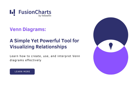
Venn diagrams - An Overview | Charts
Venn diagrams are visual representations used to illustrate relationships, similarities, and differences between sets. Consisting of overlapping circles, each circle represents a set, with shared areas showing common elements and non-overlapping parts indicating unique elements. Venn diagrams are widely used in mathematics, logic, and data analysis to compare and contrast groups effectively. For more information, visit FusionCharts.
0 notes
Text

React Native - An Overview | FusionCharts
React Native is an open-source framework developed by Facebook for building cross-platform mobile applications using JavaScript and React. It enables developers to write a single codebase that runs on both iOS and Android, offering a native-like performance and user experience, while leveraging reusable components and a large ecosystem. For more information, visit FusionCharts.
0 notes
Text
Test Management | FusionCharts

Test management involves planning, organizing, and controlling activities related to testing and quality assurance. It encompasses defining test objectives, creating test plans, scheduling tests, allocating resources, and tracking progress. Through meticulous management, it ensures that testing procedures are efficient, thorough, and aligned with project goals, ultimately facilitating the delivery of high-quality software products. If you want to learn more, please visit our website.
0 notes
Text
Python Data Visualization Library | FusionCharts
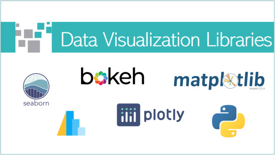
The Python Data Visualization Library is a robust toolkit for creating compelling visualizations from data. With intuitive syntax and extensive customization options, it allows users to generate insightful charts, graphs, and plots effortlessly. Whether you're exploring trends, presenting findings, or communicating insights, this library offers a rich array of visualization tools to elevate your data analysis projects with Python.
0 notes
Text
Looker : Empowering Data-Driven Decisions | FusionCharts

Looker is a powerful business intelligence and data analytics platform designed to empower organizations to explore, analyze, and share insights from their data. With intuitive visualization tools and a robust data modeling layer, Looker enables users to uncover valuable insights and make data-driven decisions. Its cloud-native architecture ensures scalability and flexibility, making it a preferred choice for businesses of all sizes. To learn more please visit our website.
0 notes
Text
AmCharts | FusionCharts

AmCharts revolutionizes data visualization with its advanced charting solutions, empowering businesses to transform raw data into insightful graphics effortlessly. With a diverse range of customizable charts, maps, and graphs, AmCharts offers unparalleled flexibility and performance. Seamlessly integrate stunning visualizations into your applications and websites, enhancing user experience and driving data-driven decisions. Discover the power of AmCharts today with FusionCharts blog post.
0 notes
Text
Angular Developers- FusionCharts

Looking for skilled Angular developers to enhance your data visualization projects? Look no further! Our team at FusionCharts is equipped with expertise in Angular development, ensuring seamless integration and optimized performance for your FusionCharts and FusionTime implementations. With FusionCharts v3.23 and FusionTime v2.9, we're elevating data visualization to new heights. Trust us for top-notch Angular development services and unlock the full potential of your data visualization endeavors.
0 notes
Text
Content Security Policy | FusionCharts
Content Security Policy (CSP) is a web security standard that mitigates cross-site scripting (XSS) attacks by defining and enforcing a set of content restrictions for a web page. It enables web developers to specify trusted sources for content such as scripts, stylesheets, and images, reducing the risk of unauthorized code execution and data theft. If you want to explore more about Content Security Policy, take a look at this blog.

0 notes
Text
3D Bubble Chart | FusionCharts
A 3D bubble chart visually represents data points using spheres in a three-dimensional space. Each sphere's size corresponds to a data value, while its position on the axes indicates different variables. This chart type is effective for illustrating relationships between three numerical variables, offering depth and perspective to data visualization, aiding in the interpretation of complex datasets. If you want to explore more about 3D Bubble Charts, take a look at this blog.

0 notes
Text
Web Chart | FusionCharts
Web Chart is an intuitive online tool for creating, customizing, and sharing dynamic charts and graphs. With a user-friendly interface, it simplifies data visualization for professionals and enthusiasts alike. Offering a variety of chart types, color schemes, and labeling options, Web Chart enables users to present data effectively across diverse platforms. Its versatility and accessibility make it a valuable resource for data-driven communication. If you want to explore more about Web Chart, take a look at this blog.
0 notes
Text
No-Code Integration | FusionCharts
No-Code Integration revolutionizes software development by enabling seamless connectivity between applications without traditional coding. It empowers users to effortlessly link disparate systems, automate workflows, and enhance collaboration. By eliminating complex coding requirements, No-Code Integration accelerates development cycles, making it accessible to a broader audience and fostering innovation in the digital landscape. If you want to explore more about No-Code Integration, take a look at this blog.

0 notes
Text
Doughnut Charts | FusionCharts
Doughnut charts is a variant of pie charts, visually represent data in a circular format. Their ring-shaped design conveys proportions of a whole with clear segments, making it easy to grasp relationships at a glance. Ideal for illustrating percentages and comparisons, doughnut charts are commonly used in data visualization to convey insights in a concise and visually appealing manner. If you want to explore more about Doughnut Charts, take a look at this website.

0 notes
Text
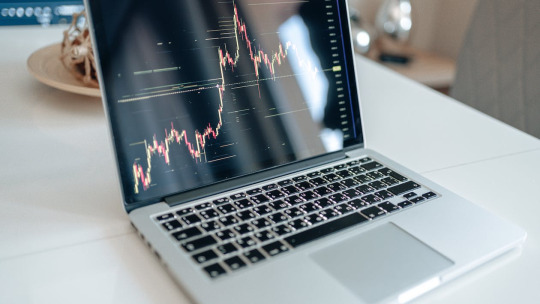
Candlestick | FusionCharts
Candlestick charts are a visual representation of financial price movements used in technical analysis. Each candlestick displays the opening, closing, high, and low prices within a specific time frame. Bullish and bearish trends are indicated by different colors and shapes, providing traders with key insights into market sentiment and potential future price movements. Candlestick patterns are valuable tools for predicting market trends and making informed trading decisions.

0 notes
Text
Dashboard Interactive | FusionCharts
Dashboard Interactive offers a dynamic and user-friendly platform that transforms data into insightful visuals. With intuitive features, it empowers users to explore, analyze, and present complex information effortlessly. Unlocking real-time data-driven decision-making, Dashboard Interactive enhances business intelligence, making it an indispensable tool for professionals across various industries. If you want to explore more about Dashboard Interactive, take a look at this website.
0 notes